
Recommended
More Related Content
What's hot
What's hot (19)
Viewers also liked
Similar to Student magazine contents analysis
Similar to Student magazine contents analysis (20)
Recently uploaded
Recently uploaded (20)
Student magazine contents analysis
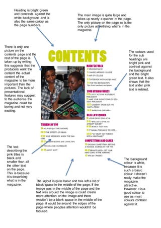
- 1. Heading is bright green and contrasts against the white background and is also the same colour as the page numbers. The main image is quite large and takes up nearly a quarter of the page. The only picture on the page so is the only picture advertising what’s in the magazine. The colours used for the sub headings are bright pink and contrast against the background and the bright green text. It also shows that the text under pink text is related. The text describing the pink titles is black and smaller than all the other text on the page. This is because it is describing what is in the magazine. The background colour is white, because it is such a basic colour it doesn’t really make the magazine attractive. However it is a good colour to use as most colours contrast against it. There is only one picture on the contents page and the rest of the page is taken up by writing; this suggests that the producers want the content the actual content of the magazine to be more important than the pictures. The lack of presentational features may suggest to the audience the magazine could be boring and not very exciting. The layout is quite basic and has left a lot of black space in the middle of the page. If the image was in the middle of the page and the text was around the image is could create more attention on the image and there wouldn’t be a blank space in the middle of the page, it would be around the edges of the page where peoples attention wouldn’t be focused.