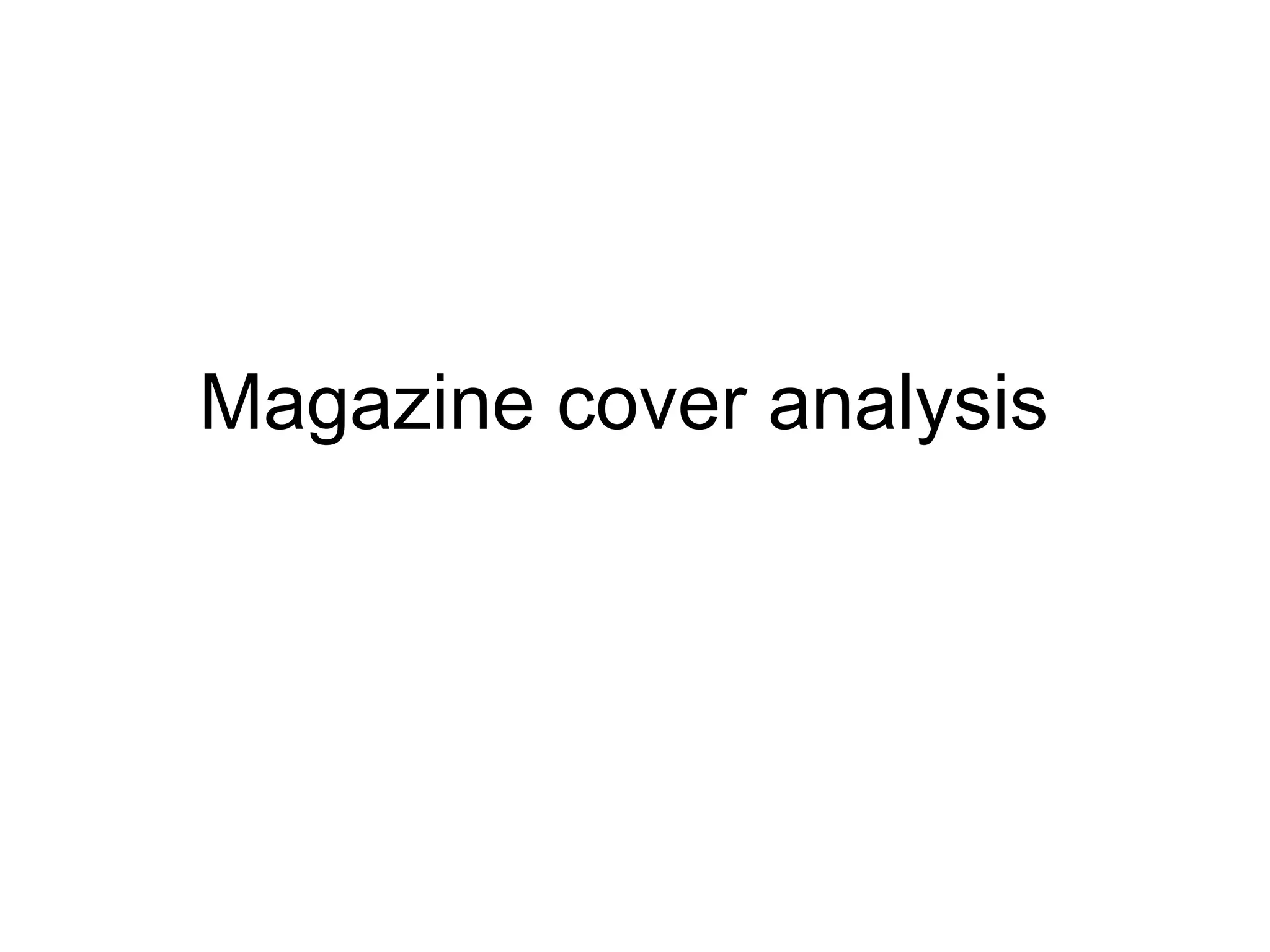
This magazine cover follows conventions in its use of colour, layout, fonts and images. The colours red, gold and white represent the main subject, Iron Man, and allow the title and other text to stand out from the dark background. The layout forms a 'Z' shape with text flowing at the top and sides around a central image. Sans serif fonts are used throughout for readability and visual consistency. Larger text sizes draw more attention to highlight important information like the magazine title and cover story details.
Instructions for Submissions thorugh G- Classroom.pptxJheel Barad
This presentation provides a briefing on how to upload submissions and documents in Google Classroom. It was prepared as part of an orientation for new Sainik School in-service teacher trainees. As a training officer, my goal is to ensure that you are comfortable and proficient with this essential tool for managing assignments and fostering student engagement.
The Art Pastor's Guide to Sabbath | Steve ThomasonSteve Thomason
What is the purpose of the Sabbath Law in the Torah. It is interesting to compare how the context of the law shifts from Exodus to Deuteronomy. Who gets to rest, and why?
The Roman Empire A Historical Colossus.pdfkaushalkr1407
The Roman Empire, a vast and enduring power, stands as one of history's most remarkable civilizations, leaving an indelible imprint on the world. It emerged from the Roman Republic, transitioning into an imperial powerhouse under the leadership of Augustus Caesar in 27 BCE. This transformation marked the beginning of an era defined by unprecedented territorial expansion, architectural marvels, and profound cultural influence.
The empire's roots lie in the city of Rome, founded, according to legend, by Romulus in 753 BCE. Over centuries, Rome evolved from a small settlement to a formidable republic, characterized by a complex political system with elected officials and checks on power. However, internal strife, class conflicts, and military ambitions paved the way for the end of the Republic. Julius Caesar’s dictatorship and subsequent assassination in 44 BCE created a power vacuum, leading to a civil war. Octavian, later Augustus, emerged victorious, heralding the Roman Empire’s birth.
Under Augustus, the empire experienced the Pax Romana, a 200-year period of relative peace and stability. Augustus reformed the military, established efficient administrative systems, and initiated grand construction projects. The empire's borders expanded, encompassing territories from Britain to Egypt and from Spain to the Euphrates. Roman legions, renowned for their discipline and engineering prowess, secured and maintained these vast territories, building roads, fortifications, and cities that facilitated control and integration.
The Roman Empire’s society was hierarchical, with a rigid class system. At the top were the patricians, wealthy elites who held significant political power. Below them were the plebeians, free citizens with limited political influence, and the vast numbers of slaves who formed the backbone of the economy. The family unit was central, governed by the paterfamilias, the male head who held absolute authority.
Culturally, the Romans were eclectic, absorbing and adapting elements from the civilizations they encountered, particularly the Greeks. Roman art, literature, and philosophy reflected this synthesis, creating a rich cultural tapestry. Latin, the Roman language, became the lingua franca of the Western world, influencing numerous modern languages.
Roman architecture and engineering achievements were monumental. They perfected the arch, vault, and dome, constructing enduring structures like the Colosseum, Pantheon, and aqueducts. These engineering marvels not only showcased Roman ingenuity but also served practical purposes, from public entertainment to water supply.
Read| The latest issue of The Challenger is here! We are thrilled to announce that our school paper has qualified for the NATIONAL SCHOOLS PRESS CONFERENCE (NSPC) 2024. Thank you for your unwavering support and trust. Dive into the stories that made us stand out!
Welcome to TechSoup New Member Orientation and Q&A (May 2024).pdfTechSoup
In this webinar you will learn how your organization can access TechSoup's wide variety of product discount and donation programs. From hardware to software, we'll give you a tour of the tools available to help your nonprofit with productivity, collaboration, financial management, donor tracking, security, and more.
How to Split Bills in the Odoo 17 POS ModuleCeline George
Bills have a main role in point of sale procedure. It will help to track sales, handling payments and giving receipts to customers. Bill splitting also has an important role in POS. For example, If some friends come together for dinner and if they want to divide the bill then it is possible by POS bill splitting. This slide will show how to split bills in odoo 17 POS.
The Indian economy is classified into different sectors to simplify the analysis and understanding of economic activities. For Class 10, it's essential to grasp the sectors of the Indian economy, understand their characteristics, and recognize their importance. This guide will provide detailed notes on the Sectors of the Indian Economy Class 10, using specific long-tail keywords to enhance comprehension.
For more information, visit-www.vavaclasses.com
This is a presentation by Dada Robert in a Your Skill Boost masterclass organised by the Excellence Foundation for South Sudan (EFSS) on Saturday, the 25th and Sunday, the 26th of May 2024.
He discussed the concept of quality improvement, emphasizing its applicability to various aspects of life, including personal, project, and program improvements. He defined quality as doing the right thing at the right time in the right way to achieve the best possible results and discussed the concept of the "gap" between what we know and what we do, and how this gap represents the areas we need to improve. He explained the scientific approach to quality improvement, which involves systematic performance analysis, testing and learning, and implementing change ideas. He also highlighted the importance of client focus and a team approach to quality improvement.
Palestine last event orientationfvgnh .pptxRaedMohamed3
An EFL lesson about the current events in Palestine. It is intended to be for intermediate students who wish to increase their listening skills through a short lesson in power point.
How to Make a Field invisible in Odoo 17Celine George
It is possible to hide or invisible some fields in odoo. Commonly using “invisible” attribute in the field definition to invisible the fields. This slide will show how to make a field invisible in odoo 17.
Ethnobotany and Ethnopharmacology:
Ethnobotany in herbal drug evaluation,
Impact of Ethnobotany in traditional medicine,
New development in herbals,
Bio-prospecting tools for drug discovery,
Role of Ethnopharmacology in drug evaluation,
Reverse Pharmacology.
2. SkylineMasthead
Anchor/model credit
Cover line
price &
dateline
The colour of the magazine
follows the
main conventions of the rule
of 3, whereby the 3 main
colours that have been used
in the magazine are: red,
gold, and white. These
colours are a representations
of the main focus of the
magazine, which is a picture
of iron man. Here, his
costume has the colours red
and gold. Where the title of
the magazine “Empire” is in
white. This allows the title
and other extra text stand our
from the dark background
such as, the title, the
characters name, and other
information about the film, or
what the magazine contains.
These colours can connote
for different things. The
colour red and gold can
signify the idea of power,
wealth, strength, and all
these play with the main
component of the film itself,
where the character, being a
superhero, has all these
aspects.
This magazine covers conventional
layout is shown as the letter ‘Z’ flipped
over, where the text flow on the top
and the two sides of the cover. This
conventional layout allows the main
image on the cover of the magazine to
be the main focus and allow the
audience understand what the main
features in the magazine are.
The fonts that have been used are all in a Sans serif font, whereby the title is in a bold Sans
serif font called ‘Bebas Neue’. The title is brought about in this font because it allows the
readers to be able to read it clearly and allows the main title to standout from the rest. It’s the
first thing that catches the audiences attention. The other fonts that have been used are mainly
all different styles of Sans serif. This was done because it allowed the audience to be able to
comfortably read the magazine, as it flows well with the theme. The anchor/ model credit font is
the same as the masthead however, it’s a lot slimmer.
The size of the text on the
magazine play an important role
in obtaining the readers attention.
As well as the font, the lager the
text size, the more eye-catching it
would be. The masthead and the
other model credit, as well as the
skyline, are the largest text on the
page, this is to allow the readers
know clearly what the magazine
holds, its theme etc…
The camera angle
and shot that was
used was used
effectively because of
the eye level, medium
shot used, it makes
the main picture look
as it is staring at the
reader, drawing them
more closer to read
the magazine.
3. Skylinemasthead
Date/ price
Button/
flash
Cover line
barcode
Anchor/
model
credit
Main
cover line
The main colours that have
been used are: gold, white blue
and black. These colour have
many connotations and
denotations. The use of the
black and dark blue
background, helps to place an
emphasis and allow the text
around the image stand out.
The connotations of this could
be that it can symbolise the
idea of binary opposites; light
and dark. This allows the
protagonist in the cover
standout the most. ‘Gollum’
tends to blend in with the
background, which gives off a
dark and mysterious
atmosphere. Having the
protagonist dressed in red,
makes him stand out as well,
enabling him to be the main
focus of the magazine.
The house style of ‘Empire’ is
similar to the last magazine
cover that I have analysed.
Reason being for this is
because the title font and size
and positioning is the same,
the only change is the change
in colour.
The conventional Layout that
has been used is the ‘Z’ shape.
Where the text flows from at the
top and bottom and the sides.
The middle is left bare, to allow
the readers focus on the image
placed in the centre. The text
that runs at the bottom is a
technique used to naturally
develop curiosity in the
audience and make them turn
the page as the since ends with
an ellipses
The fonts that have been used are Sans
serif, whereby the title is in a bold Sans
serif font called ‘Bebas Neue’. The title is
brought about in this font because it allows
the readers to be able to read it clearly and
allows the main title to standout from the
rest and it’s the first thing that catches the
audiences attention. The other fonts that
have been used is serif, this is shown
through the model credit ‘ The HOBBIT AN
UNEXPECTED JOURNEY’. The
significance of using a different font would
be because it allows it stand out and
separate itself from the other fonts. This
indicates to the audience that that they are
looking at something different. This also
allows it to follow a certain theme. Originally
the title is written like this, so to keep the
originality of the title of the main movie they
are promoting.
The target audience
would inevitably be those
who are perhaps a fan of
‘The Hobbit’, hence, a
cover as such will allow
the company to make
profit. When the target
audience buy the
magazine in hope to get
information and gossip
about the movie.
4. Skyline/
banner
masthead
Cover
line
Anchor/
model
credit
Bar code/
date/ price
The colours that have been used
in this magazine cover are; blue,
black, and white. The
connotations of using the colours
blue and white, highlight the idea
of something cold and at the
bottom of the magazine, there is a
frost like grain. Blue and white are
a way of foreshadowing the setting
of the film, presumably being set
in winter. The black is used for the
smaller text, so that the readers
can easily read them over the light
background. This magazine
therefore follows the rule of three,
since it uses three major colours.
Layout Empire magazine
uses a conventional layout of
a magazine to maximise the
front cover's effectiveness.
This cover follows the ‘T’
shape rule, whereby the
image in centred and the text
runs at the top and down the
middle. The masthead is
placed at the top of the page,
just under the skyline and
this is because the typical
western eye tend to straight
away look to the top-left of a
page. Due to this Empire
magazine makes sure that
the first thing that the reader
sees is the masthead, and
using it to their advantage,
immediately letting them
know what magazine they
are about to read. The
tagline is placed just above
the masthead, ensuring that
it is one of the first things the
reader sees. This allows the
reader to be enticed by the
magazine very quickly,
making them want to buy and
read the magazine
The masthead is the largest piece of
text on the front cover; this is done
because the largest font means it will
draw more of the attention from the
reader. Every other piece of text on the
front cover apart from the masthead
uses a different font, but are very
similar due to the bold, sans serif
nature of the text, creating a similar feel
across the page. Size is an important
factor in choosing font and text, since
larger fonts grab the reader's attention
more than smaller fonts. This allows
the magazine to highlight specific
pieces of information they want the
readers to see quickly and clearly. The
model credit is presented in the form of
a large, serif font that looks formal,
professional and fits the overall theme
of the featured film.
The target audience for this magazine mainly leans towards fans who really like Sherlock Holmes. The cover
image standing out mainly from the rest, as the readers naturally see this as the first thing that they see, they
are most likely to pick up this magazine. Another marketing technique that has been used is the text “world
exclusive” this, means that information such as the posy production and other information about this new
upcoming movie, will only be available here. Therefore, this will urge fans to buy this magazine because of its
context.
The camera angle that has been used, is a medium shot presented at eye level,
this main image was presented at the centre of the magazine as it works well in
drawing the audience in well, through this camera shot, we are able to feel as
though the main character is looking straight at us, drawing them to by the
magazine, for particular fans.
5. Masthead
skyline
button
Cover
line
Freebies
and cover
line
Bar code/
price/ date
Anchor/
model
credit
The main colours that have
been displayed are orange, black
and white. These colours blend
together as set the theme of the
film as a whole, the idea of a
blurred background, which could
signify a fast moving still image,
and the main character (Angelina
Jolie) dressed in black, directs all
focus on her yellow/ orange
background can presumable
capture a sunset or the dramatic
colours of flame. The use of a
The font that has been used
changed form ‘serif’ to ‘
Sans serif’ however, the
change in size and colour
and any other effect used,
makes the over text look
different depending on what
it wants to show. The
masthead is, like the other
magazine covers, the largest
of them all, according to
size. This was done to draw
attention to the title so that
the audiences are aware of
the magazine they are
looking at. The skyline and
other smaller text are written
in Sans serif, with thing
letters and some in bold,
allowing them to be
readable, or draw attention
to specific areas that they
would want the readers to
see.
The camera shots
that have been
used, capture the
main importance
and focus on the
magazine. Having
the main character
in focus, where the
background in
blurred and the
masthead is
mashed as well.
Portrays her as a
powerful and
invincible person.
Thus any fan of
action Movies or
Angelina are most
likely to buy this
magazine.
The layout of this
magazine follows the ‘Z’
rule which has been
flipped over. This layout
allows the masthead run
along the top, with some
text that run along the
bottom and the sides of
the magazine. This
method allowed excess
amount of space for more
information (Freebies) to
be included, so the reader
know what the top and
most exclusive news are.
The house style, in comparison to the magazine viewed before, shows the difference in
each layout, font, and colour. This could therefore, bring excitement to daily individuals
who tend to read ‘ Total Film’ a lot. As depending on each cover the whole layout and
theme changes to bring out the basics of the movie they are promoting
Main
cover
line
6. Masthead
skyline
button
Cover
line
Freebies
and cover
line
Bar code/
price/ date
Anchor/
model
credit
The main colours that have
been displayed are orange, black
and white. These colours blend
together as set the theme of the
film as a whole, the idea of a
blurred background, which could
signify a fast moving still image,
and the main character (Angelina
Jolie) dressed in black, directs all
focus on her yellow/ orange
background can presumable
capture a sunset or the dramatic
colours of flame. The use of a
The font that has been used
changed form ‘serif’ to ‘
Sans serif’ however, the
change in size and colour
and any other effect used,
makes the over text look
different depending on what
it wants to show. The
masthead is, like the other
magazine covers, the largest
of them all, according to
size. This was done to draw
attention to the title so that
the audiences are aware of
the magazine they are
looking at. The skyline and
other smaller text are written
in Sans serif, with thing
letters and some in bold,
allowing them to be
readable, or draw attention
to specific areas that they
would want the readers to
see.
The camera shots
that have been
used, capture the
main importance
and focus on the
magazine. Having
the main character
in focus, where the
background in
blurred and the
masthead is
mashed as well.
Portrays her as a
powerful and
invincible person.
Thus any fan of
action Movies or
Angelina are most
likely to buy this
magazine.
The layout of this
magazine follows the ‘Z’
rule which has been
flipped over. This layout
allows the masthead run
along the top, with some
text that run along the
bottom and the sides of
the magazine. This
method allowed excess
amount of space for more
information (Freebies) to
be included, so the reader
know what the top and
most exclusive news are.
The house style, in comparison to the magazine viewed before, shows the difference in
each layout, font, and colour. This could therefore, bring excitement to daily individuals
who tend to read ‘ Total Film’ a lot. As depending on each cover the whole layout and
theme changes to bring out the basics of the movie they are promoting
Main
cover
line