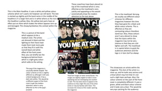
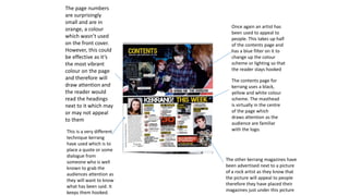
This document summarizes the design elements used on the front cover and contents pages of a Kerrang magazine. The front cover uses a black and white color scheme with artist photos in grayscale to fit the theme. Coverlines are in contrasting colors like yellow and red to draw attention. The contents pages continue the color blocking with quotes in vibrant colors to hook readers. Photos of popular artists are prominently featured throughout to appeal to readers and promote articles. Consistent branding elements like the logo and masthead maintain recognition across pages.