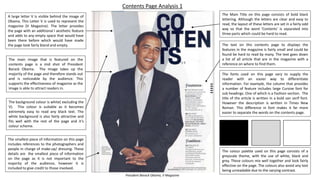
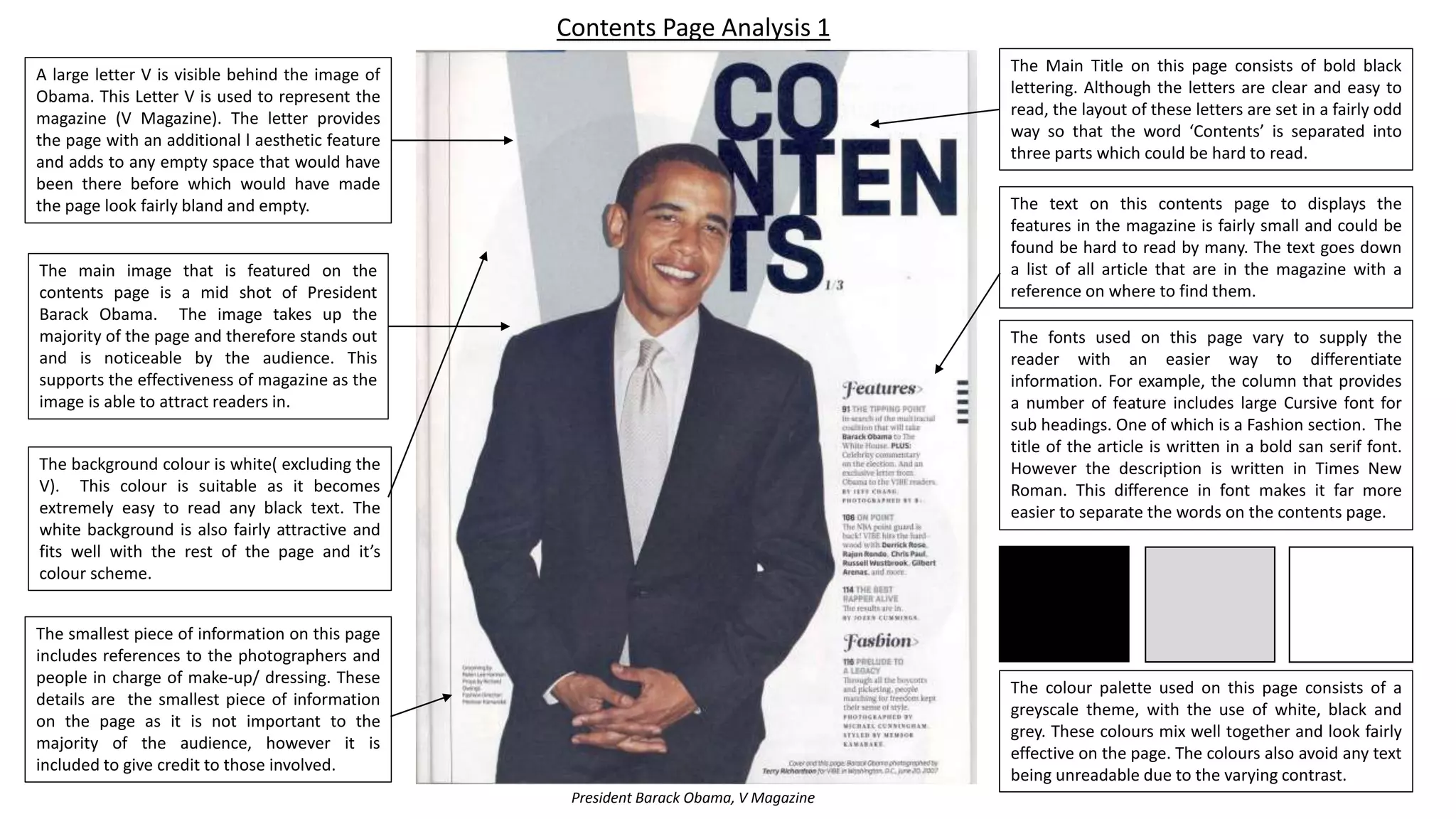
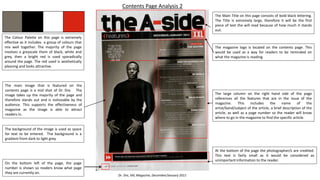
The document analyzes the contents pages of two magazines - V Magazine and XXL Magazine. It discusses various design elements of the pages including images, fonts, color schemes, layouts and how information is organized and presented. The main elements that stand out are the large celebrity images in the center of the pages, the mastheads at the top, and the columns listing article titles, descriptions and page numbers to easily direct readers to content. The color palettes for both pages involve grayscale tones along with pops of bright red. Fonts are used distinctly for different types of information. Overall the pages aim to attract readers with images and clearly present what the magazines contain through structured lists.
This is Emily's answer to the first question of our evaluation for our music magazine. The question is, "In what way does your media product use, develop or challenge codes and conventions of real media products?".
My magazine analysis for my A-Level Media Blog. I have analysed two Music magazines, Metal Hammer and Kerrang, I chose both of these magazines because my magazine will be focused on the same genre of music as these and both of the main articles were Slipknot.
The Art Pastor's Guide to Sabbath | Steve ThomasonSteve Thomason
What is the purpose of the Sabbath Law in the Torah. It is interesting to compare how the context of the law shifts from Exodus to Deuteronomy. Who gets to rest, and why?
How to Create Map Views in the Odoo 17 ERPCeline George
The map views are useful for providing a geographical representation of data. They allow users to visualize and analyze the data in a more intuitive manner.
Operation “Blue Star” is the only event in the history of Independent India where the state went into war with its own people. Even after about 40 years it is not clear if it was culmination of states anger over people of the region, a political game of power or start of dictatorial chapter in the democratic setup.
The people of Punjab felt alienated from main stream due to denial of their just demands during a long democratic struggle since independence. As it happen all over the word, it led to militant struggle with great loss of lives of military, police and civilian personnel. Killing of Indira Gandhi and massacre of innocent Sikhs in Delhi and other India cities was also associated with this movement.
Ethnobotany and Ethnopharmacology:
Ethnobotany in herbal drug evaluation,
Impact of Ethnobotany in traditional medicine,
New development in herbals,
Bio-prospecting tools for drug discovery,
Role of Ethnopharmacology in drug evaluation,
Reverse Pharmacology.
Model Attribute Check Company Auto PropertyCeline George
In Odoo, the multi-company feature allows you to manage multiple companies within a single Odoo database instance. Each company can have its own configurations while still sharing common resources such as products, customers, and suppliers.
Read| The latest issue of The Challenger is here! We are thrilled to announce that our school paper has qualified for the NATIONAL SCHOOLS PRESS CONFERENCE (NSPC) 2024. Thank you for your unwavering support and trust. Dive into the stories that made us stand out!
Instructions for Submissions thorugh G- Classroom.pptxJheel Barad
This presentation provides a briefing on how to upload submissions and documents in Google Classroom. It was prepared as part of an orientation for new Sainik School in-service teacher trainees. As a training officer, my goal is to ensure that you are comfortable and proficient with this essential tool for managing assignments and fostering student engagement.
Unit 8 - Information and Communication Technology (Paper I).pdfThiyagu K
This slides describes the basic concepts of ICT, basics of Email, Emerging Technology and Digital Initiatives in Education. This presentations aligns with the UGC Paper I syllabus.
Unit 8 - Information and Communication Technology (Paper I).pdf
Contents page analysis
1. The text on this contents page to displays the
features in the magazine is fairly small and could be
found be hard to read by many. The text goes down
a list of all article that are in the magazine with a
reference on where to find them.
The colour palette used on this page consists of a
greyscale theme, with the use of white, black and
grey. These colours mix well together and look fairly
effective on the page. The colours also avoid any text
being unreadable due to the varying contrast.
The Main Title on this page consists of bold black
lettering. Although the letters are clear and easy to
read, the layout of these letters are set in a fairly odd
way so that the word ‘Contents’ is separated into
three parts which could be hard to read.
The main image that is featured on the
contents page is a mid shot of President
Barack Obama. The image takes up the
majority of the page and therefore stands out
and is noticeable by the audience. This
supports the effectiveness of magazine as the
image is able to attract readers in.
A large letter V is visible behind the image of
Obama. This Letter V is used to represent the
magazine (V Magazine). The letter provides
the page with an additional l aesthetic feature
and adds to any empty space that would have
been there before which would have made
the page look fairly bland and empty.
The fonts used on this page vary to supply the
reader with an easier way to differentiate
information. For example, the column that provides
a number of feature includes large Cursive font for
sub headings. One of which is a Fashion section. The
title of the article is written in a bold san serif font.
However the description is written in Times New
Roman. This difference in font makes it far more
easier to separate the words on the contents page.
The smallest piece of information on this page
includes references to the photographers and
people in charge of make-up/ dressing. These
details are the smallest piece of information
on the page as it is not important to the
majority of the audience, however it is
included to give credit to those involved.
The background colour is white( excluding the
V). This colour is suitable as it becomes
extremely easy to read any black text. The
white background is also fairly attractive and
fits well with the rest of the page and it’s
colour scheme.
Contents Page Analysis 1
President Barack Obama, V Magazine
2. Dr. Dre, XXL Magazine, December/January 2011
Contents Page Analysis 2
The Colour Palette on this page is extremely
effective as it includes a group of colours that
mix well together. The majority of the page
involves a greyscale them of black, white and
grey, then a bright red is used sporadically
around the page. The red used is aesthetically
pleasing and looks attractive.
The main image that is featured on the
contents page is a mid shot of Dr. Dre. The
image takes up the majority of the page and
therefore stands out and is noticeable by the
audience. This supports the effectiveness of
magazine as the image is able to attract
readers in.
The Main Title on this page consists of bold black lettering.
The Title is extremely large, therefore it will be the first
piece of text the will read because of how much it stands
out.
The magazine logo is located on the contents page. This
would be used as a way for readers to be reminded on
what the magazine is reading.
At the bottom of the page the photographer/s are credited.
This text is fairly small as it would be considered as
unimportant information to the reader.
On the bottom left of the page, the page
number is shown so readers know what page
they are currently on.
The large column on the right hand side of the page
references all the features that are in the issue of the
magazine. This includes the name of the
artist/band/subject of the article, a brief description of the
article, as well as a page number so the reader will know
where to go in the magazine to find the specific article.
The background of the image is used as space
for text to be entered. The background is a
gradient front dark to light grey.
3. The masthead is located at the top of the contents page in
the centre. It is fairly large and in bold, black text. Being
the name of the magazine, the masthead is used as a way
to represent them
The Colour Palette on this page include a similar
colour scheme to the XXL contents page. The
majority of the page involves a greyscale theme
of black and white, then a bright red is used
sporadically around the page to emphasis key
information. The red used is aesthetically
pleasing and looks attractive.
The image takes up the entire page and the
subject is centred at the bottom of it. The
background is blurred as a way to focus the
attention onto her.
The fonts used on this page vary to supply the reader with
an easier way to differentiate information. The names of
articles and artists are written in bold, black text . A brief
description of that name is written alongside it is a much
smaller black
A quote is used in the middle on the left hand
side of the page. This provides a snippet of what
the woman feature on the page says in her
article. Below this, the article name and page
that it is on is shown in red so that if readers are
interested they can read the entire story.
The features that are showing in on the page are listed in 2
columns. These columns involve a list of article that are in
the magazine, a brief description on them with a page
reference on where to find them.