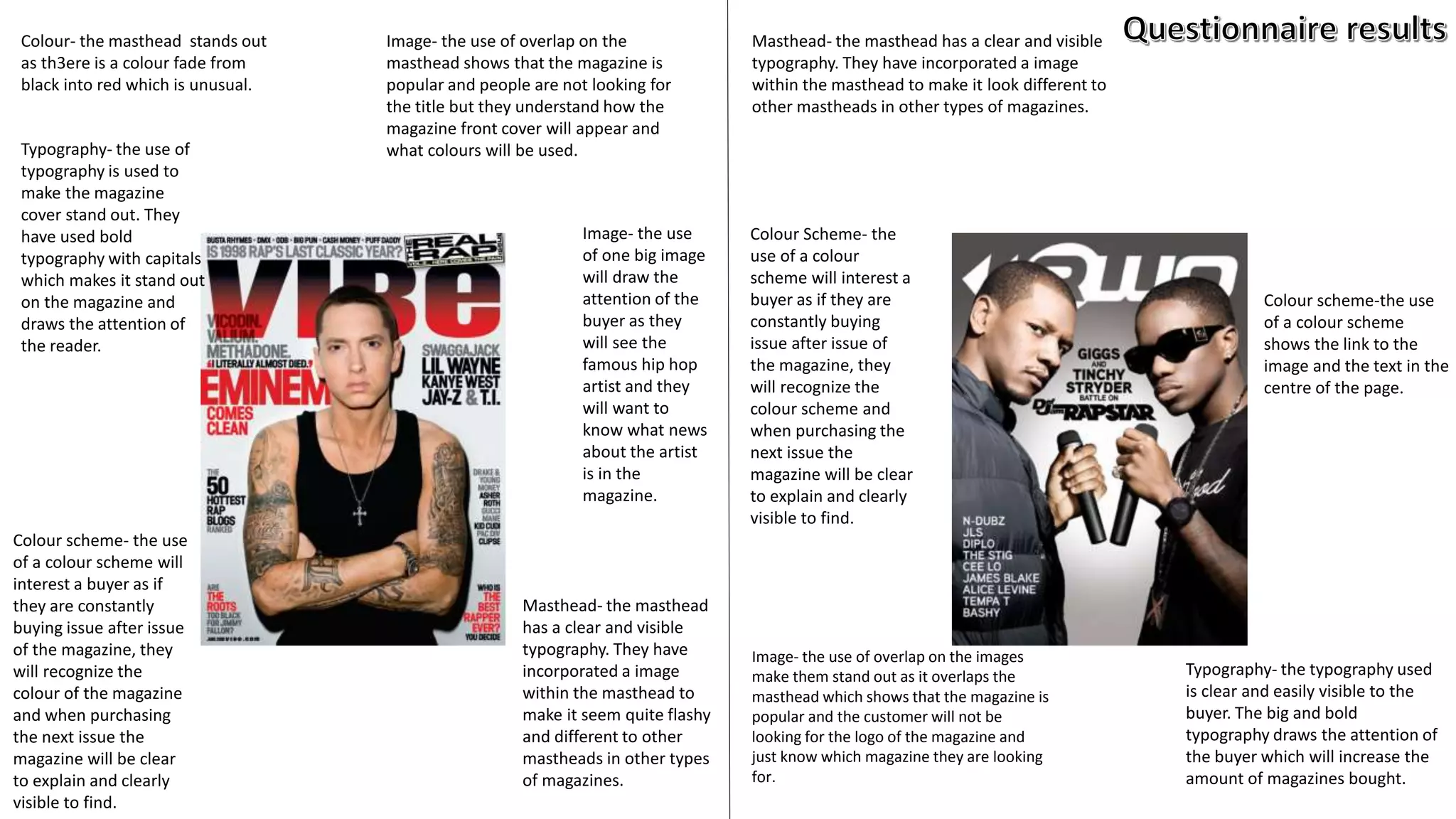
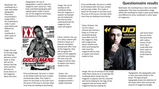
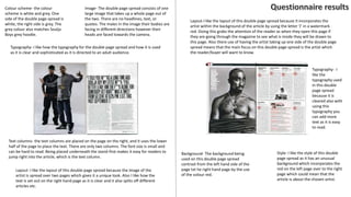
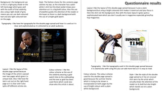
Colour- the masthead stands out
as th3ere is a colour fade from
black into red which is unusual.
Image- the use of overlap on the
masthead shows that the magazine is
popular and people are not looking for
the title but they understand how the
magazine front cover will appear and
what colours will be used.Typography- the use of
typography is used to
make the magazine
cover stand out. They
have used bold
typography with capitals
which makes it stand out
on the magazine and
draws the attention of
the reader.
Image- the use
of one big image
will draw the
attention of the
buyer as they
will see the
famous hip hop
artist and they
will want to
know what news
about the artist
is in the
magazine.
Colour scheme- the use
of a colour scheme will
interest a buyer as if
they are constantly
buying issue after issue
of the magazine, they
will recognize the
colour of the magazine
and when purchasing
the next issue the
magazine will be clear
to explain and clearly
visible to find.
Masthead- the masthead
has a clear and visible
typography. They have
incorporated a image
within the masthead to
make it seem quite flashy
and different to other
mastheads in other types
of magazines.
Image- the use of overlap on the images
make them stand out as it overlaps the
masthead which shows that the magazine is
popular and the customer will not be
looking for the logo of the magazine and
just know which magazine they are looking
for.
Colour Scheme- the
use of a colour
scheme will interest a
buyer as if they are
constantly buying
issue after issue of
the magazine, they
will recognize the
colour scheme and
when purchasing the
next issue the
magazine will be clear
to explain and clearly
visible to find.
Colour scheme-the use
of a colour scheme
shows the link to the
image and the text in the
centre of the page.
Typography- the typography used
is clear and easily visible to the
buyer. The big and bold
typography draws the attention of
the buyer which will increase the
amount of magazines bought.
Masthead- the masthead has a clear and visible
typography. They have incorporated a image
within the masthead to make it look different to
other mastheads in other types of magazines.
Colour- the
masthead stands out
as there is a bold
background with a
bright masthead.
Image- the use of
overlap on the
masthead shows
that the magazine is
popular and people
are not looking for
the title but they
understand how the
magazine front
cover will appear.
Typography- the use of
typography is used to make the
magazine cover stand out. They
have used bold typography with
capitals which makes it stand
out on the magazine and draws
the attention of the reader.
Image- the use
of one big image
will draw the
attention of the
buyer as they
will see the
famous hip hop
artist and they
will want to
know what is in
the magazine
about the artist.
Colour scheme- the use
of a colour scheme will
interest a buyer as if
they are constantly
buying issue after issue
of the magazine, they
will recognize the
colour of the magazine
and when purchasing
the next issue the
magazine will be clear
to explain and clearly
visible to find.
Masthead- the
masthead has a
clear and visible
typography.
They have
incorporated a
image within
the masthead to
make it seem
quite flashy and
different to
other
mastheads in
other types of
magazines.
Image- the use of overlap on the image
make them stand out as it overlaps the
masthead which shows that the
magazine is popular and the customer
will not be looking for the logo of the
magazine and just know which
magazine they are looking for.
Colour Scheme- the
use of a colour
scheme will interest a
buyer as if they are
constantly buying
issue after issue of
the magazine, they
will recognize the
colour scheme and
when purchasing the
next issue the
magazine will be clear
to explain and clearly
visible to find.
Left Hand Third-
the use of the
left hand third
with replica
colours to the
artist ‘Jay-Z’
could infer that
them topics in
white writing
could relate to
him.
Typography- the typography used
is clear and easily visible to the
buyer. The big and bold
typography draws the attention of
the buyer which will increase the
amount of magazines bought.
Price and Barcode- the price is visible
at the bottom with the issue number
and barcode visible. This makes it
easier for the buyer to see how much
the price of the issue is and also what
issue they are looking at purchasing.
Price and Barcode- the price is visible
at the bottom with the issue number
and barcode visible. This makes it
easier for the buyer to see how much
the price of the issue is and also what
issue they are looking at purchasing.
Masthead- the masthead has a clear and visible
typography. They have incorporated a image
within the masthead to make it seem quite flashy
and different to other mastheads in other types
of magazines.
Background- the
background used
on this issue is
plain so therefore
you can use a dark
and bold subtitle
and text to show
what is in the
issue.
Style- The fashion choice for this contents page
catches my eye, as the artist is wearing an
unusual orange jacket which grabs your
attention and draws you to it, also the use of
the jewellery will appeal to the buyer.
Typography- I like how the
typography for contents is laid
out as it is unusual but is bold
and clear. However it is quite
large so it takes up a lot of
room on the page which could
be used for images etc.
Colour scheme-
I like the edition
of colour from
the orange
jacket to the
text under the
masthead which
could show a
link to who the
magazines main
article is about.
Layout- I like the layout of the page also, as the text is all on one side and
together. Also the difference in text from the title of each section of text gives
a contrast to the font, as a different font is used for the ‘contents’ title
compared to the text used for the sub-titles and then the text used for
different page numbers.
Colour
scheme-I like
the colour
scheme of
this contents
page as it is
quite bold
and simple.
Layout- I like the layout of the page, also as the text is all on one side and put together this
makes it easier for the reader to find which section they wish to read or go back to. I also
like how the subtitle of each section is in bold as that is what the readers wish to know.
Also I like that the main image takes up the page as it means that a focus of this issue of
magazine is that person or group.
Background- The background on this contents page is a image of the
artist which could mean that the main article of this issue is about
him or something which he is involved in (music/video etc.).
Typography- The
typography used in
this contents is bold
and clear. Different
sized text has been
used to show that
the subtitles of each
article are the only
thing you need to
read from a far and
your attention will
be drawn in
immediately.
Style- The fashion choice for this contents page
catches my eye, as the artist is wearing double
denim which could be the latest trend when
the magazine was issued, also this look the
artist has gone for is quite a sophisticated but
casual look.
Typography- I like
how the
typography for
contents is laid
out as it is
unusual but is
bold and clear.
However it is
quite large so it
takes up a lot of
room on the page
which could be
used for images
etc.
Colour scheme-
I like the colour
scheme used as
the white on the
artist could link
the text on the
left hand third.
Layout- I like the layout of the page also, as the text is all on one side and together.
I also like how the title of each section of text is a different font, so that the
readers know where the next main topic begins when looking for a certain topic.
Also the difference in text from the title of each section of text gives a contrast to
the font, as a different font is used for the ‘contents’ title compared to the text
used for the sub-titles and then the text used for different page numbers.
Style- the fashion choice for this
contents page follows the hip hop
theme and the gold chains catches
the eye of the buyer because of the
gold chain being a bright colour and
the background being a dark colour.
Colour scheme-I
like the ccolour
scheme of this
contents page
as it is quite
bold and simple
but the gold
chain and the
rest of the
jewellery draws
the attention of
the buyer.
Layout- I like the layout of the page, also as the text is all on one side and put
together this makes it easier for the reader to find which section they wish to read
or go back to. I also like how the subtitle of each section is in bold as that is what
the readers wish to know. Also I like that the main image takes up most of the
page as it means that a focus of this issue of magazine is that person.
Background- The background on this
contents page is plain because they use
a bold dark typography. Doing this
means the writing stands out more and
you can increase the amount of text
written in the description.
Typography- The
typography used in
this contents is bold
and clear. Different
sized text has been
used to show that
the subtitles of each
article are the only
thing you need to
read from a far and
your attention will
be drawn in
immediately.
Background- the background
used on this issue is plain so
therefore you can use a dark
and bold subtitle and text to
show what is in the issue.
Colour scheme- the colour
scheme is white and grey. One
side of the double page spread is
white, the right side is grey. The
grey colour also matches Soulja
Boys grey hoodie.
Image- The double page spread consists of one
large image that takes up a whole page out of
the two. There are no headlines, text, or
quotes. The males in the image their bodies are
facing in different directions however their
heads are faced towards the camera.
Typography- I like how the typography for the double page spread and how it is used
as it is clear and sophisticated as it is directed to an adult audience.
Text columns- the text columns are placed on the page on the right, and it uses the lower
half of the page to place the text. There are only two columns. The font size is small and
can be hard to read. Being placed underneath the stand-first makes it easy for readers to
jump right into the article, which is the text column.
Layout- I like the layout of this double page spread because the image of the
artist is spread over two pages which gives it a unique look. Also I like how the
text is set out on the right hand page as it is clear and it also splits off different
articles etc.
Style- I like the style of this double
page spread as it has an unusual
background which incorporates the
red on the left page over to the right
page which could mean that the
article is about the chosen artist.
Layout-I like the layout of this double page spread because it incorporates the
artist within the background of the article by using the letter ‘J’ in a watermark
red. Doing this grabs the attention of the reader as when they open this page if
they are going through the magazine to see what is inside they will be drawn to
this page. Also there use of having the artist taking up one side of the double page
spread means that the main focus on this double page spread is the artist which
the reader/buyer will want to know.
Background- The background being
used on this double page spread
contrast from the left hand side of the
page txt he right hand page by the use
of the colour red.
Typography- I
like the
typography used
in this double
page spread
because it is
cleared also with
using this
typography you
can add more
text as it is easy
to read.
Background- the background use
in this is a light grey shade on the
left hand page which goes well
with the outfit of that celebrity,
also using a light shade of grey
means you can use dark coloured
text and also light coloured text
on the page.
Style- The fashion choice for this contents page
catches my eye, as the character has a plain
white t-shirt but the black jacket draws your
attention as it is a big bold colour. Also the use
of jewellery grabs the attention of the reader or
the buyer as there is a dark background with
the use of a bright gold watch.
Typography- I like how the typography for the double page spread and how it is used as it is
clear and sophisticated as it is directed to an adult audience.
Colour scheme- I like the
colour scheme as the use of
the celebrity wearing a gold
watch links to the subheading
and the text as gold has been
used there which could also
show who the article is about.
Layout- I like the layout of this
double page spread because
the image of the artist is spread
over two pages which gives it a
unique look. Also I like how the
text is set out on the right hand
page as it is clear and it also
splits off different articles etc.
Style- I like the style of this double
page spread as it has an unusual
shirt worn by the artist which
actually draws the attention of the
reader as its bold but also bright
which stands out on a plain
background.
Colour scheme- The colour scheme
used for this double page spread is
good because the summer theme
which is trying to be shown is
incorporated on both pages by the
use of bright colours with a plain
white background.
Layout-I like the layout of this double page spread because it uses a plain
background but using a bright coloured shirt makes it stand out and your focus is
then the shirt not the background. Also with this basic layout it gives quite a
sophisticated look which you don't usually see in magazines especially grime/hip
hop magazines.
Typography- I like the typography used in this double page spread because
it is cleared also with using this you can add more text as it is easy to read.

Chosen Genre Anaylsis

  • 1.
    Colour- the mastheadstands out as th3ere is a colour fade from black into red which is unusual. Image- the use of overlap on the masthead shows that the magazine is popular and people are not looking for the title but they understand how the magazine front cover will appear and what colours will be used.Typography- the use of typography is used to make the magazine cover stand out. They have used bold typography with capitals which makes it stand out on the magazine and draws the attention of the reader. Image- the use of one big image will draw the attention of the buyer as they will see the famous hip hop artist and they will want to know what news about the artist is in the magazine. Colour scheme- the use of a colour scheme will interest a buyer as if they are constantly buying issue after issue of the magazine, they will recognize the colour of the magazine and when purchasing the next issue the magazine will be clear to explain and clearly visible to find. Masthead- the masthead has a clear and visible typography. They have incorporated a image within the masthead to make it seem quite flashy and different to other mastheads in other types of magazines. Image- the use of overlap on the images make them stand out as it overlaps the masthead which shows that the magazine is popular and the customer will not be looking for the logo of the magazine and just know which magazine they are looking for. Colour Scheme- the use of a colour scheme will interest a buyer as if they are constantly buying issue after issue of the magazine, they will recognize the colour scheme and when purchasing the next issue the magazine will be clear to explain and clearly visible to find. Colour scheme-the use of a colour scheme shows the link to the image and the text in the centre of the page. Typography- the typography used is clear and easily visible to the buyer. The big and bold typography draws the attention of the buyer which will increase the amount of magazines bought. Masthead- the masthead has a clear and visible typography. They have incorporated a image within the masthead to make it look different to other mastheads in other types of magazines.
  • 2.
    Colour- the masthead standsout as there is a bold background with a bright masthead. Image- the use of overlap on the masthead shows that the magazine is popular and people are not looking for the title but they understand how the magazine front cover will appear. Typography- the use of typography is used to make the magazine cover stand out. They have used bold typography with capitals which makes it stand out on the magazine and draws the attention of the reader. Image- the use of one big image will draw the attention of the buyer as they will see the famous hip hop artist and they will want to know what is in the magazine about the artist. Colour scheme- the use of a colour scheme will interest a buyer as if they are constantly buying issue after issue of the magazine, they will recognize the colour of the magazine and when purchasing the next issue the magazine will be clear to explain and clearly visible to find. Masthead- the masthead has a clear and visible typography. They have incorporated a image within the masthead to make it seem quite flashy and different to other mastheads in other types of magazines. Image- the use of overlap on the image make them stand out as it overlaps the masthead which shows that the magazine is popular and the customer will not be looking for the logo of the magazine and just know which magazine they are looking for. Colour Scheme- the use of a colour scheme will interest a buyer as if they are constantly buying issue after issue of the magazine, they will recognize the colour scheme and when purchasing the next issue the magazine will be clear to explain and clearly visible to find. Left Hand Third- the use of the left hand third with replica colours to the artist ‘Jay-Z’ could infer that them topics in white writing could relate to him. Typography- the typography used is clear and easily visible to the buyer. The big and bold typography draws the attention of the buyer which will increase the amount of magazines bought. Price and Barcode- the price is visible at the bottom with the issue number and barcode visible. This makes it easier for the buyer to see how much the price of the issue is and also what issue they are looking at purchasing. Price and Barcode- the price is visible at the bottom with the issue number and barcode visible. This makes it easier for the buyer to see how much the price of the issue is and also what issue they are looking at purchasing. Masthead- the masthead has a clear and visible typography. They have incorporated a image within the masthead to make it seem quite flashy and different to other mastheads in other types of magazines.
  • 3.
    Background- the background used onthis issue is plain so therefore you can use a dark and bold subtitle and text to show what is in the issue. Style- The fashion choice for this contents page catches my eye, as the artist is wearing an unusual orange jacket which grabs your attention and draws you to it, also the use of the jewellery will appeal to the buyer. Typography- I like how the typography for contents is laid out as it is unusual but is bold and clear. However it is quite large so it takes up a lot of room on the page which could be used for images etc. Colour scheme- I like the edition of colour from the orange jacket to the text under the masthead which could show a link to who the magazines main article is about. Layout- I like the layout of the page also, as the text is all on one side and together. Also the difference in text from the title of each section of text gives a contrast to the font, as a different font is used for the ‘contents’ title compared to the text used for the sub-titles and then the text used for different page numbers. Colour scheme-I like the colour scheme of this contents page as it is quite bold and simple. Layout- I like the layout of the page, also as the text is all on one side and put together this makes it easier for the reader to find which section they wish to read or go back to. I also like how the subtitle of each section is in bold as that is what the readers wish to know. Also I like that the main image takes up the page as it means that a focus of this issue of magazine is that person or group. Background- The background on this contents page is a image of the artist which could mean that the main article of this issue is about him or something which he is involved in (music/video etc.). Typography- The typography used in this contents is bold and clear. Different sized text has been used to show that the subtitles of each article are the only thing you need to read from a far and your attention will be drawn in immediately.
  • 4.
    Style- The fashionchoice for this contents page catches my eye, as the artist is wearing double denim which could be the latest trend when the magazine was issued, also this look the artist has gone for is quite a sophisticated but casual look. Typography- I like how the typography for contents is laid out as it is unusual but is bold and clear. However it is quite large so it takes up a lot of room on the page which could be used for images etc. Colour scheme- I like the colour scheme used as the white on the artist could link the text on the left hand third. Layout- I like the layout of the page also, as the text is all on one side and together. I also like how the title of each section of text is a different font, so that the readers know where the next main topic begins when looking for a certain topic. Also the difference in text from the title of each section of text gives a contrast to the font, as a different font is used for the ‘contents’ title compared to the text used for the sub-titles and then the text used for different page numbers. Style- the fashion choice for this contents page follows the hip hop theme and the gold chains catches the eye of the buyer because of the gold chain being a bright colour and the background being a dark colour. Colour scheme-I like the ccolour scheme of this contents page as it is quite bold and simple but the gold chain and the rest of the jewellery draws the attention of the buyer. Layout- I like the layout of the page, also as the text is all on one side and put together this makes it easier for the reader to find which section they wish to read or go back to. I also like how the subtitle of each section is in bold as that is what the readers wish to know. Also I like that the main image takes up most of the page as it means that a focus of this issue of magazine is that person. Background- The background on this contents page is plain because they use a bold dark typography. Doing this means the writing stands out more and you can increase the amount of text written in the description. Typography- The typography used in this contents is bold and clear. Different sized text has been used to show that the subtitles of each article are the only thing you need to read from a far and your attention will be drawn in immediately. Background- the background used on this issue is plain so therefore you can use a dark and bold subtitle and text to show what is in the issue.
  • 5.
    Colour scheme- thecolour scheme is white and grey. One side of the double page spread is white, the right side is grey. The grey colour also matches Soulja Boys grey hoodie. Image- The double page spread consists of one large image that takes up a whole page out of the two. There are no headlines, text, or quotes. The males in the image their bodies are facing in different directions however their heads are faced towards the camera. Typography- I like how the typography for the double page spread and how it is used as it is clear and sophisticated as it is directed to an adult audience. Text columns- the text columns are placed on the page on the right, and it uses the lower half of the page to place the text. There are only two columns. The font size is small and can be hard to read. Being placed underneath the stand-first makes it easy for readers to jump right into the article, which is the text column. Layout- I like the layout of this double page spread because the image of the artist is spread over two pages which gives it a unique look. Also I like how the text is set out on the right hand page as it is clear and it also splits off different articles etc. Style- I like the style of this double page spread as it has an unusual background which incorporates the red on the left page over to the right page which could mean that the article is about the chosen artist. Layout-I like the layout of this double page spread because it incorporates the artist within the background of the article by using the letter ‘J’ in a watermark red. Doing this grabs the attention of the reader as when they open this page if they are going through the magazine to see what is inside they will be drawn to this page. Also there use of having the artist taking up one side of the double page spread means that the main focus on this double page spread is the artist which the reader/buyer will want to know. Background- The background being used on this double page spread contrast from the left hand side of the page txt he right hand page by the use of the colour red. Typography- I like the typography used in this double page spread because it is cleared also with using this typography you can add more text as it is easy to read.
  • 6.
    Background- the backgrounduse in this is a light grey shade on the left hand page which goes well with the outfit of that celebrity, also using a light shade of grey means you can use dark coloured text and also light coloured text on the page. Style- The fashion choice for this contents page catches my eye, as the character has a plain white t-shirt but the black jacket draws your attention as it is a big bold colour. Also the use of jewellery grabs the attention of the reader or the buyer as there is a dark background with the use of a bright gold watch. Typography- I like how the typography for the double page spread and how it is used as it is clear and sophisticated as it is directed to an adult audience. Colour scheme- I like the colour scheme as the use of the celebrity wearing a gold watch links to the subheading and the text as gold has been used there which could also show who the article is about. Layout- I like the layout of this double page spread because the image of the artist is spread over two pages which gives it a unique look. Also I like how the text is set out on the right hand page as it is clear and it also splits off different articles etc. Style- I like the style of this double page spread as it has an unusual shirt worn by the artist which actually draws the attention of the reader as its bold but also bright which stands out on a plain background. Colour scheme- The colour scheme used for this double page spread is good because the summer theme which is trying to be shown is incorporated on both pages by the use of bright colours with a plain white background. Layout-I like the layout of this double page spread because it uses a plain background but using a bright coloured shirt makes it stand out and your focus is then the shirt not the background. Also with this basic layout it gives quite a sophisticated look which you don't usually see in magazines especially grime/hip hop magazines. Typography- I like the typography used in this double page spread because it is cleared also with using this you can add more text as it is easy to read.