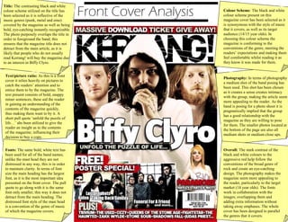
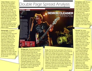
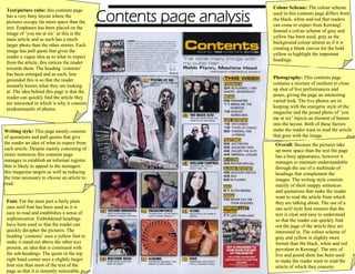
The document provides an analysis of the design elements used across the front cover, double page spread, and contents page of a Kerrang! magazine issue. Some of the key points summarized:
- The front cover uses a black and white color scheme and band photography to represent the genres covered while drawing attention to the main article. Bold fonts are used for clarity.
- The double page spread continues the black, white, and red color scheme and features a live band photo to seem more natural. The informal writing style and fonts aim to engage younger readers.
- The contents page is visually-focused with large band images and pull quotes to entice readers. A gray and yellow color scheme highlights headings among the busy