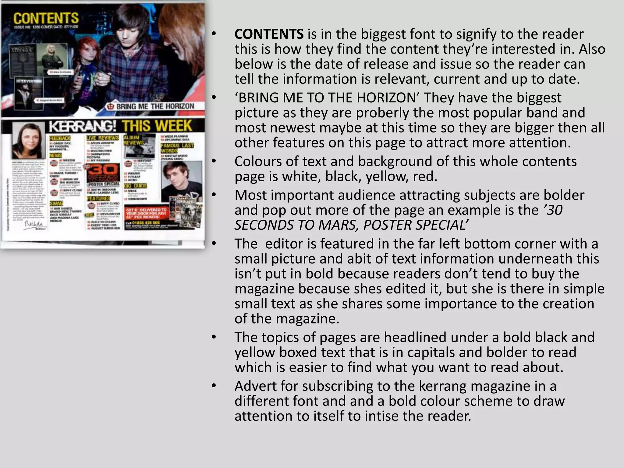
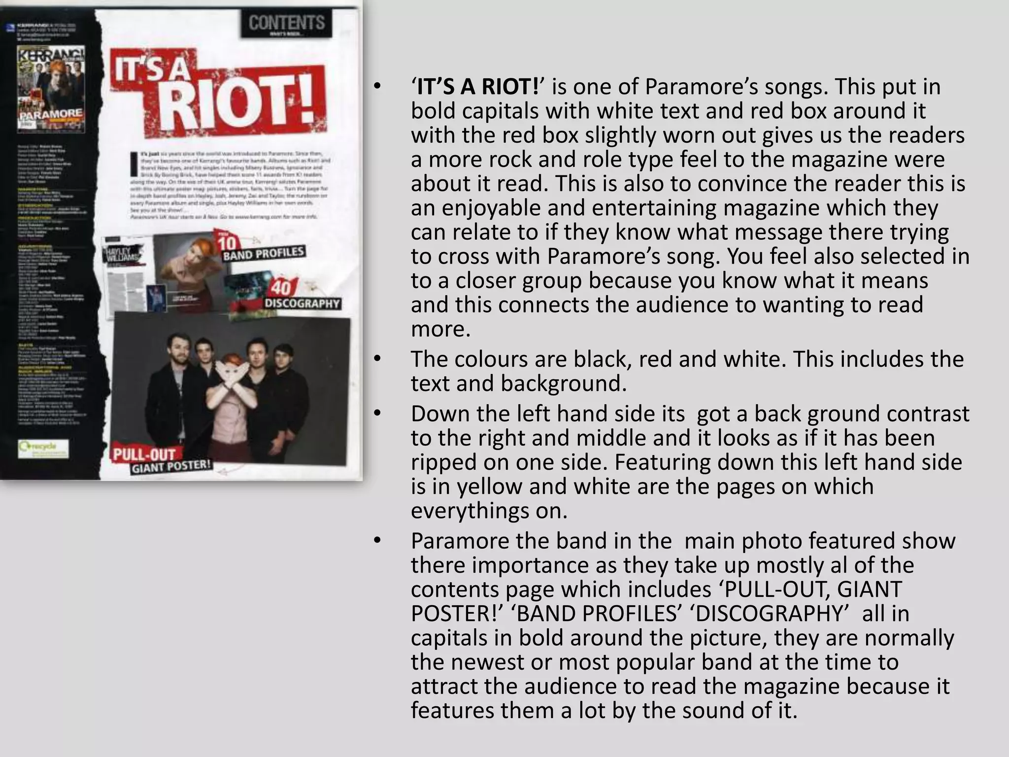
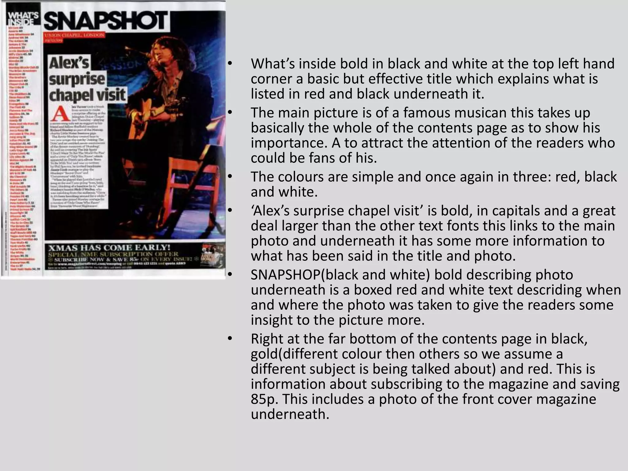
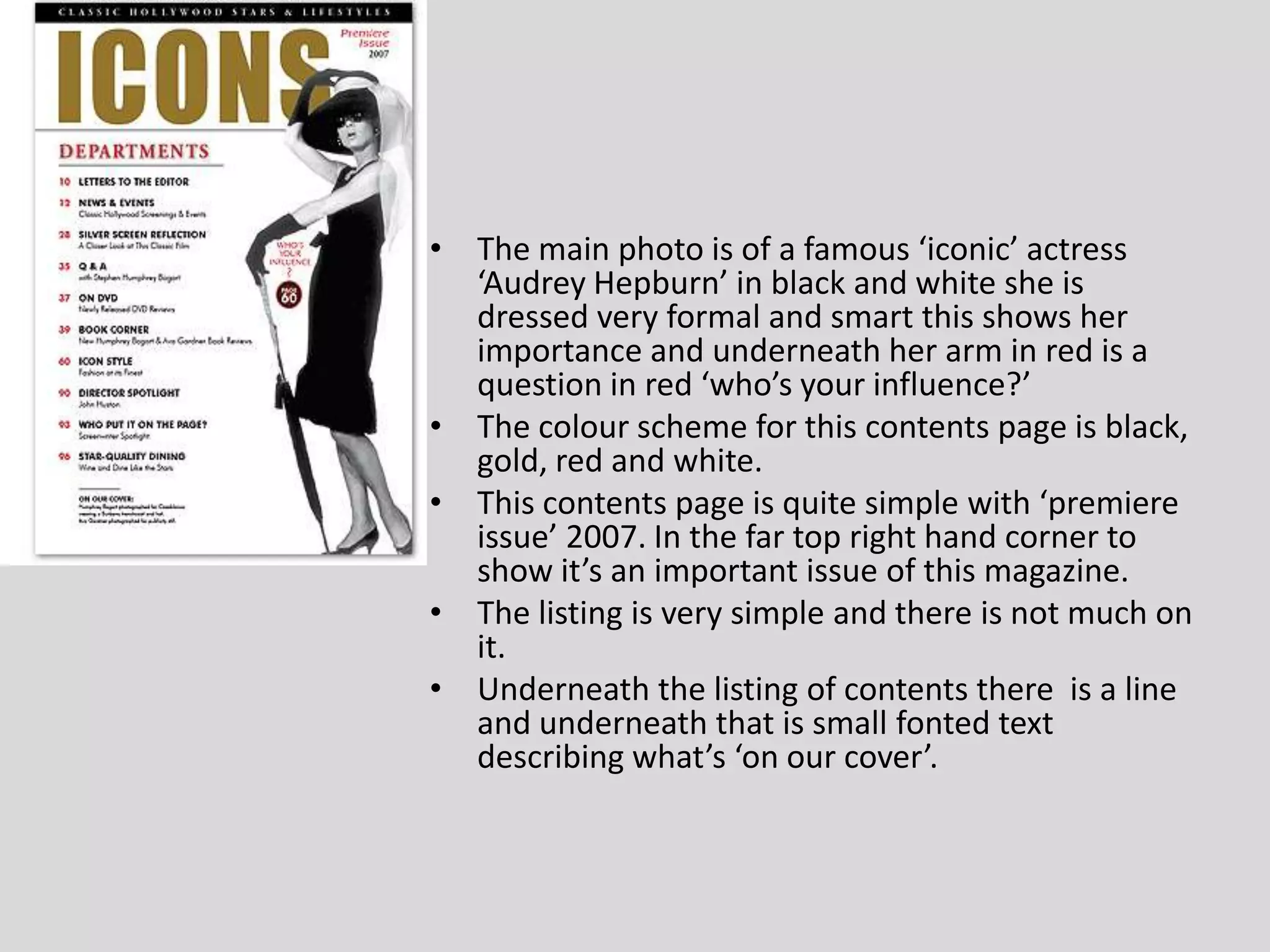
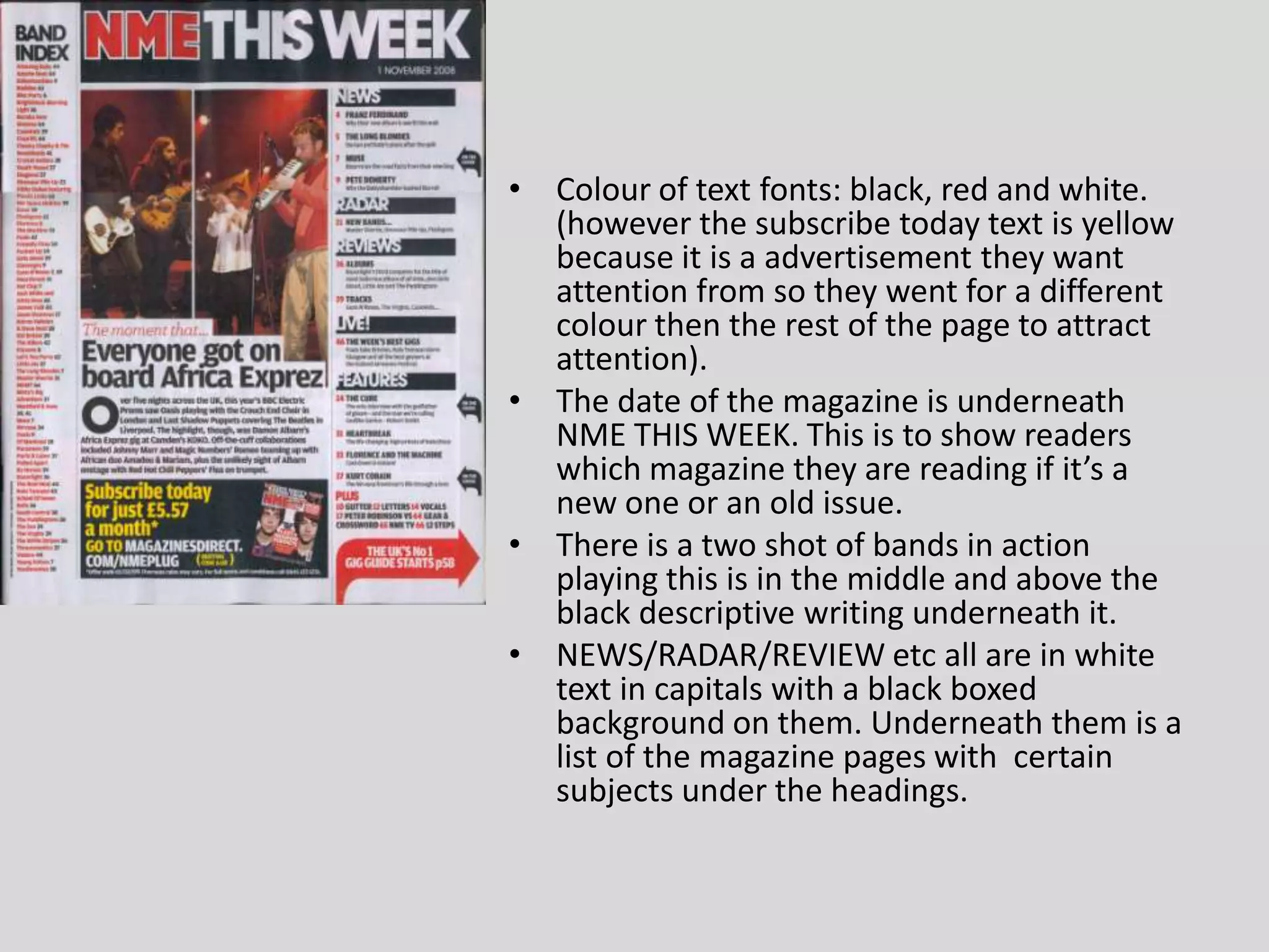
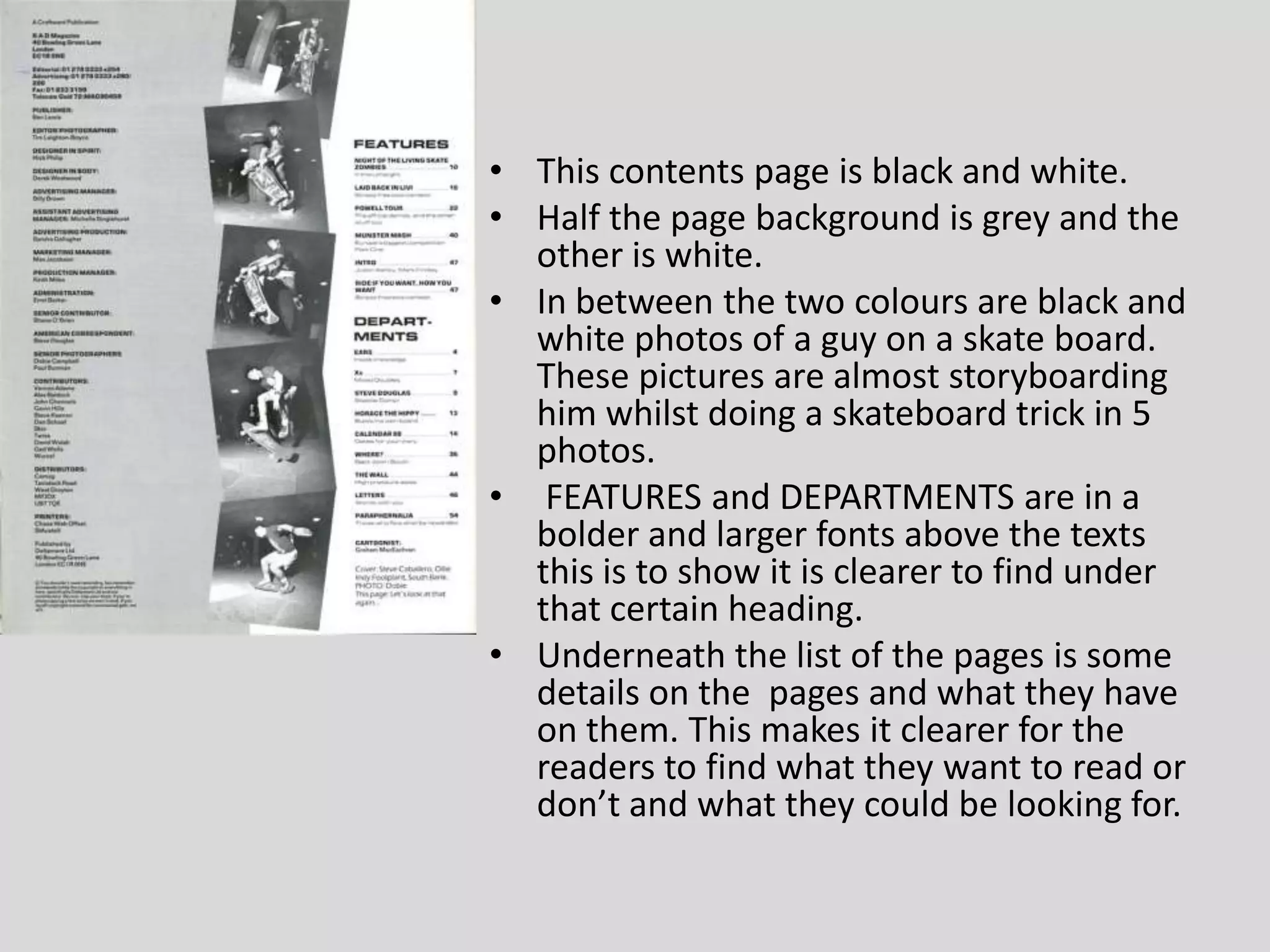
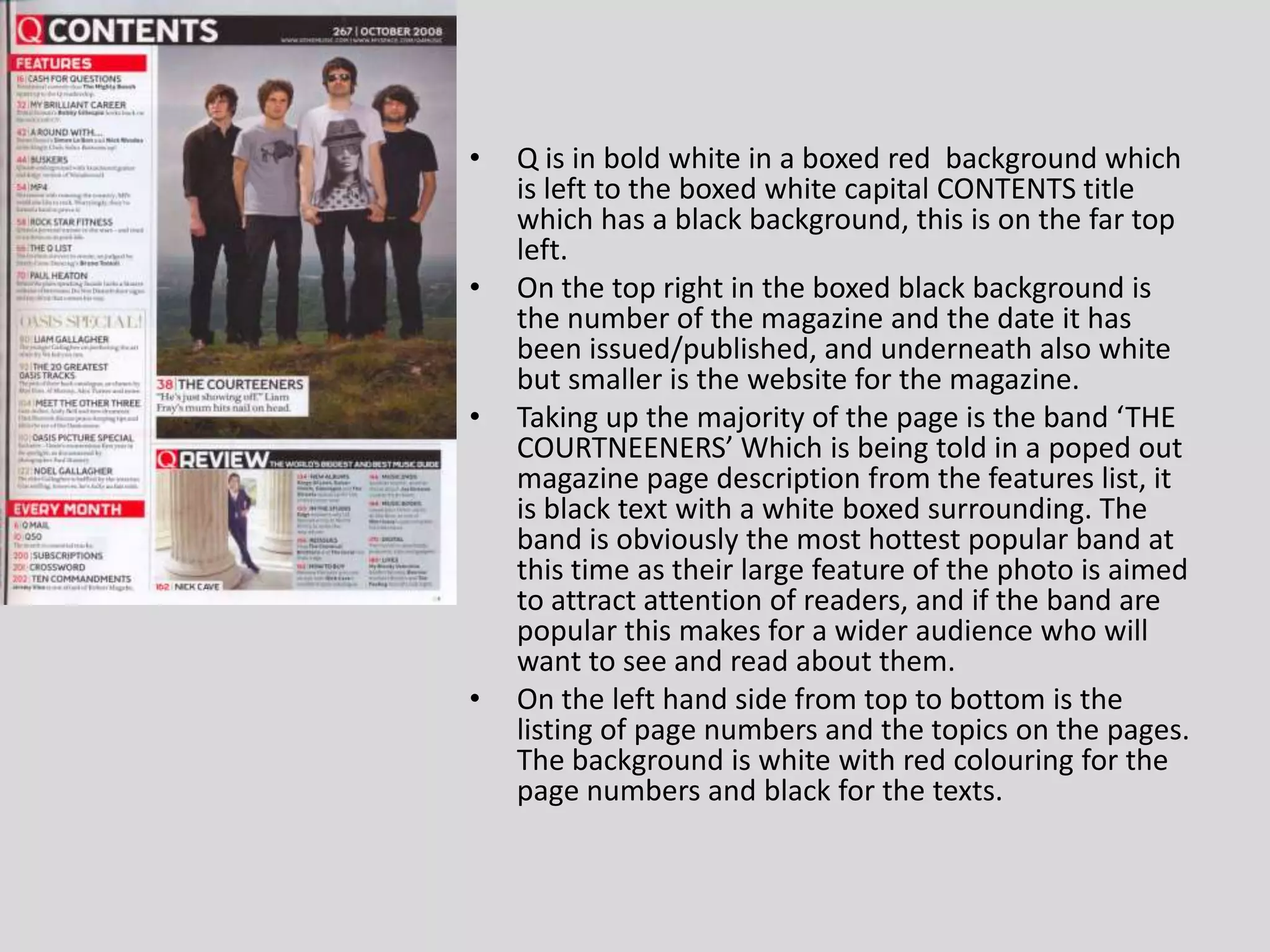
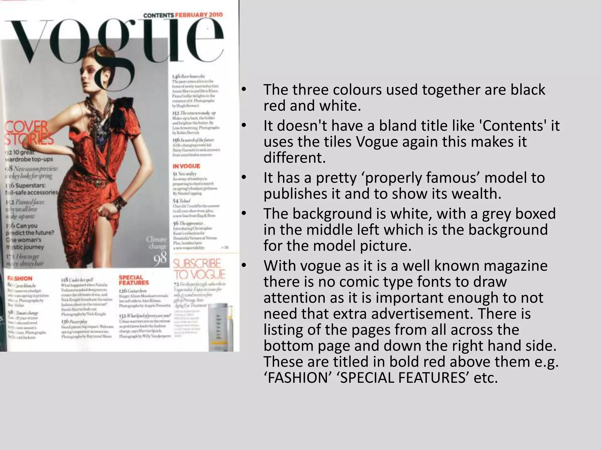
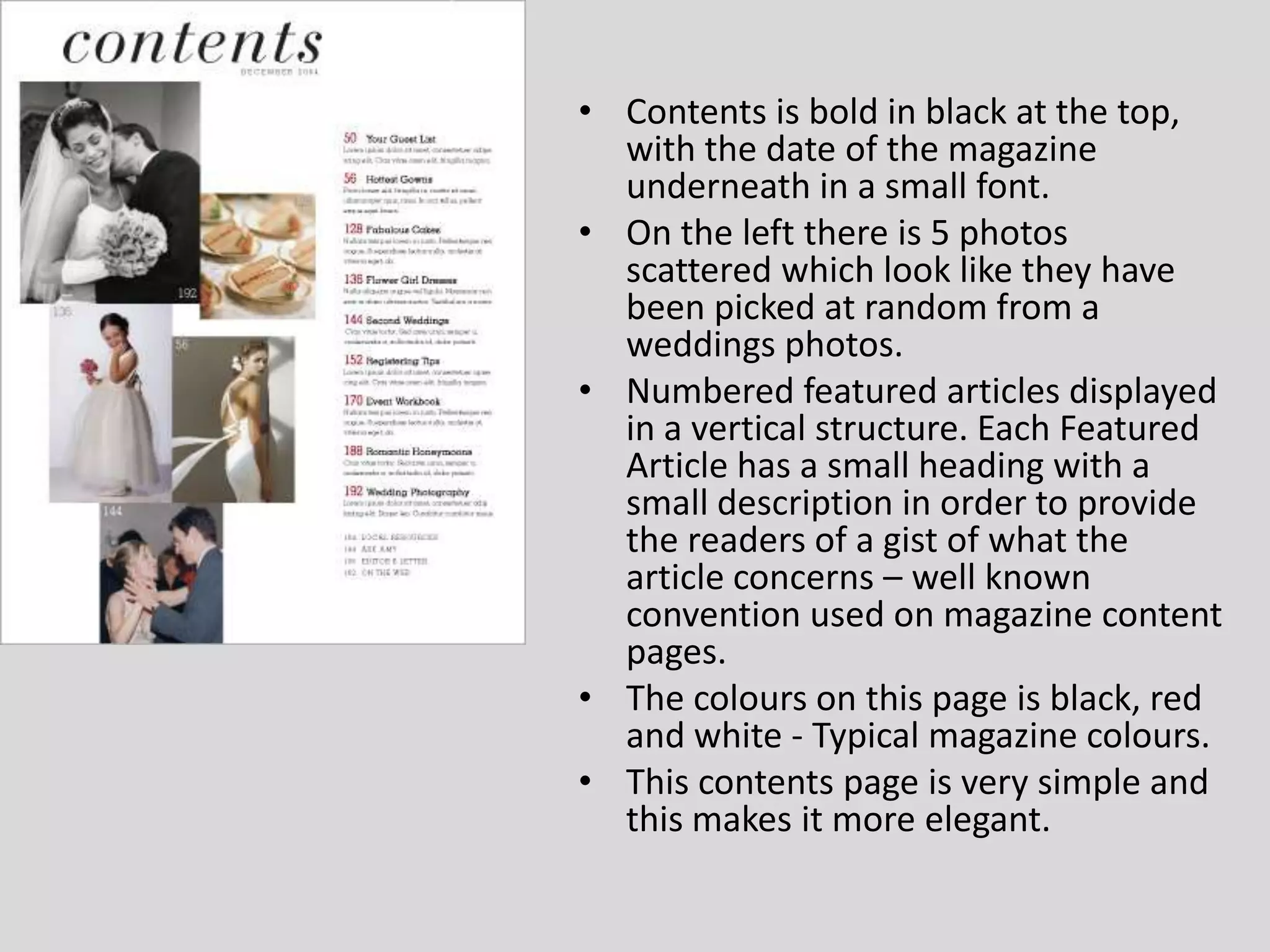
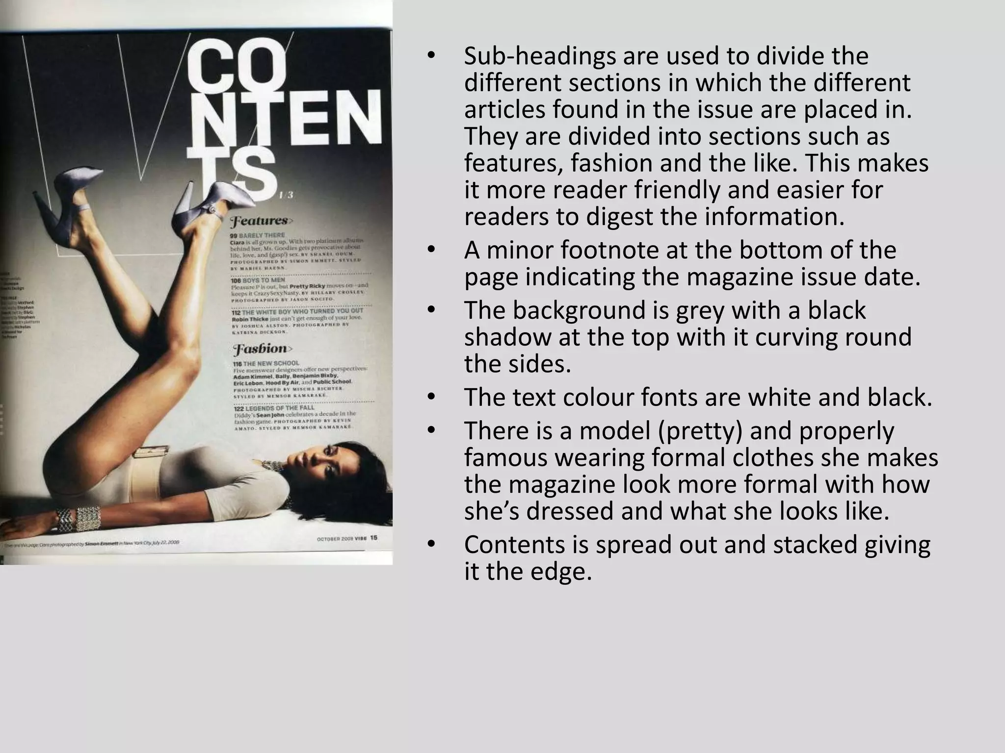
SlideShare a Scribd company logo
1 of 11
CONTENTS PAGES X10
CONTENTS is in the biggest font to signify to the reader this is how they find the content they’re interested in. Also below is the date of release and issue so the reader can tell the information is relevant, current and up to date. ‘BRING ME TO THE HORIZON’ They have the biggest picture as they are proberly the most popular band and most newest maybe at this time so they are bigger then all other features on this page to attract more attention. Colours of text and background of this whole contents page is white, black, yellow, red. Most important audience attracting subjects are bolder and pop out more of the page an example is the ’30 SECONDS TO MARS, POSTER SPECIAL’ The  editor is featured in the far left bottom corner with a small picture and abit of text information underneath this isn’t put in bold because readers don’t tend to buy the magazine because shes edited it, but she is there in simple small text as she shares some importance to the creation of the magazine. The topics of pages are headlined under a bold black and yellow boxed text that is in capitals and bolder to read which is easier to find what you want to read about. Advert for subscribing to the kerrang magazine in a different font and and a bold colour scheme to draw attention to itself to intise the reader.
‘IT’S A RIOT!’ is one of Paramore’s songs. This put in bold capitals with white text and red box around it with the red box slightly worn out gives us the readers a more rock and role type feel to the magazine were about it read. This is also to convince the reader this is an enjoyable and entertaining magazine which they can relate to if they know what message there trying to cross with Paramore’s song. You feel also selected in to a closer group because you know what it means and this connects the audience to wanting to read more. The colours are black, red and white. This includes the text and background.  Down the left hand side its  got a back ground contrast to the right and middle and it looks as if it has been ripped on one side. Featuring down this left hand side is in yellow and white are the pages on which everythings on. Paramore the band in the  main photo featured show there importance as they take up mostly al of the contents page which includes ‘PULL-OUT, GIANT POSTER!’ ‘BAND PROFILES’ ‘DISCOGRAPHY’  all in capitals in bold around the picture, they are normally the newest or most popular band at the time to attract the audience to read the magazine because it features them a lot by the sound of it.
What’s inside bold in black and white at the top left hand corner a basic but effective title which explains what is listed in red and black underneath it. The main picture is of a famous musican this takes up basically the whole of the contents page as to show his importance. A to attract the attention of the readers who could be fans of his. The colours are simple and once again in three: red, black and white. ‘Alex’s surprise chapel visit’ is bold, in capitals and a great deal larger than the other text fonts this links to the main photo and underneath it has some more information to what has been said in the title and photo. SNAPSHOP(black and white) bold describing photo underneath is a boxed red and white text descriding when and where the photo was taken to give the readers some insight to the picture more. Right at the far bottom of the contents page in black, gold(different colour then others so we assume a different subject is being talked about) and red. This is information about subscribing to the magazine and saving 85p. This includes a photo of the front cover magazine underneath.
The main photo is of a famous ‘iconic’ actress ‘Audrey Hepburn’ in black and white she is dressed very formal and smart this shows her importance and underneath her arm in red is a question in red ‘who’s your influence?’ The colour scheme for this contents page is black, gold, red and white. This contents page is quite simple with ‘premiere issue’ 2007. In the far top right hand corner to show it’s an important issue of this magazine. The listing is very simple and there is not much on it. Underneath the listing of contents there  is a line and underneath that is small fonted text describing what’s ‘on our cover’.
Colour of text fonts: black, red and white. (however the subscribe today text is yellow because it is a advertisement they want attention from so they went for a different colour then the rest of the page to attract attention). The date of the magazine is underneath NME THIS WEEK. This is to show readers which magazine they are reading if it’s a new one or an old issue. There is a two shot of bands in action playing this is in the middle and above the black descriptive writing underneath it.  NEWS/RADAR/REVIEW etc all are in white text in capitals with a black boxed background on them. Underneath them is a list of the magazine pages with  certain subjects under the headings.
This contents page is black and white. Half the page background is grey and the other is white. In between the two colours are black and white photos of a guy on a skate board. These pictures are almost storyboarding him whilst doing a skateboard trick in 5 photos.  FEATURES and DEPARTMENTS are in a bolder and larger fonts above the texts this is to show it is clearer to find under that certain heading. Underneath the list of the pages is some details on the  pages and what they have on them. This makes it clearer for the readers to find what they want to read or don’t and what they could be looking for.
Q is in bold white in a boxed red  background which is left to the boxed white capital CONTENTS title which has a black background, this is on the far top left. On the top right in the boxed black background is the number of the magazine and the date it has been issued/published, and underneath also white but smaller is the website for the magazine. Taking up the majority of the page is the band ‘THE COURTNEENERS’ Which is being told in a poped out magazine page description from the features list, it is black text with a white boxed surrounding. The band is obviously the most hottest popular band at this time as their large feature of the photo is aimed to attract attention of readers, and if the band are popular this makes for a wider audience who will want to see and read about them. On the left hand side from top to bottom is the listing of page numbers and the topics on the pages. The background is white with red colouring for the page numbers and black for the texts.
The three colours used together are black red and white. It doesn't have a bland title like 'Contents' it uses the tiles Vogue again this makes it different. It has a pretty ‘properly famous’ model to publishes it and to show its wealth. The background is white, with a grey boxed in the middle left which is the background for the model picture. With vogue as it is a well known magazine there is no comic type fonts to draw attention as it is important enough to not need that extra advertisement. There is listing of the pages from all across the bottom page and down the right hand side. These are titled in bold red above them e.g. ‘FASHION’ ‘SPECIAL FEATURES’ etc.
Contents is bold in black at the top, with the date of the magazine underneath in a small font. On the left there is 5 photos scattered which look like they have been picked at random from a weddings photos. Numbered featured articles displayed in a vertical structure. Each Featured Article has a small heading with a small description in order to provide the readers of a gist of what the article concerns – well known convention used on magazine content pages. The colours on this page is black, red and white - Typical magazine colours. This contents page is very simple and this makes it more elegant.
Sub-headings are used to divide the different sections in which the different articles found in the issue are placed in. They are divided into sections such as features, fashion and the like. This makes it more reader friendly and easier for readers to digest the information. A minor footnote at the bottom of the page indicating the magazine issue date. The background is grey with a black shadow at the top with it curving round the sides. The text colour fonts are white and black. There is a model (pretty) and properly famous wearing formal clothes she makes the magazine look more formal with how she’s dressed and what she looks like. Contents is spread out and stacked giving it the edge.

More Related Content

What's hot

Detailed analysis of a music magazine
Detailed analysis of a music magazineDetailed analysis of a music magazine
Detailed analysis of a music magazineayreslou
 
Media foundation portfolio research
Media foundation portfolio  researchMedia foundation portfolio  research
Media foundation portfolio researcha_mcdermott
 
Magazine Cover/Contents/DPS Analysis
Magazine Cover/Contents/DPS AnalysisMagazine Cover/Contents/DPS Analysis
Magazine Cover/Contents/DPS AnalysisOliver Brayshaw
 
Q cover analysisisisi
Q cover analysisisisiQ cover analysisisisi
Q cover analysisisisibeckybbb
 
Mojo’ magazine analysis
Mojo’ magazine analysisMojo’ magazine analysis
Mojo’ magazine analysisasmediac14
 
Music magazine analysis
Music magazine analysisMusic magazine analysis
Music magazine analysisDariusslide
 
Similar music magazine analysis
Similar music magazine analysisSimilar music magazine analysis
Similar music magazine analysisJessica Davies
 
Task 3 nme arctic monkeys
Task 3 nme arctic monkeys Task 3 nme arctic monkeys
Task 3 nme arctic monkeys quinnf1
 
NME analysis
NME analysisNME analysis
NME analysisbeckyt95
 
Magazine research: NME, Kerrang and Q
Magazine research: NME, Kerrang and QMagazine research: NME, Kerrang and Q
Magazine research: NME, Kerrang and QAbbieHollis
 

What's hot (20)

Detailed analysis of a music magazine
Detailed analysis of a music magazineDetailed analysis of a music magazine
Detailed analysis of a music magazine
 
Maganalasys 44
Maganalasys 44Maganalasys 44
Maganalasys 44
 
Radial Analysis
Radial AnalysisRadial Analysis
Radial Analysis
 
Media foundation portfolio research
Media foundation portfolio  researchMedia foundation portfolio  research
Media foundation portfolio research
 
Magazine analysis
Magazine analysisMagazine analysis
Magazine analysis
 
Magazine Cover/Contents/DPS Analysis
Magazine Cover/Contents/DPS AnalysisMagazine Cover/Contents/DPS Analysis
Magazine Cover/Contents/DPS Analysis
 
Dizzee rascal anaylsis
Dizzee rascal anaylsisDizzee rascal anaylsis
Dizzee rascal anaylsis
 
Research task
Research taskResearch task
Research task
 
Own magazine analysis
Own magazine analysisOwn magazine analysis
Own magazine analysis
 
Analysis of Kerrang
Analysis of KerrangAnalysis of Kerrang
Analysis of Kerrang
 
Textual Analysis
Textual AnalysisTextual Analysis
Textual Analysis
 
Q cover analysisisisi
Q cover analysisisisiQ cover analysisisisi
Q cover analysisisisi
 
Magazine covers 10x
Magazine covers 10xMagazine covers 10x
Magazine covers 10x
 
Mojo’ magazine analysis
Mojo’ magazine analysisMojo’ magazine analysis
Mojo’ magazine analysis
 
Music magazine analysis
Music magazine analysisMusic magazine analysis
Music magazine analysis
 
Similar music magazine analysis
Similar music magazine analysisSimilar music magazine analysis
Similar music magazine analysis
 
Task 3 nme arctic monkeys
Task 3 nme arctic monkeys Task 3 nme arctic monkeys
Task 3 nme arctic monkeys
 
NME analysis
NME analysisNME analysis
NME analysis
 
Magazine research: NME, Kerrang and Q
Magazine research: NME, Kerrang and QMagazine research: NME, Kerrang and Q
Magazine research: NME, Kerrang and Q
 
FCD 2
FCD 2FCD 2
FCD 2
 

Viewers also liked

Viewers also liked (20)

Encontro com Onofre Varela
Encontro com Onofre Varela Encontro com Onofre Varela
Encontro com Onofre Varela
 
How I met DevOps Agile Tour Clermont-Ferrand 2013
How I met DevOps Agile Tour Clermont-Ferrand 2013How I met DevOps Agile Tour Clermont-Ferrand 2013
How I met DevOps Agile Tour Clermont-Ferrand 2013
 
Psh2013 presentación
Psh2013 presentaciónPsh2013 presentación
Psh2013 presentación
 
Algebra
AlgebraAlgebra
Algebra
 
Build android piano[ no coding
Build android piano[ no codingBuild android piano[ no coding
Build android piano[ no coding
 
09 aula 10042012
09   aula 1004201209   aula 10042012
09 aula 10042012
 
11 ideas claves
11 ideas claves11 ideas claves
11 ideas claves
 
Op87 1
Op87 1Op87 1
Op87 1
 
Task 7 questionnaire analysis
Task 7 questionnaire analysisTask 7 questionnaire analysis
Task 7 questionnaire analysis
 
Possible Tower - Battlefield monument
Possible Tower - Battlefield monumentPossible Tower - Battlefield monument
Possible Tower - Battlefield monument
 
Suzuki violin method vol 08
Suzuki violin method   vol 08Suzuki violin method   vol 08
Suzuki violin method vol 08
 
Photograph idea
Photograph ideaPhotograph idea
Photograph idea
 
Ba202basic marketing zassan
Ba202basic marketing zassanBa202basic marketing zassan
Ba202basic marketing zassan
 
Dn13 u3 a5_ccm
Dn13 u3 a5_ccmDn13 u3 a5_ccm
Dn13 u3 a5_ccm
 
Motores trifasicos de induccion
Motores trifasicos de induccionMotores trifasicos de induccion
Motores trifasicos de induccion
 
2da reunion md aprender esc 107
2da reunion md aprender esc 1072da reunion md aprender esc 107
2da reunion md aprender esc 107
 
Cáritas corazóndela parroquia-alfonsomarín
Cáritas corazóndela parroquia-alfonsomarínCáritas corazóndela parroquia-alfonsomarín
Cáritas corazóndela parroquia-alfonsomarín
 
Estilos musica electronica actuales
Estilos musica electronica actualesEstilos musica electronica actuales
Estilos musica electronica actuales
 
Diseño de solucion prototipo bd contratacion
Diseño de solucion prototipo bd contratacionDiseño de solucion prototipo bd contratacion
Diseño de solucion prototipo bd contratacion
 
лекц 5,
лекц 5,лекц 5,
лекц 5,
 

Similar to Contents pages

Rock magazine covers
Rock magazine coversRock magazine covers
Rock magazine coversSigridsynnove
 
Music Magazine Analysis; Front Cover, Contents & Dps
Music Magazine Analysis; Front Cover, Contents & DpsMusic Magazine Analysis; Front Cover, Contents & Dps
Music Magazine Analysis; Front Cover, Contents & DpsWill Drummee
 
Magazine cover, contents page and dps
Magazine cover, contents page and dpsMagazine cover, contents page and dps
Magazine cover, contents page and dpscaitlinomara1998
 
Contents analysis
Contents analysisContents analysis
Contents analysiskimb0ot
 
Contents analysis
Contents analysisContents analysis
Contents analysiskimb0ot
 
Hannah Wood Music Magazine Analysis
Hannah Wood Music Magazine Analysis Hannah Wood Music Magazine Analysis
Hannah Wood Music Magazine Analysis hannahwood88
 
Contents ananlysis
Contents ananlysisContents ananlysis
Contents ananlysisToddcg12
 
Rad analysis
Rad analysisRad analysis
Rad analysiscpile05
 
Rad analysis
Rad analysisRad analysis
Rad analysiscpile05
 
Research
ResearchResearch
Researchjoshfoo
 
Research
ResearchResearch
Researchjoshfoo
 
Research
ResearchResearch
Researchjoshfoo
 
Contents page analysis
Contents page analysisContents page analysis
Contents page analysisKirsty Allen
 
Analysing articles
Analysing articlesAnalysing articles
Analysing articlesKyle150
 
Music and school Magazine analysis
Music and school Magazine analysisMusic and school Magazine analysis
Music and school Magazine analysishalimashalim
 
Contents analysis
Contents analysis Contents analysis
Contents analysis tafigaza
 
Music magazine anaylsis
Music magazine anaylsis Music magazine anaylsis
Music magazine anaylsis kirbiekay
 

Similar to Contents pages (20)

Rock magazine covers
Rock magazine coversRock magazine covers
Rock magazine covers
 
Music Magazine Analysis; Front Cover, Contents & Dps
Music Magazine Analysis; Front Cover, Contents & DpsMusic Magazine Analysis; Front Cover, Contents & Dps
Music Magazine Analysis; Front Cover, Contents & Dps
 
Magazine cover, contents page and dps
Magazine cover, contents page and dpsMagazine cover, contents page and dps
Magazine cover, contents page and dps
 
Contents analysis
Contents analysisContents analysis
Contents analysis
 
Contents analysis
Contents analysisContents analysis
Contents analysis
 
Hannah Wood Music Magazine Analysis
Hannah Wood Music Magazine Analysis Hannah Wood Music Magazine Analysis
Hannah Wood Music Magazine Analysis
 
Contents ananlysis
Contents ananlysisContents ananlysis
Contents ananlysis
 
Rad analysis
Rad analysisRad analysis
Rad analysis
 
Rad analysis
Rad analysisRad analysis
Rad analysis
 
As 21
As 21As 21
As 21
 
As 21
As 21As 21
As 21
 
Research
ResearchResearch
Research
 
Research
ResearchResearch
Research
 
Research
ResearchResearch
Research
 
Contents page analysis
Contents page analysisContents page analysis
Contents page analysis
 
Analysis of Contents
Analysis of ContentsAnalysis of Contents
Analysis of Contents
 
Analysing articles
Analysing articlesAnalysing articles
Analysing articles
 
Music and school Magazine analysis
Music and school Magazine analysisMusic and school Magazine analysis
Music and school Magazine analysis
 
Contents analysis
Contents analysis Contents analysis
Contents analysis
 
Music magazine anaylsis
Music magazine anaylsis Music magazine anaylsis
Music magazine anaylsis
 

More from sophiekilloran

More from sophiekilloran (10)

Q magazine
Q magazineQ magazine
Q magazine
 
Q magazine flat plan.
Q magazine flat plan.Q magazine flat plan.
Q magazine flat plan.
 
evaluation
 evaluation evaluation
evaluation
 
Planning layout
Planning layoutPlanning layout
Planning layout
 
Planning layout
Planning layoutPlanning layout
Planning layout
 
Planning layout
Planning layoutPlanning layout
Planning layout
 
Flat plan 2 final
Flat plan 2 finalFlat plan 2 final
Flat plan 2 final
 
'Kerrang!'%20flat%20plan[1]
'Kerrang!'%20flat%20plan[1]'Kerrang!'%20flat%20plan[1]
'Kerrang!'%20flat%20plan[1]
 
Double page spreads
Double page spreadsDouble page spreads
Double page spreads
 
Media rough powerpoint
Media rough powerpointMedia rough powerpoint
Media rough powerpoint
 

Contents pages

  • 2. CONTENTS is in the biggest font to signify to the reader this is how they find the content they’re interested in. Also below is the date of release and issue so the reader can tell the information is relevant, current and up to date. ‘BRING ME TO THE HORIZON’ They have the biggest picture as they are proberly the most popular band and most newest maybe at this time so they are bigger then all other features on this page to attract more attention. Colours of text and background of this whole contents page is white, black, yellow, red. Most important audience attracting subjects are bolder and pop out more of the page an example is the ’30 SECONDS TO MARS, POSTER SPECIAL’ The editor is featured in the far left bottom corner with a small picture and abit of text information underneath this isn’t put in bold because readers don’t tend to buy the magazine because shes edited it, but she is there in simple small text as she shares some importance to the creation of the magazine. The topics of pages are headlined under a bold black and yellow boxed text that is in capitals and bolder to read which is easier to find what you want to read about. Advert for subscribing to the kerrang magazine in a different font and and a bold colour scheme to draw attention to itself to intise the reader.
  • 3. ‘IT’S A RIOT!’ is one of Paramore’s songs. This put in bold capitals with white text and red box around it with the red box slightly worn out gives us the readers a more rock and role type feel to the magazine were about it read. This is also to convince the reader this is an enjoyable and entertaining magazine which they can relate to if they know what message there trying to cross with Paramore’s song. You feel also selected in to a closer group because you know what it means and this connects the audience to wanting to read more. The colours are black, red and white. This includes the text and background. Down the left hand side its got a back ground contrast to the right and middle and it looks as if it has been ripped on one side. Featuring down this left hand side is in yellow and white are the pages on which everythings on. Paramore the band in the main photo featured show there importance as they take up mostly al of the contents page which includes ‘PULL-OUT, GIANT POSTER!’ ‘BAND PROFILES’ ‘DISCOGRAPHY’ all in capitals in bold around the picture, they are normally the newest or most popular band at the time to attract the audience to read the magazine because it features them a lot by the sound of it.
  • 4. What’s inside bold in black and white at the top left hand corner a basic but effective title which explains what is listed in red and black underneath it. The main picture is of a famous musican this takes up basically the whole of the contents page as to show his importance. A to attract the attention of the readers who could be fans of his. The colours are simple and once again in three: red, black and white. ‘Alex’s surprise chapel visit’ is bold, in capitals and a great deal larger than the other text fonts this links to the main photo and underneath it has some more information to what has been said in the title and photo. SNAPSHOP(black and white) bold describing photo underneath is a boxed red and white text descriding when and where the photo was taken to give the readers some insight to the picture more. Right at the far bottom of the contents page in black, gold(different colour then others so we assume a different subject is being talked about) and red. This is information about subscribing to the magazine and saving 85p. This includes a photo of the front cover magazine underneath.
  • 5. The main photo is of a famous ‘iconic’ actress ‘Audrey Hepburn’ in black and white she is dressed very formal and smart this shows her importance and underneath her arm in red is a question in red ‘who’s your influence?’ The colour scheme for this contents page is black, gold, red and white. This contents page is quite simple with ‘premiere issue’ 2007. In the far top right hand corner to show it’s an important issue of this magazine. The listing is very simple and there is not much on it. Underneath the listing of contents there is a line and underneath that is small fonted text describing what’s ‘on our cover’.
  • 6. Colour of text fonts: black, red and white. (however the subscribe today text is yellow because it is a advertisement they want attention from so they went for a different colour then the rest of the page to attract attention). The date of the magazine is underneath NME THIS WEEK. This is to show readers which magazine they are reading if it’s a new one or an old issue. There is a two shot of bands in action playing this is in the middle and above the black descriptive writing underneath it. NEWS/RADAR/REVIEW etc all are in white text in capitals with a black boxed background on them. Underneath them is a list of the magazine pages with certain subjects under the headings.
  • 7. This contents page is black and white. Half the page background is grey and the other is white. In between the two colours are black and white photos of a guy on a skate board. These pictures are almost storyboarding him whilst doing a skateboard trick in 5 photos. FEATURES and DEPARTMENTS are in a bolder and larger fonts above the texts this is to show it is clearer to find under that certain heading. Underneath the list of the pages is some details on the pages and what they have on them. This makes it clearer for the readers to find what they want to read or don’t and what they could be looking for.
  • 8. Q is in bold white in a boxed red background which is left to the boxed white capital CONTENTS title which has a black background, this is on the far top left. On the top right in the boxed black background is the number of the magazine and the date it has been issued/published, and underneath also white but smaller is the website for the magazine. Taking up the majority of the page is the band ‘THE COURTNEENERS’ Which is being told in a poped out magazine page description from the features list, it is black text with a white boxed surrounding. The band is obviously the most hottest popular band at this time as their large feature of the photo is aimed to attract attention of readers, and if the band are popular this makes for a wider audience who will want to see and read about them. On the left hand side from top to bottom is the listing of page numbers and the topics on the pages. The background is white with red colouring for the page numbers and black for the texts.
  • 9. The three colours used together are black red and white. It doesn't have a bland title like 'Contents' it uses the tiles Vogue again this makes it different. It has a pretty ‘properly famous’ model to publishes it and to show its wealth. The background is white, with a grey boxed in the middle left which is the background for the model picture. With vogue as it is a well known magazine there is no comic type fonts to draw attention as it is important enough to not need that extra advertisement. There is listing of the pages from all across the bottom page and down the right hand side. These are titled in bold red above them e.g. ‘FASHION’ ‘SPECIAL FEATURES’ etc.
  • 10. Contents is bold in black at the top, with the date of the magazine underneath in a small font. On the left there is 5 photos scattered which look like they have been picked at random from a weddings photos. Numbered featured articles displayed in a vertical structure. Each Featured Article has a small heading with a small description in order to provide the readers of a gist of what the article concerns – well known convention used on magazine content pages. The colours on this page is black, red and white - Typical magazine colours. This contents page is very simple and this makes it more elegant.
  • 11. Sub-headings are used to divide the different sections in which the different articles found in the issue are placed in. They are divided into sections such as features, fashion and the like. This makes it more reader friendly and easier for readers to digest the information. A minor footnote at the bottom of the page indicating the magazine issue date. The background is grey with a black shadow at the top with it curving round the sides. The text colour fonts are white and black. There is a model (pretty) and properly famous wearing formal clothes she makes the magazine look more formal with how she’s dressed and what she looks like. Contents is spread out and stacked giving it the edge.