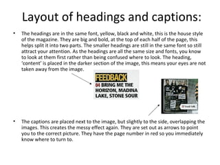
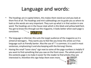
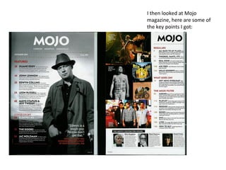
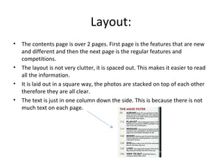
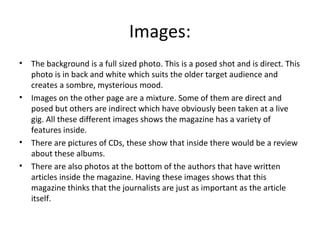
The document analyzes and compares the contents pages of two music magazines - Kerrang! and Mojo. For Kerrang!, the summary notes that the page is divided in half with a large image at the top highlighting the cover story. Smaller images and four columns of text list other articles. Headings are in a bold yellow font for consistency. The language uses informal tones and punctuation to appeal to teenagers. For Mojo, the summary states that the two-page contents is more spaced out than Kerrang!'s. Photos include posed shots, concert images, and author pictures. The language is more formal and straightforward to suit Mojo's older audience.