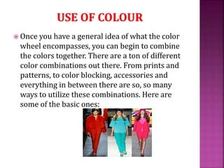
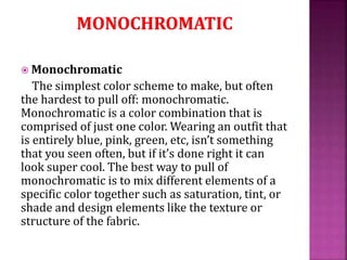
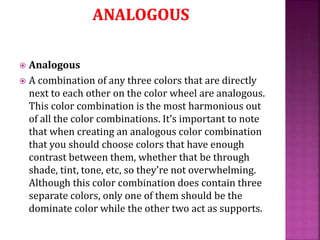
 Colour plays an important role in achieving a
successful design
 Fashion designers incorporate colour to achieve a
harmonious garment design
 Balance, proportion, emphasis, unity and rhythm
rely on colour
 Creates the greatest visual impact for the
consumer
 Can affect illusions of the size and shape
 Can reflect the personality of an individual
 Is associated with psychological traits and
emotions
 Primary colors:
 Red, yellow, and blue
 Secondary colors:
 Orange, green, and violet (purple). They are made by mixing
equal amounts of two primary hues together.
 Intermediate colors:
 Result when equal amounts of adjoining primary and
secondary colors are combined. (Yellow-green, red-
orange…)
 Neutral
 White, black, gray
 Monochromatic color scheme
 A one-color plan that uses different tints shades, and
intensities. A navy blue pair of pants, with a light blue
shirt is monochromatic. Same “color” different shades.
 Analogous color scheme
 Uses neighboring, or adjacent, colors on the wheel. It is
sometimes called a related color scheme since two or
three “related” colors are used.
 Complementary color scheme
 Uses opposite hues on the color wheel. Complementary
colors are across from each other on the wheel
 Triad color scheme
 Combines three colors equidistant on the wheel.
Examples are red, yellow, and blue.
1.Monochromatic color scheme
A one-color plan that uses different tints shades, and intensities. A navy
blue pair of pants, with a light blue shirt is monochromatic. Same “color”
different shades.
2.Analogous color scheme
Uses neighboring, or adjacent, colors on the wheel. It is sometimes called a
related color scheme since two or three “related” colors are used.
3.Complementary color scheme
Uses opposite hues on the color wheel. Complementary colors are across
from each other on the wheel
4.Triad color scheme
Combines three colors equidistant on the wheel. Examples are red, yellow,
and blue.
5.Intensity
The brightness or dullness of a color
6.Value
The lightness or darkness of a color between almost white to almost black
7.Warm colors
Hues, such as red, orange, and yellow, that appear to be hot like the sun or
fire.
 RED: exciting, aggressive, passionate
 ORANGE: earthy, warm, hopeful
 YELLOW: cheerful, sunny, cowardly
 GREEN: restful, envious, fresh
 BLUE: calming, cool, depressed
 PURPLE: drama, rich, royal
 WHITE: innocent, pure, peaceful
 BLACK: sophisticated, gloomy, mysterious
 GRAY: old, sad, modest
 This course requires that you learn Elements and Principles of Design.
 There are four ELEMENTS OF DESIGN:
1. Line
2. Shape
3. Texture
4. Colour
 And there are five PRINCIPLES OF DESIGN:
1. Balance
2. Proportion
3. Rhythm
4. Emphasis
5. Harmony
Warm-up
Complete the Colors review sheet using
your color wheel and notes consider
elements and principals of design
Tasks
Warm-up worksheet(illustrate your design
with Color Handbook )
 Neutrals are colors that do not pop out or
attract a lot of attention to the eye such as black,
beige, taupe, olive, and more. They literally go
with everything and anything, and can be
used to slowly integrate color into your
designing by pairing bolder color combinations
with them
 Classic colour combinations look stylish on
everyone, no matter the season. Neutral colours
worn together create looks that are timeless
and flattering, while providing plenty of
flexibility in your designing. Neutral colours
include black, navy, white, brown, grey and
khaki.

 Once you have a general idea of what the color
wheel encompasses, you can begin to combine
the colors together. There are a ton of different
color combinations out there. From prints and
patterns, to color blocking, accessories and
everything in between there are so, so many
ways to utilize these combinations. Here are
some of the basic ones:
 Monochromatic
The simplest color scheme to make, but often
the hardest to pull off: monochromatic.
Monochromatic is a color combination that is
comprised of just one color. Wearing an outfit that
is entirely blue, pink, green, etc, isn’t something
that you seen often, but if it’s done right it can
look super cool. The best way to pull of
monochromatic is to mix different elements of a
specific color together such as saturation, tint, or
shade and design elements like the texture or
structure of the fabric.
 Complementary
 These are the colors that are directly across
from each other on the color wheel. Because of
their high contrast, as the name implies, they
complement each other the most out of any
color combination. Because of this not only are
they the simplest color combinations to create,
but they’re also the most bold. An easy way to
add a complementary color combination to
your outfit is to start out with a primary color
as the base for the look and then wear its
complement in your accessory choices.
 Analogous
 A combination of any three colors that are directly
next to each other on the color wheel are analogous.
This color combination is the most harmonious out
of all the color combinations. It’s important to note
that when creating an analogous color combination
that you should choose colors that have enough
contrast between them, whether that be through
shade, tint, tone, etc, so they’re not overwhelming.
Although this color combination does contain three
separate colors, only one of them should be the
dominate color while the other two act as supports.
 Split complementary
 This color combination is found by taking a
base color then pairing it with colors directly
next to it’s adjacent color. For example, in the
picture above, a green-blue (teal) is paired with
red and red-orange to create a split
complementary. This color combination has
much of the same lasting impression that
complementary color schemes produce but
because of it is split, it’s generally more
flattering and dimensional.
Color theory
Color theory

Color theory

  • 2.
     Colour playsan important role in achieving a successful design  Fashion designers incorporate colour to achieve a harmonious garment design  Balance, proportion, emphasis, unity and rhythm rely on colour  Creates the greatest visual impact for the consumer  Can affect illusions of the size and shape  Can reflect the personality of an individual  Is associated with psychological traits and emotions
  • 3.
     Primary colors: Red, yellow, and blue  Secondary colors:  Orange, green, and violet (purple). They are made by mixing equal amounts of two primary hues together.  Intermediate colors:  Result when equal amounts of adjoining primary and secondary colors are combined. (Yellow-green, red- orange…)  Neutral  White, black, gray
  • 4.
     Monochromatic colorscheme  A one-color plan that uses different tints shades, and intensities. A navy blue pair of pants, with a light blue shirt is monochromatic. Same “color” different shades.  Analogous color scheme  Uses neighboring, or adjacent, colors on the wheel. It is sometimes called a related color scheme since two or three “related” colors are used.  Complementary color scheme  Uses opposite hues on the color wheel. Complementary colors are across from each other on the wheel  Triad color scheme  Combines three colors equidistant on the wheel. Examples are red, yellow, and blue.
  • 5.
    1.Monochromatic color scheme Aone-color plan that uses different tints shades, and intensities. A navy blue pair of pants, with a light blue shirt is monochromatic. Same “color” different shades. 2.Analogous color scheme Uses neighboring, or adjacent, colors on the wheel. It is sometimes called a related color scheme since two or three “related” colors are used. 3.Complementary color scheme Uses opposite hues on the color wheel. Complementary colors are across from each other on the wheel 4.Triad color scheme Combines three colors equidistant on the wheel. Examples are red, yellow, and blue. 5.Intensity The brightness or dullness of a color 6.Value The lightness or darkness of a color between almost white to almost black 7.Warm colors Hues, such as red, orange, and yellow, that appear to be hot like the sun or fire.
  • 6.
     RED: exciting,aggressive, passionate  ORANGE: earthy, warm, hopeful  YELLOW: cheerful, sunny, cowardly  GREEN: restful, envious, fresh  BLUE: calming, cool, depressed  PURPLE: drama, rich, royal  WHITE: innocent, pure, peaceful  BLACK: sophisticated, gloomy, mysterious  GRAY: old, sad, modest
  • 7.
     This courserequires that you learn Elements and Principles of Design.  There are four ELEMENTS OF DESIGN: 1. Line 2. Shape 3. Texture 4. Colour  And there are five PRINCIPLES OF DESIGN: 1. Balance 2. Proportion 3. Rhythm 4. Emphasis 5. Harmony
  • 8.
    Warm-up Complete the Colorsreview sheet using your color wheel and notes consider elements and principals of design Tasks Warm-up worksheet(illustrate your design with Color Handbook )
  • 9.
     Neutrals arecolors that do not pop out or attract a lot of attention to the eye such as black, beige, taupe, olive, and more. They literally go with everything and anything, and can be used to slowly integrate color into your designing by pairing bolder color combinations with them
  • 10.
     Classic colourcombinations look stylish on everyone, no matter the season. Neutral colours worn together create looks that are timeless and flattering, while providing plenty of flexibility in your designing. Neutral colours include black, navy, white, brown, grey and khaki. 
  • 11.
     Once youhave a general idea of what the color wheel encompasses, you can begin to combine the colors together. There are a ton of different color combinations out there. From prints and patterns, to color blocking, accessories and everything in between there are so, so many ways to utilize these combinations. Here are some of the basic ones:
  • 13.
     Monochromatic The simplestcolor scheme to make, but often the hardest to pull off: monochromatic. Monochromatic is a color combination that is comprised of just one color. Wearing an outfit that is entirely blue, pink, green, etc, isn’t something that you seen often, but if it’s done right it can look super cool. The best way to pull of monochromatic is to mix different elements of a specific color together such as saturation, tint, or shade and design elements like the texture or structure of the fabric.
  • 15.
     Complementary  Theseare the colors that are directly across from each other on the color wheel. Because of their high contrast, as the name implies, they complement each other the most out of any color combination. Because of this not only are they the simplest color combinations to create, but they’re also the most bold. An easy way to add a complementary color combination to your outfit is to start out with a primary color as the base for the look and then wear its complement in your accessory choices.
  • 17.
     Analogous  Acombination of any three colors that are directly next to each other on the color wheel are analogous. This color combination is the most harmonious out of all the color combinations. It’s important to note that when creating an analogous color combination that you should choose colors that have enough contrast between them, whether that be through shade, tint, tone, etc, so they’re not overwhelming. Although this color combination does contain three separate colors, only one of them should be the dominate color while the other two act as supports.
  • 19.
     Split complementary This color combination is found by taking a base color then pairing it with colors directly next to it’s adjacent color. For example, in the picture above, a green-blue (teal) is paired with red and red-orange to create a split complementary. This color combination has much of the same lasting impression that complementary color schemes produce but because of it is split, it’s generally more flattering and dimensional.