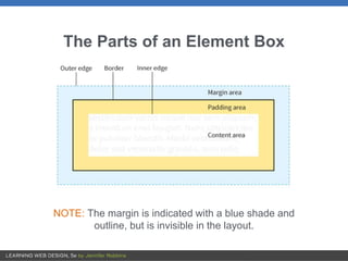
The document discusses various CSS properties that control the visual presentation of element boxes, including:
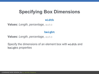
- Box dimensions, padding, borders, margins, and display roles can be specified.
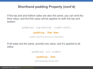
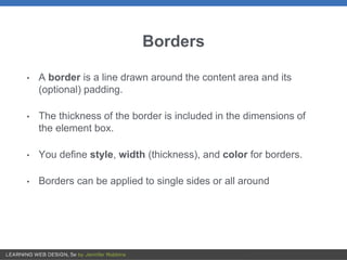
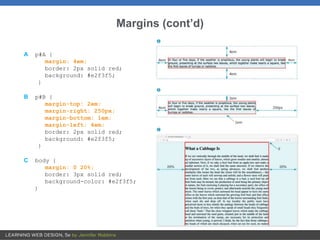
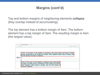
- Padding adds space within the border. Borders define lines around elements. Margins add space outside borders.
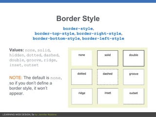
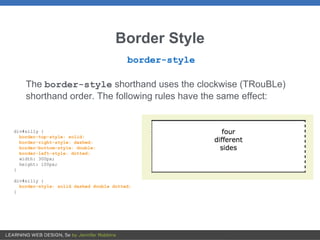
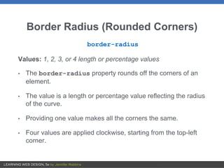
- Border styles, widths, colors, and radii can style box edges. Drop shadows add visual effects.
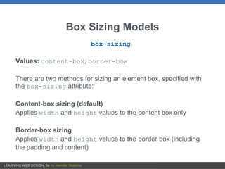
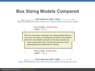
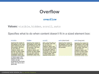
- Box sizing, overflow, and display properties control box behavior in page layouts.


![The Box Model [CSS Introduction]](https://cdn.slidesharecdn.com/ss_thumbnails/chapter3-part2-boxmodel-150120083129-conversion-gate01-thumbnail.jpg?width=640&height=640&fit=bounds)