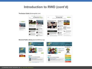
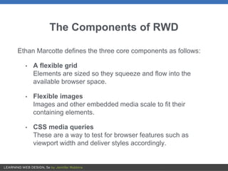
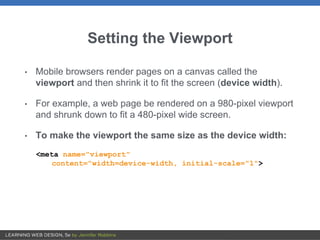
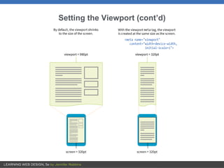
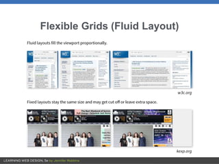
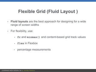
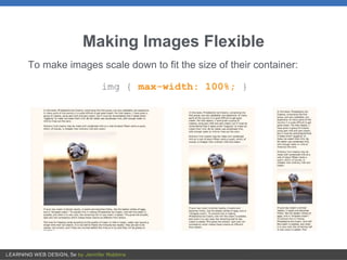
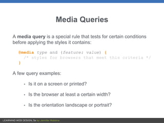
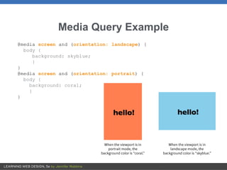
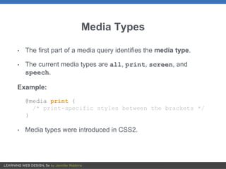
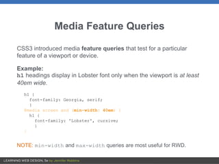
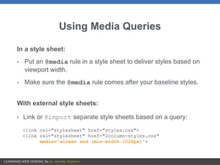
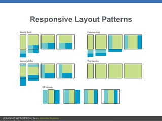
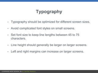
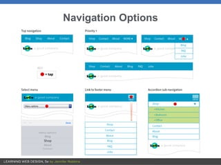
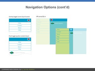
2. OVERVIEW
• What RWD is
• Fluid layouts
• Media queries
• Design strategies and patterns
• Testing options
3. Introduction to RWD
• RWD is a design and production approach that allows a web
page to adapt to the screen it is viewed on.
• The same HTML source is styled differently based on the
width of the screen.
• It ensures mobile users get the same content as other users,
with a presentation that optimizes usability.
• The term was coined by Ethan Marcotte in 2010 in his article
“Responsive Web Design” for A List Apart.
5. The Components of RWD
Ethan Marcotte defines the three core components as follows:
• A flexible grid
Elements are sized so they squeeze and flow into the
available browser space.
• Flexible images
Images and other embedded media scale to fit their
containing elements.
• CSS media queries
These are a way to test for browser features such as
viewport width and deliver styles accordingly.
6. Setting the Viewport
• Mobile browsers render pages on a canvas called the
viewport and then shrink it to fit the screen (device width).
• For example, a web page be rendered on a 980-pixel viewport
and shrunk down to fit a 480-pixel wide screen.
• To make the viewport the same size as the device width:
<meta name="viewport"
content="width=device-width, initial-scale="1">
9. Flexible Grid (Fluid Layout )
• Fluid layouts are the best approach for designing for a wide
range of screen widths
• For flexibility, use:
• fr and minmax() and content-based grid track values
• flex in Flexbox
• percentage measurements
10. Making Images Flexible
To make images scale down to fit the size of their container:
img { max-width: 100%; }
11. Media Queries
A media query is a special rule that tests for certain conditions
before applying the styles it contains:
@media type and (feature: value) {
/* styles for browsers that meet this criteria */
}
A few query examples:
• Is it on a screen or printed?
• Is the browser at least a certain width?
• Is the orientation landscape or portrait?
12. Media Query Example
@media screen and (orientation: landscape) {
body {
background: skyblue;
}
}
@media screen and (orientation: portrait) {
body {
background: coral;
}
}
13. Media Types
• The first part of a media query identifies the media type.
• The current media types are all, print, screen, and
speech.
Example:
@media print {
/* print-specific styles between the brackets */
}
• Media types were introduced in CSS2.
14. Media Feature Queries
CSS3 introduced media feature queries that test for a particular
feature of a viewport or device.
Example:
h1 headings display in Lobster font only when the viewport is at least
40em wide.
h1 {
font-family: Georgia, serif;
}
@media screen and (min-width: 40em) {
h1 {
font-family: 'Lobster', cursive;
}
}
NOTE: min-width and max-width queries are most useful for RWD.
15. Using Media Queries
In a style sheet:
• Put an @media rule in a style sheet to deliver styles based on
viewport width.
• Make sure the @media rule comes after your baseline styles.
With external style sheets:
• Link or @import separate style sheets based on a query:
<link rel="stylesheet" href="styles.css">
<link rel="stylesheet" href="2column-styles.css"
media="screen and (min-width:1024px)">
16. Breakpoints
• A breakpoint is the point at which we use a media query to
introduce a style change.
• Best practice is to create breakpoints for individual parts of the
page rather than the entire page at once.
• Designers generally create the narrow-screen version first and
then change components as needed as the screen grows
larger.
• Em-based breakpoints introduce layout changes proportional
to font size.
18. Designing Responsively
You need to pay attention to the following aspects of the
page in a responsive design:
• Content hierarchy
• Layout
• Typography
• Navigation
• Images
• Special content like tables and forms
19. Content Hierarchy
• The biggest challenge is deciding what is visible in the
first screen on small devices.
• You should strive for content parity across devices.
Everyone should have access to the same information,
even if it’s not in exactly the same place.
• Content organization is the most important part of site
planning. It’s often handled by information architects or
content strategists.
20. Layout
• RWD is based on fluid layouts.
• The most common approach is to start with one column
on small devices and add columns as space is
available.
• The optimum width of a text element should be based on a
line length of 45 to 75 characters. If lines are much
longer, introduce a breakpoint.
22. Typography
• Typography should be optimized for different screen sizes.
• Avoid complicated font styles on small screens.
• Set font size to keep line lengths between 45 to 75
characters.
• Line height should generally be larger on larger screens.
• Left and right margins can increase on larger screens.
25. Images
• Use responsive image markup techniques.
• Serve the smallest file size version by default.
• Make sure important image detail isn’t lost at smaller sizes.
Allow zooming or provide a cropped version.
• Avoid text in graphics or provide alternative versions with
larger type for small screens.
26. Special Content
• Forms
Design for efficiency and flexibility (Flexbox)
• Tables
Research responsive table patterns
• Interactive elements
— Scale videos proportionally.
— Explore alternatives that work better on small screens (for
example, linking to a map app instead of just providing a small
embedded map).
27. Site Testing
Testing sites in a wide variety of browsing environments is
critical:
• Real devices
The best way to test is on actual smartphones, tablets, etc.
• Emulators
Use a desktop application that simulates device hardware and
software.
• Browser testing services
Subscription-based services show how your site looks on a
huge variety of browsers.