Downloaded 846 times


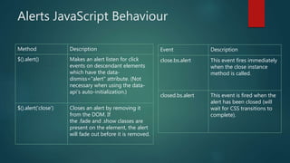


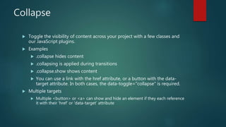


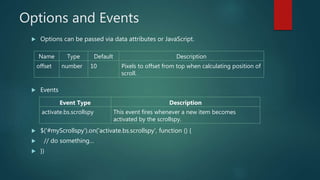
![Activate individual tabs in several ways
$('#myTab a[href="#profile"]').tab('show') // Select tab by name
$('#myTab a:first').tab('show') // Select first tab
$('#myTab a:last').tab('show') // Select last tab
$('#myTab li:eq(2) a').tab('show') // Select third tab (0-indexed)](https://image.slidesharecdn.com/bootstrap4ppt-170901111847/85/Bootstrap-4-ppt-30-320.jpg)


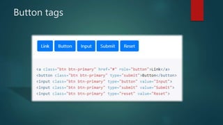
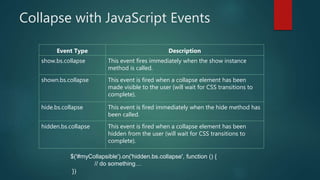
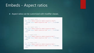
![Popover Everywhere
initialize all popovers on a page would be to select them by their data-toggle
attribute:
$(function () {
$('[data-toggle="popover"]').popover()
})
Using the container option
$(function () {
$('.example-popover').popover({
container: 'body'
})
})](https://image.slidesharecdn.com/bootstrap4ppt-170901111847/85/Bootstrap-4-ppt-36-320.jpg)


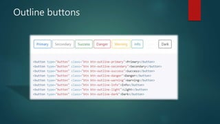
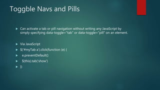
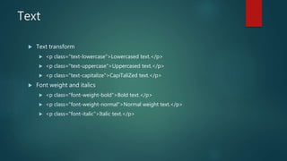
![Scrollspy - Using JavaScript
After adding position: relative; in your CSS, call the scrollspy via JavaScript:
Methods
$('[data-spy="scroll"]').each(function () {
var $spy = $(this).scrollspy('refresh')
})
$('body').scrollspy({ target: '#navbar-example' })](https://image.slidesharecdn.com/bootstrap4ppt-170901111847/85/Bootstrap-4-ppt-41-320.jpg)


Bootstrap 4 beta introduces support for IE10+, iOS 7+, and Android 5.0, with a new grid system including an 'xl' tier for screens over 1200px. Key updates include utility classes for spacing, image handling, and responsive tables, as well as enhancements for components like alerts, cards, and navbars. Additionally, there are improvements in form controls, jumbotrons, and scrollspy functionalities, ensuring more streamlined and modern design capabilities.


![Getting Started with Apache Spark: Big Data Made Simple [Free Meetup]](https://cdn.slidesharecdn.com/ss_thumbnails/apachesparkgettingstarted-260203175547-8361bcc3-thumbnail.jpg?width=640&height=640&fit=bounds)


