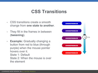
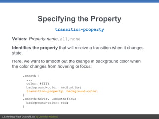
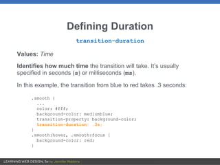
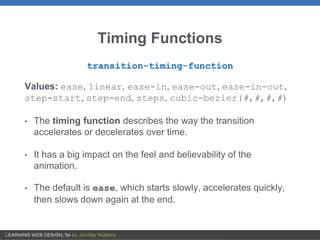
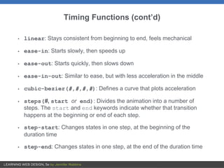
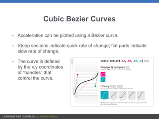
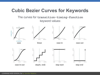
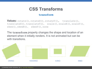
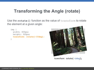
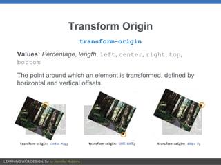
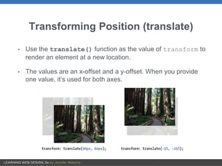
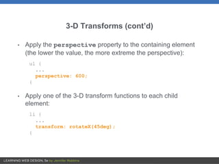
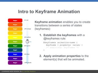
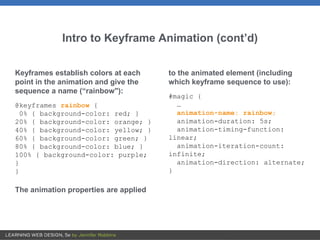
SlideShare a Scribd company logo
1 of 26
18
TRANSITIONS, TRANSFORMS,
AND ANIMATION
OVERVIEW
• Creating smooth transitions
• Moving, rotating, and scaling elements
• Combining transitions and transforms
• 3-D transforms
• Keyframe animation overview
CSS Transitions
• CSS transitions create a smooth
change from one state to another.
• They fill in the frames in between
(tweening).
• Example: Gradually changing a
button from red to blue (through
purple) when the mouse pointer
hovers over it.
State 1: Default
State 2: When the mouse is over
the element
Transition Properties
transition-property
Which CSS property to change
transition-duration
How long the transition should take in seconds (or milliseconds)
transition-timing-function
The manner in which the transition accelerates
transition-delay
Whether there should be a pause before the transition starts and
how long that pause should be (in seconds)
Specifying the Property
transition-property
Values: Property-name, all, none
Identifies the property that will receive a transition when it changes
state.
Here, we want to smooth out the change in background color when
the color changes from hovering or focus:
.smooth {
...
color: #fff;
background-color: mediumblue;
transition-property: background-color;
}
.smooth:hover, .smooth:focus {
background-color: red;
}
Defining Duration
transition-duration
Values: Time
Identifies how much time the transition will take. It’s usually
specified in seconds (s) or milliseconds (ms).
In this example, the transition from blue to red takes .3 seconds:
.smooth {
...
color: #fff;
background-color: mediumblue;
transition-property: background-color;
transition-duration: .3s;
}
.smooth:hover, .smooth:focus {
background-color: red;
}
Timing Functions
transition-timing-function
Values: ease, linear, ease-in, ease-out, ease-in-out,
step-start, step-end, steps, cubic-bezier(#,#,#,#)
• The timing function describes the way the transition
accelerates or decelerates over time.
• It has a big impact on the feel and believability of the
animation.
• The default is ease, which starts slowly, accelerates quickly,
then slows down again at the end.
Timing Functions (cont’d)
• linear: Stays consistent from beginning to end, feels mechanical
• ease-in: Starts slowly, then speeds up
• ease-out: Starts quickly, then slows down
• ease-in-out: Similar to ease, but with less acceleration in the middle
• cubic-bezier(#,#,#,#): Defines a curve that plots acceleration
• steps(#, start or end): Divides the animation into a number of
steps. The start and end keywords indicate whether that transition
happens at the beginning or end of each step.
• step-start: Changes states in one step, at the beginning of the
duration time
• step-end: Changes states in one step, at the end of the duration time
Cubic Bezier Curves
• Acceleration can be plotted using a Bezier curve.
• Steep sections indicate quick rate of change; flat parts indicate
slow rate of change.
• The curve is defined
by the x,y coordinates
of “handles” that
control the curve.
Cubic Bezier Curves for Keywords
The curves for transition-timing-function
keyword values:
Transition Delay
transition-delay
Values: Time
Delays the start of the transition by the amount of time specified.
In this example, the transition will begin .2 seconds after the user hovers
over the element:
.smooth {
...
color: #fff;
background-color: mediumblue;
transition-property: background-color;
transition-duration: .3s;
transition-timing-function: ease-in-out;
transition-delay: 0.2s;
}
.smooth:hover, .smooth:focus {
background-color: red;
}
Shorthand transition Property
transition
Values: property duration timing-function delay
Combines all the transition properties into one declaration.
Values are separated by character spaces.
The duration time must appear before delay time.
.smooth {
...
color: #fff;
background-color: mediumblue;
transition: background-color .3s ease-in-out 0.2s;
}
Transitioning Multiple Properties
• You can set the transitions for multiple properties with one
declaration.
• Separate value sets with commas.
• This declaration smoothes out the changes in background
color, color, and letter spacing of an element:
.smooth {
…
transition: background-color 0.3s ease-out 0.2s,
color 2s ease-in,
letter-spacing 0.3s ease-out;
}
Making All Transitions Smooth
If you want the same duration, timing-function, and delay
for all your transitions, use the all keyword for
transition-property:
.smooth {
…
transition: all 0.2s ease-in-out;
}
CSS Transforms
transform
Values: rotate(), rotateX(), rotateY(), translate(),
translateX(), translateY(), scale(), scaleX(), scaleY(),
skew(), skewX(), skewY(), none
The transform property changes the shape and location of an
element when it initially renders. It is not animated but can be
with transitions.
Transforming the Angle (rotate)
Use the rotate() function as the value of transform to rotate
the element at a given angle:
img {
width: 400px;
height: 300px;
transform: rotate(-10deg);
}
Transform Origin
transform-origin
Values: Percentage, length, left, center, right, top,
bottom
The point around which an element is transformed, defined by
horizontal and vertical offsets.
Transforming Position (translate)
• Use the translate() function as the value of transform to
render an element at a new location.
• The values are an x-offset and a y-offset. When you provide
one value, it’s used for both axes.
Transforming Size (scale)
• Use the scaleX(), scaleY(), or scale function to change
the size at which an element renders.
• The value is a unitless number that specifies a size ratio.
• The scale() shorthand provides x-offset and y-offset values
(providing one value applies to both axes).
Transforming Slant (skew)
• Use the skewX(), skewY(), or skew function to change the angle
of the horizontal or vertical axes (or both).
• The value is the number of degrees the angle should be.
• The skew() shorthand provides x-offset and y-offset values
(providing one value applies it to the x-axis only).
Multiple Transforms
You can apply more than one transform type in a declaration:
img:hover, img:focus {
transform: scale(1.5) rotate(-5deg) translate(50px,30px);
}
They’re applied in the order in which they’re listed. Order matters
in the final result.
NOTE: If you apply a transform on an element in a different state (for
example, :hover), repeat all transforms applied so far to that element
or they will be overwritten.
Smoothing Out Transformations
Smooth out a transform using the transition property.
Example:
Make an element appear to rotate smoothly when the mouse
moves over it or when it’s in focus:
a:hover img.twist, a:focus img.twist {
transform: rotate(-5deg);
}
img.twist {
transition-property: transform;
transition-duration: .3s;
}
3-D Transforms
You can apply perspective to element boxes to make them
appear as though they’re in a 3-D space.
3-D Transforms (cont’d)
• Apply the perspective property to the containing element
(the lower the value, the more extreme the perspective):
ul {
...
perspective: 600;
{
• Apply one of the 3-D transform functions to each child
element:
li {
...
transform: rotateX(45deg);
{
Intro to Keyframe Animation
Keyframe animation enables you to create
transitions between a series of states
(keyframes):
1. Establish the keyframes with a
@keyframes rule:
@keyframes animation-name {
keyframe { property: value; }
/* additional keyframes */
}
2. Apply animation properties to the
element(s) that will be animated.
Intro to Keyframe Animation (cont’d)
Keyframes establish colors at each
point in the animation and give the
sequence a name (“rainbow"):
@keyframes rainbow {
0% { background-color: red; }
20% { background-color: orange; }
40% { background-color: yellow; }
60% { background-color: green; }
80% { background-color: blue; }
100% { background-color: purple;
}
}
The animation properties are applied
to the animated element (including
which keyframe sequence to use):
#magic {
…
animation-name: rainbow;
animation-duration: 5s;
animation-timing-function:
linear;
animation-iteration-count:
infinite;
animation-direction: alternate;
}

More Related Content

What's hot (20)

JavaScript - Chapter 5 - Operators
 JavaScript - Chapter 5 - Operators JavaScript - Chapter 5 - Operators
JavaScript - Chapter 5 - Operators
 
CSS Animations & Transitions
CSS Animations & TransitionsCSS Animations & Transitions
CSS Animations & Transitions
 
Active x control
Active x controlActive x control
Active x control
 
Event In JavaScript
Event In JavaScriptEvent In JavaScript
Event In JavaScript
 
Functions in javascript
Functions in javascriptFunctions in javascript
Functions in javascript
 
Html forms
Html formsHtml forms
Html forms
 
Web design - Working with forms in HTML
Web design - Working with forms in HTMLWeb design - Working with forms in HTML
Web design - Working with forms in HTML
 
Css box-model
Css box-modelCss box-model
Css box-model
 
jQuery - Chapter 3 - Effects
jQuery - Chapter 3 - Effects  jQuery - Chapter 3 - Effects
jQuery - Chapter 3 - Effects
 
CSS Selectors
CSS SelectorsCSS Selectors
CSS Selectors
 
Java script
Java scriptJava script
Java script
 
Javascript 101
Javascript 101Javascript 101
Javascript 101
 
HTML5 Canvas - Basics.pptx
HTML5 Canvas - Basics.pptxHTML5 Canvas - Basics.pptx
HTML5 Canvas - Basics.pptx
 
JavaScript - Chapter 12 - Document Object Model
  JavaScript - Chapter 12 - Document Object Model  JavaScript - Chapter 12 - Document Object Model
JavaScript - Chapter 12 - Document Object Model
 
Basics of JavaScript
Basics of JavaScriptBasics of JavaScript
Basics of JavaScript
 
How Cascading Style Sheets (CSS) Works
How Cascading Style Sheets (CSS) WorksHow Cascading Style Sheets (CSS) Works
How Cascading Style Sheets (CSS) Works
 
Php string function
Php string function Php string function
Php string function
 
Css3
Css3Css3
Css3
 
Introduction to CSS3
Introduction to CSS3Introduction to CSS3
Introduction to CSS3
 
Introduction to JavaScript Basics.
Introduction to JavaScript Basics.Introduction to JavaScript Basics.
Introduction to JavaScript Basics.
 

Similar to Chapter 18: Transitions, Transforms, and Animation

Dynamic CSS: Transforms, Transitions, and Animation Basics
Dynamic CSS: Transforms, Transitions, and Animation BasicsDynamic CSS: Transforms, Transitions, and Animation Basics
Dynamic CSS: Transforms, Transitions, and Animation BasicsBeth Soderberg
 
CSS3 TTA (Transform Transition Animation)
CSS3 TTA (Transform Transition Animation)CSS3 TTA (Transform Transition Animation)
CSS3 TTA (Transform Transition Animation)창석 한
 
CSS3 Animation for beginners - Imrokraft
CSS3 Animation for beginners - ImrokraftCSS3 Animation for beginners - Imrokraft
CSS3 Animation for beginners - Imrokraftimrokraft
 
ADVANCE CSS STYDY COURSE TO BECOME A PROFESSIONAL.docx
ADVANCE CSS STYDY COURSE TO BECOME A PROFESSIONAL.docxADVANCE CSS STYDY COURSE TO BECOME A PROFESSIONAL.docx
ADVANCE CSS STYDY COURSE TO BECOME A PROFESSIONAL.docxgreatmike3
 
KEY FRAME SYSTEM-Ruby Stella mary.pptx
KEY FRAME SYSTEM-Ruby Stella mary.pptxKEY FRAME SYSTEM-Ruby Stella mary.pptx
KEY FRAME SYSTEM-Ruby Stella mary.pptxComputerScienceDepar6
 
Workshop 18: CSS Animations & cool effects
Workshop 18: CSS Animations & cool effectsWorkshop 18: CSS Animations & cool effects
Workshop 18: CSS Animations & cool effectsVisual Engineering
 
Les 2 motion_11
Les 2 motion_11Les 2 motion_11
Les 2 motion_11sujameryll
 
Introduction to Canvas - Toronto HTML5 User Group
Introduction to Canvas - Toronto HTML5 User GroupIntroduction to Canvas - Toronto HTML5 User Group
Introduction to Canvas - Toronto HTML5 User Groupdreambreeze
 
Introduction to Canvas - Toronto HTML5 User Group
Introduction to Canvas - Toronto HTML5 User GroupIntroduction to Canvas - Toronto HTML5 User Group
Introduction to Canvas - Toronto HTML5 User Groupbernice-chan
 
2hjsakhvchcvj hSKchvsABJChjSVCHjhvcvdxz.pptx
2hjsakhvchcvj hSKchvsABJChjSVCHjhvcvdxz.pptx2hjsakhvchcvj hSKchvsABJChjSVCHjhvcvdxz.pptx
2hjsakhvchcvj hSKchvsABJChjSVCHjhvcvdxz.pptxHarikumar Rajasekar
 
Speed+velocity+acceleration
Speed+velocity+accelerationSpeed+velocity+acceleration
Speed+velocity+accelerationjacquibridges
 
Unit-3 overview of transformations
Unit-3 overview of transformationsUnit-3 overview of transformations
Unit-3 overview of transformationsAmol Gaikwad
 

Similar to Chapter 18: Transitions, Transforms, and Animation (20)

Dynamic CSS: Transforms, Transitions, and Animation Basics
Dynamic CSS: Transforms, Transitions, and Animation BasicsDynamic CSS: Transforms, Transitions, and Animation Basics
Dynamic CSS: Transforms, Transitions, and Animation Basics
 
Transition
TransitionTransition
Transition
 
Transition and tooltips.pdf
Transition and tooltips.pdfTransition and tooltips.pdf
Transition and tooltips.pdf
 
CSS3 TTA (Transform Transition Animation)
CSS3 TTA (Transform Transition Animation)CSS3 TTA (Transform Transition Animation)
CSS3 TTA (Transform Transition Animation)
 
Animation ppt
Animation pptAnimation ppt
Animation ppt
 
Css3
Css3Css3
Css3
 
CSS3 Animation for beginners - Imrokraft
CSS3 Animation for beginners - ImrokraftCSS3 Animation for beginners - Imrokraft
CSS3 Animation for beginners - Imrokraft
 
ADVANCE CSS STYDY COURSE TO BECOME A PROFESSIONAL.docx
ADVANCE CSS STYDY COURSE TO BECOME A PROFESSIONAL.docxADVANCE CSS STYDY COURSE TO BECOME A PROFESSIONAL.docx
ADVANCE CSS STYDY COURSE TO BECOME A PROFESSIONAL.docx
 
KEY FRAME SYSTEM-Ruby Stella mary.pptx
KEY FRAME SYSTEM-Ruby Stella mary.pptxKEY FRAME SYSTEM-Ruby Stella mary.pptx
KEY FRAME SYSTEM-Ruby Stella mary.pptx
 
Css3animation
Css3animationCss3animation
Css3animation
 
Css3
Css3Css3
Css3
 
Workshop 18: CSS Animations & cool effects
Workshop 18: CSS Animations & cool effectsWorkshop 18: CSS Animations & cool effects
Workshop 18: CSS Animations & cool effects
 
Velocity ok
Velocity okVelocity ok
Velocity ok
 
Les 2 motion_11
Les 2 motion_11Les 2 motion_11
Les 2 motion_11
 
Introduction to Canvas - Toronto HTML5 User Group
Introduction to Canvas - Toronto HTML5 User GroupIntroduction to Canvas - Toronto HTML5 User Group
Introduction to Canvas - Toronto HTML5 User Group
 
Introduction to Canvas - Toronto HTML5 User Group
Introduction to Canvas - Toronto HTML5 User GroupIntroduction to Canvas - Toronto HTML5 User Group
Introduction to Canvas - Toronto HTML5 User Group
 
Intro to Canva
Intro to CanvaIntro to Canva
Intro to Canva
 
2hjsakhvchcvj hSKchvsABJChjSVCHjhvcvdxz.pptx
2hjsakhvchcvj hSKchvsABJChjSVCHjhvcvdxz.pptx2hjsakhvchcvj hSKchvsABJChjSVCHjhvcvdxz.pptx
2hjsakhvchcvj hSKchvsABJChjSVCHjhvcvdxz.pptx
 
Speed+velocity+acceleration
Speed+velocity+accelerationSpeed+velocity+acceleration
Speed+velocity+acceleration
 
Unit-3 overview of transformations
Unit-3 overview of transformationsUnit-3 overview of transformations
Unit-3 overview of transformations
 

More from Steve Guinan

Chapter 17: Responsive Web Design
Chapter 17: Responsive Web DesignChapter 17: Responsive Web Design
Chapter 17: Responsive Web DesignSteve Guinan
 
Chapter 15: Floating and Positioning
Chapter 15: Floating and Positioning Chapter 15: Floating and Positioning
Chapter 15: Floating and Positioning Steve Guinan
 
Chapter 14: Box Model
Chapter 14: Box ModelChapter 14: Box Model
Chapter 14: Box ModelSteve Guinan
 
Chapter 13: Colors and Backgrounds
Chapter 13: Colors and BackgroundsChapter 13: Colors and Backgrounds
Chapter 13: Colors and BackgroundsSteve Guinan
 
Chapter 12: CSS Part 2
Chapter 12: CSS Part 2Chapter 12: CSS Part 2
Chapter 12: CSS Part 2Steve Guinan
 
Chapter 11: Intro to CSS
Chapter 11: Intro to CSSChapter 11: Intro to CSS
Chapter 11: Intro to CSSSteve Guinan
 
Chapter 23: Web Images
Chapter 23: Web ImagesChapter 23: Web Images
Chapter 23: Web ImagesSteve Guinan
 
HubSpot Student Instructions
HubSpot Student InstructionsHubSpot Student Instructions
HubSpot Student InstructionsSteve Guinan
 
Ch 5: Marking up Text
Ch 5: Marking up TextCh 5: Marking up Text
Ch 5: Marking up TextSteve Guinan
 
Ch 3: Big Concepts
Ch 3: Big ConceptsCh 3: Big Concepts
Ch 3: Big ConceptsSteve Guinan
 
Ch 2: How the Web Works
Ch 2: How the Web WorksCh 2: How the Web Works
Ch 2: How the Web WorksSteve Guinan
 
Ch 1: Getting Started
Ch 1: Getting StartedCh 1: Getting Started
Ch 1: Getting StartedSteve Guinan
 
Intro to Web Design 6e Chapter 7
Intro to Web Design 6e Chapter 7Intro to Web Design 6e Chapter 7
Intro to Web Design 6e Chapter 7Steve Guinan
 
Intro to Web Design 6e Chapter 6
Intro to Web Design 6e Chapter 6Intro to Web Design 6e Chapter 6
Intro to Web Design 6e Chapter 6Steve Guinan
 
Intro to Web Design 6e Chapter 5
Intro to Web Design 6e Chapter 5Intro to Web Design 6e Chapter 5
Intro to Web Design 6e Chapter 5Steve Guinan
 
Intro to Web Design 6e Chapter 4
Intro to Web Design 6e Chapter 4 Intro to Web Design 6e Chapter 4
Intro to Web Design 6e Chapter 4 Steve Guinan
 

More from Steve Guinan (20)

Chapter 17: Responsive Web Design
Chapter 17: Responsive Web DesignChapter 17: Responsive Web Design
Chapter 17: Responsive Web Design
 
Chapter 15: Floating and Positioning
Chapter 15: Floating and Positioning Chapter 15: Floating and Positioning
Chapter 15: Floating and Positioning
 
Chapter 9: Forms
Chapter 9: FormsChapter 9: Forms
Chapter 9: Forms
 
Chapter 8: Tables
Chapter 8: TablesChapter 8: Tables
Chapter 8: Tables
 
Chapter 14: Box Model
Chapter 14: Box ModelChapter 14: Box Model
Chapter 14: Box Model
 
Chapter 13: Colors and Backgrounds
Chapter 13: Colors and BackgroundsChapter 13: Colors and Backgrounds
Chapter 13: Colors and Backgrounds
 
Chapter 12: CSS Part 2
Chapter 12: CSS Part 2Chapter 12: CSS Part 2
Chapter 12: CSS Part 2
 
Chapter 11: Intro to CSS
Chapter 11: Intro to CSSChapter 11: Intro to CSS
Chapter 11: Intro to CSS
 
Chapter 23: Web Images
Chapter 23: Web ImagesChapter 23: Web Images
Chapter 23: Web Images
 
Chapter 7: Images
Chapter 7: ImagesChapter 7: Images
Chapter 7: Images
 
HubSpot Student Instructions
HubSpot Student InstructionsHubSpot Student Instructions
HubSpot Student Instructions
 
Ch 6: Links
Ch 6: LinksCh 6: Links
Ch 6: Links
 
Ch 5: Marking up Text
Ch 5: Marking up TextCh 5: Marking up Text
Ch 5: Marking up Text
 
Ch 3: Big Concepts
Ch 3: Big ConceptsCh 3: Big Concepts
Ch 3: Big Concepts
 
Ch 2: How the Web Works
Ch 2: How the Web WorksCh 2: How the Web Works
Ch 2: How the Web Works
 
Ch 1: Getting Started
Ch 1: Getting StartedCh 1: Getting Started
Ch 1: Getting Started
 
Intro to Web Design 6e Chapter 7
Intro to Web Design 6e Chapter 7Intro to Web Design 6e Chapter 7
Intro to Web Design 6e Chapter 7
 
Intro to Web Design 6e Chapter 6
Intro to Web Design 6e Chapter 6Intro to Web Design 6e Chapter 6
Intro to Web Design 6e Chapter 6
 
Intro to Web Design 6e Chapter 5
Intro to Web Design 6e Chapter 5Intro to Web Design 6e Chapter 5
Intro to Web Design 6e Chapter 5
 
Intro to Web Design 6e Chapter 4
Intro to Web Design 6e Chapter 4 Intro to Web Design 6e Chapter 4
Intro to Web Design 6e Chapter 4
 

Recently uploaded

10.pdfMature Call girls in Dubai +971563133746 Dubai Call girls
10.pdfMature Call girls in Dubai +971563133746 Dubai Call girls10.pdfMature Call girls in Dubai +971563133746 Dubai Call girls
10.pdfMature Call girls in Dubai +971563133746 Dubai Call girlsstephieert
 
Russian Call Girls Thane Swara 8617697112 Independent Escort Service Thane
Russian Call Girls Thane Swara 8617697112 Independent Escort Service ThaneRussian Call Girls Thane Swara 8617697112 Independent Escort Service Thane
Russian Call Girls Thane Swara 8617697112 Independent Escort Service ThaneCall girls in Ahmedabad High profile
 
Call Girls In Model Towh Delhi 💯Call Us 🔝8264348440🔝
Call Girls In Model Towh Delhi 💯Call Us 🔝8264348440🔝Call Girls In Model Towh Delhi 💯Call Us 🔝8264348440🔝
Call Girls In Model Towh Delhi 💯Call Us 🔝8264348440🔝soniya singh
 
AlbaniaDreamin24 - How to easily use an API with Flows
AlbaniaDreamin24 - How to easily use an API with FlowsAlbaniaDreamin24 - How to easily use an API with Flows
AlbaniaDreamin24 - How to easily use an API with FlowsThierry TROUIN ☁
 
AWS Community DAY Albertini-Ellan Cloud Security (1).pptx
AWS Community DAY Albertini-Ellan Cloud Security (1).pptxAWS Community DAY Albertini-Ellan Cloud Security (1).pptx
AWS Community DAY Albertini-Ellan Cloud Security (1).pptxellan12
 
VIP Kolkata Call Girl Salt Lake 👉 8250192130 Available With Room
VIP Kolkata Call Girl Salt Lake 👉 8250192130  Available With RoomVIP Kolkata Call Girl Salt Lake 👉 8250192130  Available With Room
VIP Kolkata Call Girl Salt Lake 👉 8250192130 Available With Roomishabajaj13
 
Gram Darshan PPT cyber rural in villages of india
Gram Darshan PPT cyber rural  in villages of indiaGram Darshan PPT cyber rural  in villages of india
Gram Darshan PPT cyber rural in villages of indiaimessage0108
 
How is AI changing journalism? (v. April 2024)
How is AI changing journalism? (v. April 2024)How is AI changing journalism? (v. April 2024)
How is AI changing journalism? (v. April 2024)Damian Radcliffe
 
Low Rate Young Call Girls in Sector 63 Mamura Noida ✔️☆9289244007✔️☆ Female E...
Low Rate Young Call Girls in Sector 63 Mamura Noida ✔️☆9289244007✔️☆ Female E...Low Rate Young Call Girls in Sector 63 Mamura Noida ✔️☆9289244007✔️☆ Female E...
Low Rate Young Call Girls in Sector 63 Mamura Noida ✔️☆9289244007✔️☆ Female E...SofiyaSharma5
 
'Future Evolution of the Internet' delivered by Geoff Huston at Everything Op...
'Future Evolution of the Internet' delivered by Geoff Huston at Everything Op...'Future Evolution of the Internet' delivered by Geoff Huston at Everything Op...
'Future Evolution of the Internet' delivered by Geoff Huston at Everything Op...APNIC
 
DDoS In Oceania and the Pacific, presented by Dave Phelan at NZNOG 2024
DDoS In Oceania and the Pacific, presented by Dave Phelan at NZNOG 2024DDoS In Oceania and the Pacific, presented by Dave Phelan at NZNOG 2024
DDoS In Oceania and the Pacific, presented by Dave Phelan at NZNOG 2024APNIC
 
Networking in the Penumbra presented by Geoff Huston at NZNOG
Networking in the Penumbra presented by Geoff Huston at NZNOGNetworking in the Penumbra presented by Geoff Huston at NZNOG
Networking in the Penumbra presented by Geoff Huston at NZNOGAPNIC
 
Chennai Call Girls Alwarpet Phone 🍆 8250192130 👅 celebrity escorts service
Chennai Call Girls Alwarpet Phone 🍆 8250192130 👅 celebrity escorts serviceChennai Call Girls Alwarpet Phone 🍆 8250192130 👅 celebrity escorts service
Chennai Call Girls Alwarpet Phone 🍆 8250192130 👅 celebrity escorts servicevipmodelshub1
 
Moving Beyond Twitter/X and Facebook - Social Media for local news providers
Moving Beyond Twitter/X and Facebook - Social Media for local news providersMoving Beyond Twitter/X and Facebook - Social Media for local news providers
Moving Beyond Twitter/X and Facebook - Social Media for local news providersDamian Radcliffe
 
Chennai Call Girls Porur Phone 🍆 8250192130 👅 celebrity escorts service
Chennai Call Girls Porur Phone 🍆 8250192130 👅 celebrity escorts serviceChennai Call Girls Porur Phone 🍆 8250192130 👅 celebrity escorts service
Chennai Call Girls Porur Phone 🍆 8250192130 👅 celebrity escorts servicesonalikaur4
 
Call Girls in Uttam Nagar Delhi 💯Call Us 🔝8264348440🔝
Call Girls in Uttam Nagar Delhi 💯Call Us 🔝8264348440🔝Call Girls in Uttam Nagar Delhi 💯Call Us 🔝8264348440🔝
Call Girls in Uttam Nagar Delhi 💯Call Us 🔝8264348440🔝soniya singh
 
VIP Kolkata Call Girl Kestopur 👉 8250192130 Available With Room
VIP Kolkata Call Girl Kestopur 👉 8250192130  Available With RoomVIP Kolkata Call Girl Kestopur 👉 8250192130  Available With Room
VIP Kolkata Call Girl Kestopur 👉 8250192130 Available With Roomdivyansh0kumar0
 
VIP Call Girls Kolkata Ananya 🤌 8250192130 🚀 Vip Call Girls Kolkata
VIP Call Girls Kolkata Ananya 🤌  8250192130 🚀 Vip Call Girls KolkataVIP Call Girls Kolkata Ananya 🤌  8250192130 🚀 Vip Call Girls Kolkata
VIP Call Girls Kolkata Ananya 🤌 8250192130 🚀 Vip Call Girls Kolkataanamikaraghav4
 
GDG Cloud Southlake 32: Kyle Hettinger: Demystifying the Dark Web
GDG Cloud Southlake 32: Kyle Hettinger: Demystifying the Dark WebGDG Cloud Southlake 32: Kyle Hettinger: Demystifying the Dark Web
GDG Cloud Southlake 32: Kyle Hettinger: Demystifying the Dark WebJames Anderson
 

Recently uploaded (20)

10.pdfMature Call girls in Dubai +971563133746 Dubai Call girls
10.pdfMature Call girls in Dubai +971563133746 Dubai Call girls10.pdfMature Call girls in Dubai +971563133746 Dubai Call girls
10.pdfMature Call girls in Dubai +971563133746 Dubai Call girls
 
Russian Call Girls Thane Swara 8617697112 Independent Escort Service Thane
Russian Call Girls Thane Swara 8617697112 Independent Escort Service ThaneRussian Call Girls Thane Swara 8617697112 Independent Escort Service Thane
Russian Call Girls Thane Swara 8617697112 Independent Escort Service Thane
 
Call Girls In Model Towh Delhi 💯Call Us 🔝8264348440🔝
Call Girls In Model Towh Delhi 💯Call Us 🔝8264348440🔝Call Girls In Model Towh Delhi 💯Call Us 🔝8264348440🔝
Call Girls In Model Towh Delhi 💯Call Us 🔝8264348440🔝
 
AlbaniaDreamin24 - How to easily use an API with Flows
AlbaniaDreamin24 - How to easily use an API with FlowsAlbaniaDreamin24 - How to easily use an API with Flows
AlbaniaDreamin24 - How to easily use an API with Flows
 
AWS Community DAY Albertini-Ellan Cloud Security (1).pptx
AWS Community DAY Albertini-Ellan Cloud Security (1).pptxAWS Community DAY Albertini-Ellan Cloud Security (1).pptx
AWS Community DAY Albertini-Ellan Cloud Security (1).pptx
 
VIP Kolkata Call Girl Salt Lake 👉 8250192130 Available With Room
VIP Kolkata Call Girl Salt Lake 👉 8250192130  Available With RoomVIP Kolkata Call Girl Salt Lake 👉 8250192130  Available With Room
VIP Kolkata Call Girl Salt Lake 👉 8250192130 Available With Room
 
Gram Darshan PPT cyber rural in villages of india
Gram Darshan PPT cyber rural  in villages of indiaGram Darshan PPT cyber rural  in villages of india
Gram Darshan PPT cyber rural in villages of india
 
How is AI changing journalism? (v. April 2024)
How is AI changing journalism? (v. April 2024)How is AI changing journalism? (v. April 2024)
How is AI changing journalism? (v. April 2024)
 
Low Rate Young Call Girls in Sector 63 Mamura Noida ✔️☆9289244007✔️☆ Female E...
Low Rate Young Call Girls in Sector 63 Mamura Noida ✔️☆9289244007✔️☆ Female E...Low Rate Young Call Girls in Sector 63 Mamura Noida ✔️☆9289244007✔️☆ Female E...
Low Rate Young Call Girls in Sector 63 Mamura Noida ✔️☆9289244007✔️☆ Female E...
 
'Future Evolution of the Internet' delivered by Geoff Huston at Everything Op...
'Future Evolution of the Internet' delivered by Geoff Huston at Everything Op...'Future Evolution of the Internet' delivered by Geoff Huston at Everything Op...
'Future Evolution of the Internet' delivered by Geoff Huston at Everything Op...
 
DDoS In Oceania and the Pacific, presented by Dave Phelan at NZNOG 2024
DDoS In Oceania and the Pacific, presented by Dave Phelan at NZNOG 2024DDoS In Oceania and the Pacific, presented by Dave Phelan at NZNOG 2024
DDoS In Oceania and the Pacific, presented by Dave Phelan at NZNOG 2024
 
Networking in the Penumbra presented by Geoff Huston at NZNOG
Networking in the Penumbra presented by Geoff Huston at NZNOGNetworking in the Penumbra presented by Geoff Huston at NZNOG
Networking in the Penumbra presented by Geoff Huston at NZNOG
 
Chennai Call Girls Alwarpet Phone 🍆 8250192130 👅 celebrity escorts service
Chennai Call Girls Alwarpet Phone 🍆 8250192130 👅 celebrity escorts serviceChennai Call Girls Alwarpet Phone 🍆 8250192130 👅 celebrity escorts service
Chennai Call Girls Alwarpet Phone 🍆 8250192130 👅 celebrity escorts service
 
Moving Beyond Twitter/X and Facebook - Social Media for local news providers
Moving Beyond Twitter/X and Facebook - Social Media for local news providersMoving Beyond Twitter/X and Facebook - Social Media for local news providers
Moving Beyond Twitter/X and Facebook - Social Media for local news providers
 
Chennai Call Girls Porur Phone 🍆 8250192130 👅 celebrity escorts service
Chennai Call Girls Porur Phone 🍆 8250192130 👅 celebrity escorts serviceChennai Call Girls Porur Phone 🍆 8250192130 👅 celebrity escorts service
Chennai Call Girls Porur Phone 🍆 8250192130 👅 celebrity escorts service
 
Call Girls in Uttam Nagar Delhi 💯Call Us 🔝8264348440🔝
Call Girls in Uttam Nagar Delhi 💯Call Us 🔝8264348440🔝Call Girls in Uttam Nagar Delhi 💯Call Us 🔝8264348440🔝
Call Girls in Uttam Nagar Delhi 💯Call Us 🔝8264348440🔝
 
VIP Kolkata Call Girl Kestopur 👉 8250192130 Available With Room
VIP Kolkata Call Girl Kestopur 👉 8250192130  Available With RoomVIP Kolkata Call Girl Kestopur 👉 8250192130  Available With Room
VIP Kolkata Call Girl Kestopur 👉 8250192130 Available With Room
 
VIP Call Girls Kolkata Ananya 🤌 8250192130 🚀 Vip Call Girls Kolkata
VIP Call Girls Kolkata Ananya 🤌  8250192130 🚀 Vip Call Girls KolkataVIP Call Girls Kolkata Ananya 🤌  8250192130 🚀 Vip Call Girls Kolkata
VIP Call Girls Kolkata Ananya 🤌 8250192130 🚀 Vip Call Girls Kolkata
 
Dwarka Sector 26 Call Girls | Delhi | 9999965857 🫦 Vanshika Verma More Our Se...
Dwarka Sector 26 Call Girls | Delhi | 9999965857 🫦 Vanshika Verma More Our Se...Dwarka Sector 26 Call Girls | Delhi | 9999965857 🫦 Vanshika Verma More Our Se...
Dwarka Sector 26 Call Girls | Delhi | 9999965857 🫦 Vanshika Verma More Our Se...
 
GDG Cloud Southlake 32: Kyle Hettinger: Demystifying the Dark Web
GDG Cloud Southlake 32: Kyle Hettinger: Demystifying the Dark WebGDG Cloud Southlake 32: Kyle Hettinger: Demystifying the Dark Web
GDG Cloud Southlake 32: Kyle Hettinger: Demystifying the Dark Web
 

Chapter 18: Transitions, Transforms, and Animation

  • 2. OVERVIEW • Creating smooth transitions • Moving, rotating, and scaling elements • Combining transitions and transforms • 3-D transforms • Keyframe animation overview
  • 3. CSS Transitions • CSS transitions create a smooth change from one state to another. • They fill in the frames in between (tweening). • Example: Gradually changing a button from red to blue (through purple) when the mouse pointer hovers over it. State 1: Default State 2: When the mouse is over the element
  • 4. Transition Properties transition-property Which CSS property to change transition-duration How long the transition should take in seconds (or milliseconds) transition-timing-function The manner in which the transition accelerates transition-delay Whether there should be a pause before the transition starts and how long that pause should be (in seconds)
  • 5. Specifying the Property transition-property Values: Property-name, all, none Identifies the property that will receive a transition when it changes state. Here, we want to smooth out the change in background color when the color changes from hovering or focus: .smooth { ... color: #fff; background-color: mediumblue; transition-property: background-color; } .smooth:hover, .smooth:focus { background-color: red; }
  • 6. Defining Duration transition-duration Values: Time Identifies how much time the transition will take. It’s usually specified in seconds (s) or milliseconds (ms). In this example, the transition from blue to red takes .3 seconds: .smooth { ... color: #fff; background-color: mediumblue; transition-property: background-color; transition-duration: .3s; } .smooth:hover, .smooth:focus { background-color: red; }
  • 7. Timing Functions transition-timing-function Values: ease, linear, ease-in, ease-out, ease-in-out, step-start, step-end, steps, cubic-bezier(#,#,#,#) • The timing function describes the way the transition accelerates or decelerates over time. • It has a big impact on the feel and believability of the animation. • The default is ease, which starts slowly, accelerates quickly, then slows down again at the end.
  • 8. Timing Functions (cont’d) • linear: Stays consistent from beginning to end, feels mechanical • ease-in: Starts slowly, then speeds up • ease-out: Starts quickly, then slows down • ease-in-out: Similar to ease, but with less acceleration in the middle • cubic-bezier(#,#,#,#): Defines a curve that plots acceleration • steps(#, start or end): Divides the animation into a number of steps. The start and end keywords indicate whether that transition happens at the beginning or end of each step. • step-start: Changes states in one step, at the beginning of the duration time • step-end: Changes states in one step, at the end of the duration time
  • 9. Cubic Bezier Curves • Acceleration can be plotted using a Bezier curve. • Steep sections indicate quick rate of change; flat parts indicate slow rate of change. • The curve is defined by the x,y coordinates of “handles” that control the curve.
  • 10. Cubic Bezier Curves for Keywords The curves for transition-timing-function keyword values:
  • 11. Transition Delay transition-delay Values: Time Delays the start of the transition by the amount of time specified. In this example, the transition will begin .2 seconds after the user hovers over the element: .smooth { ... color: #fff; background-color: mediumblue; transition-property: background-color; transition-duration: .3s; transition-timing-function: ease-in-out; transition-delay: 0.2s; } .smooth:hover, .smooth:focus { background-color: red; }
  • 12. Shorthand transition Property transition Values: property duration timing-function delay Combines all the transition properties into one declaration. Values are separated by character spaces. The duration time must appear before delay time. .smooth { ... color: #fff; background-color: mediumblue; transition: background-color .3s ease-in-out 0.2s; }
  • 13. Transitioning Multiple Properties • You can set the transitions for multiple properties with one declaration. • Separate value sets with commas. • This declaration smoothes out the changes in background color, color, and letter spacing of an element: .smooth { … transition: background-color 0.3s ease-out 0.2s, color 2s ease-in, letter-spacing 0.3s ease-out; }
  • 14. Making All Transitions Smooth If you want the same duration, timing-function, and delay for all your transitions, use the all keyword for transition-property: .smooth { … transition: all 0.2s ease-in-out; }
  • 15. CSS Transforms transform Values: rotate(), rotateX(), rotateY(), translate(), translateX(), translateY(), scale(), scaleX(), scaleY(), skew(), skewX(), skewY(), none The transform property changes the shape and location of an element when it initially renders. It is not animated but can be with transitions.
  • 16. Transforming the Angle (rotate) Use the rotate() function as the value of transform to rotate the element at a given angle: img { width: 400px; height: 300px; transform: rotate(-10deg); }
  • 17. Transform Origin transform-origin Values: Percentage, length, left, center, right, top, bottom The point around which an element is transformed, defined by horizontal and vertical offsets.
  • 18. Transforming Position (translate) • Use the translate() function as the value of transform to render an element at a new location. • The values are an x-offset and a y-offset. When you provide one value, it’s used for both axes.
  • 19. Transforming Size (scale) • Use the scaleX(), scaleY(), or scale function to change the size at which an element renders. • The value is a unitless number that specifies a size ratio. • The scale() shorthand provides x-offset and y-offset values (providing one value applies to both axes).
  • 20. Transforming Slant (skew) • Use the skewX(), skewY(), or skew function to change the angle of the horizontal or vertical axes (or both). • The value is the number of degrees the angle should be. • The skew() shorthand provides x-offset and y-offset values (providing one value applies it to the x-axis only).
  • 21. Multiple Transforms You can apply more than one transform type in a declaration: img:hover, img:focus { transform: scale(1.5) rotate(-5deg) translate(50px,30px); } They’re applied in the order in which they’re listed. Order matters in the final result. NOTE: If you apply a transform on an element in a different state (for example, :hover), repeat all transforms applied so far to that element or they will be overwritten.
  • 22. Smoothing Out Transformations Smooth out a transform using the transition property. Example: Make an element appear to rotate smoothly when the mouse moves over it or when it’s in focus: a:hover img.twist, a:focus img.twist { transform: rotate(-5deg); } img.twist { transition-property: transform; transition-duration: .3s; }
  • 23. 3-D Transforms You can apply perspective to element boxes to make them appear as though they’re in a 3-D space.
  • 24. 3-D Transforms (cont’d) • Apply the perspective property to the containing element (the lower the value, the more extreme the perspective): ul { ... perspective: 600; { • Apply one of the 3-D transform functions to each child element: li { ... transform: rotateX(45deg); {
  • 25. Intro to Keyframe Animation Keyframe animation enables you to create transitions between a series of states (keyframes): 1. Establish the keyframes with a @keyframes rule: @keyframes animation-name { keyframe { property: value; } /* additional keyframes */ } 2. Apply animation properties to the element(s) that will be animated.
  • 26. Intro to Keyframe Animation (cont’d) Keyframes establish colors at each point in the animation and give the sequence a name (“rainbow"): @keyframes rainbow { 0% { background-color: red; } 20% { background-color: orange; } 40% { background-color: yellow; } 60% { background-color: green; } 80% { background-color: blue; } 100% { background-color: purple; } } The animation properties are applied to the animated element (including which keyframe sequence to use): #magic { … animation-name: rainbow; animation-duration: 5s; animation-timing-function: linear; animation-iteration-count: infinite; animation-direction: alternate; }