This document discusses various methods for styling colors and backgrounds in CSS, including:
1) Using named color values or RGB, HSL, and RGBa values to specify foreground and background colors.
2) Applying background images, adjusting their position, size, and repetition.
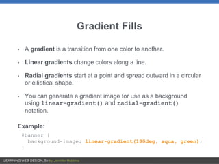
3) Creating gradients using functions like linear-gradient() and radial-gradient().
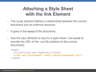
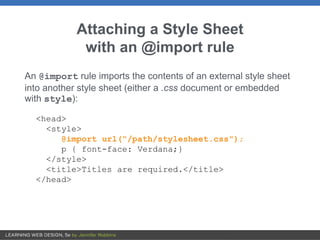
4) Attaching external style sheets to HTML documents using <link> tags or @import rules.


![Attribute Selectors
Targets elements based on attribute names or values. There
are eight types:
Simple attribute selector
Matches an element with a given attribute:
E[attribute]
img[title] { border: 3px solid;}
(Matches every img element that has a title attribute)](https://image.slidesharecdn.com/lwdch13colors-200930221227/85/Chapter-13-Colors-and-Backgrounds-36-320.jpg)
![Attribute Selectors (cont’d)
Exact attribute value selector
Matches an element with a specific value for an attribute:
E[attribute="exact value"]
img[title="first grade"] {border: 3px solid;}
(matches only if the title value is "first grade")
Partial attribute value selector (~)
Matches an element by one part of an attribute value.:
E[attribute~="value"]
img[title~="grade"] {border: 3px solid;}
(matches "first grade", "second grade", and so on)](https://image.slidesharecdn.com/lwdch13colors-200930221227/85/Chapter-13-Colors-and-Backgrounds-37-320.jpg)
![Attribute Selectors (cont’d.)
Hyphen-separated attribute value selector (|)
Targets hyphen-separated values:
E[attribute|="value"]
Beginning substring attribute value selector (^)
Matches an element with attribute values that start with the given string of
characters:
E[attribute^="first part of a value"]
Ending substring attribute value selector ($)
Matches an element with attribute values that end with the given string of
characters:
E[attribute$="last part of a value"]
Arbitrary substring attribute value selector (*)
Looks for the text string in any part of the attribute value:
E[attribute*="any part of the value"]](https://image.slidesharecdn.com/lwdch13colors-200930221227/85/Chapter-13-Colors-and-Backgrounds-38-320.jpg)