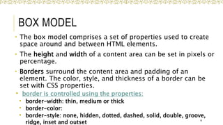
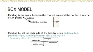
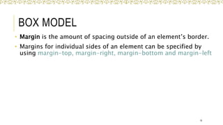
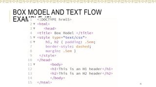
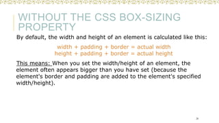
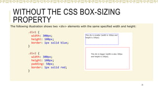
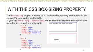
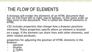
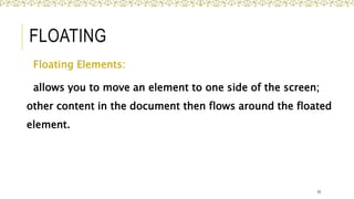
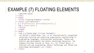
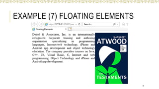
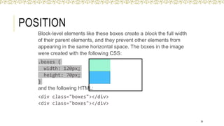
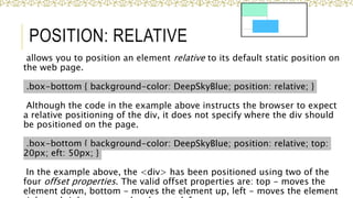
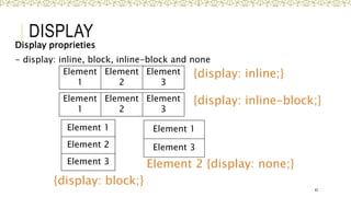
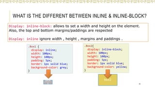
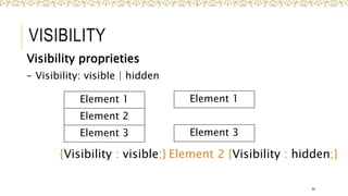
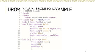
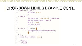
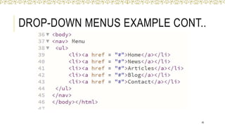
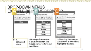
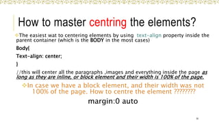
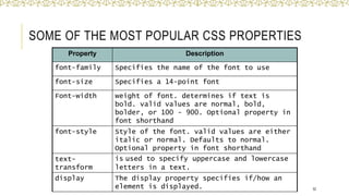
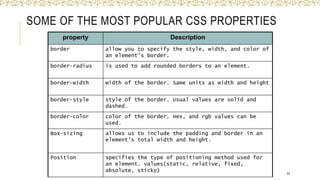
CHAPTER 4
INTRODUCTION
TO CASCADING
STYLE SHEETS
(CSS) - Part 2
IT 210
Web-Based Design
1
O B J E C T I V E S
By the end of this chapter, you’ll be able to:
Specify element backgrounds and colors.
 Understand the box model and how to control margins, borders and
padding.
 Use style sheets to separate the presentation from the content.
2
OUTLINES FOR PART 2
Backgrounds.
 Element Dimensions
 Box Model and Text Flow.
 Drop-Down Menus.
3
BACKGROUNDS
o CSS can control the backgrounds of block-level elements by
adding:
 Colors
 Images
o Example (4) adds a corporate logo to the bottom-right
corner of the document. This logo stays fixed in the corner
even when the user scrolls up or down the screen.
4
BACKGROUNDS
EXAMPLE (4)
5
BACKGROUNDS
EXAMPLE (4)
6
Fig. 4.11 | Adding background images and indentation
BACKGROUNDS
Value Description Value
background-color Specifies the background color to
be used
RGB format
(decimal or hex)
background-image Specifies URL background
images to be used
URL
background-
position
Specifies the position of the
background images
top, bottom,
center, left and
right
vertical ,
horizontal
background-size Specifies the size of the
background images 7
BACKGROUNDS
Value Description Value
background-repeat Specifies how to repeat the
background images
no-repeat,
repeat(default),
repeat-x
(horizontally),
repeat-y(vertically)
background-attachment Specifies whether the
background images are
fixed or scrolls with the
rest of the page
Scroll (default),
fixed
8
ELEMENT DIMENSIONS
 CSS rules can specify the actual dimensions of each
page element.
 Example (5) demonstrates how to set the
dimensions of elements.
9
ELEMENT DIMENSIONS
EXAMPLE (5)
10
ELEMENT DIMENSIONS
EXAMPLE (5)
11
ELEMENT DIMENSIONS
EXAMPLE (5) IN THE BROWSER
12
ELEMENT DIMENSIONS
Specifying the width and height of an Element
 Dimensions of elements on a page can be set with
CSS by using properties height and width
13
ELEMENT DIMENSIONS
Overflow Property and Scroll Bars
Problem with setting both vertical and horizontal dimensions
of an element
 Content might sometimes exceed the set boundaries; in
which case the element must be made large enough for all
the content to fit.
 Can set the overflow property to scroll, which adds scroll
bars if the text overflows the boundaries set for it.
• The overflow property can be set to display, hide, or scroll,
and dictates how HTML will render content that overflows
its parent’s content area. 14
Fig. 4.13 | Box model for block-level elements.
BOX MODEL
15
BOX MODEL
• The box model comprises a set of properties used to create
space around and between HTML elements.
• The height and width of a content area can be set in pixels or
percentage.
• Borders surround the content area and padding of an
element. The color, style, and thickness of a border can be
set with CSS properties.
 border is controlled using the properties:
 border-width: thin, medium or thick
 border-color:
 border-style: none, hidden, dotted, dashed, solid, double, groove,
ridge, inset and outset 16
BOX MODEL
• Padding is the space between the content area and the border. It can be
set in pixels or percent.
• Padding be set for each side of the box by using padding-top,
padding-right, padding-bottom, and padding-left
• P { padding: 40px 60 px 30px 40px;}
17
BOX MODEL
• Margin is the amount of spacing outside of an element’s border.
• Margins for individual sides of an element can be specified by
using margin-top, margin-right, margin-bottom and margin-left
18
BOX MODEL AND TEXT FLOW
EXAMPLE (5)
19
BOX MODEL AND TEXT FLOW
EXAMPLE (5) IN THE BROWSER
20
BOX MODEL AND TEXT FLOW
EXAMPLE (6)
21
BOX MODEL AND TEXT FLOW
EXAMPLE (6)
22
Fig. 4.14 | Borders of block-level elements.
BOX MODEL AND TEXT FLOW
EXAMPLE (6)
23
WITHOUT THE CSS BOX-SIZING
PROPERTY
By default, the width and height of an element is calculated like this:
width + padding + border = actual width
height + padding + border = actual height
This means: When you set the width/height of an element, the
element often appears bigger than you have set (because the
element's border and padding are added to the element's specified
width/height).
24
WITHOUT THE CSS BOX-SIZING
PROPERTY
The following illustration shows two <div> elements with the same specified width and height:
25
.div1 {
width: 300px;
height: 100px;
border: 1px solid blue;
}
.div2 {
width: 300px;
height: 100px;
padding: 50px;
border: 1px solid red;
}
WITH THE CSS BOX-SIZING PROPERTY
The box-sizing property allows us to include the padding and border in an
element's total width and height.
If you set box-sizing: border-box; on an element padding and border are
included in the width and height:
26
.div1 {
width: 300px;
height: 100px;
border: 1px solid blue;
box-sizing: border-box;
}
.div2 {
width: 300px;
height: 100px;
padding: 50px;
border: 1px solid red;
box-sizing: border-box;
}
CSS FOR FORM ELEMENTS
27
HTML Code:
Output:
CSS FOR FORM ELEMENTS
28
Same HTML Code with this
output:
How?
CSS FOR FORM ELEMENTS
29
CSS code:
THANK YOU
30
EXTRA SLIDES
31
THE FLOW OF ELEMENTS
A browser will render the elements of an HTML document that
has no CSS from left to right, top to bottom, in the same order as
they exist in the document. This is called the flow of elements in
HTML.
CSS includes properties that change how a browser positions
elements. These properties specify where an element is located
on a page, if the element can share lines with other elements, and
other related attributes.
properties for adjusting the position of HTML elements in the
browser:
• position
• display
• z-index 32
FLOATING
Floating Elements:
allows you to move an element to one side of the screen;
other content in the document then flows around the floated
element.
33
EXAMPLE (7) FLOATING ELEMENTS
34
EXAMPLE (7) FLOATING ELEMENTS
35
POSITION
36
Block-level elements like these boxes create a block the full width
of their parent elements, and they prevent other elements from
appearing in the same horizontal space. The boxes in the image
were created with the following CSS:
.boxes {
width: 120px;
height: 70px;
}
and the following HTML:
<div class="boxes"></div>
POSITION: RELATIVE
allows you to position an element relative to its default static position on
the web page.
.box-bottom { background-color: DeepSkyBlue; position: relative; }
Although the code in the example above instructs the browser to expect
a relative positioning of the div, it does not specify where the div should
be positioned on the page.
.box-bottom { background-color: DeepSkyBlue; position: relative; top:
20px; eft: 50px; }
In the example above, the <div> has been positioned using two of the
four offset properties. The valid offset properties are: top - moves the
element down, bottom - moves the element up, left - moves the element
37
POSITION: ABSOLUTE
all other elements on the page will ignore the absolute
element and act like it is not present on the page. The
element will be positioned relative to its closest positioned
parent element.
.box-bottom { background-color: DeepSkyBlue; position:
absolute; top: 20px; left: 50px; }
In the example above, the .box-bottom <div> will be moved
down and right from the top left corner of the view. If offset
properties weren’t specified, the top box would be entirely
covered by the bottom box.
The bottom box in this image (colored blue) is displaced from
the top left corner of its container. It is 20 pixels lower and 50
pixels to the right of the top box. 38
POSITION
Value Description
Static the default value (it does not need to be specified)
relative This value allows you to position an element relative to its
default static position on the web page.
absolute When an element’s position is set to absolute all other elements
on the page will ignore the absolute element and act like it is
not present on the page. The element will be positioned relative
to its closest positioned parent element.
fixed The element is positioned relative to the browser window
sticky The element is positioned based on the user's scroll position A
sticky element toggles between relative and fixed, depending on
the scroll position. It is positioned relative until a given offset
position is met in the viewport - then it "sticks" in place (like
39
EXAMPLE OF POSITION
(FIXED AND STICKY)
40
EXAMPLE OF POSITION CONT..
41
DISPLAY
Display proprieties
- display: inline, block, inline-block and none
42
Element
1
Element
2
Element
3
Element 1
Element 3
Element 1
Element 2
Element 3
{display: inline;}
{display: block;}
Element 2 {display: none;}
Element
1
Element
2
Element
3
{display: inline-block;}
WHAT IS THE DIFFERENT BETWEEN INLINE & INLINE-BLOCK?
Display: inline-block: allows to set a width and height on the element.
Also, the top and bottom margins/paddings are respected
Display: inline ignore width , height , margins and paddings .
43
.Box1 {
display: inline;
width: 100px;
height: 100px;
padding: 5px;
border: 1px solid blue;
background-color: grey;
}
.Box2{
display: inline-block;
width: 100px;
height: 100px;
padding: 5px;
border: 1px solid blue;
background-color: yellow;
}
box
1
box2
VISIBILITY
Visibility proprieties
- Visibility: visible | hidden
44
Element 1
Element 2
Element 3
{Visibility : visible;} Element 2 {Visibility : hidden;}
Element 1
Element 3
DROP-DOWN MENUS
 Drop-down menus are a good way to provide navigation
links without using a lot of screen space. In this section,
we take a second look at the:
:hover pseudoclass
 used to apply styles to an element when the mouse
cursor is over it.
display property
 allows a programmer to decide if an element is displayed
as a block element, inline element, or is not rendered at
all (none).
45
DROP-DOWN MENUS EXAMPLE
46
DROP-DOWN MENUS EXAMPLE CONT..
47
DROP-DOWN MENUS EXAMPLE CONT..
48
a) A
collapsed
menu
DROP-DOWN MENUS
EXAMPLE (8) IN THE BROWSER
49
b) A drop-down menu
is displayed when the
mouse cursor is hovered
over Menu
c) Hovering the mouse
cursor over a menu link
highlights the link
A B C
How to master centring the elements?
The easiest wat to centering elements by using text-align property inside the
parent container (which is the BODY in the most cases)
Body{
Text-align: center;
}
//this will center all the paragraphs ,images and everything inside the page as
long as they are inline, or block element and their width is 100% of the page.
In case we have a block element, and their width was not
100% of the page. How to centre the element ????????
margin:0 auto
50
SUMMARY
o This chapter introduced you to Cascading Style Sheet
Rules associated with color on web pages.
o You configured inline styles, embedded styles, and
external styles.
o You applied CSS style rules to HTML, class, and id
selectors.
o You are able to submit your CSS to the W3C CSS
Validation test.
51
SOME OF THE MOST POPULAR CSS PROPERTIES
52
Property Description
font-family Specifies the name of the font to use
font-size Specifies a 14-point font
Font-width weight of font. determines if text is
bold. valid values are normal, bold,
bolder, or 100 - 900. Optional property in
font shorthand
font-style Style of the font. valid values are either
italic or normal. Defaults to normal.
Optional property in font shorthand
text-
transform
is used to specify uppercase and lowercase
letters in a text.
display The display property specifies if/how an
element is displayed.
SOME OF THE MOST POPULAR CSS PROPERTIES
53
property Description
border allow you to specify the style, width, and color of
an element's border.
border-radius is used to add rounded borders to an element.
border-width width of the border. Same units as width and height
border-style style of the border. Usual values are solid and
dashed.
border-color color of the border. Hex, and rgb values can be
used.
Box-sizing allows us to include the padding and border in an
element's total width and height.
Position specifies the type of positioning method used for
an element. values(static, relative, fixed,
absolute, sticky)

Lecture 10 CSS part 2.pptxvvvvvvvvvvvvvv

  • 1.
    CHAPTER 4 INTRODUCTION TO CASCADING STYLESHEETS (CSS) - Part 2 IT 210 Web-Based Design 1
  • 2.
    O B JE C T I V E S By the end of this chapter, you’ll be able to: Specify element backgrounds and colors.  Understand the box model and how to control margins, borders and padding.  Use style sheets to separate the presentation from the content. 2
  • 3.
    OUTLINES FOR PART2 Backgrounds.  Element Dimensions  Box Model and Text Flow.  Drop-Down Menus. 3
  • 4.
    BACKGROUNDS o CSS cancontrol the backgrounds of block-level elements by adding:  Colors  Images o Example (4) adds a corporate logo to the bottom-right corner of the document. This logo stays fixed in the corner even when the user scrolls up or down the screen. 4
  • 5.
  • 6.
    BACKGROUNDS EXAMPLE (4) 6 Fig. 4.11| Adding background images and indentation
  • 7.
    BACKGROUNDS Value Description Value background-colorSpecifies the background color to be used RGB format (decimal or hex) background-image Specifies URL background images to be used URL background- position Specifies the position of the background images top, bottom, center, left and right vertical , horizontal background-size Specifies the size of the background images 7
  • 8.
    BACKGROUNDS Value Description Value background-repeatSpecifies how to repeat the background images no-repeat, repeat(default), repeat-x (horizontally), repeat-y(vertically) background-attachment Specifies whether the background images are fixed or scrolls with the rest of the page Scroll (default), fixed 8
  • 9.
    ELEMENT DIMENSIONS  CSSrules can specify the actual dimensions of each page element.  Example (5) demonstrates how to set the dimensions of elements. 9
  • 10.
  • 11.
  • 12.
  • 13.
    ELEMENT DIMENSIONS Specifying thewidth and height of an Element  Dimensions of elements on a page can be set with CSS by using properties height and width 13
  • 14.
    ELEMENT DIMENSIONS Overflow Propertyand Scroll Bars Problem with setting both vertical and horizontal dimensions of an element  Content might sometimes exceed the set boundaries; in which case the element must be made large enough for all the content to fit.  Can set the overflow property to scroll, which adds scroll bars if the text overflows the boundaries set for it. • The overflow property can be set to display, hide, or scroll, and dictates how HTML will render content that overflows its parent’s content area. 14
  • 15.
    Fig. 4.13 |Box model for block-level elements. BOX MODEL 15
  • 16.
    BOX MODEL • Thebox model comprises a set of properties used to create space around and between HTML elements. • The height and width of a content area can be set in pixels or percentage. • Borders surround the content area and padding of an element. The color, style, and thickness of a border can be set with CSS properties.  border is controlled using the properties:  border-width: thin, medium or thick  border-color:  border-style: none, hidden, dotted, dashed, solid, double, groove, ridge, inset and outset 16
  • 17.
    BOX MODEL • Paddingis the space between the content area and the border. It can be set in pixels or percent. • Padding be set for each side of the box by using padding-top, padding-right, padding-bottom, and padding-left • P { padding: 40px 60 px 30px 40px;} 17
  • 18.
    BOX MODEL • Marginis the amount of spacing outside of an element’s border. • Margins for individual sides of an element can be specified by using margin-top, margin-right, margin-bottom and margin-left 18
  • 19.
    BOX MODEL ANDTEXT FLOW EXAMPLE (5) 19
  • 20.
    BOX MODEL ANDTEXT FLOW EXAMPLE (5) IN THE BROWSER 20
  • 21.
    BOX MODEL ANDTEXT FLOW EXAMPLE (6) 21
  • 22.
    BOX MODEL ANDTEXT FLOW EXAMPLE (6) 22
  • 23.
    Fig. 4.14 |Borders of block-level elements. BOX MODEL AND TEXT FLOW EXAMPLE (6) 23
  • 24.
    WITHOUT THE CSSBOX-SIZING PROPERTY By default, the width and height of an element is calculated like this: width + padding + border = actual width height + padding + border = actual height This means: When you set the width/height of an element, the element often appears bigger than you have set (because the element's border and padding are added to the element's specified width/height). 24
  • 25.
    WITHOUT THE CSSBOX-SIZING PROPERTY The following illustration shows two <div> elements with the same specified width and height: 25 .div1 { width: 300px; height: 100px; border: 1px solid blue; } .div2 { width: 300px; height: 100px; padding: 50px; border: 1px solid red; }
  • 26.
    WITH THE CSSBOX-SIZING PROPERTY The box-sizing property allows us to include the padding and border in an element's total width and height. If you set box-sizing: border-box; on an element padding and border are included in the width and height: 26 .div1 { width: 300px; height: 100px; border: 1px solid blue; box-sizing: border-box; } .div2 { width: 300px; height: 100px; padding: 50px; border: 1px solid red; box-sizing: border-box; }
  • 27.
    CSS FOR FORMELEMENTS 27 HTML Code: Output:
  • 28.
    CSS FOR FORMELEMENTS 28 Same HTML Code with this output: How?
  • 29.
    CSS FOR FORMELEMENTS 29 CSS code:
  • 30.
  • 31.
  • 32.
    THE FLOW OFELEMENTS A browser will render the elements of an HTML document that has no CSS from left to right, top to bottom, in the same order as they exist in the document. This is called the flow of elements in HTML. CSS includes properties that change how a browser positions elements. These properties specify where an element is located on a page, if the element can share lines with other elements, and other related attributes. properties for adjusting the position of HTML elements in the browser: • position • display • z-index 32
  • 33.
    FLOATING Floating Elements: allows youto move an element to one side of the screen; other content in the document then flows around the floated element. 33
  • 34.
  • 35.
  • 36.
    POSITION 36 Block-level elements likethese boxes create a block the full width of their parent elements, and they prevent other elements from appearing in the same horizontal space. The boxes in the image were created with the following CSS: .boxes { width: 120px; height: 70px; } and the following HTML: <div class="boxes"></div> <div class="boxes"></div>
  • 37.
    POSITION: RELATIVE allows youto position an element relative to its default static position on the web page. .box-bottom { background-color: DeepSkyBlue; position: relative; } Although the code in the example above instructs the browser to expect a relative positioning of the div, it does not specify where the div should be positioned on the page. .box-bottom { background-color: DeepSkyBlue; position: relative; top: 20px; eft: 50px; } In the example above, the <div> has been positioned using two of the four offset properties. The valid offset properties are: top - moves the element down, bottom - moves the element up, left - moves the element 37
  • 38.
    POSITION: ABSOLUTE all otherelements on the page will ignore the absolute element and act like it is not present on the page. The element will be positioned relative to its closest positioned parent element. .box-bottom { background-color: DeepSkyBlue; position: absolute; top: 20px; left: 50px; } In the example above, the .box-bottom <div> will be moved down and right from the top left corner of the view. If offset properties weren’t specified, the top box would be entirely covered by the bottom box. The bottom box in this image (colored blue) is displaced from the top left corner of its container. It is 20 pixels lower and 50 pixels to the right of the top box. 38
  • 39.
    POSITION Value Description Static thedefault value (it does not need to be specified) relative This value allows you to position an element relative to its default static position on the web page. absolute When an element’s position is set to absolute all other elements on the page will ignore the absolute element and act like it is not present on the page. The element will be positioned relative to its closest positioned parent element. fixed The element is positioned relative to the browser window sticky The element is positioned based on the user's scroll position A sticky element toggles between relative and fixed, depending on the scroll position. It is positioned relative until a given offset position is met in the viewport - then it "sticks" in place (like 39
  • 40.
  • 41.
  • 42.
    DISPLAY Display proprieties - display:inline, block, inline-block and none 42 Element 1 Element 2 Element 3 Element 1 Element 3 Element 1 Element 2 Element 3 {display: inline;} {display: block;} Element 2 {display: none;} Element 1 Element 2 Element 3 {display: inline-block;}
  • 43.
    WHAT IS THEDIFFERENT BETWEEN INLINE & INLINE-BLOCK? Display: inline-block: allows to set a width and height on the element. Also, the top and bottom margins/paddings are respected Display: inline ignore width , height , margins and paddings . 43 .Box1 { display: inline; width: 100px; height: 100px; padding: 5px; border: 1px solid blue; background-color: grey; } .Box2{ display: inline-block; width: 100px; height: 100px; padding: 5px; border: 1px solid blue; background-color: yellow; } box 1 box2
  • 44.
    VISIBILITY Visibility proprieties - Visibility:visible | hidden 44 Element 1 Element 2 Element 3 {Visibility : visible;} Element 2 {Visibility : hidden;} Element 1 Element 3
  • 45.
    DROP-DOWN MENUS  Drop-downmenus are a good way to provide navigation links without using a lot of screen space. In this section, we take a second look at the: :hover pseudoclass  used to apply styles to an element when the mouse cursor is over it. display property  allows a programmer to decide if an element is displayed as a block element, inline element, or is not rendered at all (none). 45
  • 46.
  • 47.
  • 48.
  • 49.
    a) A collapsed menu DROP-DOWN MENUS EXAMPLE(8) IN THE BROWSER 49 b) A drop-down menu is displayed when the mouse cursor is hovered over Menu c) Hovering the mouse cursor over a menu link highlights the link A B C
  • 50.
    How to mastercentring the elements? The easiest wat to centering elements by using text-align property inside the parent container (which is the BODY in the most cases) Body{ Text-align: center; } //this will center all the paragraphs ,images and everything inside the page as long as they are inline, or block element and their width is 100% of the page. In case we have a block element, and their width was not 100% of the page. How to centre the element ???????? margin:0 auto 50
  • 51.
    SUMMARY o This chapterintroduced you to Cascading Style Sheet Rules associated with color on web pages. o You configured inline styles, embedded styles, and external styles. o You applied CSS style rules to HTML, class, and id selectors. o You are able to submit your CSS to the W3C CSS Validation test. 51
  • 52.
    SOME OF THEMOST POPULAR CSS PROPERTIES 52 Property Description font-family Specifies the name of the font to use font-size Specifies a 14-point font Font-width weight of font. determines if text is bold. valid values are normal, bold, bolder, or 100 - 900. Optional property in font shorthand font-style Style of the font. valid values are either italic or normal. Defaults to normal. Optional property in font shorthand text- transform is used to specify uppercase and lowercase letters in a text. display The display property specifies if/how an element is displayed.
  • 53.
    SOME OF THEMOST POPULAR CSS PROPERTIES 53 property Description border allow you to specify the style, width, and color of an element's border. border-radius is used to add rounded borders to an element. border-width width of the border. Same units as width and height border-style style of the border. Usual values are solid and dashed. border-color color of the border. Hex, and rgb values can be used. Box-sizing allows us to include the padding and border in an element's total width and height. Position specifies the type of positioning method used for an element. values(static, relative, fixed, absolute, sticky)