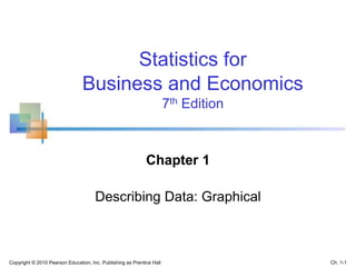
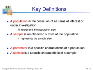
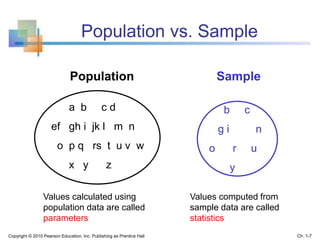
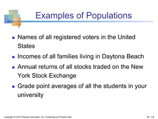
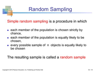
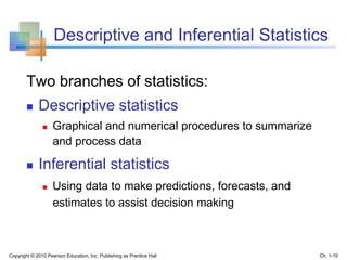
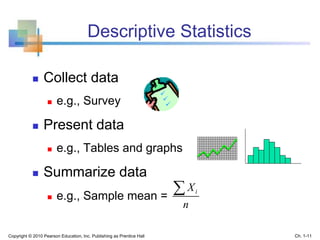
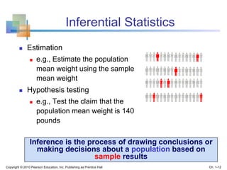
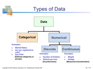
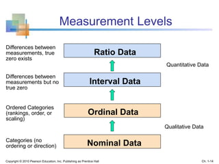
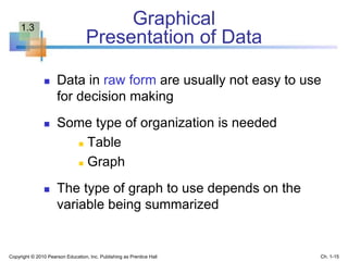
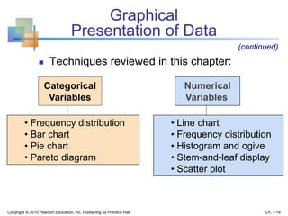
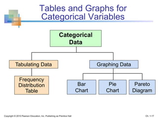
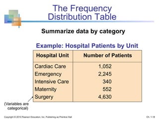
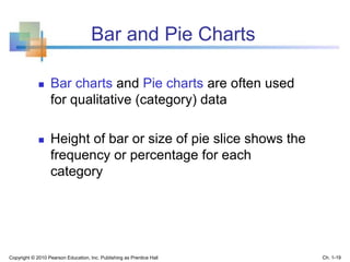
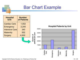
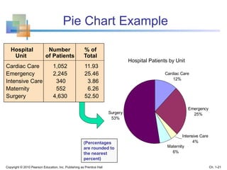
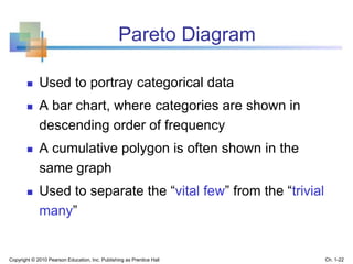
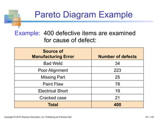
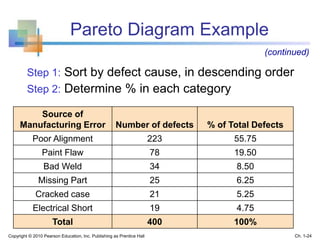
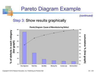
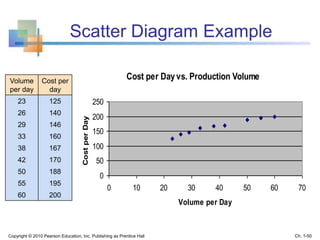
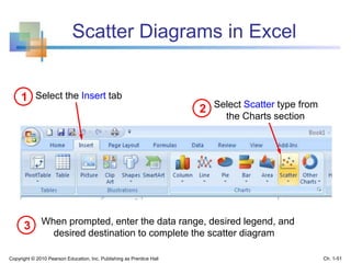
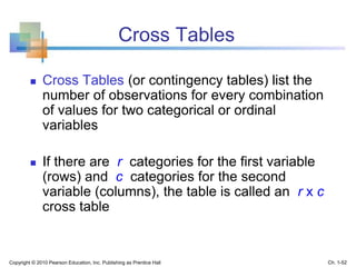
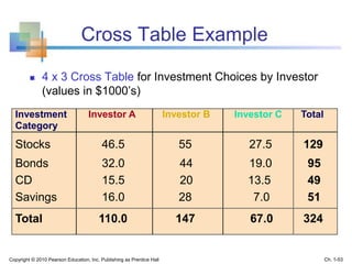
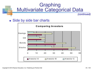
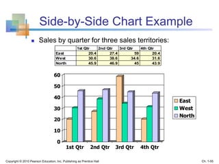
This document provides an overview of key concepts in descriptive statistics including graphical presentation of data. It discusses frequency distributions and different types of graphs used to describe categorical and numerical variables such as bar charts, pie charts, histograms, and scatter plots. Examples are provided to illustrate how to construct and interpret these various graphs. The goal is to explain how graphical displays of data can help summarize and convey information more clearly than raw numbers alone.
Introduction to statistical concepts specific to business and economics, focusing on understanding data classification and the importance of decision-making in uncertainty.
Discusses how decisions are based on incomplete information and the role of statistics in summarizing, analyzing, and interpreting data.
Key definitions including population, sample, parameter, and statistic, with further explanations on descriptive and inferential statistics.
Types of data and levels of measurement, stressing the importance of proper data definitions for effective statistical analysis.
Various graphical techniques for presenting data, including frequency distribution, bar charts, and pie charts, emphasizing their application to categorical and numerical data.
Definition and creation of frequency distributions and histograms, along with examples illustrating the process with sample data.
Methods for displaying data distribution using stem-and-leaf diagrams and ogives to depict cumulative frequencies.
Techniques for analyzing relationships among variables using scatter plots and cross tables, with emphasis on clarity in data presentation.Identifying common pitfalls in data presentation, with recommendations for ensuring clarity and accuracy in statistical displays.
A summary of key definitions and techniques covered in the chapter, reinforcing the importance of organized data for effective decision making.