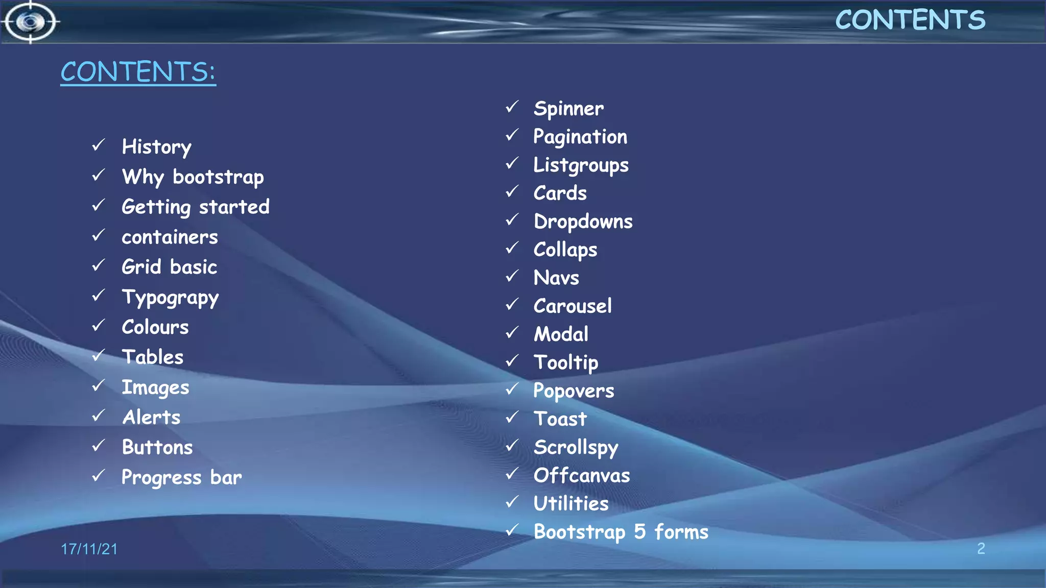
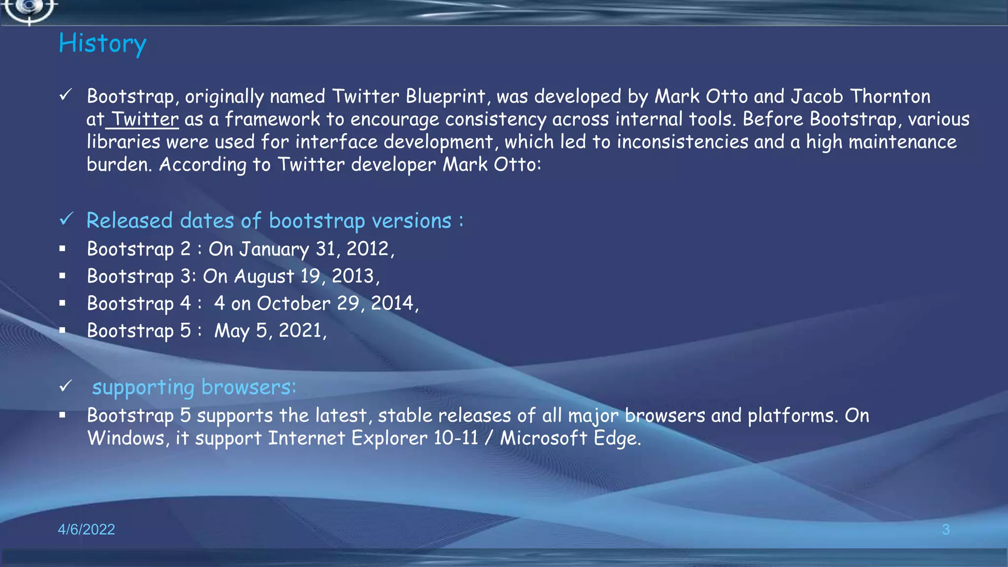
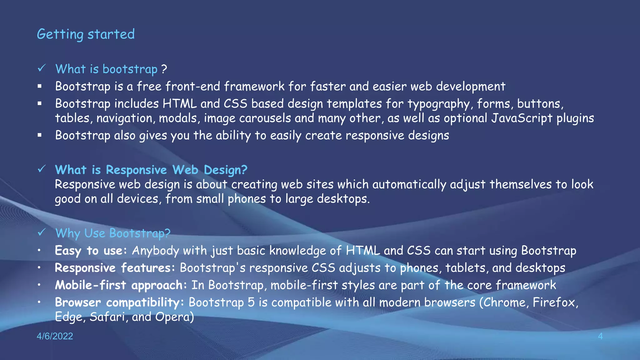
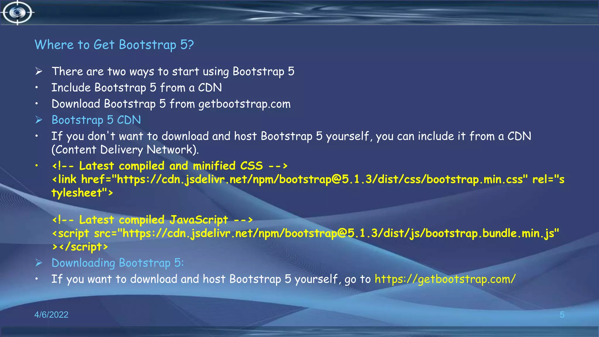
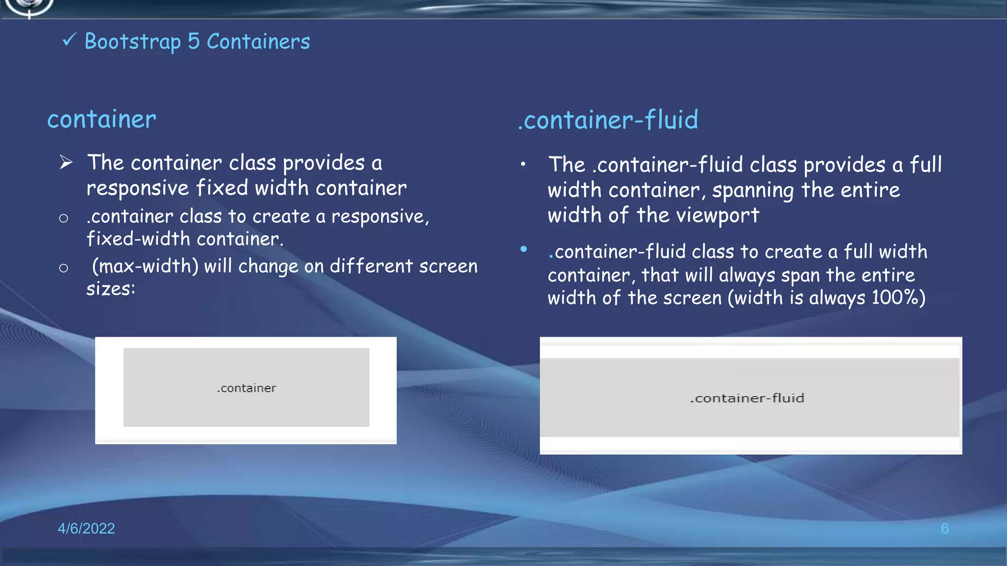
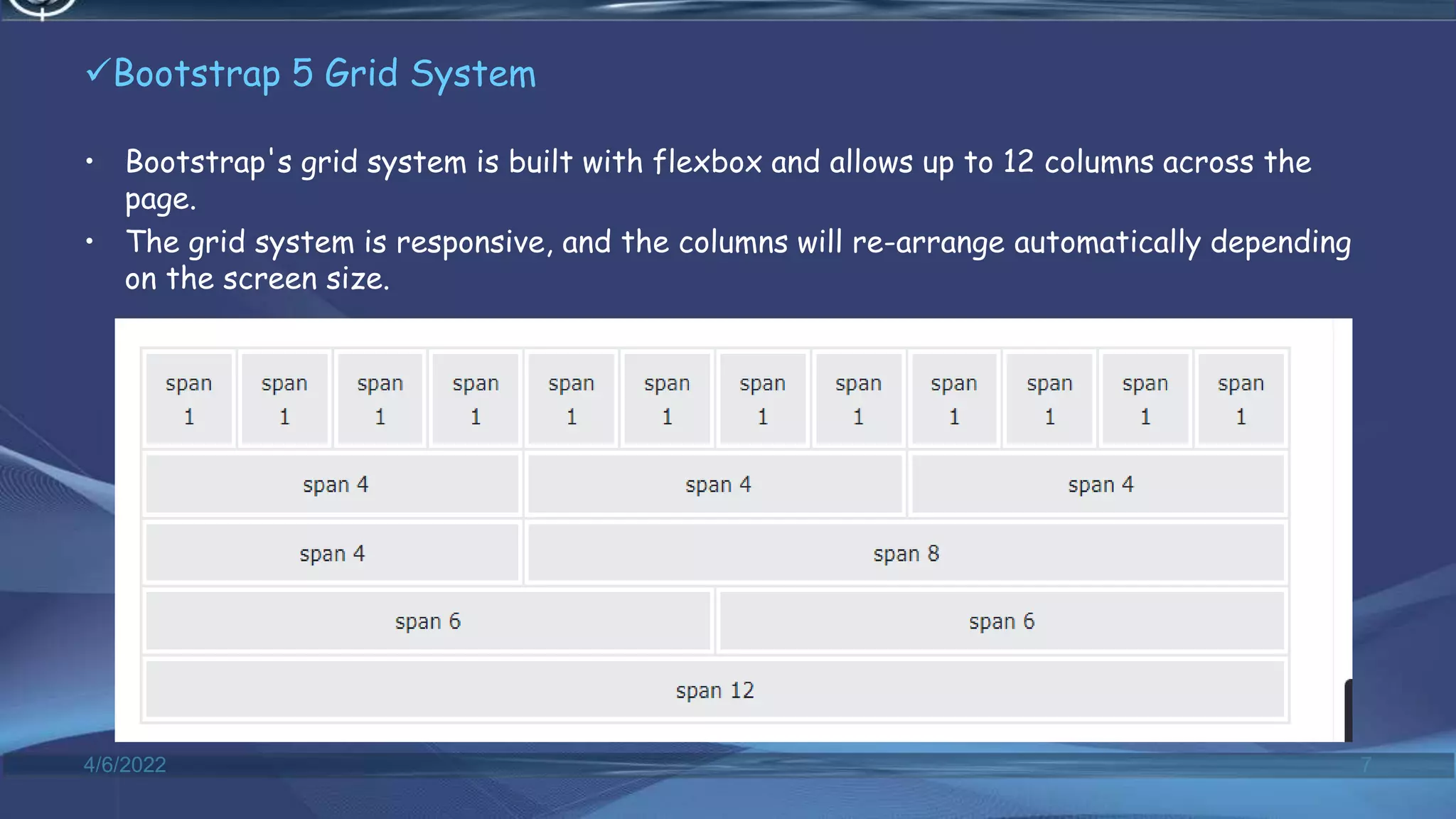
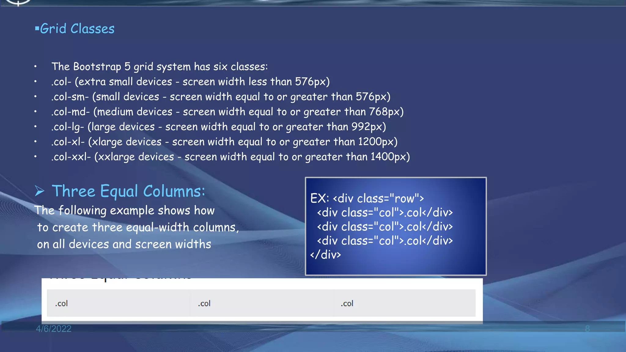
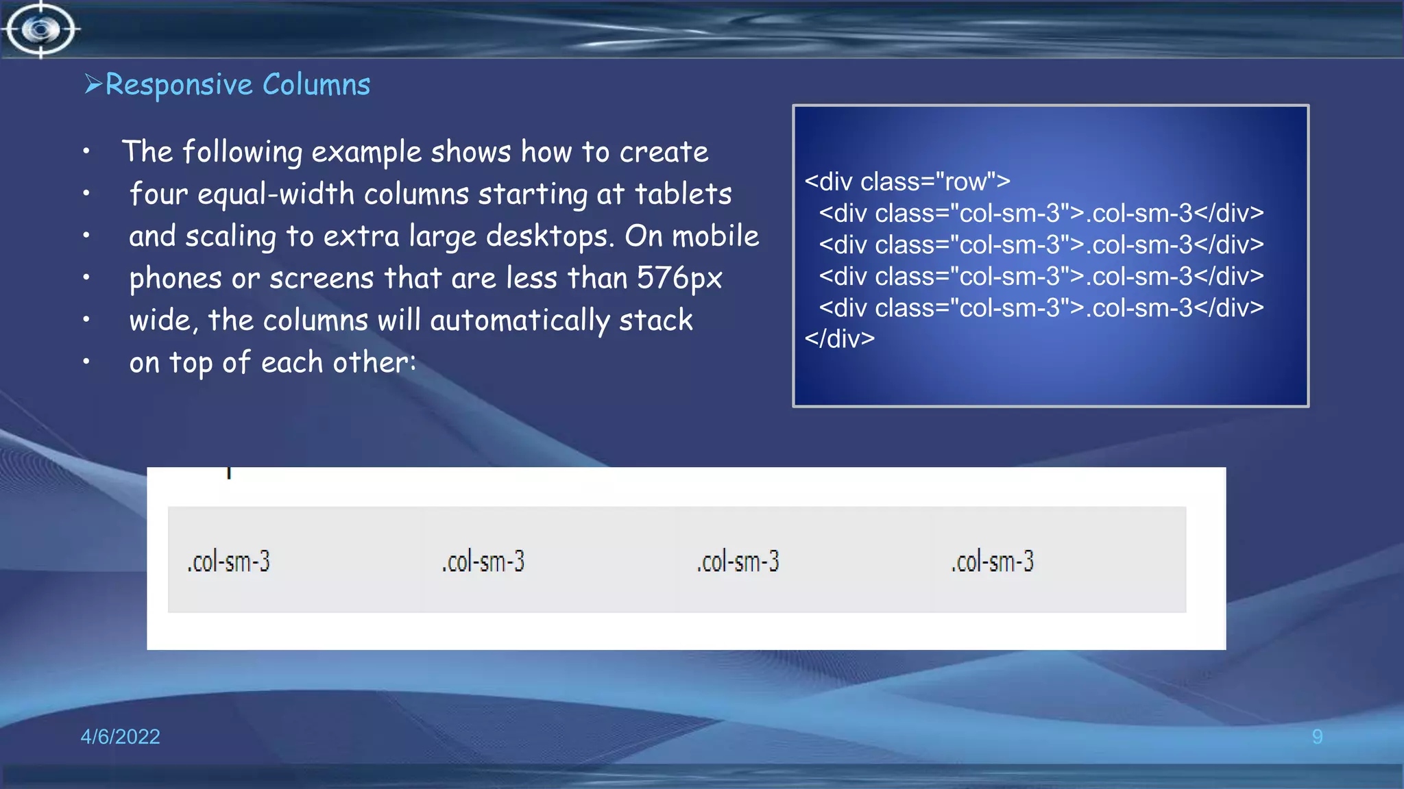
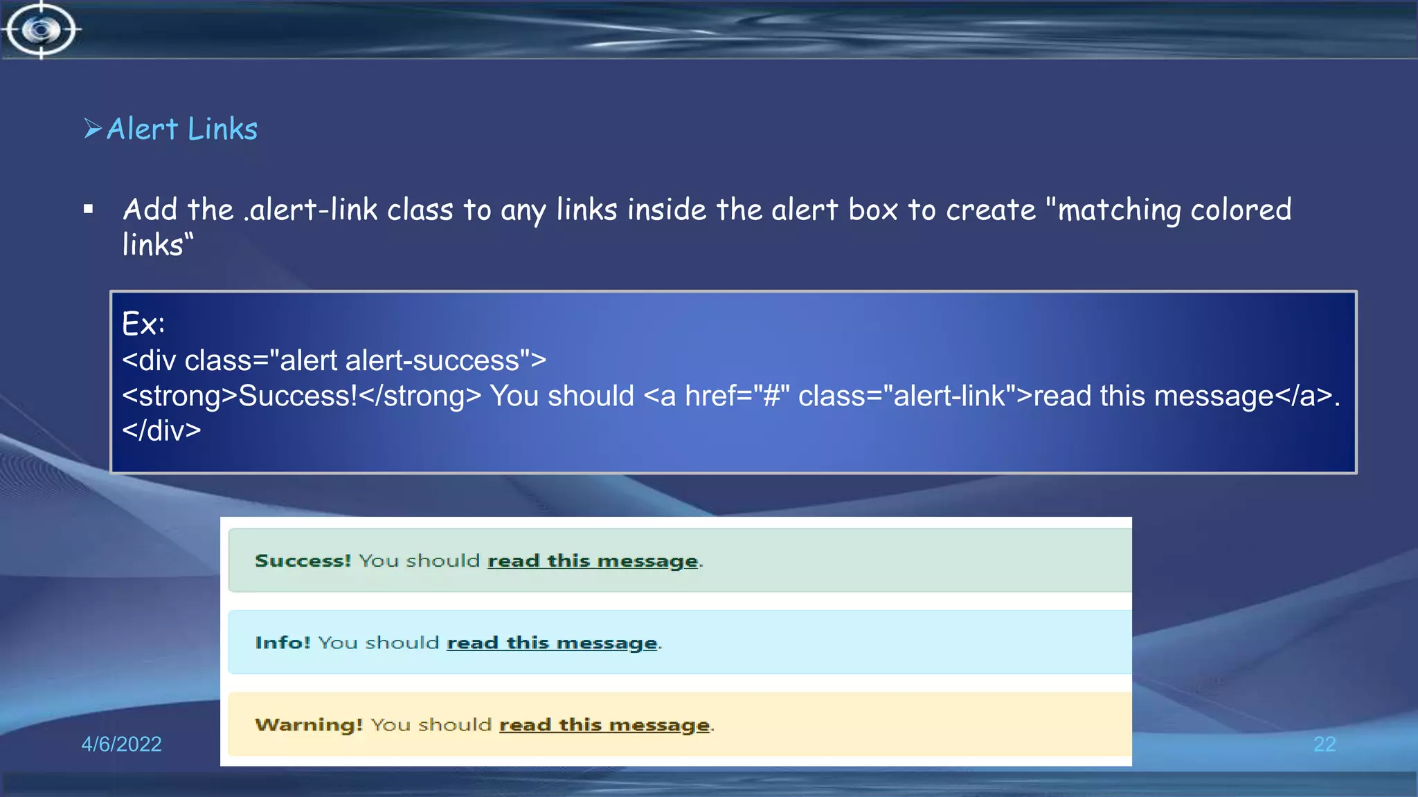
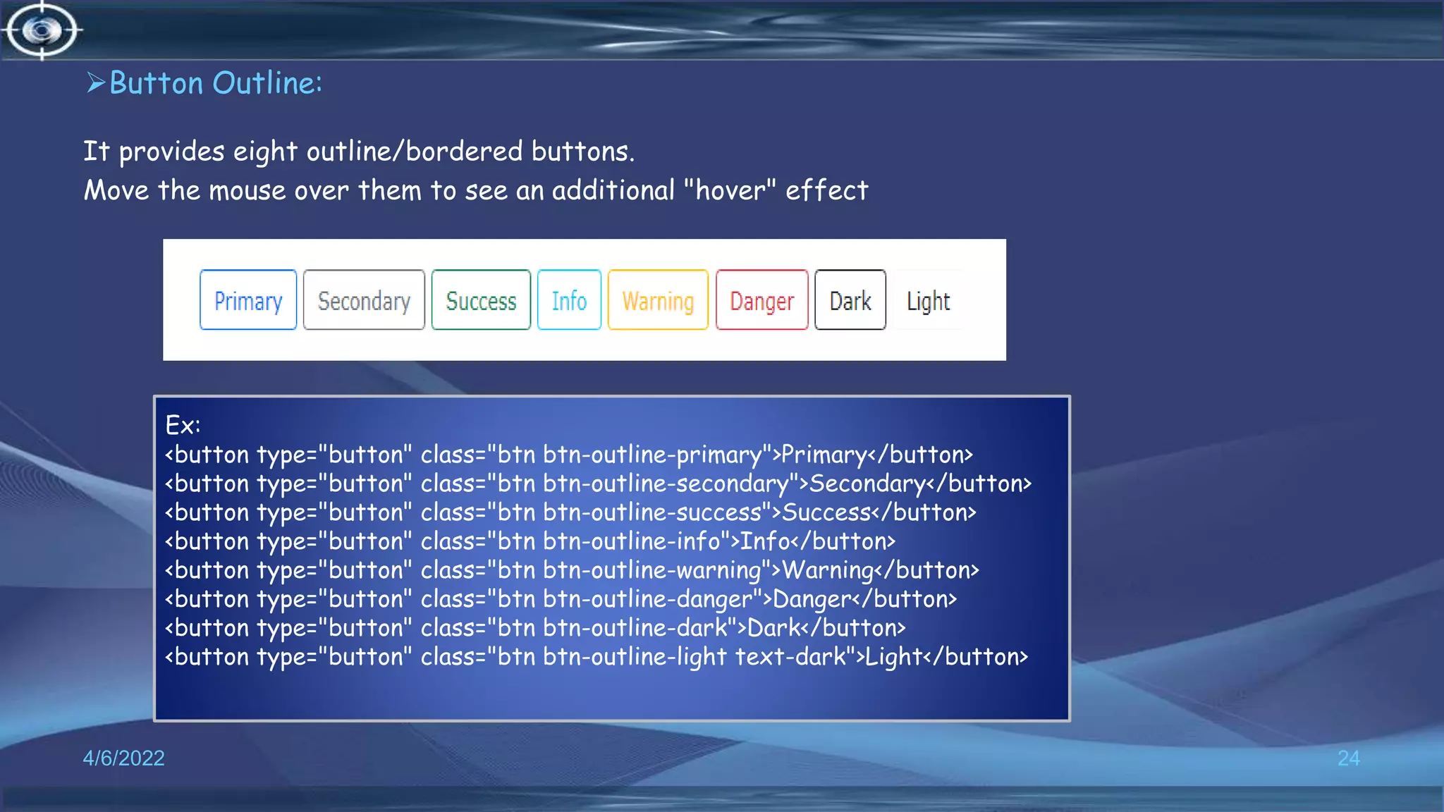
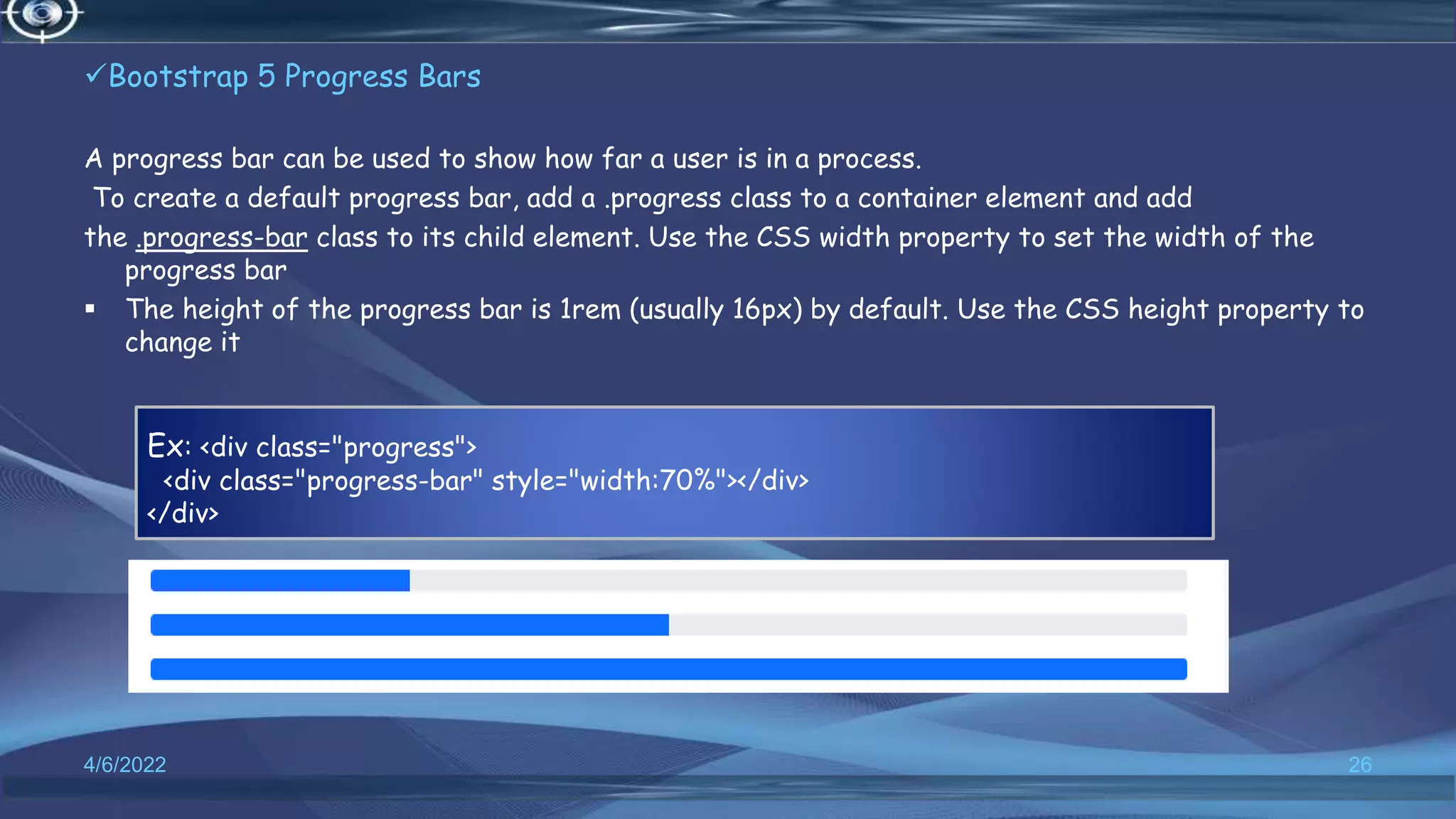
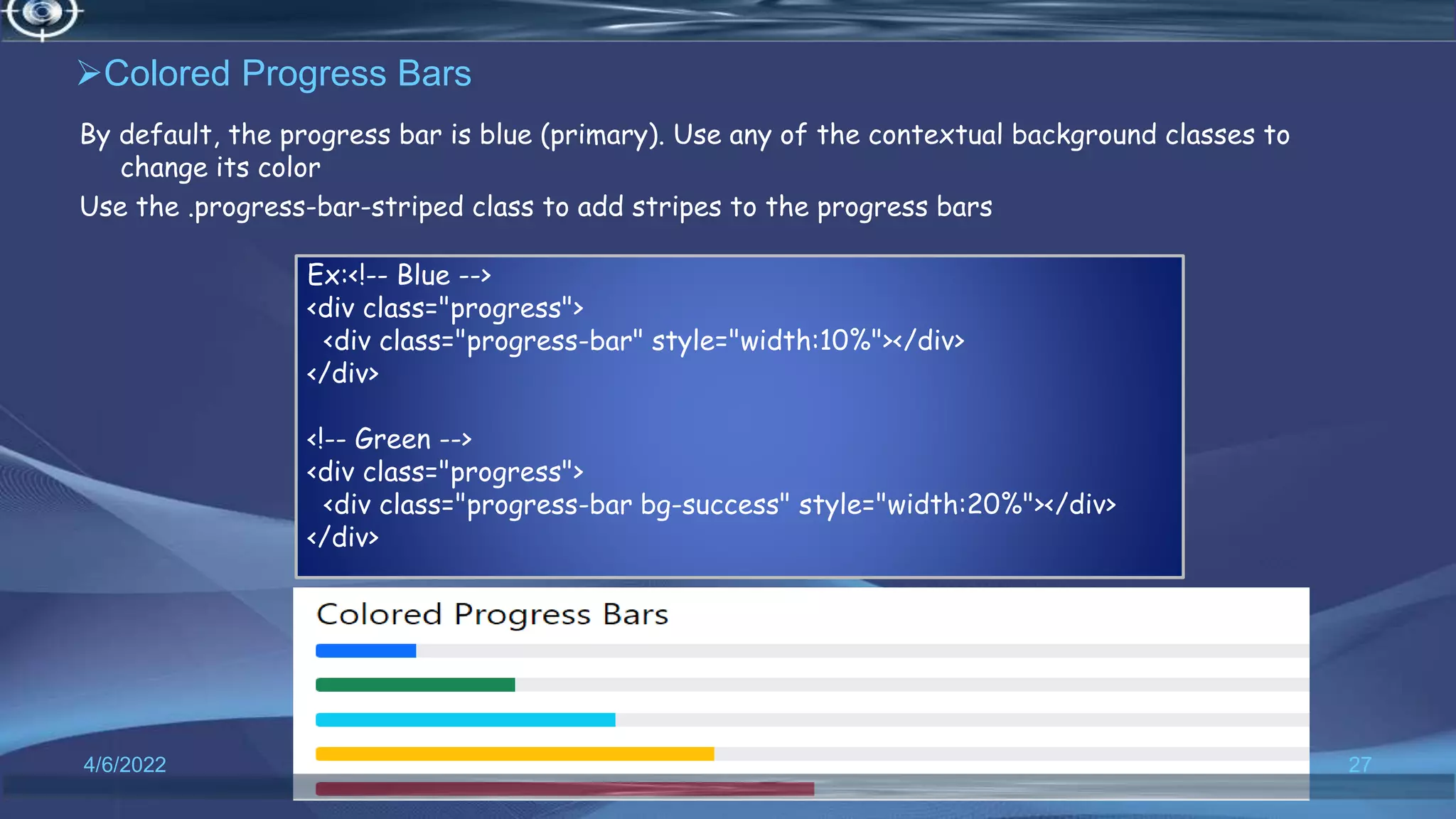
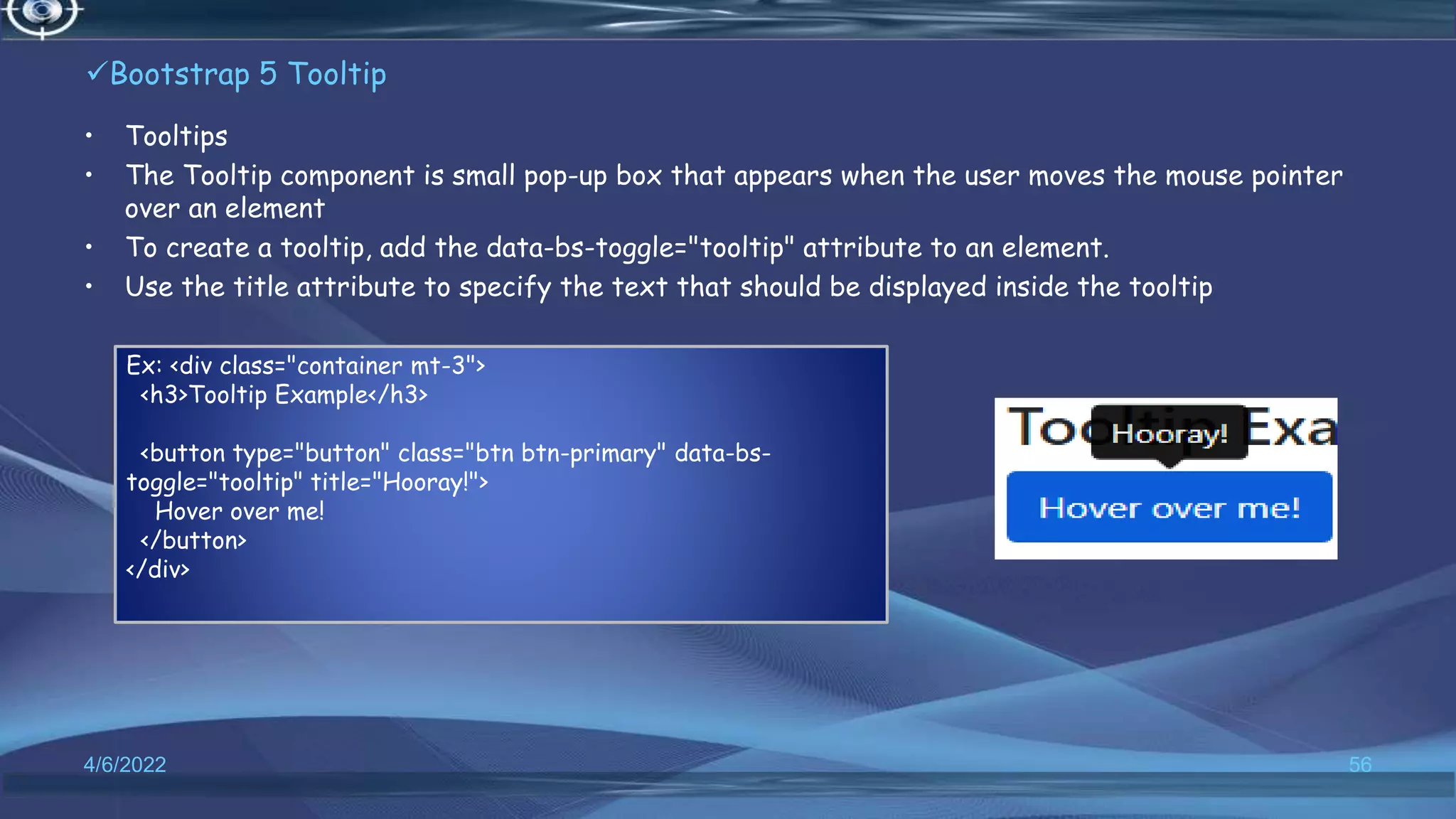
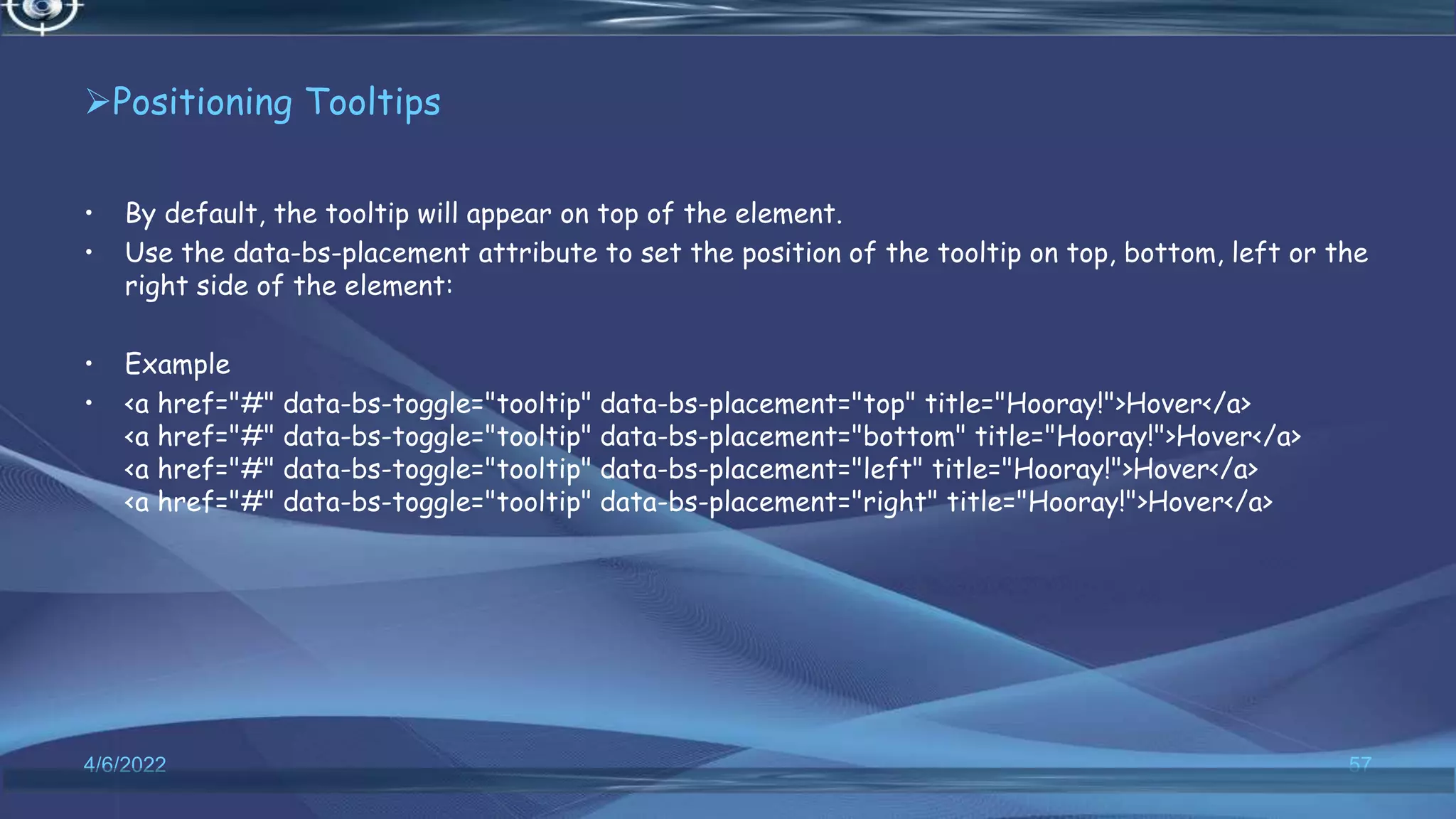
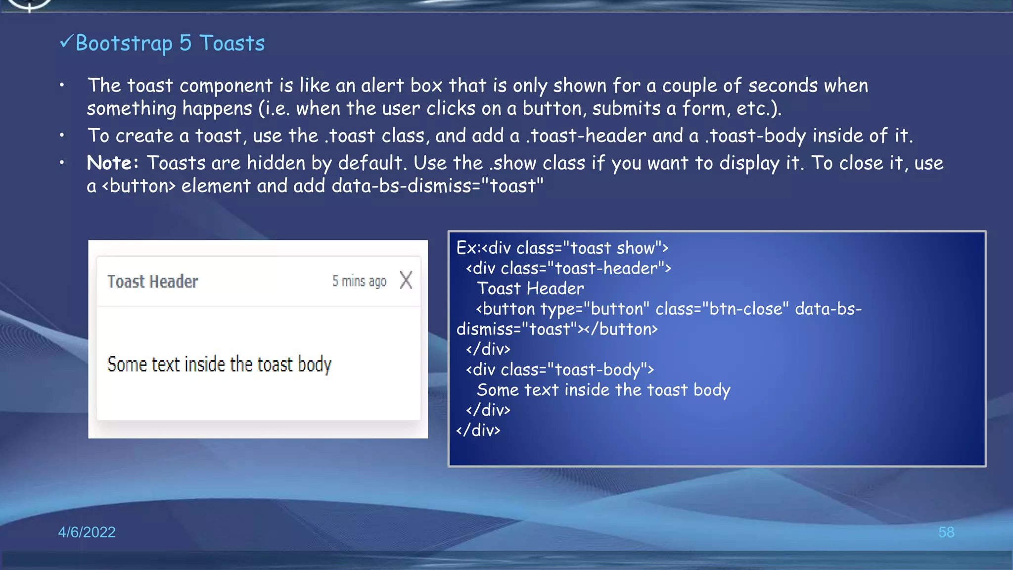
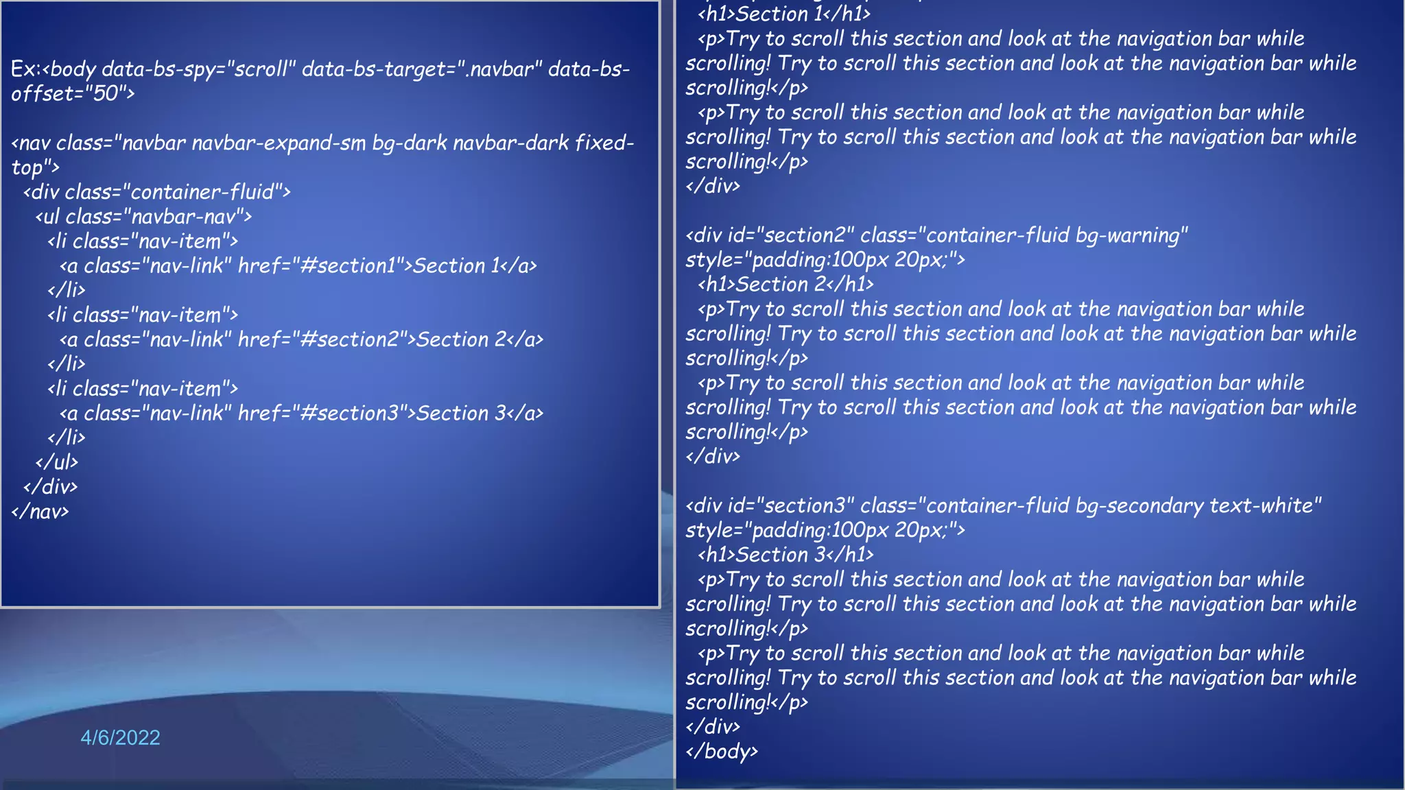
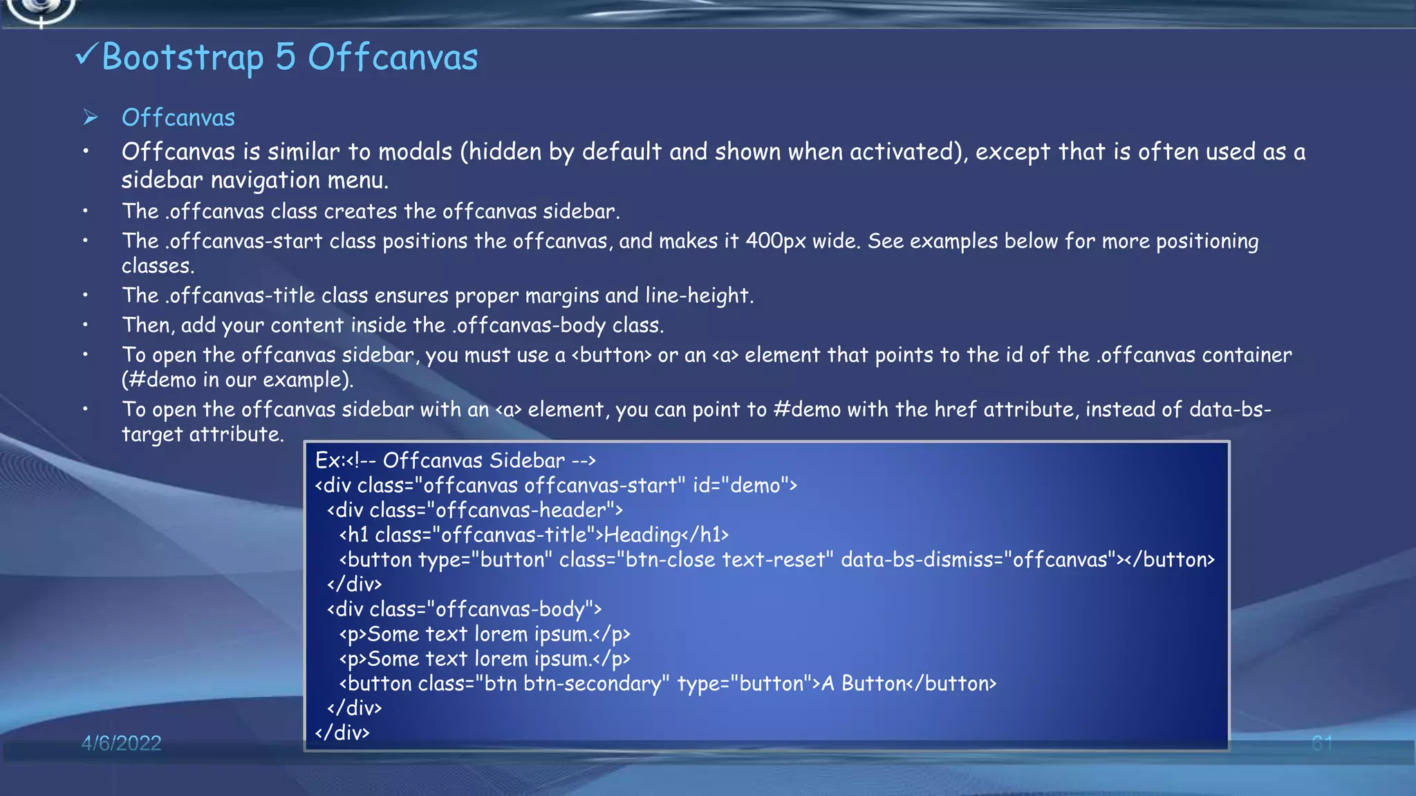
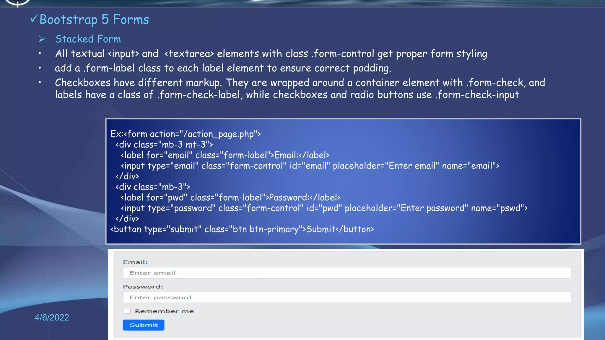
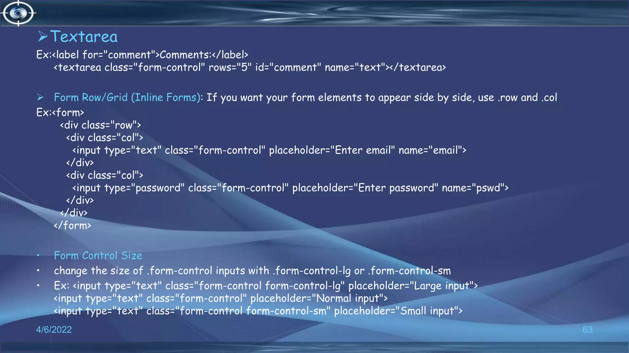
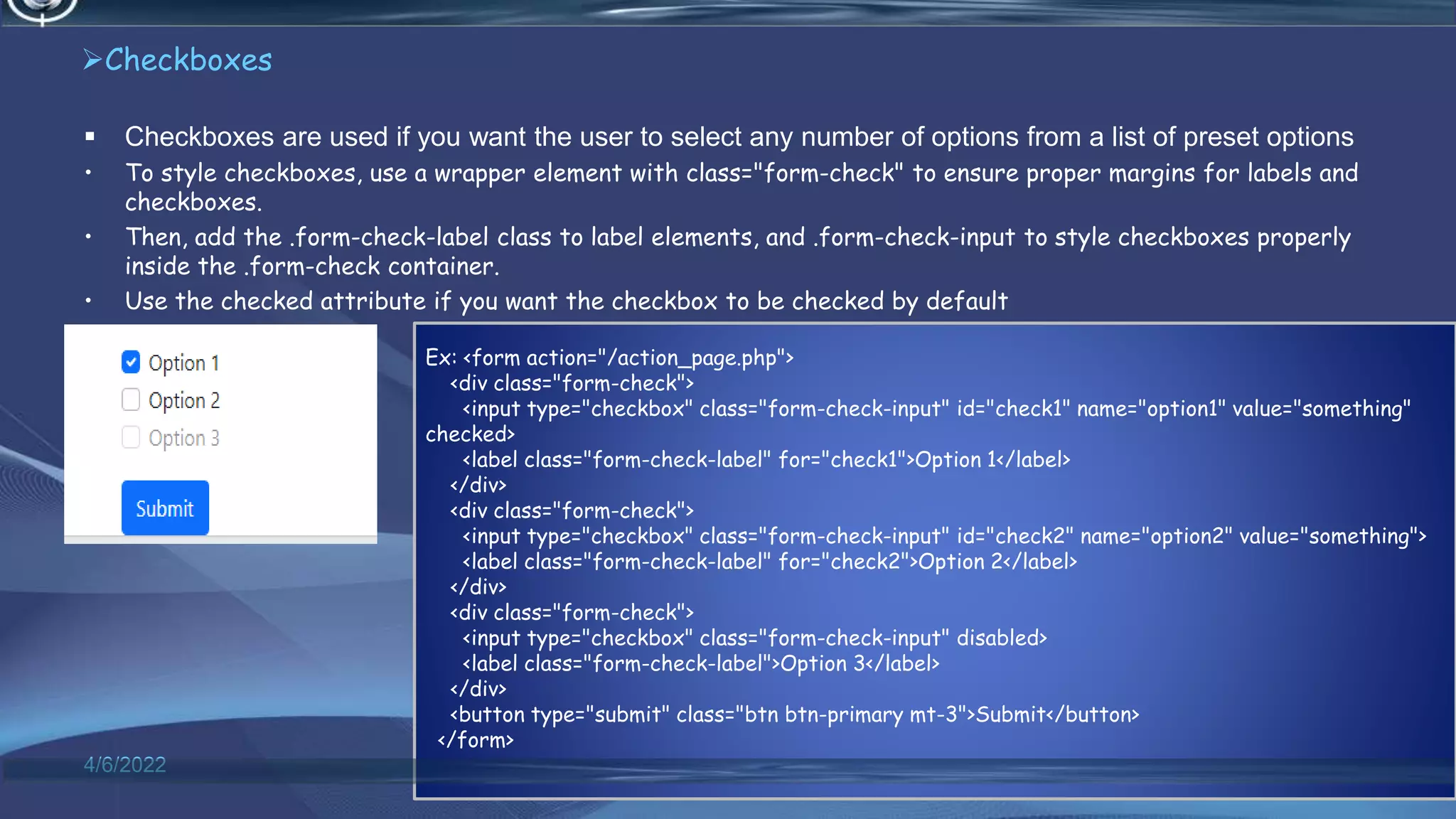
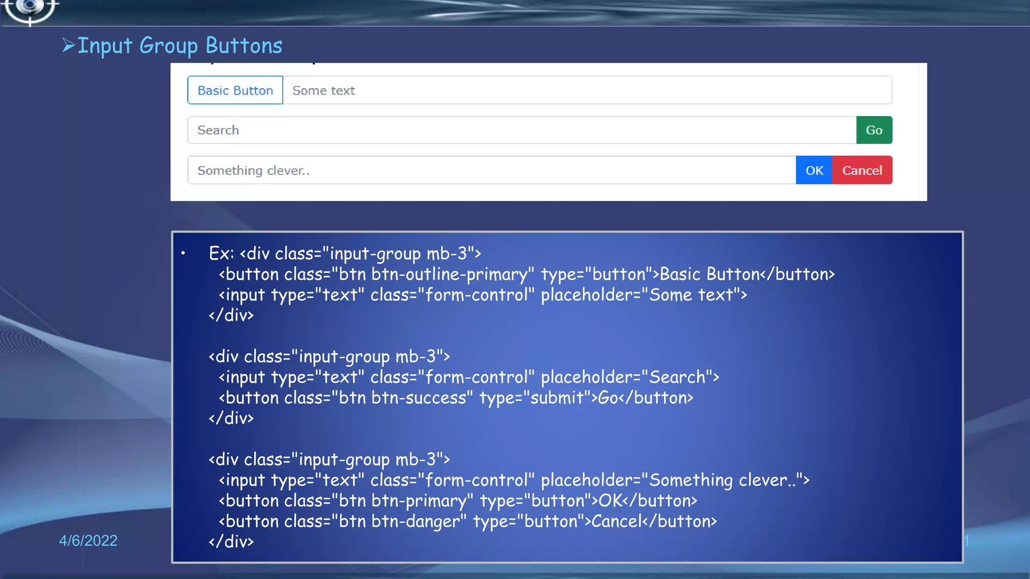
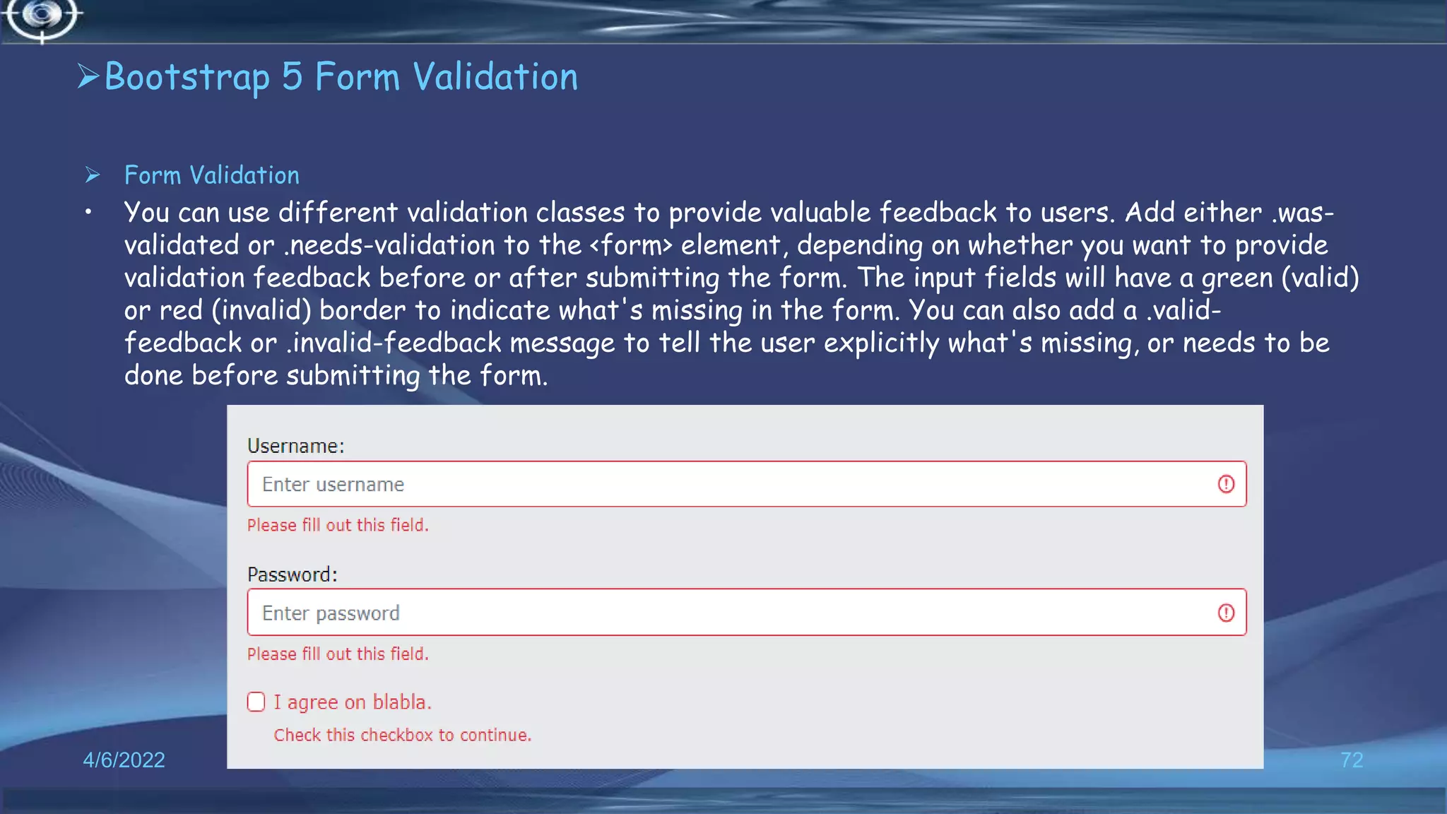
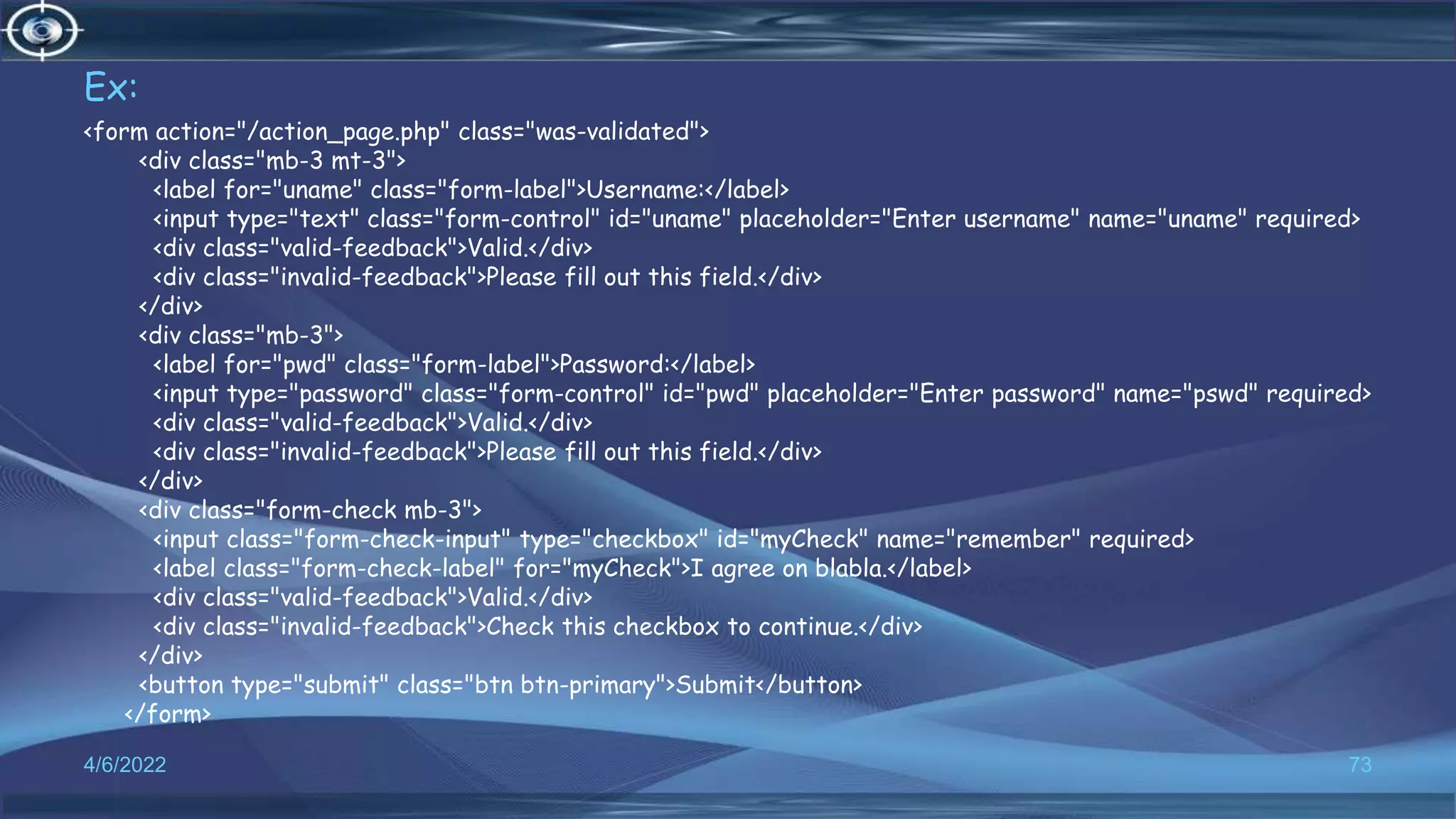
SlideShare a Scribd company logo
1 of 73
6 April 2022 www.snipe.co.in 1
SNIPE TEAM
01/12/2017
CONTENTS:
 History
 Why bootstrap
 Getting started
 containers
 Grid basic
 Typograpy
 Colours
 Tables
 Images
 Alerts
 Buttons
 Progress bar
 Spinner
 Pagination
 Listgroups
 Cards
 Dropdowns
 Collaps
 Navs
 Carousel
 Modal
 Tooltip
 Popovers
 Toast
 Scrollspy
 Offcanvas
 Utilities
 Bootstrap 5 forms
17/11/21 2
CONTENTS
History
 Bootstrap, originally named Twitter Blueprint, was developed by Mark Otto and Jacob Thornton
at Twitter as a framework to encourage consistency across internal tools. Before Bootstrap, various
libraries were used for interface development, which led to inconsistencies and a high maintenance
burden. According to Twitter developer Mark Otto:
 Released dates of bootstrap versions :
 Bootstrap 2 : On January 31, 2012,
 Bootstrap 3: On August 19, 2013,
 Bootstrap 4 : 4 on October 29, 2014,
 Bootstrap 5 : May 5, 2021,
 supporting browsers:
 Bootstrap 5 supports the latest, stable releases of all major browsers and platforms. On
Windows, it support Internet Explorer 10-11 / Microsoft Edge.
4/6/2022 3
Getting started
 What is bootstrap ?
 Bootstrap is a free front-end framework for faster and easier web development
 Bootstrap includes HTML and CSS based design templates for typography, forms, buttons,
tables, navigation, modals, image carousels and many other, as well as optional JavaScript plugins
 Bootstrap also gives you the ability to easily create responsive designs
 What is Responsive Web Design?
Responsive web design is about creating web sites which automatically adjust themselves to look
good on all devices, from small phones to large desktops.
 Why Use Bootstrap?
• Easy to use: Anybody with just basic knowledge of HTML and CSS can start using Bootstrap
• Responsive features: Bootstrap's responsive CSS adjusts to phones, tablets, and desktops
• Mobile-first approach: In Bootstrap, mobile-first styles are part of the core framework
• Browser compatibility: Bootstrap 5 is compatible with all modern browsers (Chrome, Firefox,
Edge, Safari, and Opera)
4/6/2022 4
Where to Get Bootstrap 5?
 There are two ways to start using Bootstrap 5
• Include Bootstrap 5 from a CDN
• Download Bootstrap 5 from getbootstrap.com
 Bootstrap 5 CDN
• If you don't want to download and host Bootstrap 5 yourself, you can include it from a CDN
(Content Delivery Network).
• <!-- Latest compiled and minified CSS -->
<link href="https://cdn.jsdelivr.net/npm/bootstrap@5.1.3/dist/css/bootstrap.min.css" rel="s
tylesheet">
<!-- Latest compiled JavaScript -->
<script src="https://cdn.jsdelivr.net/npm/bootstrap@5.1.3/dist/js/bootstrap.bundle.min.js"
></script>
 Downloading Bootstrap 5:
• If you want to download and host Bootstrap 5 yourself, go to https://getbootstrap.com/
4/6/2022 5
 Bootstrap 5 Containers
container
 The container class provides a
responsive fixed width container
o .container class to create a responsive,
fixed-width container.
o (max-width) will change on different screen
sizes:
.container-fluid
• The .container-fluid class provides a full
width container, spanning the entire
width of the viewport
• .container-fluid class to create a full width
container, that will always span the entire
width of the screen (width is always 100%)
4/6/2022 6
Bootstrap 5 Grid System
• Bootstrap's grid system is built with flexbox and allows up to 12 columns across the
page.
• The grid system is responsive, and the columns will re-arrange automatically depending
on the screen size.
4/6/2022 7
Grid Classes
• The Bootstrap 5 grid system has six classes:
• .col- (extra small devices - screen width less than 576px)
• .col-sm- (small devices - screen width equal to or greater than 576px)
• .col-md- (medium devices - screen width equal to or greater than 768px)
• .col-lg- (large devices - screen width equal to or greater than 992px)
• .col-xl- (xlarge devices - screen width equal to or greater than 1200px)
• .col-xxl- (xxlarge devices - screen width equal to or greater than 1400px)
 Three Equal Columns:
The following example shows how
to create three equal-width columns,
on all devices and screen widths
4/6/2022 8
EX: <div class="row">
<div class="col">.col</div>
</div>
Responsive Columns
• The following example shows how to create
• four equal-width columns starting at tablets
• and scaling to extra large desktops. On mobile
• phones or screens that are less than 576px
• wide, the columns will automatically stack
• on top of each other:
4/6/2022 9
<div class="row">
<div class="col-sm-3">.col-sm-3</div>
</div>
 Two Unequal Responsive Columns
The following example shows how to get two
various-width columns starting at tablets
and scaling to large extra desktops
4/6/2022 10
<div class="row">
<div class="col-sm-4">.col-sm-4</div>
<div class="col-sm-8">.col-sm-8</div>
</div>
Bootstrap 5 Text/Typography
• Bootstrap 5 uses a default font-size of 1rem (16px by default), and its line-height is 1.5.
• In addition, all <p> elements have margin-top: 0 and margin-bottom: 1rem (16px by default)
• <h1> - <h6>: Bootstrap 5 styles HTML headings (<h1> to <h6>) with a bolder font-weight and a
responsive font-size
• Display Headings: Display headings are used to stand out more than normal headings (larger font-
size and lighter font-weight), and there are six classes to choose from: .display-1 to .display-6:
<small>: In Bootstrap 5 the HTML <small> element (and the .small class) is used to create a
smaller, secondary text in any heading:
• <mark>:Bootstrap 5 will style <mark> and .mark with a yellow background color and some padding
• Use the mark element to highlight text.
• <abbr>: Bootstrap 5 will style the HTML <abbr> element with a dotted border bottom and a
cursor with question mark on hover:
4/6/2022 11
Bootstrap 5 Colors
 Text Colors
• Bootstrap 5 has some contextual classes that can
be used to provide "meaning through colors".
• The classes for text colors are: .text-
muted, .text-primary, .text-success, .text-
info, .text-warning, .text-danger, .text-
secondary, .text-white, .text-dark, .text-
body (default body color/often black) and .text-
light:
4/6/2022 12
ex:
<div>
<p class="text-muted">This text is muted.</p>
<p class="text-primary">This text is important.</p>
<p class="text-success">This text indicate
success.</p>
<p class="text-info">This text represents some
information.</p>
<p class="text-warning">This text represents a
warning.</p>
Background Colors
• The classes for background colors are: .bg-primary, .bg-success, .bg-info, .bg-warning, .bg-
danger, .bg-secondary, .bg-dark and .bg-light.
4/6/2022 13
ex:
<p class="bg-primary text-white">This text is
important.</p>
<p class="bg-success text-white">This text indicates
success.</p>
<p class="bg-info text-white">This text represents
some information.</p>
<p class="bg-warning text-white">This text
represents a warning.</p>
Bootstrap 5 Tables
 Basic Table
A basic Bootstrap 5 table has a light padding and
horizontal dividers.The .table class adds basic styling to a table:
4/6/2022 14
ex:
<table class="table">
<thead>
<tr>
<th>Firstname</th>
<th>Lastname</th>
<th>Email</th>
</tr>
</thead>
Tables:
 Striped Rows-The .table-striped class adds zebra-stripes to a table.
 Bordered Table- The .table-bordered class adds borders on all sides of the table and cells.
 Hover Rows -The .table-hover class adds a hover effect (grey background color) on table rows.
 Black/Dark Table - The .table-dark class adds a black background to the table
 Dark Striped Table- Combine .table-dark and .table-striped to create a dark, striped table.
 Hoverable Dark Table -The .table-hover class adds a hover effect (grey background color) on
table rows.
 Borderless Table - The .table-borderless class removes borders from the table.
 Contextual Classes - Contextual classess can be used to color the whole table (<table>), the table
rows (<tr>) or table cells (<td>).
o Contextual classes can be used to color the table, table rows or table cells. The classes that can
be used are: .table-primary, .table-success, .table-info, .table-warning, .table-danger, .table-
active, .table-secondary, .table-light and .table-dark
 Small table -The .table-sm class makes the table smaller by cutting cell padding in half.
4/6/2022 15
Responsive Tables
• The .table-responsive class adds a scrollbar to the table when needed (when it is too big
horizontally)
• We can also decide when the table should get a scrollbar, depending on the screen width:
 Class Screen width
• .table-responsive-sm < 576px.
• table-responsive-md < 768px
• .table-responsive-lg < 992px
• .table-responsive-xl < 1200px
• .table-responsive-xxl < 1400px
4/6/2022 16
Bootstrap 5 Images
• Image Shapes:
4/6/2022 17
Rounded Corners
 The .rounded class adds rounded corners to an image
ex: <img src="cinqueterre.jpg" class="rounded" alt="Cinque Terre">.
 Circle
• The .rounded-circle class shapes the image to a circle:
Ex:<img src="cinqueterre.jpg" class="rounded-circle" alt="Cinque Terre">.
 Thumbnail
• The .img-thumbnail class shapes the image to a thumbnail (bordered):
Ex: <img src="cinqueterre.jpg" class="img-thumbnail" alt="Cinque Terre">
4/6/2022 18
Aligning Images
• Float an image to the left with the .float-start class or to the right with .float-end
Ex: <img src="paris.jpg" class="float-start" alt="Paris" width="304" height="236">
<img src="paris.jpg" class="float-end" alt="Paris" width="304" height="236">
4/6/2022 19
 Centered Image
• Center an image by adding the utility classes .mx-auto (margin:auto) and .d-
block (display:block) to the image
• Ex: <img src="paris.jpg" class="mx-auto d-block" style="width:50%">
 Responsive Images
• Images come in all sizes. So do screens. Responsive images automatically adjust to fit
the size of the screen.
• Create responsive images by adding an .img-fluid class to the <img> tag. The image will
then scale nicely to the parent element.
• The .img-fluid class applies max-width: 100%; and height: auto; to the image
• Ex: <img class="img-fluid" src="ny.jpg" alt="New York" width="1100" height="500">
4/6/2022 20
Bootstrap 5 Alerts
Alerts: Bootstrap 5 provides an easy way to create predefined alert messages
Alerts are created with the .alert class, followed by one of the contextual classes
.alert-success, .alert-info, .alert-warning, .alert-danger, .alert-primary,
.alert-secondary, .alert-light or .alert-dark.
4/6/2022 21
Ex:
<div class="alert alert-success">
<strong>Success!</strong>
This alert box could indicate a
successful or positive action.
</div>
Alert Links
 Add the .alert-link class to any links inside the alert box to create "matching colored
links“
4/6/2022 22
Ex:
<div class="alert alert-success">
<strong>Success!</strong> You should <a href="#" class="alert-link">read this message</a>.
</div>
Bootstrap 5 Buttons
Bootstrap 5 provides different styles of buttons
The button classes can be used on <a>, <button>, or <input> elements
4/6/2022 23
Ex:
<button type="button" class="btn">Basic</button>
<button type="button" class="btn btn-primary">Primary</button>
<button type="button" class="btn btn-secondary">Secondary</button>
<button type="button" class="btn btn-success">Success</button>
<button type="button" class="btn btn-info">Info</button>
<button type="button" class="btn btn-warning">Warning</button>
<button type="button" class="btn btn-danger">Danger</button>
<button type="button" class="btn btn-dark">Dark</button>
<button type="button" class="btn btn-light">Light</button>
<button type="button" class="btn btn-link">Link</button>
Button Outline:
It provides eight outline/bordered buttons.
Move the mouse over them to see an additional "hover" effect
4/6/2022 24
Ex:
<button type="button" class="btn btn-outline-primary">Primary</button>
<button type="button" class="btn btn-outline-secondary">Secondary</button>
<button type="button" class="btn btn-outline-success">Success</button>
<button type="button" class="btn btn-outline-info">Info</button>
<button type="button" class="btn btn-outline-warning">Warning</button>
<button type="button" class="btn btn-outline-danger">Danger</button>
<button type="button" class="btn btn-outline-dark">Dark</button>
<button type="button" class="btn btn-outline-light text-dark">Light</button>
Button Sizes
Use the .btn-lg class for large buttons or .btn-sm class for small buttons
4/6/2022 25
Ex:
<button type="button" class="btn btn-primary btn-lg">Large</button>
<button type="button" class="btn btn-primary">Default</button>
<button type="button" class="btn btn-primary btn-sm">Small</button>
Bootstrap 5 Progress Bars
A progress bar can be used to show how far a user is in a process.
To create a default progress bar, add a .progress class to a container element and add
the .progress-bar class to its child element. Use the CSS width property to set the width of the
progress bar
 The height of the progress bar is 1rem (usually 16px) by default. Use the CSS height property to
change it
4/6/2022 26
Ex: <div class="progress">
<div class="progress-bar" style="width:70%"></div>
</div>
Colored Progress Bars
By default, the progress bar is blue (primary). Use any of the contextual background classes to
change its color
Use the .progress-bar-striped class to add stripes to the progress bars
4/6/2022 27
Ex:<!-- Blue -->
<div class="progress">
<div class="progress-bar" style="width:10%"></div>
</div>
<!-- Green -->
<div class="progress">
<div class="progress-bar bg-success" style="width:20%"></div>
</div>
Multiple Progress Bars
Progress bars can also be stacked
 Add the .progress-bar-animated class to animate the progress bar
4/6/2022 28
Ex:<div class="progress">
<div class="progress-bar bg-success" style="width:40%">
Free Space
</div>
<div class="progress-bar bg-warning" style="width:10%">
Warning
</div>
<div class="progress-bar bg-danger" style="width:20%">
Danger
</div>
</div>
Bootstrap 5 Spinners
Spinners
 To create a spinner/loader, use the .spinner-border class:
Ex:<div class="spinner-border"></div>
 Colored Spinners
Use any text color utilities to add a color to the spinner
Ex:<div class="spinner-border text-muted"></div>
<div class="spinner-border text-primary"></div>
<div class="spinner-border text-success"></div>
Growing Spinners
Use the .spinner-grow class if you want the spinner/loader to grow instead of "spin"
ex:<div class="spinner-grow text-muted"></div>
<div class="spinner-grow text-primary"></div>
<div class="spinner-grow text-success"></div>
4/6/2022 29
Spinner Size
Use .spinner-border-sm or .spinner-grow-sm to create a smaller spinner
Ex:<div class="spinner-border spinner-border-sm"></div>
<div class="spinner-grow spinner-grow-sm"></div>
 Spinner Buttons
You can also add spinners to a button, with or without text:
Ex: <button class="btn btn-primary">
<span class="spinner-border spinner-border-sm"></span>
</button>
<button class="btn btn-primary">
<span class="spinner-border spinner-border-sm"></span>
Loading..</button>
4/6/2022 30
Bootstrap 5 Pagination
 Basic Pagination
If you have a web site with lots of pages, you may wish to add some sort of pagination to
each page.
To create a basic pagination, add the .pagination class to an <ul> element. Then add
the .page-item to each <li> element and a .page-link class to each link inside <li>
4/6/2022 31
Ex:
<ul class="pagination">
<li class="page-item"><a class="page-link" href="#">Previous</a></li>
<li class="page-item"><a class="page-link" href="#">1</a></li>
<li class="page-item"><a class="page-link" href="#">2</a></li>
<li class="page-item"><a class="page-link" href="#">3</a></li>
<li class="page-item"><a class="page-link" href="#">Next</a></li>
</ul>
pagination
 Active State
The .active class is used to "highlight" the current page
Ex: <li class="page-item active"><a class="page-link" href="#">2</a></li>
 Disabled State
The .disabled class is used for un-clickable links:
Ex:<li class="page-item disabled"><a class="page-link" href="#">Previous</a></li>
 Pagination Sizing
Pagination blocks can also be sized to a larger or a smaller size
Add class .pagination-lg for larger blocks or .pagination-sm for smaller blocks
Ex: <ul class="pagination pagination-lg"></ul>
<ul class="pagination pagination-sm"></ul>
4/6/2022 32
bootstrap5 List Groups
 Basic List Groups
The most basic list group is an unordered list with list items
To create a basic list group, use an <ul> element with class .list-group,
and <li> elements with class .list-group-item
4/6/2022 33
Ex:
<ul class="list-group">
<li class="list-group-item">First item</li>
<li class="list-group-item">Second item</li>
<li class="list-group-item">Third item</li>
</ul>
Active State
 Use the .active class to highlight the current item
Ex: <ul class="list-group">
<li class="list-group-item active">Active item</li>
</ul>
 List Group With Linked Items:
 To create a list group with linked items, use <div> instead of <ul> and <a> instead of <li>. Optionally,
add the .list-group-item-action class if you want a grey background color on hover
Ex: <div class="list-group">
<a href="#" class="list-group-item list-group-item-action">First item</a>
</div>
 Disabled Item:
The .disabled class adds a lighter text color to the disabled item. And when used on links,
it will remove the hover effect
Ex: <div class="list-group">
<a href="#" class="list-group-item disabled">Disabled item</a>
</div>
4/6/2022 34
Flush / Remove Borders
 Flush / Remove Borders
• Use the .list-group-flush class to remove some borders and rounded corners:
Ex:<ul class="list-group list-group-flush">
<li class="list-group-item">First item</li>
<li class="list-group-item">Second item</li>
</ul>
 Numbered List Groups
• Use the .list-group-numbered class to create list items with numbers in front of them
Ex: <ol class="list-group list-group-numbered">
<li class="list-group-item">First item</li>
<li class="list-group-item">Second item</li> </ol>
 Horizontal List Groups
If you want the list items to display horizontally instead of vertically (side by side instead of on top of each
other), add the .list-group-horizontal class to .list-group:
 Ex: <ul class="list-group list-group-horizontal">
<li class="list-group-item">First item</li>
<li class="list-group-item">Second item</li></ul>
4/6/2022 35
Contextual Classes
 Contextual classes can be used to add color to the list items
 The classes for coloring list-items are: .list-group-item-success, list-group-item-secondary, list-group-item-
info, list-group-item-warning, .list-group-item-danger, .list-group-item-primary, list-group-item-dark and list-
group-item-light
Ex: <ul class="list-group">
<li class="list-group-item list-group-item-success">Success item</li>
<li class="list-group-item list-group-item-secondary">Secondary item</li></ul>
 List Group with Badges
 Combine .badge classes with utility/helper classes to add badges inside the list group:
Ex: <ul class="list-group">
<li class="list-group-item d-flex justify-content-between align-items-center">
Inbox
<span class="badge bg-primary rounded-pill">12</span>
</li></ul>
4/6/2022 36
Bootstrap 5 Cards
 Cards
A card in Bootstrap 5 is a bordered box with some padding around its content.
It includes options for headers, footers, content, colors, etc.
 A basic card is created with the .card class, and content
 inside the card has a .card-body class
Ex: <div class="card">
<div class="card-body">Basic card</div>
</div>
 Header and Footer
 The .card-header class adds a heading to the card and the .card-footer
class adds a footer to the card
Ex: <div class="card">
<div class="card-header">Header</div>
<div class="card-body">Content</div>
<div class="card-footer">Footer</div>
</div>
4/6/2022 37
Contextual Cards
• To add a background color the card, use contextual classes (.bg-primary, .bg-success, .bg-
info, .bg-warning, .bg-danger, .bg-secondary, .bg-dark and .bg-light)
 Titles, text, and links
Use .card-title to add card titles to any heading element. The .card-text class is used to remove bottom
margins for a <p> element if it is the last child (or the only one) inside .card-body. The .card-link class
adds a blue color to any link, and a hover effect
4/6/2022 38
Ex:
<div class="card">
<div class="card-body">
<h4 class="card-title">Card title</h4>
<p class="card-text">Some example text.
Some example text.</p>
<a href="#" class="card-link">Card link</a>
<a href="#" class="card-link">Another link</a>
</div>
</div>
Card Images
Add .card-img-top or .card-img-bottom to an <img> to place the image at the top or at the bottom
inside the card. we have added the image outside of the .card-body to span the entire width
4/6/2022 39
Ex:
<div class="card" style="width:400px">
<img class="card-img-
top" src="img_avatar1.png" alt="Card image">
<div class="card-body">
<h4 class="card-title">John Doe</h4>
<p class="card-text">Some example text.</p>
<a href="#" class="btn btn-primary">See Profile</a>
</div>
</div>
Card Image Overlays
• Turn an image into a card background and use .card-img-overlay to add text on top of the
image
4/6/2022 40
Ex:
<div class="card" style="width:500px">
<img class="card-img-
top" src="img_avatar1.png" alt="Card image">
<div class="card-img-overlay">
<h4 class="card-title">John Doe</h4>
<p class="card-text">Some example text.</p>
<a href="#" class="btn btn-primary">See Profile</a>
</div>
</div>
Bootstrap 5 Dropdowns
 Basic Dropdown
A dropdown menu is a toggleable menu that allows the user to choose one value from a predefined list
 The .dropdown class indicates a dropdown menu.
 To open the dropdown menu, use a button or a link
with a class of .dropdown-toggle and
the data-bs-toggle="dropdown" attribute.
 Add the .dropdown-menu class to a <div>
element to actually build the dropdown menu.
Then add the .dropdown-item class to each
element (links or buttons) inside the dropdown
menu.
4/6/2022 41
Ex:
<div class="dropdown">
<button type="button" class="btn btn-primary
dropdown-toggle" data-bs-toggle="dropdown">
Dropdown button
</button>
<ul class="dropdown-menu">
<li><a class="dropdown-item" href="#">Link
1</a></li>
<li><a class="dropdown-item" href="#">Link
2</a></li>
<li><a class="dropdown-item" href="#">Link
3</a></li>
</ul>
</div>
Dropdown Divider
• The .dropdown-divider class is used to separate links inside the dropdown menu with a thin
horizontal border
•
4/6/2022 42
Ex:
<ul class="dropdown-menu">
<li><a class="dropdown-item" href="#">Link 1</a></li>
<li><a class="dropdown-item" href="#">Link 2</a></li>
<li><a class="dropdown-item" href="#">Link 3</a></li>
<li><hr class="dropdown-divider"></li>
<li><a class="dropdown-item" href="#">Another link</a></li>
</ul>
Dropdown Header
• The .dropdown-header class is used to add headers inside the dropdown menu
• Ex:<li><h5 class="dropdown-header">Dropdown header 1</h5></li>
 Disable and Active items
• Highlight a specific dropdown item with the .active class (adds a blue background color).
• To disable an item in the dropdown menu, use the .disabled class
• Ex:<li><a class="dropdown-item" href="#">Normal</a></li>
<li><a class="dropdown-item active" href="#">Active</a></li>
<li><a class="dropdown-item disabled" href="#">Disabled</a></li>
 Dropdown Position
• create a "dropend" or "dropstart" menu, by adding the .dropend or .dropstart class to the
dropdown element. Note that the caret/arrow is added automatically
• Ex:<div class="dropdown dropend"></div> (drop right)
• <div class="dropdown dropstart"></div>(drop left)
 Dropup: dropdown menu to expand upwards instead of downwards, change the <div> element with
class="dropdown" to "dropup“
• Ex:<div class="dropup">
4/6/2022 43
Dropdown Text
• The .dropdown-item-text class is used to add plain text to a dropdown item, or used on links for default
link styling
Ex: <li><a class="dropdown-item-text" href="#">Text Link</a></li>
<li><span class="dropdown-item-text">Just Text</span></li>
 Grouped Buttons with a Dropdown
4/6/2022 44
Ex:
<div class="btn-group">
<button type="button" class="btn btn-primary">Apple</button>
<button type="button" class="btn btn-
primary">Samsung</button>
<div class="btn-group">
<button type="button" class="btn btn-primary dropdown-
toggle" data-bs-toggle="dropdown">Sony</button>
<ul class="dropdown-menu">
<li><a class="dropdown-item" href="#">Tablet</a></li>
<li><a class="dropdown-item" href="#">Smartphone</a></li>
</ul>
</div>
</div>
Vertical Button Group w/ Dropdown
4/6/2022 45
Ex:
• <div class="btn-group">
<button type="button" class="btn btn-primary">Apple</button>
<button type="button" class="btn btn-primary">Samsung</button>
<div class="btn-group">
<button type="button" class="btn btn-primary dropdown-toggle" data-
bs-toggle="dropdown">Sony</button>
<ul class="dropdown-menu">
<li><a class="dropdown-item" href="#">Tablet</a></li>
<li><a class="dropdown-item" href="#">Smartphone</a></li>
</ul>
</div>
</div>
Bootstrap 5 Collapse
 Basic Collapsible
• Collapsibles are useful when you want to hide and show large amount of content
• The .collapse class indicates a collapsible element (a <div> in our example); this is the content that will
be shown or hidden with a click of a button.
• To control (show/hide) the collapsible content, add the data-bs-toggle="collapse" attribute to an <a> or
a <button> element. Then add the data-bs-target="#id" attribute to connect the button with the
collapsible content (<div id="demo">).
4/6/2022 46
Ex:
<button type="button" class="btn btn-primary" data-bs-toggle="collapse" data-bs-target="#demo">Simple
collapsible</button>
<div id="demo" class="collapse">
Lorem ipsum dolor sit amet, consectetur adipisicing elit,
sed do eiusmod tempor incididunt ut labore et dolore magna aliqua. Ut enim ad minim veniam,
quis nostrud exercitation ullamco laboris nisi ut aliquip ex ea commodo consequat.
</div>
</div>
Bootstrap 5 Navbars
 Navigation Bars
• A navigation bar is a navigation header that is placed at the top of the page
• With Bootstrap, a navigation bar can extend or collapse, depending on the screen size.
• A standard navigation bar is created with the .navbar class, followed by a responsive collapsing class: .navbar-
expand-xxl|xl|lg|md|sm (stacks the navbar vertically on xxlarge, extra large, large, medium or small screens).
• To add links inside the navbar, use either an <ul> element (or a <div>) with class="navbar-nav". Then add <li> elements
with a .nav-item class followed by an <a> element with a .nav-link class
4/6/2022 47
Ex: <nav class="navbar navbar-expand-sm bg-light">
<div class="container-fluid">
<!-- Links -->
<ul class="navbar-nav">
<li class="nav-item">
<a class="nav-link" href="#">Link 1</a>
</li>
<li class="nav-item">
<a class="nav-link" href="#">Link 2</a>
</li>
</ul>
</div>
</nav>
Vertical Navbar
• Remove the .navbar-expand-* class to create a navigation bar that will always be vertical:
• Ex: <nav class="navbar bg-light“>….</nav>
 Centered Navbar
• Add the .justify-content-center class to center the navigation bar
• Ex: <nav class="navbar navbar-expand-sm bg-light justify-content-center">...</nav>
 Colored Navbar
• Use any of the .bg-color classes to change the background color of the navbar (.bg-primary, .bg-success, .bg-
info, .bg-warning, .bg-danger, .bg-secondary, .bg-dark and .bg-light)
• Ex: <nav class="navbar navbar-expand-sm bg-light navbar-light">
<div class="container-fluid">
<ul class="navbar-nav">
<li class="nav-item">
<a class="nav-link active" href="#">Active</a>
</li>
<li class="nav-item">
<a class="nav-link" href="#">Link</a>
</li>
4/6/2022 48
Brand / Logo
• The .navbar-brand class is used to highlight the brand/logo/project name of your page
• using the .navbar-brand class with images, Bootstrap 5 will automatically style the image to fit
the navbar vertically.
• Ex: <nav class="navbar navbar-expand-sm bg-dark navbar-dark">
<div class="container-fluid">
<a class="navbar-brand" href="#">Logo</a>
</div>
</nav>
 Navbar text
• Use the .navbar-text class to vertical align any elements inside the navbar that are not links
(ensures proper padding and text color).
• Ex: <nav class="navbar navbar-expand-sm bg-dark navbar-dark">
<div class="container-fluid">
<span class="navbar-text">Navbar text</span>
</div>
</nav>
4/6/2022 49
Navbar With Dropdown
• Navbars can also hold dropdown menus
 Navbar Forms and Buttons
We can also include forms
inside the navigation bar
4/6/2022 50
Ex: :<li class="nav-item dropdown">
<a class="nav-link dropdown-
toggle" href="#" role="button" data-bs-
toggle="dropdown">Dropdown</a>
<ul class="dropdown-menu">
<li><a class="dropdown-item" href="#">Link</a></li>
<li><a class="dropdown-item" href="#">Another link</a></li>
<li><a class="dropdown-item" href="#">A third link</a></li>
</ul>
</li>
Ex: <nav class="navbar navbar-expand-sm navbar-dark bg-dark">
<div class="container-fluid">
<a class="navbar-brand" href="javascript:void(0)">Logo</a>
<button class="navbar-toggler" type="button" data-bs-
toggle="collapse" data-bs-target="#mynavbar">
<span class="navbar-toggler-icon"></span>
</button> <form class="d-flex">
<input class="form-control me-2" type="text" placeholder="Search">
<button class="btn btn-primary" type="button">Search</button>
</form>
Fixed Navigation Bar
 The navigation bar can also be fixed at the top or at the bottom of the page.
A fixed navigation bar stays visible in a fixed position (top or bottom) independent of the page
scroll.
The .fixed-top class makes the navigation bar fixed at the top:
Ex: <nav class="navbar navbar-expand-sm bg-dark navbar-dark fixed-top">…</nav>
 .fixed-bottom
 Use the .fixed-bottom class to make the navbar stay at the bottom of the page
 <nav class="navbar navbar-expand-sm bg-dark navbar-dark fixed-bottom">…</nav>
 sticky-top
 Use the .sticky-top class to make the navbar fixed/stay at the top of the page when you
scroll past it
 <nav class="navbar navbar-expand-sm bg-dark navbar-dark sticky-top">...</nav>
4/6/2022 51
Bootstrap 5 Carousel
• Carousel / Slideshow
• The Carousel is a slideshow for cycling through elements
4/6/2022 52
4/6/2022 53
• Ex:<div id="demo" class="carousel slide" data-bs-ride="carousel">
<!-- Indicators/dots -->
<div class="carousel-indicators">
<button type="button" data-bs-target="#demo" data-bs-slide-to="0" class="active"></button>
<button type="button" data-bs-target="#demo" data-bs-slide-to="1"></button>
<button type="button" data-bs-target="#demo" data-bs-slide-to="2"></button>
</div>
<!-- The slideshow/carousel -->
<div class="carousel-inner">
<div class="carousel-item active">
<img src="la.jpg" alt="Los Angeles" class="d-block w-100">
</div>
<div class="carousel-item">
<img src="chicago.jpg" alt="Chicago" class="d-block w-100">
</div>
<div class="carousel-item">
<img src="ny.jpg" alt="New York" class="d-block w-100">
</div>
</div>
<!-- Left and right controls/icons -->
<button class="carousel-control-prev" type="button" data-bs-target="#demo" data-bs-slide="prev">
<span class="carousel-control-prev-icon"></span>
</button>
<button class="carousel-control-next" type="button" data-bs-target="#demo" data-bs-slide="next">
<span class="carousel-control-next-icon"></span>
</button>
</div>
A description of what each class from the example above do
4/6/2022 54
Bootstrap 5 Modal
• Modals
• The Modal component is a dialog box/popup window that is displayed on top of the current page
4/6/2022 55
• Ex:<button type="button" class="btn btn-primary" data-bs-
toggle="modal" data-bs-target="#myModal">
Open modal
</button>
<!-- The Modal -->
<div class="modal" id="myModal">
<div class="modal-dialog">
<div class="modal-content">
<!-- Modal Header -->
<div class="modal-header">
<h4 class="modal-title">Modal Heading</h4>
<button type="button" class="btn-close" data-bs-
dismiss="modal"></button>
</div>
Bootstrap 5 Tooltip
• Tooltips
• The Tooltip component is small pop-up box that appears when the user moves the mouse pointer
over an element
• To create a tooltip, add the data-bs-toggle="tooltip" attribute to an element.
• Use the title attribute to specify the text that should be displayed inside the tooltip
4/6/2022 56
Ex: <div class="container mt-3">
<h3>Tooltip Example</h3>
<button type="button" class="btn btn-primary" data-bs-
toggle="tooltip" title="Hooray!">
Hover over me!
</button>
</div>
Positioning Tooltips
• By default, the tooltip will appear on top of the element.
• Use the data-bs-placement attribute to set the position of the tooltip on top, bottom, left or the
right side of the element:
• Example
• <a href="#" data-bs-toggle="tooltip" data-bs-placement="top" title="Hooray!">Hover</a>
<a href="#" data-bs-toggle="tooltip" data-bs-placement="bottom" title="Hooray!">Hover</a>
<a href="#" data-bs-toggle="tooltip" data-bs-placement="left" title="Hooray!">Hover</a>
<a href="#" data-bs-toggle="tooltip" data-bs-placement="right" title="Hooray!">Hover</a>
4/6/2022 57
Bootstrap 5 Toasts
• The toast component is like an alert box that is only shown for a couple of seconds when
something happens (i.e. when the user clicks on a button, submits a form, etc.).
• To create a toast, use the .toast class, and add a .toast-header and a .toast-body inside of it.
• Note: Toasts are hidden by default. Use the .show class if you want to display it. To close it, use
a <button> element and add data-bs-dismiss="toast"
4/6/2022 58
Ex:<div class="toast show">
<div class="toast-header">
Toast Header
<button type="button" class="btn-close" data-bs-
dismiss="toast"></button>
</div>
<div class="toast-body">
Some text inside the toast body
</div>
</div>
Bootstrap 5 Scrollspy
• Scrollspy is used to automatically update links in a navigation list based on scroll position.
• Add data-bs-spy="scroll" to the element that should be used as the scrollable area (often this is
the <body> element).
• Then add the data-bs-target attribute with a value of the id or the class name of the navigation
bar (.navbar). This is to make sure that the navbar is connected with the scrollable area.
• Note that scrollable elements must match the ID of the links inside the navbar's list items (<div
id="section1"> matches <a href="#section1">).
• The optional data-bs-offset attribute specifies the number of pixels to offset from top when
calculating the position of scroll. This is useful when you feel that the links inside the navbar
changes the active state too soon or too early when jumping to the scrollable elements. Default is
10 pixels.
•
4/6/2022 59
4/6/2022 60
Ex:<body data-bs-spy="scroll" data-bs-target=".navbar" data-bs-
offset="50">
<nav class="navbar navbar-expand-sm bg-dark navbar-dark fixed-
top">
<div class="container-fluid">
<ul class="navbar-nav">
<li class="nav-item">
<a class="nav-link" href="#section1">Section 1</a>
</li>
<li class="nav-item">
<a class="nav-link" href="#section2">Section 2</a>
</li>
<li class="nav-item">
<a class="nav-link" href="#section3">Section 3</a>
</li>
</ul>
</div>
</nav>
<h1>Section 1</h1>
<p>Try to scroll this section and look at the navigation bar while
scrolling! Try to scroll this section and look at the navigation bar while
scrolling!</p>
<p>Try to scroll this section and look at the navigation bar while
scrolling! Try to scroll this section and look at the navigation bar while
scrolling!</p>
</div>
<div id="section2" class="container-fluid bg-warning"
style="padding:100px 20px;">
<h1>Section 2</h1>
<p>Try to scroll this section and look at the navigation bar while
scrolling! Try to scroll this section and look at the navigation bar while
scrolling!</p>
<p>Try to scroll this section and look at the navigation bar while
scrolling! Try to scroll this section and look at the navigation bar while
scrolling!</p>
</div>
<div id="section3" class="container-fluid bg-secondary text-white"
style="padding:100px 20px;">
<h1>Section 3</h1>
<p>Try to scroll this section and look at the navigation bar while
scrolling! Try to scroll this section and look at the navigation bar while
scrolling!</p>
<p>Try to scroll this section and look at the navigation bar while
scrolling! Try to scroll this section and look at the navigation bar while
scrolling!</p>
</div>
</body>
Bootstrap 5 Offcanvas
 Offcanvas
• Offcanvas is similar to modals (hidden by default and shown when activated), except that is often used as a
sidebar navigation menu.
• The .offcanvas class creates the offcanvas sidebar.
• The .offcanvas-start class positions the offcanvas, and makes it 400px wide. See examples below for more positioning
classes.
• The .offcanvas-title class ensures proper margins and line-height.
• Then, add your content inside the .offcanvas-body class.
• To open the offcanvas sidebar, you must use a <button> or an <a> element that points to the id of the .offcanvas container
(#demo in our example).
• To open the offcanvas sidebar with an <a> element, you can point to #demo with the href attribute, instead of data-bs-
target attribute.
4/6/2022 61
Ex:<!-- Offcanvas Sidebar -->
<div class="offcanvas offcanvas-start" id="demo">
<div class="offcanvas-header">
<h1 class="offcanvas-title">Heading</h1>
<button type="button" class="btn-close text-reset" data-bs-dismiss="offcanvas"></button>
</div>
<div class="offcanvas-body">
<p>Some text lorem ipsum.</p>
<button class="btn btn-secondary" type="button">A Button</button>
</div>
</div>
Bootstrap 5 Forms
 Stacked Form
• All textual <input> and <textarea> elements with class .form-control get proper form styling
• add a .form-label class to each label element to ensure correct padding.
• Checkboxes have different markup. They are wrapped around a container element with .form-check, and
labels have a class of .form-check-label, while checkboxes and radio buttons use .form-check-input
4/6/2022 62
Ex:<form action="/action_page.php">
<div class="mb-3 mt-3">
<label for="email" class="form-label">Email:</label>
<input type="email" class="form-control" id="email" placeholder="Enter email" name="email">
</div>
<div class="mb-3">
<label for="pwd" class="form-label">Password:</label>
<input type="password" class="form-control" id="pwd" placeholder="Enter password" name="pswd">
</div>
<button type="submit" class="btn btn-primary">Submit</button>
Textarea
Ex:<label for="comment">Comments:</label>
<textarea class="form-control" rows="5" id="comment" name="text"></textarea>
 Form Row/Grid (Inline Forms): If you want your form elements to appear side by side, use .row and .col
Ex:<form>
<div class="row">
<div class="col">
<input type="text" class="form-control" placeholder="Enter email" name="email">
</div>
<div class="col">
<input type="password" class="form-control" placeholder="Enter password" name="pswd">
</div>
</div>
</form>
• Form Control Size
• change the size of .form-control inputs with .form-control-lg or .form-control-sm
• Ex: <input type="text" class="form-control form-control-lg" placeholder="Large input">
<input type="text" class="form-control" placeholder="Normal input">
<input type="text" class="form-control form-control-sm" placeholder="Small input">
4/6/2022 63
Disabled and Readonly
• Use the disabled and/or readonly attributes to disable the input field
• Ex: <input type="text" class="form-control" placeholder="Normal input">
<input type="text" class="form-control" placeholder="Disabled input" disabled>
<input type="text" class="form-control" placeholder="Readonly input" readonly>
 Plain text Inputs:
.form-control-plaintext class to style an input field without borders, but keep proper
marigins and padding:
Ex: <input type="text" class="form-control-plaintext" placeholder="Plaintext input">
 Color Picker:
To style an input with type="color" properly, use the .form-control-color class
Ex:<input type="color" class="form-control form-control-color" value="#CCCCCC">
4/6/2022 64
Bootstrap 5 Select
• Select menus are used if you want to allow the user to pick from multiple options.
To style a select menu in Bootstrap 5, add the .form-select class to the <select> element
Ex:<select class="form-select">
<option>1</option>
<option>2</option>
<option>3</option>
<option>4</option>
</select>
 Select Menu Size
• Use the .form-select-lg or .form-select-sm class to change the size of the select menu
Ex: <select class="form-select form-select-sm mt-3">
<select class="form-select mt-3">
<select class="form-select form-select-lg">
 Disabled Select Menu
Use the disabled attribute to disable the select menu:
• Ex: <select class="form-select" disabled></select>
4/6/2022 65
Checkboxes
 Checkboxes are used if you want the user to select any number of options from a list of preset options
• To style checkboxes, use a wrapper element with class="form-check" to ensure proper margins for labels and
checkboxes.
• Then, add the .form-check-label class to label elements, and .form-check-input to style checkboxes properly
inside the .form-check container.
• Use the checked attribute if you want the checkbox to be checked by default
4/6/2022 66
Ex: <form action="/action_page.php">
<div class="form-check">
<input type="checkbox" class="form-check-input" id="check1" name="option1" value="something"
checked>
<label class="form-check-label" for="check1">Option 1</label>
</div>
<div class="form-check">
<input type="checkbox" class="form-check-input" id="check2" name="option2" value="something">
<label class="form-check-label" for="check2">Option 2</label>
</div>
<div class="form-check">
<input type="checkbox" class="form-check-input" disabled>
<label class="form-check-label">Option 3</label>
</div>
<button type="submit" class="btn btn-primary mt-3">Submit</button>
</form>
Radio buttons
• Radio buttons are used if you want to limit the user to just one selection from a list of preset options.
• <div class="form-check">
<input type="radio" class="form-check-input" id="radio1" name="optradio" value="option1" checked>Option 1
<label class="form-check-label" for="radio1"></label>
</div>
<div class="form-check">
<input type="radio" class="form-check-input" id="radio2" name="optradio" value="option2">Option 2
<label class="form-check-label" for="radio2"></label>
</div>
 Toggle Switches
• If you want your checkbox to be styled as a toggle switch, use the .form-switch class together with
the .form-check container:
• Ex:<div class="form-check form-switch">
<input class="form-check-input" type="checkbox" id="mySwitch" name="darkmode" value="yes" checked>
<label class="form-check-label" for="mySwitch">Dark Mode</label>
</div>
4/6/2022 67
Bootstrap 5 Range
 Custom Range
• To style a range menu, add the .form-range class to the input element with type="range
• Ex:<label for="customRange" class="form-label">Custom range</label>
<input type="range" class="form-range" id="customRange">
 Steps
• By default, the interval between the range numbers is 1. You can change it by using the step attribute
• Ex:<input type="range" class="form-range" step="10">
 Min and Max
• By default, the mininmum value is 0 and maximum value is 100. You can use the min and/or max attribute
change it:
• Ex:<input type="range" class="form-range" min="0" max="4">
4/6/2022 68
Bootstrap 5 Input Groups
 Input Groups
• The .input-group class is a container to enhance an input by adding an icon, text or a button in front or behind
the input field as a "help text".
• To style the specified help text, use the .input-group-text class:
4/6/2022 69
Ex:<form>
<div class="input-group">
<span class="input-group-text">@</span>
<input type="text" class="form-control" placeholder="Username">
</div>
<div class="input-group">
<input type="text" class="form-control" placeholder="Your Email">
<span class="input-group-text">@example.com</span>
</div>
</form>
Input Group with Checkboxes and Radios
• Input Group with Checkboxes and Radios
• You can also use checkboxes or radio buttons instead of text
4/6/2022 70
Ex:<div class="input-group mb-3">
<div class="input-group-text">
<input type="checkbox">
</div>
<input type="text" class="form-control" placeholder="Some text">
</div>
<div class="input-group mb-3">
<div class="input-group-text">
<input type="radio">
</div>
<input type="text" class="form-control" placeholder="Some text">
</div>
Input Group Buttons
4/6/2022 71
• Ex: <div class="input-group mb-3">
<button class="btn btn-outline-primary" type="button">Basic Button</button>
<input type="text" class="form-control" placeholder="Some text">
</div>
<div class="input-group mb-3">
<input type="text" class="form-control" placeholder="Search">
<button class="btn btn-success" type="submit">Go</button>
</div>
<div class="input-group mb-3">
<input type="text" class="form-control" placeholder="Something clever..">
<button class="btn btn-primary" type="button">OK</button>
<button class="btn btn-danger" type="button">Cancel</button>
</div>
Bootstrap 5 Form Validation
 Form Validation
• You can use different validation classes to provide valuable feedback to users. Add either .was-
validated or .needs-validation to the <form> element, depending on whether you want to provide
validation feedback before or after submitting the form. The input fields will have a green (valid)
or red (invalid) border to indicate what's missing in the form. You can also add a .valid-
feedback or .invalid-feedback message to tell the user explicitly what's missing, or needs to be
done before submitting the form.
4/6/2022 72
Ex:
<form action="/action_page.php" class="was-validated">
<div class="mb-3 mt-3">
<label for="uname" class="form-label">Username:</label>
<input type="text" class="form-control" id="uname" placeholder="Enter username" name="uname" required>
<div class="valid-feedback">Valid.</div>
<div class="invalid-feedback">Please fill out this field.</div>
</div>
<div class="mb-3">
<label for="pwd" class="form-label">Password:</label>
<input type="password" class="form-control" id="pwd" placeholder="Enter password" name="pswd" required>
<div class="valid-feedback">Valid.</div>
<div class="invalid-feedback">Please fill out this field.</div>
</div>
<div class="form-check mb-3">
<input class="form-check-input" type="checkbox" id="myCheck" name="remember" required>
<label class="form-check-label" for="myCheck">I agree on blabla.</label>
<div class="valid-feedback">Valid.</div>
<div class="invalid-feedback">Check this checkbox to continue.</div>
</div>
<button type="submit" class="btn btn-primary">Submit</button>
</form>
4/6/2022 73

More Related Content

What's hot (20)

Css3
Css3Css3
Css3
 
Css ppt
Css pptCss ppt
Css ppt
 
CSS for Beginners
CSS for BeginnersCSS for Beginners
CSS for Beginners
 
Bootstrap
BootstrapBootstrap
Bootstrap
 
Bootstrap 3
Bootstrap 3Bootstrap 3
Bootstrap 3
 
Bootstrap
BootstrapBootstrap
Bootstrap
 
Intro to HTML and CSS basics
Intro to HTML and CSS basicsIntro to HTML and CSS basics
Intro to HTML and CSS basics
 
Java script
Java scriptJava script
Java script
 
CSS3 Media Queries
CSS3 Media QueriesCSS3 Media Queries
CSS3 Media Queries
 
Bootstrap ppt
Bootstrap pptBootstrap ppt
Bootstrap ppt
 
Lab #2: Introduction to Javascript
Lab #2: Introduction to JavascriptLab #2: Introduction to Javascript
Lab #2: Introduction to Javascript
 
Bootstrap Framework
Bootstrap Framework Bootstrap Framework
Bootstrap Framework
 
CSS
CSSCSS
CSS
 
Complete Lecture on Css presentation
Complete Lecture on Css presentation Complete Lecture on Css presentation
Complete Lecture on Css presentation
 
Introduction to Bootstrap
Introduction to BootstrapIntroduction to Bootstrap
Introduction to Bootstrap
 
Flexbox and Grid Layout
Flexbox and Grid LayoutFlexbox and Grid Layout
Flexbox and Grid Layout
 
Introduction to Cascading Style Sheets (CSS)
Introduction to Cascading Style Sheets (CSS)Introduction to Cascading Style Sheets (CSS)
Introduction to Cascading Style Sheets (CSS)
 
Introduction to BOOTSTRAP
Introduction to BOOTSTRAPIntroduction to BOOTSTRAP
Introduction to BOOTSTRAP
 
Flexbox
FlexboxFlexbox
Flexbox
 
HTML CSS & Javascript
HTML CSS & JavascriptHTML CSS & Javascript
HTML CSS & Javascript
 

Similar to Bootstrap 5 ppt

Battle of the Front-End Frameworks: Bootstrap vs. Foundation
Battle of the Front-End Frameworks: Bootstrap vs. FoundationBattle of the Front-End Frameworks: Bootstrap vs. Foundation
Battle of the Front-End Frameworks: Bootstrap vs. FoundationRachel Cherry
 
bootstrap.pptx
bootstrap.pptxbootstrap.pptx
bootstrap.pptxLibin51
 
7.-Bootstrap-5-report powerpoint presentation
7.-Bootstrap-5-report powerpoint presentation7.-Bootstrap-5-report powerpoint presentation
7.-Bootstrap-5-report powerpoint presentationJohnLagman3
 
Create Responsive Website Design with Bootstrap 3
Create Responsive Website Design with Bootstrap 3Create Responsive Website Design with Bootstrap 3
Create Responsive Website Design with Bootstrap 3Wahyu Putra
 
Responsive Web Design (April 18th, Los Angeles)
Responsive Web Design (April 18th, Los Angeles)Responsive Web Design (April 18th, Los Angeles)
Responsive Web Design (April 18th, Los Angeles)Thinkful
 
IBM Connect 2016 - AD1548 - Building Responsive XPages Applications
IBM Connect 2016 - AD1548 - Building Responsive XPages ApplicationsIBM Connect 2016 - AD1548 - Building Responsive XPages Applications
IBM Connect 2016 - AD1548 - Building Responsive XPages Applicationsbeglee
 
An introduction to bootstrap
An introduction to bootstrapAn introduction to bootstrap
An introduction to bootstrapMind IT Systems
 
Bootstrap - Basics
Bootstrap - BasicsBootstrap - Basics
Bootstrap - BasicsFirosK2
 
Twitter bootstrap training_session_ppt
Twitter bootstrap training_session_pptTwitter bootstrap training_session_ppt
Twitter bootstrap training_session_pptRadheshyam Kori
 
Web development and web design with seo
Web development and web design with seoWeb development and web design with seo
Web development and web design with seoRajat Anand
 
Lect-4-Responsive-Web-06032024-082044am.pptx
Lect-4-Responsive-Web-06032024-082044am.pptxLect-4-Responsive-Web-06032024-082044am.pptx
Lect-4-Responsive-Web-06032024-082044am.pptxzainm7032
 
Great Responsive-ability Web Design
Great Responsive-ability Web DesignGreat Responsive-ability Web Design
Great Responsive-ability Web DesignMike Wilcox
 
Let's dig into the Omega Theme!
Let's dig into the Omega Theme!Let's dig into the Omega Theme!
Let's dig into the Omega Theme!Mediacurrent
 

Similar to Bootstrap 5 ppt (20)

Battle of the Front-End Frameworks: Bootstrap vs. Foundation
Battle of the Front-End Frameworks: Bootstrap vs. FoundationBattle of the Front-End Frameworks: Bootstrap vs. Foundation
Battle of the Front-End Frameworks: Bootstrap vs. Foundation
 
bootstrap.pptx
bootstrap.pptxbootstrap.pptx
bootstrap.pptx
 
Bootstrap day1
Bootstrap day1Bootstrap day1
Bootstrap day1
 
7.-Bootstrap-5-report powerpoint presentation
7.-Bootstrap-5-report powerpoint presentation7.-Bootstrap-5-report powerpoint presentation
7.-Bootstrap-5-report powerpoint presentation
 
Module 3 - Intro to Bootstrap
Module 3 - Intro to BootstrapModule 3 - Intro to Bootstrap
Module 3 - Intro to Bootstrap
 
Responsive web design
Responsive web designResponsive web design
Responsive web design
 
Bootstrap
Bootstrap Bootstrap
Bootstrap
 
Create Responsive Website Design with Bootstrap 3
Create Responsive Website Design with Bootstrap 3Create Responsive Website Design with Bootstrap 3
Create Responsive Website Design with Bootstrap 3
 
Responsive Web Design (April 18th, Los Angeles)
Responsive Web Design (April 18th, Los Angeles)Responsive Web Design (April 18th, Los Angeles)
Responsive Web Design (April 18th, Los Angeles)
 
Bootstrap [part 1]
Bootstrap [part 1]Bootstrap [part 1]
Bootstrap [part 1]
 
IBM Connect 2016 - AD1548 - Building Responsive XPages Applications
IBM Connect 2016 - AD1548 - Building Responsive XPages ApplicationsIBM Connect 2016 - AD1548 - Building Responsive XPages Applications
IBM Connect 2016 - AD1548 - Building Responsive XPages Applications
 
BOTSTRAP.ppt
BOTSTRAP.pptBOTSTRAP.ppt
BOTSTRAP.ppt
 
An introduction to bootstrap
An introduction to bootstrapAn introduction to bootstrap
An introduction to bootstrap
 
Bootstrap - Basics
Bootstrap - BasicsBootstrap - Basics
Bootstrap - Basics
 
Twitter bootstrap training_session_ppt
Twitter bootstrap training_session_pptTwitter bootstrap training_session_ppt
Twitter bootstrap training_session_ppt
 
Web development and web design with seo
Web development and web design with seoWeb development and web design with seo
Web development and web design with seo
 
Lect-4-Responsive-Web-06032024-082044am.pptx
Lect-4-Responsive-Web-06032024-082044am.pptxLect-4-Responsive-Web-06032024-082044am.pptx
Lect-4-Responsive-Web-06032024-082044am.pptx
 
Great Responsive-ability Web Design
Great Responsive-ability Web DesignGreat Responsive-ability Web Design
Great Responsive-ability Web Design
 
Twitter Bootstrap
Twitter BootstrapTwitter Bootstrap
Twitter Bootstrap
 
Let's dig into the Omega Theme!
Let's dig into the Omega Theme!Let's dig into the Omega Theme!
Let's dig into the Omega Theme!
 

More from Mallikarjuna G D (20)

Reactjs
ReactjsReactjs
Reactjs
 
CSS
CSSCSS
CSS
 
Angular 2.0
Angular  2.0Angular  2.0
Angular 2.0
 
Spring andspringboot training
Spring andspringboot trainingSpring andspringboot training
Spring andspringboot training
 
Hibernate
HibernateHibernate
Hibernate
 
Jspprogramming
JspprogrammingJspprogramming
Jspprogramming
 
Servlet programming
Servlet programmingServlet programming
Servlet programming
 
Servlet programming
Servlet programmingServlet programming
Servlet programming
 
Mmg logistics edu-final
Mmg  logistics edu-finalMmg  logistics edu-final
Mmg logistics edu-final
 
Interview preparation net_asp_csharp
Interview preparation net_asp_csharpInterview preparation net_asp_csharp
Interview preparation net_asp_csharp
 
Interview preparation devops
Interview preparation devopsInterview preparation devops
Interview preparation devops
 
Interview preparation testing
Interview preparation testingInterview preparation testing
Interview preparation testing
 
Interview preparation data_science
Interview preparation data_scienceInterview preparation data_science
Interview preparation data_science
 
Interview preparation full_stack_java
Interview preparation full_stack_javaInterview preparation full_stack_java
Interview preparation full_stack_java
 
Enterprunership
EnterprunershipEnterprunership
Enterprunership
 
Core java
Core javaCore java
Core java
 
Type script
Type scriptType script
Type script
 
Angularj2.0
Angularj2.0Angularj2.0
Angularj2.0
 
Git Overview
Git OverviewGit Overview
Git Overview
 
Jenkins
JenkinsJenkins
Jenkins
 

Recently uploaded

HỌC TỐT TIẾNG ANH 11 THEO CHƯƠNG TRÌNH GLOBAL SUCCESS ĐÁP ÁN CHI TIẾT - CẢ NĂ...
HỌC TỐT TIẾNG ANH 11 THEO CHƯƠNG TRÌNH GLOBAL SUCCESS ĐÁP ÁN CHI TIẾT - CẢ NĂ...HỌC TỐT TIẾNG ANH 11 THEO CHƯƠNG TRÌNH GLOBAL SUCCESS ĐÁP ÁN CHI TIẾT - CẢ NĂ...
HỌC TỐT TIẾNG ANH 11 THEO CHƯƠNG TRÌNH GLOBAL SUCCESS ĐÁP ÁN CHI TIẾT - CẢ NĂ...Nguyen Thanh Tu Collection
 
THEORIES OF ORGANIZATION-PUBLIC ADMINISTRATION
THEORIES OF ORGANIZATION-PUBLIC ADMINISTRATIONTHEORIES OF ORGANIZATION-PUBLIC ADMINISTRATION
THEORIES OF ORGANIZATION-PUBLIC ADMINISTRATIONHumphrey A Beña
 
ACC 2024 Chronicles. Cardiology. Exam.pdf
ACC 2024 Chronicles. Cardiology. Exam.pdfACC 2024 Chronicles. Cardiology. Exam.pdf
ACC 2024 Chronicles. Cardiology. Exam.pdfSpandanaRallapalli
 
INTRODUCTION TO CATHOLIC CHRISTOLOGY.pptx
INTRODUCTION TO CATHOLIC CHRISTOLOGY.pptxINTRODUCTION TO CATHOLIC CHRISTOLOGY.pptx
INTRODUCTION TO CATHOLIC CHRISTOLOGY.pptxHumphrey A Beña
 
Visit to a blind student's school🧑‍🦯🧑‍🦯(community medicine)
Visit to a blind student's school🧑‍🦯🧑‍🦯(community medicine)Visit to a blind student's school🧑‍🦯🧑‍🦯(community medicine)
Visit to a blind student's school🧑‍🦯🧑‍🦯(community medicine)lakshayb543
 
MULTIDISCIPLINRY NATURE OF THE ENVIRONMENTAL STUDIES.pptx
MULTIDISCIPLINRY NATURE OF THE ENVIRONMENTAL STUDIES.pptxMULTIDISCIPLINRY NATURE OF THE ENVIRONMENTAL STUDIES.pptx
MULTIDISCIPLINRY NATURE OF THE ENVIRONMENTAL STUDIES.pptxAnupkumar Sharma
 
ENGLISH6-Q4-W3.pptxqurter our high choom
ENGLISH6-Q4-W3.pptxqurter our high choomENGLISH6-Q4-W3.pptxqurter our high choom
ENGLISH6-Q4-W3.pptxqurter our high choomnelietumpap1
 
Difference Between Search & Browse Methods in Odoo 17
Difference Between Search & Browse Methods in Odoo 17Difference Between Search & Browse Methods in Odoo 17
Difference Between Search & Browse Methods in Odoo 17Celine George
 
ENGLISH 7_Q4_LESSON 2_ Employing a Variety of Strategies for Effective Interp...
ENGLISH 7_Q4_LESSON 2_ Employing a Variety of Strategies for Effective Interp...ENGLISH 7_Q4_LESSON 2_ Employing a Variety of Strategies for Effective Interp...
ENGLISH 7_Q4_LESSON 2_ Employing a Variety of Strategies for Effective Interp...JhezDiaz1
 
ECONOMIC CONTEXT - LONG FORM TV DRAMA - PPT
ECONOMIC CONTEXT - LONG FORM TV DRAMA - PPTECONOMIC CONTEXT - LONG FORM TV DRAMA - PPT
ECONOMIC CONTEXT - LONG FORM TV DRAMA - PPTiammrhaywood
 
ISYU TUNGKOL SA SEKSWLADIDA (ISSUE ABOUT SEXUALITY
ISYU TUNGKOL SA SEKSWLADIDA (ISSUE ABOUT SEXUALITYISYU TUNGKOL SA SEKSWLADIDA (ISSUE ABOUT SEXUALITY
ISYU TUNGKOL SA SEKSWLADIDA (ISSUE ABOUT SEXUALITYKayeClaireEstoconing
 
Barangay Council for the Protection of Children (BCPC) Orientation.pptx
Barangay Council for the Protection of Children (BCPC) Orientation.pptxBarangay Council for the Protection of Children (BCPC) Orientation.pptx
Barangay Council for the Protection of Children (BCPC) Orientation.pptxCarlos105
 
Procuring digital preservation CAN be quick and painless with our new dynamic...
Procuring digital preservation CAN be quick and painless with our new dynamic...Procuring digital preservation CAN be quick and painless with our new dynamic...
Procuring digital preservation CAN be quick and painless with our new dynamic...Jisc
 
call girls in Kamla Market (DELHI) 🔝 >༒9953330565🔝 genuine Escort Service 🔝✔️✔️
call girls in Kamla Market (DELHI) 🔝 >༒9953330565🔝 genuine Escort Service 🔝✔️✔️call girls in Kamla Market (DELHI) 🔝 >༒9953330565🔝 genuine Escort Service 🔝✔️✔️
call girls in Kamla Market (DELHI) 🔝 >༒9953330565🔝 genuine Escort Service 🔝✔️✔️9953056974 Low Rate Call Girls In Saket, Delhi NCR
 
Roles & Responsibilities in Pharmacovigilance
Roles & Responsibilities in PharmacovigilanceRoles & Responsibilities in Pharmacovigilance
Roles & Responsibilities in PharmacovigilanceSamikshaHamane
 
Gas measurement O2,Co2,& ph) 04/2024.pptx
Gas measurement O2,Co2,& ph) 04/2024.pptxGas measurement O2,Co2,& ph) 04/2024.pptx
Gas measurement O2,Co2,& ph) 04/2024.pptxDr.Ibrahim Hassaan
 
Science 7 Quarter 4 Module 2: Natural Resources.pptx
Science 7 Quarter 4 Module 2: Natural Resources.pptxScience 7 Quarter 4 Module 2: Natural Resources.pptx
Science 7 Quarter 4 Module 2: Natural Resources.pptxMaryGraceBautista27
 
Earth Day Presentation wow hello nice great
Earth Day Presentation wow hello nice greatEarth Day Presentation wow hello nice great
Earth Day Presentation wow hello nice greatYousafMalik24
 

Recently uploaded (20)

HỌC TỐT TIẾNG ANH 11 THEO CHƯƠNG TRÌNH GLOBAL SUCCESS ĐÁP ÁN CHI TIẾT - CẢ NĂ...
HỌC TỐT TIẾNG ANH 11 THEO CHƯƠNG TRÌNH GLOBAL SUCCESS ĐÁP ÁN CHI TIẾT - CẢ NĂ...HỌC TỐT TIẾNG ANH 11 THEO CHƯƠNG TRÌNH GLOBAL SUCCESS ĐÁP ÁN CHI TIẾT - CẢ NĂ...
HỌC TỐT TIẾNG ANH 11 THEO CHƯƠNG TRÌNH GLOBAL SUCCESS ĐÁP ÁN CHI TIẾT - CẢ NĂ...
 
THEORIES OF ORGANIZATION-PUBLIC ADMINISTRATION
THEORIES OF ORGANIZATION-PUBLIC ADMINISTRATIONTHEORIES OF ORGANIZATION-PUBLIC ADMINISTRATION
THEORIES OF ORGANIZATION-PUBLIC ADMINISTRATION
 
ACC 2024 Chronicles. Cardiology. Exam.pdf
ACC 2024 Chronicles. Cardiology. Exam.pdfACC 2024 Chronicles. Cardiology. Exam.pdf
ACC 2024 Chronicles. Cardiology. Exam.pdf
 
INTRODUCTION TO CATHOLIC CHRISTOLOGY.pptx
INTRODUCTION TO CATHOLIC CHRISTOLOGY.pptxINTRODUCTION TO CATHOLIC CHRISTOLOGY.pptx
INTRODUCTION TO CATHOLIC CHRISTOLOGY.pptx
 
Visit to a blind student's school🧑‍🦯🧑‍🦯(community medicine)
Visit to a blind student's school🧑‍🦯🧑‍🦯(community medicine)Visit to a blind student's school🧑‍🦯🧑‍🦯(community medicine)
Visit to a blind student's school🧑‍🦯🧑‍🦯(community medicine)
 
MULTIDISCIPLINRY NATURE OF THE ENVIRONMENTAL STUDIES.pptx
MULTIDISCIPLINRY NATURE OF THE ENVIRONMENTAL STUDIES.pptxMULTIDISCIPLINRY NATURE OF THE ENVIRONMENTAL STUDIES.pptx
MULTIDISCIPLINRY NATURE OF THE ENVIRONMENTAL STUDIES.pptx
 
ENGLISH6-Q4-W3.pptxqurter our high choom
ENGLISH6-Q4-W3.pptxqurter our high choomENGLISH6-Q4-W3.pptxqurter our high choom
ENGLISH6-Q4-W3.pptxqurter our high choom
 
Difference Between Search & Browse Methods in Odoo 17
Difference Between Search & Browse Methods in Odoo 17Difference Between Search & Browse Methods in Odoo 17
Difference Between Search & Browse Methods in Odoo 17
 
ENGLISH 7_Q4_LESSON 2_ Employing a Variety of Strategies for Effective Interp...
ENGLISH 7_Q4_LESSON 2_ Employing a Variety of Strategies for Effective Interp...ENGLISH 7_Q4_LESSON 2_ Employing a Variety of Strategies for Effective Interp...
ENGLISH 7_Q4_LESSON 2_ Employing a Variety of Strategies for Effective Interp...
 
ECONOMIC CONTEXT - LONG FORM TV DRAMA - PPT
ECONOMIC CONTEXT - LONG FORM TV DRAMA - PPTECONOMIC CONTEXT - LONG FORM TV DRAMA - PPT
ECONOMIC CONTEXT - LONG FORM TV DRAMA - PPT
 
ISYU TUNGKOL SA SEKSWLADIDA (ISSUE ABOUT SEXUALITY
ISYU TUNGKOL SA SEKSWLADIDA (ISSUE ABOUT SEXUALITYISYU TUNGKOL SA SEKSWLADIDA (ISSUE ABOUT SEXUALITY
ISYU TUNGKOL SA SEKSWLADIDA (ISSUE ABOUT SEXUALITY
 
YOUVE_GOT_EMAIL_PRELIMS_EL_DORADO_2024.pptx
YOUVE_GOT_EMAIL_PRELIMS_EL_DORADO_2024.pptxYOUVE_GOT_EMAIL_PRELIMS_EL_DORADO_2024.pptx
YOUVE_GOT_EMAIL_PRELIMS_EL_DORADO_2024.pptx
 
Barangay Council for the Protection of Children (BCPC) Orientation.pptx
Barangay Council for the Protection of Children (BCPC) Orientation.pptxBarangay Council for the Protection of Children (BCPC) Orientation.pptx
Barangay Council for the Protection of Children (BCPC) Orientation.pptx
 
Procuring digital preservation CAN be quick and painless with our new dynamic...
Procuring digital preservation CAN be quick and painless with our new dynamic...Procuring digital preservation CAN be quick and painless with our new dynamic...
Procuring digital preservation CAN be quick and painless with our new dynamic...
 
OS-operating systems- ch04 (Threads) ...
OS-operating systems- ch04 (Threads) ...OS-operating systems- ch04 (Threads) ...
OS-operating systems- ch04 (Threads) ...
 
call girls in Kamla Market (DELHI) 🔝 >༒9953330565🔝 genuine Escort Service 🔝✔️✔️
call girls in Kamla Market (DELHI) 🔝 >༒9953330565🔝 genuine Escort Service 🔝✔️✔️call girls in Kamla Market (DELHI) 🔝 >༒9953330565🔝 genuine Escort Service 🔝✔️✔️
call girls in Kamla Market (DELHI) 🔝 >༒9953330565🔝 genuine Escort Service 🔝✔️✔️
 
Roles & Responsibilities in Pharmacovigilance
Roles & Responsibilities in PharmacovigilanceRoles & Responsibilities in Pharmacovigilance
Roles & Responsibilities in Pharmacovigilance
 
Gas measurement O2,Co2,& ph) 04/2024.pptx
Gas measurement O2,Co2,& ph) 04/2024.pptxGas measurement O2,Co2,& ph) 04/2024.pptx
Gas measurement O2,Co2,& ph) 04/2024.pptx
 
Science 7 Quarter 4 Module 2: Natural Resources.pptx
Science 7 Quarter 4 Module 2: Natural Resources.pptxScience 7 Quarter 4 Module 2: Natural Resources.pptx
Science 7 Quarter 4 Module 2: Natural Resources.pptx
 
Earth Day Presentation wow hello nice great
Earth Day Presentation wow hello nice greatEarth Day Presentation wow hello nice great
Earth Day Presentation wow hello nice great
 

Bootstrap 5 ppt

  • 1. 6 April 2022 www.snipe.co.in 1 SNIPE TEAM 01/12/2017
  • 2. CONTENTS:  History  Why bootstrap  Getting started  containers  Grid basic  Typograpy  Colours  Tables  Images  Alerts  Buttons  Progress bar  Spinner  Pagination  Listgroups  Cards  Dropdowns  Collaps  Navs  Carousel  Modal  Tooltip  Popovers  Toast  Scrollspy  Offcanvas  Utilities  Bootstrap 5 forms 17/11/21 2 CONTENTS
  • 3. History  Bootstrap, originally named Twitter Blueprint, was developed by Mark Otto and Jacob Thornton at Twitter as a framework to encourage consistency across internal tools. Before Bootstrap, various libraries were used for interface development, which led to inconsistencies and a high maintenance burden. According to Twitter developer Mark Otto:  Released dates of bootstrap versions :  Bootstrap 2 : On January 31, 2012,  Bootstrap 3: On August 19, 2013,  Bootstrap 4 : 4 on October 29, 2014,  Bootstrap 5 : May 5, 2021,  supporting browsers:  Bootstrap 5 supports the latest, stable releases of all major browsers and platforms. On Windows, it support Internet Explorer 10-11 / Microsoft Edge. 4/6/2022 3
  • 4. Getting started  What is bootstrap ?  Bootstrap is a free front-end framework for faster and easier web development  Bootstrap includes HTML and CSS based design templates for typography, forms, buttons, tables, navigation, modals, image carousels and many other, as well as optional JavaScript plugins  Bootstrap also gives you the ability to easily create responsive designs  What is Responsive Web Design? Responsive web design is about creating web sites which automatically adjust themselves to look good on all devices, from small phones to large desktops.  Why Use Bootstrap? • Easy to use: Anybody with just basic knowledge of HTML and CSS can start using Bootstrap • Responsive features: Bootstrap's responsive CSS adjusts to phones, tablets, and desktops • Mobile-first approach: In Bootstrap, mobile-first styles are part of the core framework • Browser compatibility: Bootstrap 5 is compatible with all modern browsers (Chrome, Firefox, Edge, Safari, and Opera) 4/6/2022 4
  • 5. Where to Get Bootstrap 5?  There are two ways to start using Bootstrap 5 • Include Bootstrap 5 from a CDN • Download Bootstrap 5 from getbootstrap.com  Bootstrap 5 CDN • If you don't want to download and host Bootstrap 5 yourself, you can include it from a CDN (Content Delivery Network). • <!-- Latest compiled and minified CSS --> <link href="https://cdn.jsdelivr.net/npm/bootstrap@5.1.3/dist/css/bootstrap.min.css" rel="s tylesheet"> <!-- Latest compiled JavaScript --> <script src="https://cdn.jsdelivr.net/npm/bootstrap@5.1.3/dist/js/bootstrap.bundle.min.js" ></script>  Downloading Bootstrap 5: • If you want to download and host Bootstrap 5 yourself, go to https://getbootstrap.com/ 4/6/2022 5
  • 6.  Bootstrap 5 Containers container  The container class provides a responsive fixed width container o .container class to create a responsive, fixed-width container. o (max-width) will change on different screen sizes: .container-fluid • The .container-fluid class provides a full width container, spanning the entire width of the viewport • .container-fluid class to create a full width container, that will always span the entire width of the screen (width is always 100%) 4/6/2022 6
  • 7. Bootstrap 5 Grid System • Bootstrap's grid system is built with flexbox and allows up to 12 columns across the page. • The grid system is responsive, and the columns will re-arrange automatically depending on the screen size. 4/6/2022 7
  • 8. Grid Classes • The Bootstrap 5 grid system has six classes: • .col- (extra small devices - screen width less than 576px) • .col-sm- (small devices - screen width equal to or greater than 576px) • .col-md- (medium devices - screen width equal to or greater than 768px) • .col-lg- (large devices - screen width equal to or greater than 992px) • .col-xl- (xlarge devices - screen width equal to or greater than 1200px) • .col-xxl- (xxlarge devices - screen width equal to or greater than 1400px)  Three Equal Columns: The following example shows how to create three equal-width columns, on all devices and screen widths 4/6/2022 8 EX: <div class="row"> <div class="col">.col</div> <div class="col">.col</div> <div class="col">.col</div> </div>
  • 9. Responsive Columns • The following example shows how to create • four equal-width columns starting at tablets • and scaling to extra large desktops. On mobile • phones or screens that are less than 576px • wide, the columns will automatically stack • on top of each other: 4/6/2022 9 <div class="row"> <div class="col-sm-3">.col-sm-3</div> <div class="col-sm-3">.col-sm-3</div> <div class="col-sm-3">.col-sm-3</div> <div class="col-sm-3">.col-sm-3</div> </div>
  • 10.  Two Unequal Responsive Columns The following example shows how to get two various-width columns starting at tablets and scaling to large extra desktops 4/6/2022 10 <div class="row"> <div class="col-sm-4">.col-sm-4</div> <div class="col-sm-8">.col-sm-8</div> </div>
  • 11. Bootstrap 5 Text/Typography • Bootstrap 5 uses a default font-size of 1rem (16px by default), and its line-height is 1.5. • In addition, all <p> elements have margin-top: 0 and margin-bottom: 1rem (16px by default) • <h1> - <h6>: Bootstrap 5 styles HTML headings (<h1> to <h6>) with a bolder font-weight and a responsive font-size • Display Headings: Display headings are used to stand out more than normal headings (larger font- size and lighter font-weight), and there are six classes to choose from: .display-1 to .display-6: <small>: In Bootstrap 5 the HTML <small> element (and the .small class) is used to create a smaller, secondary text in any heading: • <mark>:Bootstrap 5 will style <mark> and .mark with a yellow background color and some padding • Use the mark element to highlight text. • <abbr>: Bootstrap 5 will style the HTML <abbr> element with a dotted border bottom and a cursor with question mark on hover: 4/6/2022 11
  • 12. Bootstrap 5 Colors  Text Colors • Bootstrap 5 has some contextual classes that can be used to provide "meaning through colors". • The classes for text colors are: .text- muted, .text-primary, .text-success, .text- info, .text-warning, .text-danger, .text- secondary, .text-white, .text-dark, .text- body (default body color/often black) and .text- light: 4/6/2022 12 ex: <div> <p class="text-muted">This text is muted.</p> <p class="text-primary">This text is important.</p> <p class="text-success">This text indicate success.</p> <p class="text-info">This text represents some information.</p> <p class="text-warning">This text represents a warning.</p>
  • 13. Background Colors • The classes for background colors are: .bg-primary, .bg-success, .bg-info, .bg-warning, .bg- danger, .bg-secondary, .bg-dark and .bg-light. 4/6/2022 13 ex: <p class="bg-primary text-white">This text is important.</p> <p class="bg-success text-white">This text indicates success.</p> <p class="bg-info text-white">This text represents some information.</p> <p class="bg-warning text-white">This text represents a warning.</p>
  • 14. Bootstrap 5 Tables  Basic Table A basic Bootstrap 5 table has a light padding and horizontal dividers.The .table class adds basic styling to a table: 4/6/2022 14 ex: <table class="table"> <thead> <tr> <th>Firstname</th> <th>Lastname</th> <th>Email</th> </tr> </thead>
  • 15. Tables:  Striped Rows-The .table-striped class adds zebra-stripes to a table.  Bordered Table- The .table-bordered class adds borders on all sides of the table and cells.  Hover Rows -The .table-hover class adds a hover effect (grey background color) on table rows.  Black/Dark Table - The .table-dark class adds a black background to the table  Dark Striped Table- Combine .table-dark and .table-striped to create a dark, striped table.  Hoverable Dark Table -The .table-hover class adds a hover effect (grey background color) on table rows.  Borderless Table - The .table-borderless class removes borders from the table.  Contextual Classes - Contextual classess can be used to color the whole table (<table>), the table rows (<tr>) or table cells (<td>). o Contextual classes can be used to color the table, table rows or table cells. The classes that can be used are: .table-primary, .table-success, .table-info, .table-warning, .table-danger, .table- active, .table-secondary, .table-light and .table-dark  Small table -The .table-sm class makes the table smaller by cutting cell padding in half. 4/6/2022 15
  • 16. Responsive Tables • The .table-responsive class adds a scrollbar to the table when needed (when it is too big horizontally) • We can also decide when the table should get a scrollbar, depending on the screen width:  Class Screen width • .table-responsive-sm < 576px. • table-responsive-md < 768px • .table-responsive-lg < 992px • .table-responsive-xl < 1200px • .table-responsive-xxl < 1400px 4/6/2022 16
  • 17. Bootstrap 5 Images • Image Shapes: 4/6/2022 17
  • 18. Rounded Corners  The .rounded class adds rounded corners to an image ex: <img src="cinqueterre.jpg" class="rounded" alt="Cinque Terre">.  Circle • The .rounded-circle class shapes the image to a circle: Ex:<img src="cinqueterre.jpg" class="rounded-circle" alt="Cinque Terre">.  Thumbnail • The .img-thumbnail class shapes the image to a thumbnail (bordered): Ex: <img src="cinqueterre.jpg" class="img-thumbnail" alt="Cinque Terre"> 4/6/2022 18
  • 19. Aligning Images • Float an image to the left with the .float-start class or to the right with .float-end Ex: <img src="paris.jpg" class="float-start" alt="Paris" width="304" height="236"> <img src="paris.jpg" class="float-end" alt="Paris" width="304" height="236"> 4/6/2022 19
  • 20.  Centered Image • Center an image by adding the utility classes .mx-auto (margin:auto) and .d- block (display:block) to the image • Ex: <img src="paris.jpg" class="mx-auto d-block" style="width:50%">  Responsive Images • Images come in all sizes. So do screens. Responsive images automatically adjust to fit the size of the screen. • Create responsive images by adding an .img-fluid class to the <img> tag. The image will then scale nicely to the parent element. • The .img-fluid class applies max-width: 100%; and height: auto; to the image • Ex: <img class="img-fluid" src="ny.jpg" alt="New York" width="1100" height="500"> 4/6/2022 20
  • 21. Bootstrap 5 Alerts Alerts: Bootstrap 5 provides an easy way to create predefined alert messages Alerts are created with the .alert class, followed by one of the contextual classes .alert-success, .alert-info, .alert-warning, .alert-danger, .alert-primary, .alert-secondary, .alert-light or .alert-dark. 4/6/2022 21 Ex: <div class="alert alert-success"> <strong>Success!</strong> This alert box could indicate a successful or positive action. </div>
  • 22. Alert Links  Add the .alert-link class to any links inside the alert box to create "matching colored links“ 4/6/2022 22 Ex: <div class="alert alert-success"> <strong>Success!</strong> You should <a href="#" class="alert-link">read this message</a>. </div>
  • 23. Bootstrap 5 Buttons Bootstrap 5 provides different styles of buttons The button classes can be used on <a>, <button>, or <input> elements 4/6/2022 23 Ex: <button type="button" class="btn">Basic</button> <button type="button" class="btn btn-primary">Primary</button> <button type="button" class="btn btn-secondary">Secondary</button> <button type="button" class="btn btn-success">Success</button> <button type="button" class="btn btn-info">Info</button> <button type="button" class="btn btn-warning">Warning</button> <button type="button" class="btn btn-danger">Danger</button> <button type="button" class="btn btn-dark">Dark</button> <button type="button" class="btn btn-light">Light</button> <button type="button" class="btn btn-link">Link</button>
  • 24. Button Outline: It provides eight outline/bordered buttons. Move the mouse over them to see an additional "hover" effect 4/6/2022 24 Ex: <button type="button" class="btn btn-outline-primary">Primary</button> <button type="button" class="btn btn-outline-secondary">Secondary</button> <button type="button" class="btn btn-outline-success">Success</button> <button type="button" class="btn btn-outline-info">Info</button> <button type="button" class="btn btn-outline-warning">Warning</button> <button type="button" class="btn btn-outline-danger">Danger</button> <button type="button" class="btn btn-outline-dark">Dark</button> <button type="button" class="btn btn-outline-light text-dark">Light</button>
  • 25. Button Sizes Use the .btn-lg class for large buttons or .btn-sm class for small buttons 4/6/2022 25 Ex: <button type="button" class="btn btn-primary btn-lg">Large</button> <button type="button" class="btn btn-primary">Default</button> <button type="button" class="btn btn-primary btn-sm">Small</button>
  • 26. Bootstrap 5 Progress Bars A progress bar can be used to show how far a user is in a process. To create a default progress bar, add a .progress class to a container element and add the .progress-bar class to its child element. Use the CSS width property to set the width of the progress bar  The height of the progress bar is 1rem (usually 16px) by default. Use the CSS height property to change it 4/6/2022 26 Ex: <div class="progress"> <div class="progress-bar" style="width:70%"></div> </div>
  • 27. Colored Progress Bars By default, the progress bar is blue (primary). Use any of the contextual background classes to change its color Use the .progress-bar-striped class to add stripes to the progress bars 4/6/2022 27 Ex:<!-- Blue --> <div class="progress"> <div class="progress-bar" style="width:10%"></div> </div> <!-- Green --> <div class="progress"> <div class="progress-bar bg-success" style="width:20%"></div> </div>
  • 28. Multiple Progress Bars Progress bars can also be stacked  Add the .progress-bar-animated class to animate the progress bar 4/6/2022 28 Ex:<div class="progress"> <div class="progress-bar bg-success" style="width:40%"> Free Space </div> <div class="progress-bar bg-warning" style="width:10%"> Warning </div> <div class="progress-bar bg-danger" style="width:20%"> Danger </div> </div>
  • 29. Bootstrap 5 Spinners Spinners  To create a spinner/loader, use the .spinner-border class: Ex:<div class="spinner-border"></div>  Colored Spinners Use any text color utilities to add a color to the spinner Ex:<div class="spinner-border text-muted"></div> <div class="spinner-border text-primary"></div> <div class="spinner-border text-success"></div> Growing Spinners Use the .spinner-grow class if you want the spinner/loader to grow instead of "spin" ex:<div class="spinner-grow text-muted"></div> <div class="spinner-grow text-primary"></div> <div class="spinner-grow text-success"></div> 4/6/2022 29
  • 30. Spinner Size Use .spinner-border-sm or .spinner-grow-sm to create a smaller spinner Ex:<div class="spinner-border spinner-border-sm"></div> <div class="spinner-grow spinner-grow-sm"></div>  Spinner Buttons You can also add spinners to a button, with or without text: Ex: <button class="btn btn-primary"> <span class="spinner-border spinner-border-sm"></span> </button> <button class="btn btn-primary"> <span class="spinner-border spinner-border-sm"></span> Loading..</button> 4/6/2022 30
  • 31. Bootstrap 5 Pagination  Basic Pagination If you have a web site with lots of pages, you may wish to add some sort of pagination to each page. To create a basic pagination, add the .pagination class to an <ul> element. Then add the .page-item to each <li> element and a .page-link class to each link inside <li> 4/6/2022 31 Ex: <ul class="pagination"> <li class="page-item"><a class="page-link" href="#">Previous</a></li> <li class="page-item"><a class="page-link" href="#">1</a></li> <li class="page-item"><a class="page-link" href="#">2</a></li> <li class="page-item"><a class="page-link" href="#">3</a></li> <li class="page-item"><a class="page-link" href="#">Next</a></li> </ul>
  • 32. pagination  Active State The .active class is used to "highlight" the current page Ex: <li class="page-item active"><a class="page-link" href="#">2</a></li>  Disabled State The .disabled class is used for un-clickable links: Ex:<li class="page-item disabled"><a class="page-link" href="#">Previous</a></li>  Pagination Sizing Pagination blocks can also be sized to a larger or a smaller size Add class .pagination-lg for larger blocks or .pagination-sm for smaller blocks Ex: <ul class="pagination pagination-lg"></ul> <ul class="pagination pagination-sm"></ul> 4/6/2022 32
  • 33. bootstrap5 List Groups  Basic List Groups The most basic list group is an unordered list with list items To create a basic list group, use an <ul> element with class .list-group, and <li> elements with class .list-group-item 4/6/2022 33 Ex: <ul class="list-group"> <li class="list-group-item">First item</li> <li class="list-group-item">Second item</li> <li class="list-group-item">Third item</li> </ul>
  • 34. Active State  Use the .active class to highlight the current item Ex: <ul class="list-group"> <li class="list-group-item active">Active item</li> </ul>  List Group With Linked Items:  To create a list group with linked items, use <div> instead of <ul> and <a> instead of <li>. Optionally, add the .list-group-item-action class if you want a grey background color on hover Ex: <div class="list-group"> <a href="#" class="list-group-item list-group-item-action">First item</a> </div>  Disabled Item: The .disabled class adds a lighter text color to the disabled item. And when used on links, it will remove the hover effect Ex: <div class="list-group"> <a href="#" class="list-group-item disabled">Disabled item</a> </div> 4/6/2022 34
  • 35. Flush / Remove Borders  Flush / Remove Borders • Use the .list-group-flush class to remove some borders and rounded corners: Ex:<ul class="list-group list-group-flush"> <li class="list-group-item">First item</li> <li class="list-group-item">Second item</li> </ul>  Numbered List Groups • Use the .list-group-numbered class to create list items with numbers in front of them Ex: <ol class="list-group list-group-numbered"> <li class="list-group-item">First item</li> <li class="list-group-item">Second item</li> </ol>  Horizontal List Groups If you want the list items to display horizontally instead of vertically (side by side instead of on top of each other), add the .list-group-horizontal class to .list-group:  Ex: <ul class="list-group list-group-horizontal"> <li class="list-group-item">First item</li> <li class="list-group-item">Second item</li></ul> 4/6/2022 35
  • 36. Contextual Classes  Contextual classes can be used to add color to the list items  The classes for coloring list-items are: .list-group-item-success, list-group-item-secondary, list-group-item- info, list-group-item-warning, .list-group-item-danger, .list-group-item-primary, list-group-item-dark and list- group-item-light Ex: <ul class="list-group"> <li class="list-group-item list-group-item-success">Success item</li> <li class="list-group-item list-group-item-secondary">Secondary item</li></ul>  List Group with Badges  Combine .badge classes with utility/helper classes to add badges inside the list group: Ex: <ul class="list-group"> <li class="list-group-item d-flex justify-content-between align-items-center"> Inbox <span class="badge bg-primary rounded-pill">12</span> </li></ul> 4/6/2022 36
  • 37. Bootstrap 5 Cards  Cards A card in Bootstrap 5 is a bordered box with some padding around its content. It includes options for headers, footers, content, colors, etc.  A basic card is created with the .card class, and content  inside the card has a .card-body class Ex: <div class="card"> <div class="card-body">Basic card</div> </div>  Header and Footer  The .card-header class adds a heading to the card and the .card-footer class adds a footer to the card Ex: <div class="card"> <div class="card-header">Header</div> <div class="card-body">Content</div> <div class="card-footer">Footer</div> </div> 4/6/2022 37
  • 38. Contextual Cards • To add a background color the card, use contextual classes (.bg-primary, .bg-success, .bg- info, .bg-warning, .bg-danger, .bg-secondary, .bg-dark and .bg-light)  Titles, text, and links Use .card-title to add card titles to any heading element. The .card-text class is used to remove bottom margins for a <p> element if it is the last child (or the only one) inside .card-body. The .card-link class adds a blue color to any link, and a hover effect 4/6/2022 38 Ex: <div class="card"> <div class="card-body"> <h4 class="card-title">Card title</h4> <p class="card-text">Some example text. Some example text.</p> <a href="#" class="card-link">Card link</a> <a href="#" class="card-link">Another link</a> </div> </div>
  • 39. Card Images Add .card-img-top or .card-img-bottom to an <img> to place the image at the top or at the bottom inside the card. we have added the image outside of the .card-body to span the entire width 4/6/2022 39 Ex: <div class="card" style="width:400px"> <img class="card-img- top" src="img_avatar1.png" alt="Card image"> <div class="card-body"> <h4 class="card-title">John Doe</h4> <p class="card-text">Some example text.</p> <a href="#" class="btn btn-primary">See Profile</a> </div> </div>
  • 40. Card Image Overlays • Turn an image into a card background and use .card-img-overlay to add text on top of the image 4/6/2022 40 Ex: <div class="card" style="width:500px"> <img class="card-img- top" src="img_avatar1.png" alt="Card image"> <div class="card-img-overlay"> <h4 class="card-title">John Doe</h4> <p class="card-text">Some example text.</p> <a href="#" class="btn btn-primary">See Profile</a> </div> </div>
  • 41. Bootstrap 5 Dropdowns  Basic Dropdown A dropdown menu is a toggleable menu that allows the user to choose one value from a predefined list  The .dropdown class indicates a dropdown menu.  To open the dropdown menu, use a button or a link with a class of .dropdown-toggle and the data-bs-toggle="dropdown" attribute.  Add the .dropdown-menu class to a <div> element to actually build the dropdown menu. Then add the .dropdown-item class to each element (links or buttons) inside the dropdown menu. 4/6/2022 41 Ex: <div class="dropdown"> <button type="button" class="btn btn-primary dropdown-toggle" data-bs-toggle="dropdown"> Dropdown button </button> <ul class="dropdown-menu"> <li><a class="dropdown-item" href="#">Link 1</a></li> <li><a class="dropdown-item" href="#">Link 2</a></li> <li><a class="dropdown-item" href="#">Link 3</a></li> </ul> </div>
  • 42. Dropdown Divider • The .dropdown-divider class is used to separate links inside the dropdown menu with a thin horizontal border • 4/6/2022 42 Ex: <ul class="dropdown-menu"> <li><a class="dropdown-item" href="#">Link 1</a></li> <li><a class="dropdown-item" href="#">Link 2</a></li> <li><a class="dropdown-item" href="#">Link 3</a></li> <li><hr class="dropdown-divider"></li> <li><a class="dropdown-item" href="#">Another link</a></li> </ul>
  • 43. Dropdown Header • The .dropdown-header class is used to add headers inside the dropdown menu • Ex:<li><h5 class="dropdown-header">Dropdown header 1</h5></li>  Disable and Active items • Highlight a specific dropdown item with the .active class (adds a blue background color). • To disable an item in the dropdown menu, use the .disabled class • Ex:<li><a class="dropdown-item" href="#">Normal</a></li> <li><a class="dropdown-item active" href="#">Active</a></li> <li><a class="dropdown-item disabled" href="#">Disabled</a></li>  Dropdown Position • create a "dropend" or "dropstart" menu, by adding the .dropend or .dropstart class to the dropdown element. Note that the caret/arrow is added automatically • Ex:<div class="dropdown dropend"></div> (drop right) • <div class="dropdown dropstart"></div>(drop left)  Dropup: dropdown menu to expand upwards instead of downwards, change the <div> element with class="dropdown" to "dropup“ • Ex:<div class="dropup"> 4/6/2022 43
  • 44. Dropdown Text • The .dropdown-item-text class is used to add plain text to a dropdown item, or used on links for default link styling Ex: <li><a class="dropdown-item-text" href="#">Text Link</a></li> <li><span class="dropdown-item-text">Just Text</span></li>  Grouped Buttons with a Dropdown 4/6/2022 44 Ex: <div class="btn-group"> <button type="button" class="btn btn-primary">Apple</button> <button type="button" class="btn btn- primary">Samsung</button> <div class="btn-group"> <button type="button" class="btn btn-primary dropdown- toggle" data-bs-toggle="dropdown">Sony</button> <ul class="dropdown-menu"> <li><a class="dropdown-item" href="#">Tablet</a></li> <li><a class="dropdown-item" href="#">Smartphone</a></li> </ul> </div> </div>
  • 45. Vertical Button Group w/ Dropdown 4/6/2022 45 Ex: • <div class="btn-group"> <button type="button" class="btn btn-primary">Apple</button> <button type="button" class="btn btn-primary">Samsung</button> <div class="btn-group"> <button type="button" class="btn btn-primary dropdown-toggle" data- bs-toggle="dropdown">Sony</button> <ul class="dropdown-menu"> <li><a class="dropdown-item" href="#">Tablet</a></li> <li><a class="dropdown-item" href="#">Smartphone</a></li> </ul> </div> </div>
  • 46. Bootstrap 5 Collapse  Basic Collapsible • Collapsibles are useful when you want to hide and show large amount of content • The .collapse class indicates a collapsible element (a <div> in our example); this is the content that will be shown or hidden with a click of a button. • To control (show/hide) the collapsible content, add the data-bs-toggle="collapse" attribute to an <a> or a <button> element. Then add the data-bs-target="#id" attribute to connect the button with the collapsible content (<div id="demo">). 4/6/2022 46 Ex: <button type="button" class="btn btn-primary" data-bs-toggle="collapse" data-bs-target="#demo">Simple collapsible</button> <div id="demo" class="collapse"> Lorem ipsum dolor sit amet, consectetur adipisicing elit, sed do eiusmod tempor incididunt ut labore et dolore magna aliqua. Ut enim ad minim veniam, quis nostrud exercitation ullamco laboris nisi ut aliquip ex ea commodo consequat. </div> </div>
  • 47. Bootstrap 5 Navbars  Navigation Bars • A navigation bar is a navigation header that is placed at the top of the page • With Bootstrap, a navigation bar can extend or collapse, depending on the screen size. • A standard navigation bar is created with the .navbar class, followed by a responsive collapsing class: .navbar- expand-xxl|xl|lg|md|sm (stacks the navbar vertically on xxlarge, extra large, large, medium or small screens). • To add links inside the navbar, use either an <ul> element (or a <div>) with class="navbar-nav". Then add <li> elements with a .nav-item class followed by an <a> element with a .nav-link class 4/6/2022 47 Ex: <nav class="navbar navbar-expand-sm bg-light"> <div class="container-fluid"> <!-- Links --> <ul class="navbar-nav"> <li class="nav-item"> <a class="nav-link" href="#">Link 1</a> </li> <li class="nav-item"> <a class="nav-link" href="#">Link 2</a> </li> </ul> </div> </nav>
  • 48. Vertical Navbar • Remove the .navbar-expand-* class to create a navigation bar that will always be vertical: • Ex: <nav class="navbar bg-light“>….</nav>  Centered Navbar • Add the .justify-content-center class to center the navigation bar • Ex: <nav class="navbar navbar-expand-sm bg-light justify-content-center">...</nav>  Colored Navbar • Use any of the .bg-color classes to change the background color of the navbar (.bg-primary, .bg-success, .bg- info, .bg-warning, .bg-danger, .bg-secondary, .bg-dark and .bg-light) • Ex: <nav class="navbar navbar-expand-sm bg-light navbar-light"> <div class="container-fluid"> <ul class="navbar-nav"> <li class="nav-item"> <a class="nav-link active" href="#">Active</a> </li> <li class="nav-item"> <a class="nav-link" href="#">Link</a> </li> 4/6/2022 48
  • 49. Brand / Logo • The .navbar-brand class is used to highlight the brand/logo/project name of your page • using the .navbar-brand class with images, Bootstrap 5 will automatically style the image to fit the navbar vertically. • Ex: <nav class="navbar navbar-expand-sm bg-dark navbar-dark"> <div class="container-fluid"> <a class="navbar-brand" href="#">Logo</a> </div> </nav>  Navbar text • Use the .navbar-text class to vertical align any elements inside the navbar that are not links (ensures proper padding and text color). • Ex: <nav class="navbar navbar-expand-sm bg-dark navbar-dark"> <div class="container-fluid"> <span class="navbar-text">Navbar text</span> </div> </nav> 4/6/2022 49
  • 50. Navbar With Dropdown • Navbars can also hold dropdown menus  Navbar Forms and Buttons We can also include forms inside the navigation bar 4/6/2022 50 Ex: :<li class="nav-item dropdown"> <a class="nav-link dropdown- toggle" href="#" role="button" data-bs- toggle="dropdown">Dropdown</a> <ul class="dropdown-menu"> <li><a class="dropdown-item" href="#">Link</a></li> <li><a class="dropdown-item" href="#">Another link</a></li> <li><a class="dropdown-item" href="#">A third link</a></li> </ul> </li> Ex: <nav class="navbar navbar-expand-sm navbar-dark bg-dark"> <div class="container-fluid"> <a class="navbar-brand" href="javascript:void(0)">Logo</a> <button class="navbar-toggler" type="button" data-bs- toggle="collapse" data-bs-target="#mynavbar"> <span class="navbar-toggler-icon"></span> </button> <form class="d-flex"> <input class="form-control me-2" type="text" placeholder="Search"> <button class="btn btn-primary" type="button">Search</button> </form>
  • 51. Fixed Navigation Bar  The navigation bar can also be fixed at the top or at the bottom of the page. A fixed navigation bar stays visible in a fixed position (top or bottom) independent of the page scroll. The .fixed-top class makes the navigation bar fixed at the top: Ex: <nav class="navbar navbar-expand-sm bg-dark navbar-dark fixed-top">…</nav>  .fixed-bottom  Use the .fixed-bottom class to make the navbar stay at the bottom of the page  <nav class="navbar navbar-expand-sm bg-dark navbar-dark fixed-bottom">…</nav>  sticky-top  Use the .sticky-top class to make the navbar fixed/stay at the top of the page when you scroll past it  <nav class="navbar navbar-expand-sm bg-dark navbar-dark sticky-top">...</nav> 4/6/2022 51
  • 52. Bootstrap 5 Carousel • Carousel / Slideshow • The Carousel is a slideshow for cycling through elements 4/6/2022 52
  • 53. 4/6/2022 53 • Ex:<div id="demo" class="carousel slide" data-bs-ride="carousel"> <!-- Indicators/dots --> <div class="carousel-indicators"> <button type="button" data-bs-target="#demo" data-bs-slide-to="0" class="active"></button> <button type="button" data-bs-target="#demo" data-bs-slide-to="1"></button> <button type="button" data-bs-target="#demo" data-bs-slide-to="2"></button> </div> <!-- The slideshow/carousel --> <div class="carousel-inner"> <div class="carousel-item active"> <img src="la.jpg" alt="Los Angeles" class="d-block w-100"> </div> <div class="carousel-item"> <img src="chicago.jpg" alt="Chicago" class="d-block w-100"> </div> <div class="carousel-item"> <img src="ny.jpg" alt="New York" class="d-block w-100"> </div> </div> <!-- Left and right controls/icons --> <button class="carousel-control-prev" type="button" data-bs-target="#demo" data-bs-slide="prev"> <span class="carousel-control-prev-icon"></span> </button> <button class="carousel-control-next" type="button" data-bs-target="#demo" data-bs-slide="next"> <span class="carousel-control-next-icon"></span> </button> </div>
  • 54. A description of what each class from the example above do 4/6/2022 54
  • 55. Bootstrap 5 Modal • Modals • The Modal component is a dialog box/popup window that is displayed on top of the current page 4/6/2022 55 • Ex:<button type="button" class="btn btn-primary" data-bs- toggle="modal" data-bs-target="#myModal"> Open modal </button> <!-- The Modal --> <div class="modal" id="myModal"> <div class="modal-dialog"> <div class="modal-content"> <!-- Modal Header --> <div class="modal-header"> <h4 class="modal-title">Modal Heading</h4> <button type="button" class="btn-close" data-bs- dismiss="modal"></button> </div>
  • 56. Bootstrap 5 Tooltip • Tooltips • The Tooltip component is small pop-up box that appears when the user moves the mouse pointer over an element • To create a tooltip, add the data-bs-toggle="tooltip" attribute to an element. • Use the title attribute to specify the text that should be displayed inside the tooltip 4/6/2022 56 Ex: <div class="container mt-3"> <h3>Tooltip Example</h3> <button type="button" class="btn btn-primary" data-bs- toggle="tooltip" title="Hooray!"> Hover over me! </button> </div>
  • 57. Positioning Tooltips • By default, the tooltip will appear on top of the element. • Use the data-bs-placement attribute to set the position of the tooltip on top, bottom, left or the right side of the element: • Example • <a href="#" data-bs-toggle="tooltip" data-bs-placement="top" title="Hooray!">Hover</a> <a href="#" data-bs-toggle="tooltip" data-bs-placement="bottom" title="Hooray!">Hover</a> <a href="#" data-bs-toggle="tooltip" data-bs-placement="left" title="Hooray!">Hover</a> <a href="#" data-bs-toggle="tooltip" data-bs-placement="right" title="Hooray!">Hover</a> 4/6/2022 57
  • 58. Bootstrap 5 Toasts • The toast component is like an alert box that is only shown for a couple of seconds when something happens (i.e. when the user clicks on a button, submits a form, etc.). • To create a toast, use the .toast class, and add a .toast-header and a .toast-body inside of it. • Note: Toasts are hidden by default. Use the .show class if you want to display it. To close it, use a <button> element and add data-bs-dismiss="toast" 4/6/2022 58 Ex:<div class="toast show"> <div class="toast-header"> Toast Header <button type="button" class="btn-close" data-bs- dismiss="toast"></button> </div> <div class="toast-body"> Some text inside the toast body </div> </div>
  • 59. Bootstrap 5 Scrollspy • Scrollspy is used to automatically update links in a navigation list based on scroll position. • Add data-bs-spy="scroll" to the element that should be used as the scrollable area (often this is the <body> element). • Then add the data-bs-target attribute with a value of the id or the class name of the navigation bar (.navbar). This is to make sure that the navbar is connected with the scrollable area. • Note that scrollable elements must match the ID of the links inside the navbar's list items (<div id="section1"> matches <a href="#section1">). • The optional data-bs-offset attribute specifies the number of pixels to offset from top when calculating the position of scroll. This is useful when you feel that the links inside the navbar changes the active state too soon or too early when jumping to the scrollable elements. Default is 10 pixels. • 4/6/2022 59
  • 60. 4/6/2022 60 Ex:<body data-bs-spy="scroll" data-bs-target=".navbar" data-bs- offset="50"> <nav class="navbar navbar-expand-sm bg-dark navbar-dark fixed- top"> <div class="container-fluid"> <ul class="navbar-nav"> <li class="nav-item"> <a class="nav-link" href="#section1">Section 1</a> </li> <li class="nav-item"> <a class="nav-link" href="#section2">Section 2</a> </li> <li class="nav-item"> <a class="nav-link" href="#section3">Section 3</a> </li> </ul> </div> </nav> <h1>Section 1</h1> <p>Try to scroll this section and look at the navigation bar while scrolling! Try to scroll this section and look at the navigation bar while scrolling!</p> <p>Try to scroll this section and look at the navigation bar while scrolling! Try to scroll this section and look at the navigation bar while scrolling!</p> </div> <div id="section2" class="container-fluid bg-warning" style="padding:100px 20px;"> <h1>Section 2</h1> <p>Try to scroll this section and look at the navigation bar while scrolling! Try to scroll this section and look at the navigation bar while scrolling!</p> <p>Try to scroll this section and look at the navigation bar while scrolling! Try to scroll this section and look at the navigation bar while scrolling!</p> </div> <div id="section3" class="container-fluid bg-secondary text-white" style="padding:100px 20px;"> <h1>Section 3</h1> <p>Try to scroll this section and look at the navigation bar while scrolling! Try to scroll this section and look at the navigation bar while scrolling!</p> <p>Try to scroll this section and look at the navigation bar while scrolling! Try to scroll this section and look at the navigation bar while scrolling!</p> </div> </body>
  • 61. Bootstrap 5 Offcanvas  Offcanvas • Offcanvas is similar to modals (hidden by default and shown when activated), except that is often used as a sidebar navigation menu. • The .offcanvas class creates the offcanvas sidebar. • The .offcanvas-start class positions the offcanvas, and makes it 400px wide. See examples below for more positioning classes. • The .offcanvas-title class ensures proper margins and line-height. • Then, add your content inside the .offcanvas-body class. • To open the offcanvas sidebar, you must use a <button> or an <a> element that points to the id of the .offcanvas container (#demo in our example). • To open the offcanvas sidebar with an <a> element, you can point to #demo with the href attribute, instead of data-bs- target attribute. 4/6/2022 61 Ex:<!-- Offcanvas Sidebar --> <div class="offcanvas offcanvas-start" id="demo"> <div class="offcanvas-header"> <h1 class="offcanvas-title">Heading</h1> <button type="button" class="btn-close text-reset" data-bs-dismiss="offcanvas"></button> </div> <div class="offcanvas-body"> <p>Some text lorem ipsum.</p> <p>Some text lorem ipsum.</p> <button class="btn btn-secondary" type="button">A Button</button> </div> </div>
  • 62. Bootstrap 5 Forms  Stacked Form • All textual <input> and <textarea> elements with class .form-control get proper form styling • add a .form-label class to each label element to ensure correct padding. • Checkboxes have different markup. They are wrapped around a container element with .form-check, and labels have a class of .form-check-label, while checkboxes and radio buttons use .form-check-input 4/6/2022 62 Ex:<form action="/action_page.php"> <div class="mb-3 mt-3"> <label for="email" class="form-label">Email:</label> <input type="email" class="form-control" id="email" placeholder="Enter email" name="email"> </div> <div class="mb-3"> <label for="pwd" class="form-label">Password:</label> <input type="password" class="form-control" id="pwd" placeholder="Enter password" name="pswd"> </div> <button type="submit" class="btn btn-primary">Submit</button>
  • 63. Textarea Ex:<label for="comment">Comments:</label> <textarea class="form-control" rows="5" id="comment" name="text"></textarea>  Form Row/Grid (Inline Forms): If you want your form elements to appear side by side, use .row and .col Ex:<form> <div class="row"> <div class="col"> <input type="text" class="form-control" placeholder="Enter email" name="email"> </div> <div class="col"> <input type="password" class="form-control" placeholder="Enter password" name="pswd"> </div> </div> </form> • Form Control Size • change the size of .form-control inputs with .form-control-lg or .form-control-sm • Ex: <input type="text" class="form-control form-control-lg" placeholder="Large input"> <input type="text" class="form-control" placeholder="Normal input"> <input type="text" class="form-control form-control-sm" placeholder="Small input"> 4/6/2022 63
  • 64. Disabled and Readonly • Use the disabled and/or readonly attributes to disable the input field • Ex: <input type="text" class="form-control" placeholder="Normal input"> <input type="text" class="form-control" placeholder="Disabled input" disabled> <input type="text" class="form-control" placeholder="Readonly input" readonly>  Plain text Inputs: .form-control-plaintext class to style an input field without borders, but keep proper marigins and padding: Ex: <input type="text" class="form-control-plaintext" placeholder="Plaintext input">  Color Picker: To style an input with type="color" properly, use the .form-control-color class Ex:<input type="color" class="form-control form-control-color" value="#CCCCCC"> 4/6/2022 64
  • 65. Bootstrap 5 Select • Select menus are used if you want to allow the user to pick from multiple options. To style a select menu in Bootstrap 5, add the .form-select class to the <select> element Ex:<select class="form-select"> <option>1</option> <option>2</option> <option>3</option> <option>4</option> </select>  Select Menu Size • Use the .form-select-lg or .form-select-sm class to change the size of the select menu Ex: <select class="form-select form-select-sm mt-3"> <select class="form-select mt-3"> <select class="form-select form-select-lg">  Disabled Select Menu Use the disabled attribute to disable the select menu: • Ex: <select class="form-select" disabled></select> 4/6/2022 65
  • 66. Checkboxes  Checkboxes are used if you want the user to select any number of options from a list of preset options • To style checkboxes, use a wrapper element with class="form-check" to ensure proper margins for labels and checkboxes. • Then, add the .form-check-label class to label elements, and .form-check-input to style checkboxes properly inside the .form-check container. • Use the checked attribute if you want the checkbox to be checked by default 4/6/2022 66 Ex: <form action="/action_page.php"> <div class="form-check"> <input type="checkbox" class="form-check-input" id="check1" name="option1" value="something" checked> <label class="form-check-label" for="check1">Option 1</label> </div> <div class="form-check"> <input type="checkbox" class="form-check-input" id="check2" name="option2" value="something"> <label class="form-check-label" for="check2">Option 2</label> </div> <div class="form-check"> <input type="checkbox" class="form-check-input" disabled> <label class="form-check-label">Option 3</label> </div> <button type="submit" class="btn btn-primary mt-3">Submit</button> </form>
  • 67. Radio buttons • Radio buttons are used if you want to limit the user to just one selection from a list of preset options. • <div class="form-check"> <input type="radio" class="form-check-input" id="radio1" name="optradio" value="option1" checked>Option 1 <label class="form-check-label" for="radio1"></label> </div> <div class="form-check"> <input type="radio" class="form-check-input" id="radio2" name="optradio" value="option2">Option 2 <label class="form-check-label" for="radio2"></label> </div>  Toggle Switches • If you want your checkbox to be styled as a toggle switch, use the .form-switch class together with the .form-check container: • Ex:<div class="form-check form-switch"> <input class="form-check-input" type="checkbox" id="mySwitch" name="darkmode" value="yes" checked> <label class="form-check-label" for="mySwitch">Dark Mode</label> </div> 4/6/2022 67
  • 68. Bootstrap 5 Range  Custom Range • To style a range menu, add the .form-range class to the input element with type="range • Ex:<label for="customRange" class="form-label">Custom range</label> <input type="range" class="form-range" id="customRange">  Steps • By default, the interval between the range numbers is 1. You can change it by using the step attribute • Ex:<input type="range" class="form-range" step="10">  Min and Max • By default, the mininmum value is 0 and maximum value is 100. You can use the min and/or max attribute change it: • Ex:<input type="range" class="form-range" min="0" max="4"> 4/6/2022 68
  • 69. Bootstrap 5 Input Groups  Input Groups • The .input-group class is a container to enhance an input by adding an icon, text or a button in front or behind the input field as a "help text". • To style the specified help text, use the .input-group-text class: 4/6/2022 69 Ex:<form> <div class="input-group"> <span class="input-group-text">@</span> <input type="text" class="form-control" placeholder="Username"> </div> <div class="input-group"> <input type="text" class="form-control" placeholder="Your Email"> <span class="input-group-text">@example.com</span> </div> </form>
  • 70. Input Group with Checkboxes and Radios • Input Group with Checkboxes and Radios • You can also use checkboxes or radio buttons instead of text 4/6/2022 70 Ex:<div class="input-group mb-3"> <div class="input-group-text"> <input type="checkbox"> </div> <input type="text" class="form-control" placeholder="Some text"> </div> <div class="input-group mb-3"> <div class="input-group-text"> <input type="radio"> </div> <input type="text" class="form-control" placeholder="Some text"> </div>
  • 71. Input Group Buttons 4/6/2022 71 • Ex: <div class="input-group mb-3"> <button class="btn btn-outline-primary" type="button">Basic Button</button> <input type="text" class="form-control" placeholder="Some text"> </div> <div class="input-group mb-3"> <input type="text" class="form-control" placeholder="Search"> <button class="btn btn-success" type="submit">Go</button> </div> <div class="input-group mb-3"> <input type="text" class="form-control" placeholder="Something clever.."> <button class="btn btn-primary" type="button">OK</button> <button class="btn btn-danger" type="button">Cancel</button> </div>
  • 72. Bootstrap 5 Form Validation  Form Validation • You can use different validation classes to provide valuable feedback to users. Add either .was- validated or .needs-validation to the <form> element, depending on whether you want to provide validation feedback before or after submitting the form. The input fields will have a green (valid) or red (invalid) border to indicate what's missing in the form. You can also add a .valid- feedback or .invalid-feedback message to tell the user explicitly what's missing, or needs to be done before submitting the form. 4/6/2022 72
  • 73. Ex: <form action="/action_page.php" class="was-validated"> <div class="mb-3 mt-3"> <label for="uname" class="form-label">Username:</label> <input type="text" class="form-control" id="uname" placeholder="Enter username" name="uname" required> <div class="valid-feedback">Valid.</div> <div class="invalid-feedback">Please fill out this field.</div> </div> <div class="mb-3"> <label for="pwd" class="form-label">Password:</label> <input type="password" class="form-control" id="pwd" placeholder="Enter password" name="pswd" required> <div class="valid-feedback">Valid.</div> <div class="invalid-feedback">Please fill out this field.</div> </div> <div class="form-check mb-3"> <input class="form-check-input" type="checkbox" id="myCheck" name="remember" required> <label class="form-check-label" for="myCheck">I agree on blabla.</label> <div class="valid-feedback">Valid.</div> <div class="invalid-feedback">Check this checkbox to continue.</div> </div> <button type="submit" class="btn btn-primary">Submit</button> </form> 4/6/2022 73