Introduce Bootstrap 3 to develop 
RESPONSIVE 
design application 
Copyright 2014 eXo Platform
Copyright 2014 eXo Platform 
A presentation 
by eXo UI Team
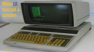
When UI 
was not a 
concern 
Copyright 2014 eXo Platform
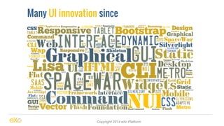
Many UI innovation since 
Copyright 2014 eXo Platform
And some company 
success to create 
wonderful design 
for web application 
Copyright 2014 eXo Platform
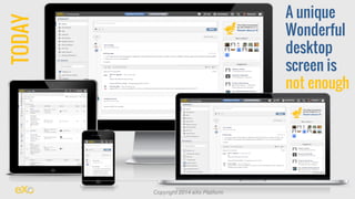
A unique 
Wonderful 
desktop 
screen is 
not enough 
Copyright 2014 eXo Platform TODAY
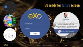
Be ready for future screen 
Copyright 2014 eXo Platform
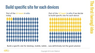
Build specific site for each devices 
Copyright 2014 eXo Platform 
Part of the UI team in eXo 
today 
Part of the UI team in eXo if we decide 
to build specific site for each device 
Build a specific site for desktop, mobile, tablet… was definitively not the good solution 
The first (wrong) idea
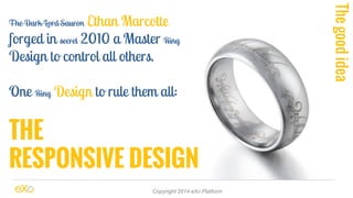
The Dark Lord Sauron Ethan Marcotte 
forged in secret 2010 a Master Ring 
Design to control all others. 
One Ring Design to rule them all: 
THE 
RESPONSIVE DESIGN 
Copyright 2014 eXo Platform 
The good idea
Time for specialist 
1. Responsive Design 
2. Bootstrap 3 
3. Responsive Web Application 
4. Demo 
5. Responsive eXo Platform 
Enjoy... Keep question on your book note, we will answer at the end 
Copyright 2014 eXo Platform
What is exactly a 
RESPONSIVE DESIGN 
Web application ? 
Copyright 2014 eXo Platform
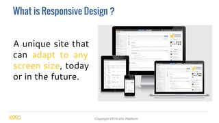
What is Responsive Design ? 
A unique site that 
can adapt to any 
screen size, today 
or in the future. 
Copyright 2014 eXo Platform
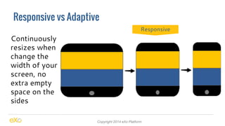
Responsive vs Adaptive 
Copyright 2014 eXo Platform 
Continuously 
resizes when 
change the 
width of your 
screen, no 
extra empty 
space on the 
sides 
Responsive
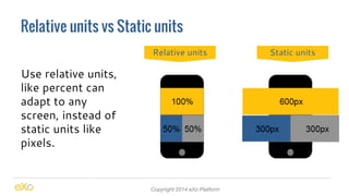
Relative units vs Static units 
Copyright 2014 eXo Platform 
Use relative units, 
like percent can 
adapt to any 
screen, instead of 
static units like 
pixels. 
Relative units Static units
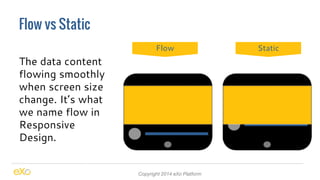
Flow vs Static 
Copyright 2014 eXo Platform 
The data content 
flowing smoothly 
when screen size 
change. It’s what 
we name flow in 
Responsive 
Design. 
Flow Static
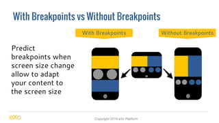
With Breakpoints vs Without Breakpoints 
Copyright 2014 eXo Platform 
Predict 
breakpoints when 
screen size change 
allow to adapt 
your content to 
the screen size 
With Breakpoints Without Breakpoints
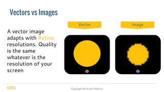
Vectors vs Images 
Copyright 2014 eXo Platform 
A vector image 
adapts with Retina 
resolutions. Quality 
is the same 
whatever is the 
resolution of your 
screen 
Vector Image
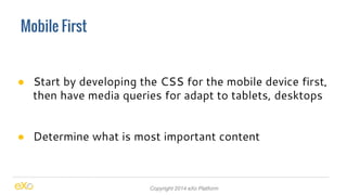
Mobile First 
● Start by developing the CSS for the mobile device first, 
then have media queries for adapt to tablets, desktops 
● Determine what is most important content 
Copyright 2014 eXo Platform
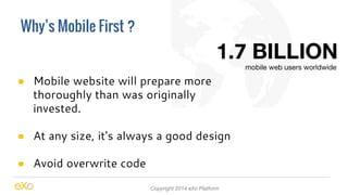
Why’s Mobile First ? 
● Mobile website will prepare more 
thoroughly than was originally 
invested. 
● At any size, it's always a good design 
● Avoid overwrite code 
Copyright 2014 eXo Platform
A free responsive framework 
BOOTSTRAP 3 
originally by Twitter 
Copyright 2014 eXo Platform
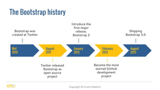
The Bootstrap history 
Copyright 2014 eXo Platform 
Mid 
2010 
August 
2011 
February 
2012 
January 
2012 
August 
2013 
Bootstrap was 
created at Twitter 
Twitter released 
Bootstrap as 
open source 
project 
Become the most 
starred GitHub 
development 
project 
Introduce the 
first major 
release, 
Bootstrap 2 
Shipping 
Bootstrap 3.0
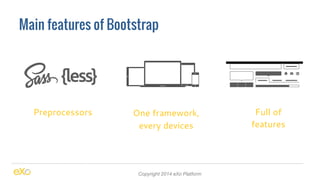
Main features of Bootstrap 
Preprocessors One framework, 
every devices 
Copyright 2014 eXo Platform 
Full of 
features
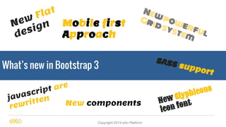
New Flat 
design Mobile first 
Approach 
What’s new in Bootstrap 3 
Grid system 
New components 
New powerful 
SASS support 
New Glyphicons 
icon font 
Copyright 2014 eXo Platform 
javascript are 
rewritten
Advantage 
● Create a web application very fast 
● It’s natively responsive framework 
● It’s fully and easily customisable 
Copyright 2014 eXo Platform
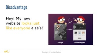
Disadvantage 
Hey! My new 
website looks just 
like everyone else’s! 
Copyright 2014 eXo Platform
Disadvantage 
No backward compatibility 
between versions 
Copyright 2014 eXo Platform
Competitors 
Copyright 2014 eXo Platform
Create a responsive 
WEB APPLICATION 
using Bootstrap 3 
Copyright 2014 eXo Platform
Responsive with bootstrap 3 
● css3 media queries 
● Grid system 
● Responsive utilities 
● Responsive embed and flexible image 
Copyright 2014 eXo Platform
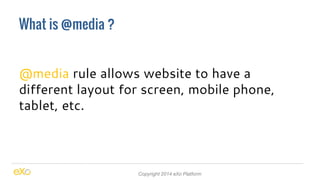
What is @media ? 
@media rule allows website to have a 
different layout for screen, mobile phone, 
tablet, etc. 
Copyright 2014 eXo Platform
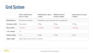
Grid System 
Copyright 2014 eXo Platform
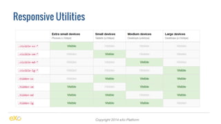
Responsive Utilities 
Copyright 2014 eXo Platform
How to make 
EXO PLATFORM 
responsive with bootstrap 3? 
Copyright 2014 eXo Platform
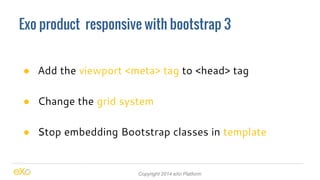
Exo product responsive with bootstrap 3 
● Add the viewport <meta> tag to <head> tag 
● Change the grid system 
● Stop embedding Bootstrap classes in template 
Copyright 2014 eXo Platform
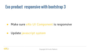
Exo product responsive with bootstrap 3 
● Make sure eXo UI Component is responsive 
● Update javascript system 
Copyright 2014 eXo Platform
It’s time for 
THANK YOU 
see you soon ... 
Copyright 2014 eXo Platform