Analysis of Q double page spread
•Download as DOCX, PDF•
0 likes•89 views
My analysis of Q's double page spread, describing the codes and conventions and why they have been used
Report
Share
Report
Share
Recommended
Cd Collage
The document discusses different magazine and CD covers, analyzing aspects like the use of photos, text, colors, and effects. Key points mentioned include a cover that makes a band look like a scribble, another that blends photo and cartoon styles, and one that focuses attention on the artist through blurring the background. Elements like lines, logos, and simple versus complex designs are also evaluated for their visual impact.
Evaluation Part 2
1) The poster for The Hanging Tree featured a gnarled tree title text that fit the film's narrative and conveyed a horror feeling, along with low-key lighting and a silhouette tree overlay that obscured the image and created a sinister feeling.
2) The magazine cover continued themes from the trailer while including generic conventions like a masthead and selling line. Muted colors and a handwritten font gave it a "classy" and artistic style similar to Sight and Sound magazine.
3) Overall, the ancillary materials and trailer emphasized selling the auteur director more than the film itself, influenced by filmmakers like Hitchcock and Romero who promoted their artistic vision. The magazine positioned the director
Evlauation 2
The combination of the main product (trailer) and ancillary texts (poster and magazine cover) effectively promoted the film and reinforced its horror genre conventions. The poster featured a gnarled tree title alluding to the film's title and theme of horror. Low lighting and a silhouette overlay created a sinister feel. The magazine cover imitated the style of Sight and Sound magazine to appeal to an artistic audience, with handwritten fonts, muted colors, and a focus on the director to emphasize the auteur theory. Overall, the campaign often focused more on selling the director's artistic vision than the film itself, taking inspiration from filmmakers like Hitchcock and Romero who promoted their work in this way.
3 nme double page spread
This double page spread from NME magazine features an article about British rapper Dizzee Rascal. Dizzee Rascal's image takes up the center of the page to draw readers' attention. Various elements are used following magazine conventions, such as the masthead, page numbers, and credits. However, some elements break conventions, like using 4 columns instead of following the rule of thirds. The images and article text provide context about Dizzee Rascal's background and rise to fame in the rap genre.
Film poster and magazine draft layouts
The document discusses the design process for magazine and movie poster drafts. It describes different layout options tested, including placement of the masthead, title, tagline, images, billing blocks, and review quotes. The key decisions reached were to:
- Use a single large background image on the poster/magazine cover
- Place the title at the bottom of the poster to seem more dramatic
- Include a billing block and review quotes on the poster for credibility
- Position the masthead at the top of the magazine cover per convention
- Add circular coverlines and a single background image to the magazine cover for visual interest.
Little White Lies Magazine
Little White Lies magazine designs each issue around a feature film, often illustrated on the cover by the lead actor. The interior design is also influenced by the cover film through icons, headings and custom fonts. However, the overall magazine template remains consistent. The magazine aims to catch readers' attention in a unique way with each issue while maintaining continuity through consistently placing the title and barcode at the top of the cover. Film titles are kept small and inconspicuous to focus attention on the character and leave interpretation of the story to the design and color scheme rather than relying on the title.
Little white lies cover compari
The document compares the author's movie poster design for Ender's Game to covers from Little White Lies magazine. It notes that while the author's design captured the sci-fi themes, the character portrait could have been larger to fill out the cover more. Looking at covers from Little White Lies and Drive, the author realizes integrating typography more with the artwork and adding more shading to the facial portrait could have improved their design.
My Magazine Cover - The Process
The document describes the process of designing a magazine cover in 5 stages. At each stage, the designer makes refinements based on feedback and research. By stage 5, additional sell lines and graphics are added to make the cover more visually appealing and informative for the target audience. The final design prominently features an upcoming independent film as the main story, with additional articles on popular franchises and an exclusive competition.
Magazine analysis and planning
The document discusses magazine covers for horror publications. It analyzes covers of magazines like Fangoria, noting that they feature large central images taking up the whole page to draw attention. The colors used are typically red, black, and white to symbolize blood, gore and death. Fonts are bold and banners/text relate to horror films and content within. The analyzed covers inform the plan for the author's own magazine cover for "Terror Weekly", which will feature a dark recreated horror scene image, and use red and black colors and a scratched masthead design consistent with other horror magazine styles.
Question 2
The document discusses how the candidate's magazine front cover photo represents social groups similarly to the Kerrang! magazine that influenced it. Both photos show the models staring directly at the camera from the front in similar poses. While the expressions differ slightly, with the Kerrang! model looking more playful and the candidate's model looking mildly happy but serious, the hairstyles suggest both magazines represent a down-to-earth, natural look. The camera angle, lighting choices, and costumes were also chosen differently between the photos to convey different meanings and representations of the featured artists.
House Styles for music magazine
The document summarizes the conventions used in magazine design such as mastheads, headlines, photographs, captions, and color schemes. It provides examples of how different magazines employ these conventions in their house styles to attract audiences. The conventions help magazines "hold together" through consistent branding and by engaging readers with bold designs, interesting photographs, and relevant content.
Music magazine evaluation
This document summarizes a student's analysis and evaluation of competitor music magazines for the purpose of designing their own music magazine. The student chose rock magazines KERRANG!, NME, and Metal Hammer as competitors since they share the same genre but different target audiences. The student analyzed aspects like front pages, content pages, and feature articles to identify conventions used to appeal to different audiences. Information from the competitor analysis informed design choices for the student's own magazine cover to develop conventions in a way that would attract their target teenage audience.
Magazine Analysis House Style.
The magazine consistently uses the same masthead, a letter Q, in the top left corner of the cover to identify the brand across issues. All cover images are model shots where the artist or band is deliberately dressed and posed. Larger cover images of artists are prioritized over the title to attract viewers and promote the featured content. A framed layout is used to make the center images on some covers stand out professionally and draw the eye.
Film Poster Analysis
This document analyzes and summarizes the symbolism and conventions used in a movie poster. It discusses how the two contrasting colors could represent different opinions or good and evil. It also notes that the dark colors suggest dark themes, and the inclusion of a gun and police badge reinforce the gangster genre. Additionally, it points out how the positioning of actors implies a power hierarchy and familial theme that is common in the genre. Overall, the poster provides insights into the characters and film through its unique design choices, while also leaving some ambiguity to intrigue audiences.
Double page spread analysis
This document summarizes the layout and design of a magazine page featuring an article on musician Dizzie Rascal. The main image is of Dizzie Rascal to identify him as the subject of the article. Additional photos suggest his lifestyle and interests to relate to readers. Bold text and vibrant colors are used for the headline and throughout the page to represent Dizzie Rascal's personality and music genre. The layout follows a grid with four sections - the model's face, headline, empty space, and body text.
Print screens for magazine......................................
The document describes the process of designing a film magazine mockup. First, an image was chosen and placed on a black background to set the mystery/thriller genre. Boxes and additional photos from other films were added to showcase multiple movies. A barcode, footer with other film titles, and large main film title were incorporated to resemble a real magazine. Straps with consistent colors were put down the sides. The magazine title is in red font to stand out, along with the website, date, and price. Lines separate the straps to make the text readable. More straps were added to fill space and provide information. A circular shape was included to highlight a competition and entice readers to learn more inside.
Drafts and Fonts
In this document, the author discusses three drafts of a film poster layout and two drafts of a magazine cover layout for a horror film project. For the first poster draft, the author models it after the "Sweeney Todd" poster for its effective style. The second poster draft resembles "The Woman in Black 2" poster to emphasize supernatural and madness elements. The final poster draft combines effective elements of the first two. For the first magazine cover draft, the author again models it after "Sweeney Todd" to link designs. The second magazine cover draft links from other horror posters and magazines since there was no cover for "The Woman in Black 2." Font choices are considered from the website "fontspace" to
Magazine Comparison
The document compares and contrasts the front covers of two music magazines - Kerrang and NME. It analyzes various design elements including the mastheads, cover images, main cover lines, fonts, and color schemes used and how they appeal to each magazine's target audience. Both magazines use informal language and design techniques to attract readers and make them feel part of an exclusive fan community, without alienating broader audiences.
Research contents 2
The document summarizes key aspects of layout, design and stylistic elements across various pages and sections of a music magazine called Mojo. It notes consistency in placement of the masthead, date and page numbers which contribute to the magazine's overall house style. Different fonts, text sizes and colors are used strategically throughout to guide the eye and represent different genres discussed. Images feature alternative fashions to align with the magazine's music genre. Columns and overlapping elements create a collage-like contents page.
Preliminary student risk assessment
This risk assessment document evaluates potential hazards students may face while taking photos inside the college corridors and on the field. The hazards identified include obstructing foot traffic in corridors, falling down stairs, and slippery conditions from rain while photographing outdoors. Existing controls include instructing students to walk on the left side of corridors. Further actions planned are warning models about surroundings, photographing during lessons to avoid crowds, and checking weather before outdoor shoots.
Questionnaire tally
This document summarizes the results of a questionnaire with 10 questions. For each question, participant responses are tallied in a yes/no format or with a range of possible answers. The number of ticks indicates how many participants selected each answer. For some questions, participants provided additional comments to explain or qualify their responses. The questionnaire covered topics like music preferences, activities, job interests, spending habits, and demographic information.
Analysis of NME double page spread
Dizzee Rascal is depicted spray painting graffiti on a wall while wearing a bright red jacket to draw attention. The article uses this image and headline referring to "Tags" to summarize a story about Dizzee Rascal's rebellious nature and passion for music. Additional images show stereotypical signs of a party, such as stereo equipment and empty bottles, to provide context around Dizzee Rascal and young people.
My genre
The genre of R&B emerged in the 1920s-1930s from jazz and blues music performed by African American musicians in cities across the US. In the 1940s, RCA Victor marketed the genre as "Blues and Rhythm" and the term "Rhythm and Blues" was adopted in 1949. In the 1950s, R&B music gained popularity among white teenagers but remained primarily an African American genre. Major R&B labels like Motown and Atlantic emerged in the late 1950s-1960s. By the 1970s, R&B encompassed soul, funk, and disco styles. Contemporary R&B became popular in the 1980s but declined in the 2000s due to the rise of hip hop
Similarities in nme
The masthead, color scheme, and fonts connect the different parts of the magazine by providing branding and consistency across pages. The masthead appears on the front cover, contents page, and double page spread to remind readers which magazine they are reading. Using red, white, and black throughout creates a unified theme. Bold, capital titles stand out with the same colors. A theme of youthfulness also ties the pages together, as the images depict musicians and models in their 20s to early 30s, signaling the target audience.
American ghetto research
- The document discusses the origins of American ghettos, which formed due to immigration, poverty, and lack of integration between ethnicities. This led to divides between black and white communities.
- American ghettos are often defined as communities made up primarily of one homogeneous race or ethnicity, and are characterized by high levels of poverty. This poverty separates ghettos from other neighborhoods and makes it difficult for residents to migrate elsewhere.
- Even after the civil rights movement, most of the US remains residentially segregated, with black and white Americans living in separate neighborhoods. The movement of jobs and middle-class residents to suburbs left many minority communities in inner cities economically devastated.
A2 presentation
This document provides an overview of an A2 media studies course. It discusses how students studied the 2014 film Pride and analyzed representations of the working class. Students are creating a radio show based on Pride and will produce a documentary on a topic of their choice. The document also covers key concepts for analyzing representation, the process of mediation, and how students have learned to use audio editing software GarageBand to mix and export audio files.
Clothes, locations and make up
A description of the clothes and make up which the models will wear. Also the locations where the photos will be taken
Graphs and conclusions
This document appears to be a survey containing questions about music preferences, hobbies, spending habits, and demographic information like age. It asks the respondent to rate artists on a scale and select answers for multiple choice questions about activities, charitable work, and amounts of money. The final questions collect age and what seems to be the last question of the survey.
As media coursework introduction
James will create parts of a music magazine for a coursework project, including a front cover, content page, and double page spread using the codes and conventions of music magazines. He will use Photoshop for the front cover and content page, and InDesign for the double page spread. His last project was on a college magazine, and he hopes to improve his textual analysis and Photoshop skills from that project through this one.
Q contents page analysis
The document discusses the layout and design of the contents page of the Q magazine. It notes that the "Q" masthead is repeated on each page to reinforce the magazine brand. The page numbers are eye-catching even though small. The date of the issue is prominently displayed to catch the reader's eye. The main heading "Contents" stands out in white capital letters on a black background. Subheadings name the artists to allow readers to easily find stories of interest.
More Related Content
What's hot
Magazine analysis and planning
The document discusses magazine covers for horror publications. It analyzes covers of magazines like Fangoria, noting that they feature large central images taking up the whole page to draw attention. The colors used are typically red, black, and white to symbolize blood, gore and death. Fonts are bold and banners/text relate to horror films and content within. The analyzed covers inform the plan for the author's own magazine cover for "Terror Weekly", which will feature a dark recreated horror scene image, and use red and black colors and a scratched masthead design consistent with other horror magazine styles.
Question 2
The document discusses how the candidate's magazine front cover photo represents social groups similarly to the Kerrang! magazine that influenced it. Both photos show the models staring directly at the camera from the front in similar poses. While the expressions differ slightly, with the Kerrang! model looking more playful and the candidate's model looking mildly happy but serious, the hairstyles suggest both magazines represent a down-to-earth, natural look. The camera angle, lighting choices, and costumes were also chosen differently between the photos to convey different meanings and representations of the featured artists.
House Styles for music magazine
The document summarizes the conventions used in magazine design such as mastheads, headlines, photographs, captions, and color schemes. It provides examples of how different magazines employ these conventions in their house styles to attract audiences. The conventions help magazines "hold together" through consistent branding and by engaging readers with bold designs, interesting photographs, and relevant content.
Music magazine evaluation
This document summarizes a student's analysis and evaluation of competitor music magazines for the purpose of designing their own music magazine. The student chose rock magazines KERRANG!, NME, and Metal Hammer as competitors since they share the same genre but different target audiences. The student analyzed aspects like front pages, content pages, and feature articles to identify conventions used to appeal to different audiences. Information from the competitor analysis informed design choices for the student's own magazine cover to develop conventions in a way that would attract their target teenage audience.
Magazine Analysis House Style.
The magazine consistently uses the same masthead, a letter Q, in the top left corner of the cover to identify the brand across issues. All cover images are model shots where the artist or band is deliberately dressed and posed. Larger cover images of artists are prioritized over the title to attract viewers and promote the featured content. A framed layout is used to make the center images on some covers stand out professionally and draw the eye.
Film Poster Analysis
This document analyzes and summarizes the symbolism and conventions used in a movie poster. It discusses how the two contrasting colors could represent different opinions or good and evil. It also notes that the dark colors suggest dark themes, and the inclusion of a gun and police badge reinforce the gangster genre. Additionally, it points out how the positioning of actors implies a power hierarchy and familial theme that is common in the genre. Overall, the poster provides insights into the characters and film through its unique design choices, while also leaving some ambiguity to intrigue audiences.
Double page spread analysis
This document summarizes the layout and design of a magazine page featuring an article on musician Dizzie Rascal. The main image is of Dizzie Rascal to identify him as the subject of the article. Additional photos suggest his lifestyle and interests to relate to readers. Bold text and vibrant colors are used for the headline and throughout the page to represent Dizzie Rascal's personality and music genre. The layout follows a grid with four sections - the model's face, headline, empty space, and body text.
Print screens for magazine......................................
The document describes the process of designing a film magazine mockup. First, an image was chosen and placed on a black background to set the mystery/thriller genre. Boxes and additional photos from other films were added to showcase multiple movies. A barcode, footer with other film titles, and large main film title were incorporated to resemble a real magazine. Straps with consistent colors were put down the sides. The magazine title is in red font to stand out, along with the website, date, and price. Lines separate the straps to make the text readable. More straps were added to fill space and provide information. A circular shape was included to highlight a competition and entice readers to learn more inside.
Drafts and Fonts
In this document, the author discusses three drafts of a film poster layout and two drafts of a magazine cover layout for a horror film project. For the first poster draft, the author models it after the "Sweeney Todd" poster for its effective style. The second poster draft resembles "The Woman in Black 2" poster to emphasize supernatural and madness elements. The final poster draft combines effective elements of the first two. For the first magazine cover draft, the author again models it after "Sweeney Todd" to link designs. The second magazine cover draft links from other horror posters and magazines since there was no cover for "The Woman in Black 2." Font choices are considered from the website "fontspace" to
Magazine Comparison
The document compares and contrasts the front covers of two music magazines - Kerrang and NME. It analyzes various design elements including the mastheads, cover images, main cover lines, fonts, and color schemes used and how they appeal to each magazine's target audience. Both magazines use informal language and design techniques to attract readers and make them feel part of an exclusive fan community, without alienating broader audiences.
Research contents 2
The document summarizes key aspects of layout, design and stylistic elements across various pages and sections of a music magazine called Mojo. It notes consistency in placement of the masthead, date and page numbers which contribute to the magazine's overall house style. Different fonts, text sizes and colors are used strategically throughout to guide the eye and represent different genres discussed. Images feature alternative fashions to align with the magazine's music genre. Columns and overlapping elements create a collage-like contents page.
What's hot (11)
Print screens for magazine......................................
Print screens for magazine......................................
Viewers also liked
Preliminary student risk assessment
This risk assessment document evaluates potential hazards students may face while taking photos inside the college corridors and on the field. The hazards identified include obstructing foot traffic in corridors, falling down stairs, and slippery conditions from rain while photographing outdoors. Existing controls include instructing students to walk on the left side of corridors. Further actions planned are warning models about surroundings, photographing during lessons to avoid crowds, and checking weather before outdoor shoots.
Questionnaire tally
This document summarizes the results of a questionnaire with 10 questions. For each question, participant responses are tallied in a yes/no format or with a range of possible answers. The number of ticks indicates how many participants selected each answer. For some questions, participants provided additional comments to explain or qualify their responses. The questionnaire covered topics like music preferences, activities, job interests, spending habits, and demographic information.
Analysis of NME double page spread
Dizzee Rascal is depicted spray painting graffiti on a wall while wearing a bright red jacket to draw attention. The article uses this image and headline referring to "Tags" to summarize a story about Dizzee Rascal's rebellious nature and passion for music. Additional images show stereotypical signs of a party, such as stereo equipment and empty bottles, to provide context around Dizzee Rascal and young people.
My genre
The genre of R&B emerged in the 1920s-1930s from jazz and blues music performed by African American musicians in cities across the US. In the 1940s, RCA Victor marketed the genre as "Blues and Rhythm" and the term "Rhythm and Blues" was adopted in 1949. In the 1950s, R&B music gained popularity among white teenagers but remained primarily an African American genre. Major R&B labels like Motown and Atlantic emerged in the late 1950s-1960s. By the 1970s, R&B encompassed soul, funk, and disco styles. Contemporary R&B became popular in the 1980s but declined in the 2000s due to the rise of hip hop
Similarities in nme
The masthead, color scheme, and fonts connect the different parts of the magazine by providing branding and consistency across pages. The masthead appears on the front cover, contents page, and double page spread to remind readers which magazine they are reading. Using red, white, and black throughout creates a unified theme. Bold, capital titles stand out with the same colors. A theme of youthfulness also ties the pages together, as the images depict musicians and models in their 20s to early 30s, signaling the target audience.
American ghetto research
- The document discusses the origins of American ghettos, which formed due to immigration, poverty, and lack of integration between ethnicities. This led to divides between black and white communities.
- American ghettos are often defined as communities made up primarily of one homogeneous race or ethnicity, and are characterized by high levels of poverty. This poverty separates ghettos from other neighborhoods and makes it difficult for residents to migrate elsewhere.
- Even after the civil rights movement, most of the US remains residentially segregated, with black and white Americans living in separate neighborhoods. The movement of jobs and middle-class residents to suburbs left many minority communities in inner cities economically devastated.
A2 presentation
This document provides an overview of an A2 media studies course. It discusses how students studied the 2014 film Pride and analyzed representations of the working class. Students are creating a radio show based on Pride and will produce a documentary on a topic of their choice. The document also covers key concepts for analyzing representation, the process of mediation, and how students have learned to use audio editing software GarageBand to mix and export audio files.
Clothes, locations and make up
A description of the clothes and make up which the models will wear. Also the locations where the photos will be taken
Graphs and conclusions
This document appears to be a survey containing questions about music preferences, hobbies, spending habits, and demographic information like age. It asks the respondent to rate artists on a scale and select answers for multiple choice questions about activities, charitable work, and amounts of money. The final questions collect age and what seems to be the last question of the survey.
As media coursework introduction
James will create parts of a music magazine for a coursework project, including a front cover, content page, and double page spread using the codes and conventions of music magazines. He will use Photoshop for the front cover and content page, and InDesign for the double page spread. His last project was on a college magazine, and he hopes to improve his textual analysis and Photoshop skills from that project through this one.
Q contents page analysis
The document discusses the layout and design of the contents page of the Q magazine. It notes that the "Q" masthead is repeated on each page to reinforce the magazine brand. The page numbers are eye-catching even though small. The date of the issue is prominently displayed to catch the reader's eye. The main heading "Contents" stands out in white capital letters on a black background. Subheadings name the artists to allow readers to easily find stories of interest.
Student magazine presentation
This document contains descriptions of several photos taken by James Leatham for the student magazine 'College Weekly'. The photos include images of the art department building, student artwork, an empty playing field, students outside a building, lockers inside another building, and a portrait of a classmate. Each photo is intended to illustrate a different cover story or article topic such as reductions in art funding, exercise levels, organization tips, and fashion advice. Context and details are provided about the location, time of day, composition, and intended message behind each photo.
Preliminary production schedule call sheet
This production schedule call sheet outlines the details for a photoshoot at Solihull Sixth Form on September 30th, 2015. The photoshoot involves taking pictures of models at various locations around the school including the art building, corridors, field, drama room, and sports hall between 9:45am and 10:35am. The photoshoot is for the client Solihull Sixth Form and College Weekly magazine, and will require a photographer, models dressed fashionably but with no makeup, and no transportation or catering needs.
NME contents page analysis
My analysis of NME contents page, talking about the codes and conventions and why they have been used
Analysis of articles
The document summarizes an article about Akon and his next album. It notes that the title of the article clearly shows what it will be about. It also notes that the inclusion of "Q&A" indicates it will have a question and answer format.
It states that the author ("Associated Press") and publication date ("Sunday, Nov 1, 2015, 9:00pm") provide important context. Within the article, the questions and answers are clearly separated, though some may see the Q&A style as patronizing.
Overall, the document examines key elements of the article like the title, author, and question/answer format, and considers whether the reading audience may find the style patronizing.
Question 7
Looking back at your preliminary task, what do you feel you have learnt in the progression from it to the full product?
Viewers also liked (16)
Similar to Analysis of Q double page spread
Unit 13 - LO1 - Meanings
The document analyzes various elements of magazine covers and articles, including their denotations and connotations. It discusses the masthead, images, headlines, cover lines, and other design elements. For the masthead, it notes the logo, font, and use of red connotes passion for music. The main image is a close-up of Noel Gallagher to represent the main story. Headlines and cover lines use larger fonts and star power to attract readers. Photos are chosen to represent the atmosphere and power of the music genre. Overall the document provides a detailed semiotic analysis of how magazine design conveys intended meanings.
Analysis of music magazines
The document provides an in-depth analysis of the layout, design elements, and stylistic choices made across the cover and interior pages of several issues of rock music magazines. Key points analyzed include:
- The use of splash images, fonts, colors, and layouts on the covers that aim to represent the boldness and rebellious nature of rock music. Photographs and text are analyzed for how they connect the audience to the artists.
- Consistent use of colors, fonts and design elements across covers and interior pages to create continuity and a recognizable house style.
- Interior page designs that utilize headlines, images, and text snippets to entice readers towards specific articles and widen audience appeal.
Music Magazine Textual Analysis
The document provides an analysis of various magazine covers and contents pages. It examines design elements like images, headlines, and layouts and discusses how they are used to promote featured artists and attract readers. For example, a Drake cover uses gold embellishments to match his image and bling, while a Father John Misty article has an unusual title and photo to reflect his eccentric personality. Positioning of images and text and color schemes are also analyzed in terms of drawing attention and brand familiarity.
Deconstructions of rock magazines
The document provides an analysis of the deconstruction of various rock magazine covers, contents pages, and double page spreads. It examines elements like the mastheads, images, headlines, fonts, and color schemes used and what they communicate about the magazines' brands and intended audiences. Specific magazines analyzed include "Rock Sound", "NME", and "Kerrang". Key points examined include how the visual design elements relate to the genres of rock/punk music and are intended to attract target audiences interested in those styles of music.
Magazine Comparison
The document compares the front covers of two music magazines, Kerrang and NME. For Kerrang, the masthead uses a distressed font to appeal to rock fans, and the cover image features Fall Out Boy's Pete Wentz to attract readers. NME's masthead uses bold red and white for brand recognition, and its cover features various artists in a collage for its decade review issue. Both magazines use informal language and eye-catching designs to engage their target audiences.
Analysis of Contents
The document analyzes the contents pages of three music magazines: NME, Q, and Kerrang. It finds that all three magazines use consistent color schemes and layouts to clearly present the magazine contents and make navigation easy for readers. The contents pages list articles and bands with brief descriptions and page numbers. Imagery of musicians promotes the types of music covered. Consistent formatting across the magazines creates a professional, organized presentation.
Media preasentation
The document discusses the design elements of a magazine cover and articles. It analyzes how elements like the color scheme, images, typography and layout are used to clearly communicate the genre of music, tone, and key stories. Specific techniques included using bold colors and images to draw attention to the main story, positioning artist photos and quotes to instantly convey what each article is about, and maintaining a consistent and aesthetically pleasing design to please readers.
Compare and contrast two contents pages
Both the Kerrang and Q magazine contents pages are laid out similarly, with the main difference being the placement of the image on the left for Kerrang and on the right for Q. The image takes up most of the page in both magazines and is meant to draw readers' attention. The Kerrang image depicts the band All Time Low wearing dark, punk-inspired clothing, while the Q image shows Adele making direct eye contact. Both magazines use stylistic elements like bold, capitalized text and a light color scheme to ensure the contents are clear and easy to read.
Final mcr double page
The article provides an inside look at My Chemical Romance's new album recording process. It discusses how the band took extra time to ensure each song had meaning. It hints that the new album will be their best yet and that future tours are planned. The article uses informal language like jokes and quotes from the band to give fans a sense of the band's confidence in the new material and excitement to share it. Images of the band in the studio give readers insight into the album's creation.
Deconstruction of magazines 2
1) The masthead of "Q" magazine and the dominant image of Ed Sheeran implies that the artist is the most important part of the magazine. The casual image of Ed with his guitar suggests his relaxed musical style.
2) Details like font, placement, and color are used purposefully throughout the magazine to draw attention to important information and create a clean layout that would appeal to their target audience of 16-24 year olds.
3) The well-organized front cover uses techniques like bold text, separation of articles with lines, and framing of the dominant image to clearly present content to readers.
Double page analysis
The document contains summaries of magazine pages about concerts by the bands Paramore and Nirvana:
1) The Paramore page uses puns in the masthead and kicker related to the band's songs and their boat concert. Photos show the band and opening acts performing.
2) The Nirvana page features a black-and-white photo of Kurt Cobain playing guitar. The article discusses the band's top ten gigs. Photos show band performances and a theater advertising their name.
3) Both pages have an unorganized layout with uneven columns and randomly placed images, reflecting the messy conventions of rock music and its target teenage audience.
Digipack evaluation Q1
The document summarizes the design choices for a digipak album cover. It describes using individual images of band members on the front cover to help build recognition. Font, colors, and effects like a glass effect were chosen to represent the post-hardcore genre and attract fans. Inside, a graffiti background photo ties the theme together and credits are listed as is standard. Overall, conventions were challenged by focusing on building the band's image while representing their genre through visual elements.
Question 2
1) The document analyzes the effectiveness of a band's album packaging, including a digipack and magazine advertisement.
2) Research showed that rock genre packaging commonly uses black and white themes with color text. Inspired by this, the digipack design used a black and white front cover.
3) Careful research ensured the packaging used proper codes and conventions. However, an initial design failed to connect the digipack sides cohesively, so it was redesigned to flow like a single image.
Magazine analysis
The document provides an analysis of magazines in the heavy metal genre conducted by Abigail Downes to inform the design of their own heavy metal magazine focusing on death metal and slam. Downes analyzes conventions of existing magazines such as layout, cover lines, language used, color schemes, and how bands are presented photographically. This analysis will help Downes understand what makes a successful magazine in the genre so they can design an appealing magazine for the heavy metal community.
Doubl page spread
The double page spread features an interview with two artists who have formed a new band. A large main image shows the two artists in a sophisticated setting. The text of the interview is informal and humorous in tone, using colloquial language to discuss how the artists met and the new band's formation. Pull quotes and a variety of fonts are used throughout to represent the rock genre and make the interview engaging for readers.
Neck deep kerrang analysis
The document discusses the design elements of Kerrang magazine covers and how they appeal to their target audience. Kerrang uses bold colors, dramatic images of rock artists, and attention-grabbing fonts to attract readers. The covers feature dominant images of popular bands to draw in fans. Subtle messages about individuality and rebellion are encoded in design choices like the use of the color red. Kerrang aims to engage adolescents aged 13-19 from working class backgrounds who aspire to the rock lifestyle. Consistent branding and cover designs keep the audience interested issue to issue.
Unit 14 - LO3
The document provides step-by-step instructions for setting up photography equipment and creating magazine pages in Photoshop. It describes securely balancing and attaching the camera to the tripod so images do not become fuzzy or the camera does not fall. It then outlines the process of drawing layout grids, adding elements like mastheads, images, headlines, and promotions to the front cover and double-page spread pages in Photoshop. Minor mistakes made in the interview text are also identified and corrected to improve professionalism.
Evaluation 1
The document summarizes the ways in which the media product uses, develops, and challenges conventions of real media. It discusses using a masthead similar to other magazines in terms of location, colors, and font. Images are used that represent the rock genre through posing, clothing, and facial expressions of models. Layout follows conventions such as masthead location, pull quotes, and issue dates. The written content aims to be interesting and understandable for the target audience. In summary, the document outlines how the media product adheres to and develops conventions through its visual design, images, layout, and writing.
Media magazine covers analysis
This document analyzes magazine covers and design elements. It discusses how the mastheads on the covers of NME and Rolling Stone magazines are covered by the images but are still recognizable brands. The placement of images, text, colors and barcodes are meant to attract readers and promote the main stories or artists featured. Elements like alliteration, repetition of colors and direct eye contact with the camera are used to create intrigue and connection with potential buyers.
Critical Responses Task 2
The document analyzes the target audience, images, words, colors, fonts, layout, captions, anchorage, and codes/conventions used in the magazine Mixmag. Mixmag targets men and women aged 19-30 who enjoy electronic dance music, festivals, and socializing. Images on the cover feature recognizable EDM artists around the same age as readers. Bright colors and fonts are used to attract attention, while the inside layout has a relaxed feel with large central images and unorganized text. Captions give context to images and help engage the target readership.
Similar to Analysis of Q double page spread (20)
Recently uploaded
HYPERTENSION - SLIDE SHARE PRESENTATION.
IT WILL BE HELPFULL FOR THE NUSING STUDENTS
IT FOCUSED ON MEDICAL MANAGEMENT AND NURSING MANAGEMENT.
HIGHLIGHTS ON HEALTH EDUCATION.
Accounting for Restricted Grants When and How To Record Properly
In this webinar, member learned how to stay in compliance with generally accepted accounting principles (GAAP) for restricted grants.
BÀI TẬP BỔ TRỢ TIẾNG ANH LỚP 9 CẢ NĂM - GLOBAL SUCCESS - NĂM HỌC 2024-2025 - ...
BÀI TẬP BỔ TRỢ TIẾNG ANH LỚP 9 CẢ NĂM - GLOBAL SUCCESS - NĂM HỌC 2024-2025 - ...Nguyen Thanh Tu Collection
https://app.box.com/s/tacvl9ekroe9hqupdnjruiypvm9rdaneGeography as a Discipline Chapter 1 __ Class 11 Geography NCERT _ Class Notes...
Geography as discipline
BÀI TẬP BỔ TRỢ TIẾNG ANH LỚP 8 - CẢ NĂM - FRIENDS PLUS - NĂM HỌC 2023-2024 (B...
BÀI TẬP BỔ TRỢ TIẾNG ANH LỚP 8 - CẢ NĂM - FRIENDS PLUS - NĂM HỌC 2023-2024 (B...Nguyen Thanh Tu Collection
https://app.box.com/s/nrwz52lilmrw6m5kqeqn83q6vbdp8yzpBenner "Expanding Pathways to Publishing Careers"
This presentation was provided by Rebecca Benner, Ph.D., of the American Society of Anesthesiologists, for the second session of NISO's 2024 Training Series "DEIA in the Scholarly Landscape." Session Two: 'Expanding Pathways to Publishing Careers,' was held June 13, 2024.
Leveraging Generative AI to Drive Nonprofit Innovation
In this webinar, participants learned how to utilize Generative AI to streamline operations and elevate member engagement. Amazon Web Service experts provided a customer specific use cases and dived into low/no-code tools that are quick and easy to deploy through Amazon Web Service (AWS.)
BIOLOGY NATIONAL EXAMINATION COUNCIL (NECO) 2024 PRACTICAL MANUAL.pptx
Practical manual for National Examination Council, Nigeria.
Contains guides on answering questions on the specimens provided
How to Download & Install Module From the Odoo App Store in Odoo 17
Custom modules offer the flexibility to extend Odoo's capabilities, address unique requirements, and optimize workflows to align seamlessly with your organization's processes. By leveraging custom modules, businesses can unlock greater efficiency, productivity, and innovation, empowering them to stay competitive in today's dynamic market landscape. In this tutorial, we'll guide you step by step on how to easily download and install modules from the Odoo App Store.
Temple of Asclepius in Thrace. Excavation results
The temple and the sanctuary around were dedicated to Asklepios Zmidrenus. This name has been known since 1875 when an inscription dedicated to him was discovered in Rome. The inscription is dated in 227 AD and was left by soldiers originating from the city of Philippopolis (modern Plovdiv).
RHEOLOGY Physical pharmaceutics-II notes for B.pharm 4th sem students
Physical pharmaceutics notes for B.pharm students
Recently uploaded (20)
REASIGNACION 2024 UGEL CHUPACA 2024 UGEL CHUPACA.pdf
REASIGNACION 2024 UGEL CHUPACA 2024 UGEL CHUPACA.pdf
Accounting for Restricted Grants When and How To Record Properly
Accounting for Restricted Grants When and How To Record Properly
BÀI TẬP BỔ TRỢ TIẾNG ANH LỚP 9 CẢ NĂM - GLOBAL SUCCESS - NĂM HỌC 2024-2025 - ...
BÀI TẬP BỔ TRỢ TIẾNG ANH LỚP 9 CẢ NĂM - GLOBAL SUCCESS - NĂM HỌC 2024-2025 - ...
Geography as a Discipline Chapter 1 __ Class 11 Geography NCERT _ Class Notes...
Geography as a Discipline Chapter 1 __ Class 11 Geography NCERT _ Class Notes...
BÀI TẬP BỔ TRỢ TIẾNG ANH LỚP 8 - CẢ NĂM - FRIENDS PLUS - NĂM HỌC 2023-2024 (B...
BÀI TẬP BỔ TRỢ TIẾNG ANH LỚP 8 - CẢ NĂM - FRIENDS PLUS - NĂM HỌC 2023-2024 (B...
Leveraging Generative AI to Drive Nonprofit Innovation
Leveraging Generative AI to Drive Nonprofit Innovation
BIOLOGY NATIONAL EXAMINATION COUNCIL (NECO) 2024 PRACTICAL MANUAL.pptx
BIOLOGY NATIONAL EXAMINATION COUNCIL (NECO) 2024 PRACTICAL MANUAL.pptx
How to Download & Install Module From the Odoo App Store in Odoo 17
How to Download & Install Module From the Odoo App Store in Odoo 17
NEWSPAPERS - QUESTION 1 - REVISION POWERPOINT.pptx
NEWSPAPERS - QUESTION 1 - REVISION POWERPOINT.pptx
RHEOLOGY Physical pharmaceutics-II notes for B.pharm 4th sem students
RHEOLOGY Physical pharmaceutics-II notes for B.pharm 4th sem students
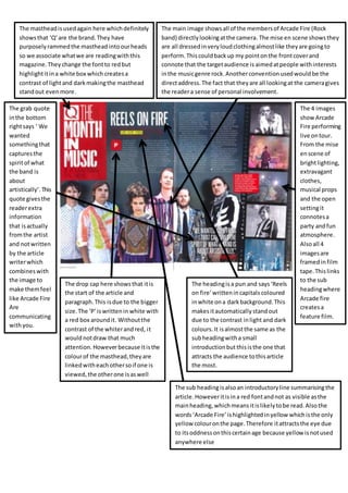
Analysis of Q double page spread
- 1. The mastheadisusedagain here whichdefinitely showsthat ‘Q’are the brand.They have purposelyrammedthe masthead intoourheads so we associate whatwe are readingwiththis magazine.They change the fontto redbut highlightitina white box which createsa contrast of lightand darkmakingthe masthead standout evenmore. The main image showsall of the membersof Arcade Fire (Rock band) directlylookingatthe camera. The mise en scene showsthey are all dressedinveryloudclothingalmostlike theyare goingto perform.Thiscouldbackup my pointonthe frontcoverand connote that the targetaudience is aimedatpeople withinterests inthe musicgenre rock.Anotherconventionusedwouldbe the directaddress.The fact that theyare all lookingat the cameragives the readera sense of personal involvement. The grab quote inthe bottom rightsays ‘ We wanted somethingthat capturesthe spiritof what the band is about artistically’.This quote givesthe readerextra information that isactually fromthe artist and notwritten by the article writerwhich combines with the image to make themfeel like Arcade Fire Are communicating withyou. The 4 images showArcade Fire performing live ontour. From the mise enscene of brightlighting, extravagant clothes, musical props and the open settingit connotesa party andfun atmosphere. Alsoall 4 imagesare framedinfilm tape.Thislinks to the sub headingwhere Arcade fire createsa feature film. The drop cap here showsthat itis the start of the article and paragraph.This isdue to the bigger size.The ‘P’iswrittenin white with a red box aroundit. Withoutthe contrast of the whiterandred, it wouldnotdraw that much attention. Howeverbecause itisthe colourof the masthead, theyare linkedwitheachothersoif one is viewed, the otherone isaswell The headingisa pun and says ‘Reels on fire’writtenincapitals coloured inwhite ona darkbackground.This makesitautomatically standout due to the contrast inlight and dark colours. It isalmostthe same as the subheadingwitha small introductionbutthisisthe one that attracts the audience tothisarticle the most. The sub headingisalsoan introductoryline summarisingthe article.Howeveritisina red fontandnot as visible asthe mainheading,whichmeansitislikelytobe read.Alsothe words ‘Arcade Fire’ ishighlighted inyellow whichisthe only yellow colouronthe page.Therefore itattractsthe eye due to itsoddnessonthiscertainage because yellowisnotused anywhere else