Little white lies cover compari
•Download as DOC, PDF•
0 likes•223 views

The document compares the author's movie poster design for Ender's Game to covers from Little White Lies magazine. It notes that while the author's design captured the sci-fi themes, the character portrait could have been larger to fill out the cover more. Looking at covers from Little White Lies and Drive, the author realizes integrating typography more with the artwork and adding more shading to the facial portrait could have improved their design.

Recommended
More Related Content
What's hot
What's hot (20)
Viewers also liked
Similar to Little white lies cover compari
Similar to Little white lies cover compari (20)
More from Josh Matthews
More from Josh Matthews (20)
Little white lies cover compari
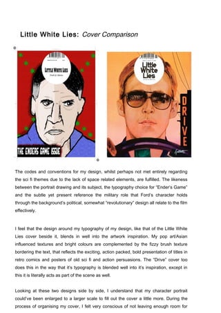
- 1. Little White Lies: Cover Comparison The codes and conventions for my design, whilst perhaps not met entirely regarding the sci fi themes due to the lack of space related elements, are fulfilled. The likeness between the portrait drawing and its subject, the typography choice for “Ender’s Game” and the subtle yet present reference the military role that Ford’s character holds through the background’s political, somewhat “revolutionary” design all relate to the film effectively. I feel that the design around my typography of my design, like that of the Little White Lies cover beside it, blends in well into the artwork inspiration. My pop art/Asian influenced textures and bright colours are complemented by the fizzy brush texture bordering the text, that reflects the exciting, action packed, bold presentation of titles in retro comics and posters of old sci fi and action persuasions. The “Drive” cover too does this in the way that it’s typography is blended well into it’s inspiration, except in this it is literally acts as part of the scene as well. Looking at these two designs side by side, I understand that my character portrait could’ve been enlarged to a larger scale to fill out the cover a little more. During the process of organising my cover, I felt very conscious of not leaving enough room for
- 2. certain items but now, after noticing how Ryan Gosling fills out the cover and how his forehead sits directly under the Little White Lies title sticker, I can’t help but let a large red background gap that sits predominantly under, above and around the sticker in my design, catch my attention. The art styles are quite different, mine being drawn more as a cartoon, the professional design adopting a more detailed approach. However, it seems that perhaps if had took inspiration from some of the facial shading that the professional has used in the “Drive” cover, I would’ve been able to enhance the character likeness.