The document contains summaries of magazine pages about concerts by the bands Paramore and Nirvana:
1) The Paramore page uses puns in the masthead and kicker related to the band's songs and their boat concert. Photos show the band and opening acts performing.
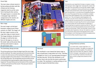
2) The Nirvana page features a black-and-white photo of Kurt Cobain playing guitar. The article discusses the band's top ten gigs. Photos show band performances and a theater advertising their name.
3) Both pages have an unorganized layout with uneven columns and randomly placed images, reflecting the messy conventions of rock music and its target teenage audience.