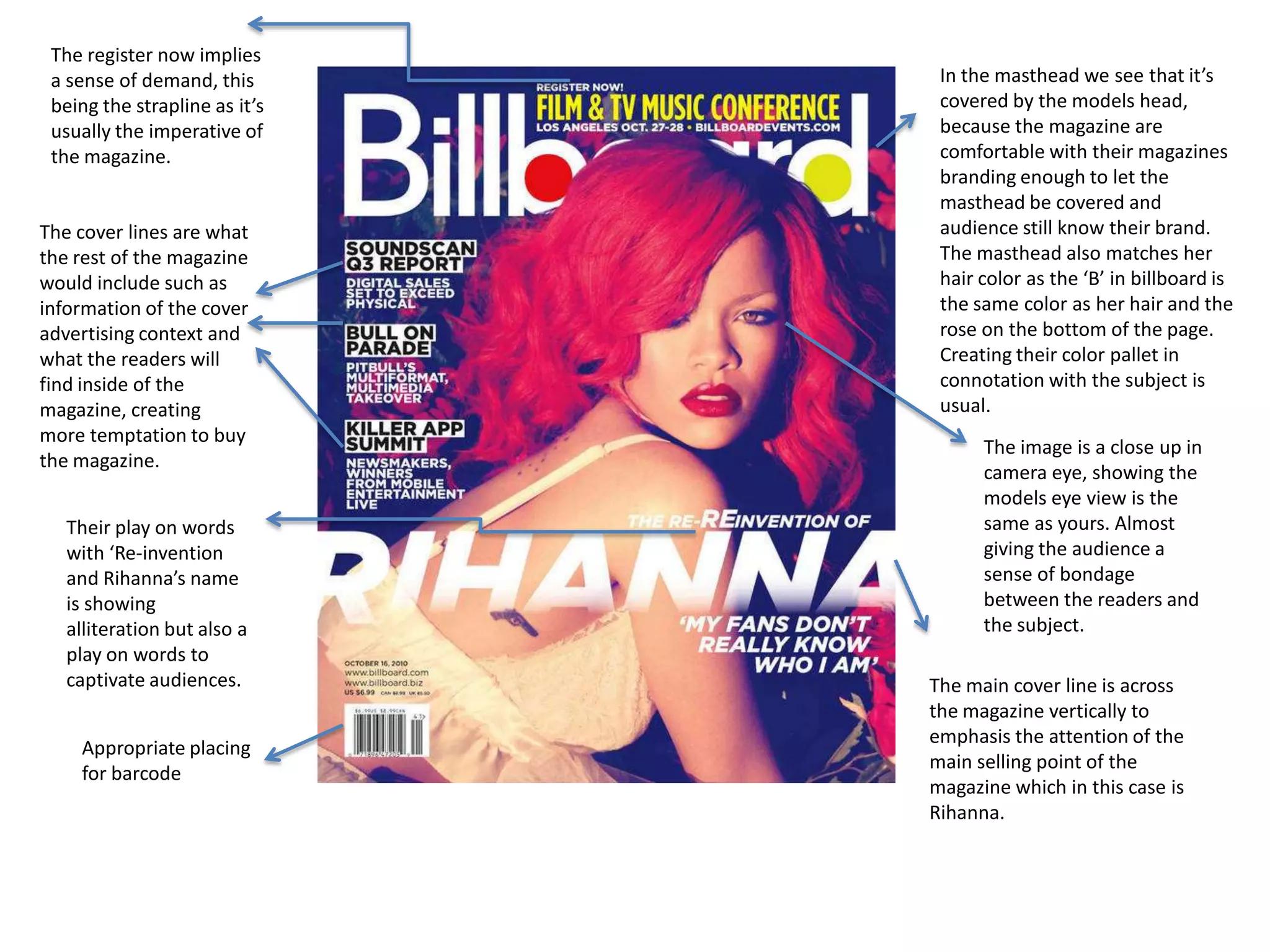
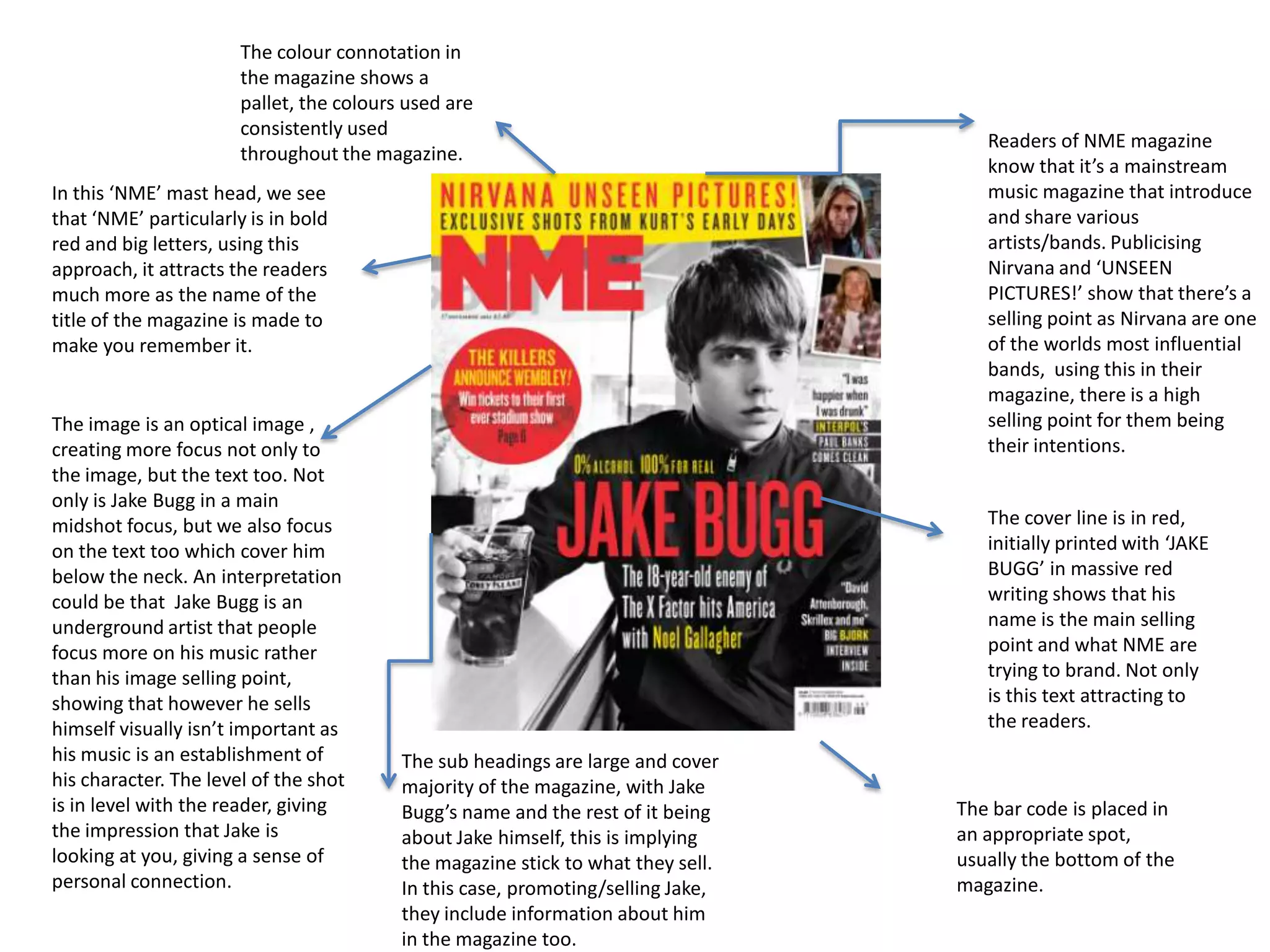
The register now implies
a sense of demand, this
being the strapline as it’s
usually the imperative of
the magazine.

The cover lines are what
the rest of the magazine
would include such as
information of the cover
advertising context and
what the readers will
find inside of the
magazine, creating
more temptation to buy
the magazine.
Their play on words
with ‘Re-invention
and Rihanna’s name
is showing
alliteration but also a
play on words to
captivate audiences.
Appropriate placing
for barcode

In the masthead we see that it’s
covered by the models head,
because the magazine are
comfortable with their magazines
branding enough to let the
masthead be covered and
audience still know their brand.
The masthead also matches her
hair color as the ‘B’ in billboard is
the same color as her hair and the
rose on the bottom of the page.
Creating their color pallet in
connotation with the subject is
usual.
The image is a close up in
camera eye, showing the
models eye view is the
same as yours. Almost
giving the audience a
sense of bondage
between the readers and
the subject.

The main cover line is across
the magazine vertically to
emphasis the attention of the
main selling point of the
magazine which in this case is
Rihanna.
The colour connotation in
the magazine shows a
pallet, the colours used are
consistently used
throughout the magazine.
In this ‘NME’ mast head, we see
that ‘NME’ particularly is in bold
red and big letters, using this
approach, it attracts the readers
much more as the name of the
title of the magazine is made to
make you remember it.

The image is an optical image ,
creating more focus not only to
the image, but the text too. Not
only is Jake Bugg in a main
midshot focus, but we also focus
on the text too which cover him
below the neck. An interpretation
could be that Jake Bugg is an
underground artist that people
focus more on his music rather
than his image selling point,
showing that however he sells
himself visually isn’t important as
his music is an establishment of
his character. The level of the shot
is in level with the reader, giving
the impression that Jake is
looking at you, giving a sense of
personal connection.

Readers of NME magazine
know that it’s a mainstream
music magazine that introduce
and share various
artists/bands. Publicising
Nirvana and ‘UNSEEN
PICTURES!’ show that there’s a
selling point as Nirvana are one
of the worlds most influential
bands, using this in their
magazine, there is a high
selling point for them being
their intentions.
The cover line is in red,
initially printed with ‘JAKE
BUGG’ in massive red
writing shows that his
name is the main selling
point and what NME are
trying to brand. Not only
is this text attracting to
the readers.

The sub headings are large and cover
majority of the magazine, with Jake
Bugg’s name and the rest of it being
about Jake himself, this is implying
the magazine stick to what they sell.
In this case, promoting/selling Jake,
they include information about him
in the magazine too.

The bar code is placed in
an appropriate spot,
usually the bottom of the
magazine.
Straight away, we notice that the ‘Rolling
Stone’ is covered by Jay Z’s head, showing
that the branding they’re establishing is
already so well known that the mast head
can be covered with people knowing what
the magazine is.

Having Jay Z’s photo in a close up
shot and a optical position create
importance to who is on the
cover of the magazine and their
selling point to the magazine.

The colour scheme is black, red
and white as his attire is black.
Using this colour
scheme, they’ve contributed it
towards their pallet and their
text, making the magazine more
appealing and intriguing to the
readers.

The colour clash of the
black and white in
‘songs’ shows a new
approach of text and
presentation which no
other magazine has
really done before,
giving Rolling Stones a
new edge of branding.

The barcode is also in a vertical
approach just like the mast head, giving
another dynamic.

The mast head isn’t like
usual mastheads that is
plastered along the
magazine cover, instead
it’s going down the
magazine cover which
adds dynamic and
breaks the ‘rules’ you’d
say of magazines adding
a new layer to the
selling point making it
more appealing and
Rolling Stones having a
wide fan base they do
with their magazine, are
allowed to break that
rule.

Media magazine covers analysis

  • 1.
    The register nowimplies a sense of demand, this being the strapline as it’s usually the imperative of the magazine. The cover lines are what the rest of the magazine would include such as information of the cover advertising context and what the readers will find inside of the magazine, creating more temptation to buy the magazine. Their play on words with ‘Re-invention and Rihanna’s name is showing alliteration but also a play on words to captivate audiences. Appropriate placing for barcode In the masthead we see that it’s covered by the models head, because the magazine are comfortable with their magazines branding enough to let the masthead be covered and audience still know their brand. The masthead also matches her hair color as the ‘B’ in billboard is the same color as her hair and the rose on the bottom of the page. Creating their color pallet in connotation with the subject is usual. The image is a close up in camera eye, showing the models eye view is the same as yours. Almost giving the audience a sense of bondage between the readers and the subject. The main cover line is across the magazine vertically to emphasis the attention of the main selling point of the magazine which in this case is Rihanna.
  • 2.
    The colour connotationin the magazine shows a pallet, the colours used are consistently used throughout the magazine. In this ‘NME’ mast head, we see that ‘NME’ particularly is in bold red and big letters, using this approach, it attracts the readers much more as the name of the title of the magazine is made to make you remember it. The image is an optical image , creating more focus not only to the image, but the text too. Not only is Jake Bugg in a main midshot focus, but we also focus on the text too which cover him below the neck. An interpretation could be that Jake Bugg is an underground artist that people focus more on his music rather than his image selling point, showing that however he sells himself visually isn’t important as his music is an establishment of his character. The level of the shot is in level with the reader, giving the impression that Jake is looking at you, giving a sense of personal connection. Readers of NME magazine know that it’s a mainstream music magazine that introduce and share various artists/bands. Publicising Nirvana and ‘UNSEEN PICTURES!’ show that there’s a selling point as Nirvana are one of the worlds most influential bands, using this in their magazine, there is a high selling point for them being their intentions. The cover line is in red, initially printed with ‘JAKE BUGG’ in massive red writing shows that his name is the main selling point and what NME are trying to brand. Not only is this text attracting to the readers. The sub headings are large and cover majority of the magazine, with Jake Bugg’s name and the rest of it being about Jake himself, this is implying the magazine stick to what they sell. In this case, promoting/selling Jake, they include information about him in the magazine too. The bar code is placed in an appropriate spot, usually the bottom of the magazine.
  • 3.
    Straight away, wenotice that the ‘Rolling Stone’ is covered by Jay Z’s head, showing that the branding they’re establishing is already so well known that the mast head can be covered with people knowing what the magazine is. Having Jay Z’s photo in a close up shot and a optical position create importance to who is on the cover of the magazine and their selling point to the magazine. The colour scheme is black, red and white as his attire is black. Using this colour scheme, they’ve contributed it towards their pallet and their text, making the magazine more appealing and intriguing to the readers. The colour clash of the black and white in ‘songs’ shows a new approach of text and presentation which no other magazine has really done before, giving Rolling Stones a new edge of branding. The barcode is also in a vertical approach just like the mast head, giving another dynamic. The mast head isn’t like usual mastheads that is plastered along the magazine cover, instead it’s going down the magazine cover which adds dynamic and breaks the ‘rules’ you’d say of magazines adding a new layer to the selling point making it more appealing and Rolling Stones having a wide fan base they do with their magazine, are allowed to break that rule.