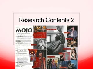
2. Masthead
The masthead in the early editions are always similar, where the masthead is
to the top left of the page and is in a bold and uppercase font. The editor has
done this to create a house style and has created a brand identity doing so.
The dateline is always located in the same place, adding to the house style
and making it easy for the reader to find. The editor has also used sans serif
this is to keep it clear and recognisable as many ages will read this magazine.
3. Page Numbers
The page numbers are
in a box-out this is to
be distinct and clear,
this also attracts the
readers eye. The
written contents takes
up a quarter of the
page, therefore
appealing to a range of
ages. The page
numbers in the
contents links to the
page numbers on the
right, this is so the
reader can get a small
insight on what the
story will be like.
4. Text/fonts
There are many different fonts used
within this article, this links to the
genres of the magazine. The main
titles in the article are in bold and
also in a larger font as this attracts
the readers eye. The information is
in italics as they want to give you
more detail about the main title.
White writing on a red box-out has
been used as this creates a distinct
look, therefore appealing to the
customer. Sans serif has been used
for the numbers to give a slightly
alternative look.
5. Images
The images link to the genre because as they are
wearing quite alternative clothes, this links to the
genre of the music magazine. Many of these images
are taken using different angles from medium shots
to wide shots, this is because they want to show a
little bit about there personality before you read the
article.
6. Columns and layout
Columns are used on this contents page however two images
overlap the columns creating a collage effect this makes the
contents page seem fun.
The layout of the contents page has created a house style as this
is consistent throughout Mojo magazines. It is also interesting
that in many of the mojo magazines a couple of pages after the
contents page there is a section called, ‘What goes on!’ this
elaborates on the stories seen on contents page. This is an
interesting feature that I haven’t seen in any other magazines.
7. Links and Representations
Another theory that is present is
Richard Dyer’s as he said ‘A star is an
image, not a real person, that is
constructed.’ this is presented as in this
image we see a man dressed in a
glittery hat with a glittery guitar strap. It
could be argued this is all for show as it
is an action shot taken of the artist on
stage. The red in his jacket has a
connotation of danger but the gold
tassels contradicts and could be a sign
of royalty or formality.
8. Links and Representations
The contents page links to the genres of the
magazine because there are very alternative
artists included. Laura Mulvey’s theory has
been broken as the woman in the contents
page isn’t ‘viewed for the pleasure of men’, she
is quite refined and looks laid back.
What is also interesting is;
• The pose which looks quite relaxed but
‘manly’.
• Her top say’s ‘sweet’ but she is dressed quite
‘manly’.
• The cowboy hat relates to the country genre.