SlideShare a Scribd company logo
1 of 4
The masthead consists of the bold colours, red and white. This
can resemble how the genre of the magazine its based on, is
quite bold. On the title of the magazine there is almost like a
dint like appearance- this links to the dominant image as its got
that sticker affect, some skaters stick stickers on their
skateboards so it keeps that constant coordination towards the
dominant image.
The name of the magazine has an exclamation point, which
connotes shouting, like before , this is also representing the
genre of music in which the magazine is based on. This is
because people associate rock genres as screaming and
shouting.
An alternative idea from this is so it engages their target
audience when they walk past the magazine, creating the aim
to get them stop and buy the magazine- this could be because
of the bold fonts being used, and the exclamation point at the
end… as if its almost shouting at them.
The bold fonts used also help to represet how much that genre
stands out from mainstream music.
The dominant image used is the front singer of a
band Neck Deep, Ben Barlow. By creating him as the
dominant image for that weeks magazine cover,
helps attract more of KERRANG!’s audience build and
buy the magazine, as a result of fans of that particular
band or just himself will see it and be automatically
intrigued. His facial expression is shocked, which links
to the subtitle quote “he worlds most wanted”
creating a sense of mystery, curiosity, drawing the
audience in.
Ben appears of the front cover as dominating over
the masthead, this is because the magazine company
want to show off their popularity- they are doing this
cleverly by having some of the title missing, this is to
represent that their company is that big, they don’t
need to have there name visible, because of maybe
their bold choice in colours, they are well
remembered.
He appears to hold a skate board which shows his
causal part in life, allowing many other people from
that audience to relate in interests and will be
engaged by that. Its also sponsoring their band in a
senses they have there name on the skate board. It
also once again allows Neck deeps fan base to by the
magazine and become familiar with the company.
Everything kerrang does on their front page, in my
opinion is always helping them build up their target
audience , luring them in with big top name brands .
Kerrang has put the rest of the band as sub images, this
shows how the front singer is presented as the important
one and almost represents a hierarchy . Kerrang also shows
a sense of direct mode of address. This is shown when the
sub images are looking directly at the camera, as if they are
looking at us personally- by doing this is attracts us to the
images which is the magazines constant aim
Here they show another sub image but
of the same person that is in the
dominant image. Only this time it is with
a dog. This is to draw the attention,
possibly to female audiences because ,
nothing wins a girls heart like an animal
lover. It enhances the audience once
more.
Kerrang keeps a constant colour scheme throughout their front
cover, and as part of their target audience I know that that
constant colour scheme is shown throughout the magazine. The
use of the white on red is eye catching. The use of the colour red is
a use of semiology as it can suggest negative , evil, devilish beings.
Theoretically speaking, I think this is clever as rock music r centuries
has been portrayed as “the devils music” , so it’s a bold and risky
colour to use, but kerrang , adding the bold font, use this and
embrace it. The conative meaning for this, potentially maybe that
even though all these stereotypes of the music is represented, you
should still listen to the music, and be bold about it , to wear what
you want with pride and listen to what you want, by doing this it
creates the use of subject positon .
Here the creaters of kerrang magazine use a
different colour and font scheme to draw
away from the main topic of that weeks
magazine, allowing the audience to know
that even if they didn'’t like or listen to that
band there is still much much more in that
magazine about a big chunk of well known
bands. The bands names are written in a
different colour font, the use of the orange
has a massive impact as it stands out greatly
from the black background, the use of
capitalized letter also help to engage the
audience towards buying the magazine
because it personifies that the magazine and
the information's shouting directly at you to
buy the magazine - yet another ruse of direct
mode of address. ( ever magazine company's
aim is to make their magazine cover as
persuading as possible to get people to buy it
!)
Here the background of the magazine is a
collage of the band , this shows that they
are going to be a he part of the
magazine. Also, the sell line, “form skater
kids to the worlds most wanted” emerge
with the background because its almost
like it’s a wanted poster, multiple photos
to give that sense of emergency to find
them. The front cover shows a constant
theme .
Kerrang uses different band names to
draw more people in , they do this by
their skyline, as shown at the top of the
magazine. The name of the bands , again
are in a orange font, with bold
capitalized letters… again this is to over
egzadurate how much is in that
magazine.
This double page spread was taken from another
kerrang magazine..
Here kerrang has used a running head in a noticeable
place to grab the attention to the reader. By putting it
near the dominant image, its hard to miss.
The font and the colours are bold. They resemble
kerrang’s bold red masthead and it is what the
company is remembered by the background of the
running head is black, which using bathes theory, is
just normal , but using the conational meaning, it
could also link to how black is seen as a stereotypical
colours for this genre of music, the colours black
resembles everything evil , and darkness. So using
these colours, really match perfectly to what the
magazine is about and the genre of music. The same
method applies for the red that has been used. It also
jumps out massively from the black background,
which also resembles how people see the music as
screaming .
The heading on the double page spread is to create a sense of
comedy. I know this with being apart of the audience for this
magazine.
It also creates a sense of mystery. it shows you me at six singer
Josh Franceshi and bring me the horizons singer Oliver Skyes..
By replacing the six and writing Sykes, so as a result of this
terrible pun, it allows the reader to be curious as to why Oliver
is with him.
The colour scheme still is repeated and Sykes is red to show the
different name of the band and to create that shocked and
almost confused reaction when you read it.
The layout of this double page spread is simple, which makes it
very effective for the reader as it almost cuts straight to the
point, as it doesn't’t drag on. It appeals o the audience in this
sense because there target audience is many adolescents, they
aren't going to read two pages worth of information, they will
lose interest .- so by doing this, kerrang allows the audience to
still be engaged but they cleverly don't go over bard with there
information.
The use of the drop cap, also known as a kicker, helps
set the rest of the article, its shows the introduction of
the article. Yet again, kerrang uses there iconic red bold
font to engage the reader onto reading that article.
Here the 2 band members are dressed quite casually. Which suggests that they quite laidback and comfortable in their own skin. This shows , to an extent Hall and receptions theory , as it
could potentially be a hidden message, that you should dress the way you want, be the way you want and you should be comfortable with how you are , the decode of this would be so the
audience feels like that’s the way they have to be, they might then aspire to be like those two. The informality of how Josh and Oli is dressed and positioned fits well with genre of music,
because it would look outplaced and the magazines theme wouldn't’t run smoothly if they were dressed formally as if they were going o an award ceremony. They way they are positioned
suggest a personal relationship, in this case, being friendship-this is also as Oli makes a love heart with his hands.
Due to this, it could make the audience curious and raise questions like are the going to do a collaboration ? Or are they touring together? Kerrang keeps the audience engaged constantly by
revealing information but all of it and the reason for things . The body language represented shows a friendly atmosphere, this could potentially be an encode(theoretically speaking) , and
the hidden message could be that you should treat everybody with love and in a friendly manner, the reader will realize this and some of the audience will aspire to be like them so by
presenting these men in a friendly manner , will help encourage people to become nicer people.
In terms of mise en scene, the lighting used on the two men is pointing directly on them, this shows that they are the main focus on this page, and that they are the important information. It
also creates a sense of dominance over everything else on this page. The company used cinematography and used a 2 shot to help show more information on the page because if someone
was not familiar with the bands, but recognized there appearance or face, it will help them realize.
the way the writer has written the article is informal,
this is because of who the magazine is aimed at,
adolescents who read this wont be intrigued or
possibly understand it if its wrote formally, like a
newspaper, also it links to the genre of music again.
Again kerrang is keeping the constant colour theme
throughout the magazine.
Gender: male AND female
Male- 50% of the audience read these
magazines and share interest in these things
Female 50% of the audience also read these
type of magazines and share these interests.
Age group of people that buy these types of
magazine is from 13 -19 year
olds(adolescents).
Physcographic- personally I believe strongly
that the category of aspirers falls under the
category of my target audience as they are
oriented to their image and appearance.
Another category that my target audience falls
under are the strugglers and reformers, due to
buying alcohol and seeking enlighten.
Social class- the social class in which would
mostly be my target audience varies from
working class (D) and casual/lowest grade
workers (E).

More Related Content

What's hot

Media evaluation
Media evaluationMedia evaluation
Media evaluationmegan
 
Magazine Double Page Spread Research
Magazine Double Page Spread ResearchMagazine Double Page Spread Research
Magazine Double Page Spread ResearchLynley Sykes
 
Joss bradley research and planning
Joss bradley  research and planningJoss bradley  research and planning
Joss bradley research and planningJoss Bradley
 
Photography planning
Photography planningPhotography planning
Photography planningEmma Kelly
 
As media coursework best
As media coursework bestAs media coursework best
As media coursework bestJoss Bradley
 
Analysis of music magazine one nme
Analysis of music magazine one nmeAnalysis of music magazine one nme
Analysis of music magazine one nmealishalumsden
 
Dizzee rascal cover page
Dizzee rascal cover page Dizzee rascal cover page
Dizzee rascal cover page ALarsen14
 
Front Cover Analysis
Front Cover Analysis Front Cover Analysis
Front Cover Analysis Shauna-Mullen
 
5 magazine front covers
5 magazine front covers5 magazine front covers
5 magazine front coversrobyngarcia
 
Product Research
Product ResearchProduct Research
Product Researchkatwatson96
 
Textual Analysis of "Real Texts"
Textual Analysis of "Real Texts"Textual Analysis of "Real Texts"
Textual Analysis of "Real Texts"10BeatBe
 
Signs & Signifiers Textual Analysis of Music Magazines
Signs & Signifiers Textual Analysis of Music MagazinesSigns & Signifiers Textual Analysis of Music Magazines
Signs & Signifiers Textual Analysis of Music MagazinesBetsyEGR
 
Media page designs
Media page designsMedia page designs
Media page designs10BeatBe
 
Front Cover Analysis
Front Cover AnalysisFront Cover Analysis
Front Cover AnalysisShauna-Mullen
 
Magazine music evaluation
Magazine music evaluationMagazine music evaluation
Magazine music evaluationcassidy111
 
Magazine analysis
Magazine analysisMagazine analysis
Magazine analysismillerjess
 

What's hot (18)

Media evaluation
Media evaluationMedia evaluation
Media evaluation
 
Magazine Double Page Spread Research
Magazine Double Page Spread ResearchMagazine Double Page Spread Research
Magazine Double Page Spread Research
 
Question 1
Question 1Question 1
Question 1
 
Joss bradley research and planning
Joss bradley  research and planningJoss bradley  research and planning
Joss bradley research and planning
 
Photography planning
Photography planningPhotography planning
Photography planning
 
As media coursework best
As media coursework bestAs media coursework best
As media coursework best
 
Analysis of music magazine one nme
Analysis of music magazine one nmeAnalysis of music magazine one nme
Analysis of music magazine one nme
 
Dizzee rascal cover page
Dizzee rascal cover page Dizzee rascal cover page
Dizzee rascal cover page
 
Front Cover Analysis
Front Cover Analysis Front Cover Analysis
Front Cover Analysis
 
5 magazine front covers
5 magazine front covers5 magazine front covers
5 magazine front covers
 
Product Research
Product ResearchProduct Research
Product Research
 
Textual Analysis of "Real Texts"
Textual Analysis of "Real Texts"Textual Analysis of "Real Texts"
Textual Analysis of "Real Texts"
 
Textual analysis
Textual analysis Textual analysis
Textual analysis
 
Signs & Signifiers Textual Analysis of Music Magazines
Signs & Signifiers Textual Analysis of Music MagazinesSigns & Signifiers Textual Analysis of Music Magazines
Signs & Signifiers Textual Analysis of Music Magazines
 
Media page designs
Media page designsMedia page designs
Media page designs
 
Front Cover Analysis
Front Cover AnalysisFront Cover Analysis
Front Cover Analysis
 
Magazine music evaluation
Magazine music evaluationMagazine music evaluation
Magazine music evaluation
 
Magazine analysis
Magazine analysisMagazine analysis
Magazine analysis
 

Similar to Bold Magazine Cover Designs and Techniques

Front Cover Annotations
Front Cover AnnotationsFront Cover Annotations
Front Cover AnnotationsStevenSibiya
 
Magazine analysis
Magazine analysisMagazine analysis
Magazine analysismillerjess
 
Magazine Comparison
Magazine ComparisonMagazine Comparison
Magazine Comparisonguestc740a47
 
Market research
Market researchMarket research
Market researchKaris Hays
 
Signs & Signifiers Textual Analysis of Music Magazines
Signs & Signifiers Textual Analysis of Music MagazinesSigns & Signifiers Textual Analysis of Music Magazines
Signs & Signifiers Textual Analysis of Music MagazinesBetsyEGR
 
Market research
Market researchMarket research
Market researchKaris Hays
 
Magazine Comparison
Magazine ComparisonMagazine Comparison
Magazine Comparisonguest924bb5c
 
Analysing 3 magazine covers
Analysing 3 magazine coversAnalysing 3 magazine covers
Analysing 3 magazine coversblack-bird
 
Double page analysis
Double page analysisDouble page analysis
Double page analysisarnellgrace
 
Magazine research really official [recovered]
Magazine research really official [recovered]Magazine research really official [recovered]
Magazine research really official [recovered]Karis Hays
 
Media Evaluation
Media EvaluationMedia Evaluation
Media EvaluationEmLeeman1
 
Magazine research really official [recovered]
Magazine research really official [recovered]Magazine research really official [recovered]
Magazine research really official [recovered]eleanorwaring1
 

Similar to Bold Magazine Cover Designs and Techniques (20)

Front Cover Annotations
Front Cover AnnotationsFront Cover Annotations
Front Cover Annotations
 
Magazine analysis
Magazine analysisMagazine analysis
Magazine analysis
 
Magazine Comparison
Magazine ComparisonMagazine Comparison
Magazine Comparison
 
Market research
Market researchMarket research
Market research
 
Signs & Signifiers Textual Analysis of Music Magazines
Signs & Signifiers Textual Analysis of Music MagazinesSigns & Signifiers Textual Analysis of Music Magazines
Signs & Signifiers Textual Analysis of Music Magazines
 
Market research
Market researchMarket research
Market research
 
Magazine Comparison
Magazine ComparisonMagazine Comparison
Magazine Comparison
 
Task 2
Task 2Task 2
Task 2
 
Analysing 3 magazine covers
Analysing 3 magazine coversAnalysing 3 magazine covers
Analysing 3 magazine covers
 
Music magazine ananlyiss
Music magazine ananlyissMusic magazine ananlyiss
Music magazine ananlyiss
 
Double page analysis
Double page analysisDouble page analysis
Double page analysis
 
textual analysis
textual analysis textual analysis
textual analysis
 
textual analysis
textual analysis textual analysis
textual analysis
 
Magazine research really official [recovered]
Magazine research really official [recovered]Magazine research really official [recovered]
Magazine research really official [recovered]
 
Media Evaluation
Media EvaluationMedia Evaluation
Media Evaluation
 
Media expansion
Media expansionMedia expansion
Media expansion
 
Media expansion
Media expansionMedia expansion
Media expansion
 
Evaluation 5
Evaluation 5Evaluation 5
Evaluation 5
 
Magazine research really official [recovered]
Magazine research really official [recovered]Magazine research really official [recovered]
Magazine research really official [recovered]
 
Textual Analysis
Textual AnalysisTextual Analysis
Textual Analysis
 

Recently uploaded

FULL ENJOY - 9953040155 Call Girls in Sector 61 | Noida
FULL ENJOY - 9953040155 Call Girls in Sector 61 | NoidaFULL ENJOY - 9953040155 Call Girls in Sector 61 | Noida
FULL ENJOY - 9953040155 Call Girls in Sector 61 | NoidaMalviyaNagarCallGirl
 
Hauz Khas Call Girls ☎ 7042364481 independent Escorts Service in delhi
Hauz Khas Call Girls ☎ 7042364481 independent Escorts Service in delhiHauz Khas Call Girls ☎ 7042364481 independent Escorts Service in delhi
Hauz Khas Call Girls ☎ 7042364481 independent Escorts Service in delhiHot Call Girls In Sector 58 (Noida)
 
定制昆士兰大学毕业证(本硕)UQ学位证书原版一比一
定制昆士兰大学毕业证(本硕)UQ学位证书原版一比一定制昆士兰大学毕业证(本硕)UQ学位证书原版一比一
定制昆士兰大学毕业证(本硕)UQ学位证书原版一比一fjjhfuubb
 
Beautiful Vip Call Girls Punjabi Bagh 9711199012 Call /Whatsapps
Beautiful Vip  Call Girls Punjabi Bagh 9711199012 Call /WhatsappsBeautiful Vip  Call Girls Punjabi Bagh 9711199012 Call /Whatsapps
Beautiful Vip Call Girls Punjabi Bagh 9711199012 Call /Whatsappssapnasaifi408
 
2024 TOP 10 most fuel-efficient vehicles according to the US agency
2024 TOP 10 most fuel-efficient vehicles according to the US agency2024 TOP 10 most fuel-efficient vehicles according to the US agency
2024 TOP 10 most fuel-efficient vehicles according to the US agencyHyundai Motor Group
 
UNIT-1-VEHICLE STRUCTURE AND ENGINES.ppt
UNIT-1-VEHICLE STRUCTURE AND ENGINES.pptUNIT-1-VEHICLE STRUCTURE AND ENGINES.ppt
UNIT-1-VEHICLE STRUCTURE AND ENGINES.pptDineshKumar4165
 
VDA 6.3 Process Approach in Automotive Industries
VDA 6.3 Process Approach in Automotive IndustriesVDA 6.3 Process Approach in Automotive Industries
VDA 6.3 Process Approach in Automotive IndustriesKannanDN
 
Russian Call Girls Delhi Indirapuram {9711199171} Aarvi Gupta ✌️Independent ...
Russian  Call Girls Delhi Indirapuram {9711199171} Aarvi Gupta ✌️Independent ...Russian  Call Girls Delhi Indirapuram {9711199171} Aarvi Gupta ✌️Independent ...
Russian Call Girls Delhi Indirapuram {9711199171} Aarvi Gupta ✌️Independent ...shivangimorya083
 
原版工艺美国普林斯顿大学毕业证Princeton毕业证成绩单修改留信学历认证
原版工艺美国普林斯顿大学毕业证Princeton毕业证成绩单修改留信学历认证原版工艺美国普林斯顿大学毕业证Princeton毕业证成绩单修改留信学历认证
原版工艺美国普林斯顿大学毕业证Princeton毕业证成绩单修改留信学历认证jjrehjwj11gg
 
(办理学位证)墨尔本大学毕业证(Unimelb毕业证书)成绩单留信学历认证原版一模一样
(办理学位证)墨尔本大学毕业证(Unimelb毕业证书)成绩单留信学历认证原版一模一样(办理学位证)墨尔本大学毕业证(Unimelb毕业证书)成绩单留信学历认证原版一模一样
(办理学位证)墨尔本大学毕业证(Unimelb毕业证书)成绩单留信学历认证原版一模一样whjjkkk
 
Dubai Call Girls Size E6 (O525547819) Call Girls In Dubai
Dubai Call Girls  Size E6 (O525547819) Call Girls In DubaiDubai Call Girls  Size E6 (O525547819) Call Girls In Dubai
Dubai Call Girls Size E6 (O525547819) Call Girls In Dubaikojalkojal131
 
call girls in Jama Masjid (DELHI) 🔝 >༒9953330565🔝 genuine Escort Service 🔝✔️✔️
call girls in Jama Masjid (DELHI) 🔝 >༒9953330565🔝 genuine Escort Service 🔝✔️✔️call girls in Jama Masjid (DELHI) 🔝 >༒9953330565🔝 genuine Escort Service 🔝✔️✔️
call girls in Jama Masjid (DELHI) 🔝 >༒9953330565🔝 genuine Escort Service 🔝✔️✔️9953056974 Low Rate Call Girls In Saket, Delhi NCR
 
如何办理迈阿密大学毕业证(UM毕业证)成绩单留信学历认证原版一比一
如何办理迈阿密大学毕业证(UM毕业证)成绩单留信学历认证原版一比一如何办理迈阿密大学毕业证(UM毕业证)成绩单留信学历认证原版一比一
如何办理迈阿密大学毕业证(UM毕业证)成绩单留信学历认证原版一比一ga6c6bdl
 
办理埃默里大学毕业证Emory毕业证原版一比一
办理埃默里大学毕业证Emory毕业证原版一比一办理埃默里大学毕业证Emory毕业证原版一比一
办理埃默里大学毕业证Emory毕业证原版一比一mkfnjj
 
Call Girls in Karachi | +923081633338 | Karachi Call Girls
Call Girls in Karachi  | +923081633338 | Karachi Call GirlsCall Girls in Karachi  | +923081633338 | Karachi Call Girls
Call Girls in Karachi | +923081633338 | Karachi Call GirlsAyesha Khan
 
Innovating Manufacturing with CNC Technology
Innovating Manufacturing with CNC TechnologyInnovating Manufacturing with CNC Technology
Innovating Manufacturing with CNC Technologyquickpartslimitlessm
 
Call Girl Service Global Village Dubai +971509430017 Independent Call Girls G...
Call Girl Service Global Village Dubai +971509430017 Independent Call Girls G...Call Girl Service Global Village Dubai +971509430017 Independent Call Girls G...
Call Girl Service Global Village Dubai +971509430017 Independent Call Girls G...kexey39068
 
2024 WRC Hyundai World Rally Team’s i20 N Rally1 Hybrid
2024 WRC Hyundai World Rally Team’s i20 N Rally1 Hybrid2024 WRC Hyundai World Rally Team’s i20 N Rally1 Hybrid
2024 WRC Hyundai World Rally Team’s i20 N Rally1 HybridHyundai Motor Group
 
Not Sure About VW EGR Valve Health Look For These Symptoms
Not Sure About VW EGR Valve Health Look For These SymptomsNot Sure About VW EGR Valve Health Look For These Symptoms
Not Sure About VW EGR Valve Health Look For These SymptomsFifth Gear Automotive
 

Recently uploaded (20)

FULL ENJOY - 9953040155 Call Girls in Sector 61 | Noida
FULL ENJOY - 9953040155 Call Girls in Sector 61 | NoidaFULL ENJOY - 9953040155 Call Girls in Sector 61 | Noida
FULL ENJOY - 9953040155 Call Girls in Sector 61 | Noida
 
Hauz Khas Call Girls ☎ 7042364481 independent Escorts Service in delhi
Hauz Khas Call Girls ☎ 7042364481 independent Escorts Service in delhiHauz Khas Call Girls ☎ 7042364481 independent Escorts Service in delhi
Hauz Khas Call Girls ☎ 7042364481 independent Escorts Service in delhi
 
定制昆士兰大学毕业证(本硕)UQ学位证书原版一比一
定制昆士兰大学毕业证(本硕)UQ学位证书原版一比一定制昆士兰大学毕业证(本硕)UQ学位证书原版一比一
定制昆士兰大学毕业证(本硕)UQ学位证书原版一比一
 
Beautiful Vip Call Girls Punjabi Bagh 9711199012 Call /Whatsapps
Beautiful Vip  Call Girls Punjabi Bagh 9711199012 Call /WhatsappsBeautiful Vip  Call Girls Punjabi Bagh 9711199012 Call /Whatsapps
Beautiful Vip Call Girls Punjabi Bagh 9711199012 Call /Whatsapps
 
Call Girls In Kirti Nagar 📱 9999965857 🤩 Delhi 🫦 HOT AND SEXY VVIP 🍎 SERVICE
Call Girls In Kirti Nagar 📱  9999965857  🤩 Delhi 🫦 HOT AND SEXY VVIP 🍎 SERVICECall Girls In Kirti Nagar 📱  9999965857  🤩 Delhi 🫦 HOT AND SEXY VVIP 🍎 SERVICE
Call Girls In Kirti Nagar 📱 9999965857 🤩 Delhi 🫦 HOT AND SEXY VVIP 🍎 SERVICE
 
2024 TOP 10 most fuel-efficient vehicles according to the US agency
2024 TOP 10 most fuel-efficient vehicles according to the US agency2024 TOP 10 most fuel-efficient vehicles according to the US agency
2024 TOP 10 most fuel-efficient vehicles according to the US agency
 
UNIT-1-VEHICLE STRUCTURE AND ENGINES.ppt
UNIT-1-VEHICLE STRUCTURE AND ENGINES.pptUNIT-1-VEHICLE STRUCTURE AND ENGINES.ppt
UNIT-1-VEHICLE STRUCTURE AND ENGINES.ppt
 
VDA 6.3 Process Approach in Automotive Industries
VDA 6.3 Process Approach in Automotive IndustriesVDA 6.3 Process Approach in Automotive Industries
VDA 6.3 Process Approach in Automotive Industries
 
Russian Call Girls Delhi Indirapuram {9711199171} Aarvi Gupta ✌️Independent ...
Russian  Call Girls Delhi Indirapuram {9711199171} Aarvi Gupta ✌️Independent ...Russian  Call Girls Delhi Indirapuram {9711199171} Aarvi Gupta ✌️Independent ...
Russian Call Girls Delhi Indirapuram {9711199171} Aarvi Gupta ✌️Independent ...
 
原版工艺美国普林斯顿大学毕业证Princeton毕业证成绩单修改留信学历认证
原版工艺美国普林斯顿大学毕业证Princeton毕业证成绩单修改留信学历认证原版工艺美国普林斯顿大学毕业证Princeton毕业证成绩单修改留信学历认证
原版工艺美国普林斯顿大学毕业证Princeton毕业证成绩单修改留信学历认证
 
(办理学位证)墨尔本大学毕业证(Unimelb毕业证书)成绩单留信学历认证原版一模一样
(办理学位证)墨尔本大学毕业证(Unimelb毕业证书)成绩单留信学历认证原版一模一样(办理学位证)墨尔本大学毕业证(Unimelb毕业证书)成绩单留信学历认证原版一模一样
(办理学位证)墨尔本大学毕业证(Unimelb毕业证书)成绩单留信学历认证原版一模一样
 
Dubai Call Girls Size E6 (O525547819) Call Girls In Dubai
Dubai Call Girls  Size E6 (O525547819) Call Girls In DubaiDubai Call Girls  Size E6 (O525547819) Call Girls In Dubai
Dubai Call Girls Size E6 (O525547819) Call Girls In Dubai
 
call girls in Jama Masjid (DELHI) 🔝 >༒9953330565🔝 genuine Escort Service 🔝✔️✔️
call girls in Jama Masjid (DELHI) 🔝 >༒9953330565🔝 genuine Escort Service 🔝✔️✔️call girls in Jama Masjid (DELHI) 🔝 >༒9953330565🔝 genuine Escort Service 🔝✔️✔️
call girls in Jama Masjid (DELHI) 🔝 >༒9953330565🔝 genuine Escort Service 🔝✔️✔️
 
如何办理迈阿密大学毕业证(UM毕业证)成绩单留信学历认证原版一比一
如何办理迈阿密大学毕业证(UM毕业证)成绩单留信学历认证原版一比一如何办理迈阿密大学毕业证(UM毕业证)成绩单留信学历认证原版一比一
如何办理迈阿密大学毕业证(UM毕业证)成绩单留信学历认证原版一比一
 
办理埃默里大学毕业证Emory毕业证原版一比一
办理埃默里大学毕业证Emory毕业证原版一比一办理埃默里大学毕业证Emory毕业证原版一比一
办理埃默里大学毕业证Emory毕业证原版一比一
 
Call Girls in Karachi | +923081633338 | Karachi Call Girls
Call Girls in Karachi  | +923081633338 | Karachi Call GirlsCall Girls in Karachi  | +923081633338 | Karachi Call Girls
Call Girls in Karachi | +923081633338 | Karachi Call Girls
 
Innovating Manufacturing with CNC Technology
Innovating Manufacturing with CNC TechnologyInnovating Manufacturing with CNC Technology
Innovating Manufacturing with CNC Technology
 
Call Girl Service Global Village Dubai +971509430017 Independent Call Girls G...
Call Girl Service Global Village Dubai +971509430017 Independent Call Girls G...Call Girl Service Global Village Dubai +971509430017 Independent Call Girls G...
Call Girl Service Global Village Dubai +971509430017 Independent Call Girls G...
 
2024 WRC Hyundai World Rally Team’s i20 N Rally1 Hybrid
2024 WRC Hyundai World Rally Team’s i20 N Rally1 Hybrid2024 WRC Hyundai World Rally Team’s i20 N Rally1 Hybrid
2024 WRC Hyundai World Rally Team’s i20 N Rally1 Hybrid
 
Not Sure About VW EGR Valve Health Look For These Symptoms
Not Sure About VW EGR Valve Health Look For These SymptomsNot Sure About VW EGR Valve Health Look For These Symptoms
Not Sure About VW EGR Valve Health Look For These Symptoms
 

Bold Magazine Cover Designs and Techniques

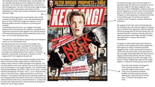
  • 1. The masthead consists of the bold colours, red and white. This can resemble how the genre of the magazine its based on, is quite bold. On the title of the magazine there is almost like a dint like appearance- this links to the dominant image as its got that sticker affect, some skaters stick stickers on their skateboards so it keeps that constant coordination towards the dominant image. The name of the magazine has an exclamation point, which connotes shouting, like before , this is also representing the genre of music in which the magazine is based on. This is because people associate rock genres as screaming and shouting. An alternative idea from this is so it engages their target audience when they walk past the magazine, creating the aim to get them stop and buy the magazine- this could be because of the bold fonts being used, and the exclamation point at the end… as if its almost shouting at them. The bold fonts used also help to represet how much that genre stands out from mainstream music. The dominant image used is the front singer of a band Neck Deep, Ben Barlow. By creating him as the dominant image for that weeks magazine cover, helps attract more of KERRANG!’s audience build and buy the magazine, as a result of fans of that particular band or just himself will see it and be automatically intrigued. His facial expression is shocked, which links to the subtitle quote “he worlds most wanted” creating a sense of mystery, curiosity, drawing the audience in. Ben appears of the front cover as dominating over the masthead, this is because the magazine company want to show off their popularity- they are doing this cleverly by having some of the title missing, this is to represent that their company is that big, they don’t need to have there name visible, because of maybe their bold choice in colours, they are well remembered. He appears to hold a skate board which shows his causal part in life, allowing many other people from that audience to relate in interests and will be engaged by that. Its also sponsoring their band in a senses they have there name on the skate board. It also once again allows Neck deeps fan base to by the magazine and become familiar with the company. Everything kerrang does on their front page, in my opinion is always helping them build up their target audience , luring them in with big top name brands . Kerrang has put the rest of the band as sub images, this shows how the front singer is presented as the important one and almost represents a hierarchy . Kerrang also shows a sense of direct mode of address. This is shown when the sub images are looking directly at the camera, as if they are looking at us personally- by doing this is attracts us to the images which is the magazines constant aim Here they show another sub image but of the same person that is in the dominant image. Only this time it is with a dog. This is to draw the attention, possibly to female audiences because , nothing wins a girls heart like an animal lover. It enhances the audience once more. Kerrang keeps a constant colour scheme throughout their front cover, and as part of their target audience I know that that constant colour scheme is shown throughout the magazine. The use of the white on red is eye catching. The use of the colour red is a use of semiology as it can suggest negative , evil, devilish beings. Theoretically speaking, I think this is clever as rock music r centuries has been portrayed as “the devils music” , so it’s a bold and risky colour to use, but kerrang , adding the bold font, use this and embrace it. The conative meaning for this, potentially maybe that even though all these stereotypes of the music is represented, you should still listen to the music, and be bold about it , to wear what you want with pride and listen to what you want, by doing this it creates the use of subject positon .
  • 2. Here the creaters of kerrang magazine use a different colour and font scheme to draw away from the main topic of that weeks magazine, allowing the audience to know that even if they didn'’t like or listen to that band there is still much much more in that magazine about a big chunk of well known bands. The bands names are written in a different colour font, the use of the orange has a massive impact as it stands out greatly from the black background, the use of capitalized letter also help to engage the audience towards buying the magazine because it personifies that the magazine and the information's shouting directly at you to buy the magazine - yet another ruse of direct mode of address. ( ever magazine company's aim is to make their magazine cover as persuading as possible to get people to buy it !) Here the background of the magazine is a collage of the band , this shows that they are going to be a he part of the magazine. Also, the sell line, “form skater kids to the worlds most wanted” emerge with the background because its almost like it’s a wanted poster, multiple photos to give that sense of emergency to find them. The front cover shows a constant theme . Kerrang uses different band names to draw more people in , they do this by their skyline, as shown at the top of the magazine. The name of the bands , again are in a orange font, with bold capitalized letters… again this is to over egzadurate how much is in that magazine.
  • 3. This double page spread was taken from another kerrang magazine.. Here kerrang has used a running head in a noticeable place to grab the attention to the reader. By putting it near the dominant image, its hard to miss. The font and the colours are bold. They resemble kerrang’s bold red masthead and it is what the company is remembered by the background of the running head is black, which using bathes theory, is just normal , but using the conational meaning, it could also link to how black is seen as a stereotypical colours for this genre of music, the colours black resembles everything evil , and darkness. So using these colours, really match perfectly to what the magazine is about and the genre of music. The same method applies for the red that has been used. It also jumps out massively from the black background, which also resembles how people see the music as screaming . The heading on the double page spread is to create a sense of comedy. I know this with being apart of the audience for this magazine. It also creates a sense of mystery. it shows you me at six singer Josh Franceshi and bring me the horizons singer Oliver Skyes.. By replacing the six and writing Sykes, so as a result of this terrible pun, it allows the reader to be curious as to why Oliver is with him. The colour scheme still is repeated and Sykes is red to show the different name of the band and to create that shocked and almost confused reaction when you read it. The layout of this double page spread is simple, which makes it very effective for the reader as it almost cuts straight to the point, as it doesn't’t drag on. It appeals o the audience in this sense because there target audience is many adolescents, they aren't going to read two pages worth of information, they will lose interest .- so by doing this, kerrang allows the audience to still be engaged but they cleverly don't go over bard with there information. The use of the drop cap, also known as a kicker, helps set the rest of the article, its shows the introduction of the article. Yet again, kerrang uses there iconic red bold font to engage the reader onto reading that article. Here the 2 band members are dressed quite casually. Which suggests that they quite laidback and comfortable in their own skin. This shows , to an extent Hall and receptions theory , as it could potentially be a hidden message, that you should dress the way you want, be the way you want and you should be comfortable with how you are , the decode of this would be so the audience feels like that’s the way they have to be, they might then aspire to be like those two. The informality of how Josh and Oli is dressed and positioned fits well with genre of music, because it would look outplaced and the magazines theme wouldn't’t run smoothly if they were dressed formally as if they were going o an award ceremony. They way they are positioned suggest a personal relationship, in this case, being friendship-this is also as Oli makes a love heart with his hands. Due to this, it could make the audience curious and raise questions like are the going to do a collaboration ? Or are they touring together? Kerrang keeps the audience engaged constantly by revealing information but all of it and the reason for things . The body language represented shows a friendly atmosphere, this could potentially be an encode(theoretically speaking) , and the hidden message could be that you should treat everybody with love and in a friendly manner, the reader will realize this and some of the audience will aspire to be like them so by presenting these men in a friendly manner , will help encourage people to become nicer people. In terms of mise en scene, the lighting used on the two men is pointing directly on them, this shows that they are the main focus on this page, and that they are the important information. It also creates a sense of dominance over everything else on this page. The company used cinematography and used a 2 shot to help show more information on the page because if someone was not familiar with the bands, but recognized there appearance or face, it will help them realize. the way the writer has written the article is informal, this is because of who the magazine is aimed at, adolescents who read this wont be intrigued or possibly understand it if its wrote formally, like a newspaper, also it links to the genre of music again. Again kerrang is keeping the constant colour theme throughout the magazine.
  • 4. Gender: male AND female Male- 50% of the audience read these magazines and share interest in these things Female 50% of the audience also read these type of magazines and share these interests. Age group of people that buy these types of magazine is from 13 -19 year olds(adolescents). Physcographic- personally I believe strongly that the category of aspirers falls under the category of my target audience as they are oriented to their image and appearance. Another category that my target audience falls under are the strugglers and reformers, due to buying alcohol and seeking enlighten. Social class- the social class in which would mostly be my target audience varies from working class (D) and casual/lowest grade workers (E).