
Recommended
More Related Content
What's hot
What's hot (20)
Viewers also liked
Viewers also liked (16)
Similar to NME contents page analysis
Similar to NME contents page analysis (20)
Recently uploaded
Recently uploaded (20)
NME contents page analysis
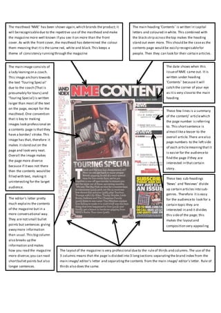
- 1. The masthead ‘NME’ has been shown again,which brands the product; it will berecognisabledue to the repetitive use of the masthead and make the magazine more well known if you see iton more than the front cover. As with the front cover, the masthead has determined the colour them meaning that it is the same red, white and black.This keeps a theme of consistency runningthrough the magazine The main heading ‘Contents’ is written in capital letters and coloured in white. This combined with the black strip acrossthetop makes the heading stand out even more. This should be the caseas the contents page would be easily recognisablefor people. Then they can look for their certain articles. The date shows when this issueof NME came out. It is written under heading ‘Contents’ becauseit will catch the corner of your eye as itis very closeto the main heading The main image consists of a lady leaningon a coach. This image anchors towards the text ‘Touring Special’ due to the coach (That is presumably for tours) and ‘Touring Special) is written larger than most of the text on the page, except for the masthead. One convention that is key to making images look professional on a contents page is that they have a border/ stroke. This image has that, therefore it makes it stand out on the page and look very neat. Overall the image makes the page more diverse because if itwas not there then the contents would be filled with text, makingit uninteresting for the target audience. The editor’s letter pretty much explains the contents of the magazine but in a more conversational way. They are not small bullet points but sentences giving away more information than usual.This bigcolumn also breaks up the information and makes how you read the magazine more diverse; you can read shortbullet points but also longer sentences. These few lines is a summary of the content/ articlewhich the page number is referring to. This shortsentence is almostlikea teaser to the overall article.There arealso page numbers to the left side of each articlemeaningthat it is easier for the audienceto find the page if they are interested in that certain story. The layoutof the magazine is very professional dueto the ruleof thirds and columns.The use of the 3 columns means that the page is divided into 3 longsections separatingthe brand index from the main image/ editor’s letter and separatingthe contents from the main image/ editor’s letter. Rule of thirds also does the same. These two sub-headings ‘News’ and ‘Reviews’ divide up certain articles into sub- genres. Therefore itis easy for the audienceto look for a certain topic they are interested in and it divides this sideof the page; this makes the layoutand composition very appealing