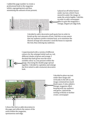
I placed an off white banner
under my text, which I have
moved to under the image, to
make the article legible. I did this
in order to add a newspaper
effect to give the magazine a
vintage, elegant yet edgy look.
I decided to place my text
under then image and
vertically to the left as, the
image contained too much
blank space. It also added a
vintage, magazine effect
keeping with my audience
and genre. I placed the
writing in blocks to further
create a newspaper
I experimented with a variety of different
colours for the enlarged initial such as, red,
different shades of green and orange. I
decided that dark green was the most
suitable colour as, was present within the
image, thus tying the double page spread
together. I decided to capitalize and enlarge
the first initial to add a textured, decorative
look.
I decided to add a decorative pull quote box in order to
break up the vast amounts of text. I did this as was aware
that my audience prefers minimal text, so to minimize the
illusion of large text amounts I used the boxes to separate
the text, thus enticing my audience.
I added the page number to create a
professional look to the magazine
whilst, segregating text and thus
minimizing the amount of text present.
I chose this font as adds decoration to
the page and reflects the nature of the
artist within the magazine,
spontaneous and edgy.

Analysis of new double page spread- Progression stage

  • 1.
    I placed anoff white banner under my text, which I have moved to under the image, to make the article legible. I did this in order to add a newspaper effect to give the magazine a vintage, elegant yet edgy look. I decided to place my text under then image and vertically to the left as, the image contained too much blank space. It also added a vintage, magazine effect keeping with my audience and genre. I placed the writing in blocks to further create a newspaper I experimented with a variety of different colours for the enlarged initial such as, red, different shades of green and orange. I decided that dark green was the most suitable colour as, was present within the image, thus tying the double page spread together. I decided to capitalize and enlarge the first initial to add a textured, decorative look. I decided to add a decorative pull quote box in order to break up the vast amounts of text. I did this as was aware that my audience prefers minimal text, so to minimize the illusion of large text amounts I used the boxes to separate the text, thus enticing my audience. I added the page number to create a professional look to the magazine whilst, segregating text and thus minimizing the amount of text present. I chose this font as adds decoration to the page and reflects the nature of the artist within the magazine, spontaneous and edgy.