
Recommended
More Related Content
What's hot
What's hot (20)
Viewers also liked
Similar to A2 Media - Empire 1
Similar to A2 Media - Empire 1 (20)
More from zoelingua
Recently uploaded
Recently uploaded (20)
A2 Media - Empire 1
- 1. Research Into Existing Products: Magazine Front Cover – Empire Zoë Freeman
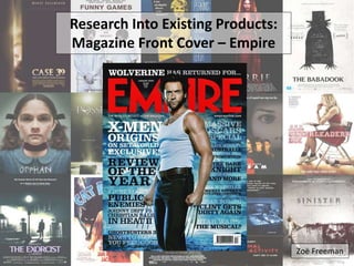
- 2. Main image – The main image is the most prominent feature of the front cover as it has been placed over the masthead and cover lines. Furthermore, the editors use of an image of the protagonist from that weeks featured film allows the audience to identify with the character and increase their interest in buying the magazine. The lighting and editing of the image also help it to stand out further; shadows are created and the lighting is manipulated to enhance the power of the image. In terms of mis-en-scene, the simplistic and understated costume enables the audience to also focus on the cover lines and become interested in other aspects of the magazine. Typically, front cover images are shot in a medium close up with the cover artist looking directly into the camera. However, in this image the characters eyes do not engage with the audience and look off into the distance. Cover lines – A number of cover lines are used in this example of Empire magazine; many of which mention the names of films/actors. The main aim of these cover lines is to promote film related news in a minimal number of words that will entice the audience into buying the magazine. There is very little blank space on the cover due to the amount of text that is used, this would appeal to the audience as it suggests that this magazine has a large amount of information in it. The font choice for the cover lines is appropriate and varies in colour to fit stylistically. Similarly, the mode of address is suitable for the target audience. Rhetorical questions are also used to entice the audience. Tag line – Empire’s tagline suggests that it is a well established movie magazine which dominates the industry.
- 3. Masthead – Empire’s masthead establishes their brand identity as it is used consistently in the same place with the same eye- catching red. As the largest piece of text on the magazine cover, it stands out in comparison to the other text on the front cover but does not overshadow it. Perhaps the placement of the image reestablishes the presence of the cover lines. Furthermore, as Empire is an established movie magazine it is able to have images obstructing the masthead as many people will know what magazine it is without needing to see the whole title. The red contrasts greatly with the dark blue/black colour scheme and further allows the masthead to stand out. Web address – The inclusion of a web address on the front cover promotes the company and also indicates there is web content available should the reader not purchase the magazine but still want to access similar information. It also gives an indication of the target audience; as the internet can be accessed by anyone of any age, Empire magazine may be suggesting that their content is appropriate for most ages who are interested in film. Background image – The background image of this front cover looks almost apocalyptic; fitting with the strong stance of the actor in the image. It is also relatively bland and has been re-coloured to fit with the colour scheme of the front cover. Date/price – Both of these have been strategically placed between the middle of the ‘M’ of the masthead to give the reader the information they need without distracting them away from the main image and the cover lines.