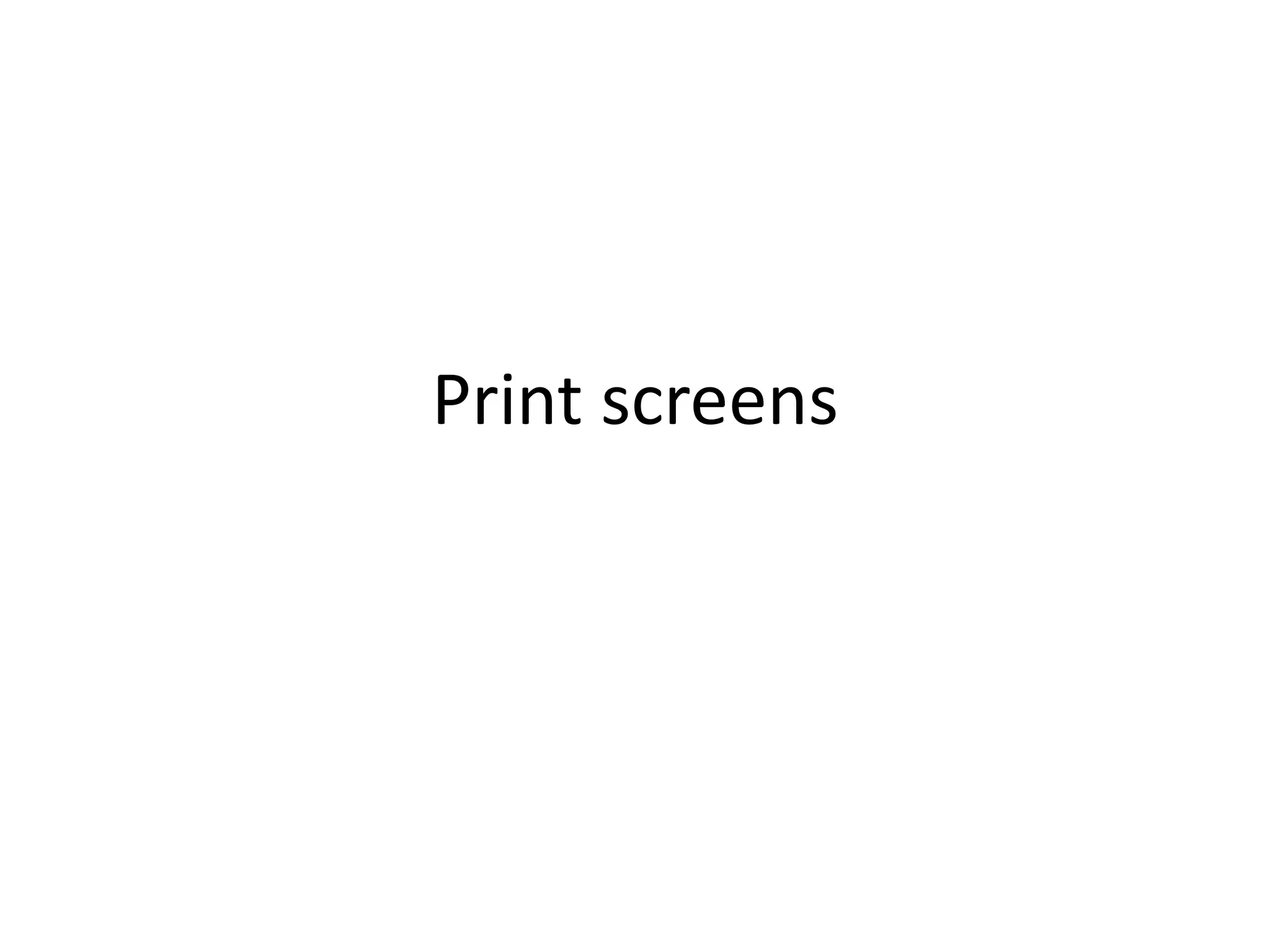
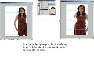
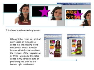
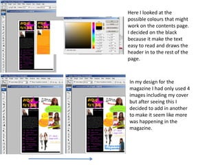
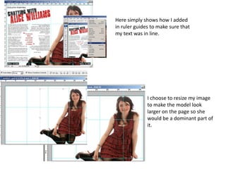
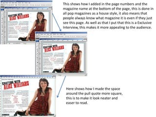
Print screens
I choose to flip my image so that it was facing
inwards, this makes it seem more like she is
looking in to the page.
This shows how I created my header.


    I thought that there was a lot of
    open space on the page so
    added in a circle saying world
    exclusive as well as a yellow
    banner with information about
    the contents of the magazine on
    it. While I was doing this I also
    added in my bar code, date of
    publishing and price to the
    bottom right hand corner.
Here I looked at the
possible colours that might
work on the contents page.
I decided on the black
because it make the text
easy to read and draws the
header in to the rest of the
page.


In my design for the
magazine I had only used 4
images including my cover
but after seeing this I
decided to add in another
to make it seem like more
was happening in the
magazine.
Here simply shows how I added
in ruler guides to make sure that
my text was in line.


              I choose to resize my image
              to make the model look
              larger on the page so she
              would be a dominant part of
              it.
This shows how I added in the page numbers and the
magazine name at the bottom of the page, this is done in
all pop magazines as a house style, it also means that
people always know what magazine it is even if they just
see this page. As well as that I put that this is a Exclusive
Interview, this makes it more appealing to the audience.


  Here shows how I made the space
  around the pull quote more square,
  this is to make it look neater and
  easer to read.

Print screens

  • 1.
  • 2.
    I choose toflip my image so that it was facing inwards, this makes it seem more like she is looking in to the page.
  • 3.
    This shows howI created my header. I thought that there was a lot of open space on the page so added in a circle saying world exclusive as well as a yellow banner with information about the contents of the magazine on it. While I was doing this I also added in my bar code, date of publishing and price to the bottom right hand corner.
  • 4.
    Here I lookedat the possible colours that might work on the contents page. I decided on the black because it make the text easy to read and draws the header in to the rest of the page. In my design for the magazine I had only used 4 images including my cover but after seeing this I decided to add in another to make it seem like more was happening in the magazine.
  • 5.
    Here simply showshow I added in ruler guides to make sure that my text was in line. I choose to resize my image to make the model look larger on the page so she would be a dominant part of it.
  • 6.
    This shows howI added in the page numbers and the magazine name at the bottom of the page, this is done in all pop magazines as a house style, it also means that people always know what magazine it is even if they just see this page. As well as that I put that this is a Exclusive Interview, this makes it more appealing to the audience. Here shows how I made the space around the pull quote more square, this is to make it look neater and easer to read.