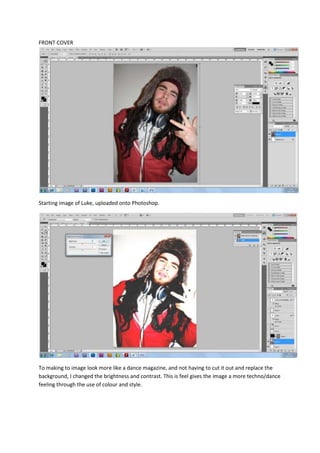
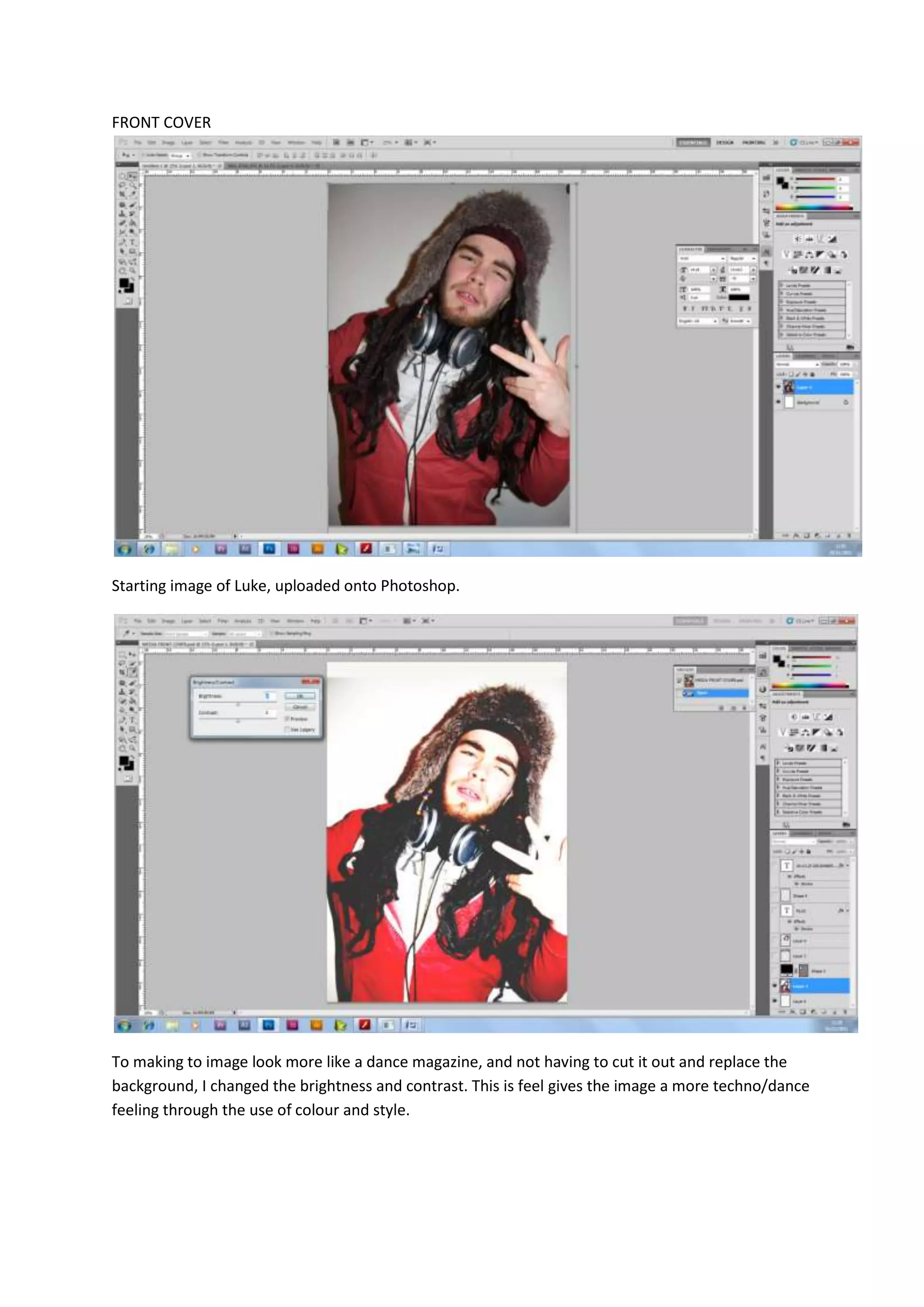
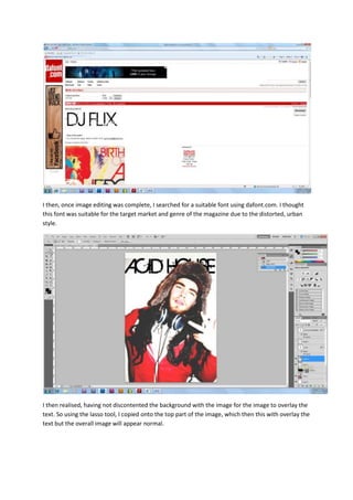
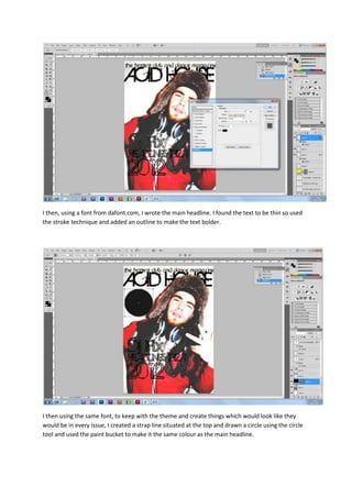
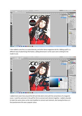
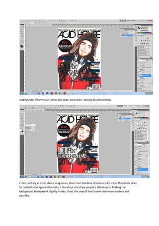
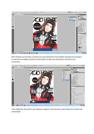
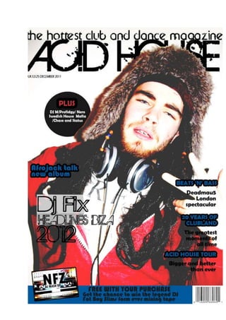
FRONT COVER


Starting image of Luke, uploaded onto Photoshop.


To making to image look more like a dance magazine, and not having to cut it out and replace the
background, I changed the brightness and contrast. This is feel gives the image a more techno/dance
feeling through the use of colour and style.
I then, once image editing was complete, I searched for a suitable font using dafont.com. I thought
this font was suitable for the target market and genre of the magazine due to the distorted, urban
style.


I then realised, having not discontented the background with the image for the image to overlay the
text. So using the lasso tool, I copied onto the top part of the image, which then this with overlay the
text but the overall image will appear normal.
I then, using a font from dafont.com, I wrote the main headline. I found the text to be thin so used
the stroke technique and added an outline to make the text bolder.


I then using the same font, to keep with the theme and create things which would look like they
would be in every issue, I created a strap line situated at the top and drawn a circle using the circle
tool and used the paint bucket to make it the same colour as the main headline.
I then added a new font, to create diversity, and other dance magazines do this. Adding a puff, is a
different way of advertising information, adding dimensions’ to the cover and is striking for the
reader to see.


I added more cover lines around the left and ride side to stick with the conventions of a magazine
cover; I used the same text in the puff for this to connect each element together. I added a boarder
to inject the same colour as the main headline to connect each element, also having the blue as in
the questionnaire this was a popular colour.
Adding extra information, price, bar code, issue date- sticking to conventions.


I then, looking at other dance magazines, their main headline stood out a lot more than mine does.
So I added a background to make it stand out and draw people’s attention in. Making the
background transparent slightly makes, I feel, the overall front cover look more modern and
youthful.
After thinking I was finished, I printed it out and realised the main headline and puff were too big so
I resizes this and added a strap line at the bottom to add more information and stick to the
conventions.


I then added the information, also adding an image to create diversity, advertising more content and
create depth.
FRONT COVER SCREEN GRABS

FRONT COVER SCREEN GRABS

  • 1.
    FRONT COVER Starting imageof Luke, uploaded onto Photoshop. To making to image look more like a dance magazine, and not having to cut it out and replace the background, I changed the brightness and contrast. This is feel gives the image a more techno/dance feeling through the use of colour and style.
  • 2.
    I then, onceimage editing was complete, I searched for a suitable font using dafont.com. I thought this font was suitable for the target market and genre of the magazine due to the distorted, urban style. I then realised, having not discontented the background with the image for the image to overlay the text. So using the lasso tool, I copied onto the top part of the image, which then this with overlay the text but the overall image will appear normal.
  • 3.
    I then, usinga font from dafont.com, I wrote the main headline. I found the text to be thin so used the stroke technique and added an outline to make the text bolder. I then using the same font, to keep with the theme and create things which would look like they would be in every issue, I created a strap line situated at the top and drawn a circle using the circle tool and used the paint bucket to make it the same colour as the main headline.
  • 4.
    I then addeda new font, to create diversity, and other dance magazines do this. Adding a puff, is a different way of advertising information, adding dimensions’ to the cover and is striking for the reader to see. I added more cover lines around the left and ride side to stick with the conventions of a magazine cover; I used the same text in the puff for this to connect each element together. I added a boarder to inject the same colour as the main headline to connect each element, also having the blue as in the questionnaire this was a popular colour.
  • 5.
    Adding extra information,price, bar code, issue date- sticking to conventions. I then, looking at other dance magazines, their main headline stood out a lot more than mine does. So I added a background to make it stand out and draw people’s attention in. Making the background transparent slightly makes, I feel, the overall front cover look more modern and youthful.
  • 6.
    After thinking Iwas finished, I printed it out and realised the main headline and puff were too big so I resizes this and added a strap line at the bottom to add more information and stick to the conventions. I then added the information, also adding an image to create diversity, advertising more content and create depth.