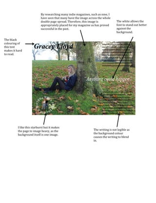
I	
  like	
  this	
  starburst	
  but	
  it	
  makes	
  
the	
  page	
  to	
  image	
  heavy,	
  as	
  the	
  
background	
  itself	
  is	
  one	
  image.	
  	
  
The	
  writing	
  is	
  not	
  legible	
  as	
  
the	
  background	
  colour	
  
causes	
  the	
  writing	
  to	
  blend	
  
in.	
  
By	
  researching	
  many	
  indie	
  magazines,	
  such	
  as	
  nme,	
  I	
  
have	
  seen	
  that	
  many	
  have	
  the	
  image	
  across	
  the	
  whole	
  
double	
  page	
  spread.	
  Therefore,	
  this	
  image	
  is	
  
appropriately	
  placed	
  for	
  my	
  magazine	
  as	
  has	
  proved	
  
successful	
  in	
  the	
  past.	
  	
  
The	
  black	
  
colouring	
  of	
  
this	
  text	
  
makes	
  it	
  hard	
  
to	
  read.	
  
The	
  white	
  allows	
  the	
  
font	
  to	
  stand	
  out	
  better	
  
against	
  the	
  
background.	
  

Double page spread evaluation

  • 1.
      I  like  this  starburst  but  it  makes   the  page  to  image  heavy,  as  the   background  itself  is  one  image.     The  writing  is  not  legible  as   the  background  colour   causes  the  writing  to  blend   in.   By  researching  many  indie  magazines,  such  as  nme,  I   have  seen  that  many  have  the  image  across  the  whole   double  page  spread.  Therefore,  this  image  is   appropriately  placed  for  my  magazine  as  has  proved   successful  in  the  past.     The  black   colouring  of   this  text   makes  it  hard   to  read.   The  white  allows  the   font  to  stand  out  better   against  the   background.