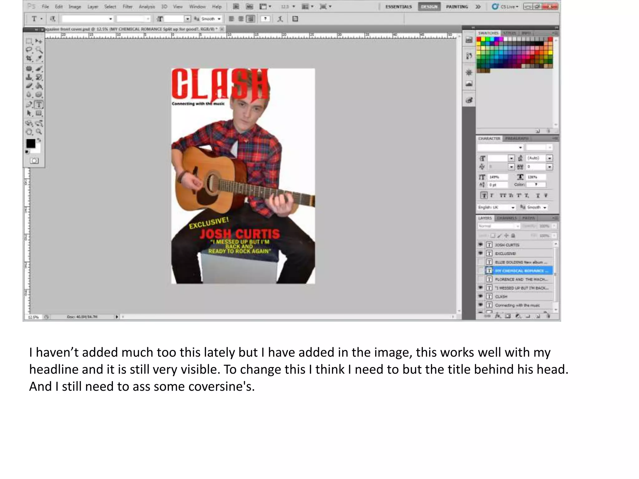
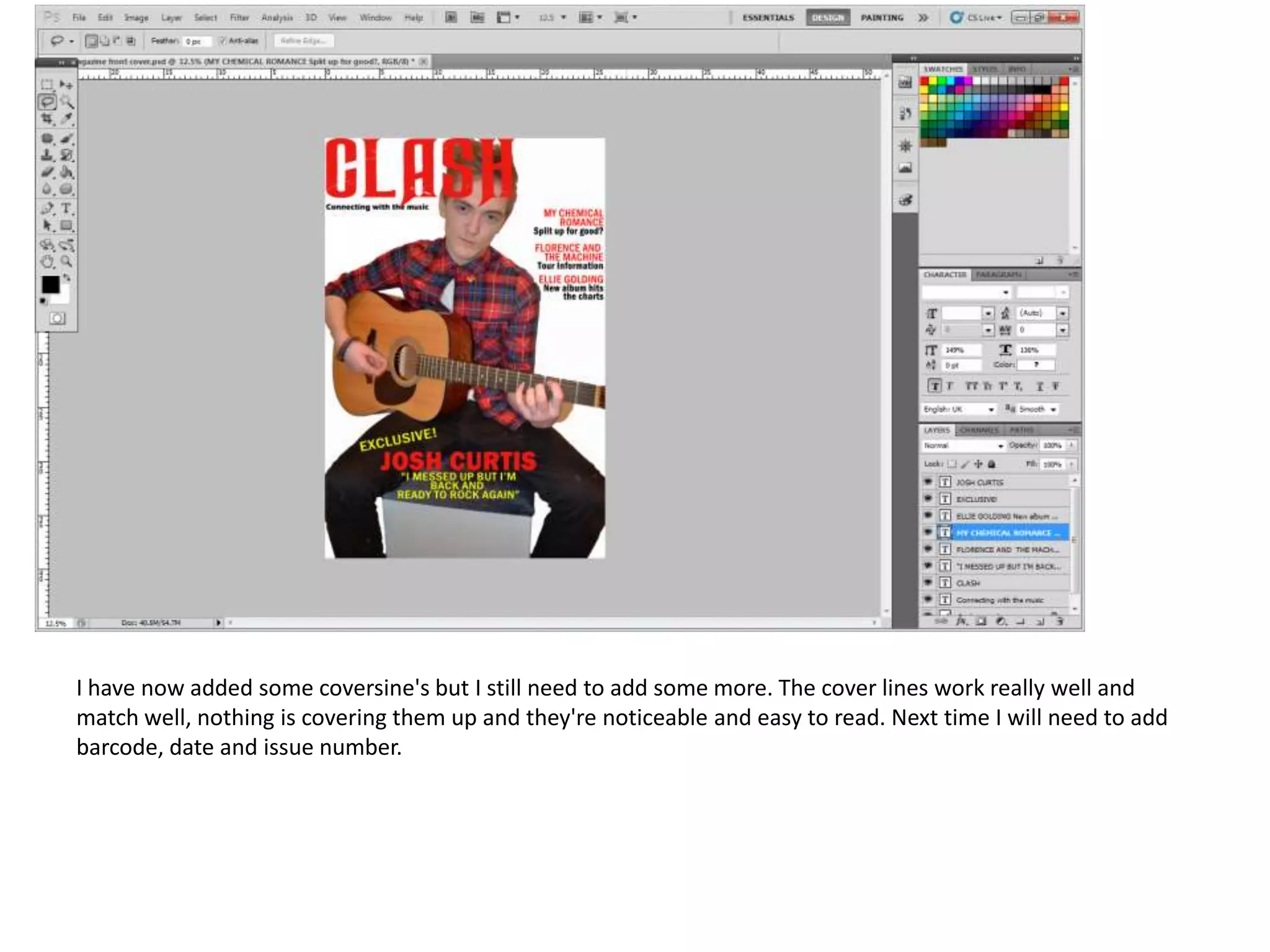
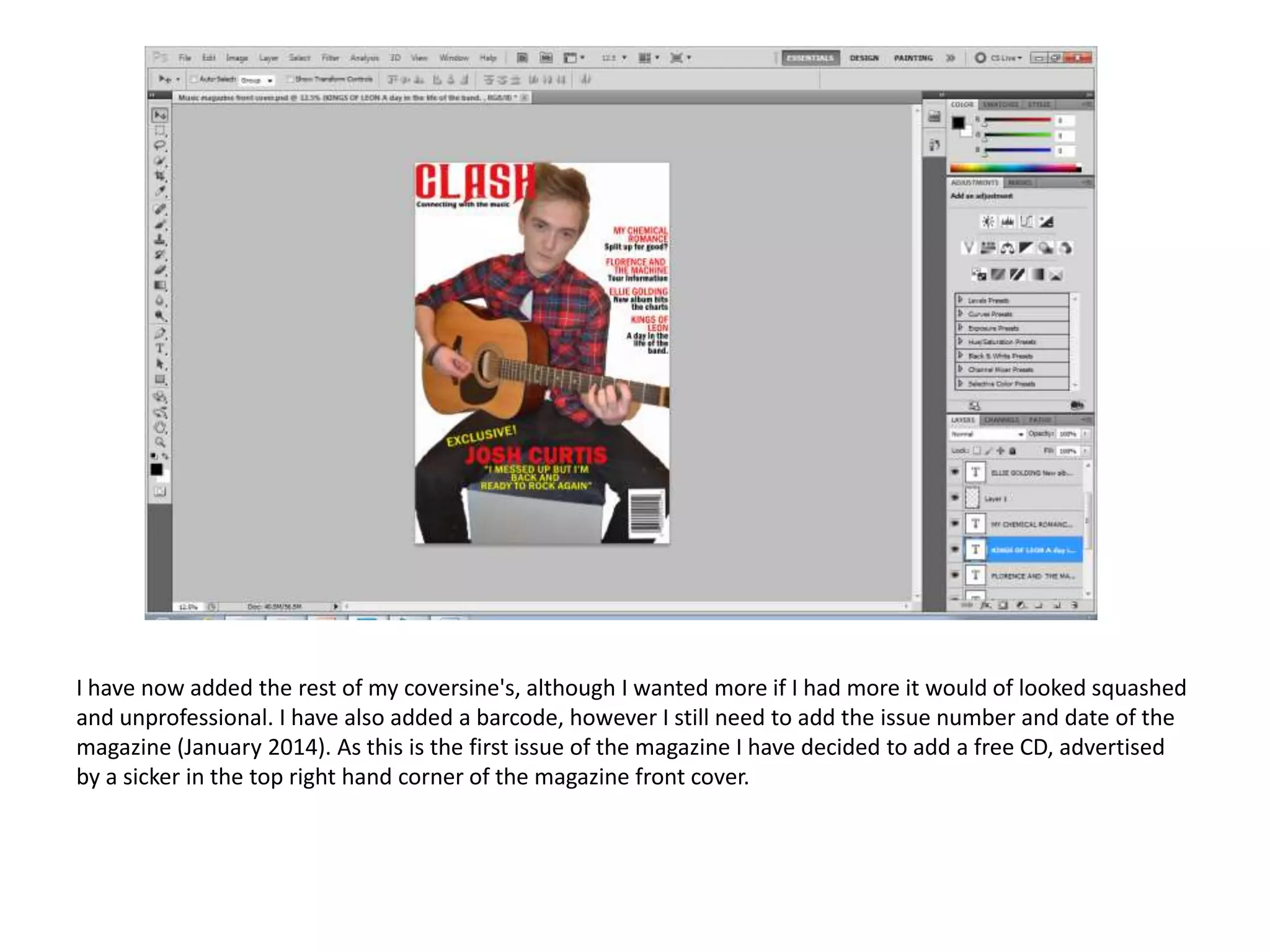
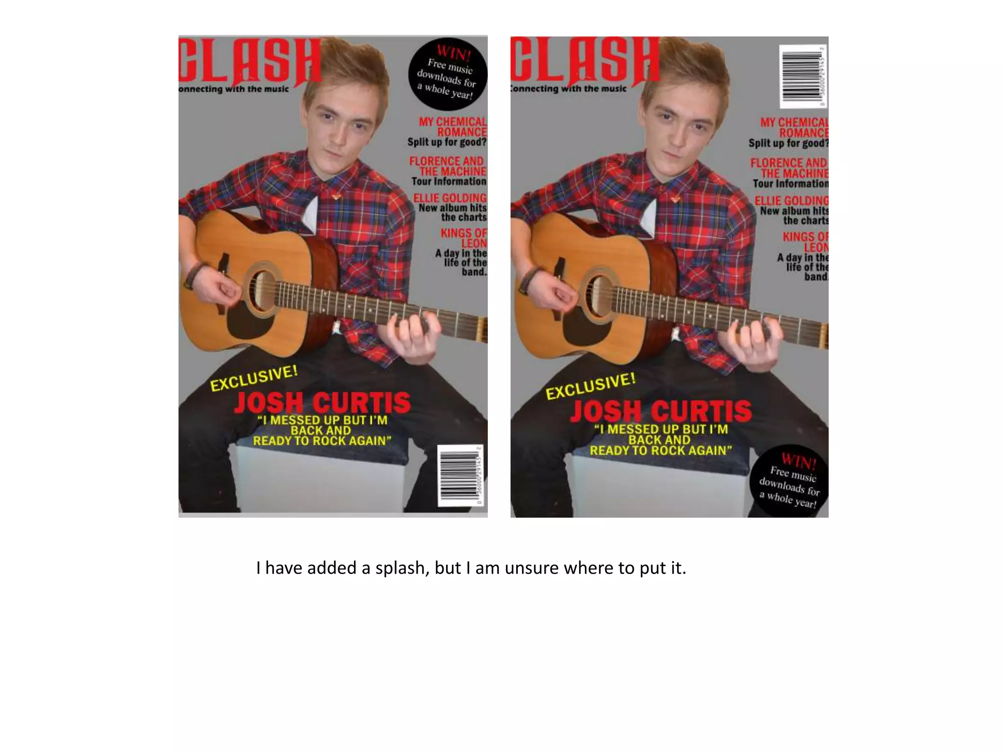
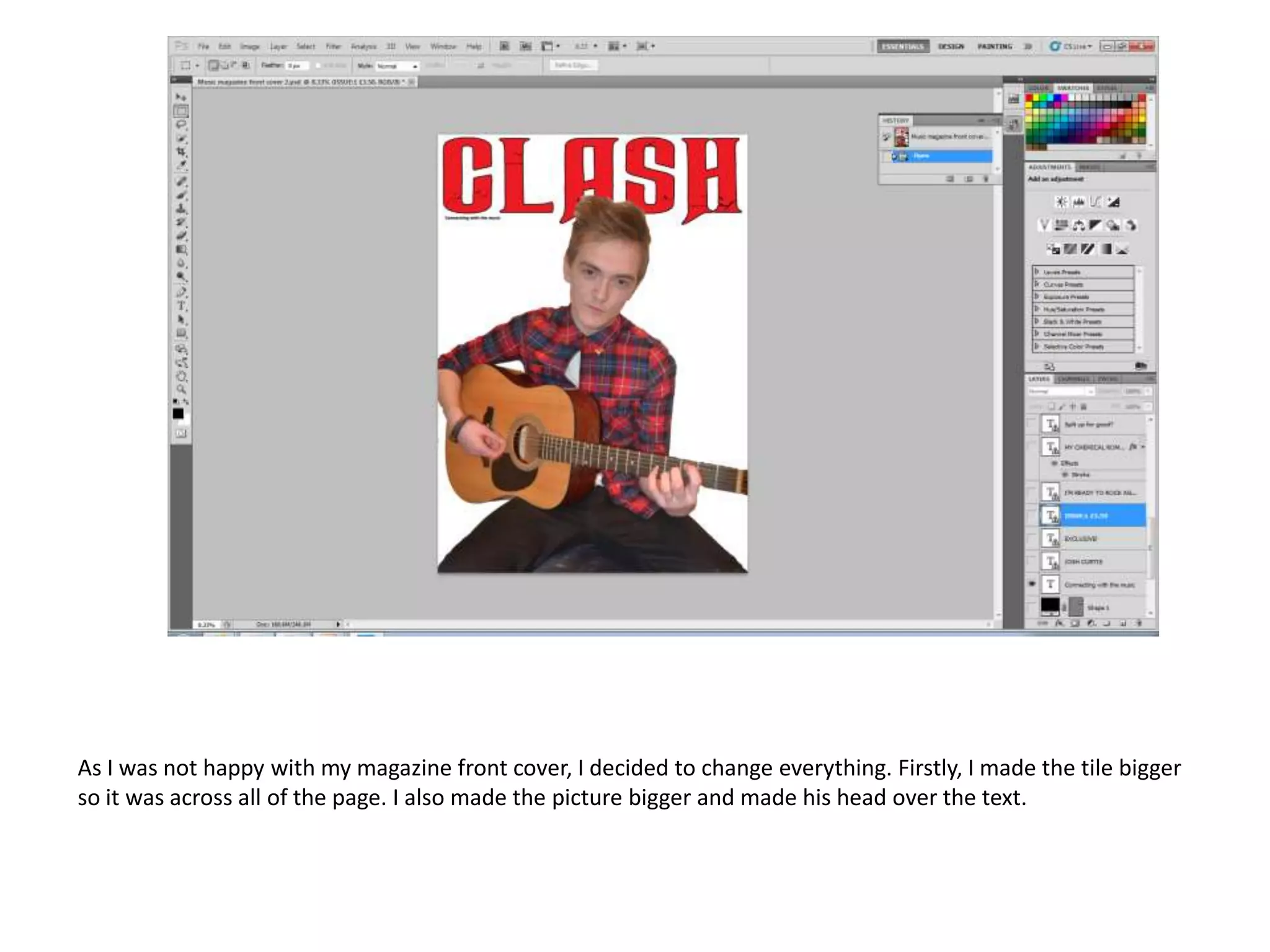
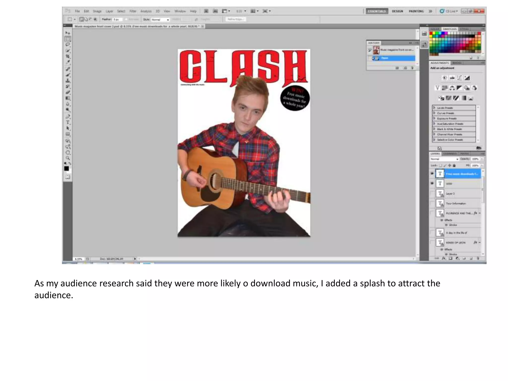
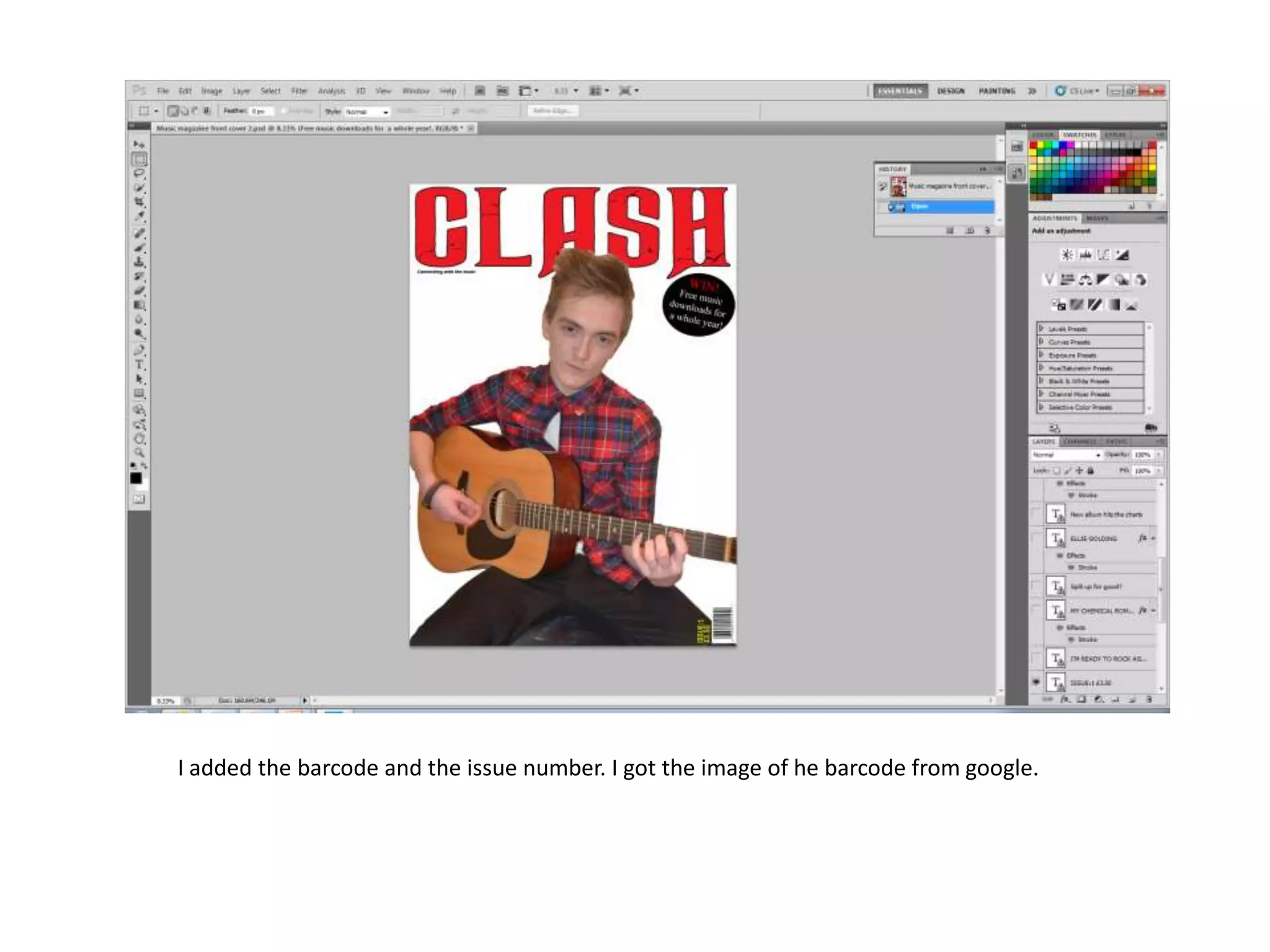
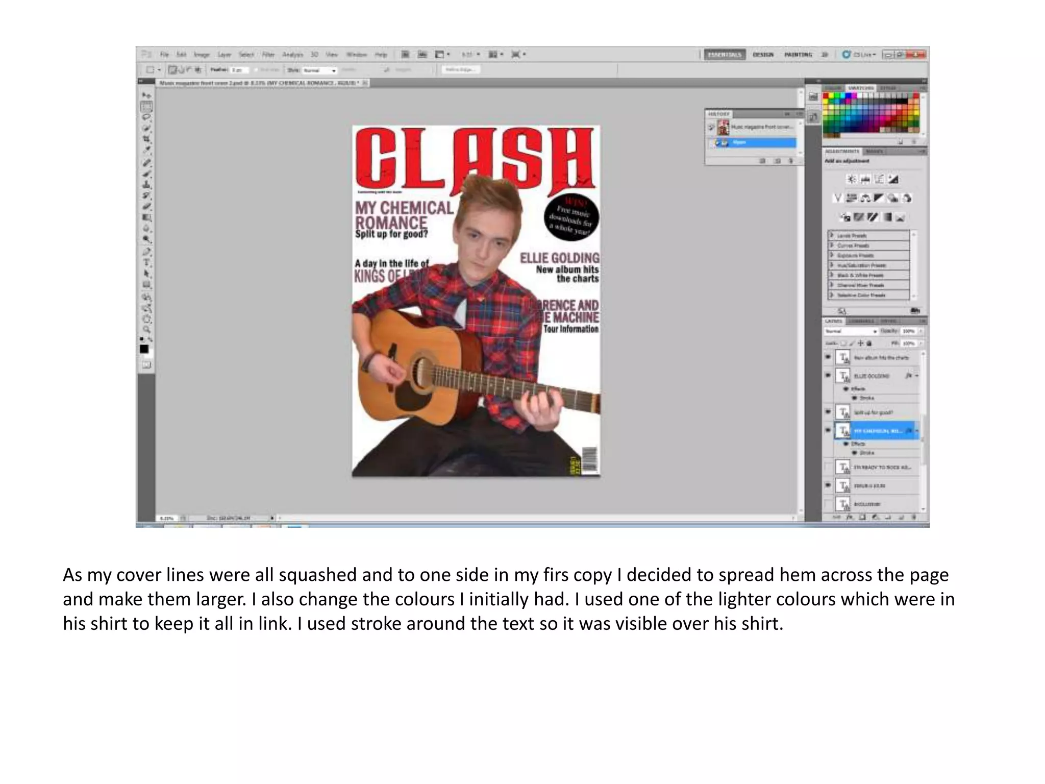
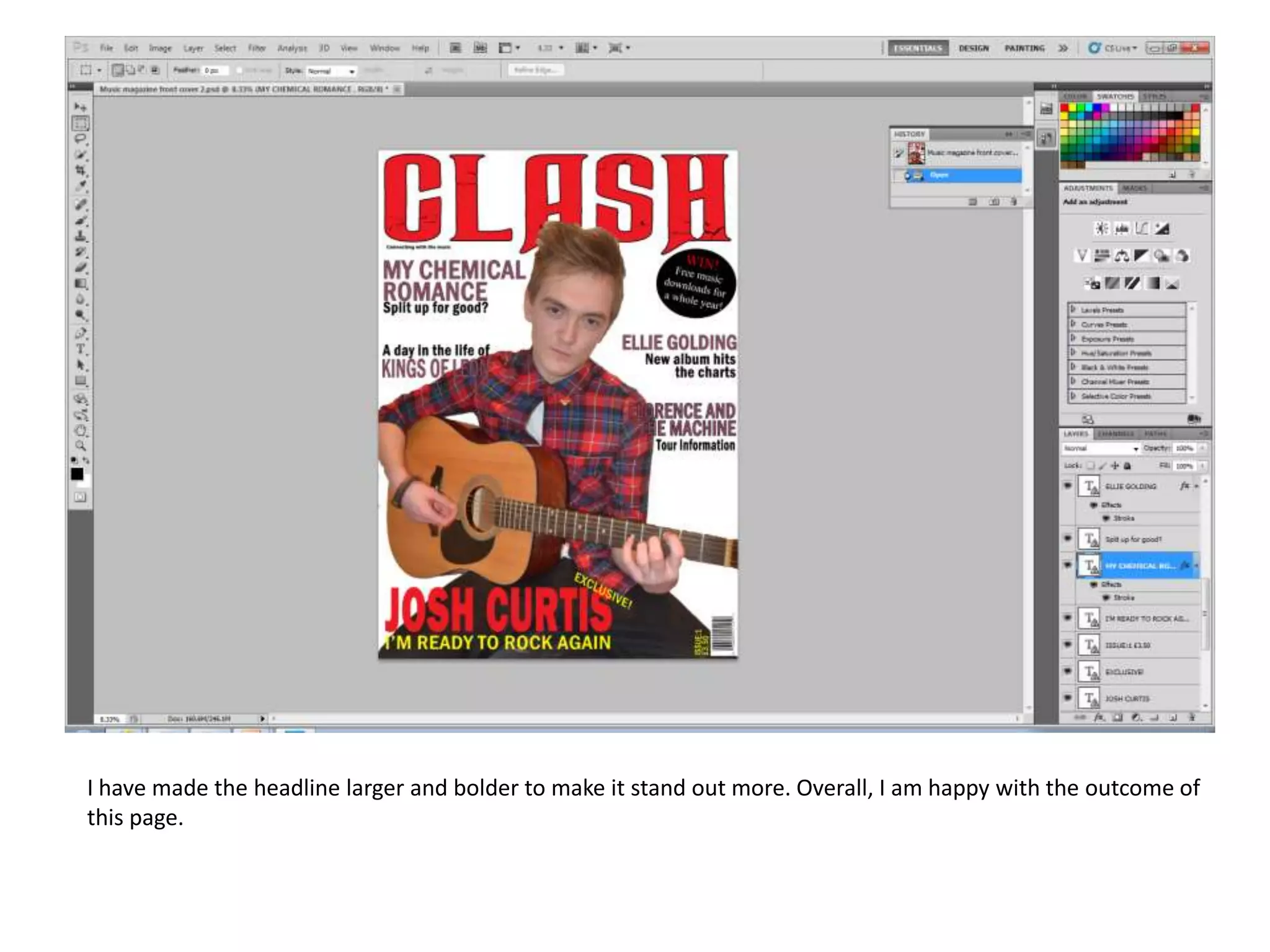
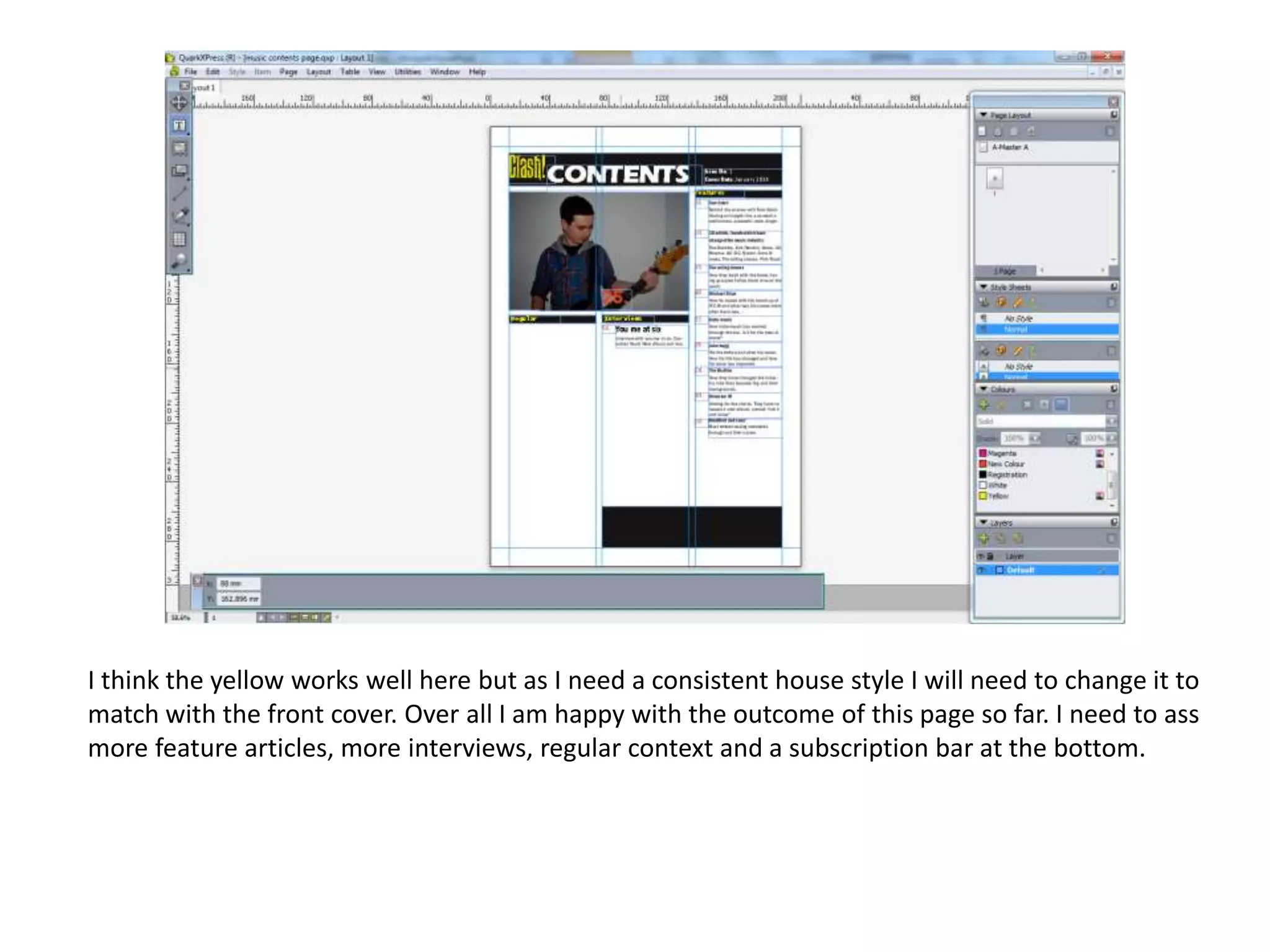
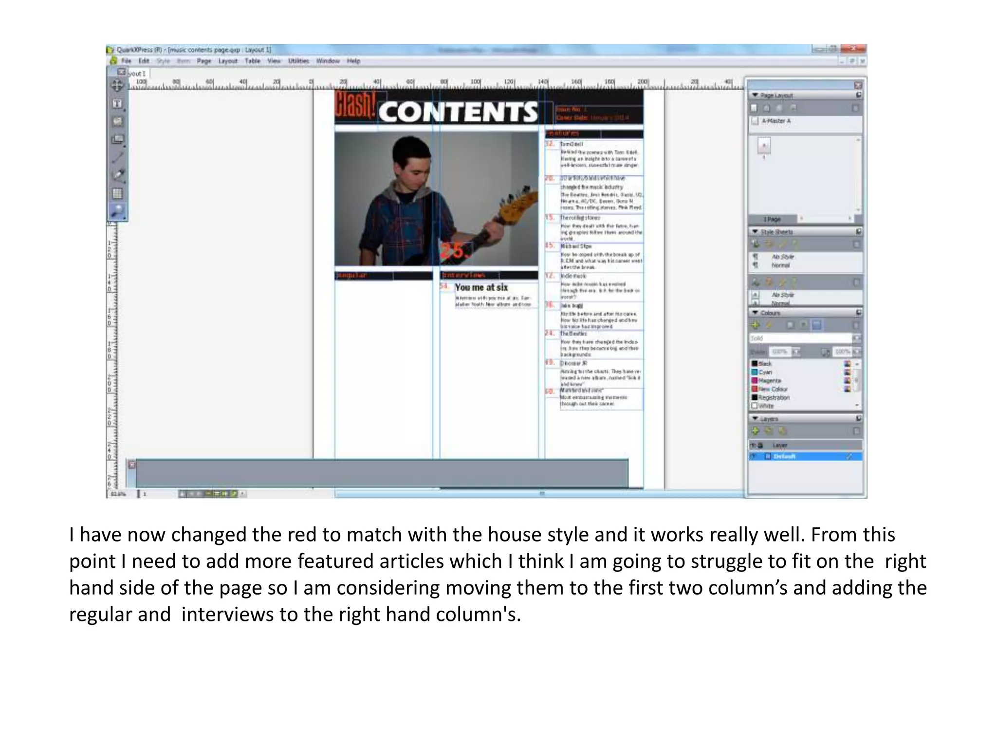
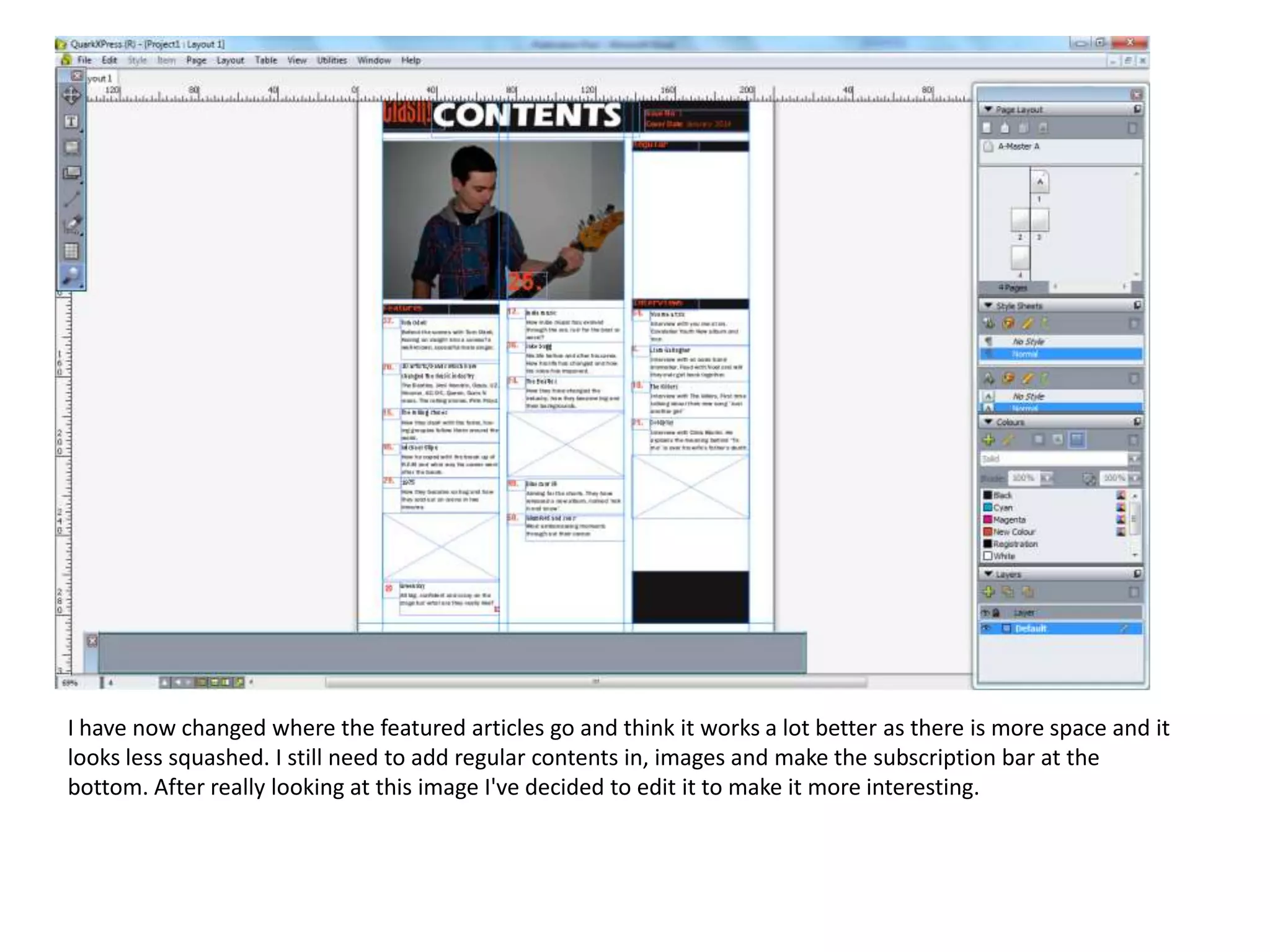
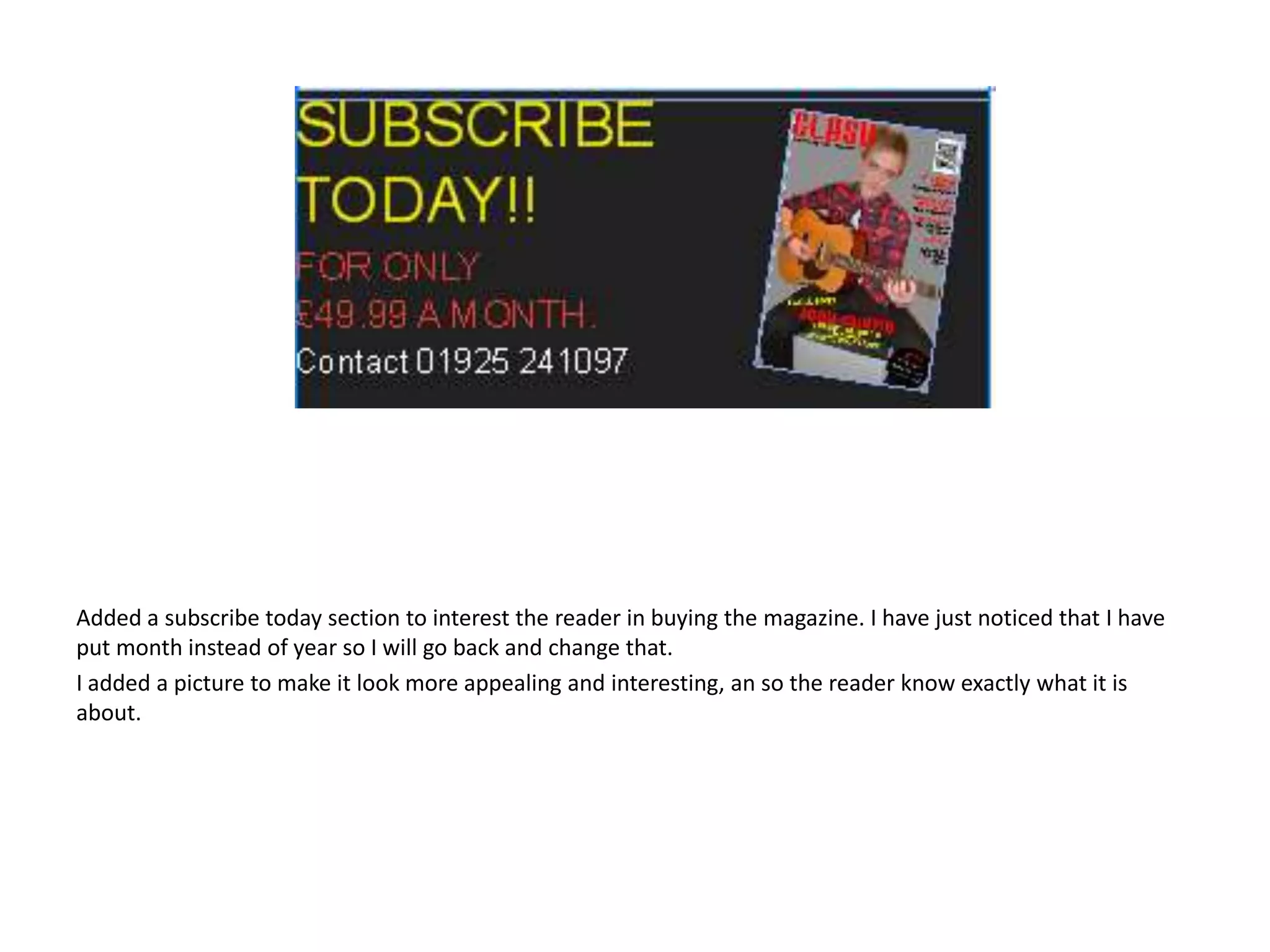
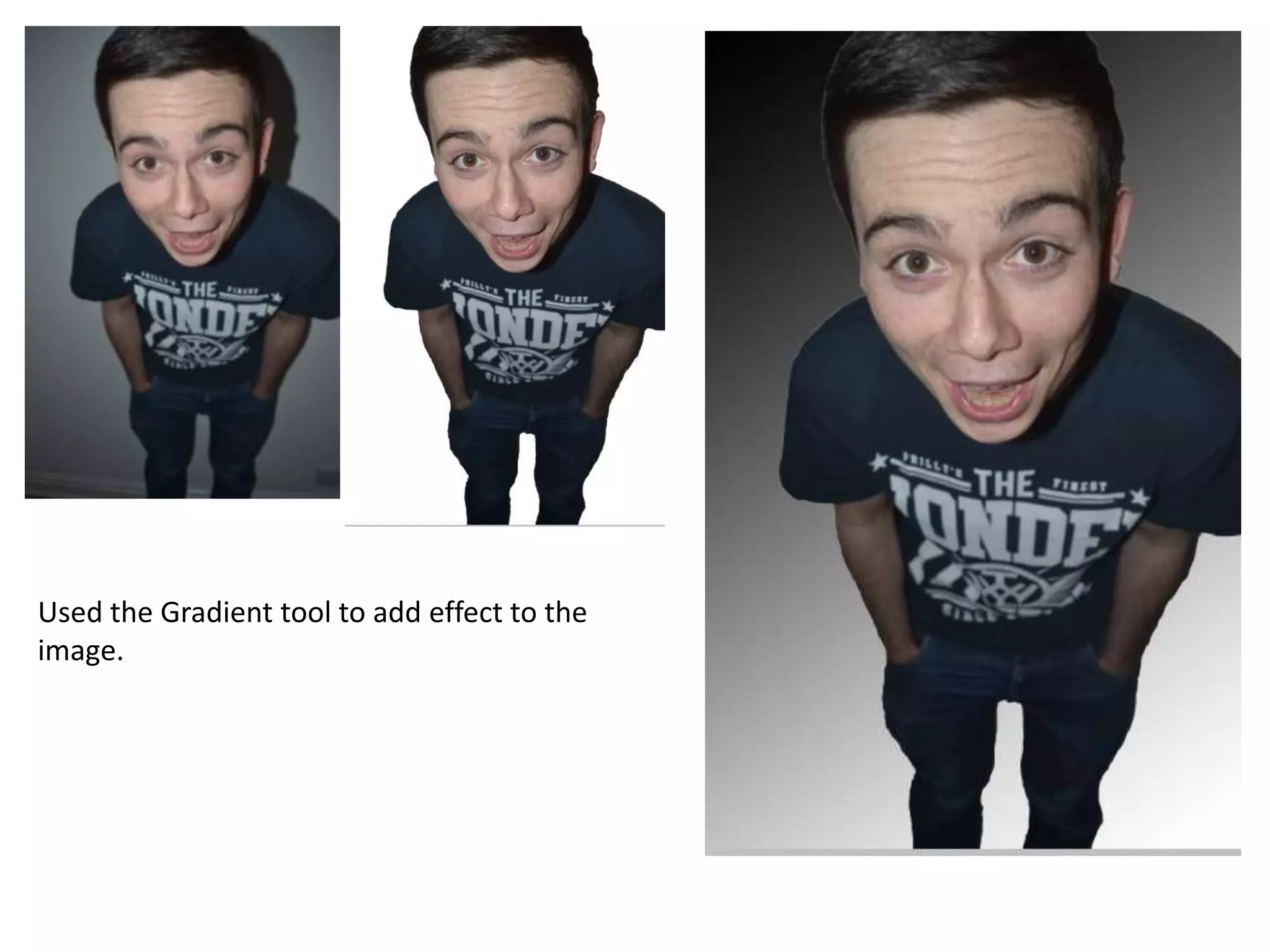
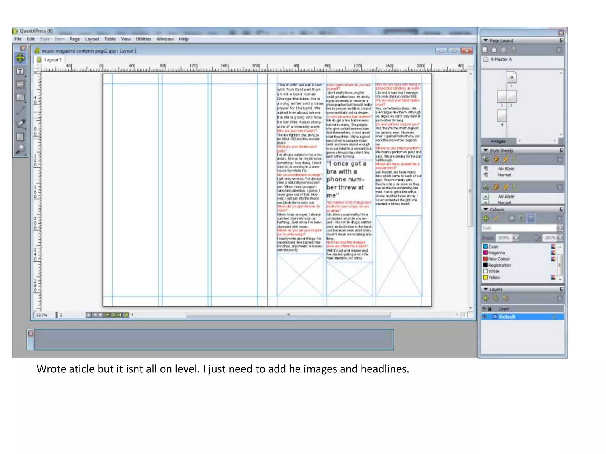
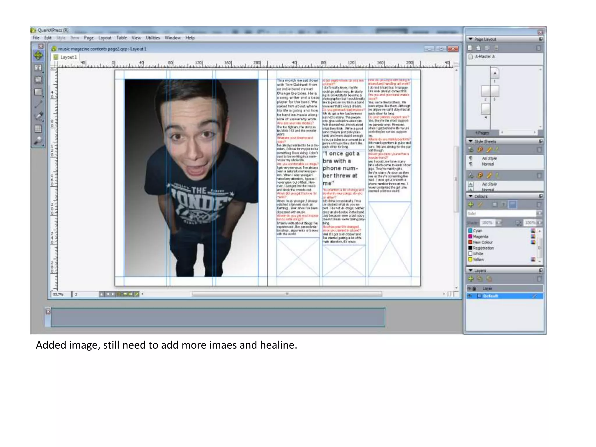
Front cover
I have started my front cover and this is the outcome. I think it needs a lot of changes .
The header is too big so I am considering getting rid of it all together. Also the colours are
too bright and are not visible enough so I am thinking about changing the main colour too
red but till use the colour yellow for headlines.
I have chosen my image, my initial plan was to have a group of boys but this was the best image.
However, I got rid of the back ground to make it look more professional and less boring. I did this
using the lasso tool on photo shop, to make this better I am considering on putting a colour on
the background like light grey.
As my first attempt was not good enough I have restarted and changed the main colour too red
as I didn’t want to get rid of the yellow all together I decided to use it in my main cover line. The
initial headline is different to this one as the image has changed. Next I will need to add the
image in and add some coversine's.
I haven’t added much too this lately but I have added in the image, this works well with my
headline and it is still very visible. To change this I think I need to but the title behind his head.
And I still need to ass some coversine's.
I have now added some coversine's but I still need to add some more. The cover lines work really well and
match well, nothing is covering them up and they're noticeable and easy to read. Next time I will need to add
barcode, date and issue number.
I have now added the rest of my coversine's, although I wanted more if I had more it would of looked squashed
and unprofessional. I have also added a barcode, however I still need to add the issue number and date of the
magazine (January 2014). As this is the first issue of the magazine I have decided to add a free CD, advertised
by a sicker in the top right hand corner of the magazine front cover.
I have added a splash, but I am unsure where to put it.
As I was not happy with my magazine front cover, I decided to change everything. Firstly, I made the tile bigger
so it was across all of the page. I also made the picture bigger and made his head over the text.
As my audience research said they were more likely o download music, I added a splash to attract the
audience.
I added the barcode and the issue number. I got the image of he barcode from google.
As my cover lines were all squashed and to one side in my firs copy I decided to spread hem across the page
and make them larger. I also change the colours I initially had. I used one of the lighter colours which were in
his shirt to keep it all in link. I used stroke around the text so it was visible over his shirt.
I have made the headline larger and bolder to make it stand out more. Overall, I am happy with the outcome of
this page.
Contents page
I think the yellow works well here but as I need a consistent house style I will need to change it to
match with the front cover. Over all I am happy with the outcome of this page so far. I need to ass
more feature articles, more interviews, regular context and a subscription bar at the bottom.
I have now changed the red to match with the house style and it works really well. From this
point I need to add more featured articles which I think I am going to struggle to fit on the right
hand side of the page so I am considering moving them to the first two column’s and adding the
regular and interviews to the right hand column's.
I have now changed where the featured articles go and think it works a lot better as there is more space and it
looks less squashed. I still need to add regular contents in, images and make the subscription bar at the
bottom. After really looking at this image I've decided to edit it to make it more interesting.
Added a subscribe today section to interest the reader in buying the magazine. I have just noticed that I have
put month instead of year so I will go back and change that.
I added a picture to make it look more appealing and interesting, an so the reader know exactly what it is
about.
Double page spread
Used the Gradient tool to add effect to the
image.
Wrote aticle but it isnt all on level. I just need to add he images and headlines.
Added image, still need to add more imaes and healine.
Made image so it was over two pages. Used gradient tool again.
Added more text to the article, Still needs a bit more so it is all on level.
Added stand first.
I have added a quote which is larger than the rest of the text to get the readers attention. I also made the
headline larger and added who took and wrote the article.
I am happy with the outcome of this page

Print screens

  • 1.
  • 2.
    I have startedmy front cover and this is the outcome. I think it needs a lot of changes . The header is too big so I am considering getting rid of it all together. Also the colours are too bright and are not visible enough so I am thinking about changing the main colour too red but till use the colour yellow for headlines.
  • 3.
    I have chosenmy image, my initial plan was to have a group of boys but this was the best image. However, I got rid of the back ground to make it look more professional and less boring. I did this using the lasso tool on photo shop, to make this better I am considering on putting a colour on the background like light grey.
  • 4.
    As my firstattempt was not good enough I have restarted and changed the main colour too red as I didn’t want to get rid of the yellow all together I decided to use it in my main cover line. The initial headline is different to this one as the image has changed. Next I will need to add the image in and add some coversine's.
  • 5.
    I haven’t addedmuch too this lately but I have added in the image, this works well with my headline and it is still very visible. To change this I think I need to but the title behind his head. And I still need to ass some coversine's.
  • 6.
    I have nowadded some coversine's but I still need to add some more. The cover lines work really well and match well, nothing is covering them up and they're noticeable and easy to read. Next time I will need to add barcode, date and issue number.
  • 7.
    I have nowadded the rest of my coversine's, although I wanted more if I had more it would of looked squashed and unprofessional. I have also added a barcode, however I still need to add the issue number and date of the magazine (January 2014). As this is the first issue of the magazine I have decided to add a free CD, advertised by a sicker in the top right hand corner of the magazine front cover.
  • 8.
    I have addeda splash, but I am unsure where to put it.
  • 9.
    As I wasnot happy with my magazine front cover, I decided to change everything. Firstly, I made the tile bigger so it was across all of the page. I also made the picture bigger and made his head over the text.
  • 10.
    As my audienceresearch said they were more likely o download music, I added a splash to attract the audience.
  • 11.
    I added thebarcode and the issue number. I got the image of he barcode from google.
  • 12.
    As my coverlines were all squashed and to one side in my firs copy I decided to spread hem across the page and make them larger. I also change the colours I initially had. I used one of the lighter colours which were in his shirt to keep it all in link. I used stroke around the text so it was visible over his shirt.
  • 13.
    I have madethe headline larger and bolder to make it stand out more. Overall, I am happy with the outcome of this page.
  • 14.
  • 15.
    I think theyellow works well here but as I need a consistent house style I will need to change it to match with the front cover. Over all I am happy with the outcome of this page so far. I need to ass more feature articles, more interviews, regular context and a subscription bar at the bottom.
  • 16.
    I have nowchanged the red to match with the house style and it works really well. From this point I need to add more featured articles which I think I am going to struggle to fit on the right hand side of the page so I am considering moving them to the first two column’s and adding the regular and interviews to the right hand column's.
  • 17.
    I have nowchanged where the featured articles go and think it works a lot better as there is more space and it looks less squashed. I still need to add regular contents in, images and make the subscription bar at the bottom. After really looking at this image I've decided to edit it to make it more interesting.
  • 18.
    Added a subscribetoday section to interest the reader in buying the magazine. I have just noticed that I have put month instead of year so I will go back and change that. I added a picture to make it look more appealing and interesting, an so the reader know exactly what it is about.
  • 19.
  • 20.
    Used the Gradienttool to add effect to the image.
  • 21.
    Wrote aticle butit isnt all on level. I just need to add he images and headlines.
  • 22.
    Added image, stillneed to add more imaes and healine.
  • 24.
    Made image soit was over two pages. Used gradient tool again.
  • 26.
    Added more textto the article, Still needs a bit more so it is all on level.
  • 27.
  • 28.
    I have addeda quote which is larger than the rest of the text to get the readers attention. I also made the headline larger and added who took and wrote the article. I am happy with the outcome of this page