The document discusses draft designs for magazine covers and spreads. For the cover, the author considers using a simple design but feels it lacks information and looks bland. For the double page spread, the author likes how the design is well-organized and professional looking. The author also discusses a third cover design they prefer because the elements are spaced out and not overcrowded.


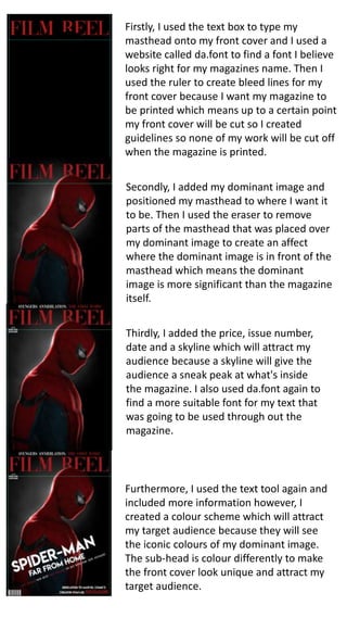


![ceramic-art-and-pottery [Autosaved].pptx](https://cdn.slidesharecdn.com/ss_thumbnails/ceramic-art-and-potteryautosaved-260113113456-35c55ddb-thumbnail.jpg?width=640&height=640&fit=bounds)


