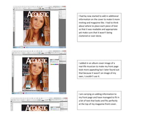
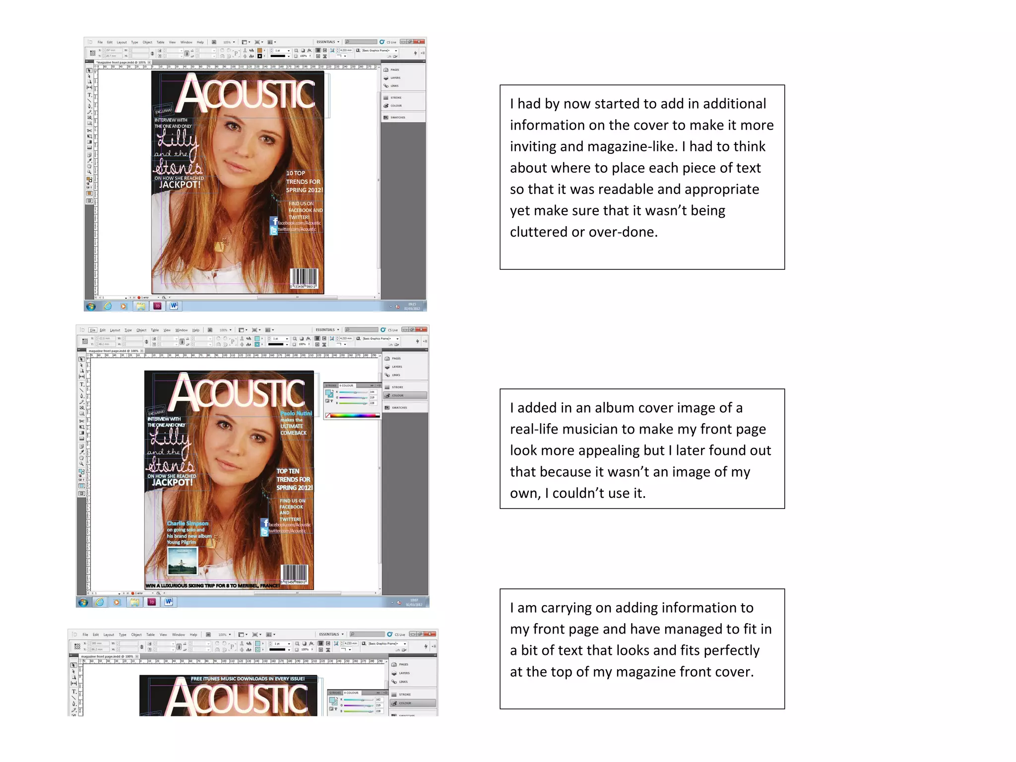
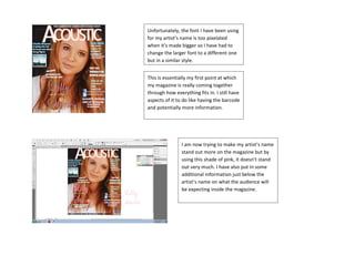
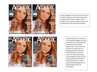
I had by now started to add in additional
information on the cover to make it more
inviting and magazine-like. I had to think
about where to place each piece of text
so that it was readable and appropriate
yet make sure that it wasn’t being
cluttered or over-done.


I added in an album cover image of a
real-life musician to make my front page
look more appealing but I later found out
that because it wasn’t an image of my
own, I couldn’t use it.


I am carrying on adding information to
my front page and have managed to fit in
a bit of text that looks and fits perfectly
at the top of my magazine front cover.
Unfortunately, the font I have been using
for my artist’s name is too pixelated
when it’s made bigger so I have had to
change the larger font to a different one
but in a similar style.


This is essentially my first point at which
my magazine is really coming together
through how everything fits in. I still have
aspects of it to do like having the barcode
and potentially more information.


                I am now trying to make my artist’s name
                stand out more on the magazine but by
                using this shade of pink, it doesn’t stand
                out very much. I have also put in some
                additional information just below the
                artist’s name on what the audience will
                be expecting inside the magazine.
I have changed the colour of the artist’s name
to make it stand out more and it luckily still
complies with the colour scheme. Also, it
stands out more and my magazine front cover
is looking like it will almost be completed.


         I have made the ‘free’ at the top
         of the page look bigger and more
         stand-out as it is something that
         would interest the reader
         greatly. Also, I have moved the
         barcode to a place that isn’t
         drawing attention away from
         texts. Moreover, the artist’s
         name is in its final destination
         and through the choice of colour
         and positioning I think that as
         the final front cover, it looks
         good and overall appeals to my
         target audience well and
         successfully.

Front Cover Progress 2

  • 1.
    I had bynow started to add in additional information on the cover to make it more inviting and magazine-like. I had to think about where to place each piece of text so that it was readable and appropriate yet make sure that it wasn’t being cluttered or over-done. I added in an album cover image of a real-life musician to make my front page look more appealing but I later found out that because it wasn’t an image of my own, I couldn’t use it. I am carrying on adding information to my front page and have managed to fit in a bit of text that looks and fits perfectly at the top of my magazine front cover.
  • 2.
    Unfortunately, the fontI have been using for my artist’s name is too pixelated when it’s made bigger so I have had to change the larger font to a different one but in a similar style. This is essentially my first point at which my magazine is really coming together through how everything fits in. I still have aspects of it to do like having the barcode and potentially more information. I am now trying to make my artist’s name stand out more on the magazine but by using this shade of pink, it doesn’t stand out very much. I have also put in some additional information just below the artist’s name on what the audience will be expecting inside the magazine.
  • 3.
    I have changedthe colour of the artist’s name to make it stand out more and it luckily still complies with the colour scheme. Also, it stands out more and my magazine front cover is looking like it will almost be completed. I have made the ‘free’ at the top of the page look bigger and more stand-out as it is something that would interest the reader greatly. Also, I have moved the barcode to a place that isn’t drawing attention away from texts. Moreover, the artist’s name is in its final destination and through the choice of colour and positioning I think that as the final front cover, it looks good and overall appeals to my target audience well and successfully.