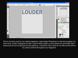
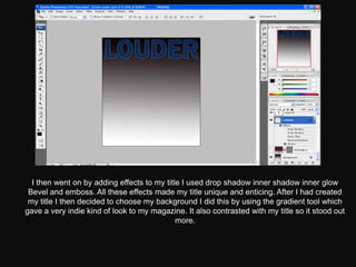
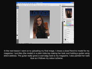
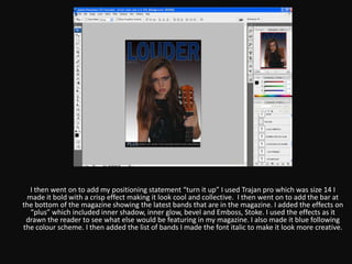
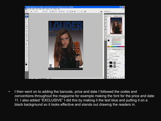
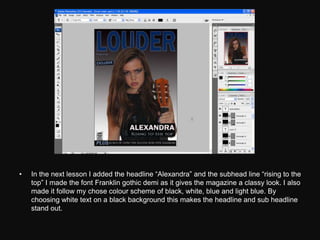
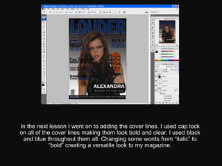
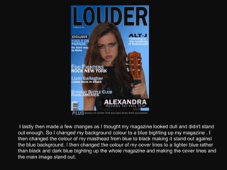
The document summarizes the process of designing a magazine cover in Adobe Photoshop. First, the designer created the title of the magazine using the font Franklin Gothic in size 50 in blue to stand out. A drop shadow and other effects were added to make the title unique. Next, a gradient background was chosen to give an indie look. In subsequent lessons, a friend was photographed holding a guitar to portray an edgy look, and text was added following the blue color scheme. Additional effects were applied to graphics and text to draw the reader in. Throughout the process, the designer experimented with colors and layouts to make the cover visually appealing and representative of the magazine's style.


![Final%20 magazine%20–%20double%20page%20spread[2]](https://cdn.slidesharecdn.com/ss_thumbnails/final20magazine2020double20page20spread2-120511045804-phpapp02-thumbnail.jpg?width=640&height=640&fit=bounds)


![Screen shots of front cover]](https://cdn.slidesharecdn.com/ss_thumbnails/screenshotsoffrontcover-130307044929-phpapp01-thumbnail.jpg?width=640&height=640&fit=bounds)


