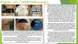
The Digipak cover uses simple black and white imagery and minimal text to convey emotion and mystery. Images of the artist with tears suggest the album will provide insight into her feelings and give the audience a sense of her true identity. While she is portrayed as a "monster", the crying implies she does not want this label and seeks sympathy from listeners. The monochrome color scheme reinforces the unknown nature of her identity.
2. Jewel Case Analysis – Ed Sheeran…
When looking at the cover of this Jewel Case by Ed Sheeran
we can see that the main part of this cover is him as himself
and the background colour of orange. This album could be
represented as this colour because of it linking in with his
image as he is “Ginger” and this shows nothing but the
colour orange which as an artist is his trademark.
Within the cover we can see that the whole cover is
dedicated to him as the artist showing that this album could
just be all about him as a person, which then would link in
with the idea of using the colour of orange as that is him.
The audience that I would think this album would be for
would be aimed at teenagers. This is because of the use of
how the album is mostly just simple with the use of only one
bold colour and simple white words for the back of the cover,
enabling the audience to know that this cover is just based
around the artist and that is it and the album helps to
identify this.
However, the cover to this album does not include a title
because of him only wanting the audience to know that this
album is all just based around him and wanting people to
know who he is and not just releasing an album for money
and fame, it presents the artist as an individual of himself.
The barcode within the back of the album shows us as the
audience that this is a sellable CD and with the writing next
to it allowing us to see the company information and
copyright terms, allowing this to be sellable.
Orange is Ed Sheeran’s
trademark because he is
seen as this ginger character
as that is the main colour of
his hair. This is showing that
his album is self-entitled to
him and is showing him as
the important inspiration
within this.
As we can see the font of the
songs looks like it has been
in a type writing font
showing that this has a
computer based font within
it. This font could show that
he is an old fashioned
vocalist however with a
modern appeal to him,
showing that he is this
person who enjoys to stay
within the past that is his
genre. This would be
cantered because it helps it
sharply stand out amongst
the orange, however still
showing that his image on
the front is more of an
appeal.
3. Digipak – JAY-Z LINKIN PARK Analysis…
When looking at this digipak we can see that they
have gone for more of an urban look with this album
cover, showing that this could relate to something
within a city or town as it has that feel to it. We can
see amongst the digipak they have the use of graffiti
which is something that you would see deep within a
town and alleys, and the colour of the brown
background helps relate to this as it looks like a
brick wall, when looking at it in this way we can see
that it is more natural and it is the way music is
supposed to be seen. With this in mind we can see
that this would aim and relate more the age of
teenager and possibly a younger adult audience.
Within the title we can see that it includes a sub-
title called “Collision Course” it links in with the
idea of genres colliding, as by looking at this design I
would link this in with the idea of Gangster/DJ
appeal gives it that collision within genre appeal and
the design helps portray this.
The use of colours in which have been used is the
use of blue which gives out the idea of it being a
spray paint colour towards the use of the graffiti in
which is being appealed and then some use of the
colour white which could show the idea of
innocence. The brown and black colour appeal could
give out the idea of it being seen as mystery and
dark and links in well with the genre of the album
The layout out of this background look like a brickwork design in colour this
could be showing the idea of this back street appeal towards it linking in with
the idea of the genres such as the gangster/DJ appeal that it has towards the
design of the album.
The different shadowing of the text gives out the layer of the art and this
could connect in with the idea of the graffiti design towards the digipak. It
could be helping to show the different types of genres in which are being
shown within the album.
4. Digipak – Lady Gaga Analysis… When looking at this digipak from Lady Gaga we can
see that this is more of a simple and easy design for a
cover. With only black and white colours and few
images, making this have limited detail however with
there being meaning behind this.
When looking at the colour black within the digipak we
can see that this gives out a gothic/Darker pop genre
within it to me connoting the image of mystery, giving
her that unknown appearance to her as the artist and
maybe the songs would possibly link in with this idea.
From looking at the image amongst the front cover of
her album we can see that she has tears coming from
her face, which this would be showing her emotions
and through this we can maybe tell that we can gain
her emotions from this able and understand her more
in her true feeling and going into that more depth,
showing that this album is being based more around
her as the artist and trying to make those links with
the audience more through the use of her emotions,
showing that she is the important character amongst
the album and connecting that impact within the
audience. The title of the album “Lady Gaga The Fame
Monster” is showing the audience that she is being
seen as a monster however she may want the audience
to know that she isn’t this monster and by showing her
emotions within the album demonstrates that she
doesn’t want to be seen like that and she may want
the sympathy giving the idea why she is the main
attraction of this album, she is seen as this different
character, not a human but a monster however still
being famous.
There could be no greyscale within
this album because of how she wants
to be seen as this unknown identity
that’s why the black is mostly used,
without the grey this could show how
empty she is and full of different
emotions in which she could be going
through.
The different emotions in which she
could be going in is lonely, crying and
empty, they may give different
emotions because of how she could be
seen as having different personalities,
giving that link and idea with how she
seems unknown to her true identity.
5. Digipak – Desert Rose Analysis… When looking at this Digipak we can see that they have gone
for this desert, western appearance look. Within this we see
can see that they have used the colours of what would be
associated with deserts which is like this pale, rocky type of
colour that it includes. Giving that affect within the album
itself, making that click between the genres made. The use
of the different times of days could be showing that this
based around her day and her relationships showing that at
the beginning and ending of day is still unable to achieve,
giving a sight into her day through song.
However, when looking at the images that
have been used within this Digipak we can
see that they have used the idea of this
western feel. When looking at the right side
where the female and male are sat together
we can see he is suited up giving him that
professional appearance to him, however he
is still wearing a cow boy like appearance hat
linking in with this context of the genre of
deserts. However the female as also got this
cowgirl look about her wearing the black
outfit connoting the idea of mysterious and
unknown with red hair showing the danger
that she could entail. Her body language is
seen as being closed up, showing that she
isn’t this open welcoming character and she
could feel this shy character within her
appearance and body language.We also can see that she is also holding a cowgirl hat as her prop she could be showing us as the audience her
appearance and how her indemnity and genre is seen as western, cowgirl, showing us her main appearance.
However when looking around this
Digipak we can also she that most
images of the female are within this.
This could be showing to us as the
audience that she is more of the
important character within this
making her sharply and boldly stand
out. This could mean that this album
is all based around her as the artist
and with the location of the desert
this could link in with the music
being about her amongst the desert.
Possibly the male could be in this
because she could be on about
having a tough time with a male
character amongst the desert.
On the left hand side of the album
we can see that she is all covered up
wit clothing around her head, this
could link in with the idea of her
being this mysterious and unknown
character amongst the desert?
When looking at the title of the Digipak called
“Desert Rose” This could establish to the audience
that we know she is in the desert and her music
would be based there and also the word “Rose”
could be her name however it could link in with
the idea of romance as a rose is seen more as a
romance prop so this album could be based around
Romance within the desert.
To conclude: Within this Digipak we can see that the main use of titles and images are being shown to represent the genre based around the album and this
idea of have gained by looking at this with the idea of Romance within the desert and that is the idea of have gained from just looking at this album in
which I haven’t seen or heard before. However, the target audience I would aim this Digipak more at would be adults within the age range of 30+ as this
could seem like a classical type of music whereas most of a younger audience would be into pop genres.
6. Digipak – Stendeck- Sonnambula Analysis…
When looking at this Digipak we
can see that this is more of a
simple and low designed layout for
the album with simple colour
schemes and the use of white.
However, whilst looking at this
Digipak back there are some initial
ideas that I can represent from
them…
From looking at the images that
have been used within this
Digipak, we can see the use of
empty branched trees. This could
represent the idea of this tree no
longer living, it is empty and
lonely it has this emotional
appearance to it. This idea could
demonstrate to me that within this
album it could talk about an empty
lonely person and the idea of the
empty leave less tree branches
could resemble this idea.
We can also see the use of red petals within the natural images that we can see, these could be connoting the idea of danger so with
the use of white used a lot this could show an innocent prospective of someone/something and the red could be the dangerous
prospective, giving that idea that within the album it could relate to opposites and conflict and the colours have given me this idea.
However looking back at the colours being
used, I believe that they have included
colour schemes to portray my idea which is
about conflict and opposites, with the idea of
white showing the good side and the red
colours showing the bad/dangerous side. On
the other hand black has also been used,
which this could be the idea of emptiness
and mystery involved within these opposites.
We can also see that this album
has a dull colour scheme for it, showing that
this Digipak could be based around this idea I
had before about being lonely and emotional
this could be representing the emotional and
darkening story that could be portrayed
throughout this album.
The credits and names of
songs/copyright details have been
designed to fit on an image/shape that
looks like the edge of a field in which
the plants are grown from
To conclude: From looking at this Digipak in which I haven’t seen or heard of
before, when analysing the items and images in which I can see from this I
believe that the ideas I get from this is that it is on the route of emphasising
the idea of opposites and conflict and clearly showing the emotions that
could be portrayed through this. Therefore I believe this creates the effect of
opposites and being empty and clearly shows this would be an emotional tone
in music, giving it this simple design, helping a message reach across to the
audience
This could be based
around an adult audience,
for those who like to infer
music from the idea of
telling stories…