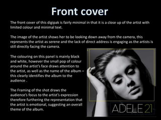
The front cover of this digipak is fairly minimal in that it is a close up of the artist with
limited colour and minimal text.
The image of the artist shows her to be looking down away from the camera, this
represents the artist as serene and the lack of direct address is engaging as the artists is
still directly facing the camera.
The colouring on this panel is mainly black
and white, however the small pop of colour
around the artist’s face draws attention to
the artist, as well as the name of the album –
this clearly identifies the album to the
audience .
The Framing of the shot draws the
audience’s focus to the artist’s expression
therefore furthering the representation that
the artist is emotional, suggesting an overall
theme of the album.
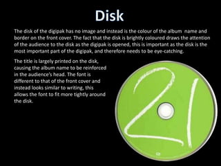
The disk of the digipak has no image and instead is the colour of the album name and
border on the front cover. The fact that the disk is brightly coloured draws the attention
of the audience to the disk as the digipak is opened, this is important as the disk is the
most important part of the digipak, and therefore needs to be eye-catching.
The title is largely printed on the disk,
causing the album name to be reinforced
in the audience’s head. The font is
different to that of the front cover and
instead looks similar to writing, this
allows the font to fit more tightly around
the disk.
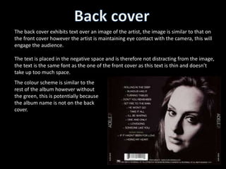
The back cover exhibits text over an image of the artist, the image is similar to that on
the front cover however the artist is maintaining eye contact with the camera, this will
engage the audience.
The text is placed in the negative space and is therefore not distracting from the image,
the text is the same font as the one of the front cover as this text is thin and doesn’t
take up too much space.
The colour scheme is similar to the
rest of the album however without
the green, this is potentially because
the album name is not on the back
cover.
The digipak overall uses a grey scale colour scheme with some lime green accents, and
as uses a thin text for the purpose of larger bodies of text e.g. the track list on the back
cover.
The artist is seen both looking at and away from the camera, allowing the audience to
see a range of emotion from the artist.
The disk is eye-catching and bright and exhibits the most important part of the digipak.

Adele digipak

  • 3.
    The front coverof this digipak is fairly minimal in that it is a close up of the artist with limited colour and minimal text. The image of the artist shows her to be looking down away from the camera, this represents the artist as serene and the lack of direct address is engaging as the artists is still directly facing the camera. The colouring on this panel is mainly black and white, however the small pop of colour around the artist’s face draws attention to the artist, as well as the name of the album – this clearly identifies the album to the audience . The Framing of the shot draws the audience’s focus to the artist’s expression therefore furthering the representation that the artist is emotional, suggesting an overall theme of the album.
  • 4.
    The disk ofthe digipak has no image and instead is the colour of the album name and border on the front cover. The fact that the disk is brightly coloured draws the attention of the audience to the disk as the digipak is opened, this is important as the disk is the most important part of the digipak, and therefore needs to be eye-catching. The title is largely printed on the disk, causing the album name to be reinforced in the audience’s head. The font is different to that of the front cover and instead looks similar to writing, this allows the font to fit more tightly around the disk.
  • 5.
    The back coverexhibits text over an image of the artist, the image is similar to that on the front cover however the artist is maintaining eye contact with the camera, this will engage the audience. The text is placed in the negative space and is therefore not distracting from the image, the text is the same font as the one of the front cover as this text is thin and doesn’t take up too much space. The colour scheme is similar to the rest of the album however without the green, this is potentially because the album name is not on the back cover.
  • 6.
    The digipak overalluses a grey scale colour scheme with some lime green accents, and as uses a thin text for the purpose of larger bodies of text e.g. the track list on the back cover. The artist is seen both looking at and away from the camera, allowing the audience to see a range of emotion from the artist. The disk is eye-catching and bright and exhibits the most important part of the digipak.