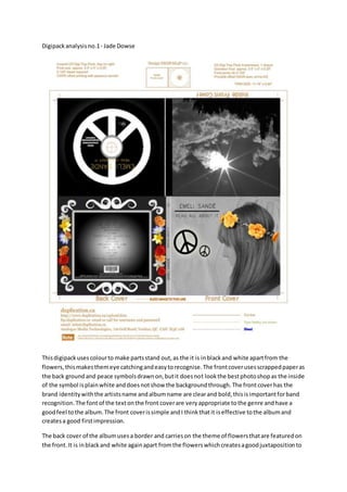
The document provides an analysis of two digipack album designs. For the first album, the summary is:
The design uses black and white with colored flowers to stand out. It has clear artist and album names on the front cover with a simple, effective design. The back cover continues the flower theme and features the track list. Minor issues include a lack of label on the spine.
The second album has a science fiction theme depicted through blue colors. The front cover features a character but lacks band identity. The back cover track list is hard to read and legal text is impossible to read. The inside continues the theme but the disc side is more plain. Overall it uses simplicity to create a rich perspective on the