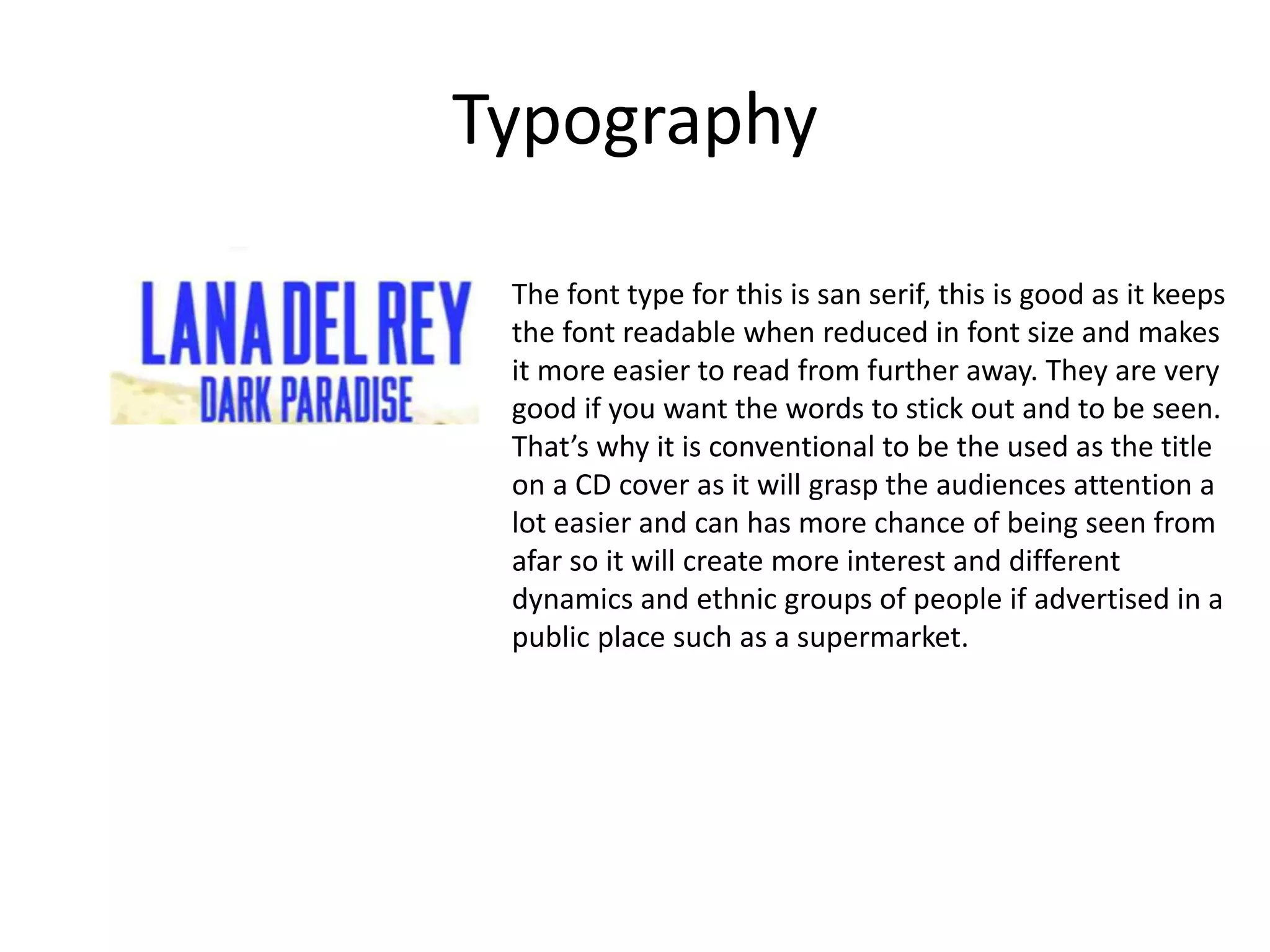
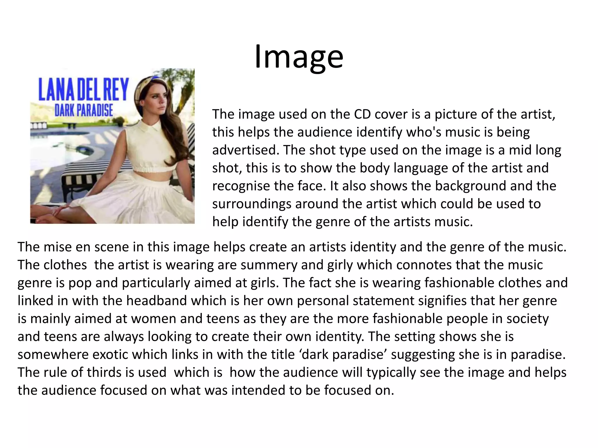
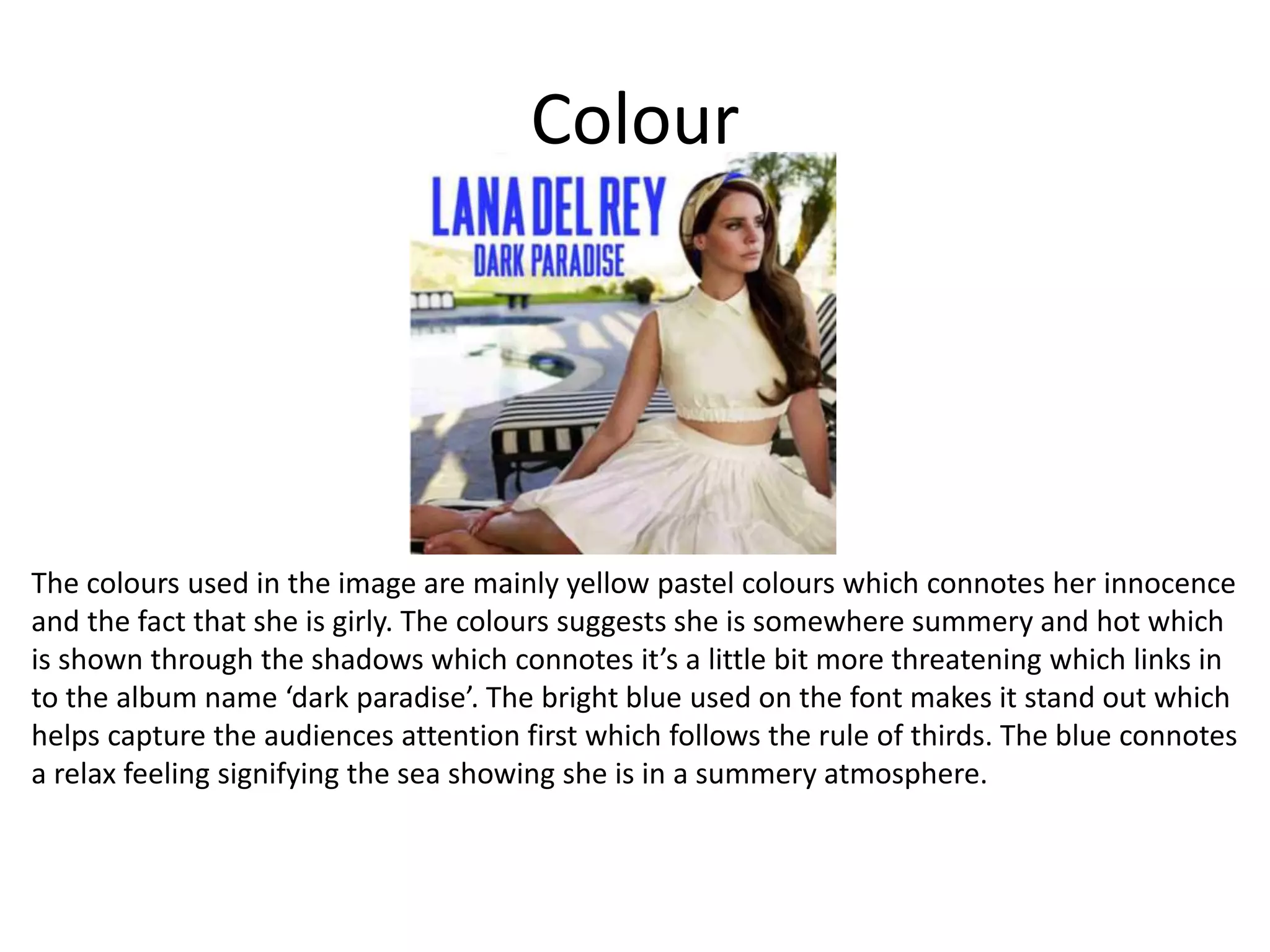
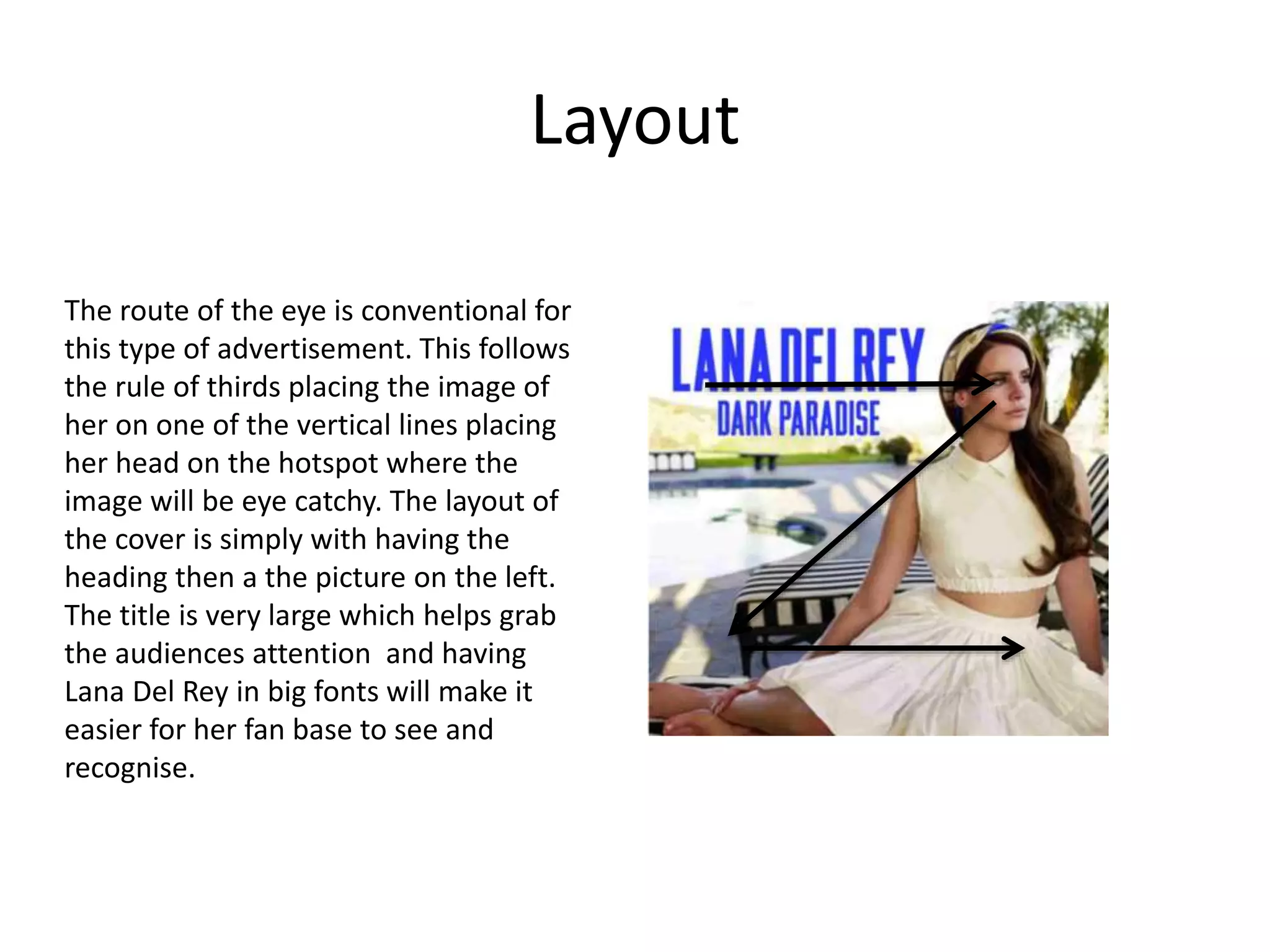
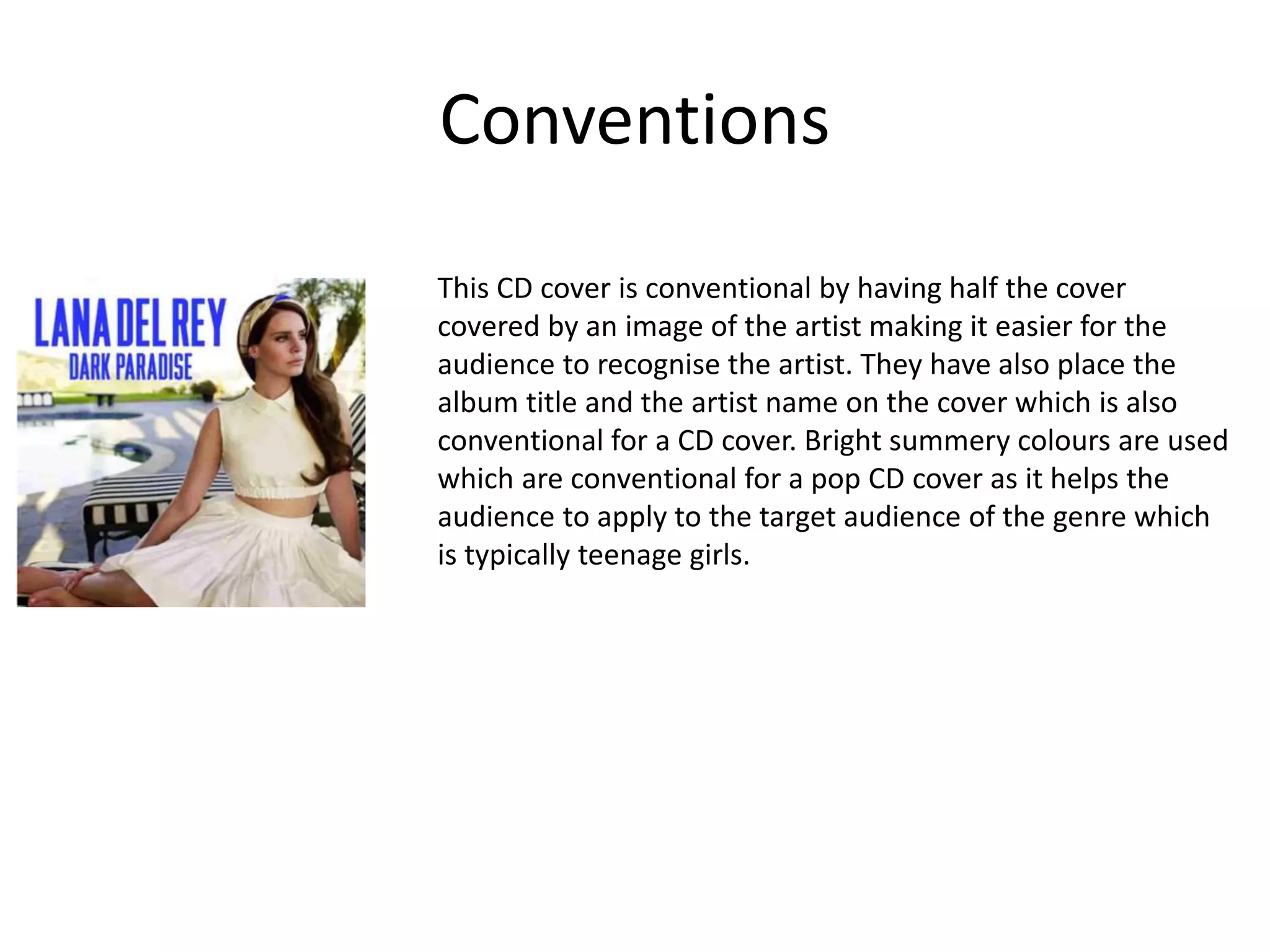
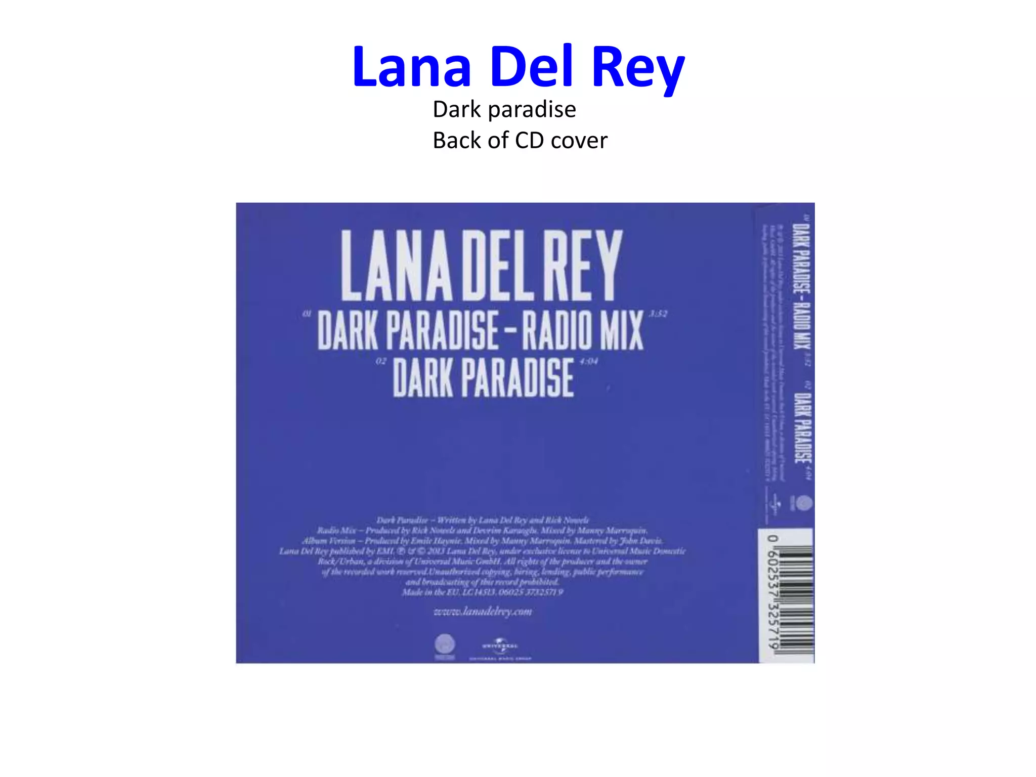
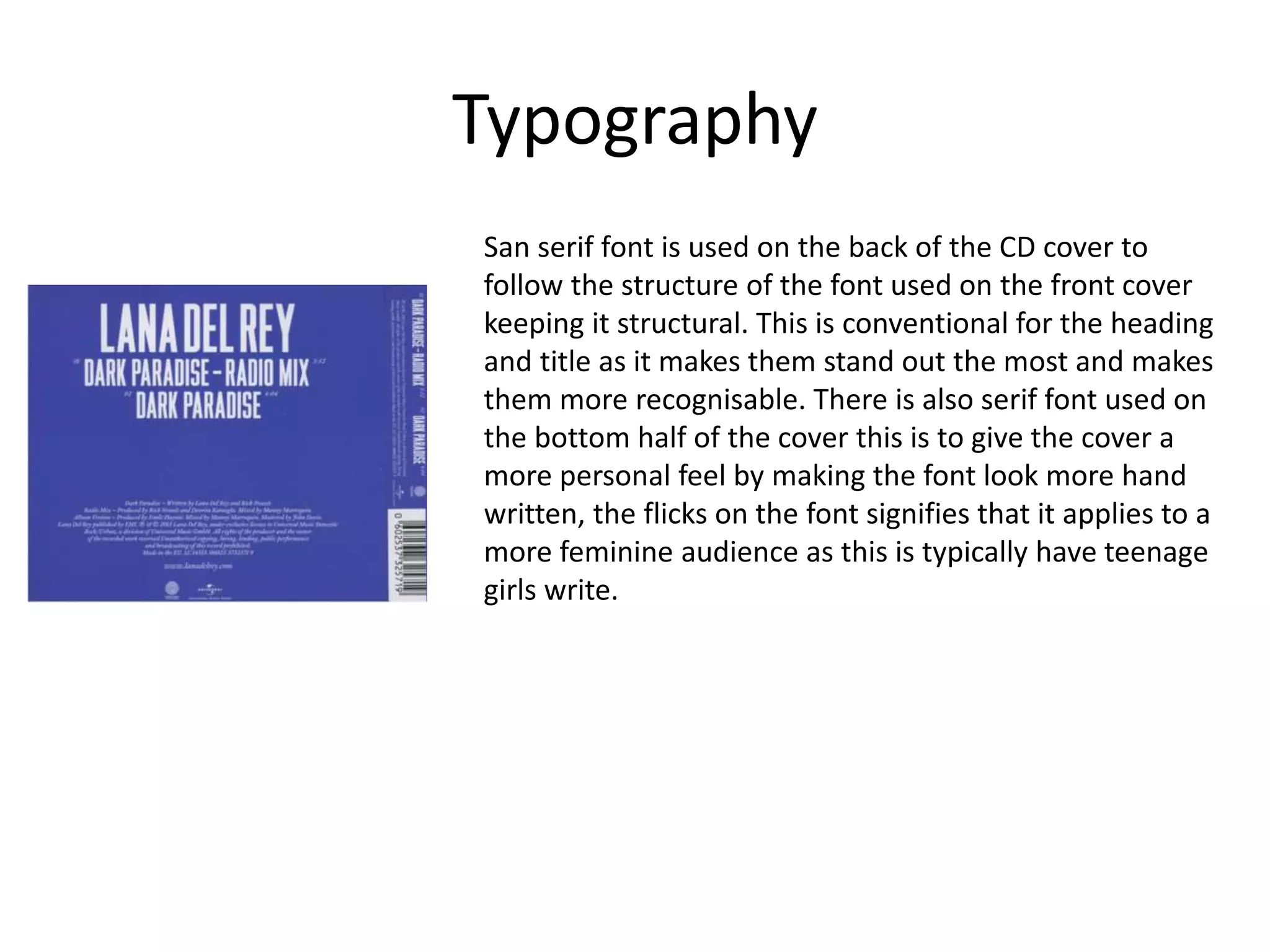
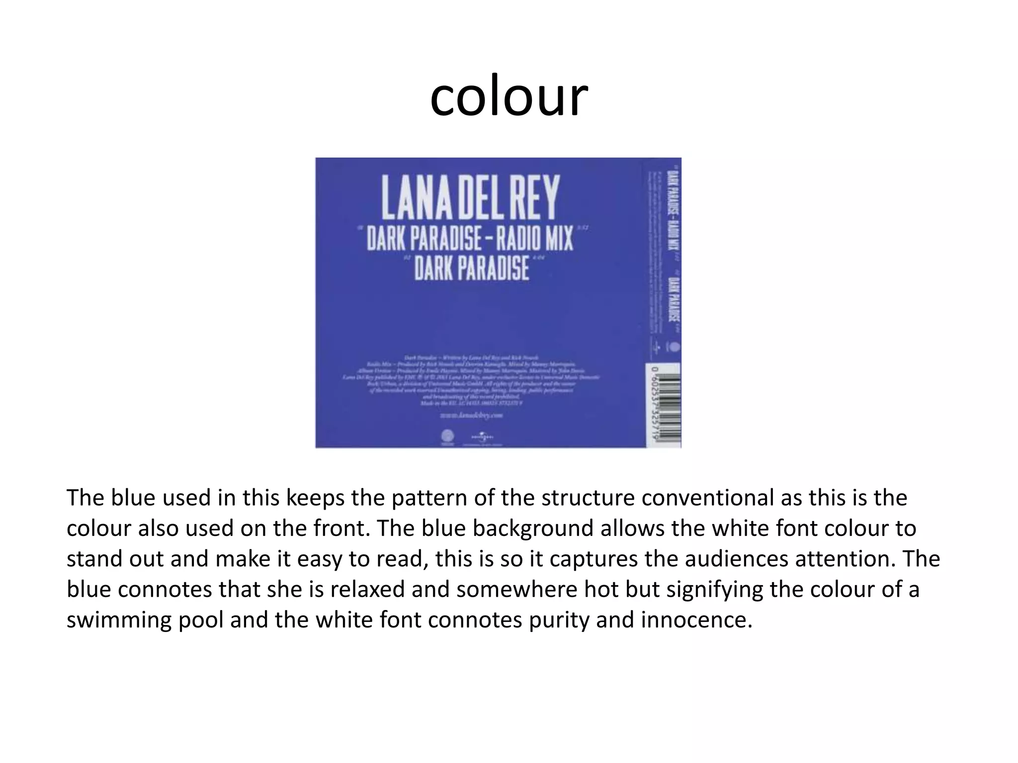
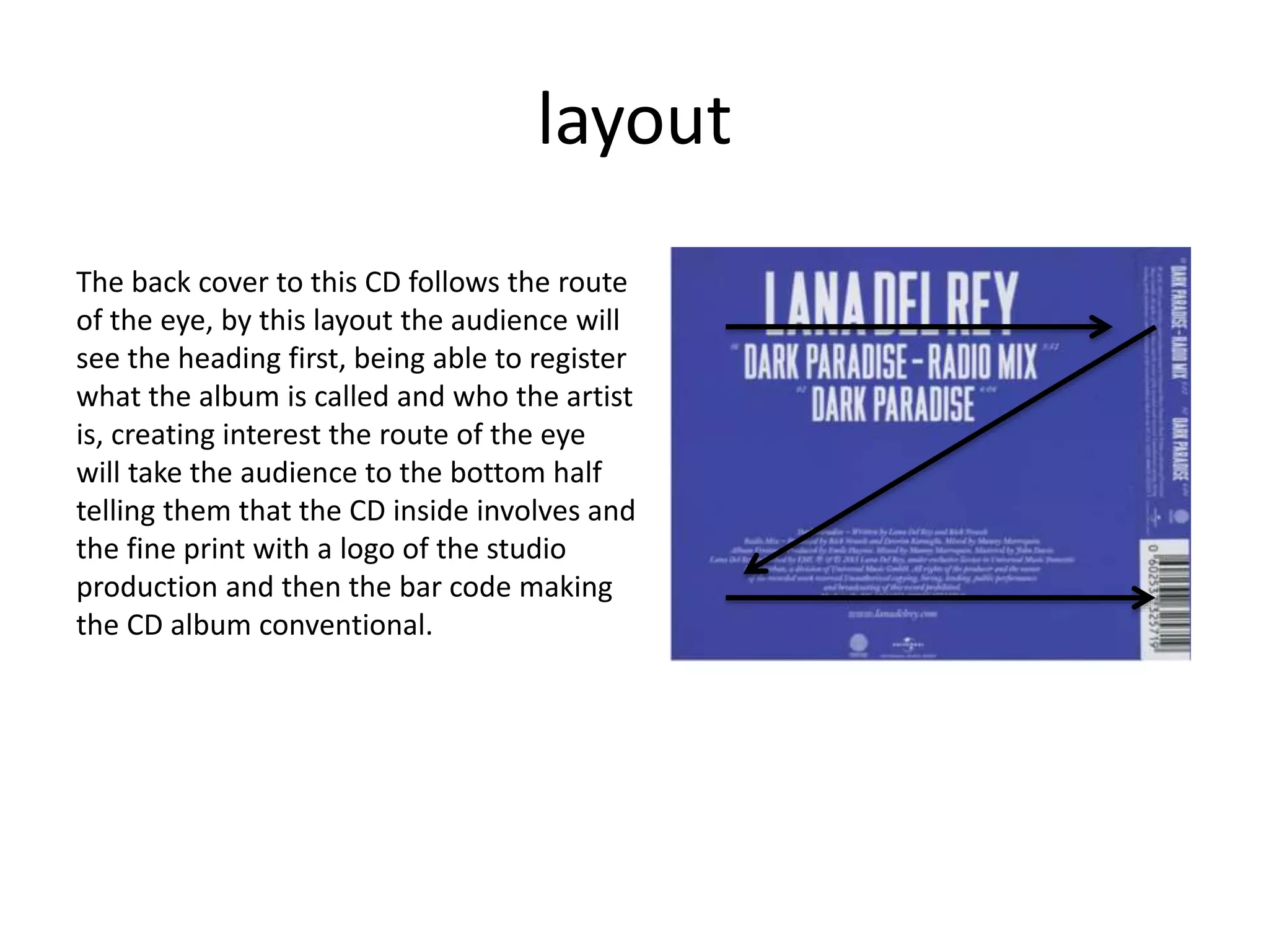
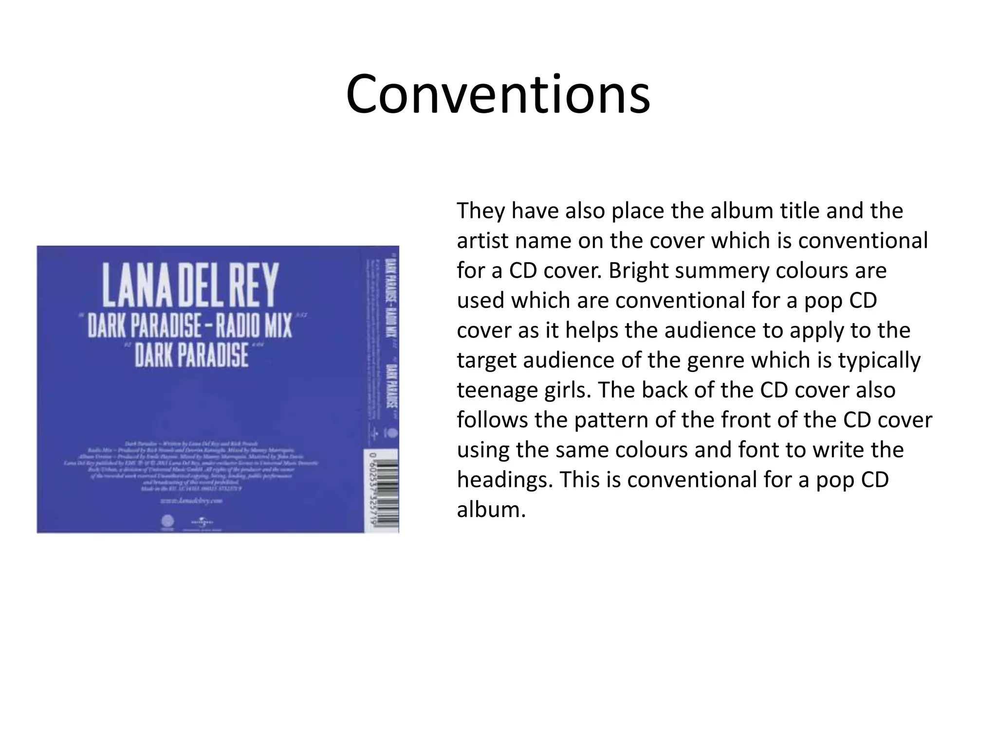
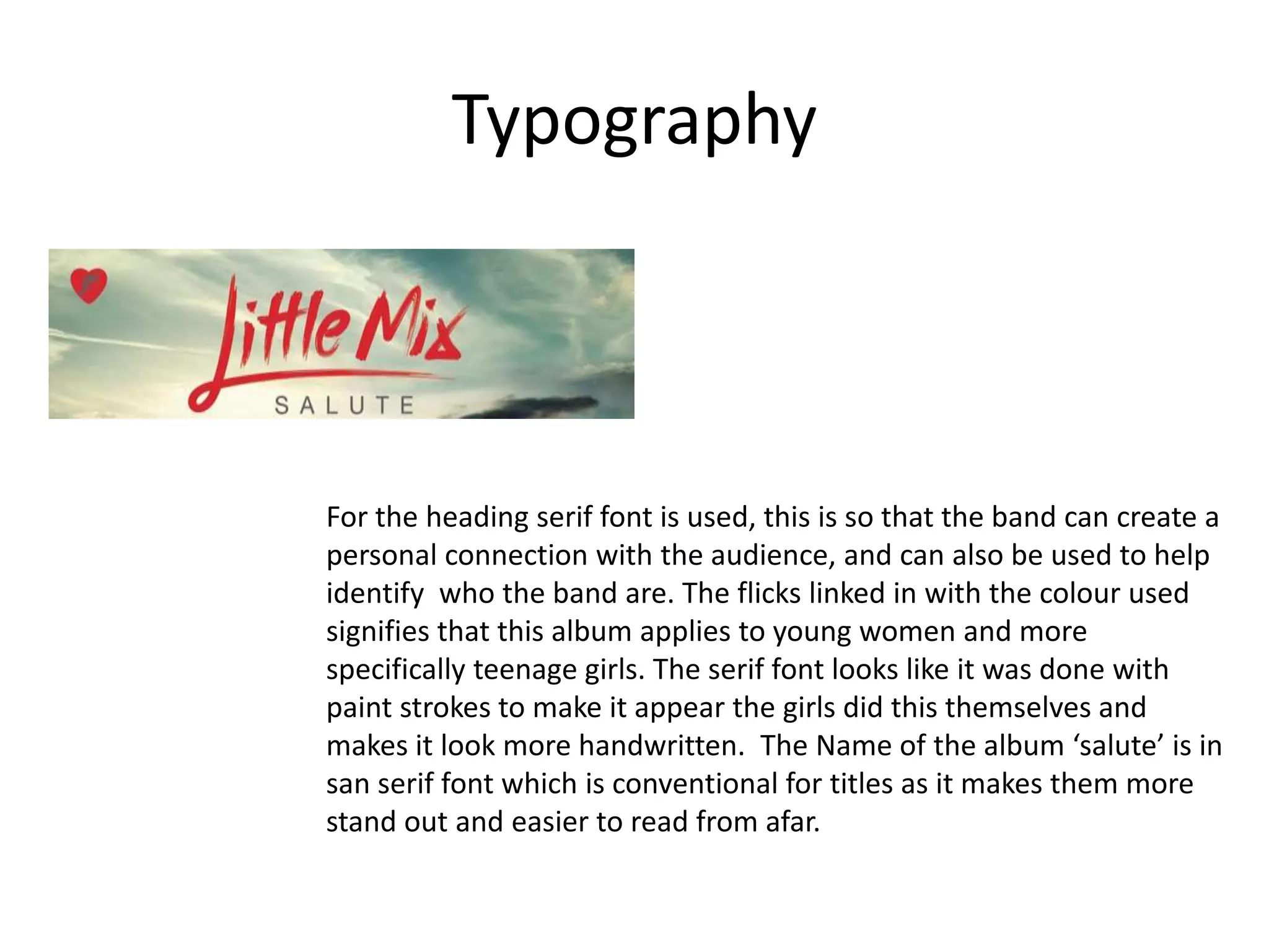
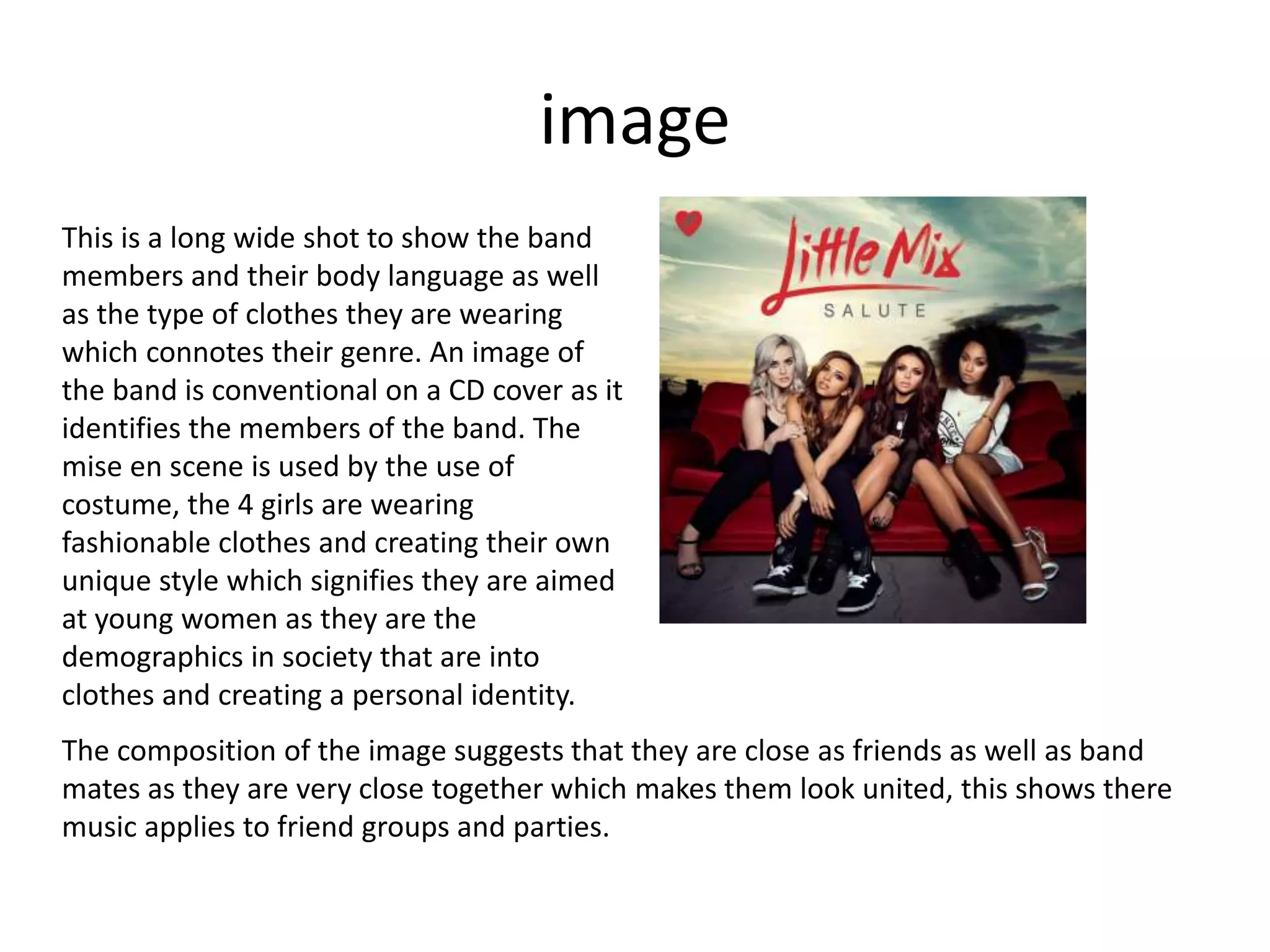
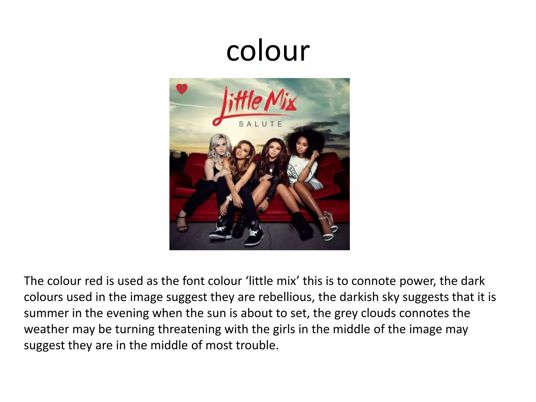
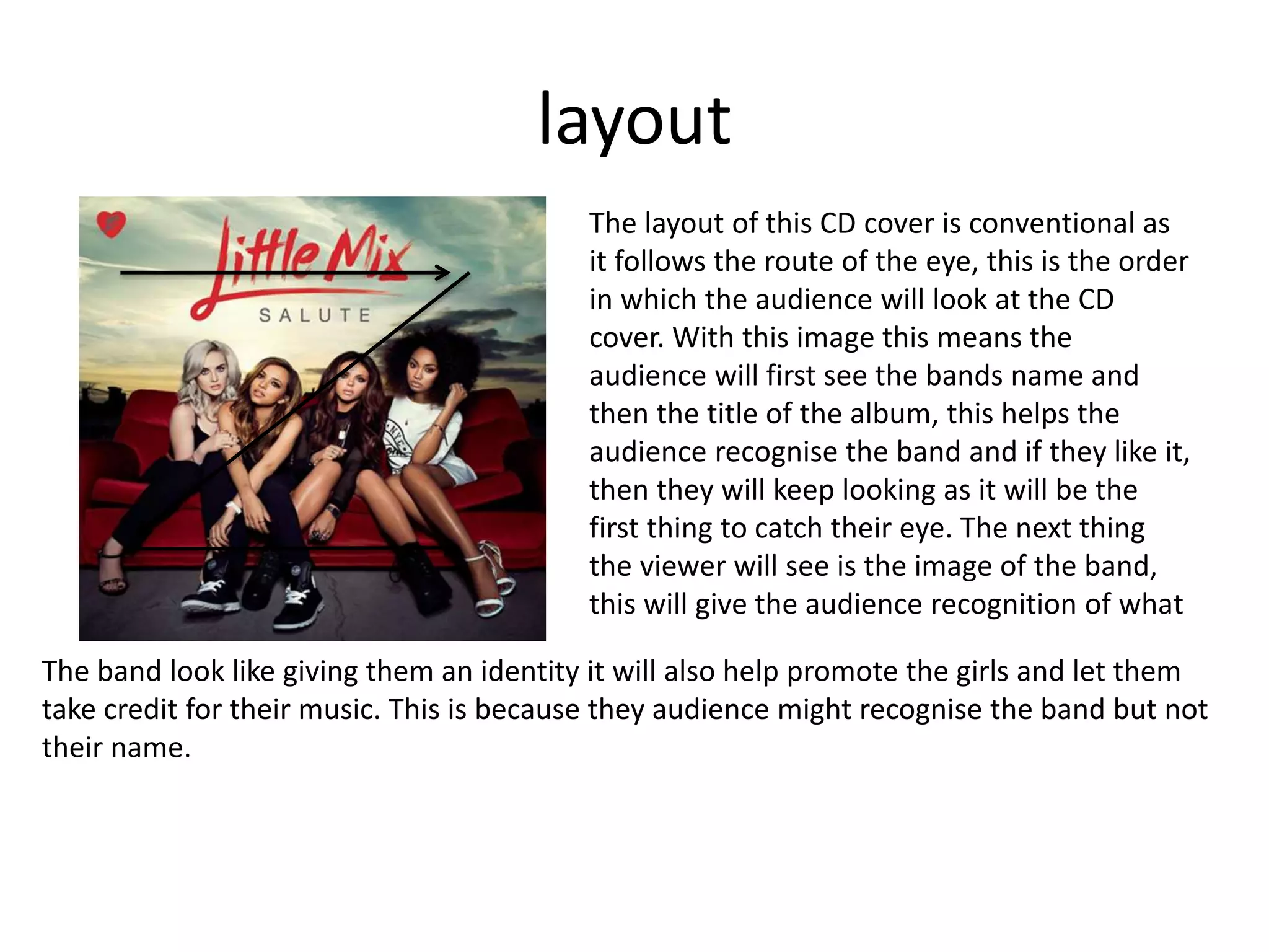
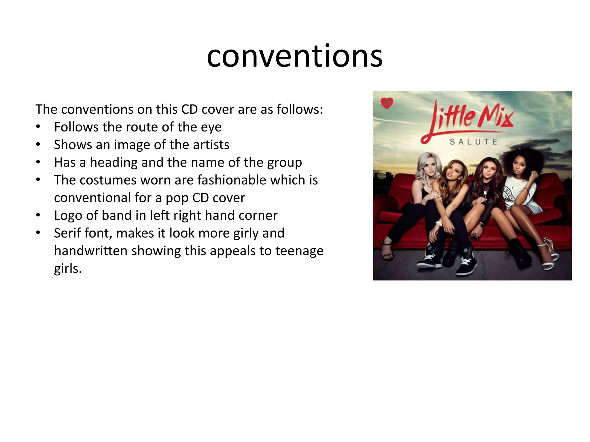
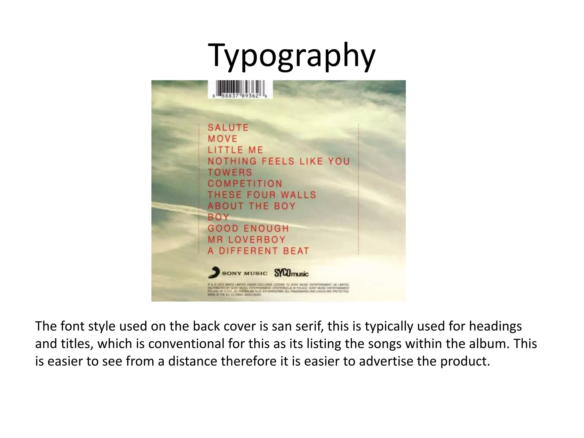
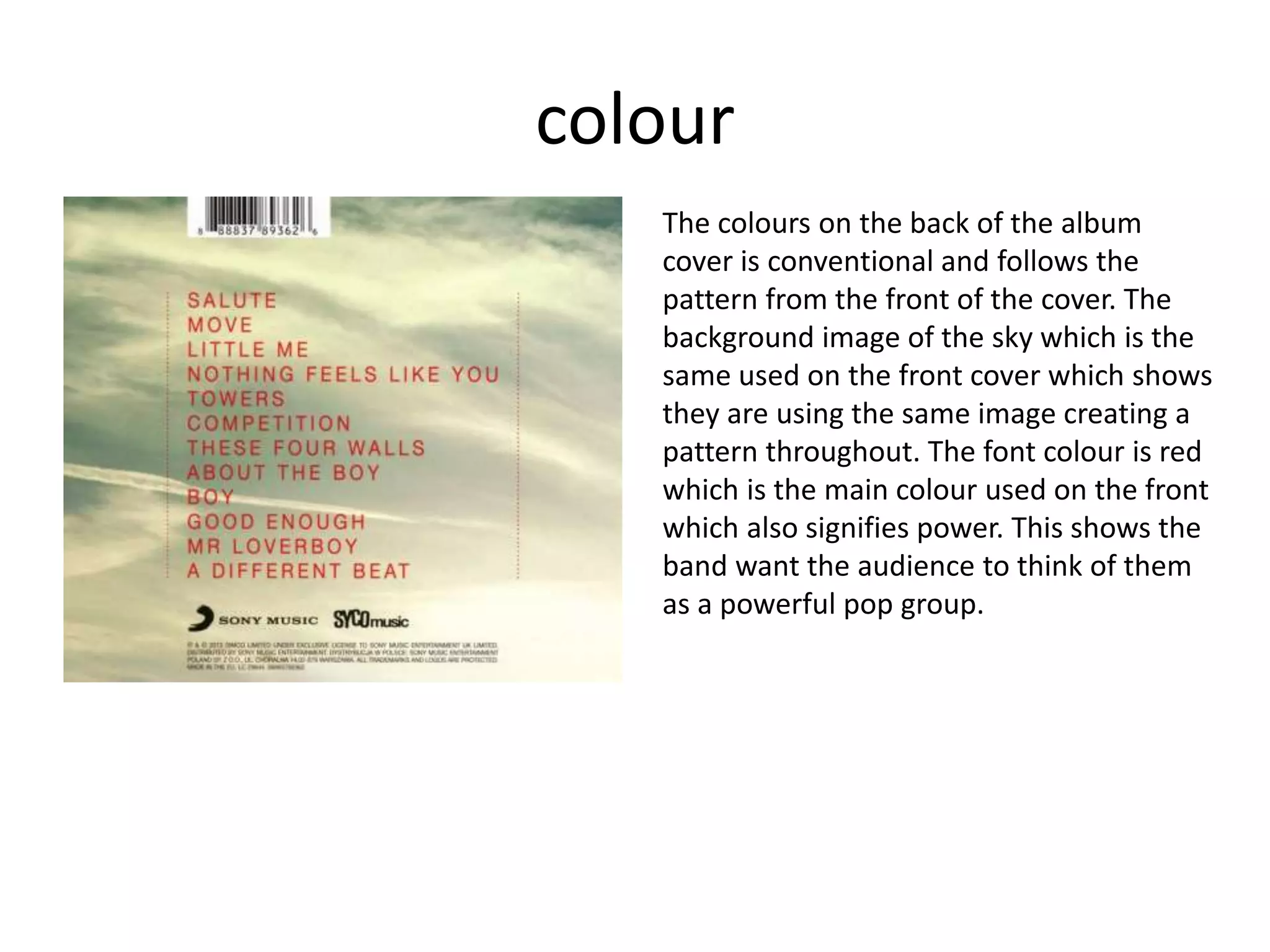
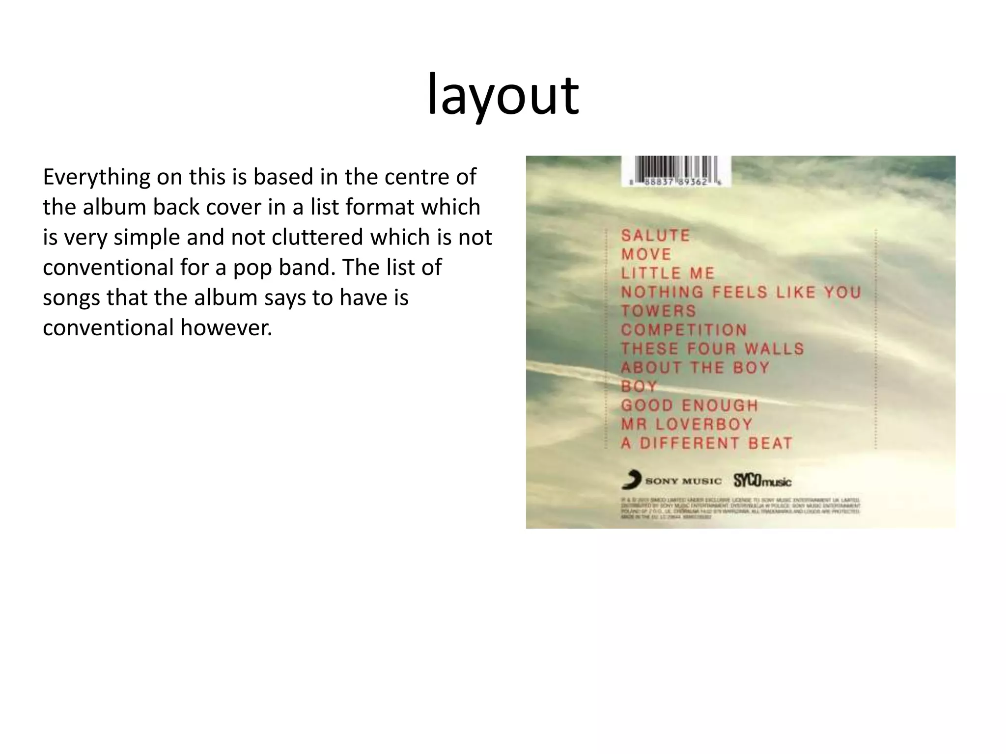
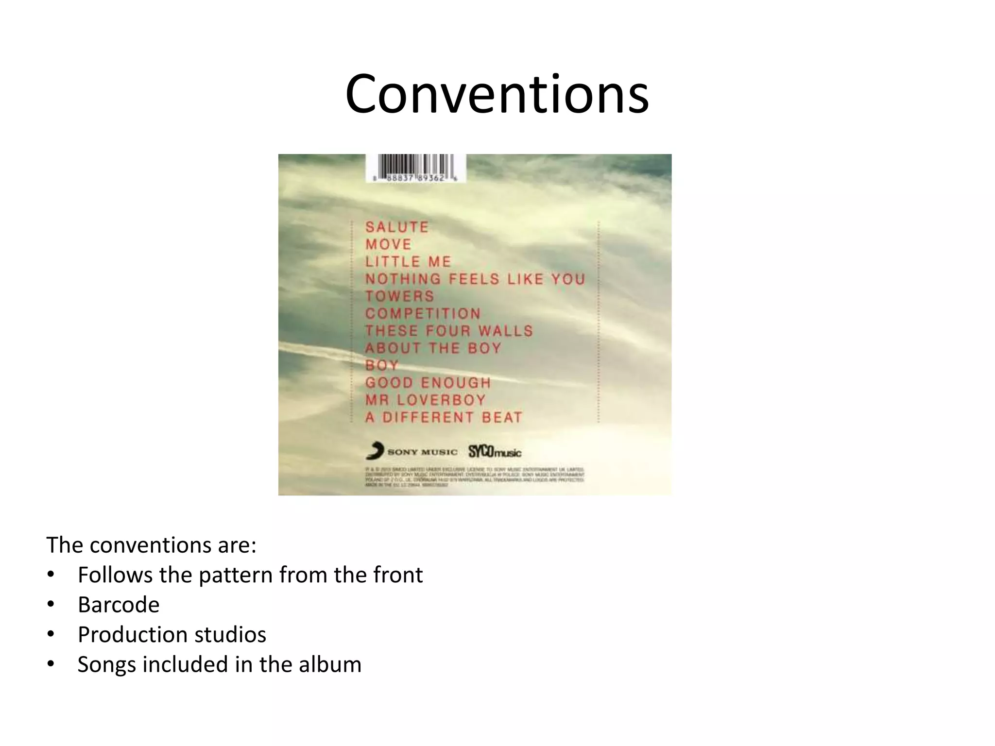
SlideShare a Scribd company logo
Lana Del Rey
Dark paradise
Typography
The font type for this is san serif, this is good as it keeps
the font readable when reduced in font size and makes
it more easier to read from further away. They are very
good if you want the words to stick out and to be seen.
That’s why it is conventional to be the used as the title
on a CD cover as it will grasp the audiences attention a
lot easier and can has more chance of being seen from
afar so it will create more interest and different
dynamics and ethnic groups of people if advertised in a
public place such as a supermarket.
Image
The image used on the CD cover is a picture of the artist,
this helps the audience identify who's music is being
advertised. The shot type used on the image is a mid long
shot, this is to show the body language of the artist and
recognise the face. It also shows the background and the
surroundings around the artist which could be used to
help identify the genre of the artists music.
The mise en scene in this image helps create an artists identity and the genre of the music.
The clothes the artist is wearing are summery and girly which connotes that the music
genre is pop and particularly aimed at girls. The fact she is wearing fashionable clothes and
linked in with the headband which is her own personal statement signifies that her genre
is mainly aimed at women and teens as they are the more fashionable people in society
and teens are always looking to create their own identity. The setting shows she is
somewhere exotic which links in with the title ‘dark paradise’ suggesting she is in paradise.
The rule of thirds is used which is how the audience will typically see the image and helps
the audience focused on what was intended to be focused on.
Colour
The colours used in the image are mainly yellow pastel colours which connotes her innocence
and the fact that she is girly. The colours suggests she is somewhere summery and hot which
is shown through the shadows which connotes it’s a little bit more threatening which links in
to the album name ‘dark paradise’. The bright blue used on the font makes it stand out which
helps capture the audiences attention first which follows the rule of thirds. The blue connotes
a relax feeling signifying the sea showing she is in a summery atmosphere.
Layout
The route of the eye is conventional for
this type of advertisement. This follows
the rule of thirds placing the image of
her on one of the vertical lines placing
her head on the hotspot where the
image will be eye catchy. The layout of
the cover is simply with having the
heading then a the picture on the left.
The title is very large which helps grab
the audiences attention and having
Lana Del Rey in big fonts will make it
easier for her fan base to see and
recognise.
Conventions
This CD cover is conventional by having half the cover
covered by an image of the artist making it easier for the
audience to recognise the artist. They have also place the
album title and the artist name on the cover which is also
conventional for a CD cover. Bright summery colours are used
which are conventional for a pop CD cover as it helps the
audience to apply to the target audience of the genre which
is typically teenage girls.
Lana Del ReyDark paradise
Back of CD cover
Typography
San serif font is used on the back of the CD cover to
follow the structure of the font used on the front cover
keeping it structural. This is conventional for the heading
and title as it makes them stand out the most and makes
them more recognisable. There is also serif font used on
the bottom half of the cover this is to give the cover a
more personal feel by making the font look more hand
written, the flicks on the font signifies that it applies to a
more feminine audience as this is typically have teenage
girls write.
colour
The blue used in this keeps the pattern of the structure conventional as this is the
colour also used on the front. The blue background allows the white font colour to
stand out and make it easy to read, this is so it captures the audiences attention. The
blue connotes that she is relaxed and somewhere hot but signifying the colour of a
swimming pool and the white font connotes purity and innocence.
layout
The back cover to this CD follows the route
of the eye, by this layout the audience will
see the heading first, being able to register
what the album is called and who the artist
is, creating interest the route of the eye
will take the audience to the bottom half
telling them that the CD inside involves and
the fine print with a logo of the studio
production and then the bar code making
the CD album conventional.
Conventions
They have also place the album title and the
artist name on the cover which is conventional
for a CD cover. Bright summery colours are
used which are conventional for a pop CD
cover as it helps the audience to apply to the
target audience of the genre which is typically
teenage girls. The back of the CD cover also
follows the pattern of the front of the CD cover
using the same colours and font to write the
headings. This is conventional for a pop CD
album.
Little Mix
Salute
Typography
For the heading serif font is used, this is so that the band can create a
personal connection with the audience, and can also be used to help
identify who the band are. The flicks linked in with the colour used
signifies that this album applies to young women and more
specifically teenage girls. The serif font looks like it was done with
paint strokes to make it appear the girls did this themselves and
makes it look more handwritten. The Name of the album ‘salute’ is in
san serif font which is conventional for titles as it makes them more
stand out and easier to read from afar.
image
This is a long wide shot to show the band
members and their body language as well
as the type of clothes they are wearing
which connotes their genre. An image of
the band is conventional on a CD cover as it
identifies the members of the band. The
mise en scene is used by the use of
costume, the 4 girls are wearing
fashionable clothes and creating their own
unique style which signifies they are aimed
at young women as they are the
demographics in society that are into
clothes and creating a personal identity.
The composition of the image suggests that they are close as friends as well as band
mates as they are very close together which makes them look united, this shows there
music applies to friend groups and parties.
colour
The colour red is used as the font colour ‘little mix’ this is to connote power, the dark
colours used in the image suggest they are rebellious, the darkish sky suggests that it is
summer in the evening when the sun is about to set, the grey clouds connotes the
weather may be turning threatening with the girls in the middle of the image may
suggest they are in the middle of most trouble.
layout
The layout of this CD cover is conventional as
it follows the route of the eye, this is the order
in which the audience will look at the CD
cover. With this image this means the
audience will first see the bands name and
then the title of the album, this helps the
audience recognise the band and if they like it,
then they will keep looking as it will be the
first thing to catch their eye. The next thing
the viewer will see is the image of the band,
this will give the audience recognition of what
The band look like giving them an identity it will also help promote the girls and let them
take credit for their music. This is because they audience might recognise the band but not
their name.
conventions
The conventions on this CD cover are as follows:
• Follows the route of the eye
• Shows an image of the artists
• Has a heading and the name of the group
• The costumes worn are fashionable which is
conventional for a pop CD cover
• Logo of band in left right hand corner
• Serif font, makes it look more girly and
handwritten showing this appeals to teenage
girls.
Little mix
Salute
CD back cover
Typography
The font style used on the back cover is san serif, this is typically used for headings
and titles, which is conventional for this as its listing the songs within the album. This
is easier to see from a distance therefore it is easier to advertise the product.
colour
The colours on the back of the album
cover is conventional and follows the
pattern from the front of the cover. The
background image of the sky which is the
same used on the front cover which shows
they are using the same image creating a
pattern throughout. The font colour is red
which is the main colour used on the front
which also signifies power. This shows the
band want the audience to think of them
as a powerful pop group.
layout
Everything on this is based in the centre of
the album back cover in a list format which
is very simple and not cluttered which is not
conventional for a pop band. The list of
songs that the album says to have is
conventional however.
Conventions
The conventions are:
• Follows the pattern from the front
• Barcode
• Production studios
• Songs included in the album

More Related Content

What's hot

Research case studies - Album art work and inserts
Research case studies - Album art work and insertsResearch case studies - Album art work and inserts
Research case studies - Album art work and insertsadinachante
 
Magazine and digi pak analysis
Magazine and digi pak analysisMagazine and digi pak analysis
Magazine and digi pak analysis
bethellis16
 
Analysing Digipaks - Sia
Analysing Digipaks - SiaAnalysing Digipaks - Sia
Analysing Digipaks - Sia
caitlinalyx
 
Music album advert analysis
Music album advert analysisMusic album advert analysis
Music album advert analysis
shaziaj
 
Digipak analysis
Digipak analysisDigipak analysis
Digipak analysis
Ariyen2016
 
Digipakaalysis1
Digipakaalysis1Digipakaalysis1
Digipakaalysis1
Saad Latif
 
Digi-packs
Digi-packs Digi-packs
Digi-packs
hayleyboylex
 
Digipak aalysis1
Digipak aalysis1Digipak aalysis1
Digipak aalysis1
Saad Latif
 
Analysis of digi pack
Analysis of digi packAnalysis of digi pack
Analysis of digi packbparsonp16
 
Florence digipak.docx 2
Florence digipak.docx 2Florence digipak.docx 2
Florence digipak.docx 2
CVSmediastudies
 
CD Cover Analysis
CD Cover AnalysisCD Cover Analysis
CD Cover Analysismediafan
 
Textual analysis
Textual analysisTextual analysis
Textual analysis
milliebevan
 
Analysis Of Digipaks
Analysis Of DigipaksAnalysis Of Digipaks
Analysis Of Digipaks
ellagreyx
 
Digi-pack Analysis
Digi-pack AnalysisDigi-pack Analysis
Digi-pack Analysis
kelseyhaslam
 
Lana del rey magazine advert and digi pak
Lana del rey magazine advert and digi pakLana del rey magazine advert and digi pak
Lana del rey magazine advert and digi pak
myajade
 
Album cover analysis
Album cover analysisAlbum cover analysis
Album cover analysis
LeahMountain
 
Florence digipak.docx 2
Florence digipak.docx 2Florence digipak.docx 2
Florence digipak.docx 2
CVSmediastudies
 
Rihanna's Loud Digpak
Rihanna's Loud DigpakRihanna's Loud Digpak
Rihanna's Loud Digpak
bethanyhead
 

What's hot (20)

Research case studies - Album art work and inserts
Research case studies - Album art work and insertsResearch case studies - Album art work and inserts
Research case studies - Album art work and inserts
 
.Aoep3
.Aoep3.Aoep3
.Aoep3
 
Magazine and digi pak analysis
Magazine and digi pak analysisMagazine and digi pak analysis
Magazine and digi pak analysis
 
Analysing Digipaks - Sia
Analysing Digipaks - SiaAnalysing Digipaks - Sia
Analysing Digipaks - Sia
 
Music album advert analysis
Music album advert analysisMusic album advert analysis
Music album advert analysis
 
Digipak analysis
Digipak analysisDigipak analysis
Digipak analysis
 
Digipakaalysis1
Digipakaalysis1Digipakaalysis1
Digipakaalysis1
 
Digi-packs
Digi-packs Digi-packs
Digi-packs
 
Digipak aalysis1
Digipak aalysis1Digipak aalysis1
Digipak aalysis1
 
Analysis of digi pack
Analysis of digi packAnalysis of digi pack
Analysis of digi pack
 
Florence digipak.docx 2
Florence digipak.docx 2Florence digipak.docx 2
Florence digipak.docx 2
 
CD Cover Analysis
CD Cover AnalysisCD Cover Analysis
CD Cover Analysis
 
Textual analysis
Textual analysisTextual analysis
Textual analysis
 
Analysis Of Digipaks
Analysis Of DigipaksAnalysis Of Digipaks
Analysis Of Digipaks
 
Digi-pack Analysis
Digi-pack AnalysisDigi-pack Analysis
Digi-pack Analysis
 
Lana del rey magazine advert and digi pak
Lana del rey magazine advert and digi pakLana del rey magazine advert and digi pak
Lana del rey magazine advert and digi pak
 
Album cover analysis
Album cover analysisAlbum cover analysis
Album cover analysis
 
Advert Analysis
Advert AnalysisAdvert Analysis
Advert Analysis
 
Florence digipak.docx 2
Florence digipak.docx 2Florence digipak.docx 2
Florence digipak.docx 2
 
Rihanna's Loud Digpak
Rihanna's Loud DigpakRihanna's Loud Digpak
Rihanna's Loud Digpak
 

Similar to Presentation1

Digi pak analysis
Digi pak analysisDigi pak analysis
Digi pak analysis
ElviraMotorga
 
Magazine analysis
Magazine analysisMagazine analysis
Magazine analysis
nattsuchecki
 
Lana del ray Digipak analysis
Lana del ray Digipak analysisLana del ray Digipak analysis
Lana del ray Digipak analysis
samfairhead
 
Digipak and magazine advert
Digipak and magazine advert Digipak and magazine advert
Digipak and magazine advert
EDavoile13
 
Digipak adverts analysis
Digipak adverts analysisDigipak adverts analysis
Digipak adverts analysis
Amy Tompkins
 
Digipack analysis
Digipack analysisDigipack analysis
Digipack analysisscottycabs
 
Digipack analysis
Digipack analysisDigipack analysis
Digipack analysisscottycabs
 
Analysing album posters
Analysing album postersAnalysing album posters
Analysing album posters
rhiannarobinson
 
Anaysis of digipak
Anaysis of digipakAnaysis of digipak
Anaysis of digipak
harveycoltman1
 
Digipak analysis
Digipak analysisDigipak analysis
Digipak analysis
MeganHarris2014
 
A2 Media - Evaluation - Question 2
A2 Media - Evaluation - Question 2A2 Media - Evaluation - Question 2
A2 Media - Evaluation - Question 2
hannahbennett98
 
Conventions analysis of 2 digipacks
Conventions analysis of 2 digipacksConventions analysis of 2 digipacks
Conventions analysis of 2 digipacks
s0018449
 
Digipak analysis
Digipak analysisDigipak analysis
Digipak analysisAbbieYapp
 
Miley cyrus Poster Analysis
Miley cyrus Poster AnalysisMiley cyrus Poster Analysis
Miley cyrus Poster Analysischarsimcox96
 
Analyse magazine adverts or digipak
Analyse magazine adverts or digipakAnalyse magazine adverts or digipak
Analyse magazine adverts or digipak
shayward99
 
Analysis of magazine advert
Analysis of magazine advertAnalysis of magazine advert
Analysis of magazine advert
MediaEdWright
 
Anaysis of digipak
Anaysis of digipakAnaysis of digipak
Anaysis of digipak
harveycoltman1
 

Similar to Presentation1 (20)

Digi pak analysis
Digi pak analysisDigi pak analysis
Digi pak analysis
 
Lana
LanaLana
Lana
 
Magazine analysis
Magazine analysisMagazine analysis
Magazine analysis
 
Lana del ray Digipak analysis
Lana del ray Digipak analysisLana del ray Digipak analysis
Lana del ray Digipak analysis
 
Digipak analysis 2
Digipak analysis 2Digipak analysis 2
Digipak analysis 2
 
Digipak and magazine advert
Digipak and magazine advert Digipak and magazine advert
Digipak and magazine advert
 
Digipak adverts analysis
Digipak adverts analysisDigipak adverts analysis
Digipak adverts analysis
 
Digipack analysis
Digipack analysisDigipack analysis
Digipack analysis
 
Digipack analysis
Digipack analysisDigipack analysis
Digipack analysis
 
Analysing album posters
Analysing album postersAnalysing album posters
Analysing album posters
 
Anaysis of digipak
Anaysis of digipakAnaysis of digipak
Anaysis of digipak
 
Digipak analysis
Digipak analysisDigipak analysis
Digipak analysis
 
A2 Media - Evaluation - Question 2
A2 Media - Evaluation - Question 2A2 Media - Evaluation - Question 2
A2 Media - Evaluation - Question 2
 
Conventions analysis of 2 digipacks
Conventions analysis of 2 digipacksConventions analysis of 2 digipacks
Conventions analysis of 2 digipacks
 
Digipak analysis
Digipak analysisDigipak analysis
Digipak analysis
 
Miley cyrus Poster Analysis
Miley cyrus Poster AnalysisMiley cyrus Poster Analysis
Miley cyrus Poster Analysis
 
Analyse magazine adverts or digipak
Analyse magazine adverts or digipakAnalyse magazine adverts or digipak
Analyse magazine adverts or digipak
 
Analysis of magazine advert
Analysis of magazine advertAnalysis of magazine advert
Analysis of magazine advert
 
Anaysis of digipak
Anaysis of digipakAnaysis of digipak
Anaysis of digipak
 
Anclilary products
Anclilary products Anclilary products
Anclilary products
 

Recently uploaded

"Protectable subject matters, Protection in biotechnology, Protection of othe...
"Protectable subject matters, Protection in biotechnology, Protection of othe..."Protectable subject matters, Protection in biotechnology, Protection of othe...
"Protectable subject matters, Protection in biotechnology, Protection of othe...
SACHIN R KONDAGURI
 
The geography of Taylor Swift - some ideas
The geography of Taylor Swift - some ideasThe geography of Taylor Swift - some ideas
The geography of Taylor Swift - some ideas
GeoBlogs
 
aaaaaaaaaaaaaaaaaaaaaaaaaaaaaaaaaaaaaaaaa
aaaaaaaaaaaaaaaaaaaaaaaaaaaaaaaaaaaaaaaaaaaaaaaaaaaaaaaaaaaaaaaaaaaaaaaaaaaaaaaaaa
aaaaaaaaaaaaaaaaaaaaaaaaaaaaaaaaaaaaaaaaa
siemaillard
 
Additional Benefits for Employee Website.pdf
Additional Benefits for Employee Website.pdfAdditional Benefits for Employee Website.pdf
Additional Benefits for Employee Website.pdf
joachimlavalley1
 
Phrasal Verbs.XXXXXXXXXXXXXXXXXXXXXXXXXX
Phrasal Verbs.XXXXXXXXXXXXXXXXXXXXXXXXXXPhrasal Verbs.XXXXXXXXXXXXXXXXXXXXXXXXXX
Phrasal Verbs.XXXXXXXXXXXXXXXXXXXXXXXXXX
MIRIAMSALINAS13
 
Instructions for Submissions thorugh G- Classroom.pptx
Instructions for Submissions thorugh G- Classroom.pptxInstructions for Submissions thorugh G- Classroom.pptx
Instructions for Submissions thorugh G- Classroom.pptx
Jheel Barad
 
June 3, 2024 Anti-Semitism Letter Sent to MIT President Kornbluth and MIT Cor...
June 3, 2024 Anti-Semitism Letter Sent to MIT President Kornbluth and MIT Cor...June 3, 2024 Anti-Semitism Letter Sent to MIT President Kornbluth and MIT Cor...
June 3, 2024 Anti-Semitism Letter Sent to MIT President Kornbluth and MIT Cor...
Levi Shapiro
 
A Strategic Approach: GenAI in Education
A Strategic Approach: GenAI in EducationA Strategic Approach: GenAI in Education
A Strategic Approach: GenAI in Education
Peter Windle
 
Language Across the Curriculm LAC B.Ed.
Language Across the  Curriculm LAC B.Ed.Language Across the  Curriculm LAC B.Ed.
Language Across the Curriculm LAC B.Ed.
Atul Kumar Singh
 
Model Attribute Check Company Auto Property
Model Attribute  Check Company Auto PropertyModel Attribute  Check Company Auto Property
Model Attribute Check Company Auto Property
Celine George
 
The Roman Empire A Historical Colossus.pdf
The Roman Empire A Historical Colossus.pdfThe Roman Empire A Historical Colossus.pdf
The Roman Empire A Historical Colossus.pdf
kaushalkr1407
 
Introduction to AI for Nonprofits with Tapp Network
Introduction to AI for Nonprofits with Tapp NetworkIntroduction to AI for Nonprofits with Tapp Network
Introduction to AI for Nonprofits with Tapp Network
TechSoup
 
Synthetic Fiber Construction in lab .pptx
Synthetic Fiber Construction in lab .pptxSynthetic Fiber Construction in lab .pptx
Synthetic Fiber Construction in lab .pptx
Pavel ( NSTU)
 
CACJapan - GROUP Presentation 1- Wk 4.pdf
CACJapan - GROUP Presentation 1- Wk 4.pdfCACJapan - GROUP Presentation 1- Wk 4.pdf
CACJapan - GROUP Presentation 1- Wk 4.pdf
camakaiclarkmusic
 
How to Make a Field invisible in Odoo 17
How to Make a Field invisible in Odoo 17How to Make a Field invisible in Odoo 17
How to Make a Field invisible in Odoo 17
Celine George
 
Unit 2- Research Aptitude (UGC NET Paper I).pdf
Unit 2- Research Aptitude (UGC NET Paper I).pdfUnit 2- Research Aptitude (UGC NET Paper I).pdf
Unit 2- Research Aptitude (UGC NET Paper I).pdf
Thiyagu K
 
Francesca Gottschalk - How can education support child empowerment.pptx
Francesca Gottschalk - How can education support child empowerment.pptxFrancesca Gottschalk - How can education support child empowerment.pptx
Francesca Gottschalk - How can education support child empowerment.pptx
EduSkills OECD
 
Embracing GenAI - A Strategic Imperative
Embracing GenAI - A Strategic ImperativeEmbracing GenAI - A Strategic Imperative
Embracing GenAI - A Strategic Imperative
Peter Windle
 
Lapbook sobre os Regimes Totalitários.pdf
Lapbook sobre os Regimes Totalitários.pdfLapbook sobre os Regimes Totalitários.pdf
Lapbook sobre os Regimes Totalitários.pdf
Jean Carlos Nunes Paixão
 
Honest Reviews of Tim Han LMA Course Program.pptx
Honest Reviews of Tim Han LMA Course Program.pptxHonest Reviews of Tim Han LMA Course Program.pptx
Honest Reviews of Tim Han LMA Course Program.pptx
timhan337
 

Recently uploaded (20)

"Protectable subject matters, Protection in biotechnology, Protection of othe...
"Protectable subject matters, Protection in biotechnology, Protection of othe..."Protectable subject matters, Protection in biotechnology, Protection of othe...
"Protectable subject matters, Protection in biotechnology, Protection of othe...
 
The geography of Taylor Swift - some ideas
The geography of Taylor Swift - some ideasThe geography of Taylor Swift - some ideas
The geography of Taylor Swift - some ideas
 
aaaaaaaaaaaaaaaaaaaaaaaaaaaaaaaaaaaaaaaaa
aaaaaaaaaaaaaaaaaaaaaaaaaaaaaaaaaaaaaaaaaaaaaaaaaaaaaaaaaaaaaaaaaaaaaaaaaaaaaaaaaa
aaaaaaaaaaaaaaaaaaaaaaaaaaaaaaaaaaaaaaaaa
 
Additional Benefits for Employee Website.pdf
Additional Benefits for Employee Website.pdfAdditional Benefits for Employee Website.pdf
Additional Benefits for Employee Website.pdf
 
Phrasal Verbs.XXXXXXXXXXXXXXXXXXXXXXXXXX
Phrasal Verbs.XXXXXXXXXXXXXXXXXXXXXXXXXXPhrasal Verbs.XXXXXXXXXXXXXXXXXXXXXXXXXX
Phrasal Verbs.XXXXXXXXXXXXXXXXXXXXXXXXXX
 
Instructions for Submissions thorugh G- Classroom.pptx
Instructions for Submissions thorugh G- Classroom.pptxInstructions for Submissions thorugh G- Classroom.pptx
Instructions for Submissions thorugh G- Classroom.pptx
 
June 3, 2024 Anti-Semitism Letter Sent to MIT President Kornbluth and MIT Cor...
June 3, 2024 Anti-Semitism Letter Sent to MIT President Kornbluth and MIT Cor...June 3, 2024 Anti-Semitism Letter Sent to MIT President Kornbluth and MIT Cor...
June 3, 2024 Anti-Semitism Letter Sent to MIT President Kornbluth and MIT Cor...
 
A Strategic Approach: GenAI in Education
A Strategic Approach: GenAI in EducationA Strategic Approach: GenAI in Education
A Strategic Approach: GenAI in Education
 
Language Across the Curriculm LAC B.Ed.
Language Across the  Curriculm LAC B.Ed.Language Across the  Curriculm LAC B.Ed.
Language Across the Curriculm LAC B.Ed.
 
Model Attribute Check Company Auto Property
Model Attribute  Check Company Auto PropertyModel Attribute  Check Company Auto Property
Model Attribute Check Company Auto Property
 
The Roman Empire A Historical Colossus.pdf
The Roman Empire A Historical Colossus.pdfThe Roman Empire A Historical Colossus.pdf
The Roman Empire A Historical Colossus.pdf
 
Introduction to AI for Nonprofits with Tapp Network
Introduction to AI for Nonprofits with Tapp NetworkIntroduction to AI for Nonprofits with Tapp Network
Introduction to AI for Nonprofits with Tapp Network
 
Synthetic Fiber Construction in lab .pptx
Synthetic Fiber Construction in lab .pptxSynthetic Fiber Construction in lab .pptx
Synthetic Fiber Construction in lab .pptx
 
CACJapan - GROUP Presentation 1- Wk 4.pdf
CACJapan - GROUP Presentation 1- Wk 4.pdfCACJapan - GROUP Presentation 1- Wk 4.pdf
CACJapan - GROUP Presentation 1- Wk 4.pdf
 
How to Make a Field invisible in Odoo 17
How to Make a Field invisible in Odoo 17How to Make a Field invisible in Odoo 17
How to Make a Field invisible in Odoo 17
 
Unit 2- Research Aptitude (UGC NET Paper I).pdf
Unit 2- Research Aptitude (UGC NET Paper I).pdfUnit 2- Research Aptitude (UGC NET Paper I).pdf
Unit 2- Research Aptitude (UGC NET Paper I).pdf
 
Francesca Gottschalk - How can education support child empowerment.pptx
Francesca Gottschalk - How can education support child empowerment.pptxFrancesca Gottschalk - How can education support child empowerment.pptx
Francesca Gottschalk - How can education support child empowerment.pptx
 
Embracing GenAI - A Strategic Imperative
Embracing GenAI - A Strategic ImperativeEmbracing GenAI - A Strategic Imperative
Embracing GenAI - A Strategic Imperative
 
Lapbook sobre os Regimes Totalitários.pdf
Lapbook sobre os Regimes Totalitários.pdfLapbook sobre os Regimes Totalitários.pdf
Lapbook sobre os Regimes Totalitários.pdf
 
Honest Reviews of Tim Han LMA Course Program.pptx
Honest Reviews of Tim Han LMA Course Program.pptxHonest Reviews of Tim Han LMA Course Program.pptx
Honest Reviews of Tim Han LMA Course Program.pptx
 

Presentation1

  • 1. Lana Del Rey Dark paradise
  • 2. Typography The font type for this is san serif, this is good as it keeps the font readable when reduced in font size and makes it more easier to read from further away. They are very good if you want the words to stick out and to be seen. That’s why it is conventional to be the used as the title on a CD cover as it will grasp the audiences attention a lot easier and can has more chance of being seen from afar so it will create more interest and different dynamics and ethnic groups of people if advertised in a public place such as a supermarket.
  • 3. Image The image used on the CD cover is a picture of the artist, this helps the audience identify who's music is being advertised. The shot type used on the image is a mid long shot, this is to show the body language of the artist and recognise the face. It also shows the background and the surroundings around the artist which could be used to help identify the genre of the artists music. The mise en scene in this image helps create an artists identity and the genre of the music. The clothes the artist is wearing are summery and girly which connotes that the music genre is pop and particularly aimed at girls. The fact she is wearing fashionable clothes and linked in with the headband which is her own personal statement signifies that her genre is mainly aimed at women and teens as they are the more fashionable people in society and teens are always looking to create their own identity. The setting shows she is somewhere exotic which links in with the title ‘dark paradise’ suggesting she is in paradise. The rule of thirds is used which is how the audience will typically see the image and helps the audience focused on what was intended to be focused on.
  • 4. Colour The colours used in the image are mainly yellow pastel colours which connotes her innocence and the fact that she is girly. The colours suggests she is somewhere summery and hot which is shown through the shadows which connotes it’s a little bit more threatening which links in to the album name ‘dark paradise’. The bright blue used on the font makes it stand out which helps capture the audiences attention first which follows the rule of thirds. The blue connotes a relax feeling signifying the sea showing she is in a summery atmosphere.
  • 5. Layout The route of the eye is conventional for this type of advertisement. This follows the rule of thirds placing the image of her on one of the vertical lines placing her head on the hotspot where the image will be eye catchy. The layout of the cover is simply with having the heading then a the picture on the left. The title is very large which helps grab the audiences attention and having Lana Del Rey in big fonts will make it easier for her fan base to see and recognise.
  • 6. Conventions This CD cover is conventional by having half the cover covered by an image of the artist making it easier for the audience to recognise the artist. They have also place the album title and the artist name on the cover which is also conventional for a CD cover. Bright summery colours are used which are conventional for a pop CD cover as it helps the audience to apply to the target audience of the genre which is typically teenage girls.
  • 7. Lana Del ReyDark paradise Back of CD cover
  • 8. Typography San serif font is used on the back of the CD cover to follow the structure of the font used on the front cover keeping it structural. This is conventional for the heading and title as it makes them stand out the most and makes them more recognisable. There is also serif font used on the bottom half of the cover this is to give the cover a more personal feel by making the font look more hand written, the flicks on the font signifies that it applies to a more feminine audience as this is typically have teenage girls write.
  • 9. colour The blue used in this keeps the pattern of the structure conventional as this is the colour also used on the front. The blue background allows the white font colour to stand out and make it easy to read, this is so it captures the audiences attention. The blue connotes that she is relaxed and somewhere hot but signifying the colour of a swimming pool and the white font connotes purity and innocence.
  • 10. layout The back cover to this CD follows the route of the eye, by this layout the audience will see the heading first, being able to register what the album is called and who the artist is, creating interest the route of the eye will take the audience to the bottom half telling them that the CD inside involves and the fine print with a logo of the studio production and then the bar code making the CD album conventional.
  • 11. Conventions They have also place the album title and the artist name on the cover which is conventional for a CD cover. Bright summery colours are used which are conventional for a pop CD cover as it helps the audience to apply to the target audience of the genre which is typically teenage girls. The back of the CD cover also follows the pattern of the front of the CD cover using the same colours and font to write the headings. This is conventional for a pop CD album.
  • 13. Typography For the heading serif font is used, this is so that the band can create a personal connection with the audience, and can also be used to help identify who the band are. The flicks linked in with the colour used signifies that this album applies to young women and more specifically teenage girls. The serif font looks like it was done with paint strokes to make it appear the girls did this themselves and makes it look more handwritten. The Name of the album ‘salute’ is in san serif font which is conventional for titles as it makes them more stand out and easier to read from afar.
  • 14. image This is a long wide shot to show the band members and their body language as well as the type of clothes they are wearing which connotes their genre. An image of the band is conventional on a CD cover as it identifies the members of the band. The mise en scene is used by the use of costume, the 4 girls are wearing fashionable clothes and creating their own unique style which signifies they are aimed at young women as they are the demographics in society that are into clothes and creating a personal identity. The composition of the image suggests that they are close as friends as well as band mates as they are very close together which makes them look united, this shows there music applies to friend groups and parties.
  • 15. colour The colour red is used as the font colour ‘little mix’ this is to connote power, the dark colours used in the image suggest they are rebellious, the darkish sky suggests that it is summer in the evening when the sun is about to set, the grey clouds connotes the weather may be turning threatening with the girls in the middle of the image may suggest they are in the middle of most trouble.
  • 16. layout The layout of this CD cover is conventional as it follows the route of the eye, this is the order in which the audience will look at the CD cover. With this image this means the audience will first see the bands name and then the title of the album, this helps the audience recognise the band and if they like it, then they will keep looking as it will be the first thing to catch their eye. The next thing the viewer will see is the image of the band, this will give the audience recognition of what The band look like giving them an identity it will also help promote the girls and let them take credit for their music. This is because they audience might recognise the band but not their name.
  • 17. conventions The conventions on this CD cover are as follows: • Follows the route of the eye • Shows an image of the artists • Has a heading and the name of the group • The costumes worn are fashionable which is conventional for a pop CD cover • Logo of band in left right hand corner • Serif font, makes it look more girly and handwritten showing this appeals to teenage girls.
  • 19. Typography The font style used on the back cover is san serif, this is typically used for headings and titles, which is conventional for this as its listing the songs within the album. This is easier to see from a distance therefore it is easier to advertise the product.
  • 20. colour The colours on the back of the album cover is conventional and follows the pattern from the front of the cover. The background image of the sky which is the same used on the front cover which shows they are using the same image creating a pattern throughout. The font colour is red which is the main colour used on the front which also signifies power. This shows the band want the audience to think of them as a powerful pop group.
  • 21. layout Everything on this is based in the centre of the album back cover in a list format which is very simple and not cluttered which is not conventional for a pop band. The list of songs that the album says to have is conventional however.
  • 22. Conventions The conventions are: • Follows the pattern from the front • Barcode • Production studios • Songs included in the album