SlideShare a Scribd company logo
Two Door Cinema Club
The Front cover of Beacon is minimalistic with the text in order to focus on the
abstract image that has been used. The text is straight to the point and refers to
only the band name and the album name – incorporated into the text creating the
link between the two which otherwise wouldn’t be made.
The Beacon sign is highlighted in LED sign type text with a glow around the
outside. This gives the impression of a motel type setting as well as that ‘garage’
type feel expected from indie artists. The image is simplistic and abstract a
convention of the brand as well as the genre. The image itself is irrelevant but is
coherent with the rest of Two Door Cinema Club’s singles and albums, all of which
take into consideration everyday locations.
The cover along with the back of the digipak does not show any band members –
emphasising that as an indie rock band it is more about the music and the image
rather than the profile of who is in the band – however this can link to the fact that
by the release of Beacon the band were already well established in the industry
and with their label Kitsune.
The colour scheme is vintage/retro through the use of location all of which follows
the style represented in their videos. The colour consists of mint green curtains –
something common in the 80’s further represented through the mise en scene of
some videos. The focus on pastels suggests femininity as well as the link to fashion
through the mise en scene of the model – eg pastel pink heels and purple knickers
both of which attract a male audience due to the male gaze as suggested by Laura
Mulvey.
The use of a model only in underwear objectifies the female body which is further
represented through the placement of the image eg where a light would be. As a
result of this metaphor the light in the image is directed to the centre in order to
attract the audience who would presumably see the cover on either a website or
in store. The use of a female model automatically attracts the typical The use of
contrasting colours eg light and dark also flows with the retro image represented
by Two Door Cinema club and other similar artists. The location of the model in
the shot is on the ceiling and central which could imply that either the lyrics,
videos or the overall mise en scene.
The main image is representative of the definition of
‘Beacon’.
A Beacon is a fire or light set up in a high or prominent
position as a warning, signal or celebration. This clarifies
the use of a high angled shot.
The back of the album is a close up of the curtain which features on the
cover showing continuity in the overall theme for this particular album. This
however is a common convention for indie music albums because most of
which have some link between the back and front. This makes it visually
appealing for the audience – particularly with the purpose of sales and the
appearance on a shelf. The image again features one particular area of light –
which on this occasion is the bottom left corner near the barcode. This poses
the idea that someone is at the location – eg a car light shining through the
window. This overall image links with existing and previous videos – all of
which wouldn’t have been known by the audience.
Due to the abundance of light in the centre we can assume that this isn’t a
matched cut from the cover but is simply related. Instead of an element of
the image being the centre the back consists of the song list and numbering.
This is in the centre because it is the main aim of the back cover of the album
– in order to inform the audience what songs will appear. An element of the
text important to highlight is the fact that “Beacon” the track appears last on
the album and is therefore central on a single line. This intentionally draws
the audience because it is the smallest visible text. It also solidifies the
message of the album – and the link to the cover image.
Below the song list is the record label and logo. This is to promote the brand
and label to inform the audience as to who has worked on the label. For
those who are familiar with the current branding of musicians under the
Kitsune label they may be able to expect conventions which are apparent in
other music.
Beneath this separated by a line is the copyright information. This is
displayed at the bottom in small print – meaning it isn’t of high importance
for the audience but is more so for music corporations. However it is
important to include the producers and the relation this has to the music
because without it the album wouldn’t have been made. Although, it isn’t
intended for the audience and that is why it refers to codes rather than
providing clear information. It could also suggest that there is a link between
the code by the barcode and for the corporation which implies it could be
part of the legal side of retailing the product.
Two Door Cinema Club
The Two Door Cinema Club
The cover of the album is an abstract highly edited image of a cat in an everyday
environment typical of the animal. This highlights that two door cinema club use
locations around the house, as well as unusual images which usually have some
link to lyrical meaning in the album. The use of the cats eyes directs the audience
to the centre of the cover where all of the text is located. It also emphasises the
fact that naturally eye contact is a place of focus. There is further direction to the
cats eyes through the choice of font/style text which includes circles to represent
‘O’. This therefore gives the cat the image of wearing glasses – something that
typically is associated in modern time with being slightly quirky and vintage – a
idealistic image the band is wanting in order to pursue branding within the indie
genre.
On this album cover the band name is much larger however this was Two Door
Cinema Club’s first major album and therefore it is a branding technique to
eliminate any distraction, it remains simplistic. The only other featured text is the
name of the album which follows conventions all music genres. However the
album name is small and located at the bottom of the page – meaning at this point
in the career creating an image for the band was highly important.
The colour scheme of the cover is in a tinted blue which suggests that the band
are ‘cool’ but it also uses dark colour in order to replicated mystery – further
projected through the fading out of blue into black and the top of the cover. An
alternative interpretation to the colour scheme could however be the fact that the
album was released in February and therefore is just representing winter
colours. This could suggest the reason that the cat appears in doors and the
requirement for bright eyes. However this could also be a representation of the
music on the album and the dazed effect on the audience – or simply the
originality of their music.
The CD for the album coincides with the album cover through the matched use of the
house cat. However, there is no editing in the cats eyes – which suggests that the cover
was using the connection between the cats eyes and the audience in order to entice. The
use of the continuity between the cover and CD certifies the originality of the band which
is highly important for being part of indie music which has such a wide range of both
artists and audiences. The location of the eyes is perfectly placed with the centre of the CD
being in the middle.
On the CD however there appears to be a reflection of the room which further replicated
the album for Beacon which implies that using simple, everyday locations for shoots is
typical of the band. The cat then fits into this theme and isn’t such an abstract image after
all. The use of the reflection ultimately suggest that the cat can see something you cannot
therefore the cat has heard the music and you have not. This acts as an encouragement to
the audience to listen to the album because a connection has been formed.
The colour scheme of the image on the CD contrasts from the dark front cover to the light
which implies that the opening of the CD represents the turning on of the light switch –
brightening the image, just as it would make the audience one step closer to listening to
the music. The fact that there is a link between the CD and the cover also makes it easier
for the audience to put the two together after listening to the music because it is
automatically identifiable. The colour of the cat on the CD follows the colour scheme in a
sense that it is the same as the blue tones used on the cover and the colour of the text on
the CD despite knowing that the cat isn’t blue.
The use of the band name on the CD is in a inverted triangle with the continued use of the
‘O’s – a convention for this album and so we can assume the single releases follow the
same theme. However on this occasion the ‘O’s’ in ‘Door’ are linked together – this could
imply that the audience are closer to the CD and the two become one.
The CD also has a set list following the circumference at the bottom of the disk. This is so
that the audience know the song list independently from the whole digipak. It could also
be said that this effect tries to mimic the shape of the cats face – the band title being the
nose and the song list being the mouth.
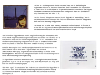
The back of the digipak focuses on the song list featuring the colours navy and
white which are prominent throughout the cover and inside. The use of the ‘O’s is
continued to show link the whole didipak together. The ‘O’s however are used
most frequently and every song on the list includes at least two references to
them which links to the name ‘Two Door’ and the branding of the band.
Beneath the song list is the list of copyright and links to the label which is in a
music smaller font to show it isn’t significant for the audience.
At the bottom of the page is again the label name and logo to inform of the
branding behind the artist which helps develop the brand which can only lead to
more influences and potentially funding.
As expected the barcode is then on the back – showing that the album was for
production to go on sale. It also keeps it away from the album art and away from
how the album would be displayed.
The other aspect to notice about this back which is conventional of digipaks is to
include the band name and album name along the spine in order for ease of
access from a shelf which is highly beneficial for the audience to be able to
identify the CD.
The use of a full image on the inside case, that is not one of the band again
suggests the focus is on the music. With Two Door Cinema Club the albums tend
to have a focus on either objects or shapes and therefore this aspect of the digipak
follows the conventions. For example in the background there is a wheel which
links to the idea that this is for a CD.
The fact that the only person featured on the digipak is of presumably a fan – it
further represents the idea that the band care more about the music they give to
their fans than the image they portray.
The image and location itself are very stereotypical of indie music in that she is
by the sea, in a city/town that clearly has a more vibrant and relaxing atmosphere
further represented in the use of the blue tone on the image.
Bombay Bicycle Club
Bombay Bicycle Club Digipak Analysis
The front cover of the digipak focuses on the mental element of the ‘fix’, through
the use of the psychedelic patterns which suggest it is a reference to the anti-
estblishment culture of the 1970’s. This links to the term ‘fix’ from the album title
which means to take an addictive drug. This suggests that the music is like an
addictive drug to the audience. This then explains why the image focuses on the
brain and senses (nose and mouth) both of which can be used in the involvement
of drugs. The use of this imagery then implies that the music on this particular
album is enjoyable.
The cover also features the band name however this is very small compared to the
album name and image however this implies that the album is targeting those who
appreciate artwork and the band already, thus would be able to recognise the style.
However the inclusion of the band name only emphasises the branding – in the
sense that it appears on everything that the band have produced.
The title of the album and the band name are in the same font which also confirms
the idea that the album is aimed at existing fans of the band who would recognise it
straight away.
The colour scheme of the album is similar that of connotations of health and
looking after people – this again links to the idea that the album affects biology by
changing chemicals in the brain – possibly a link to the endorphins released when
listening to music.
The inside panel of the digipak link directly to the drug reference in that this represents
the chemical reaction happening inside the body. All of the colours used appear in the
brain on the cover of the album. This to some degree represents the distance from the CD
the audience are once they have opened the digipak. It also refers to the possible reaction
to the music. This image does however also have a similar appearance to a virus – which
could again further imply that the music is addictive, because like a virus you can’t get rid
of it.
The highlight of this digipak is the continuity of images to represent
the cultural influence on the music. For example there is a cross over in
the image on front to the backpage – which also covers the spine of the
digipak. Again the font on the back page is the same as the band name
and album title, this again shows the continuity of the album across all
promotional material and media products.
Like most digipacks the back has the copyright scripts and a barcode
all of which are about company policy. This back also features the
record label which appears to be a common theme for any digipaks.
The more solid colour here represent the idea of relaxing and also a lot
of psychedelic patterns include blue.
The actual CD uses the same pattern that appears inside the heads used on
the cover. This implies that the CD is the fix and will have a similar effect
chemically as drugs that change chemicals. Although the pattern is similar
the colours are more vibrant and the detailing appears greater. This is the
illusion of importance because the image looks focused.
Again this album is focused on patterns and images rather than the band
and this suggests that the focus is more on the music and what that means
for the fans as oppose to branding. It also highlights the fact that this was not
the bands first album and have therefore already established an audience.

More Related Content

What's hot

Final ancillary pieces
Final ancillary piecesFinal ancillary pieces
Final ancillary pieces
jparker98
 
Genre specific digipack analysis
Genre specific digipack analysisGenre specific digipack analysis
Genre specific digipack analysis
jparker98
 
Digipak Research
Digipak ResearchDigipak Research
Digipak Research
ksimmons29
 
Evaluation of digipak full
Evaluation of digipak fullEvaluation of digipak full
Evaluation of digipak full
CVSmediastudies
 
Digipak and magazine advert
Digipak and magazine advert Digipak and magazine advert
Digipak and magazine advert
EDavoile13
 
Student ancillary analysis
Student ancillary analysisStudent ancillary analysis
Student ancillary analysis
jparker98
 
Student ancillary task convention analysis 2
Student ancillary task convention analysis 2Student ancillary task convention analysis 2
Student ancillary task convention analysis 2
Skyward9
 
Album covers and digipaks
Album covers and digipaksAlbum covers and digipaks
Album covers and digipaks
jennypinchbeck
 
Analysis albums[1]
Analysis albums[1]Analysis albums[1]
Analysis albums[1]Eddie Guy
 
Digipak and magazine advert analysis
Digipak and magazine advert analysis Digipak and magazine advert analysis
Digipak and magazine advert analysis
godsell1999
 
Digipack analysis
Digipack analysisDigipack analysis
Digipack analysis
Bethan Tinker
 
Catfish and the bottlemen
Catfish and the bottlemenCatfish and the bottlemen
Catfish and the bottlemen
Taggar97
 
Album cover analysis
Album cover analysisAlbum cover analysis
Album cover analysis
julianna321
 
Analysis further
Analysis furtherAnalysis further
Analysis further
laurenamyharriman
 
All Time Low - Future Hearts digipak
All Time Low - Future Hearts digipakAll Time Low - Future Hearts digipak
All Time Low - Future Hearts digipak
11tfree
 
EXAMPLE DIGIPACK ANALYSIS
EXAMPLE DIGIPACK ANALYSISEXAMPLE DIGIPACK ANALYSIS
EXAMPLE DIGIPACK ANALYSIS
annie addicott
 
All time Low - Digi Pack analysis
All time Low - Digi Pack analysisAll time Low - Digi Pack analysis
All time Low - Digi Pack analysis
AmanpreetBhopal
 
Analysis ofArtists Digipaks from Chosen Genre
Analysis ofArtists Digipaks from Chosen GenreAnalysis ofArtists Digipaks from Chosen Genre
Analysis ofArtists Digipaks from Chosen Genre
SophieWebster1
 
Digipack analysis
Digipack analysisDigipack analysis
Digipack analysis
annie addicott
 

What's hot (20)

Final ancillary pieces
Final ancillary piecesFinal ancillary pieces
Final ancillary pieces
 
Genre specific digipack analysis
Genre specific digipack analysisGenre specific digipack analysis
Genre specific digipack analysis
 
Digipak Research
Digipak ResearchDigipak Research
Digipak Research
 
Evaluation of digipak full
Evaluation of digipak fullEvaluation of digipak full
Evaluation of digipak full
 
Digipak and magazine advert
Digipak and magazine advert Digipak and magazine advert
Digipak and magazine advert
 
Student ancillary analysis
Student ancillary analysisStudent ancillary analysis
Student ancillary analysis
 
Student ancillary task convention analysis 2
Student ancillary task convention analysis 2Student ancillary task convention analysis 2
Student ancillary task convention analysis 2
 
Album covers and digipaks
Album covers and digipaksAlbum covers and digipaks
Album covers and digipaks
 
Lana del ray
Lana del rayLana del ray
Lana del ray
 
Analysis albums[1]
Analysis albums[1]Analysis albums[1]
Analysis albums[1]
 
Digipak and magazine advert analysis
Digipak and magazine advert analysis Digipak and magazine advert analysis
Digipak and magazine advert analysis
 
Digipack analysis
Digipack analysisDigipack analysis
Digipack analysis
 
Catfish and the bottlemen
Catfish and the bottlemenCatfish and the bottlemen
Catfish and the bottlemen
 
Album cover analysis
Album cover analysisAlbum cover analysis
Album cover analysis
 
Analysis further
Analysis furtherAnalysis further
Analysis further
 
All Time Low - Future Hearts digipak
All Time Low - Future Hearts digipakAll Time Low - Future Hearts digipak
All Time Low - Future Hearts digipak
 
EXAMPLE DIGIPACK ANALYSIS
EXAMPLE DIGIPACK ANALYSISEXAMPLE DIGIPACK ANALYSIS
EXAMPLE DIGIPACK ANALYSIS
 
All time Low - Digi Pack analysis
All time Low - Digi Pack analysisAll time Low - Digi Pack analysis
All time Low - Digi Pack analysis
 
Analysis ofArtists Digipaks from Chosen Genre
Analysis ofArtists Digipaks from Chosen GenreAnalysis ofArtists Digipaks from Chosen Genre
Analysis ofArtists Digipaks from Chosen Genre
 
Digipack analysis
Digipack analysisDigipack analysis
Digipack analysis
 

Viewers also liked

дарья бурмистрова
дарья бурмистровадарья бурмистрова
дарья бурмистроваCadets Chuvashiya
 
роль колоративных прилагательных в поэзии с.есенина и а.блока
роль колоративных прилагательных в поэзии с.есенина и а.блокароль колоративных прилагательных в поэзии с.есенина и а.блока
роль колоративных прилагательных в поэзии с.есенина и а.блокаCadets Chuvashiya
 
страх.григорьева елизавета
страх.григорьева  елизаветастрах.григорьева  елизавета
страх.григорьева елизаветаCadets Chuvashiya
 
права несовершеннолетних детей
права несовершеннолетних детейправа несовершеннолетних детей
права несовершеннолетних детейCadets Chuvashiya
 
Cтруктура РСЧС. Краснов Евгений
Cтруктура РСЧС. Краснов ЕвгенийCтруктура РСЧС. Краснов Евгений
Cтруктура РСЧС. Краснов ЕвгенийCadets Chuvashiya
 
Mother Earth
Mother EarthMother Earth
Mother Earth
Irene Aguiar
 
мадина стратегии поведения в конфликтной ситуации
мадина стратегии поведения в конфликтной ситуациимадина стратегии поведения в конфликтной ситуации
мадина стратегии поведения в конфликтной ситуацииCadets Chuvashiya
 
ЕДС_ГАРАЕВ
ЕДС_ГАРАЕВЕДС_ГАРАЕВ
ЕДС_ГАРАЕВ
Cadets Chuvashiya
 
взрыв бытового газа
взрыв бытового газавзрыв бытового газа
взрыв бытового газаCadets Chuvashiya
 
военнопленные абделхаева мария
военнопленные абделхаева мариявоеннопленные абделхаева мария
военнопленные абделхаева марияCadets Chuvashiya
 
страх Тарасов Илья
страх Тарасов Ильястрах Тарасов Илья
страх Тарасов ИльяCadets Chuvashiya
 
Григорьева Таня_ телесные повреждения 8к
Григорьева Таня_ телесные повреждения 8кГригорьева Таня_ телесные повреждения 8к
Григорьева Таня_ телесные повреждения 8кCadets Chuvashiya
 
человек в условиях автономного существования тюрикова е с
человек в условиях автономного существования тюрикова е счеловек в условиях автономного существования тюрикова е с
человек в условиях автономного существования тюрикова е с
Cadets Chuvashiya
 
исследовательская работа
исследовательская работаисследовательская работа
исследовательская работаCadets Chuvashiya
 
едс гараев
едс гараеведс гараев
едс гараев
Cadets Chuvashiya
 

Viewers also liked (20)

дарья бурмистрова
дарья бурмистровадарья бурмистрова
дарья бурмистрова
 
роль колоративных прилагательных в поэзии с.есенина и а.блока
роль колоративных прилагательных в поэзии с.есенина и а.блокароль колоративных прилагательных в поэзии с.есенина и а.блока
роль колоративных прилагательных в поэзии с.есенина и а.блока
 
страх.григорьева елизавета
страх.григорьева  елизаветастрах.григорьева  елизавета
страх.григорьева елизавета
 
права несовершеннолетних детей
права несовершеннолетних детейправа несовершеннолетних детей
права несовершеннолетних детей
 
нпк яковлева
нпк яковлеванпк яковлева
нпк яковлева
 
Cтруктура РСЧС. Краснов Евгений
Cтруктура РСЧС. Краснов ЕвгенийCтруктура РСЧС. Краснов Евгений
Cтруктура РСЧС. Краснов Евгений
 
Mother Earth
Mother EarthMother Earth
Mother Earth
 
Man n cre.
Man n cre.Man n cre.
Man n cre.
 
мадина стратегии поведения в конфликтной ситуации
мадина стратегии поведения в конфликтной ситуациимадина стратегии поведения в конфликтной ситуации
мадина стратегии поведения в конфликтной ситуации
 
ЕДС_ГАРАЕВ
ЕДС_ГАРАЕВЕДС_ГАРАЕВ
ЕДС_ГАРАЕВ
 
урусова
урусоваурусова
урусова
 
взрыв бытового газа
взрыв бытового газавзрыв бытового газа
взрыв бытового газа
 
Луцевич Егор
Луцевич ЕгорЛуцевич Егор
Луцевич Егор
 
военнопленные абделхаева мария
военнопленные абделхаева мариявоеннопленные абделхаева мария
военнопленные абделхаева мария
 
страх Тарасов Илья
страх Тарасов Ильястрах Тарасов Илья
страх Тарасов Илья
 
Григорьева Таня_ телесные повреждения 8к
Григорьева Таня_ телесные повреждения 8кГригорьева Таня_ телесные повреждения 8к
Григорьева Таня_ телесные повреждения 8к
 
человек в условиях автономного существования тюрикова е с
человек в условиях автономного существования тюрикова е счеловек в условиях автономного существования тюрикова е с
человек в условиях автономного существования тюрикова е с
 
исследовательская работа
исследовательская работаисследовательская работа
исследовательская работа
 
нпк 2012
нпк 2012нпк 2012
нпк 2012
 
едс гараев
едс гараеведс гараев
едс гараев
 

Similar to Digipaks Analysis

DIGIPAK ANALYSIS
DIGIPAK ANALYSISDIGIPAK ANALYSIS
DIGIPAK ANALYSIS
Tyler Bishop-Harris
 
Album Covers and Branding
Album Covers and BrandingAlbum Covers and Branding
Album Covers and Branding
Toni Hendry
 
Appendix 9 - Digipak analysis
Appendix 9 - Digipak analysis Appendix 9 - Digipak analysis
Appendix 9 - Digipak analysis
Hannahhhhh15
 
Digipak Research
Digipak Research Digipak Research
Digipak Research
LucyBennett10
 
Digipak research
Digipak research Digipak research
Digipak research
Cara Wilson
 
Magazine Advertisement Analysis
Magazine Advertisement AnalysisMagazine Advertisement Analysis
Magazine Advertisement Analysis
Lynley Sykes
 
Music advertisement poster analysis x3
Music advertisement poster analysis x3Music advertisement poster analysis x3
Music advertisement poster analysis x3
VictoriaCowburn
 
Digipak
DigipakDigipak
Digipak
enosd1
 
Example CD Cover Presentation
Example CD Cover PresentationExample CD Cover Presentation
Example CD Cover Presentationmollyclifton
 
Digital digipack draft
Digital digipack draftDigital digipack draft
Digital digipack draft
Liam Hodson
 
Mumford and sons
Mumford and sonsMumford and sons
Mumford and sons
Amelia Hart
 
Analysis Of 3 CD Digipak
Analysis Of 3 CD DigipakAnalysis Of 3 CD Digipak
Analysis Of 3 CD Digipak
FrankParnell123
 
Digipack analysis
Digipack analysisDigipack analysis
Digipack analysis
joehall1206
 
Digipak Analysis
Digipak AnalysisDigipak Analysis
Digipak Analysis
Megan Dent
 
Question 2
Question 2Question 2
Question 2
sapna begum
 
Digipak Analysis
Digipak AnalysisDigipak Analysis
Digipak Analysis
Megan Dent
 
A2 Media Coursework - Research - DigiPak Analysis 6X
A2 Media Coursework - Research - DigiPak Analysis 6XA2 Media Coursework - Research - DigiPak Analysis 6X
A2 Media Coursework - Research - DigiPak Analysis 6X
TAwojobi
 
Magazine Advert Analysis
Magazine Advert Analysis Magazine Advert Analysis
Magazine Advert Analysis
Browner97
 

Similar to Digipaks Analysis (20)

DIGIPAK ANALYSIS
DIGIPAK ANALYSISDIGIPAK ANALYSIS
DIGIPAK ANALYSIS
 
Album Covers and Branding
Album Covers and BrandingAlbum Covers and Branding
Album Covers and Branding
 
Appendix 9 - Digipak analysis
Appendix 9 - Digipak analysis Appendix 9 - Digipak analysis
Appendix 9 - Digipak analysis
 
Digipak Research
Digipak Research Digipak Research
Digipak Research
 
Digipak research
Digipak research Digipak research
Digipak research
 
Magazine Advertisement Analysis
Magazine Advertisement AnalysisMagazine Advertisement Analysis
Magazine Advertisement Analysis
 
Music advertisement poster analysis x3
Music advertisement poster analysis x3Music advertisement poster analysis x3
Music advertisement poster analysis x3
 
Digipak
DigipakDigipak
Digipak
 
Example CD Cover Presentation
Example CD Cover PresentationExample CD Cover Presentation
Example CD Cover Presentation
 
Digital digipack draft
Digital digipack draftDigital digipack draft
Digital digipack draft
 
Mumford and sons
Mumford and sonsMumford and sons
Mumford and sons
 
Analysis Of 3 CD Digipak
Analysis Of 3 CD DigipakAnalysis Of 3 CD Digipak
Analysis Of 3 CD Digipak
 
Album cover analysis
Album cover analysisAlbum cover analysis
Album cover analysis
 
Digipack analysis
Digipack analysisDigipack analysis
Digipack analysis
 
Digipak Analysis
Digipak AnalysisDigipak Analysis
Digipak Analysis
 
Take That Digi Pack
Take That Digi PackTake That Digi Pack
Take That Digi Pack
 
Question 2
Question 2Question 2
Question 2
 
Digipak Analysis
Digipak AnalysisDigipak Analysis
Digipak Analysis
 
A2 Media Coursework - Research - DigiPak Analysis 6X
A2 Media Coursework - Research - DigiPak Analysis 6XA2 Media Coursework - Research - DigiPak Analysis 6X
A2 Media Coursework - Research - DigiPak Analysis 6X
 
Magazine Advert Analysis
Magazine Advert Analysis Magazine Advert Analysis
Magazine Advert Analysis
 

Recently uploaded

2024.06.01 Introducing a competency framework for languag learning materials ...
2024.06.01 Introducing a competency framework for languag learning materials ...2024.06.01 Introducing a competency framework for languag learning materials ...
2024.06.01 Introducing a competency framework for languag learning materials ...
Sandy Millin
 
The French Revolution Class 9 Study Material pdf free download
The French Revolution Class 9 Study Material pdf free downloadThe French Revolution Class 9 Study Material pdf free download
The French Revolution Class 9 Study Material pdf free download
Vivekanand Anglo Vedic Academy
 
The Art Pastor's Guide to Sabbath | Steve Thomason
The Art Pastor's Guide to Sabbath | Steve ThomasonThe Art Pastor's Guide to Sabbath | Steve Thomason
The Art Pastor's Guide to Sabbath | Steve Thomason
Steve Thomason
 
special B.ed 2nd year old paper_20240531.pdf
special B.ed 2nd year old paper_20240531.pdfspecial B.ed 2nd year old paper_20240531.pdf
special B.ed 2nd year old paper_20240531.pdf
Special education needs
 
Supporting (UKRI) OA monographs at Salford.pptx
Supporting (UKRI) OA monographs at Salford.pptxSupporting (UKRI) OA monographs at Salford.pptx
Supporting (UKRI) OA monographs at Salford.pptx
Jisc
 
Home assignment II on Spectroscopy 2024 Answers.pdf
Home assignment II on Spectroscopy 2024 Answers.pdfHome assignment II on Spectroscopy 2024 Answers.pdf
Home assignment II on Spectroscopy 2024 Answers.pdf
Tamralipta Mahavidyalaya
 
How to Break the cycle of negative Thoughts
How to Break the cycle of negative ThoughtsHow to Break the cycle of negative Thoughts
How to Break the cycle of negative Thoughts
Col Mukteshwar Prasad
 
Polish students' mobility in the Czech Republic
Polish students' mobility in the Czech RepublicPolish students' mobility in the Czech Republic
Polish students' mobility in the Czech Republic
Anna Sz.
 
TESDA TM1 REVIEWER FOR NATIONAL ASSESSMENT WRITTEN AND ORAL QUESTIONS WITH A...
TESDA TM1 REVIEWER  FOR NATIONAL ASSESSMENT WRITTEN AND ORAL QUESTIONS WITH A...TESDA TM1 REVIEWER  FOR NATIONAL ASSESSMENT WRITTEN AND ORAL QUESTIONS WITH A...
TESDA TM1 REVIEWER FOR NATIONAL ASSESSMENT WRITTEN AND ORAL QUESTIONS WITH A...
EugeneSaldivar
 
aaaaaaaaaaaaaaaaaaaaaaaaaaaaaaaaaaaaaaaaa
aaaaaaaaaaaaaaaaaaaaaaaaaaaaaaaaaaaaaaaaaaaaaaaaaaaaaaaaaaaaaaaaaaaaaaaaaaaaaaaaaa
aaaaaaaaaaaaaaaaaaaaaaaaaaaaaaaaaaaaaaaaa
siemaillard
 
Sectors of the Indian Economy - Class 10 Study Notes pdf
Sectors of the Indian Economy - Class 10 Study Notes pdfSectors of the Indian Economy - Class 10 Study Notes pdf
Sectors of the Indian Economy - Class 10 Study Notes pdf
Vivekanand Anglo Vedic Academy
 
Phrasal Verbs.XXXXXXXXXXXXXXXXXXXXXXXXXX
Phrasal Verbs.XXXXXXXXXXXXXXXXXXXXXXXXXXPhrasal Verbs.XXXXXXXXXXXXXXXXXXXXXXXXXX
Phrasal Verbs.XXXXXXXXXXXXXXXXXXXXXXXXXX
MIRIAMSALINAS13
 
Instructions for Submissions thorugh G- Classroom.pptx
Instructions for Submissions thorugh G- Classroom.pptxInstructions for Submissions thorugh G- Classroom.pptx
Instructions for Submissions thorugh G- Classroom.pptx
Jheel Barad
 
Unit 8 - Information and Communication Technology (Paper I).pdf
Unit 8 - Information and Communication Technology (Paper I).pdfUnit 8 - Information and Communication Technology (Paper I).pdf
Unit 8 - Information and Communication Technology (Paper I).pdf
Thiyagu K
 
How to Make a Field invisible in Odoo 17
How to Make a Field invisible in Odoo 17How to Make a Field invisible in Odoo 17
How to Make a Field invisible in Odoo 17
Celine George
 
Digital Tools and AI for Teaching Learning and Research
Digital Tools and AI for Teaching Learning and ResearchDigital Tools and AI for Teaching Learning and Research
Digital Tools and AI for Teaching Learning and Research
Vikramjit Singh
 
Thesis Statement for students diagnonsed withADHD.ppt
Thesis Statement for students diagnonsed withADHD.pptThesis Statement for students diagnonsed withADHD.ppt
Thesis Statement for students diagnonsed withADHD.ppt
EverAndrsGuerraGuerr
 
How to Split Bills in the Odoo 17 POS Module
How to Split Bills in the Odoo 17 POS ModuleHow to Split Bills in the Odoo 17 POS Module
How to Split Bills in the Odoo 17 POS Module
Celine George
 
The Challenger.pdf DNHS Official Publication
The Challenger.pdf DNHS Official PublicationThe Challenger.pdf DNHS Official Publication
The Challenger.pdf DNHS Official Publication
Delapenabediema
 
Fish and Chips - have they had their chips
Fish and Chips - have they had their chipsFish and Chips - have they had their chips
Fish and Chips - have they had their chips
GeoBlogs
 

Recently uploaded (20)

2024.06.01 Introducing a competency framework for languag learning materials ...
2024.06.01 Introducing a competency framework for languag learning materials ...2024.06.01 Introducing a competency framework for languag learning materials ...
2024.06.01 Introducing a competency framework for languag learning materials ...
 
The French Revolution Class 9 Study Material pdf free download
The French Revolution Class 9 Study Material pdf free downloadThe French Revolution Class 9 Study Material pdf free download
The French Revolution Class 9 Study Material pdf free download
 
The Art Pastor's Guide to Sabbath | Steve Thomason
The Art Pastor's Guide to Sabbath | Steve ThomasonThe Art Pastor's Guide to Sabbath | Steve Thomason
The Art Pastor's Guide to Sabbath | Steve Thomason
 
special B.ed 2nd year old paper_20240531.pdf
special B.ed 2nd year old paper_20240531.pdfspecial B.ed 2nd year old paper_20240531.pdf
special B.ed 2nd year old paper_20240531.pdf
 
Supporting (UKRI) OA monographs at Salford.pptx
Supporting (UKRI) OA monographs at Salford.pptxSupporting (UKRI) OA monographs at Salford.pptx
Supporting (UKRI) OA monographs at Salford.pptx
 
Home assignment II on Spectroscopy 2024 Answers.pdf
Home assignment II on Spectroscopy 2024 Answers.pdfHome assignment II on Spectroscopy 2024 Answers.pdf
Home assignment II on Spectroscopy 2024 Answers.pdf
 
How to Break the cycle of negative Thoughts
How to Break the cycle of negative ThoughtsHow to Break the cycle of negative Thoughts
How to Break the cycle of negative Thoughts
 
Polish students' mobility in the Czech Republic
Polish students' mobility in the Czech RepublicPolish students' mobility in the Czech Republic
Polish students' mobility in the Czech Republic
 
TESDA TM1 REVIEWER FOR NATIONAL ASSESSMENT WRITTEN AND ORAL QUESTIONS WITH A...
TESDA TM1 REVIEWER  FOR NATIONAL ASSESSMENT WRITTEN AND ORAL QUESTIONS WITH A...TESDA TM1 REVIEWER  FOR NATIONAL ASSESSMENT WRITTEN AND ORAL QUESTIONS WITH A...
TESDA TM1 REVIEWER FOR NATIONAL ASSESSMENT WRITTEN AND ORAL QUESTIONS WITH A...
 
aaaaaaaaaaaaaaaaaaaaaaaaaaaaaaaaaaaaaaaaa
aaaaaaaaaaaaaaaaaaaaaaaaaaaaaaaaaaaaaaaaaaaaaaaaaaaaaaaaaaaaaaaaaaaaaaaaaaaaaaaaaa
aaaaaaaaaaaaaaaaaaaaaaaaaaaaaaaaaaaaaaaaa
 
Sectors of the Indian Economy - Class 10 Study Notes pdf
Sectors of the Indian Economy - Class 10 Study Notes pdfSectors of the Indian Economy - Class 10 Study Notes pdf
Sectors of the Indian Economy - Class 10 Study Notes pdf
 
Phrasal Verbs.XXXXXXXXXXXXXXXXXXXXXXXXXX
Phrasal Verbs.XXXXXXXXXXXXXXXXXXXXXXXXXXPhrasal Verbs.XXXXXXXXXXXXXXXXXXXXXXXXXX
Phrasal Verbs.XXXXXXXXXXXXXXXXXXXXXXXXXX
 
Instructions for Submissions thorugh G- Classroom.pptx
Instructions for Submissions thorugh G- Classroom.pptxInstructions for Submissions thorugh G- Classroom.pptx
Instructions for Submissions thorugh G- Classroom.pptx
 
Unit 8 - Information and Communication Technology (Paper I).pdf
Unit 8 - Information and Communication Technology (Paper I).pdfUnit 8 - Information and Communication Technology (Paper I).pdf
Unit 8 - Information and Communication Technology (Paper I).pdf
 
How to Make a Field invisible in Odoo 17
How to Make a Field invisible in Odoo 17How to Make a Field invisible in Odoo 17
How to Make a Field invisible in Odoo 17
 
Digital Tools and AI for Teaching Learning and Research
Digital Tools and AI for Teaching Learning and ResearchDigital Tools and AI for Teaching Learning and Research
Digital Tools and AI for Teaching Learning and Research
 
Thesis Statement for students diagnonsed withADHD.ppt
Thesis Statement for students diagnonsed withADHD.pptThesis Statement for students diagnonsed withADHD.ppt
Thesis Statement for students diagnonsed withADHD.ppt
 
How to Split Bills in the Odoo 17 POS Module
How to Split Bills in the Odoo 17 POS ModuleHow to Split Bills in the Odoo 17 POS Module
How to Split Bills in the Odoo 17 POS Module
 
The Challenger.pdf DNHS Official Publication
The Challenger.pdf DNHS Official PublicationThe Challenger.pdf DNHS Official Publication
The Challenger.pdf DNHS Official Publication
 
Fish and Chips - have they had their chips
Fish and Chips - have they had their chipsFish and Chips - have they had their chips
Fish and Chips - have they had their chips
 

Digipaks Analysis

  • 2. The Front cover of Beacon is minimalistic with the text in order to focus on the abstract image that has been used. The text is straight to the point and refers to only the band name and the album name – incorporated into the text creating the link between the two which otherwise wouldn’t be made. The Beacon sign is highlighted in LED sign type text with a glow around the outside. This gives the impression of a motel type setting as well as that ‘garage’ type feel expected from indie artists. The image is simplistic and abstract a convention of the brand as well as the genre. The image itself is irrelevant but is coherent with the rest of Two Door Cinema Club’s singles and albums, all of which take into consideration everyday locations. The cover along with the back of the digipak does not show any band members – emphasising that as an indie rock band it is more about the music and the image rather than the profile of who is in the band – however this can link to the fact that by the release of Beacon the band were already well established in the industry and with their label Kitsune. The colour scheme is vintage/retro through the use of location all of which follows the style represented in their videos. The colour consists of mint green curtains – something common in the 80’s further represented through the mise en scene of some videos. The focus on pastels suggests femininity as well as the link to fashion through the mise en scene of the model – eg pastel pink heels and purple knickers both of which attract a male audience due to the male gaze as suggested by Laura Mulvey. The use of a model only in underwear objectifies the female body which is further represented through the placement of the image eg where a light would be. As a result of this metaphor the light in the image is directed to the centre in order to attract the audience who would presumably see the cover on either a website or in store. The use of a female model automatically attracts the typical The use of contrasting colours eg light and dark also flows with the retro image represented by Two Door Cinema club and other similar artists. The location of the model in the shot is on the ceiling and central which could imply that either the lyrics, videos or the overall mise en scene. The main image is representative of the definition of ‘Beacon’. A Beacon is a fire or light set up in a high or prominent position as a warning, signal or celebration. This clarifies the use of a high angled shot.
  • 3. The back of the album is a close up of the curtain which features on the cover showing continuity in the overall theme for this particular album. This however is a common convention for indie music albums because most of which have some link between the back and front. This makes it visually appealing for the audience – particularly with the purpose of sales and the appearance on a shelf. The image again features one particular area of light – which on this occasion is the bottom left corner near the barcode. This poses the idea that someone is at the location – eg a car light shining through the window. This overall image links with existing and previous videos – all of which wouldn’t have been known by the audience. Due to the abundance of light in the centre we can assume that this isn’t a matched cut from the cover but is simply related. Instead of an element of the image being the centre the back consists of the song list and numbering. This is in the centre because it is the main aim of the back cover of the album – in order to inform the audience what songs will appear. An element of the text important to highlight is the fact that “Beacon” the track appears last on the album and is therefore central on a single line. This intentionally draws the audience because it is the smallest visible text. It also solidifies the message of the album – and the link to the cover image. Below the song list is the record label and logo. This is to promote the brand and label to inform the audience as to who has worked on the label. For those who are familiar with the current branding of musicians under the Kitsune label they may be able to expect conventions which are apparent in other music. Beneath this separated by a line is the copyright information. This is displayed at the bottom in small print – meaning it isn’t of high importance for the audience but is more so for music corporations. However it is important to include the producers and the relation this has to the music because without it the album wouldn’t have been made. Although, it isn’t intended for the audience and that is why it refers to codes rather than providing clear information. It could also suggest that there is a link between the code by the barcode and for the corporation which implies it could be part of the legal side of retailing the product.
  • 5. The Two Door Cinema Club The cover of the album is an abstract highly edited image of a cat in an everyday environment typical of the animal. This highlights that two door cinema club use locations around the house, as well as unusual images which usually have some link to lyrical meaning in the album. The use of the cats eyes directs the audience to the centre of the cover where all of the text is located. It also emphasises the fact that naturally eye contact is a place of focus. There is further direction to the cats eyes through the choice of font/style text which includes circles to represent ‘O’. This therefore gives the cat the image of wearing glasses – something that typically is associated in modern time with being slightly quirky and vintage – a idealistic image the band is wanting in order to pursue branding within the indie genre. On this album cover the band name is much larger however this was Two Door Cinema Club’s first major album and therefore it is a branding technique to eliminate any distraction, it remains simplistic. The only other featured text is the name of the album which follows conventions all music genres. However the album name is small and located at the bottom of the page – meaning at this point in the career creating an image for the band was highly important. The colour scheme of the cover is in a tinted blue which suggests that the band are ‘cool’ but it also uses dark colour in order to replicated mystery – further projected through the fading out of blue into black and the top of the cover. An alternative interpretation to the colour scheme could however be the fact that the album was released in February and therefore is just representing winter colours. This could suggest the reason that the cat appears in doors and the requirement for bright eyes. However this could also be a representation of the music on the album and the dazed effect on the audience – or simply the originality of their music.
  • 6. The CD for the album coincides with the album cover through the matched use of the house cat. However, there is no editing in the cats eyes – which suggests that the cover was using the connection between the cats eyes and the audience in order to entice. The use of the continuity between the cover and CD certifies the originality of the band which is highly important for being part of indie music which has such a wide range of both artists and audiences. The location of the eyes is perfectly placed with the centre of the CD being in the middle. On the CD however there appears to be a reflection of the room which further replicated the album for Beacon which implies that using simple, everyday locations for shoots is typical of the band. The cat then fits into this theme and isn’t such an abstract image after all. The use of the reflection ultimately suggest that the cat can see something you cannot therefore the cat has heard the music and you have not. This acts as an encouragement to the audience to listen to the album because a connection has been formed. The colour scheme of the image on the CD contrasts from the dark front cover to the light which implies that the opening of the CD represents the turning on of the light switch – brightening the image, just as it would make the audience one step closer to listening to the music. The fact that there is a link between the CD and the cover also makes it easier for the audience to put the two together after listening to the music because it is automatically identifiable. The colour of the cat on the CD follows the colour scheme in a sense that it is the same as the blue tones used on the cover and the colour of the text on the CD despite knowing that the cat isn’t blue. The use of the band name on the CD is in a inverted triangle with the continued use of the ‘O’s – a convention for this album and so we can assume the single releases follow the same theme. However on this occasion the ‘O’s’ in ‘Door’ are linked together – this could imply that the audience are closer to the CD and the two become one. The CD also has a set list following the circumference at the bottom of the disk. This is so that the audience know the song list independently from the whole digipak. It could also be said that this effect tries to mimic the shape of the cats face – the band title being the nose and the song list being the mouth.
  • 7. The back of the digipak focuses on the song list featuring the colours navy and white which are prominent throughout the cover and inside. The use of the ‘O’s is continued to show link the whole didipak together. The ‘O’s however are used most frequently and every song on the list includes at least two references to them which links to the name ‘Two Door’ and the branding of the band. Beneath the song list is the list of copyright and links to the label which is in a music smaller font to show it isn’t significant for the audience. At the bottom of the page is again the label name and logo to inform of the branding behind the artist which helps develop the brand which can only lead to more influences and potentially funding. As expected the barcode is then on the back – showing that the album was for production to go on sale. It also keeps it away from the album art and away from how the album would be displayed. The other aspect to notice about this back which is conventional of digipaks is to include the band name and album name along the spine in order for ease of access from a shelf which is highly beneficial for the audience to be able to identify the CD. The use of a full image on the inside case, that is not one of the band again suggests the focus is on the music. With Two Door Cinema Club the albums tend to have a focus on either objects or shapes and therefore this aspect of the digipak follows the conventions. For example in the background there is a wheel which links to the idea that this is for a CD. The fact that the only person featured on the digipak is of presumably a fan – it further represents the idea that the band care more about the music they give to their fans than the image they portray. The image and location itself are very stereotypical of indie music in that she is by the sea, in a city/town that clearly has a more vibrant and relaxing atmosphere further represented in the use of the blue tone on the image.
  • 9. Bombay Bicycle Club Digipak Analysis The front cover of the digipak focuses on the mental element of the ‘fix’, through the use of the psychedelic patterns which suggest it is a reference to the anti- estblishment culture of the 1970’s. This links to the term ‘fix’ from the album title which means to take an addictive drug. This suggests that the music is like an addictive drug to the audience. This then explains why the image focuses on the brain and senses (nose and mouth) both of which can be used in the involvement of drugs. The use of this imagery then implies that the music on this particular album is enjoyable. The cover also features the band name however this is very small compared to the album name and image however this implies that the album is targeting those who appreciate artwork and the band already, thus would be able to recognise the style. However the inclusion of the band name only emphasises the branding – in the sense that it appears on everything that the band have produced. The title of the album and the band name are in the same font which also confirms the idea that the album is aimed at existing fans of the band who would recognise it straight away. The colour scheme of the album is similar that of connotations of health and looking after people – this again links to the idea that the album affects biology by changing chemicals in the brain – possibly a link to the endorphins released when listening to music. The inside panel of the digipak link directly to the drug reference in that this represents the chemical reaction happening inside the body. All of the colours used appear in the brain on the cover of the album. This to some degree represents the distance from the CD the audience are once they have opened the digipak. It also refers to the possible reaction to the music. This image does however also have a similar appearance to a virus – which could again further imply that the music is addictive, because like a virus you can’t get rid of it.
  • 10. The highlight of this digipak is the continuity of images to represent the cultural influence on the music. For example there is a cross over in the image on front to the backpage – which also covers the spine of the digipak. Again the font on the back page is the same as the band name and album title, this again shows the continuity of the album across all promotional material and media products. Like most digipacks the back has the copyright scripts and a barcode all of which are about company policy. This back also features the record label which appears to be a common theme for any digipaks. The more solid colour here represent the idea of relaxing and also a lot of psychedelic patterns include blue. The actual CD uses the same pattern that appears inside the heads used on the cover. This implies that the CD is the fix and will have a similar effect chemically as drugs that change chemicals. Although the pattern is similar the colours are more vibrant and the detailing appears greater. This is the illusion of importance because the image looks focused. Again this album is focused on patterns and images rather than the band and this suggests that the focus is more on the music and what that means for the fans as oppose to branding. It also highlights the fact that this was not the bands first album and have therefore already established an audience.