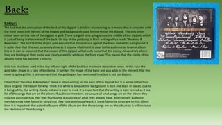
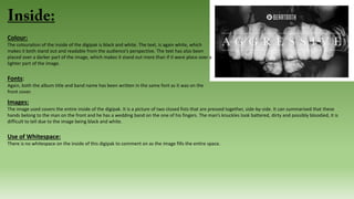
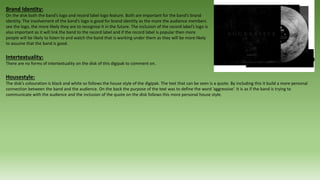
This document provides an in-depth analysis of the cover art, layout, and design elements of the Asking Alexandria album "Reckless and Relentless". Key points analyzed include:
- The front cover is in black and white to simplify the scene and focus on the half-dressed woman and broken television.
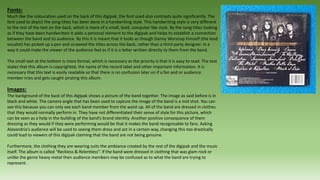
- Fonts and placement are used to clearly display the band name and album title.
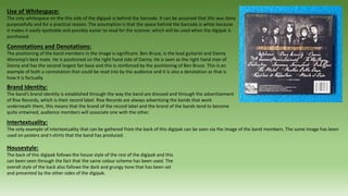
- Images throughout depict a dark, chaotic theme fitting the album title.
- Layout, fonts, and color scheme create a consistent dark style and reinforce the band's identity.
- Photos and positioning of band members establish their roles and brand.
digipak analysis lorde, lana del rey, charli xcx, team music covers i am only doing this for the dicoverability score. this is getting super annoying man, public team speaking do this at the same time, pull the exmas now this is not working god i will break. my laptop is AMAZING. ahh the struggle
This is my analysis of album covers within my genre to gain knowledge of how to create my digipack and poster. I also looked into the synergy and how the album represented all aspects of an artist.
In depth CD cover analysis of the albums Only by the Night (Kings of Leon), Stadium Arcadium (Red Hot Chilli Peppers) and Brand New Eyes (Paramore- not quite finished!)
Operation “Blue Star” is the only event in the history of Independent India where the state went into war with its own people. Even after about 40 years it is not clear if it was culmination of states anger over people of the region, a political game of power or start of dictatorial chapter in the democratic setup.
The people of Punjab felt alienated from main stream due to denial of their just demands during a long democratic struggle since independence. As it happen all over the word, it led to militant struggle with great loss of lives of military, police and civilian personnel. Killing of Indira Gandhi and massacre of innocent Sikhs in Delhi and other India cities was also associated with this movement.
A Strategic Approach: GenAI in EducationPeter Windle
Artificial Intelligence (AI) technologies such as Generative AI, Image Generators and Large Language Models have had a dramatic impact on teaching, learning and assessment over the past 18 months. The most immediate threat AI posed was to Academic Integrity with Higher Education Institutes (HEIs) focusing their efforts on combating the use of GenAI in assessment. Guidelines were developed for staff and students, policies put in place too. Innovative educators have forged paths in the use of Generative AI for teaching, learning and assessments leading to pockets of transformation springing up across HEIs, often with little or no top-down guidance, support or direction.
This Gasta posits a strategic approach to integrating AI into HEIs to prepare staff, students and the curriculum for an evolving world and workplace. We will highlight the advantages of working with these technologies beyond the realm of teaching, learning and assessment by considering prompt engineering skills, industry impact, curriculum changes, and the need for staff upskilling. In contrast, not engaging strategically with Generative AI poses risks, including falling behind peers, missed opportunities and failing to ensure our graduates remain employable. The rapid evolution of AI technologies necessitates a proactive and strategic approach if we are to remain relevant.
The French Revolution, which began in 1789, was a period of radical social and political upheaval in France. It marked the decline of absolute monarchies, the rise of secular and democratic republics, and the eventual rise of Napoleon Bonaparte. This revolutionary period is crucial in understanding the transition from feudalism to modernity in Europe.
For more information, visit-www.vavaclasses.com
Instructions for Submissions thorugh G- Classroom.pptxJheel Barad
This presentation provides a briefing on how to upload submissions and documents in Google Classroom. It was prepared as part of an orientation for new Sainik School in-service teacher trainees. As a training officer, my goal is to ensure that you are comfortable and proficient with this essential tool for managing assignments and fostering student engagement.
Synthetic Fiber Construction in lab .pptxPavel ( NSTU)
Synthetic fiber production is a fascinating and complex field that blends chemistry, engineering, and environmental science. By understanding these aspects, students can gain a comprehensive view of synthetic fiber production, its impact on society and the environment, and the potential for future innovations. Synthetic fibers play a crucial role in modern society, impacting various aspects of daily life, industry, and the environment. ynthetic fibers are integral to modern life, offering a range of benefits from cost-effectiveness and versatility to innovative applications and performance characteristics. While they pose environmental challenges, ongoing research and development aim to create more sustainable and eco-friendly alternatives. Understanding the importance of synthetic fibers helps in appreciating their role in the economy, industry, and daily life, while also emphasizing the need for sustainable practices and innovation.
June 3, 2024 Anti-Semitism Letter Sent to MIT President Kornbluth and MIT Cor...Levi Shapiro
Letter from the Congress of the United States regarding Anti-Semitism sent June 3rd to MIT President Sally Kornbluth, MIT Corp Chair, Mark Gorenberg
Dear Dr. Kornbluth and Mr. Gorenberg,
The US House of Representatives is deeply concerned by ongoing and pervasive acts of antisemitic
harassment and intimidation at the Massachusetts Institute of Technology (MIT). Failing to act decisively to ensure a safe learning environment for all students would be a grave dereliction of your responsibilities as President of MIT and Chair of the MIT Corporation.
This Congress will not stand idly by and allow an environment hostile to Jewish students to persist. The House believes that your institution is in violation of Title VI of the Civil Rights Act, and the inability or
unwillingness to rectify this violation through action requires accountability.
Postsecondary education is a unique opportunity for students to learn and have their ideas and beliefs challenged. However, universities receiving hundreds of millions of federal funds annually have denied
students that opportunity and have been hijacked to become venues for the promotion of terrorism, antisemitic harassment and intimidation, unlawful encampments, and in some cases, assaults and riots.
The House of Representatives will not countenance the use of federal funds to indoctrinate students into hateful, antisemitic, anti-American supporters of terrorism. Investigations into campus antisemitism by the Committee on Education and the Workforce and the Committee on Ways and Means have been expanded into a Congress-wide probe across all relevant jurisdictions to address this national crisis. The undersigned Committees will conduct oversight into the use of federal funds at MIT and its learning environment under authorities granted to each Committee.
• The Committee on Education and the Workforce has been investigating your institution since December 7, 2023. The Committee has broad jurisdiction over postsecondary education, including its compliance with Title VI of the Civil Rights Act, campus safety concerns over disruptions to the learning environment, and the awarding of federal student aid under the Higher Education Act.
• The Committee on Oversight and Accountability is investigating the sources of funding and other support flowing to groups espousing pro-Hamas propaganda and engaged in antisemitic harassment and intimidation of students. The Committee on Oversight and Accountability is the principal oversight committee of the US House of Representatives and has broad authority to investigate “any matter” at “any time” under House Rule X.
• The Committee on Ways and Means has been investigating several universities since November 15, 2023, when the Committee held a hearing entitled From Ivory Towers to Dark Corners: Investigating the Nexus Between Antisemitism, Tax-Exempt Universities, and Terror Financing. The Committee followed the hearing with letters to those institutions on January 10, 202
Introduction to AI for Nonprofits with Tapp NetworkTechSoup
Dive into the world of AI! Experts Jon Hill and Tareq Monaur will guide you through AI's role in enhancing nonprofit websites and basic marketing strategies, making it easy to understand and apply.
Read| The latest issue of The Challenger is here! We are thrilled to announce that our school paper has qualified for the NATIONAL SCHOOLS PRESS CONFERENCE (NSPC) 2024. Thank you for your unwavering support and trust. Dive into the stories that made us stand out!
Honest Reviews of Tim Han LMA Course Program.pptxtimhan337
Personal development courses are widely available today, with each one promising life-changing outcomes. Tim Han’s Life Mastery Achievers (LMA) Course has drawn a lot of interest. In addition to offering my frank assessment of Success Insider’s LMA Course, this piece examines the course’s effects via a variety of Tim Han LMA course reviews and Success Insider comments.
4. Colour:
The front of the Reckless and Relentless album has been made so that it is in black and white apart from
the writing, which states the title of album as that colour can be described as a yellow and gold mix.
Although there are only two noticeable things on the front cover (the half-dressed woman and the
television with a smashed screen), as an audience member looking at the cover, it still feels as if it has a
messy feel to it. By the cover being in black and white and not in colour, it allows the audience to decipher
what is going on in the picture as it simplifies the amount of stimulus the audience is receiving when
viewing it. If the cover had been made in colour then it may have been more difficult for the audience to
interpret the scene in which the cover is trying to depict.
The name of the band has been displayed in a blocky white and due to a mixture of this and its placement
on a more grey section on the front cover; it means that is made clear to the audience as to whose album
this is, as Asking Alexandria’s name stands out against the background. Due to the fact that the front cover
is in black and white, and that any highlighting or shadowing has been exaggerated, a dramatic and dark
ambience has been added to the overall mood of the digipak from the point of view of the audience.
Fonts:
The band’s name has been written in a bold and blocky font, which is emphasised due to the fact that it has also been
printed in white. The font used for the band’s name is one that Asking Alexandria use for every single, album,
advertisement or anything else related to the band. Fans of Asking Alexandria would recognise a product of the band
just by seeing this font. The font used for the album title has been stylised to look more like someone’s handwriting, it
is as if one of the band members has picked up a pen and scrawled across the front cover. The use of this font makes
the digipak seem less commercialised and more personalised. It also makes audience members feel as if they have a
more personal connection with the band.
5. Images:
The image that can be seen on the front cover is of a tattooed woman, who is wearing drab and bedraggled
clothing. Next to her there is a broken television. The television is in the forefront and to the left. Without
context the audience could presume that the damage to the television was caused by the woman in the
scene. This chaotic depiction coincides with the title of the digipak “Reckless and Relentless”. The way the
woman is sat is also interesting. She is hunched forward with her leg slightly parted but her hands crossed
on her knees. Her body positioning is not eloquent to say the least. Furthermore it looks as if she has only
just sad down after a hectic night.
The camera angle used to capture the woman on the front cover can be described as a wide shot as her
entire body is in the shot but the audience cannot see much more than that. The woman’s surroundings
look dingy and there is some form of webbing behind her head. The background also add an element of
surrealism and can leave the audience questioning as to why she is there and where is she supposed to be
exactly?
Use of White Space:
For this particular front cover there is no “white space” as such. This is due to the fact that the captured scene takes up the entire cover.
Connotations and Denotations:
One connotation that the audience can summarise from this front cover could be through the broken television in the forefront of the picture. The television
could be seen as another way in which the director of this scene has attempted to show the audience more about the woman’s personality. The television is a
physical metaphor that can be seen by the audience but it is actually a representation of the current state of the woman that can also be seen in the picture.
Much like the television, the woman is broken and run down.
It could be argued that there are more connotations that have been made through the front cover of the digipak. These connotations can be summarised from
the colouration of the front cover. The image has been shot in black and white. The colouration is important as the colours themselves could lead the audience to
pick up the mood and feeling of the music. Black is a colour commonly associated with darkness, death and tragedy. There is a lot of black on the front cover so it
could be said that these connotations where supposed to be presented to the audience. On the other hand the colour white may contrast visually but the
connotations associated with it do so also. White can be a representative of light, innocence and cleanliness. The use of the two colours means that there is a
certain juxtaposition being shown.
6. Brand Identity:
As mentioned before the font that has been used to spell out “Asking Alexandria” is a part of the brands
identity as they use the same font for the bands name on things such as posters, products, clothing and other
commodities. Fans of the band will automatically associate things with the band if they see that that font has
been used.
Although it could be described as a less direct link, the fact that a woman has been used on the front cover
can also be said to be another identifiable factor of the band’s brand identity. The band’s name is “Asking
Alexandria”. Alexandra is a female name and a lot of the bands songs, irrelevant of which album it is, the
lyrics of their songs tend to revolve around a woman or women and so do their music videos. This is why the
use of a woman weaves, as another factor into the band’s brand identity.
Intertextuality:
Intertextuality can be quite similar to brand identity. This is because you tend to find that through the use of
intertextuality bands, such as Asking Alexandria can establish a brand identity. In this case there is not much
to be said about intertextuality in consideration of this front cover. The only thing that could be said is that it
is note worthy that there is a woman on the front cover. As explained previously this is important because
most of the bands lyrics, albums, products, music videos (etc) tend to revolve around either one or multiple
women.
Housestyle:
There is a clear house style surrounding this digipak. Each panel is in black and white. Although it can be said that there is a varied use of different fonts on the
different panels or no writing at all on some of them, which would discredit the point of there being a consistent house style for this digipak. On the other hand
even the way the images have been shot on each of the panels is similar, apart from the front cover. Each of the images has been shot and edited to look as if they
are slightly faded and older than they are. It is difficult to describe but there is a certain scratched and worn look about each of the images, especially in the
images of the individual band members on the inside panels of the digipak.
7. Colour:
The fact that the colouration of the back of this digipak is black in unsurprising as it means that it coincides with
the front cover and the rest of the images and backgrounds used for the rest of the digipak. The only other
colour used on this side of the digipak is gold. There is a gold strip going across the middle of the digipak, which
is just off being in the centre of the back. On top of the gold strip is black writing which reads “Reckless &
Relentless”. The fact that the strip is gold ensures that it stands out against the black and white background. It
is quite clear that this was purposely done as it is quite vital that it is clear to the audience as to what album
this is. It can be assumed that the viewer of this digipak will already know that it is Asking Alexandria’s album
they are holding at their name was clearly stated in white on the front cover. This means that the clarity of the
albums name has become a priority.
Gold has also been used in the top left and right of the back but in a more decorative sense. In this case the
gold takes shape in a type of bordering. It borders the image of the band and also adds to the element that this
cover is quite gothic. It is important that the gold again has been used here but is not too blatant.
Other than “Reckless & Relentless” there is other writing on the back of this digipak but it is white rather than
black or gold. The reason for why I think it is white is because the background is dark and black in places. Due to
it being white, the writing stands out and is easy to read. It is important that the writing is easy to read as it is a
list of the songs that are on the album. If audience members are unsure of what songs are on the album they
may not purchase it as they may fear buying a duplicate of what they already have. Alternatively audience
members may have favourite songs that they have previously heard, if these favourite songs are on this album
then it is important that potential buyers of this album see that those songs are on this album as it will increase
the likeliness of them buying it.
8. Fonts:
Much like the colouration used on the back of this digipak, the font used also contrasts quite significantly. The
font used to depict the song titles has been done in a handwriting style. This handwriting style is very different
to the rest of the text on the back, which is more of a small, bold, computer like style. By the song titles looking
as if they have been handwritten it adds a personal element to the digipak and helps to establish a connection
between the band and its audience. By this it is meant that it looks as though Danny Worsnop himself (the lead
vocalist) has picked up a pen and scrawled the titles across the back, rather than a third party designer. In a
way it could make the viewer of the audience feel as if it is a letter written directly to them from the band.
The small text at the bottom is more formal, which is necessary as the priority is that it is easy to read. The text
states that this album is copyrighted, the name of the record label and other important information. It is
necessary that this text is easily readable so that there is no confusion later on if a fan and or audience
member tries and gets caught pirating this album.
Images:
The background of the back of this digipak shows a picture of the band together. The image as said before is in
black and white. The camera angle that has been used to capture the image of the band is a mid shot. You can
see this because you can only see each band member from the waist up. All of the band are dressed in clothes
that they would normally perform in. They have not differentiated their sense of style for this picture, which
can be seen as a help in the building of the band’s brand identity. Another positive consequence of them
dressing as they would if they were performing would be that it makes the band recognisable to fans. Asking
Alexandria’s audience will be used to seeing them dress and act in a certain way, changing this too drastically
could lead to viewers of this digipak claiming that the band are not being genuine.
Furthermore, the clothing they are wearing suits the ambiance created by the rest of the digipak and the music
itself. The album is called “Reckless & Relentless”. If the band were dressed in clothing that was glam rock or
unlike the genre heavy metal then audience members may be confused as to what the band are trying to
represent.
9. Use of Whitespace:
The only whitespace on the this side of the digipak is behind the barcode. It can be assumed that this was done
purposefully and for a practical reason. The assumption is that the space behind the barcode is white because
it makes it easily spottable and possibly easier to read for the scanner, which will be used when the digipak is
purchased.
Connotations and Denotations:
The positioning of the band members in the image is significant. Ben Bruce, is the lead guitarist and Danny
Worsnop’s best mate. He is positioned on the right hand side of Danny. He is seen as the right hand man of
Danny and has the second largest fan base and this is reinforced by the positioning of Ben Bruce. This is an
example of both a connotation that could be read into by the audience and it is also a denotation as that is
how it is factually.
Brand Identity:
The band’s brand identity is established through the way the band are dressed and through the advertisement
of Rise Records, which is their record label. Rise Records are always advertising the bands that work
underneath them, this means that the brand of the record label and the brand of the bands tend to become
quite entwined, audience members will associate one with the other.
Intertextuality:
The only example of intertextuality that can be gathered from the back of this digipak can be seen via the image of the band members. The same image has been
used on posters and t-shirts that the band has produced.
Housestyle:
The back of this digipak follows the house style of the rest of the digipak and this
can been seen through the fact that the same colour scheme has been used. The
overall style of the back also follows the dark and grungy tone that has been set
and presented by the other sides of the digipak.
10. First Panel:
The first thing that the audience will notice is that the entire first panel is
taken up with a mid-shot image of Danny Worsnop. This means that he is
the central focus of the image. After this the audience may notice other
facilities such as his surroundings, they may start to enquire into what the
purpose of the picture is and what he was supposedly doing when the
picture was taken. In the image Danny Worsnop can be seen to be writing,
smoking and drinking at a desk. This can be assumed due to the fact that
he is holding a cigarette and pen and has a bottle of Jack Daniels whisky
next to him. The band are known for being drinkers of the whisky as it is
not uncommon for the Jack Daniels brand to feature in the bands music
videos and as a part of the bands advertising. Sometimes Danny or Ben
Bruce will be seen sporting Jack Daniels clothing when performing.
The combination of drinking, smoking and writing means that this image
presents a clear following of the “rock and roll” lifestyle. The rock and roll
stereotype being that all who live a rock and roll lifestyle, drink, smoke and
then create and perform their music to their fans. The image also follows
the stereotypical way that Danny brandishes as to how he lives his life,
rough and ready. Danny has been known to be wild and presents his life as
being full of music, alcohol and partying. Fans that are viewing this image
will not be shocked to see him represented in the way he has been.
Connotations and denotations can be devised through the use of the props
in the image. The connotation being that Danny is a hard-core rock and
roller and the denotation being that Danny is the creative lyricist of the
band.
11. Furthermore, things can be said about the style of the image. It has been made to look as if it is an old faded
print. Details and sharpness have been sacrificed in order to make for a rougher, unclean and aged looking
image. The picture is faded in places but is still highly contrasting in others. Danny himself is quite dark,
whereas the background is white (except in the corners). This effect makes it look as though the artist has a
glow surrounding him. This may have been done purposely as Danny is the most well-known and front man
of the band.
There is no writing or font to be analysed, this panels purpose is not to inform viewers but has been
constructed purely for decoration. Although it could be said that it has another purpose. This being that by
showing Danny writing, it may make the viewer of this image feel as though they have an insight into the
workings of the artist. It makes the artist relatable and adds a personal touch.
In terms of intertextuality it could be said that the band members, especially Danny, Ben and Cameron have
been stylised to look like Queen band members. This can be seen mainly through their hairstyles. Danny’s
hair cut looks like that of Roger Taylor. Queen were a popular rock band that launched in the 70’s and
continued to go on until the death of Freddie Mercury. Bands such as Queen can be described as the
inspiration for a lot of bands that came after.
12. Second Panel:
The first thing that can be said about the second panel is that it has been split into three different sections. Each
section presents an image of a different band member. There could be a multitude of reasons for why this is the case
but the main reason that could be assumed is that they are sharing the same panel is because they are the less well-
known band members in comparison to Danny and Ben. The first section (from left to right) is a picture of Sam Betts
who is the band’s bass player, the second section is of Cameron Liddle who is the band’s second (rhythm) guitar
player and the third section is an image of James Cassels who is the band’s drummer. There is no use of fancy or
extravagant bordering that separates the three sections, instead a simple black line has been used. This ensures that
the focus of the audience remains upon the images rather than their surroundings.
The position of each band member differs, each one is facing a different way. All three are also in different scenes. If
you did not know their roles within the band already, there would be no way in which an audience member could
grasp which instrument each of the individuals plays. Furthermore, Sam is looking over his shoulder as if gazing into
the distance, Cameron is facing the opposite way and only the side of his head can be seen, whereas James is face on
to the camera but looking above it. It can be said that it is not important that you cannot see Cameron Liddle’s face
as he is well recognised by fans just by his hair. He is known for having a long and flowing fringe that cuts across his
face. The fact that none of them are looking at the camera adds an air of mysticism. It makes it seem as if they are
lost in thought, contemplating serious matters. If they were all face on to the camera, smiling and or laughing then
this would set a completely different mood to this album. The pictures of Sam, Cameron and James follows the dark
and sincere house style of the album. Although it could be argued that there is a glimmer of a smile by Sam in his
picture. If this is the case then that would both contradict this point and the mood set by the other images. It is hard
to read the expressions of Cameron and James as Cameron’s face is hidden behind hair and James looks
expressionless.
Unsurprisingly all of the images have been shot in black and white, which ensures that they fit with the rest of the
album. The shades of the backgrounds of the images differs. This could have been down to the amount of light that
was in the room when the image was taken or been installed in the editing process. The clothing of the band
members is very similar in style, it is almost as if they are wearing a uniform. This could have been done on purpose
as it can be important that fans see their favourite bands as a united collective.
13. Third Panel:
The third panel consists of a singular image, much like the first although the image is of Ben Bruce (the lead
guitarist). As mentioned before Ben Bruce is Danny’s right hand man and has the second largest fan base (second
only to Danny). This could be the reason as to why Ben has been given his own panel because it will be
appreciated by the audience. It will also draw fans of his to buy the digipak, whereas they may not be as
tempted he had been hidden away or swapped for one the three band members in the split and sectioned
second panel. The one thing that is confusing and will be more than likely questioned by the audience is why he
has been shot using a piano and not a guitar. It is unknown as to what the vision of the photographer and was on
this subject. Was the idea to show he cannot just play the guitar but the piano too? Were they trying to show
that he is a talented musician on not just one instrument? These would be acceptable presumptions to make as
Ben is also known for doing the back-up vocals in some of the songs or even getting is own versus in songs such
“Not the American Average”. He has already proven himself to be talented and not just with a guitar either, even
though he is the most well-known for his masterful guitar abilities.
Furthermore it shows Ben’s evolution as an artist, which fits with the band’s brand identity. If an audience was to
listen and view the music and music videos of Asking Alexandria and then compare the band’s first album and
their second album, which is Reckless and Relentless then they would notice a dramatic change in the bands
style and performance. It is difficult to describe but even the music produced by the band sounds different. In
their first album “Stand Up and Scream” the music was heavy and brutal with a slight influence of techno in
places. The songs on this album can be described as heavier but less computerised and rougher around the
edges, gravely. Much like the clear evolution of the band’s music, Ben could also be being portrayed as
evolutionary. This would be described as an example of a connotation as this theory cannot be one hundred
percent claimed to be a fact, not without hearing the thoughts of either the band or the photographer.
Again the image has been shot in black and white, meaning that this panel coincides with the house style of the digipak. Finally, much like the way Danny has
been stylised, Ben has also been made to look like a band member of queen. The reasoning behind thought can be seen through both the way Ben has been
dressed and the way in which his hair has been styled. When looking back at pictures of Brian May (Queen’s lead guitarist) his hair in some of the images
looks almost identical to Ben’s in this picture. There is more basis upon which to make this intertextual reference with this picture than that of Danny’s as it
makes more sense that Ben Bruce has been stylised on another iconic lead guitarist.
14. The disk inside the digipak is simple in style. The main colour used is black and the writing
on it is gold. This means that the writing stands out as it is very light in comparison to the
background. It makes the writing easier to read but the way the two colours contrast makes
the disk look neat and professional. Oddly this contradicts the house style of the rest of the
digipak in this sense. The reason for why it is so odd is because the same colour scheme has
been used but just in a different way.
The fonts used on the disk differ significantly. The band’s name is written in the same brand
establishing font that it is so commonly seen in but the album title has been done in style of
font that looks more handwritten. This use of diversified fonts has been used previously, on
the back of the digipak, although on the back of the digipak, the writing, depending on its
font also differed in colour.
Below “Reckless and Relentless” the band’s record company’s logo can be spotted. There is
two ways in which the placement of Rise Record’s logo can be viewed and the reasoning as
to why it was also put on the disk and not just on the digipak’s back. One reason could be
that if they disk were to be separated from the rest of the digipak, the holder of the disk
would still be able to see that the music on the disk is the property of the record label. In
other words it could be seen as a warning against audience members who are planning on
pirating the songs. On the other hand the reasoning could be less cynical. It could be a
simple case of the record label wanting to establish its link to the band and the production,
producing and presentation of this album.
15.
16. Colour:
The front cover of the digipak is in black and white. Although you cannot see through the use of colour, it can be seen
that the man on the left is covered in what could be blood. Although the colour red tends to be quite a powerful and
emotive colour, the use of this potential blood that now appears to be a shade of black has not had anything taken
away from it from the perspective of dramatic effect. The background behind the man on the left hand side is black,
which makes his face stand out as his skin appears white and contrasting. This allows the audience to see the details
of his facial structure and also makes the substance that has been smeared on his face and his facial hair more
prominent.
You could argue that the wolf on the right will not have changed much visually by being in black and white as it is
quite common for wolves to have a either a black, grey or white fur coat. What can be said is that the wolf’s eyes and
teeth look very bright and will probably be the first features that the audience’s attention is drawn too. The
brightened eyes and teeth add an element of ferocity to the wolf’s personality that is being depicted by the image.
The text on the front cover is white. The writing at the bottom stands out more than that at the top and this is
because a couple of the letters at the top are written across a lighter background, which is a part of the face of the
man in the image.
Fonts:
The font on the front of the digipak that has been used is bold and the text at the top is larger than that at the bottom. This means that the band’s name stands
out more than the title of the album. The font style of the band name is san serif and is bolder and blockier, whereas the album title font style is serif, less
blockier and more rounded in shape.
17. Images:
There are two images that have been halved on the front cover. It divided the cover into two different sections. Half
of the cover is taken up by an image of a man’s face and the other half is the face of a wolf. The man’s expression
can be described as serious, focused but also primal. There is an animalistic factor that can be seen in his eyes too.
The wolf’s expression looks angry, aggressive and as if it is ready to attack. The expression of the wolf’s expression
coincides with the album title. There is a stark contrast between the two images in terms of how the man and wolf
have been presented. This is due to the fact that although the wolf is the animal and the man is human, the man has
been made to look more like the animalistic through the adding of dirt and possibly blood on and around his face,
whereas the wolf looks clean and well groomed. This is where the contrast lies.
Use of White Space:
Combined, the images fill up the entire front cover of the digipak, which means there is little white space. The only
white space on the cover takes shape as the man’s skin but even his skin is littered with grey and black substances
that are difficult to identify due to the fact that the colouration of the image is black and white.
Connotations and Denotations:
A connotation that can be summarised from the image of the man is that the man is more of an animal than the
wolf. This is can be seen through his unkempt and lack of physical hygiene. Normally you would expect the wolf to
have its face covered in the substances that the man does. Another connotation that could be devised from the
images from the audience’s perspective would be the question of whether the creator of this digipak cover was
insinuating that the wolf “lives’ inside of the man. Are they two separate beings or is the wolf supposed to represent
the animal inside the man? A denotation that can be gathered from the images is that the wolf is angry. The reason
for why the audience may think this could be due to the fact that the wolf is snarling.
18. Brand Identity:
The man in the image is the lead vocalist of the band. Using his face on the front cover would allow fans to
automatically and instantly identify this album with the band once they saw who was on the front cover. On the flip-
side of this it also puts the lead vocalist’s face ‘out there’ so that audience members who are not fans can get used
to and identify this particular member of the band later on. On the other hand it could be argued that the band’s
brand identity is negated a little as the cover features a wolf and not a bear, especially if you bear in mind that the
word “bear” features in the band’s name “Beartooth”.
Intertextuality:
It may seem vague but an example of intertextuality can be seen through the use of an animal on the front cover of
this album. The music video for “Aggressive” contains a lot of chain link fencing, that which may be used to keep and
animal caged, his means that there is a link between the music video and digipak. The music video is also in black
and white, the colouration of the digipak is also black and white. A third example of intertextuality can be
summarised from the use of a puppy in the music video of “Aggressive”. Although it would take some “joining up
the dots’ thinking from the audience, it could still be said that the wolf is supposed to symbolise the puppy but now
fully grown.
Housestyle:
The house style of the album is black and white and the cover follows this theme. It presents no contradiction in consideration of the other panels of the digipak
or music video. The same fonts are also used on the front cover, the fonts being the same for the text on the other panels of the digipak.
19. Colour:
The back of the digipak is mainly black, although it is not a block of colour. This is due to the grey that has been
speckled across it. The use of grey in this way gives the back of the album a stone-like texture. The only features
that differ in colour are the text and logo, which are white. This makes both stand out but the use of white is
especially helpful in consideration of the text as it also makes it readable too. If the text was black or a darker
shade then it would make it very difficult for the audience to read.
Fonts:
In terms of font, the word “aggressive” has been written in the same font as it has been on the front, this adds an
element of consistency. The other text on the back has been written in a different style of font. It is still bold but
looks more as though an individual has handwritten it.
Images:
The only obvious image on the back of this digipak is the band’s logo, which can be seen towards the bottom and in the middle. It has been made so that it is large
enough for the audience to be able to decipher what it is but is not so big that it distracts the audience’s attention from the text above it. Furthermore, it could be
argued that the background is possibly and image. This is due to the fact that it cannot be said for certain as to whether the creator of this digipak made it look
like a stone texture with effects or if they took a picture of a stone and edited later on.
Use of Whitespace:
There is no whitespace on the back of this digipak to comment on.
Connotations and denotations:
It can be said that different individuals will have different connotations and denotations surrounding the word “aggressive”. On the back the band has included
definitions of the word. From this the audience can connote that this is where the band are coming from with their imagery on the front cover and how they want
the album to be perceived.
20. Brand Identity:
The only direct affluence of the band’s brand identity that can be seen on the back of this digipak is the band’s logo.
It can argued that it’s placement is so that audience members will see it and then recognise it in the future, either on
band merchandise, new albums or on other forms of advertisement.
Intertextuality:
There are no forms of intertextuality on the back of this digipak to comment on.
Housestyle:
The obvious factor that shows house style can be identified through the black and white colouration of the back, the
same colouration is used throughout the digipak. Although it is closely connected, the only other feature that
presents the following of the album’s house style can be spotted on the back of this album through the fact that the
band have stated the definition of the word “aggressive”. It’s example of how the back links in with the house style
because the word “aggressive” can be seen on the front of the album and it has now been ‘later explained’ on the
back.
21. Colour:
The colouration of the inside of the digipak is black and white. The text, is again white, which
makes it both stand out and readable from the audience’s perspective. The text has also been
placed over a darker part of the image, which makes it stand out more than if it were place over a
lighter part of the image.
Fonts:
Again, both the album title and band name has been written in the same font as it was on the
front cover.
Images:
The image used covers the entire inside of the digipak. It is a picture of two closed fists that are pressed together, side-by-side. It can summarised that these
hands belong to the man on the front and he has a wedding band on the one of his fingers. The man’s knuckles look battered, dirty and possibly bloodied, it is
difficult to tell due to the image being black and white.
Use of Whitespace:
There is no whitespace on the inside of this digipak to comment on as the image fills the entire space.
22. Connotations and Denotations:
One connotation that can be summarised by the image is that the hands belong the man who is
on the front cover. This is the case because of two reasons. The first being that they are quite
clearly hands belonging to a man and the other reason being that they look they have the same
substances on them that were on the man’s face. Another connotation that can be devised by
the audience would be that the man himself looks as if he’s ‘been in the wars’ and is a fighter.
This is due to state in which his hands are in, they are hardly clean not are undamaged looking.
A final connotation that the audience members may pick up on could be through the way in
which the fists are positioned. They are closed and together. Their stance is arguably defensive
and that of someone who is expecting a fight in the near future. A denotation can be seen
through the fact that the man is wearing a wedding band, there is no need for the audience to
assume what it represents as only married people wear them. This means that the audience
can denote that the man is married.
Brand Identity:
Again, the band logo features on the inside of the digipak but has been placed next to the band name. If any audience member was in any doubt about who the
logo belongs too then they no longer would be as it has been made quite clear through its positioning.
Intertextuality:
There are no forms of intertextuality on the inside of this digipak to comment on.
Housestyle:
Once again the colouration of the inside follows the house style set by the rest of the digipak. As mentioned before it can be assumed that the hands belong to
the man, making them related and linked to the front cover. This means that this is also another reason as to how the inside of this digipak follows the house
style.
23. Colour:
The main featuring colour on the disk is grey but has a black smoke-like overlay on top. The middle of the
disk is plain black.
Fonts:
The band’s name once again features on the disk and it is in the same font as it is on the rest of the
digipak.
Images:
The only image visible is the band’s logo and it is at the top of the plain black centre. It could be argued that the black smoke-like texture that has been added to
the disk is also an image but it is difficult to tell.
Use of Whitespace:
There is no whitespace on the inside of this digipak to comment on as the image fills the entire space.
Connotations and Denotations:
There is not enough images, effects and or text on the disk for there to be any connotations nor denotations.
24. Brand Identity:
On the disk both the band’s logo and record label logo feature. Both are important for the band’s brand
identity. The involvement of the band’s logo is good for brand identity as the more the audience members
see the logo, the more likely they are to recognise it in the future. The inclusion of the record label’s logo is
also important as it will link the band to the record label and if the record label is popular then more
people will be likely to listen to and watch the band that is working under them as they will be more likely
to assume that the band is good.
Intertextuality:
There are no forms of intertextuality on the disk of this digipak to comment on.
Housestyle:
The disk’s colouration is black and white so follows the house style of the digipak. The text that can be seen is a quote. By including this it build a more personal
connection between the band and the audience. On the back the purpose of the text was to define the word ‘aggressive’. It is as if the band is trying to
communicate with the audience and the inclusion of the quote on the disk follows this more personal house style.