This document discusses and provides examples of CD digipak packaging. Key points include:
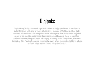
- Digipaks consist of a paperboard or cardstock outer binding with plastic trays inside to hold CDs or DVDs.
- They provide more versatility than jewel cases by allowing extra content like booklets and artwork.
- The example digipak shown contains a booklet, lyrics sheet, poster, and two CDs - one with the original album and a bonus disc.
- This type of expanded packaging works well for cult artist collectives to provide value and incentives for dedicated fans to purchase physically.


![Analysis albums[1]](https://cdn.slidesharecdn.com/ss_thumbnails/analysisalbums1-130315093507-phpapp01-thumbnail.jpg?width=640&height=640&fit=bounds)


![Analysis albums[1]](https://cdn.slidesharecdn.com/ss_thumbnails/analysisalbums1-130315093101-phpapp02-thumbnail.jpg?width=640&height=640&fit=bounds)


