Download as PDF, PPTX


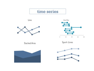
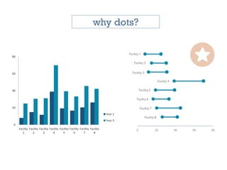
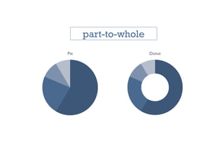

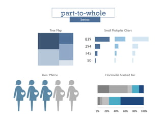
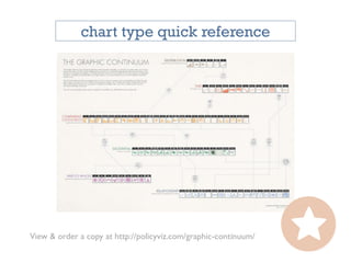


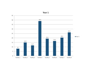

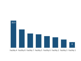
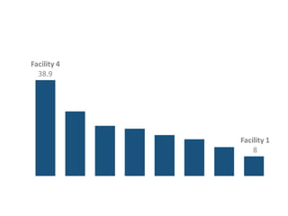

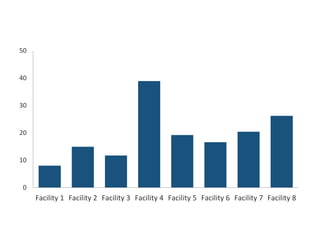
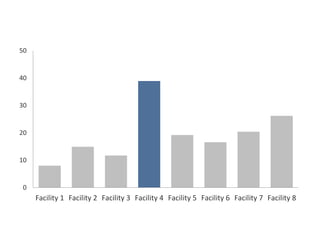
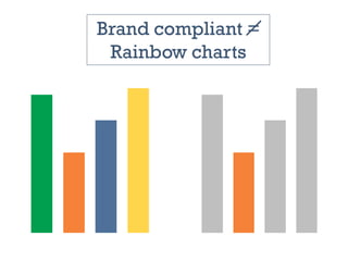


The document focuses on using storytelling principles, particularly those from Pixar, to enhance visual data presentations. It emphasizes understanding the audience's motivations and engaging them through structured narratives and effective visualization techniques. Key recommendations include decluttering visuals, using color sparingly, and purposeful titling to improve data interpretation and impact.


![[DSC Europe 25] Andrzej Kowalczyk - AI - how to start small and grow in the f...](https://cdn.slidesharecdn.com/ss_thumbnails/oy1zmo94qv6vpcqjvno2-andrzej-kowalczyk-ai-how-to-start-small-and-grow-in-the-future-1-260119121559-cf093b23-thumbnail.jpg?width=640&height=640&fit=bounds)


