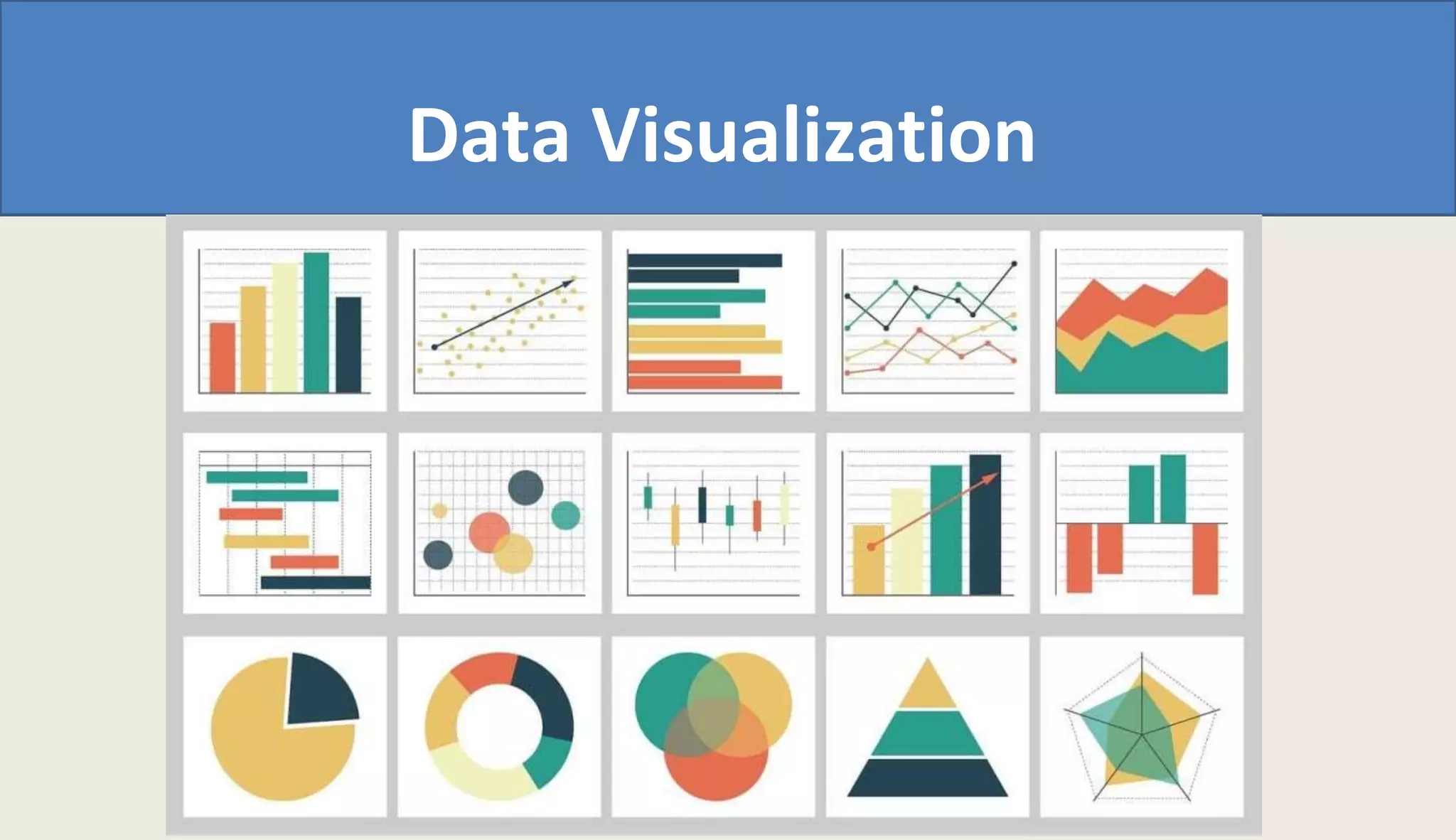
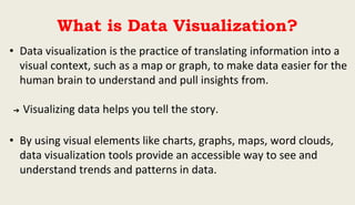
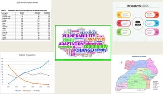
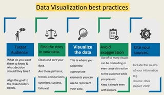
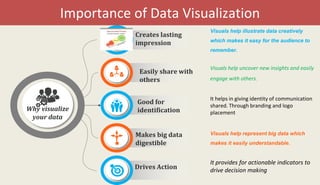
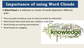
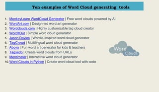


This document discusses data visualization and provides best practices for visualizing data. It defines data visualization as translating information into visual formats like charts and graphs to make insights and trends easier for people to understand. The document recommends finding the story in the data, cleaning and sorting it, selecting appropriate visual elements to represent it, avoiding exaggeration, and citing sources. It highlights how visuals help illustrate data creatively, uncover new insights, engage audiences, represent big data, and drive decision making. The importance of using word clouds to reveal audience thoughts in an exciting, emotional, and engaging way is also covered, along with ten examples of word cloud generating tools.