SlideShare a Scribd company logo
On Storyboarding as a Data Visualization Tool
A Process for Distilling Long Reports into Data Visualization Products
What are storyboards?
› A graphic representation of how a video or
visualization will unfold.
› Focus on storytelling, plot, flow, and
perspective.
› Often look like comic strips.
› Can be very detailed and visual or more
basic sketches.
Why storyboarding as a data visualization
design tool? Communications experts and
video designers frequently use a visual,
frame-by-frame representation of their
message or plot line as a way to map out how
they want their final product to flow. For data
visualization enthusiasts, the storyboarding
process can be a great way to work with a
team to pull the key messages and data
elements (“story points”) out of a long report
or set of documents and arrange them in
sequence to tell your data story.
Why does this step matter?
This process helps you transition from a long
report and abstract ideas about making an
inforgraphic or other product to tangible
plans. They make it easier for you to share
and explain your vision with your team
and/or a designer and, as a result, facilitate
collaboration and ensure that all of your
collaborators are on the same page. They
emphasize usability and clarity of content and
can ultimately save you time.
So now I have a bunch of post-its on paper
lined up with sketches. What do I do next?
Great work! You’ve done the thinking around
how to tell your story and what elements you
want to visualize. You can use the storyboard
you’ve created to make a slide deck that
someone could use for a highly visual
presentation, to work with a designer (or a
free tool, like Piktochart) to design an
infographic, or create a video based on the
frames you’ve mapped out..
Let’s practice…
Imagine you are a researcher who has just
completed a mid-term evaluation. Your team has
worked hard to write your 50 page evaluation
report, and even summarized your key data
points into a fact sheet. Now, you want to create
an infographic to include in a blog post to spark
interest from other implementers by visually
telling the story from one of your project sites.
You have a two page example of key findings in a
fact sheet from the Senegal Urban Reproductive
Health Initiative provided by the facilitators.
Follow the steps outlined above (highlight key
points, post-it, organize, brainstorm
visualizations) to create your own storyboard.
A simple process from moving
from report to storyboard:
1. Highlight Read your full narrative
document and highlight key data points or
messages. What jumps out at you? What
would your audience want to learn about?
You can do this simultaneously with a
team or on your own.
2. Post-its Write each message or statistic
that you higlighted on a post-it note.
3. Arrange the storyboard Arrange the post-
its in sequence on a large flip chart. Start
thinking through how this story would
unfold on an infographic, in a video, or on
a slidedeck: what would you want your
audience to know first? Are there any
post-its that you don’t need (because they
just add clutter) or anything missing that
you should look for in the document or
from another data source?
4. Brainstorm visualizations Think about how
you’d visualize each piece of information
on an individual post-it and draw small
sketches of what that storypoint could
look like. Don’t aim for perfection here
(we’re not all artists) & try different ideas.

More Related Content

What's hot

Data visualization introduction
Data visualization introductionData visualization introduction
Data visualization introduction
ManokamnaKochar1
 
Data Visualization Design Best Practices Workshop
Data Visualization Design Best Practices WorkshopData Visualization Design Best Practices Workshop
Data Visualization Design Best Practices Workshop
JSI
 
The Art of Business Storytelling with Data
The Art of Business Storytelling with DataThe Art of Business Storytelling with Data
The Art of Business Storytelling with Data
Andrés Fortino, PhD
 
Data visualization
Data visualizationData visualization
Data visualization
Sushil kasar
 
Data visualization
Data visualizationData visualization
Data visualization
Hoang Nguyen
 
5 Data Visualization Pitfalls
5 Data Visualization Pitfalls5 Data Visualization Pitfalls
5 Data Visualization Pitfalls
Data IQ Argentina
 
Data visualization
Data visualizationData visualization
Data visualization
Subarna Natarajan
 
Data Visualization: Impact, Intrigue, Value Add for APLIC 2014
Data Visualization: Impact, Intrigue, Value Add for APLIC 2014Data Visualization: Impact, Intrigue, Value Add for APLIC 2014
Data Visualization: Impact, Intrigue, Value Add for APLIC 2014
Amanda Makulec
 
Formula for a Winning Presentation Design
Formula for a Winning Presentation DesignFormula for a Winning Presentation Design
Formula for a Winning Presentation Design
PGi
 
Presenting Like The Artist
Presenting Like The ArtistPresenting Like The Artist
Presenting Like The Artist
Emiland
 
Identifying Your Audience
Identifying Your AudienceIdentifying Your Audience
Identifying Your Audience
Amanda Makulec
 
Data visualization
Data visualizationData visualization
Data visualization
Kaustubh Srivastava
 
Big data visualization
Big data visualizationBig data visualization
Big data visualization
Anurag Gupta
 
Data visualization
Data visualizationData visualization
Data visualization
Jan Willem Tulp
 
Data Visualization 101: How to Design Charts and Graphs
Data Visualization 101: How to Design Charts and GraphsData Visualization 101: How to Design Charts and Graphs
Data Visualization 101: How to Design Charts and Graphs
Visage
 
Data analytics
Data analyticsData analytics
Data analytics
Bhanu Pratap
 
Storytelling with Data - See | Show | Tell | Engage
Storytelling with Data - See | Show | Tell | EngageStorytelling with Data - See | Show | Tell | Engage
Storytelling with Data - See | Show | Tell | Engage
Amit Kapoor
 
Slide Design for Non Designers
Slide Design for Non DesignersSlide Design for Non Designers
Slide Design for Non Designers
SketchBubble
 
Introduction to data analytics
Introduction to data analyticsIntroduction to data analytics
Introduction to data analytics
SSaudia
 

What's hot (20)

Data visualization introduction
Data visualization introductionData visualization introduction
Data visualization introduction
 
Data Visualization Design Best Practices Workshop
Data Visualization Design Best Practices WorkshopData Visualization Design Best Practices Workshop
Data Visualization Design Best Practices Workshop
 
The Art of Business Storytelling with Data
The Art of Business Storytelling with DataThe Art of Business Storytelling with Data
The Art of Business Storytelling with Data
 
Data visualization
Data visualizationData visualization
Data visualization
 
Data visualization
Data visualizationData visualization
Data visualization
 
5 Data Visualization Pitfalls
5 Data Visualization Pitfalls5 Data Visualization Pitfalls
5 Data Visualization Pitfalls
 
Data visualization
Data visualizationData visualization
Data visualization
 
Data Visualization: Impact, Intrigue, Value Add for APLIC 2014
Data Visualization: Impact, Intrigue, Value Add for APLIC 2014Data Visualization: Impact, Intrigue, Value Add for APLIC 2014
Data Visualization: Impact, Intrigue, Value Add for APLIC 2014
 
Formula for a Winning Presentation Design
Formula for a Winning Presentation DesignFormula for a Winning Presentation Design
Formula for a Winning Presentation Design
 
Presenting Like The Artist
Presenting Like The ArtistPresenting Like The Artist
Presenting Like The Artist
 
Identifying Your Audience
Identifying Your AudienceIdentifying Your Audience
Identifying Your Audience
 
Data visualization
Data visualizationData visualization
Data visualization
 
Big data visualization
Big data visualizationBig data visualization
Big data visualization
 
Data visualization
Data visualizationData visualization
Data visualization
 
Data Visualization 101: How to Design Charts and Graphs
Data Visualization 101: How to Design Charts and GraphsData Visualization 101: How to Design Charts and Graphs
Data Visualization 101: How to Design Charts and Graphs
 
Data analytics
Data analyticsData analytics
Data analytics
 
Storytelling with Data - See | Show | Tell | Engage
Storytelling with Data - See | Show | Tell | EngageStorytelling with Data - See | Show | Tell | Engage
Storytelling with Data - See | Show | Tell | Engage
 
Slide Design for Non Designers
Slide Design for Non DesignersSlide Design for Non Designers
Slide Design for Non Designers
 
Data analytics
Data analyticsData analytics
Data analytics
 
Introduction to data analytics
Introduction to data analyticsIntroduction to data analytics
Introduction to data analytics
 

Viewers also liked

A Pixar Twist on Presenting Data
A Pixar Twist on Presenting DataA Pixar Twist on Presenting Data
A Pixar Twist on Presenting Data
Amanda Makulec
 
Data Visualization Design Best Practices Workshop
Data Visualization Design Best Practices WorkshopData Visualization Design Best Practices Workshop
Data Visualization Design Best Practices Workshop
Amanda Makulec
 
Storyboarding for Data Visualization Design
Storyboarding for Data Visualization DesignStoryboarding for Data Visualization Design
Storyboarding for Data Visualization Design
spatialhistory
 
Making Data Meaningful
Making Data MeaningfulMaking Data Meaningful
Making Data Meaningful
Amanda Makulec
 
Designing Data Visualizations to Strengthen Health Systems
Designing Data Visualizations to Strengthen Health SystemsDesigning Data Visualizations to Strengthen Health Systems
Designing Data Visualizations to Strengthen Health Systems
Amanda Makulec
 
Nurturing Data Visualization
Nurturing Data VisualizationNurturing Data Visualization
Nurturing Data Visualization
Amanda Makulec
 
Chart Makeover: A Women's Nutrition Bar Chart
Chart Makeover: A Women's Nutrition Bar ChartChart Makeover: A Women's Nutrition Bar Chart
Chart Makeover: A Women's Nutrition Bar Chart
Amanda Makulec
 
Designing Usage Dashboards for mHealth Program Monitoring
Designing Usage Dashboards for mHealth Program MonitoringDesigning Usage Dashboards for mHealth Program Monitoring
Designing Usage Dashboards for mHealth Program Monitoring
Amanda Makulec
 
Design for Delight
Design for DelightDesign for Delight
Design for Delight
Amanda Makulec
 
Data+Design
Data+DesignData+Design
Data+Design
Amanda Makulec
 
Presentating Data
Presentating DataPresentating Data
Presentating Data
Mark Hobbs
 
3 myths about presenting data
3 myths about presenting data3 myths about presenting data
3 myths about presenting data
Metamorph Training Pvt Ltd
 
Data Visualization - 5 tips for presenting data analyses
Data Visualization - 5 tips for presenting data analysesData Visualization - 5 tips for presenting data analyses
Data Visualization - 5 tips for presenting data analyses
Nicola Sandoli
 
NCompass Live: Presenting Data in Meaningful and Interesting Ways
NCompass Live: Presenting Data in Meaningful and Interesting WaysNCompass Live: Presenting Data in Meaningful and Interesting Ways
NCompass Live: Presenting Data in Meaningful and Interesting Ways
Nebraska Library Commission
 
6 Strategies for Presenting Data & Charts
6 Strategies for Presenting Data & Charts6 Strategies for Presenting Data & Charts
6 Strategies for Presenting Data & Charts
MGT OPEN
 
Interaction Design History
Interaction Design HistoryInteraction Design History
Interaction Design History
Marc Rettig
 
The Human Interface
The Human InterfaceThe Human Interface
The Human Interface
Christopher Fahey
 
Presenting Data Webinar
Presenting Data WebinarPresenting Data Webinar
Presenting Data Webinar
Gavin McMahon
 
Data Visualization Resource Guide (September 2014)
Data Visualization Resource Guide (September 2014)Data Visualization Resource Guide (September 2014)
Data Visualization Resource Guide (September 2014)
Amanda Makulec
 
The Art of Interaction
The Art of InteractionThe Art of Interaction
The Art of Interaction
EffectiveUI
 

Viewers also liked (20)

A Pixar Twist on Presenting Data
A Pixar Twist on Presenting DataA Pixar Twist on Presenting Data
A Pixar Twist on Presenting Data
 
Data Visualization Design Best Practices Workshop
Data Visualization Design Best Practices WorkshopData Visualization Design Best Practices Workshop
Data Visualization Design Best Practices Workshop
 
Storyboarding for Data Visualization Design
Storyboarding for Data Visualization DesignStoryboarding for Data Visualization Design
Storyboarding for Data Visualization Design
 
Making Data Meaningful
Making Data MeaningfulMaking Data Meaningful
Making Data Meaningful
 
Designing Data Visualizations to Strengthen Health Systems
Designing Data Visualizations to Strengthen Health SystemsDesigning Data Visualizations to Strengthen Health Systems
Designing Data Visualizations to Strengthen Health Systems
 
Nurturing Data Visualization
Nurturing Data VisualizationNurturing Data Visualization
Nurturing Data Visualization
 
Chart Makeover: A Women's Nutrition Bar Chart
Chart Makeover: A Women's Nutrition Bar ChartChart Makeover: A Women's Nutrition Bar Chart
Chart Makeover: A Women's Nutrition Bar Chart
 
Designing Usage Dashboards for mHealth Program Monitoring
Designing Usage Dashboards for mHealth Program MonitoringDesigning Usage Dashboards for mHealth Program Monitoring
Designing Usage Dashboards for mHealth Program Monitoring
 
Design for Delight
Design for DelightDesign for Delight
Design for Delight
 
Data+Design
Data+DesignData+Design
Data+Design
 
Presentating Data
Presentating DataPresentating Data
Presentating Data
 
3 myths about presenting data
3 myths about presenting data3 myths about presenting data
3 myths about presenting data
 
Data Visualization - 5 tips for presenting data analyses
Data Visualization - 5 tips for presenting data analysesData Visualization - 5 tips for presenting data analyses
Data Visualization - 5 tips for presenting data analyses
 
NCompass Live: Presenting Data in Meaningful and Interesting Ways
NCompass Live: Presenting Data in Meaningful and Interesting WaysNCompass Live: Presenting Data in Meaningful and Interesting Ways
NCompass Live: Presenting Data in Meaningful and Interesting Ways
 
6 Strategies for Presenting Data & Charts
6 Strategies for Presenting Data & Charts6 Strategies for Presenting Data & Charts
6 Strategies for Presenting Data & Charts
 
Interaction Design History
Interaction Design HistoryInteraction Design History
Interaction Design History
 
The Human Interface
The Human InterfaceThe Human Interface
The Human Interface
 
Presenting Data Webinar
Presenting Data WebinarPresenting Data Webinar
Presenting Data Webinar
 
Data Visualization Resource Guide (September 2014)
Data Visualization Resource Guide (September 2014)Data Visualization Resource Guide (September 2014)
Data Visualization Resource Guide (September 2014)
 
The Art of Interaction
The Art of InteractionThe Art of Interaction
The Art of Interaction
 

Similar to Storyboarding for Data Visualization

Part C Developing Your Design SolutionThe Production Cycle.docx
Part C Developing Your Design SolutionThe Production Cycle.docxPart C Developing Your Design SolutionThe Production Cycle.docx
Part C Developing Your Design SolutionThe Production Cycle.docx
smile790243
 
Uxpin guide to_uxdesign_process_and_documentation
Uxpin guide to_uxdesign_process_and_documentationUxpin guide to_uxdesign_process_and_documentation
Uxpin guide to_uxdesign_process_and_documentation
Marcelo Graciolli
 
Introduction to Infographic Design
Introduction to Infographic DesignIntroduction to Infographic Design
Introduction to Infographic Design
Amanda Makulec
 
VDIS10015 Presenting a body of work - Lecture 5
VDIS10015 Presenting a body of work - Lecture 5VDIS10015 Presenting a body of work - Lecture 5
VDIS10015 Presenting a body of work - Lecture 5
Virtu Institute
 
Cost Reduction in Manufacturing engineering.pptx
Cost Reduction in Manufacturing engineering.pptxCost Reduction in Manufacturing engineering.pptx
Cost Reduction in Manufacturing engineering.pptx
biyobennet11
 
Cost Reduction in Manufacturing Industry Newsletter by Slidesgo.pptx
Cost Reduction in Manufacturing Industry Newsletter by Slidesgo.pptxCost Reduction in Manufacturing Industry Newsletter by Slidesgo.pptx
Cost Reduction in Manufacturing Industry Newsletter by Slidesgo.pptx
Aman Choudhary
 
PCC2 - How do I incorporate Apple-like design into my products?
PCC2 - How do I incorporate Apple-like design into my products?PCC2 - How do I incorporate Apple-like design into my products?
PCC2 - How do I incorporate Apple-like design into my products?
ProductCamp Chicago
 
list script and flowchart
list script and flowchartlist script and flowchart
list script and flowchart
pavishkumarsingh
 
Documentation Workbook Series. Step 3 Presenting Information (Visual Document...
Documentation Workbook Series. Step 3 Presenting Information (Visual Document...Documentation Workbook Series. Step 3 Presenting Information (Visual Document...
Documentation Workbook Series. Step 3 Presenting Information (Visual Document...
Adrienne Bellehumeur
 
EBook: 5 ways of reporting your BI insights
EBook: 5 ways of reporting your BI insightsEBook: 5 ways of reporting your BI insights
EBook: 5 ways of reporting your BI insights
Data IQ Argentina
 
Happy Seollal_ Korean New Year Newsletter by Slidesgo.pptx
Happy Seollal_ Korean New Year Newsletter by Slidesgo.pptxHappy Seollal_ Korean New Year Newsletter by Slidesgo.pptx
Happy Seollal_ Korean New Year Newsletter by Slidesgo.pptx
SegundoLizana1
 
Measurecamp Manchester 2018 - designing better marketing analytics dashboard
Measurecamp Manchester 2018 - designing better marketing analytics dashboardMeasurecamp Manchester 2018 - designing better marketing analytics dashboard
Measurecamp Manchester 2018 - designing better marketing analytics dashboard
Ed Hammerton
 
Introduction to Storyboards
Introduction to StoryboardsIntroduction to Storyboards
Introduction to StoryboardsLou Patnode
 
Power BI Report.pdf
Power BI Report.pdfPower BI Report.pdf
Power BI Report.pdf
VishnuGone
 
Presentation Development Primer: Storyboarding, Slide Design
Presentation Development Primer: Storyboarding, Slide DesignPresentation Development Primer: Storyboarding, Slide Design
Presentation Development Primer: Storyboarding, Slide Design
David Tracy
 
Architectural Professional Practice - Portfolio
Architectural Professional Practice - PortfolioArchitectural Professional Practice - Portfolio
Architectural Professional Practice - PortfolioGalala University
 
Manage Stakeholder Relations
Manage Stakeholder RelationsManage Stakeholder Relations
Manage Stakeholder Relations
Info-Tech Research Group
 
Creating an infographic
Creating an infographicCreating an infographic
Creating an infographic
adamzurn
 
Editable Certificate and Transcript Design_ Enhancing Your Brand’s Profession...
Editable Certificate and Transcript Design_ Enhancing Your Brand’s Profession...Editable Certificate and Transcript Design_ Enhancing Your Brand’s Profession...
Editable Certificate and Transcript Design_ Enhancing Your Brand’s Profession...
aminulislam661165
 

Similar to Storyboarding for Data Visualization (20)

4 - Press Prep
4 - Press Prep4 - Press Prep
4 - Press Prep
 
Part C Developing Your Design SolutionThe Production Cycle.docx
Part C Developing Your Design SolutionThe Production Cycle.docxPart C Developing Your Design SolutionThe Production Cycle.docx
Part C Developing Your Design SolutionThe Production Cycle.docx
 
Uxpin guide to_uxdesign_process_and_documentation
Uxpin guide to_uxdesign_process_and_documentationUxpin guide to_uxdesign_process_and_documentation
Uxpin guide to_uxdesign_process_and_documentation
 
Introduction to Infographic Design
Introduction to Infographic DesignIntroduction to Infographic Design
Introduction to Infographic Design
 
VDIS10015 Presenting a body of work - Lecture 5
VDIS10015 Presenting a body of work - Lecture 5VDIS10015 Presenting a body of work - Lecture 5
VDIS10015 Presenting a body of work - Lecture 5
 
Cost Reduction in Manufacturing engineering.pptx
Cost Reduction in Manufacturing engineering.pptxCost Reduction in Manufacturing engineering.pptx
Cost Reduction in Manufacturing engineering.pptx
 
Cost Reduction in Manufacturing Industry Newsletter by Slidesgo.pptx
Cost Reduction in Manufacturing Industry Newsletter by Slidesgo.pptxCost Reduction in Manufacturing Industry Newsletter by Slidesgo.pptx
Cost Reduction in Manufacturing Industry Newsletter by Slidesgo.pptx
 
PCC2 - How do I incorporate Apple-like design into my products?
PCC2 - How do I incorporate Apple-like design into my products?PCC2 - How do I incorporate Apple-like design into my products?
PCC2 - How do I incorporate Apple-like design into my products?
 
list script and flowchart
list script and flowchartlist script and flowchart
list script and flowchart
 
Documentation Workbook Series. Step 3 Presenting Information (Visual Document...
Documentation Workbook Series. Step 3 Presenting Information (Visual Document...Documentation Workbook Series. Step 3 Presenting Information (Visual Document...
Documentation Workbook Series. Step 3 Presenting Information (Visual Document...
 
EBook: 5 ways of reporting your BI insights
EBook: 5 ways of reporting your BI insightsEBook: 5 ways of reporting your BI insights
EBook: 5 ways of reporting your BI insights
 
Happy Seollal_ Korean New Year Newsletter by Slidesgo.pptx
Happy Seollal_ Korean New Year Newsletter by Slidesgo.pptxHappy Seollal_ Korean New Year Newsletter by Slidesgo.pptx
Happy Seollal_ Korean New Year Newsletter by Slidesgo.pptx
 
Measurecamp Manchester 2018 - designing better marketing analytics dashboard
Measurecamp Manchester 2018 - designing better marketing analytics dashboardMeasurecamp Manchester 2018 - designing better marketing analytics dashboard
Measurecamp Manchester 2018 - designing better marketing analytics dashboard
 
Introduction to Storyboards
Introduction to StoryboardsIntroduction to Storyboards
Introduction to Storyboards
 
Power BI Report.pdf
Power BI Report.pdfPower BI Report.pdf
Power BI Report.pdf
 
Presentation Development Primer: Storyboarding, Slide Design
Presentation Development Primer: Storyboarding, Slide DesignPresentation Development Primer: Storyboarding, Slide Design
Presentation Development Primer: Storyboarding, Slide Design
 
Architectural Professional Practice - Portfolio
Architectural Professional Practice - PortfolioArchitectural Professional Practice - Portfolio
Architectural Professional Practice - Portfolio
 
Manage Stakeholder Relations
Manage Stakeholder RelationsManage Stakeholder Relations
Manage Stakeholder Relations
 
Creating an infographic
Creating an infographicCreating an infographic
Creating an infographic
 
Editable Certificate and Transcript Design_ Enhancing Your Brand’s Profession...
Editable Certificate and Transcript Design_ Enhancing Your Brand’s Profession...Editable Certificate and Transcript Design_ Enhancing Your Brand’s Profession...
Editable Certificate and Transcript Design_ Enhancing Your Brand’s Profession...
 

More from Amanda Makulec

Adapting Agile for MERL
Adapting Agile for MERLAdapting Agile for MERL
Adapting Agile for MERL
Amanda Makulec
 
Why No One is Using your Dashboard
Why No One is Using your DashboardWhy No One is Using your Dashboard
Why No One is Using your Dashboard
Amanda Makulec
 
The Simpsons, Design, and Data Use
The Simpsons, Design, and Data UseThe Simpsons, Design, and Data Use
The Simpsons, Design, and Data Use
Amanda Makulec
 
Visualizations with Empathy
Visualizations with EmpathyVisualizations with Empathy
Visualizations with Empathy
Amanda Makulec
 
Visualizations with Empathy: Developing Audience Personas
Visualizations with Empathy: Developing Audience PersonasVisualizations with Empathy: Developing Audience Personas
Visualizations with Empathy: Developing Audience Personas
Amanda Makulec
 
Are Dashboards the Magic Bullet?
Are Dashboards the Magic Bullet?Are Dashboards the Magic Bullet?
Are Dashboards the Magic Bullet?
Amanda Makulec
 
Designstorm How-to: Dot Plots
Designstorm How-to: Dot PlotsDesignstorm How-to: Dot Plots
Designstorm How-to: Dot Plots
Amanda Makulec
 
Data Dinner Parties
Data Dinner PartiesData Dinner Parties
Data Dinner Parties
Amanda Makulec
 
The Human Element
The Human ElementThe Human Element
The Human Element
Amanda Makulec
 
A Data Viz Makeover: Approaches for Improving your Visualizations
A Data Viz Makeover: Approaches for Improving your VisualizationsA Data Viz Makeover: Approaches for Improving your Visualizations
A Data Viz Makeover: Approaches for Improving your Visualizations
Amanda Makulec
 
Alternative Reporting Formats
Alternative Reporting FormatsAlternative Reporting Formats
Alternative Reporting Formats
Amanda Makulec
 
Creating Functional Art in Excel
Creating Functional Art in ExcelCreating Functional Art in Excel
Creating Functional Art in Excel
Amanda Makulec
 
August Designstorm: Alternative Reporting Formats
August Designstorm: Alternative Reporting FormatsAugust Designstorm: Alternative Reporting Formats
August Designstorm: Alternative Reporting Formats
Amanda Makulec
 
June Design-storm : Piktochart
June Design-storm : PiktochartJune Design-storm : Piktochart
June Design-storm : Piktochart
Amanda Makulec
 
Creating Functional Art in Excel
Creating Functional Art in ExcelCreating Functional Art in Excel
Creating Functional Art in Excel
Amanda Makulec
 
July Design-storm : Slidedocs
July Design-storm : SlidedocsJuly Design-storm : Slidedocs
July Design-storm : Slidedocs
Amanda Makulec
 

More from Amanda Makulec (16)

Adapting Agile for MERL
Adapting Agile for MERLAdapting Agile for MERL
Adapting Agile for MERL
 
Why No One is Using your Dashboard
Why No One is Using your DashboardWhy No One is Using your Dashboard
Why No One is Using your Dashboard
 
The Simpsons, Design, and Data Use
The Simpsons, Design, and Data UseThe Simpsons, Design, and Data Use
The Simpsons, Design, and Data Use
 
Visualizations with Empathy
Visualizations with EmpathyVisualizations with Empathy
Visualizations with Empathy
 
Visualizations with Empathy: Developing Audience Personas
Visualizations with Empathy: Developing Audience PersonasVisualizations with Empathy: Developing Audience Personas
Visualizations with Empathy: Developing Audience Personas
 
Are Dashboards the Magic Bullet?
Are Dashboards the Magic Bullet?Are Dashboards the Magic Bullet?
Are Dashboards the Magic Bullet?
 
Designstorm How-to: Dot Plots
Designstorm How-to: Dot PlotsDesignstorm How-to: Dot Plots
Designstorm How-to: Dot Plots
 
Data Dinner Parties
Data Dinner PartiesData Dinner Parties
Data Dinner Parties
 
The Human Element
The Human ElementThe Human Element
The Human Element
 
A Data Viz Makeover: Approaches for Improving your Visualizations
A Data Viz Makeover: Approaches for Improving your VisualizationsA Data Viz Makeover: Approaches for Improving your Visualizations
A Data Viz Makeover: Approaches for Improving your Visualizations
 
Alternative Reporting Formats
Alternative Reporting FormatsAlternative Reporting Formats
Alternative Reporting Formats
 
Creating Functional Art in Excel
Creating Functional Art in ExcelCreating Functional Art in Excel
Creating Functional Art in Excel
 
August Designstorm: Alternative Reporting Formats
August Designstorm: Alternative Reporting FormatsAugust Designstorm: Alternative Reporting Formats
August Designstorm: Alternative Reporting Formats
 
June Design-storm : Piktochart
June Design-storm : PiktochartJune Design-storm : Piktochart
June Design-storm : Piktochart
 
Creating Functional Art in Excel
Creating Functional Art in ExcelCreating Functional Art in Excel
Creating Functional Art in Excel
 
July Design-storm : Slidedocs
July Design-storm : SlidedocsJuly Design-storm : Slidedocs
July Design-storm : Slidedocs
 

Recently uploaded

社内勉強会資料_LLM Agents                              .
社内勉強会資料_LLM Agents                              .社内勉強会資料_LLM Agents                              .
社内勉強会資料_LLM Agents                              .
NABLAS株式会社
 
一比一原版(QU毕业证)皇后大学毕业证成绩单
一比一原版(QU毕业证)皇后大学毕业证成绩单一比一原版(QU毕业证)皇后大学毕业证成绩单
一比一原版(QU毕业证)皇后大学毕业证成绩单
enxupq
 
一比一原版(UofM毕业证)明尼苏达大学毕业证成绩单
一比一原版(UofM毕业证)明尼苏达大学毕业证成绩单一比一原版(UofM毕业证)明尼苏达大学毕业证成绩单
一比一原版(UofM毕业证)明尼苏达大学毕业证成绩单
ewymefz
 
Innovative Methods in Media and Communication Research by Sebastian Kubitschk...
Innovative Methods in Media and Communication Research by Sebastian Kubitschk...Innovative Methods in Media and Communication Research by Sebastian Kubitschk...
Innovative Methods in Media and Communication Research by Sebastian Kubitschk...
correoyaya
 
tapal brand analysis PPT slide for comptetive data
tapal brand analysis PPT slide for comptetive datatapal brand analysis PPT slide for comptetive data
tapal brand analysis PPT slide for comptetive data
theahmadsaood
 
Levelwise PageRank with Loop-Based Dead End Handling Strategy : SHORT REPORT ...
Levelwise PageRank with Loop-Based Dead End Handling Strategy : SHORT REPORT ...Levelwise PageRank with Loop-Based Dead End Handling Strategy : SHORT REPORT ...
Levelwise PageRank with Loop-Based Dead End Handling Strategy : SHORT REPORT ...
Subhajit Sahu
 
一比一原版(YU毕业证)约克大学毕业证成绩单
一比一原版(YU毕业证)约克大学毕业证成绩单一比一原版(YU毕业证)约克大学毕业证成绩单
一比一原版(YU毕业证)约克大学毕业证成绩单
enxupq
 
Algorithmic optimizations for Dynamic Levelwise PageRank (from STICD) : SHORT...
Algorithmic optimizations for Dynamic Levelwise PageRank (from STICD) : SHORT...Algorithmic optimizations for Dynamic Levelwise PageRank (from STICD) : SHORT...
Algorithmic optimizations for Dynamic Levelwise PageRank (from STICD) : SHORT...
Subhajit Sahu
 
Jpolillo Amazon PPC - Bid Optimization Sample
Jpolillo Amazon PPC - Bid Optimization SampleJpolillo Amazon PPC - Bid Optimization Sample
Jpolillo Amazon PPC - Bid Optimization Sample
James Polillo
 
一比一原版(CU毕业证)卡尔顿大学毕业证成绩单
一比一原版(CU毕业证)卡尔顿大学毕业证成绩单一比一原版(CU毕业证)卡尔顿大学毕业证成绩单
一比一原版(CU毕业证)卡尔顿大学毕业证成绩单
yhkoc
 
一比一原版(CBU毕业证)卡普顿大学毕业证成绩单
一比一原版(CBU毕业证)卡普顿大学毕业证成绩单一比一原版(CBU毕业证)卡普顿大学毕业证成绩单
一比一原版(CBU毕业证)卡普顿大学毕业证成绩单
nscud
 
做(mqu毕业证书)麦考瑞大学毕业证硕士文凭证书学费发票原版一模一样
做(mqu毕业证书)麦考瑞大学毕业证硕士文凭证书学费发票原版一模一样做(mqu毕业证书)麦考瑞大学毕业证硕士文凭证书学费发票原版一模一样
做(mqu毕业证书)麦考瑞大学毕业证硕士文凭证书学费发票原版一模一样
axoqas
 
一比一原版(ArtEZ毕业证)ArtEZ艺术学院毕业证成绩单
一比一原版(ArtEZ毕业证)ArtEZ艺术学院毕业证成绩单一比一原版(ArtEZ毕业证)ArtEZ艺术学院毕业证成绩单
一比一原版(ArtEZ毕业证)ArtEZ艺术学院毕业证成绩单
vcaxypu
 
一比一原版(TWU毕业证)西三一大学毕业证成绩单
一比一原版(TWU毕业证)西三一大学毕业证成绩单一比一原版(TWU毕业证)西三一大学毕业证成绩单
一比一原版(TWU毕业证)西三一大学毕业证成绩单
ocavb
 
SOCRadar Germany 2024 Threat Landscape Report
SOCRadar Germany 2024 Threat Landscape ReportSOCRadar Germany 2024 Threat Landscape Report
SOCRadar Germany 2024 Threat Landscape Report
SOCRadar
 
FP Growth Algorithm and its Applications
FP Growth Algorithm and its ApplicationsFP Growth Algorithm and its Applications
FP Growth Algorithm and its Applications
MaleehaSheikh2
 
一比一原版(CBU毕业证)不列颠海角大学毕业证成绩单
一比一原版(CBU毕业证)不列颠海角大学毕业证成绩单一比一原版(CBU毕业证)不列颠海角大学毕业证成绩单
一比一原版(CBU毕业证)不列颠海角大学毕业证成绩单
nscud
 
1.Seydhcuxhxyxhccuuxuxyxyxmisolids 2019.pptx
1.Seydhcuxhxyxhccuuxuxyxyxmisolids 2019.pptx1.Seydhcuxhxyxhccuuxuxyxyxmisolids 2019.pptx
1.Seydhcuxhxyxhccuuxuxyxyxmisolids 2019.pptx
Tiktokethiodaily
 
一比一原版(NYU毕业证)纽约大学毕业证成绩单
一比一原版(NYU毕业证)纽约大学毕业证成绩单一比一原版(NYU毕业证)纽约大学毕业证成绩单
一比一原版(NYU毕业证)纽约大学毕业证成绩单
ewymefz
 
standardisation of garbhpala offhgfffghh
standardisation of garbhpala offhgfffghhstandardisation of garbhpala offhgfffghh
standardisation of garbhpala offhgfffghh
ArpitMalhotra16
 

Recently uploaded (20)

社内勉強会資料_LLM Agents                              .
社内勉強会資料_LLM Agents                              .社内勉強会資料_LLM Agents                              .
社内勉強会資料_LLM Agents                              .
 
一比一原版(QU毕业证)皇后大学毕业证成绩单
一比一原版(QU毕业证)皇后大学毕业证成绩单一比一原版(QU毕业证)皇后大学毕业证成绩单
一比一原版(QU毕业证)皇后大学毕业证成绩单
 
一比一原版(UofM毕业证)明尼苏达大学毕业证成绩单
一比一原版(UofM毕业证)明尼苏达大学毕业证成绩单一比一原版(UofM毕业证)明尼苏达大学毕业证成绩单
一比一原版(UofM毕业证)明尼苏达大学毕业证成绩单
 
Innovative Methods in Media and Communication Research by Sebastian Kubitschk...
Innovative Methods in Media and Communication Research by Sebastian Kubitschk...Innovative Methods in Media and Communication Research by Sebastian Kubitschk...
Innovative Methods in Media and Communication Research by Sebastian Kubitschk...
 
tapal brand analysis PPT slide for comptetive data
tapal brand analysis PPT slide for comptetive datatapal brand analysis PPT slide for comptetive data
tapal brand analysis PPT slide for comptetive data
 
Levelwise PageRank with Loop-Based Dead End Handling Strategy : SHORT REPORT ...
Levelwise PageRank with Loop-Based Dead End Handling Strategy : SHORT REPORT ...Levelwise PageRank with Loop-Based Dead End Handling Strategy : SHORT REPORT ...
Levelwise PageRank with Loop-Based Dead End Handling Strategy : SHORT REPORT ...
 
一比一原版(YU毕业证)约克大学毕业证成绩单
一比一原版(YU毕业证)约克大学毕业证成绩单一比一原版(YU毕业证)约克大学毕业证成绩单
一比一原版(YU毕业证)约克大学毕业证成绩单
 
Algorithmic optimizations for Dynamic Levelwise PageRank (from STICD) : SHORT...
Algorithmic optimizations for Dynamic Levelwise PageRank (from STICD) : SHORT...Algorithmic optimizations for Dynamic Levelwise PageRank (from STICD) : SHORT...
Algorithmic optimizations for Dynamic Levelwise PageRank (from STICD) : SHORT...
 
Jpolillo Amazon PPC - Bid Optimization Sample
Jpolillo Amazon PPC - Bid Optimization SampleJpolillo Amazon PPC - Bid Optimization Sample
Jpolillo Amazon PPC - Bid Optimization Sample
 
一比一原版(CU毕业证)卡尔顿大学毕业证成绩单
一比一原版(CU毕业证)卡尔顿大学毕业证成绩单一比一原版(CU毕业证)卡尔顿大学毕业证成绩单
一比一原版(CU毕业证)卡尔顿大学毕业证成绩单
 
一比一原版(CBU毕业证)卡普顿大学毕业证成绩单
一比一原版(CBU毕业证)卡普顿大学毕业证成绩单一比一原版(CBU毕业证)卡普顿大学毕业证成绩单
一比一原版(CBU毕业证)卡普顿大学毕业证成绩单
 
做(mqu毕业证书)麦考瑞大学毕业证硕士文凭证书学费发票原版一模一样
做(mqu毕业证书)麦考瑞大学毕业证硕士文凭证书学费发票原版一模一样做(mqu毕业证书)麦考瑞大学毕业证硕士文凭证书学费发票原版一模一样
做(mqu毕业证书)麦考瑞大学毕业证硕士文凭证书学费发票原版一模一样
 
一比一原版(ArtEZ毕业证)ArtEZ艺术学院毕业证成绩单
一比一原版(ArtEZ毕业证)ArtEZ艺术学院毕业证成绩单一比一原版(ArtEZ毕业证)ArtEZ艺术学院毕业证成绩单
一比一原版(ArtEZ毕业证)ArtEZ艺术学院毕业证成绩单
 
一比一原版(TWU毕业证)西三一大学毕业证成绩单
一比一原版(TWU毕业证)西三一大学毕业证成绩单一比一原版(TWU毕业证)西三一大学毕业证成绩单
一比一原版(TWU毕业证)西三一大学毕业证成绩单
 
SOCRadar Germany 2024 Threat Landscape Report
SOCRadar Germany 2024 Threat Landscape ReportSOCRadar Germany 2024 Threat Landscape Report
SOCRadar Germany 2024 Threat Landscape Report
 
FP Growth Algorithm and its Applications
FP Growth Algorithm and its ApplicationsFP Growth Algorithm and its Applications
FP Growth Algorithm and its Applications
 
一比一原版(CBU毕业证)不列颠海角大学毕业证成绩单
一比一原版(CBU毕业证)不列颠海角大学毕业证成绩单一比一原版(CBU毕业证)不列颠海角大学毕业证成绩单
一比一原版(CBU毕业证)不列颠海角大学毕业证成绩单
 
1.Seydhcuxhxyxhccuuxuxyxyxmisolids 2019.pptx
1.Seydhcuxhxyxhccuuxuxyxyxmisolids 2019.pptx1.Seydhcuxhxyxhccuuxuxyxyxmisolids 2019.pptx
1.Seydhcuxhxyxhccuuxuxyxyxmisolids 2019.pptx
 
一比一原版(NYU毕业证)纽约大学毕业证成绩单
一比一原版(NYU毕业证)纽约大学毕业证成绩单一比一原版(NYU毕业证)纽约大学毕业证成绩单
一比一原版(NYU毕业证)纽约大学毕业证成绩单
 
standardisation of garbhpala offhgfffghh
standardisation of garbhpala offhgfffghhstandardisation of garbhpala offhgfffghh
standardisation of garbhpala offhgfffghh
 

Storyboarding for Data Visualization

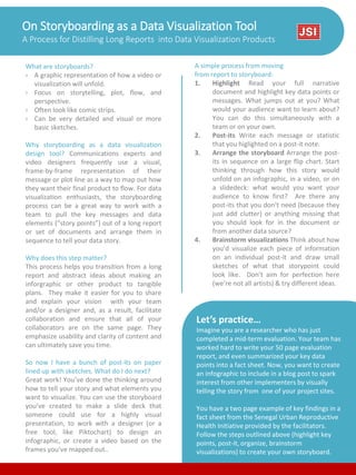
  • 1. On Storyboarding as a Data Visualization Tool A Process for Distilling Long Reports into Data Visualization Products What are storyboards? › A graphic representation of how a video or visualization will unfold. › Focus on storytelling, plot, flow, and perspective. › Often look like comic strips. › Can be very detailed and visual or more basic sketches. Why storyboarding as a data visualization design tool? Communications experts and video designers frequently use a visual, frame-by-frame representation of their message or plot line as a way to map out how they want their final product to flow. For data visualization enthusiasts, the storyboarding process can be a great way to work with a team to pull the key messages and data elements (“story points”) out of a long report or set of documents and arrange them in sequence to tell your data story. Why does this step matter? This process helps you transition from a long report and abstract ideas about making an inforgraphic or other product to tangible plans. They make it easier for you to share and explain your vision with your team and/or a designer and, as a result, facilitate collaboration and ensure that all of your collaborators are on the same page. They emphasize usability and clarity of content and can ultimately save you time. So now I have a bunch of post-its on paper lined up with sketches. What do I do next? Great work! You’ve done the thinking around how to tell your story and what elements you want to visualize. You can use the storyboard you’ve created to make a slide deck that someone could use for a highly visual presentation, to work with a designer (or a free tool, like Piktochart) to design an infographic, or create a video based on the frames you’ve mapped out.. Let’s practice… Imagine you are a researcher who has just completed a mid-term evaluation. Your team has worked hard to write your 50 page evaluation report, and even summarized your key data points into a fact sheet. Now, you want to create an infographic to include in a blog post to spark interest from other implementers by visually telling the story from one of your project sites. You have a two page example of key findings in a fact sheet from the Senegal Urban Reproductive Health Initiative provided by the facilitators. Follow the steps outlined above (highlight key points, post-it, organize, brainstorm visualizations) to create your own storyboard. A simple process from moving from report to storyboard: 1. Highlight Read your full narrative document and highlight key data points or messages. What jumps out at you? What would your audience want to learn about? You can do this simultaneously with a team or on your own. 2. Post-its Write each message or statistic that you higlighted on a post-it note. 3. Arrange the storyboard Arrange the post- its in sequence on a large flip chart. Start thinking through how this story would unfold on an infographic, in a video, or on a slidedeck: what would you want your audience to know first? Are there any post-its that you don’t need (because they just add clutter) or anything missing that you should look for in the document or from another data source? 4. Brainstorm visualizations Think about how you’d visualize each piece of information on an individual post-it and draw small sketches of what that storypoint could look like. Don’t aim for perfection here (we’re not all artists) & try different ideas.