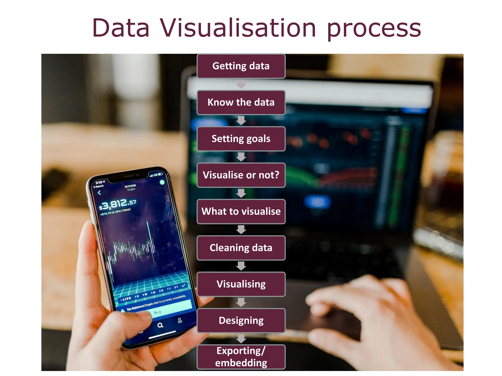
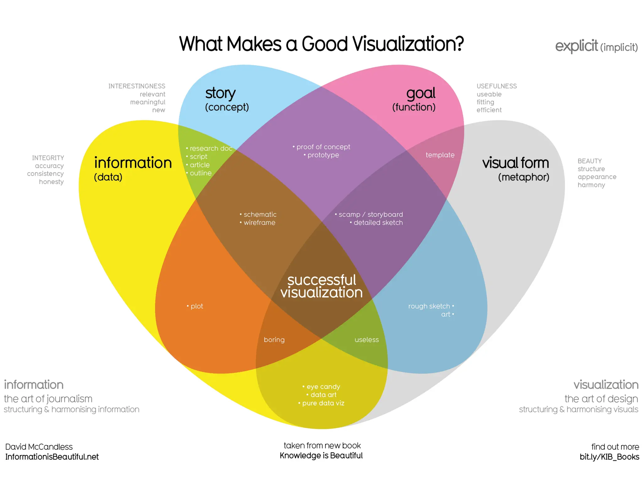
SlideShare a Scribd company logo
1 of 44
Download to read offline
Marié Roux (Manager: Research Impact Services)
Photo by ThisisEngineering
PRINCIPLES OF DATA VISUALISATION
CONTENT
• Why do we visualise data?
• Know your audience
• Find the story
• Choose visualisation type
• Effective use of colour
• Visualising qualitative data
• Visualising networks
• References
• Useful links
Data Visualisation process
Getting data
Know the data
Setting goals
Visualise or not?
What to visualise
Cleaning data
Visualising
Designing
Exporting/
embedding
Why
visualise?
Why do we visualise data?
• Primary reason to visualise – Communicate a point
or a finding revealed in your analysis
• To add legitimacy or credibility, tell stories with
numbers
• Better understand the data you gathered
• Data more persuasive when shown in graphs or
visualisations
• To inspire others into action
• Effective data visualisation can increase the impact
of your research and your engagement efforts
Only a picture
can carry such
a volume of
data in such a
small space
Edward Rolf Tufte
Why do we visualise data? (Cont.)
Two broad goals according to Angela Zoss:
1. Visualisation for analysis:
• Explore and analyse data relationships
• Try many views and combinations to find meaningful stories
2. Visualisation for communication:
• Select a particular view of the data to share
• Construct the visualisation with a goal in mind and taking the
audience into account, for example when a decision needs to be
made
3 Types of Data Visualisation
Data visualisation is an umbrella term, usually covering both information and
scientific visualisation. This is a general way of talking about anything that
converts data sources into a visual representation (like charts, graphs,
maps, sometimes even just tables).
Scientific visualisation: generally, the visualisation of scientific data that have
close ties to real-world objects with spatial properties. The different scientific
fields often have very specific conventions for doing their own types of
visualisations.
Information visualisation: also a broad term, covering most statistical charts
and graphs but also other visual/spatial metaphors that can be used to represent
data sets that don't have inherent spatial components.
Infographic: a specific sort of genre of visualisations. Infographics have become
popular on the web as a way of combining various statistics and visualisations
with a narrative.
Visual literacy
Visual literacy skills equip a learner to understand and analyse the contextual,
cultural, ethical, aesthetic, intellectual, and technical components involved in
the production and use of visual materials. A visually literate individual is both a
critical consumer of visual media and a competent contributor to a body of
shared knowledge and culture.
In an interdisciplinary, higher education environment, a visually literate individual
is able to:
• Determine the nature and extent of the visual materials needed
• Find and access needed images and visual media effectively and efficiently
• Interpret and analyse the meanings of images and visual media
• Evaluate images and their sources
• Use images and visual media effectively
• Design and create meaningful images and visual media
• Understand many of the ethical, legal, social, and economic issues
surrounding the creation and use of images and visual media, and access and
use visual materials ethically
ACRL Visual Literacy Competency Standards for Higher Education
Know your
audience
“When you tell the right story to the right
audience, and are able to identify data
points that the specific audience can
relate to and encourage them to start a
conversation, you increase your story’s
share-ability and give it the chance of
going viral”
Jessica Dubow, Amanda Makulec.
Know your audience
Understand your audience before designing your visualisation
The first and most important consideration is your audience. Their preferences will
guide every other decision about your visualisation—the dissemination mode, the
graph type, the formatting, and more. You might be designing charts for
policymakers, funders, the general public, or your own organisation’s leaders, among
many others.
What type of decisions do your viewers make?
What information do they already have available?
What additional information can your charts provide?
Do they have time (and interest) to explore an interactive website, or should you
design a one-page handout that can be understood at a glance?
Know your audience (2)
Ask two questions:
- Who is the data visualisation intended for?
- What does the audience know about the topic?
Also consider the audience’s level of
- Literacy: You can use symbols, illustrations, animations and other universally
understood graphics
- Numerical literacy: Even educated audiences are not always comfortable with data
and stats. Do they understand ratios, complex formulas or statistics. Or do they need
simplified data?
- Education/Level of technical expertise: Simplify content and define terms for less
technical audiences but provide more detail for those with expertise
- Job function: What is the purpose of your data visualisation? Academics will want to
know how data fits into existing literature. Funders will want to see results compared to
money spent. An executive will want high-level results to guide decisions. A programme
manager may only be interested in data relevant to their specific topic/area.
Know your audience (3)
Remember that the key is to keep your audience engaged
If you are sharing results in client meetings, staff retreats, conferences, or webinars,
try breaking up your charts into several slides so the chart appears to be animated.
This is called a storyboarding technique.
Draw Attention to key charts with handouts
Curated handouts might be useful to draw attention to specific highlights of your
data.
Tweeting your results
If you are planning to tweet a chart or two, be sure to adjust your charts to fit a 2:1
aspect ratio. Otherwise your visualisation will get chopped in half because when you
are scrolling through your Twitter feed, the images automatically display about twice
as wide as they are tall.
Consider these questions:
How do you engage your audience when creating and presenting data? What types
of communication modes are you currently using to share your visualisations?
Find the
story
Find the story
Data Visualisation as storytelling
- Think of your data visualisation message as a thesis statement which needs a
summary in a few concise sentences
- The ability to create a compelling, visual argument will be greater if you begin with a
clear and focused message
- The type of story you tell affects the platform you will use.
- Infographics might be more useful for persuading the audience of your point of view,
where dashboards leave the interpretation to the audience.
- Animations may be effective for college students, but not amongst older adults.
Examples:
Maps: John Snow’s map of 1854 cholera outbreak, identify point of origin, influence policy
makers to improve water sanitation.
Graphs: Florence Nightingale’s diagram of causes of death in the Crimean War, more
soldiers died from preventable illnesses than battle wounds, allocated more resources and
training to health workers
Infographics: For the general audience without background knowledge, data is simplified
by visuals and is not numerical intimidating, engaging with broad audience. It follows a
well-defined story, key messages highlighted, clear purpose.
Choose
visuali-
sation
type
https://extremepresentation.com/tools/
Data Visualisation Catalogue
https://datavizcatalogue.com/
Chart selection guide
https://datavizcatalogue.com/blog/chart-selection-guide/
Visualisation types
1D/Linear
Lists of data items, organized by a single feature (e.g.,
alphabetical order, not commonly visualised)
2D/Planar (incl. Geospatial)
• Choropleth - shows statistical data aggregated over predefined regions,
such as countries or states, by coloring or shading these regions.
• Cartogram - A cartogram map is a map that purposely distorts geographic
space based on values of a theme.
• Dot distribution map: A dot distribution map might be used to locate
each occurrence of a phenomenon, as in the map made by Dr. Snow during
the 1854 Broad Street cholera outbreak, where each dot represented one death
due to cholera.
• Proportional symbol map
• Contour/isopleth/isarithmic map
• Dasymetric map - land cover data (forest, water, grassland,
urbanization) may be used to model the distribution of population density
• Self-organizing map
Sources:
https://guides.library.duke.edu/datavis/vis_typ
es
https://uark.libguides.com/dataviz
https://en.wikipedia.org/wiki/Thematic_map
Visualisation types (2)
3D/Volumetric
• 3D computer models
• Surface and volume rendering
• Computer simulations
Temporal
• Timeline
• Time series
• Connected scatter plot
• Gantt chart
• Stream graph/ThemeRiver
• Arc diagram
• Polar area/rose/circumplex chart
• Sankey diagram
• Alluvial diagram
Timeline
Time series
Gantt chart
Sankey diagramme
Alluvial diagramme
Visualisation types (3)
Multidimensional
Bubble chart
https://images.app.goo.gl/fSiB9ZPdoQke4ymb8
• Pie chart
• Histogram
• Wordle, tag cloud
• Tree map
• Scatter plot
• Bubble chart
• Line chart
• Step chart
• Unordered bubble
chart/bubble cloud
• Bar chart
• Radial bar chart
• Area chart/stacked
graph
• Heat map
• Parallel coordinates
Radar/spider chart
• Box and whisker plot
• Mosaic display
• Waterfall chart
Visualisation types (4)
Tree/Hierarchical
• General tree visualization
• Dendrogram
• Radial tree
• Hyperbolic tree
• Tree map
• Wedge stack graph (radial hierarchy)/sunburst
• Icicle/partition chart
Network
• Matrix
• Node-link diagram
• Dependency graph/circular hierarchy
• Hive plot
• Alluvial diagram
See detailed lists of different types of visualisations:
https://datavizproject.com/
https://datavizcatalogue.com/index.html
Source: https://datavizproject.com/data-type/hyperbolic-tree/
Effective
use of
colour
Use of colour
Use of colour is a subjective topic, but there are some basic principles to think
about when choosing the colours of your visualisations.
One colour theory concept: the HSL model.
HSL breaks colour down into three separate channels: hue, saturation and
luminance.
Hue – is what most people think of as colour – red, blue, yellow, green, purple, etc.
Each colour is plotted on a scale from 0° to 359° to form a colour wheel.
Saturation – is another word for a colour’s intensity. The scale measures how
different the colour looks from neutral gray, which has 0% saturation. Colours with
high saturation look brighter and more vivid.
Luminance – describes the spectrum of a hue from dark, based on the amount of
black added.
Source: https://cambridge-intelligence.com/choosing-colors-for-your-data-
visualization/
Use of colour (2)
See how choosing different colours can make a difference.
Source: https://cambridge-intelligence.com/choosing-colors-for-your-data-
visualization/
Use of colour (3)
Play this game: Color
Your goal is to match colours.
Use of colour (4)
How to choose colours
Step 1: Decide what the colours
will represent
Decide which aspects of your data you
want to represent with colour.
Step 2: Understand your data scale
The ColorBrewer tool defines three types
of scale:
• Sequential – when data values go from
low to high
• Divergent – when data has data points
at both ends of the scale, with an
important pivot in the middle.
• Qualitative – when the data does not
have an order of magnitude.
Use of colour (5)
How to choose colours
Step 3: Decide how many hues you need
Based on the scale you chose in step 2, you can decide how many hues you need in the palette:
• Sequential data usually requires one hue, using luminance or saturation to define scale.
• Divergent data requires two hues, decreasing in saturation or luminance towards a neutral (usually
white, black or gray).
• Qualitative data requires as many hues as values, but remember the limitations of the human brain.
Try to not use more than seven or eight colours, otherwise the brain cannot recall what each one
represents.
Step 4: Look for obvious options
Before getting too creative, take a look at your data to see if there’s an obvious set of colours.
Your application or corporate style guide might be a good starting point. See example on next slide.
Use of colour (6)
How to choose colours
Example: Weather temperatures. Here blue and red are understood without
explanation
Use of colour (7)
How to choose colours
Step 5: Create your palette
Use one of the many web resources. ColorBrewer is one of the best for picking schemes for sequential,
diverging and qualitative data. Or if you have a starting point in mind, Adobe Color creates palettes
from a single colour.
There are several groups of colours that work well together. You can identify them by their relative
positions on the colour wheel:
• Monochromatic – shades of a single hue (sequential data).
• Analogous colours – colours that sit beside each other on the colour wheel (varied alternative for
sequential data).
• Complementary colours – from opposite sides of the colour wheel (diverging data).
• Triadic colours – 3 colours equally spaced around the wheel (good starting point for a qualitative
palette).
Visualise
Qualitative
data
Visualise Qualitative Data
Ways to visualise qualitative data
Qualitative data consist of non-numeric information that doesn't involve
measurements or quantities.
Coding Qualitative Data
Qualitative data analysis often use the method of marking a
certain section of data with a particular code when it falls into a specific
theme or category. Tools like Atlas Ti and Dedoose can assist with coding
and visualisation.
Text analysis
Analysis of the structure and linguistic features of a collection of text in
order to detect measurable patterns. Like coding, text analysis allows us
to visualise qualitative information in a quantitative way.
Simple text analysis can be performed with a user-friendly tool like
Voyant, but more complex analysis may require a programming language
such as Python.
Source: https://guides.lib.unc.edu/DataViz/qualitative
Ways to visualise qualitative data
Illustrative Diagrammes
If you want to produce a data visualisation
but you don't have any kind of dataset to
work from, you most likely need to create
an illustrative diagramme. Diagrammes that
involve basic shapes such as flowcharts and
mind maps can easily be made with
Microsoft Powerpoint.
Detailed or complex illustrations are usually
created with professional design software
like Adobe Illustrator.
Visualisation methods
Word Clouds and Heat Maps can be used to
visualise coded text and text analysis.
Visuali-
sing
networks
Visualising networks
Network analysis examines relationships between different entities, such
as collaborations between researchers, interactions between genes, or
communications between people in a company. It can be used for a wide
range of purposes from simply studying the structure of a community to
solving complex math and engineering problems.
Network visualisation is the visual component to network analysis.
There are a wide variety of network visualisation types to choose from
depending on what type of data you have or what types of relationships
you want to show.
Source: https://guides.lib.unc.edu/DataViz/networks
https://vimeo.com/18477762
Hans Rosling says there’s nothing boring about stats,
and then goes on to prove it. A one-hour long
documentary produced by Wingspan Productions and
broadcasted by BBC, 2010.
References
• A Reader on Data Visualization. MSIS 2629 Spring 2019. Santa Clara University.
https://mschermann.github.io/data_viz_reader/
• Dubow, Jessica & Amanda Makulec. 2014. Identifying your audience and finding your data
story. JSI Center for Health Information.
• Evergreen, Stephanie. 2017. Effective data visualization: the right chart for the right data.
Los Angeles: Sage Publications.
• Kelleher, C & Wagener, T. 2011. Ten guidelines for effective data visualization in scientific
publications. Environmental Modelling & Software. Volume 26, Issue 6, June, Pages 822-
827.
• Olshannikova, E., Ometov, A., Koucheryavy, Y., & Olsson, T. 2016. Visualizing Big Data. In
Big Data Technologies and Applications (pp. 101-131). Springer International Publishing.
• Quinn, Laura. 2017. Creating great data visualizations with low cost tools. July. Idealware.
• WILS. Principles of data visualization. https://goo.gl/eMRHOU
• WinWire Technologies. 2017. Principles for creating effective data visualization. 22 Aug
2017.
• Zoss, Angela. Data Visualization: About Data Visualization. Duke University. Library guide.
• Zoss, Angela. 2012. Introduction to data visualization. (Slideshare).
• University of North Carolina. Guide to Data Visualization: Qualitative. Library guide.
Useful links
• https://www.techchange.org/2015/05/21/audience-matters-in-data-visualization/
• https://playfairdata.com/vital-question-1-who-is-the-audience/
• https://infogram.com/blog/how-data-visualization-impacts-engagement/
• https://flowingdata.com/category/tutorials/
• https://d3js.org/
• https://datavizproject.com/
• https://flourish.studio/2018/09/28/choosing-the-right-visualisation/
• https://extremepresentation.com/wp-content/uploads/choosing-a-good-chart-09-1.pdf
• http://labs.juiceanalytics.com/chartchooser/index.html
• http://www.ala.org/acrl/standards/visualliteracy
• https://library.duke.edu/data/data-visualization
• https://blog.datawrapper.de/colorguide/
• https://cambridge-intelligence.com/choosing-colors-for-your-data-visualization/
• https://www.sciencedirect.com/topics/social-sciences/network-analysis
Questions?
E-mail: mr@sun.ac.za

More Related Content

Similar to principlesofdatavisualisation2021-210407141546.pdf

Intrographics and ict projects
Intrographics and ict projectsIntrographics and ict projects
Intrographics and ict projectsCharlotte Quemada
 
Data visualisation
Data visualisationData visualisation
Data visualisationDivek Bhatia
 
360369963-Visual-Media-and-Information.pptx
360369963-Visual-Media-and-Information.pptx360369963-Visual-Media-and-Information.pptx
360369963-Visual-Media-and-Information.pptxjaymegeramie8
 
Lunch & Learn: Information Design and Healthcare Data (UHN Human Factors)
Lunch & Learn: Information Design and Healthcare Data (UHN Human Factors)Lunch & Learn: Information Design and Healthcare Data (UHN Human Factors)
Lunch & Learn: Information Design and Healthcare Data (UHN Human Factors)Stefan Popowycz
 
The Data Stroytelling Handbook
The Data Stroytelling HandbookThe Data Stroytelling Handbook
The Data Stroytelling Handbookssuserd075da
 
Introduction to Data Visualization
Introduction to Data Visualization Introduction to Data Visualization
Introduction to Data Visualization Ana Jofre
 
Visual and interactive storytelling slides cmg 2015-final
Visual and interactive storytelling slides    cmg 2015-finalVisual and interactive storytelling slides    cmg 2015-final
Visual and interactive storytelling slides cmg 2015-finalKatherine-CWACanada
 
Marketing analytics alpesh doshi social network analysis - using social gra...
Marketing analytics alpesh doshi   social network analysis - using social gra...Marketing analytics alpesh doshi   social network analysis - using social gra...
Marketing analytics alpesh doshi social network analysis - using social gra...Alpesh Doshi
 
ENGL 318 SP18 Project 3 Assignment Sheet: Visualizing Science
ENGL 318 SP18 Project 3 Assignment Sheet: Visualizing ScienceENGL 318 SP18 Project 3 Assignment Sheet: Visualizing Science
ENGL 318 SP18 Project 3 Assignment Sheet: Visualizing ScienceJodie Nicotra
 
Making abstract data visible
Making abstract data visibleMaking abstract data visible
Making abstract data visiblePriyanshi Jain
 
All about Infographics
All about Infographics All about Infographics
All about Infographics Renee Hobbs
 
IT7113 Research - Interactive Maps
IT7113 Research - Interactive MapsIT7113 Research - Interactive Maps
IT7113 Research - Interactive MapsCathyDunton
 
Visual Analytics in Big Data
Visual Analytics in Big DataVisual Analytics in Big Data
Visual Analytics in Big DataSaurabh Shanbhag
 
Introduction to information visualisation for humanities PhDs
Introduction to information visualisation for humanities PhDsIntroduction to information visualisation for humanities PhDs
Introduction to information visualisation for humanities PhDsMia
 
Data Storytelling for Dashboard Design
Data Storytelling for Dashboard DesignData Storytelling for Dashboard Design
Data Storytelling for Dashboard Designafeigenbaum
 
Infographics assignment
Infographics assignmentInfographics assignment
Infographics assignmentKaren Freberg
 
TTI PEC Nairobi Workshop - Data Visualisation
TTI PEC Nairobi Workshop - Data VisualisationTTI PEC Nairobi Workshop - Data Visualisation
TTI PEC Nairobi Workshop - Data VisualisationResearch to Action
 

Similar to principlesofdatavisualisation2021-210407141546.pdf (20)

Intrographics and ict projects
Intrographics and ict projectsIntrographics and ict projects
Intrographics and ict projects
 
Data visualisation
Data visualisationData visualisation
Data visualisation
 
360369963-Visual-Media-and-Information.pptx
360369963-Visual-Media-and-Information.pptx360369963-Visual-Media-and-Information.pptx
360369963-Visual-Media-and-Information.pptx
 
Lunch & Learn: Information Design and Healthcare Data (UHN Human Factors)
Lunch & Learn: Information Design and Healthcare Data (UHN Human Factors)Lunch & Learn: Information Design and Healthcare Data (UHN Human Factors)
Lunch & Learn: Information Design and Healthcare Data (UHN Human Factors)
 
The Data Stroytelling Handbook
The Data Stroytelling HandbookThe Data Stroytelling Handbook
The Data Stroytelling Handbook
 
Introduction to Data Visualization
Introduction to Data Visualization Introduction to Data Visualization
Introduction to Data Visualization
 
Visual and interactive storytelling slides cmg 2015-final
Visual and interactive storytelling slides    cmg 2015-finalVisual and interactive storytelling slides    cmg 2015-final
Visual and interactive storytelling slides cmg 2015-final
 
Marketing analytics alpesh doshi social network analysis - using social gra...
Marketing analytics alpesh doshi   social network analysis - using social gra...Marketing analytics alpesh doshi   social network analysis - using social gra...
Marketing analytics alpesh doshi social network analysis - using social gra...
 
Data visualization tools
Data visualization tools Data visualization tools
Data visualization tools
 
visaul aid.pptx
visaul aid.pptxvisaul aid.pptx
visaul aid.pptx
 
ENGL 318 SP18 Project 3 Assignment Sheet: Visualizing Science
ENGL 318 SP18 Project 3 Assignment Sheet: Visualizing ScienceENGL 318 SP18 Project 3 Assignment Sheet: Visualizing Science
ENGL 318 SP18 Project 3 Assignment Sheet: Visualizing Science
 
Infographics teachingtool
Infographics teachingtoolInfographics teachingtool
Infographics teachingtool
 
Making abstract data visible
Making abstract data visibleMaking abstract data visible
Making abstract data visible
 
All about Infographics
All about Infographics All about Infographics
All about Infographics
 
IT7113 Research - Interactive Maps
IT7113 Research - Interactive MapsIT7113 Research - Interactive Maps
IT7113 Research - Interactive Maps
 
Visual Analytics in Big Data
Visual Analytics in Big DataVisual Analytics in Big Data
Visual Analytics in Big Data
 
Introduction to information visualisation for humanities PhDs
Introduction to information visualisation for humanities PhDsIntroduction to information visualisation for humanities PhDs
Introduction to information visualisation for humanities PhDs
 
Data Storytelling for Dashboard Design
Data Storytelling for Dashboard DesignData Storytelling for Dashboard Design
Data Storytelling for Dashboard Design
 
Infographics assignment
Infographics assignmentInfographics assignment
Infographics assignment
 
TTI PEC Nairobi Workshop - Data Visualisation
TTI PEC Nairobi Workshop - Data VisualisationTTI PEC Nairobi Workshop - Data Visualisation
TTI PEC Nairobi Workshop - Data Visualisation
 

Recently uploaded

VIP Call Girls Service Miyapur Hyderabad Call +91-8250192130
VIP Call Girls Service Miyapur Hyderabad Call +91-8250192130VIP Call Girls Service Miyapur Hyderabad Call +91-8250192130
VIP Call Girls Service Miyapur Hyderabad Call +91-8250192130Suhani Kapoor
 
Call Girls In Noida City Center Metro 24/7✡️9711147426✡️ Escorts Service
Call Girls In Noida City Center Metro 24/7✡️9711147426✡️ Escorts ServiceCall Girls In Noida City Center Metro 24/7✡️9711147426✡️ Escorts Service
Call Girls In Noida City Center Metro 24/7✡️9711147426✡️ Escorts Servicejennyeacort
 
Low Rate Call Girls Bhilai Anika 8250192130 Independent Escort Service Bhilai
Low Rate Call Girls Bhilai Anika 8250192130 Independent Escort Service BhilaiLow Rate Call Girls Bhilai Anika 8250192130 Independent Escort Service Bhilai
Low Rate Call Girls Bhilai Anika 8250192130 Independent Escort Service BhilaiSuhani Kapoor
 
{Pooja: 9892124323 } Call Girl in Mumbai | Jas Kaur Rate 4500 Free Hotel Del...
{Pooja:  9892124323 } Call Girl in Mumbai | Jas Kaur Rate 4500 Free Hotel Del...{Pooja:  9892124323 } Call Girl in Mumbai | Jas Kaur Rate 4500 Free Hotel Del...
{Pooja: 9892124323 } Call Girl in Mumbai | Jas Kaur Rate 4500 Free Hotel Del...Pooja Nehwal
 
Customer Service Analytics - Make Sense of All Your Data.pptx
Customer Service Analytics - Make Sense of All Your Data.pptxCustomer Service Analytics - Make Sense of All Your Data.pptx
Customer Service Analytics - Make Sense of All Your Data.pptxEmmanuel Dauda
 
VIP High Class Call Girls Bikaner Anushka 8250192130 Independent Escort Servi...
VIP High Class Call Girls Bikaner Anushka 8250192130 Independent Escort Servi...VIP High Class Call Girls Bikaner Anushka 8250192130 Independent Escort Servi...
VIP High Class Call Girls Bikaner Anushka 8250192130 Independent Escort Servi...Suhani Kapoor
 
꧁❤ Greater Noida Call Girls Delhi ❤꧂ 9711199171 ☎️ Hard And Sexy Vip Call
꧁❤ Greater Noida Call Girls Delhi ❤꧂ 9711199171 ☎️ Hard And Sexy Vip Call꧁❤ Greater Noida Call Girls Delhi ❤꧂ 9711199171 ☎️ Hard And Sexy Vip Call
꧁❤ Greater Noida Call Girls Delhi ❤꧂ 9711199171 ☎️ Hard And Sexy Vip Callshivangimorya083
 
Call Girls in Defence Colony Delhi 💯Call Us 🔝8264348440🔝
Call Girls in Defence Colony Delhi 💯Call Us 🔝8264348440🔝Call Girls in Defence Colony Delhi 💯Call Us 🔝8264348440🔝
Call Girls in Defence Colony Delhi 💯Call Us 🔝8264348440🔝soniya singh
 
Market Analysis in the 5 Largest Economic Countries in Southeast Asia.pdf
Market Analysis in the 5 Largest Economic Countries in Southeast Asia.pdfMarket Analysis in the 5 Largest Economic Countries in Southeast Asia.pdf
Market Analysis in the 5 Largest Economic Countries in Southeast Asia.pdfRachmat Ramadhan H
 
代办国外大学文凭《原版美国UCLA文凭证书》加州大学洛杉矶分校毕业证制作成绩单修改
代办国外大学文凭《原版美国UCLA文凭证书》加州大学洛杉矶分校毕业证制作成绩单修改代办国外大学文凭《原版美国UCLA文凭证书》加州大学洛杉矶分校毕业证制作成绩单修改
代办国外大学文凭《原版美国UCLA文凭证书》加州大学洛杉矶分校毕业证制作成绩单修改atducpo
 
Brighton SEO | April 2024 | Data Storytelling
Brighton SEO | April 2024 | Data StorytellingBrighton SEO | April 2024 | Data Storytelling
Brighton SEO | April 2024 | Data StorytellingNeil Barnes
 
B2 Creative Industry Response Evaluation.docx
B2 Creative Industry Response Evaluation.docxB2 Creative Industry Response Evaluation.docx
B2 Creative Industry Response Evaluation.docxStephen266013
 
RadioAdProWritingCinderellabyButleri.pdf
RadioAdProWritingCinderellabyButleri.pdfRadioAdProWritingCinderellabyButleri.pdf
RadioAdProWritingCinderellabyButleri.pdfgstagge
 
100-Concepts-of-AI by Anupama Kate .pptx
100-Concepts-of-AI by Anupama Kate .pptx100-Concepts-of-AI by Anupama Kate .pptx
100-Concepts-of-AI by Anupama Kate .pptxAnupama Kate
 
EMERCE - 2024 - AMSTERDAM - CROSS-PLATFORM TRACKING WITH GOOGLE ANALYTICS.pptx
EMERCE - 2024 - AMSTERDAM - CROSS-PLATFORM  TRACKING WITH GOOGLE ANALYTICS.pptxEMERCE - 2024 - AMSTERDAM - CROSS-PLATFORM  TRACKING WITH GOOGLE ANALYTICS.pptx
EMERCE - 2024 - AMSTERDAM - CROSS-PLATFORM TRACKING WITH GOOGLE ANALYTICS.pptxthyngster
 
Ukraine War presentation: KNOW THE BASICS
Ukraine War presentation: KNOW THE BASICSUkraine War presentation: KNOW THE BASICS
Ukraine War presentation: KNOW THE BASICSAishani27
 
Indian Call Girls in Abu Dhabi O5286O24O8 Call Girls in Abu Dhabi By Independ...
Indian Call Girls in Abu Dhabi O5286O24O8 Call Girls in Abu Dhabi By Independ...Indian Call Girls in Abu Dhabi O5286O24O8 Call Girls in Abu Dhabi By Independ...
Indian Call Girls in Abu Dhabi O5286O24O8 Call Girls in Abu Dhabi By Independ...dajasot375
 

Recently uploaded (20)

VIP Call Girls Service Miyapur Hyderabad Call +91-8250192130
VIP Call Girls Service Miyapur Hyderabad Call +91-8250192130VIP Call Girls Service Miyapur Hyderabad Call +91-8250192130
VIP Call Girls Service Miyapur Hyderabad Call +91-8250192130
 
Call Girls In Noida City Center Metro 24/7✡️9711147426✡️ Escorts Service
Call Girls In Noida City Center Metro 24/7✡️9711147426✡️ Escorts ServiceCall Girls In Noida City Center Metro 24/7✡️9711147426✡️ Escorts Service
Call Girls In Noida City Center Metro 24/7✡️9711147426✡️ Escorts Service
 
Low Rate Call Girls Bhilai Anika 8250192130 Independent Escort Service Bhilai
Low Rate Call Girls Bhilai Anika 8250192130 Independent Escort Service BhilaiLow Rate Call Girls Bhilai Anika 8250192130 Independent Escort Service Bhilai
Low Rate Call Girls Bhilai Anika 8250192130 Independent Escort Service Bhilai
 
{Pooja: 9892124323 } Call Girl in Mumbai | Jas Kaur Rate 4500 Free Hotel Del...
{Pooja:  9892124323 } Call Girl in Mumbai | Jas Kaur Rate 4500 Free Hotel Del...{Pooja:  9892124323 } Call Girl in Mumbai | Jas Kaur Rate 4500 Free Hotel Del...
{Pooja: 9892124323 } Call Girl in Mumbai | Jas Kaur Rate 4500 Free Hotel Del...
 
Russian Call Girls Dwarka Sector 15 💓 Delhi 9999965857 @Sabina Modi VVIP MODE...
Russian Call Girls Dwarka Sector 15 💓 Delhi 9999965857 @Sabina Modi VVIP MODE...Russian Call Girls Dwarka Sector 15 💓 Delhi 9999965857 @Sabina Modi VVIP MODE...
Russian Call Girls Dwarka Sector 15 💓 Delhi 9999965857 @Sabina Modi VVIP MODE...
 
Customer Service Analytics - Make Sense of All Your Data.pptx
Customer Service Analytics - Make Sense of All Your Data.pptxCustomer Service Analytics - Make Sense of All Your Data.pptx
Customer Service Analytics - Make Sense of All Your Data.pptx
 
VIP High Class Call Girls Bikaner Anushka 8250192130 Independent Escort Servi...
VIP High Class Call Girls Bikaner Anushka 8250192130 Independent Escort Servi...VIP High Class Call Girls Bikaner Anushka 8250192130 Independent Escort Servi...
VIP High Class Call Girls Bikaner Anushka 8250192130 Independent Escort Servi...
 
꧁❤ Greater Noida Call Girls Delhi ❤꧂ 9711199171 ☎️ Hard And Sexy Vip Call
꧁❤ Greater Noida Call Girls Delhi ❤꧂ 9711199171 ☎️ Hard And Sexy Vip Call꧁❤ Greater Noida Call Girls Delhi ❤꧂ 9711199171 ☎️ Hard And Sexy Vip Call
꧁❤ Greater Noida Call Girls Delhi ❤꧂ 9711199171 ☎️ Hard And Sexy Vip Call
 
꧁❤ Aerocity Call Girls Service Aerocity Delhi ❤꧂ 9999965857 ☎️ Hard And Sexy ...
꧁❤ Aerocity Call Girls Service Aerocity Delhi ❤꧂ 9999965857 ☎️ Hard And Sexy ...꧁❤ Aerocity Call Girls Service Aerocity Delhi ❤꧂ 9999965857 ☎️ Hard And Sexy ...
꧁❤ Aerocity Call Girls Service Aerocity Delhi ❤꧂ 9999965857 ☎️ Hard And Sexy ...
 
Call Girls in Defence Colony Delhi 💯Call Us 🔝8264348440🔝
Call Girls in Defence Colony Delhi 💯Call Us 🔝8264348440🔝Call Girls in Defence Colony Delhi 💯Call Us 🔝8264348440🔝
Call Girls in Defence Colony Delhi 💯Call Us 🔝8264348440🔝
 
Market Analysis in the 5 Largest Economic Countries in Southeast Asia.pdf
Market Analysis in the 5 Largest Economic Countries in Southeast Asia.pdfMarket Analysis in the 5 Largest Economic Countries in Southeast Asia.pdf
Market Analysis in the 5 Largest Economic Countries in Southeast Asia.pdf
 
VIP Call Girls Service Charbagh { Lucknow Call Girls Service 9548273370 } Boo...
VIP Call Girls Service Charbagh { Lucknow Call Girls Service 9548273370 } Boo...VIP Call Girls Service Charbagh { Lucknow Call Girls Service 9548273370 } Boo...
VIP Call Girls Service Charbagh { Lucknow Call Girls Service 9548273370 } Boo...
 
代办国外大学文凭《原版美国UCLA文凭证书》加州大学洛杉矶分校毕业证制作成绩单修改
代办国外大学文凭《原版美国UCLA文凭证书》加州大学洛杉矶分校毕业证制作成绩单修改代办国外大学文凭《原版美国UCLA文凭证书》加州大学洛杉矶分校毕业证制作成绩单修改
代办国外大学文凭《原版美国UCLA文凭证书》加州大学洛杉矶分校毕业证制作成绩单修改
 
Brighton SEO | April 2024 | Data Storytelling
Brighton SEO | April 2024 | Data StorytellingBrighton SEO | April 2024 | Data Storytelling
Brighton SEO | April 2024 | Data Storytelling
 
B2 Creative Industry Response Evaluation.docx
B2 Creative Industry Response Evaluation.docxB2 Creative Industry Response Evaluation.docx
B2 Creative Industry Response Evaluation.docx
 
RadioAdProWritingCinderellabyButleri.pdf
RadioAdProWritingCinderellabyButleri.pdfRadioAdProWritingCinderellabyButleri.pdf
RadioAdProWritingCinderellabyButleri.pdf
 
100-Concepts-of-AI by Anupama Kate .pptx
100-Concepts-of-AI by Anupama Kate .pptx100-Concepts-of-AI by Anupama Kate .pptx
100-Concepts-of-AI by Anupama Kate .pptx
 
EMERCE - 2024 - AMSTERDAM - CROSS-PLATFORM TRACKING WITH GOOGLE ANALYTICS.pptx
EMERCE - 2024 - AMSTERDAM - CROSS-PLATFORM  TRACKING WITH GOOGLE ANALYTICS.pptxEMERCE - 2024 - AMSTERDAM - CROSS-PLATFORM  TRACKING WITH GOOGLE ANALYTICS.pptx
EMERCE - 2024 - AMSTERDAM - CROSS-PLATFORM TRACKING WITH GOOGLE ANALYTICS.pptx
 
Ukraine War presentation: KNOW THE BASICS
Ukraine War presentation: KNOW THE BASICSUkraine War presentation: KNOW THE BASICS
Ukraine War presentation: KNOW THE BASICS
 
Indian Call Girls in Abu Dhabi O5286O24O8 Call Girls in Abu Dhabi By Independ...
Indian Call Girls in Abu Dhabi O5286O24O8 Call Girls in Abu Dhabi By Independ...Indian Call Girls in Abu Dhabi O5286O24O8 Call Girls in Abu Dhabi By Independ...
Indian Call Girls in Abu Dhabi O5286O24O8 Call Girls in Abu Dhabi By Independ...
 

principlesofdatavisualisation2021-210407141546.pdf

  • 1. Marié Roux (Manager: Research Impact Services) Photo by ThisisEngineering PRINCIPLES OF DATA VISUALISATION
  • 2. CONTENT • Why do we visualise data? • Know your audience • Find the story • Choose visualisation type • Effective use of colour • Visualising qualitative data • Visualising networks • References • Useful links
  • 3. Data Visualisation process Getting data Know the data Setting goals Visualise or not? What to visualise Cleaning data Visualising Designing Exporting/ embedding
  • 5. Why do we visualise data? • Primary reason to visualise – Communicate a point or a finding revealed in your analysis • To add legitimacy or credibility, tell stories with numbers • Better understand the data you gathered • Data more persuasive when shown in graphs or visualisations • To inspire others into action • Effective data visualisation can increase the impact of your research and your engagement efforts Only a picture can carry such a volume of data in such a small space Edward Rolf Tufte
  • 6. Why do we visualise data? (Cont.) Two broad goals according to Angela Zoss: 1. Visualisation for analysis: • Explore and analyse data relationships • Try many views and combinations to find meaningful stories 2. Visualisation for communication: • Select a particular view of the data to share • Construct the visualisation with a goal in mind and taking the audience into account, for example when a decision needs to be made
  • 7. 3 Types of Data Visualisation Data visualisation is an umbrella term, usually covering both information and scientific visualisation. This is a general way of talking about anything that converts data sources into a visual representation (like charts, graphs, maps, sometimes even just tables). Scientific visualisation: generally, the visualisation of scientific data that have close ties to real-world objects with spatial properties. The different scientific fields often have very specific conventions for doing their own types of visualisations. Information visualisation: also a broad term, covering most statistical charts and graphs but also other visual/spatial metaphors that can be used to represent data sets that don't have inherent spatial components. Infographic: a specific sort of genre of visualisations. Infographics have become popular on the web as a way of combining various statistics and visualisations with a narrative.
  • 8. Visual literacy Visual literacy skills equip a learner to understand and analyse the contextual, cultural, ethical, aesthetic, intellectual, and technical components involved in the production and use of visual materials. A visually literate individual is both a critical consumer of visual media and a competent contributor to a body of shared knowledge and culture. In an interdisciplinary, higher education environment, a visually literate individual is able to: • Determine the nature and extent of the visual materials needed • Find and access needed images and visual media effectively and efficiently • Interpret and analyse the meanings of images and visual media • Evaluate images and their sources • Use images and visual media effectively • Design and create meaningful images and visual media • Understand many of the ethical, legal, social, and economic issues surrounding the creation and use of images and visual media, and access and use visual materials ethically ACRL Visual Literacy Competency Standards for Higher Education
  • 9.
  • 11. “When you tell the right story to the right audience, and are able to identify data points that the specific audience can relate to and encourage them to start a conversation, you increase your story’s share-ability and give it the chance of going viral” Jessica Dubow, Amanda Makulec.
  • 12. Know your audience Understand your audience before designing your visualisation The first and most important consideration is your audience. Their preferences will guide every other decision about your visualisation—the dissemination mode, the graph type, the formatting, and more. You might be designing charts for policymakers, funders, the general public, or your own organisation’s leaders, among many others. What type of decisions do your viewers make? What information do they already have available? What additional information can your charts provide? Do they have time (and interest) to explore an interactive website, or should you design a one-page handout that can be understood at a glance?
  • 13. Know your audience (2) Ask two questions: - Who is the data visualisation intended for? - What does the audience know about the topic? Also consider the audience’s level of - Literacy: You can use symbols, illustrations, animations and other universally understood graphics - Numerical literacy: Even educated audiences are not always comfortable with data and stats. Do they understand ratios, complex formulas or statistics. Or do they need simplified data? - Education/Level of technical expertise: Simplify content and define terms for less technical audiences but provide more detail for those with expertise - Job function: What is the purpose of your data visualisation? Academics will want to know how data fits into existing literature. Funders will want to see results compared to money spent. An executive will want high-level results to guide decisions. A programme manager may only be interested in data relevant to their specific topic/area.
  • 14. Know your audience (3) Remember that the key is to keep your audience engaged If you are sharing results in client meetings, staff retreats, conferences, or webinars, try breaking up your charts into several slides so the chart appears to be animated. This is called a storyboarding technique. Draw Attention to key charts with handouts Curated handouts might be useful to draw attention to specific highlights of your data. Tweeting your results If you are planning to tweet a chart or two, be sure to adjust your charts to fit a 2:1 aspect ratio. Otherwise your visualisation will get chopped in half because when you are scrolling through your Twitter feed, the images automatically display about twice as wide as they are tall. Consider these questions: How do you engage your audience when creating and presenting data? What types of communication modes are you currently using to share your visualisations?
  • 16. Find the story Data Visualisation as storytelling - Think of your data visualisation message as a thesis statement which needs a summary in a few concise sentences - The ability to create a compelling, visual argument will be greater if you begin with a clear and focused message - The type of story you tell affects the platform you will use. - Infographics might be more useful for persuading the audience of your point of view, where dashboards leave the interpretation to the audience. - Animations may be effective for college students, but not amongst older adults. Examples: Maps: John Snow’s map of 1854 cholera outbreak, identify point of origin, influence policy makers to improve water sanitation. Graphs: Florence Nightingale’s diagram of causes of death in the Crimean War, more soldiers died from preventable illnesses than battle wounds, allocated more resources and training to health workers Infographics: For the general audience without background knowledge, data is simplified by visuals and is not numerical intimidating, engaging with broad audience. It follows a well-defined story, key messages highlighted, clear purpose.
  • 17.
  • 18.
  • 19.
  • 24. Visualisation types 1D/Linear Lists of data items, organized by a single feature (e.g., alphabetical order, not commonly visualised) 2D/Planar (incl. Geospatial) • Choropleth - shows statistical data aggregated over predefined regions, such as countries or states, by coloring or shading these regions. • Cartogram - A cartogram map is a map that purposely distorts geographic space based on values of a theme. • Dot distribution map: A dot distribution map might be used to locate each occurrence of a phenomenon, as in the map made by Dr. Snow during the 1854 Broad Street cholera outbreak, where each dot represented one death due to cholera. • Proportional symbol map • Contour/isopleth/isarithmic map • Dasymetric map - land cover data (forest, water, grassland, urbanization) may be used to model the distribution of population density • Self-organizing map Sources: https://guides.library.duke.edu/datavis/vis_typ es https://uark.libguides.com/dataviz https://en.wikipedia.org/wiki/Thematic_map
  • 25. Visualisation types (2) 3D/Volumetric • 3D computer models • Surface and volume rendering • Computer simulations Temporal • Timeline • Time series • Connected scatter plot • Gantt chart • Stream graph/ThemeRiver • Arc diagram • Polar area/rose/circumplex chart • Sankey diagram • Alluvial diagram Timeline Time series Gantt chart Sankey diagramme Alluvial diagramme
  • 26. Visualisation types (3) Multidimensional Bubble chart https://images.app.goo.gl/fSiB9ZPdoQke4ymb8 • Pie chart • Histogram • Wordle, tag cloud • Tree map • Scatter plot • Bubble chart • Line chart • Step chart • Unordered bubble chart/bubble cloud • Bar chart • Radial bar chart • Area chart/stacked graph • Heat map • Parallel coordinates Radar/spider chart • Box and whisker plot • Mosaic display • Waterfall chart
  • 27. Visualisation types (4) Tree/Hierarchical • General tree visualization • Dendrogram • Radial tree • Hyperbolic tree • Tree map • Wedge stack graph (radial hierarchy)/sunburst • Icicle/partition chart Network • Matrix • Node-link diagram • Dependency graph/circular hierarchy • Hive plot • Alluvial diagram See detailed lists of different types of visualisations: https://datavizproject.com/ https://datavizcatalogue.com/index.html Source: https://datavizproject.com/data-type/hyperbolic-tree/
  • 29. Use of colour Use of colour is a subjective topic, but there are some basic principles to think about when choosing the colours of your visualisations. One colour theory concept: the HSL model. HSL breaks colour down into three separate channels: hue, saturation and luminance. Hue – is what most people think of as colour – red, blue, yellow, green, purple, etc. Each colour is plotted on a scale from 0° to 359° to form a colour wheel. Saturation – is another word for a colour’s intensity. The scale measures how different the colour looks from neutral gray, which has 0% saturation. Colours with high saturation look brighter and more vivid. Luminance – describes the spectrum of a hue from dark, based on the amount of black added. Source: https://cambridge-intelligence.com/choosing-colors-for-your-data- visualization/
  • 30. Use of colour (2) See how choosing different colours can make a difference. Source: https://cambridge-intelligence.com/choosing-colors-for-your-data- visualization/
  • 31. Use of colour (3) Play this game: Color Your goal is to match colours.
  • 32. Use of colour (4) How to choose colours Step 1: Decide what the colours will represent Decide which aspects of your data you want to represent with colour. Step 2: Understand your data scale The ColorBrewer tool defines three types of scale: • Sequential – when data values go from low to high • Divergent – when data has data points at both ends of the scale, with an important pivot in the middle. • Qualitative – when the data does not have an order of magnitude.
  • 33. Use of colour (5) How to choose colours Step 3: Decide how many hues you need Based on the scale you chose in step 2, you can decide how many hues you need in the palette: • Sequential data usually requires one hue, using luminance or saturation to define scale. • Divergent data requires two hues, decreasing in saturation or luminance towards a neutral (usually white, black or gray). • Qualitative data requires as many hues as values, but remember the limitations of the human brain. Try to not use more than seven or eight colours, otherwise the brain cannot recall what each one represents. Step 4: Look for obvious options Before getting too creative, take a look at your data to see if there’s an obvious set of colours. Your application or corporate style guide might be a good starting point. See example on next slide.
  • 34. Use of colour (6) How to choose colours Example: Weather temperatures. Here blue and red are understood without explanation
  • 35. Use of colour (7) How to choose colours Step 5: Create your palette Use one of the many web resources. ColorBrewer is one of the best for picking schemes for sequential, diverging and qualitative data. Or if you have a starting point in mind, Adobe Color creates palettes from a single colour. There are several groups of colours that work well together. You can identify them by their relative positions on the colour wheel: • Monochromatic – shades of a single hue (sequential data). • Analogous colours – colours that sit beside each other on the colour wheel (varied alternative for sequential data). • Complementary colours – from opposite sides of the colour wheel (diverging data). • Triadic colours – 3 colours equally spaced around the wheel (good starting point for a qualitative palette).
  • 37. Visualise Qualitative Data Ways to visualise qualitative data Qualitative data consist of non-numeric information that doesn't involve measurements or quantities. Coding Qualitative Data Qualitative data analysis often use the method of marking a certain section of data with a particular code when it falls into a specific theme or category. Tools like Atlas Ti and Dedoose can assist with coding and visualisation. Text analysis Analysis of the structure and linguistic features of a collection of text in order to detect measurable patterns. Like coding, text analysis allows us to visualise qualitative information in a quantitative way. Simple text analysis can be performed with a user-friendly tool like Voyant, but more complex analysis may require a programming language such as Python. Source: https://guides.lib.unc.edu/DataViz/qualitative
  • 38. Ways to visualise qualitative data Illustrative Diagrammes If you want to produce a data visualisation but you don't have any kind of dataset to work from, you most likely need to create an illustrative diagramme. Diagrammes that involve basic shapes such as flowcharts and mind maps can easily be made with Microsoft Powerpoint. Detailed or complex illustrations are usually created with professional design software like Adobe Illustrator. Visualisation methods Word Clouds and Heat Maps can be used to visualise coded text and text analysis.
  • 40. Visualising networks Network analysis examines relationships between different entities, such as collaborations between researchers, interactions between genes, or communications between people in a company. It can be used for a wide range of purposes from simply studying the structure of a community to solving complex math and engineering problems. Network visualisation is the visual component to network analysis. There are a wide variety of network visualisation types to choose from depending on what type of data you have or what types of relationships you want to show. Source: https://guides.lib.unc.edu/DataViz/networks
  • 41. https://vimeo.com/18477762 Hans Rosling says there’s nothing boring about stats, and then goes on to prove it. A one-hour long documentary produced by Wingspan Productions and broadcasted by BBC, 2010.
  • 42. References • A Reader on Data Visualization. MSIS 2629 Spring 2019. Santa Clara University. https://mschermann.github.io/data_viz_reader/ • Dubow, Jessica & Amanda Makulec. 2014. Identifying your audience and finding your data story. JSI Center for Health Information. • Evergreen, Stephanie. 2017. Effective data visualization: the right chart for the right data. Los Angeles: Sage Publications. • Kelleher, C & Wagener, T. 2011. Ten guidelines for effective data visualization in scientific publications. Environmental Modelling & Software. Volume 26, Issue 6, June, Pages 822- 827. • Olshannikova, E., Ometov, A., Koucheryavy, Y., & Olsson, T. 2016. Visualizing Big Data. In Big Data Technologies and Applications (pp. 101-131). Springer International Publishing. • Quinn, Laura. 2017. Creating great data visualizations with low cost tools. July. Idealware. • WILS. Principles of data visualization. https://goo.gl/eMRHOU • WinWire Technologies. 2017. Principles for creating effective data visualization. 22 Aug 2017. • Zoss, Angela. Data Visualization: About Data Visualization. Duke University. Library guide. • Zoss, Angela. 2012. Introduction to data visualization. (Slideshare). • University of North Carolina. Guide to Data Visualization: Qualitative. Library guide.
  • 43. Useful links • https://www.techchange.org/2015/05/21/audience-matters-in-data-visualization/ • https://playfairdata.com/vital-question-1-who-is-the-audience/ • https://infogram.com/blog/how-data-visualization-impacts-engagement/ • https://flowingdata.com/category/tutorials/ • https://d3js.org/ • https://datavizproject.com/ • https://flourish.studio/2018/09/28/choosing-the-right-visualisation/ • https://extremepresentation.com/wp-content/uploads/choosing-a-good-chart-09-1.pdf • http://labs.juiceanalytics.com/chartchooser/index.html • http://www.ala.org/acrl/standards/visualliteracy • https://library.duke.edu/data/data-visualization • https://blog.datawrapper.de/colorguide/ • https://cambridge-intelligence.com/choosing-colors-for-your-data-visualization/ • https://www.sciencedirect.com/topics/social-sciences/network-analysis