Download as PDF, PPTX


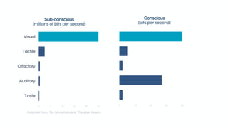
![“The two optic nerves [in the
eyes] are sending what we now
know are 20 megabits a second
of information back to the brain.”
Edward Tufte
We are visual processors (and companies know that).](https://image.slidesharecdn.com/user-centereddashboarddesign-techladydc-amakulec-171021232427/85/Developing-Dashboards-with-User-Centered-Design-4-320.jpg)
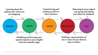


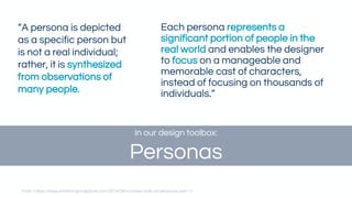
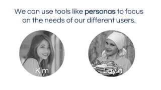
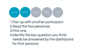

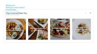
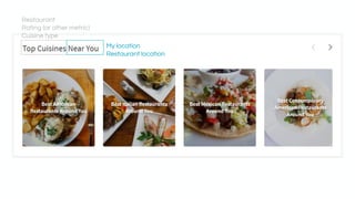
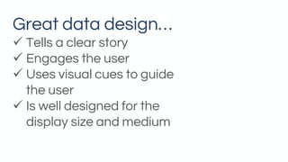
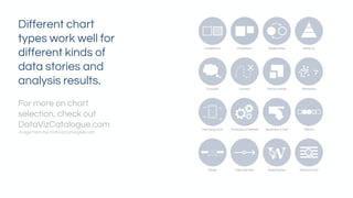


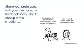
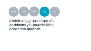

The document is a presentation on developing dashboards with user-centered design. It discusses how visualizing data can help answer questions and tells users to focus on the needs of personas when designing dashboards. The presentation guides attendees through an exercise where they identify key questions, available data, and prototype a dashboard to answer a persona's question using best practices like selecting the right chart, using visual cues, and getting early feedback.


