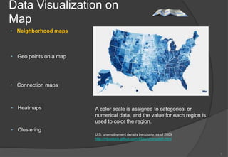
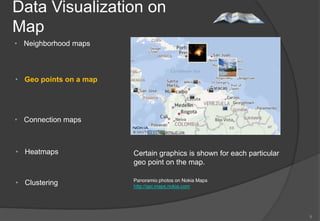
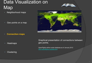
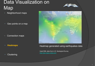
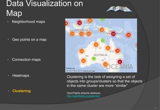
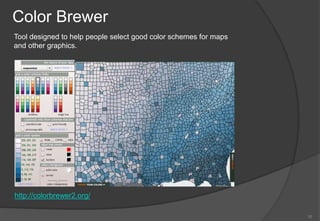
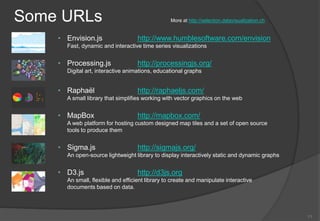
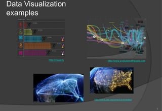
Data Visualization
Examples and Tutorials

                         "One Look Is Worth A Thousand
                                                Words“
                         Piqua Auto Supply House, 1913

German Zargaryan


                                                         1
Getting started…
• Why data visualization matters?

• Which tool to choose nowadays having all this buzz words around? (“super
  fast”, “out of the box”, “simple”, “easy”, etc.)


• Data visualization on a map


• Tools


• Helpful URLs


                                                                             2
Data Visualization
examples


            http://visual.ly               http://www.evolutionoftheweb.com


                               http://www.pbs.org/america-revealed


                                                                              3
D3.js (http://d3js.org/)
        • Small, free, JavaScript library


        • Declarative approach for operating with selections

        • Easy to debug


        • Transitions gradually interpolate styles and attributes over time
          d3.selectAll("circle").transition()
              .duration(750)
              .delay(function(d, i) { return i * 10; })
              .attr("r", function(d) { return Math.sqrt(d * scale); });
          ------------------------------------------------------------------------------
          d3.select("body").selectAll("p")
              .data([4, 8, 15, 16, 23, 42])
              .enter().append("p")
              .text(function(d) { return "I’m number " + d + "!"; });


                                                                                           4
Data Visualization on
Map
• Neighborhood maps


• Geo points on a map


• Connection maps


• Heatmaps              A color scale is assigned to categorical or
                        numerical data, and the value for each region is
                        used to color the region.
• Clustering
                        U.S. unemployment density by county, as of 2009
                        http://mbostock.github.com/d3/ex/choropleth.html


                                                                           5
Data Visualization on
Map
• Neighborhood maps


• Geo points on a map


• Connection maps


• Heatmaps              Certain graphics is shown for each particular
                        geo point on the map.

• Clustering            Panoramio photos on Nokia Maps
                        http://api.maps.nokia.com


                                                                        6
Data Visualization on
Map
• Neighborhood maps


• Geo points on a map


• Connection maps

                        Graphical presentation of connections between
• Heatmaps              geo points.

                        OpenFlights airline routes database as of January 2012
                        http://openflights.org/data.html

• Clustering


                                                                                 7
Data Visualization on
Map
• Neighborhood maps


• Geo points on a map


• Connection maps


• Heatmaps              Heatmap generated using earthquakes data

                        Used KML data from U.S. Geological Survey
                        http://api.maps.nokia.com
• Clustering


                                                                    8
Data Visualization on
Map
• Neighborhood maps


• Geo points on a map


• Connection maps


• Heatmaps              Clustering is the task of assigning a set of
                        objects into groups/clusters so that the objects
                        in the same cluster are more “similar”
• Clustering            OpenFlights airlports database
                        http://openflights.org/data.html


                                                                           9
Color Brewer
Tool designed to help people select good color schemes for maps
and other graphics.


http://colorbrewer2.org/

                                                                  10
Some URLs                                        More at http://selection.datavisualization.ch


    • Envision.js                  http://www.humblesoftware.com/envision
      Fast, dynamic and interactive time series visualizations


    • Processing.js                http://processingjs.org/
      Digital art, interactive animations, educational graphs


    • Raphaël                      http://raphaeljs.com/
      A small library that simplifies working with vector graphics on the web


    • MapBox                       http://mapbox.com/
      A web platform for hosting custom designed map tiles and a set of open source
      tools to produce them


    • Sigma.js                     http://sigmajs.org/
      An open-source lightweight library to display interactively static and dynamic graphs


    • D3.js                        http://d3js.org
      An small, flexible and efficient library to create and manipulate interactive
      documents based on data.


                                                                                                 11
Q & A or       ?

           


                   12

Data Visualization

  • 1.
    Data Visualization Examples andTutorials "One Look Is Worth A Thousand Words“ Piqua Auto Supply House, 1913 German Zargaryan 1
  • 2.
    Getting started… • Whydata visualization matters? • Which tool to choose nowadays having all this buzz words around? (“super fast”, “out of the box”, “simple”, “easy”, etc.) • Data visualization on a map • Tools • Helpful URLs 2
  • 3.
    Data Visualization examples http://visual.ly http://www.evolutionoftheweb.com http://www.pbs.org/america-revealed 3
  • 4.
    D3.js (http://d3js.org/) • Small, free, JavaScript library • Declarative approach for operating with selections • Easy to debug • Transitions gradually interpolate styles and attributes over time d3.selectAll("circle").transition() .duration(750) .delay(function(d, i) { return i * 10; }) .attr("r", function(d) { return Math.sqrt(d * scale); }); ------------------------------------------------------------------------------ d3.select("body").selectAll("p") .data([4, 8, 15, 16, 23, 42]) .enter().append("p") .text(function(d) { return "I’m number " + d + "!"; }); 4
  • 5.
    Data Visualization on Map •Neighborhood maps • Geo points on a map • Connection maps • Heatmaps A color scale is assigned to categorical or numerical data, and the value for each region is used to color the region. • Clustering U.S. unemployment density by county, as of 2009 http://mbostock.github.com/d3/ex/choropleth.html 5
  • 6.
    Data Visualization on Map •Neighborhood maps • Geo points on a map • Connection maps • Heatmaps Certain graphics is shown for each particular geo point on the map. • Clustering Panoramio photos on Nokia Maps http://api.maps.nokia.com 6
  • 7.
    Data Visualization on Map •Neighborhood maps • Geo points on a map • Connection maps Graphical presentation of connections between • Heatmaps geo points. OpenFlights airline routes database as of January 2012 http://openflights.org/data.html • Clustering 7
  • 8.
    Data Visualization on Map •Neighborhood maps • Geo points on a map • Connection maps • Heatmaps Heatmap generated using earthquakes data Used KML data from U.S. Geological Survey http://api.maps.nokia.com • Clustering 8
  • 9.
    Data Visualization on Map •Neighborhood maps • Geo points on a map • Connection maps • Heatmaps Clustering is the task of assigning a set of objects into groups/clusters so that the objects in the same cluster are more “similar” • Clustering OpenFlights airlports database http://openflights.org/data.html 9
  • 10.
    Color Brewer Tool designedto help people select good color schemes for maps and other graphics. http://colorbrewer2.org/ 10
  • 11.
    Some URLs More at http://selection.datavisualization.ch • Envision.js http://www.humblesoftware.com/envision Fast, dynamic and interactive time series visualizations • Processing.js http://processingjs.org/ Digital art, interactive animations, educational graphs • Raphaël http://raphaeljs.com/ A small library that simplifies working with vector graphics on the web • MapBox http://mapbox.com/ A web platform for hosting custom designed map tiles and a set of open source tools to produce them • Sigma.js http://sigmajs.org/ An open-source lightweight library to display interactively static and dynamic graphs • D3.js http://d3js.org An small, flexible and efficient library to create and manipulate interactive documents based on data. 11
  • 12.
    Q & Aor ?  12

Editor's Notes

  • #2 Hello!
  • #3 Main goal of the data visualization is to communicate information clearly and effectively through graphical means. It doesn’t mean that data visualization needs to look boring to be functional or extremely sophisticated to look beautiful.  So both aesthetic form and functionality need to go hand in hand.Information design is all about the psychology of how users access, learn, and remember information; the impact of colors, shapes, and patterns is huge.
  • #4 One look to the picture is enough to understand how much each country spent during Olympics.Over time web technologies have evolved to give you the ability to create new generations of useful and immersive web experiences.Today's web is a result of the ongoing efforts of aweb community that helps define these web technologiesand ensure that they're supported in all web browsers.The color bands in this visualization represent the interaction between web technologies and browsers, which brings to life the many powerful web apps that we use daily.
  • #5 D3.js is a JavaScript library for manipulating documents based on data.It helps you bring data to life using HTML, SVG and CSS.D3’s emphasis on web standards gives you the full capabilities of modern browsers without tying yourself to a proprietary framework, combining powerful visualization components and a data-driven approach to DOM manipulation.Selectors are defined by the W3C Selectors API and supported natively by modern browsers. It is possible to have dynamic properties as well by providing function instead of just color code.D3 is not a new graphical representation. Unlike Processing, Raphaël, or Protovis, the vocabulary of marks comes directly from web standardsFor example, you can create SVG elements using D3 and style them with external stylesheets.
  • #6 Data Visualization on the Map is probably the biggest subsection of all visualization types. Neighborhood maps are one of the most frequently used maps in infographic style visualizations.Color is the important part to these maps.A color scale is assigned to categorical or numerical data, and the value for each region is used to color the region. These maps usually use political boundaries as the regions (countries, cities, etc.)
  • #10 Sometimes it’s not possible to show all geo data at onceSimilarity is defined by distanceEach cluster has a color and number depending of how many points fell into that clusterNokia Maps API now supports that !
  • #12 As I promised here are some URLs