
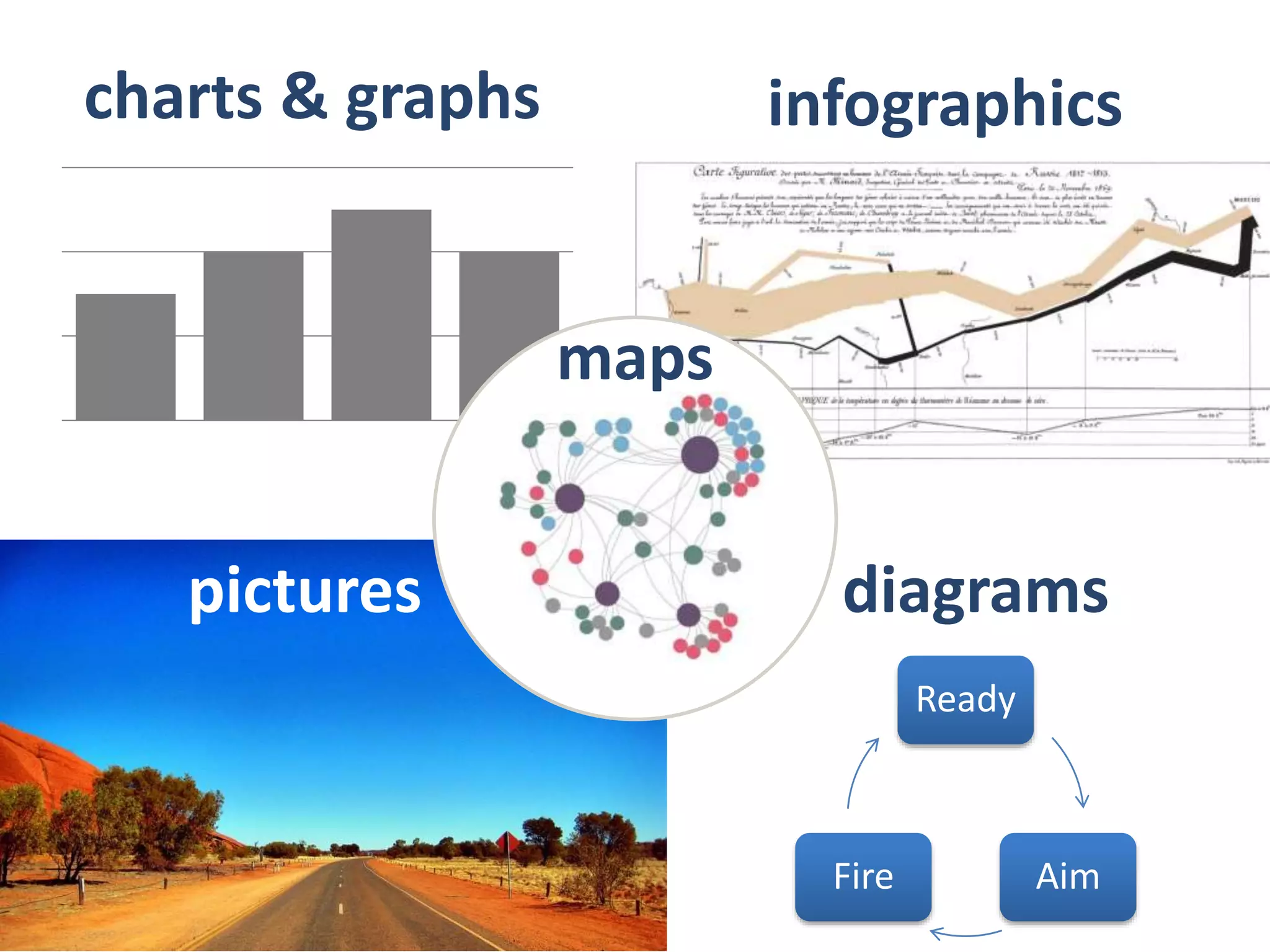

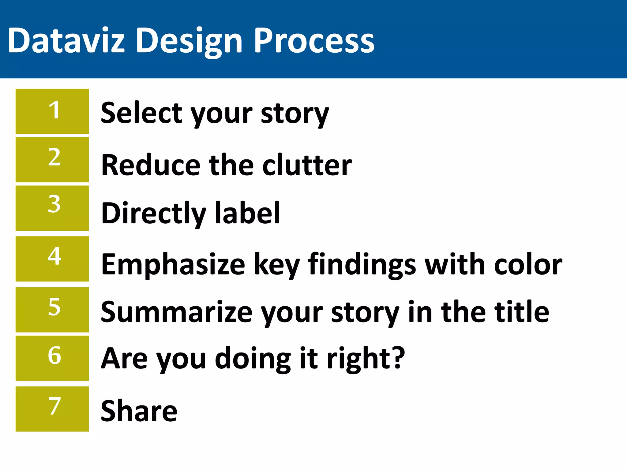
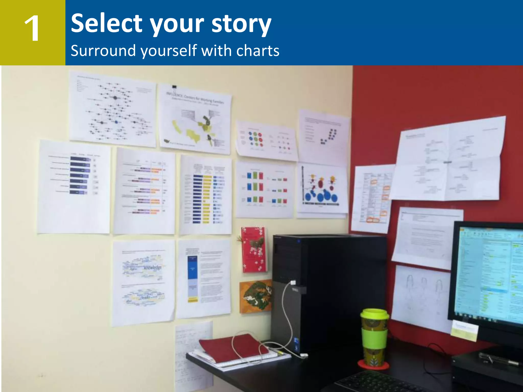
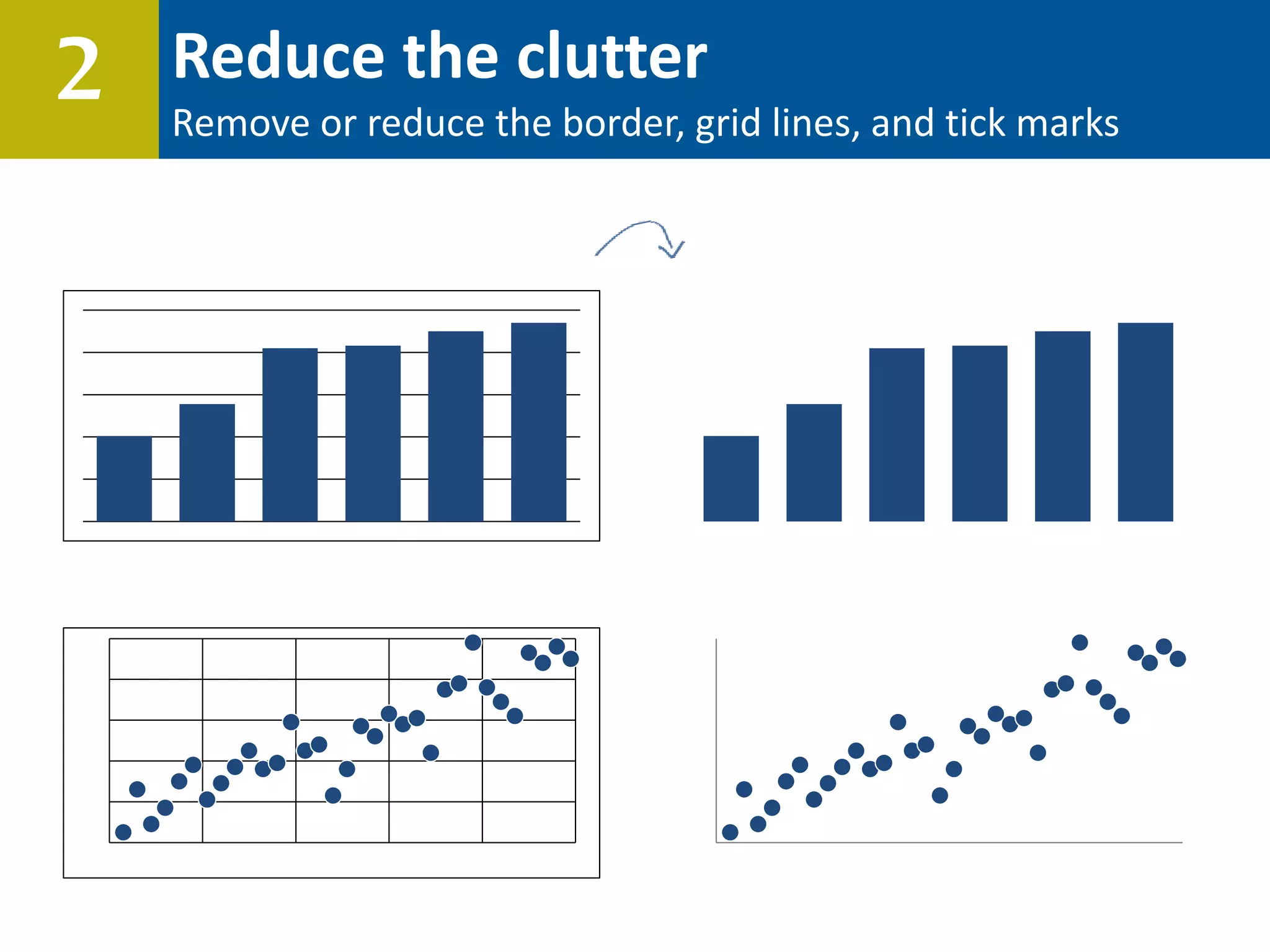
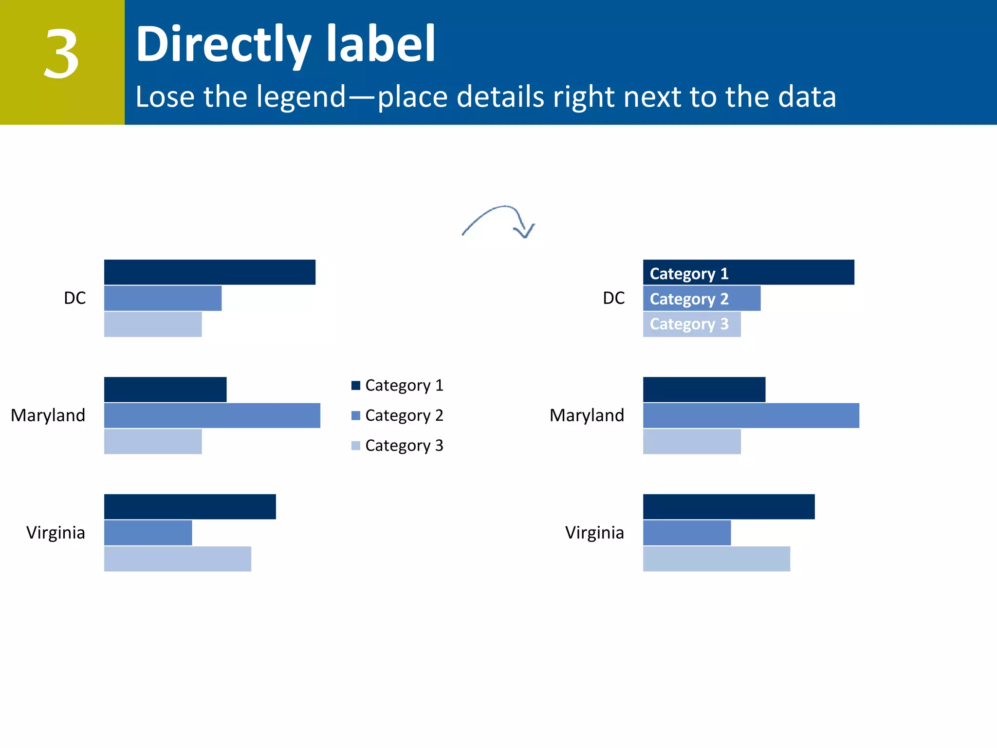
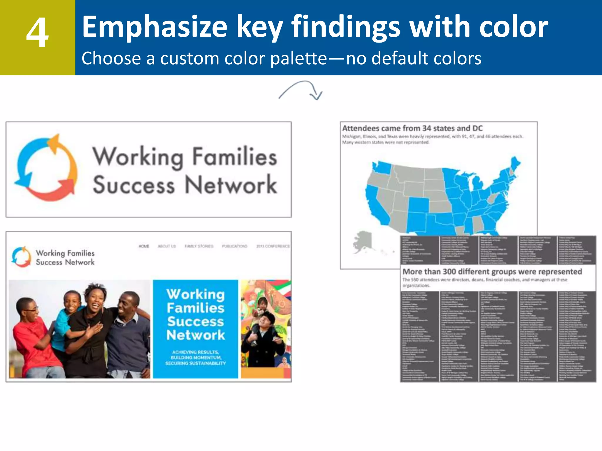
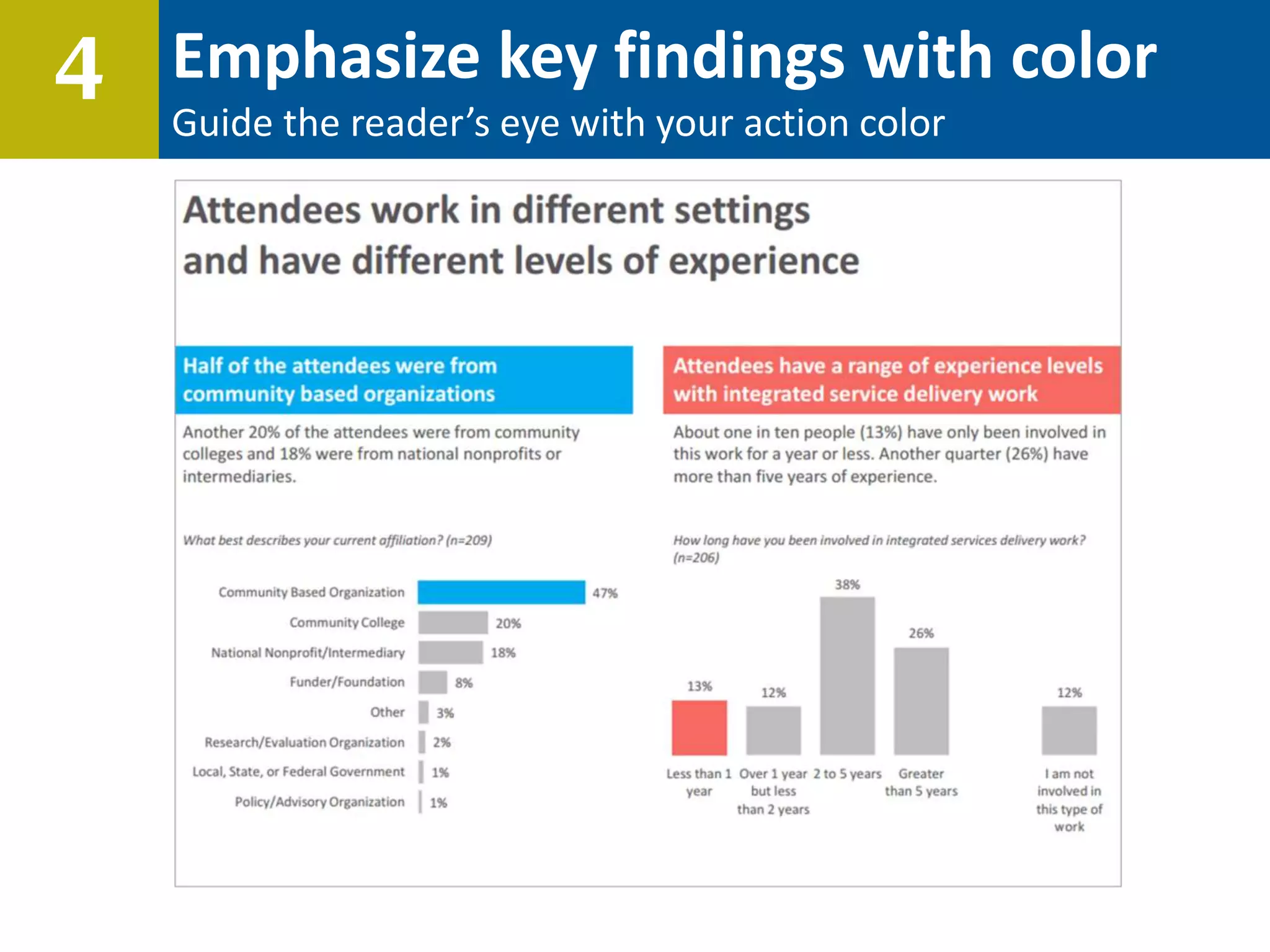
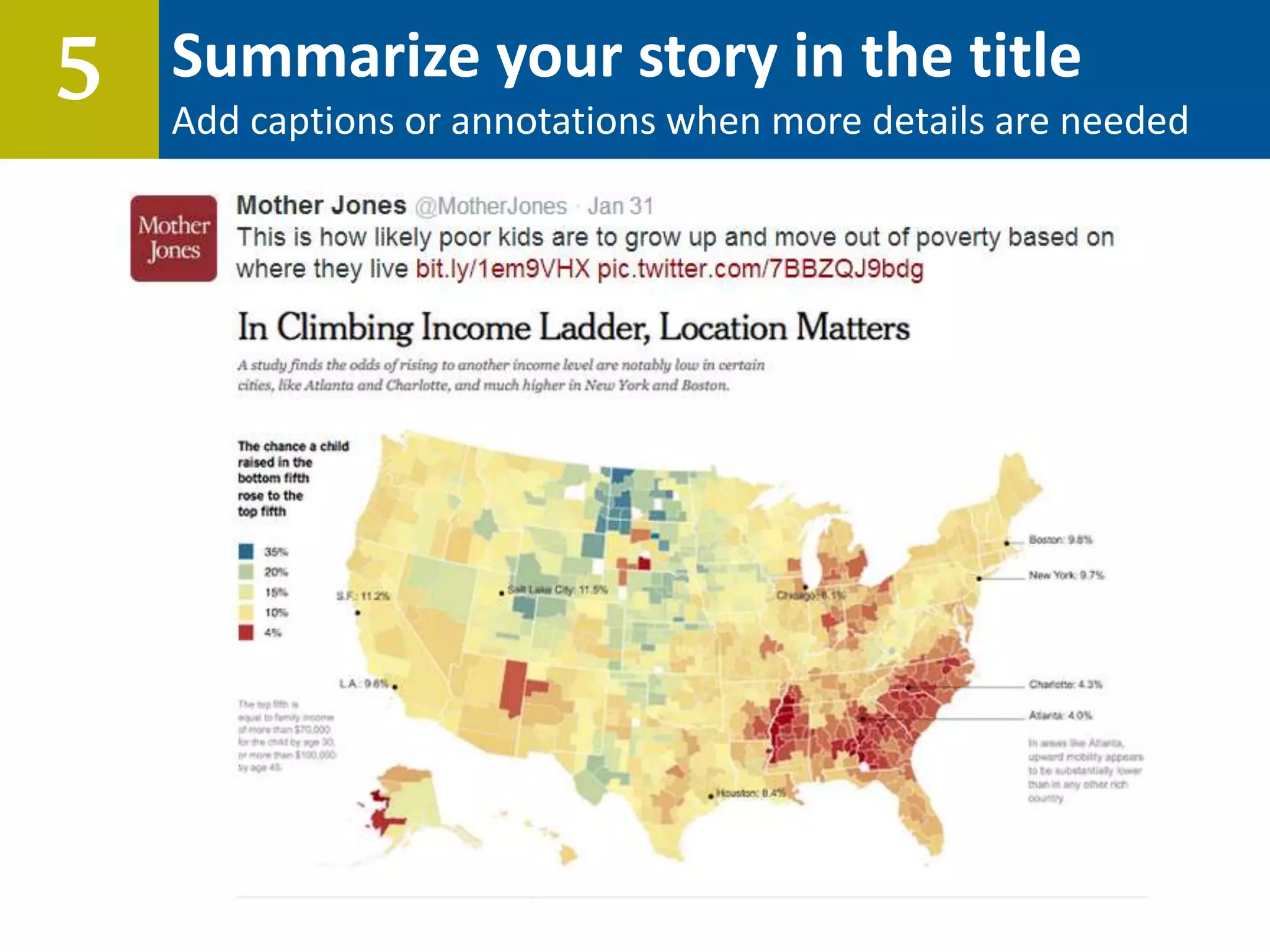

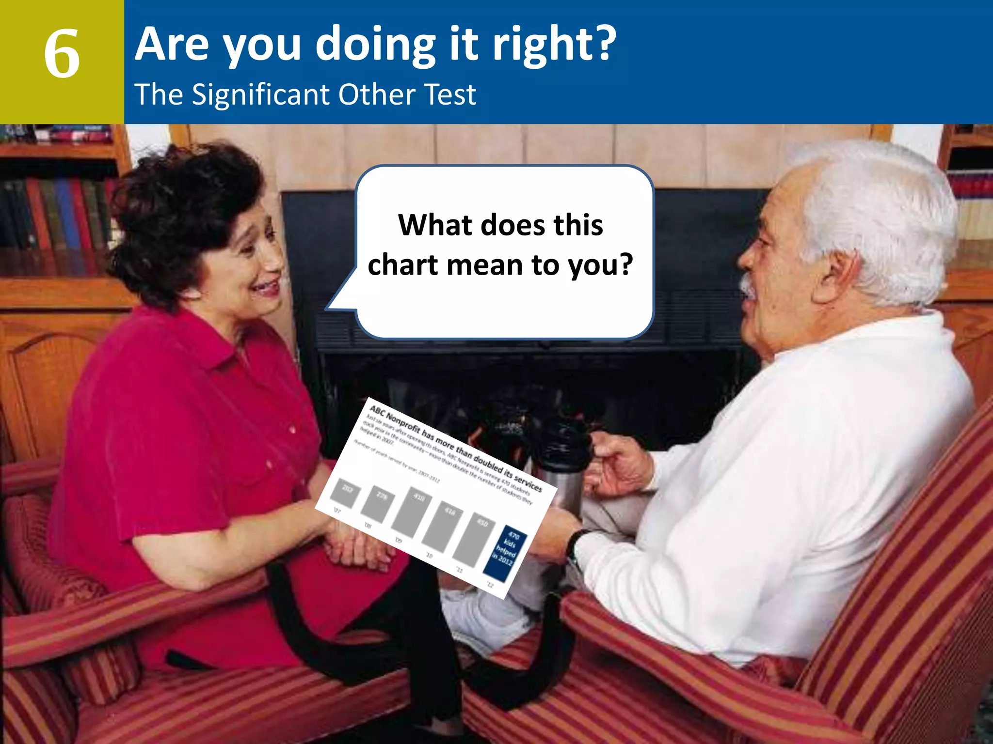
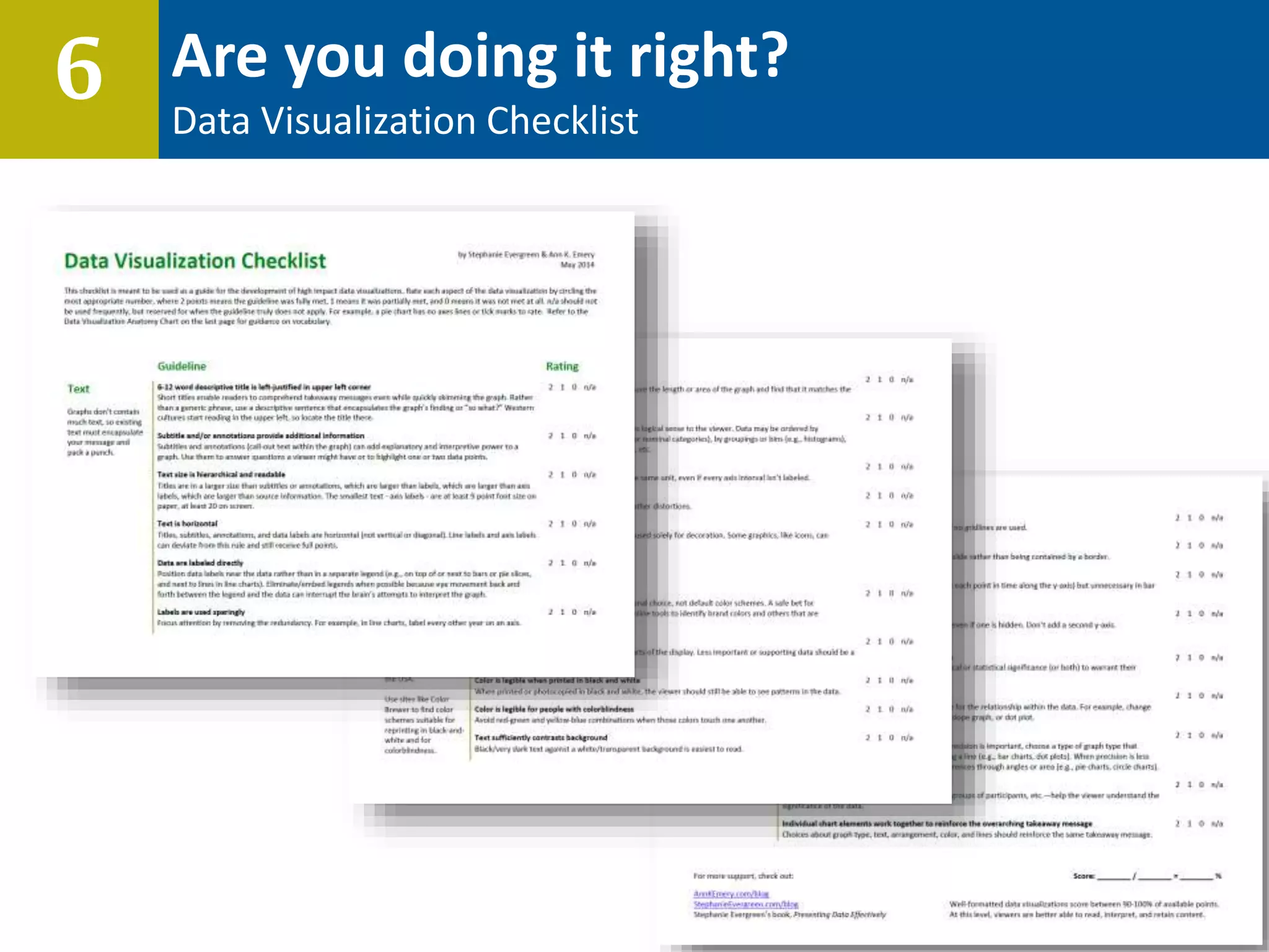
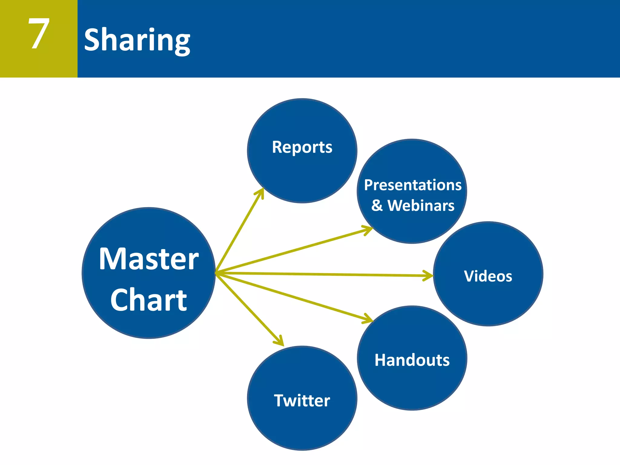
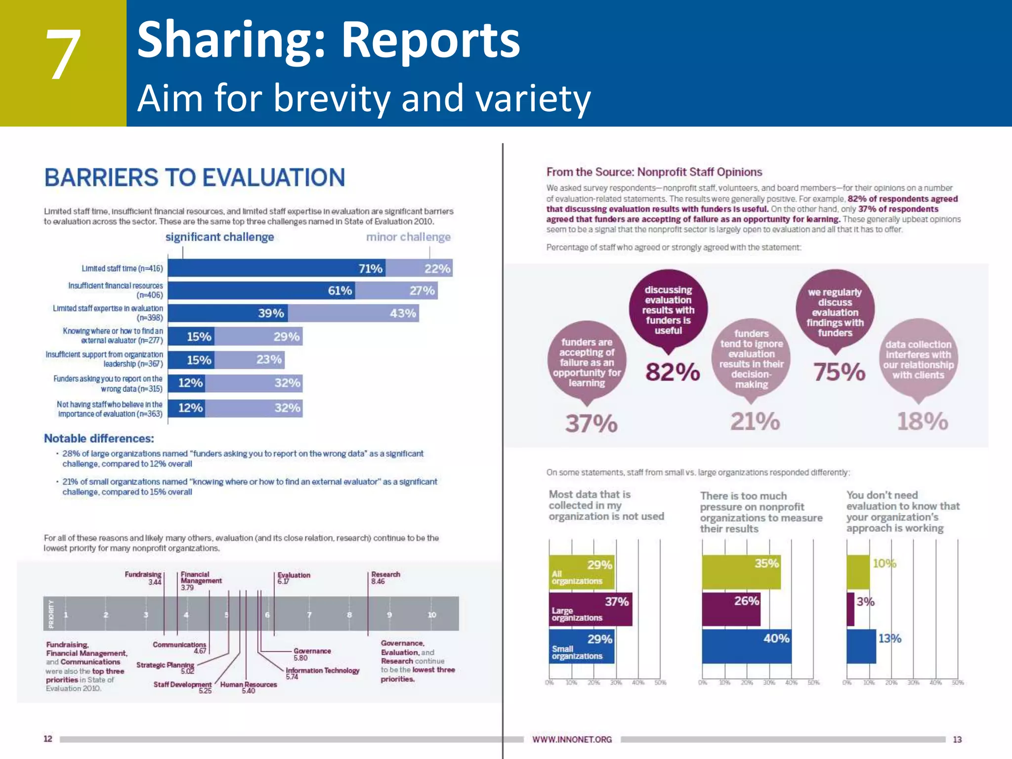
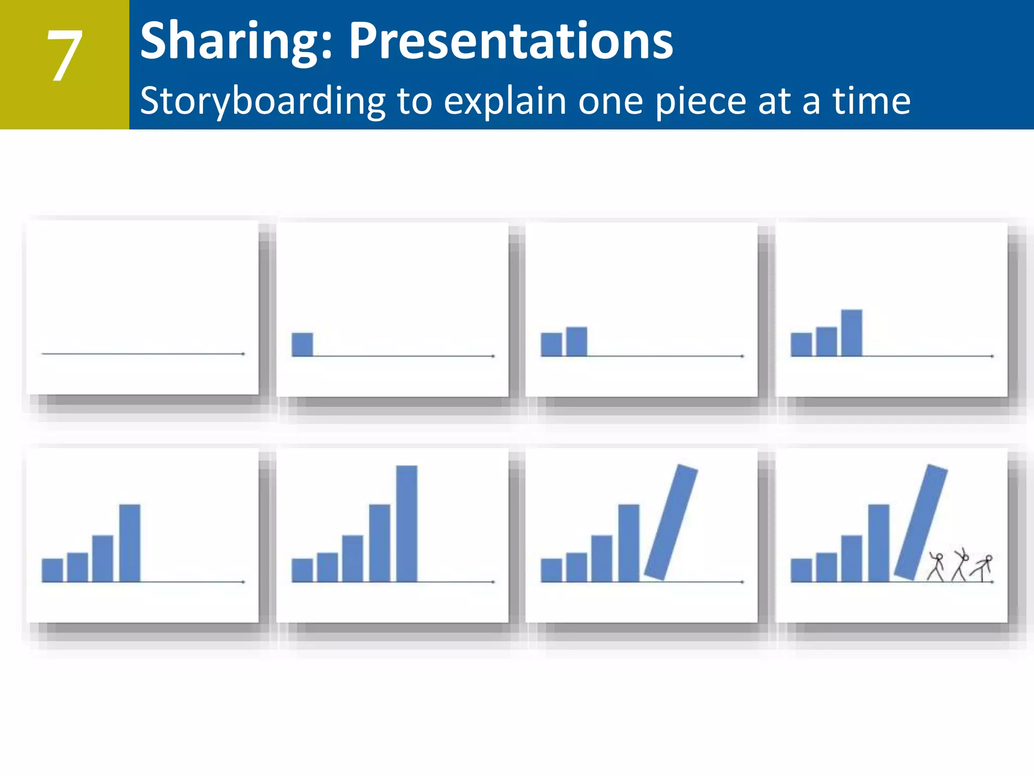
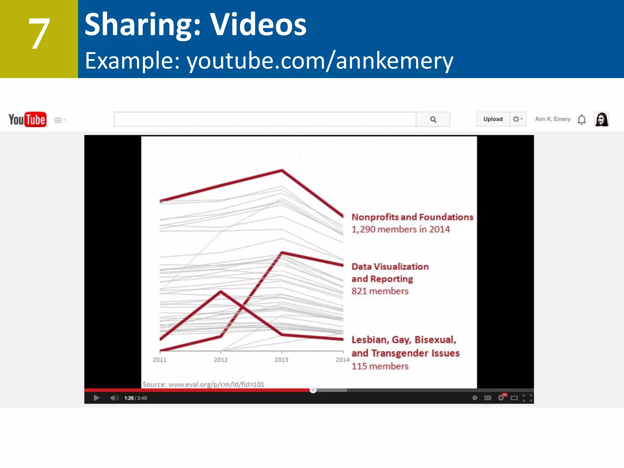
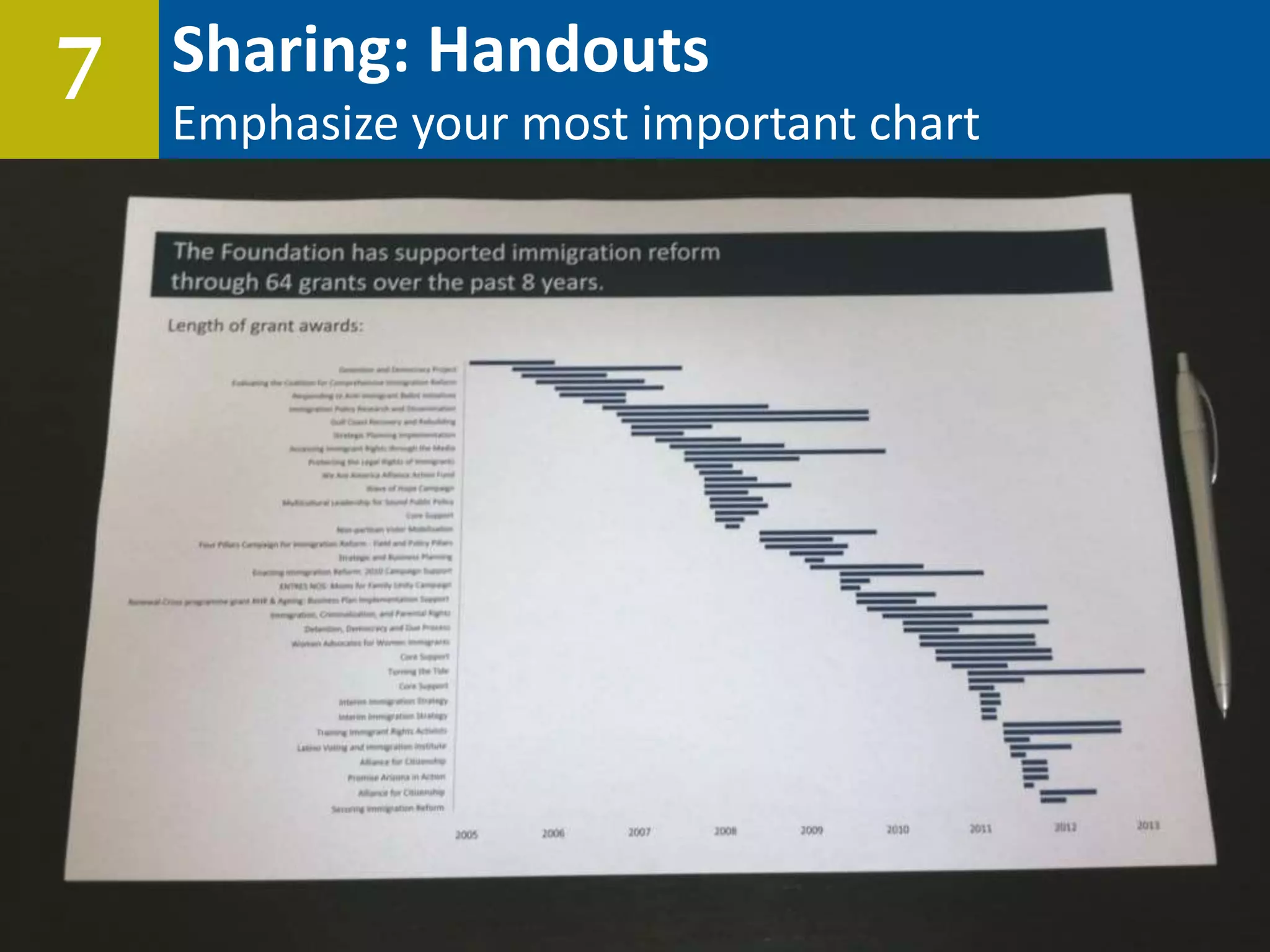
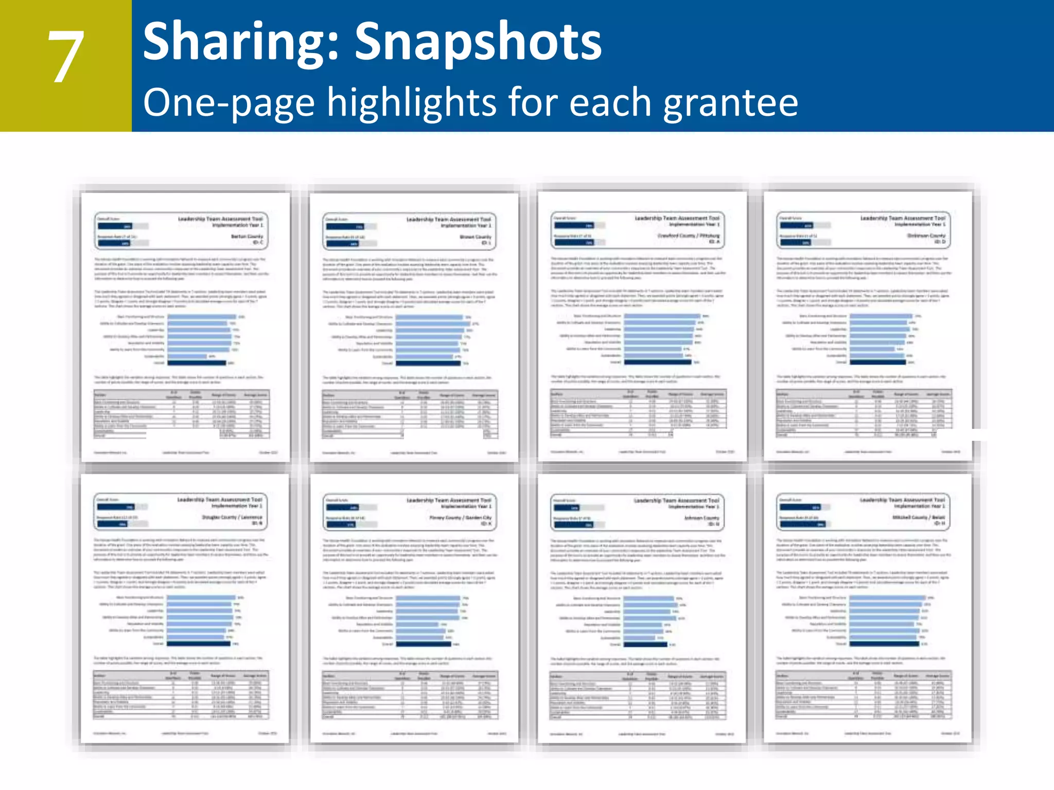
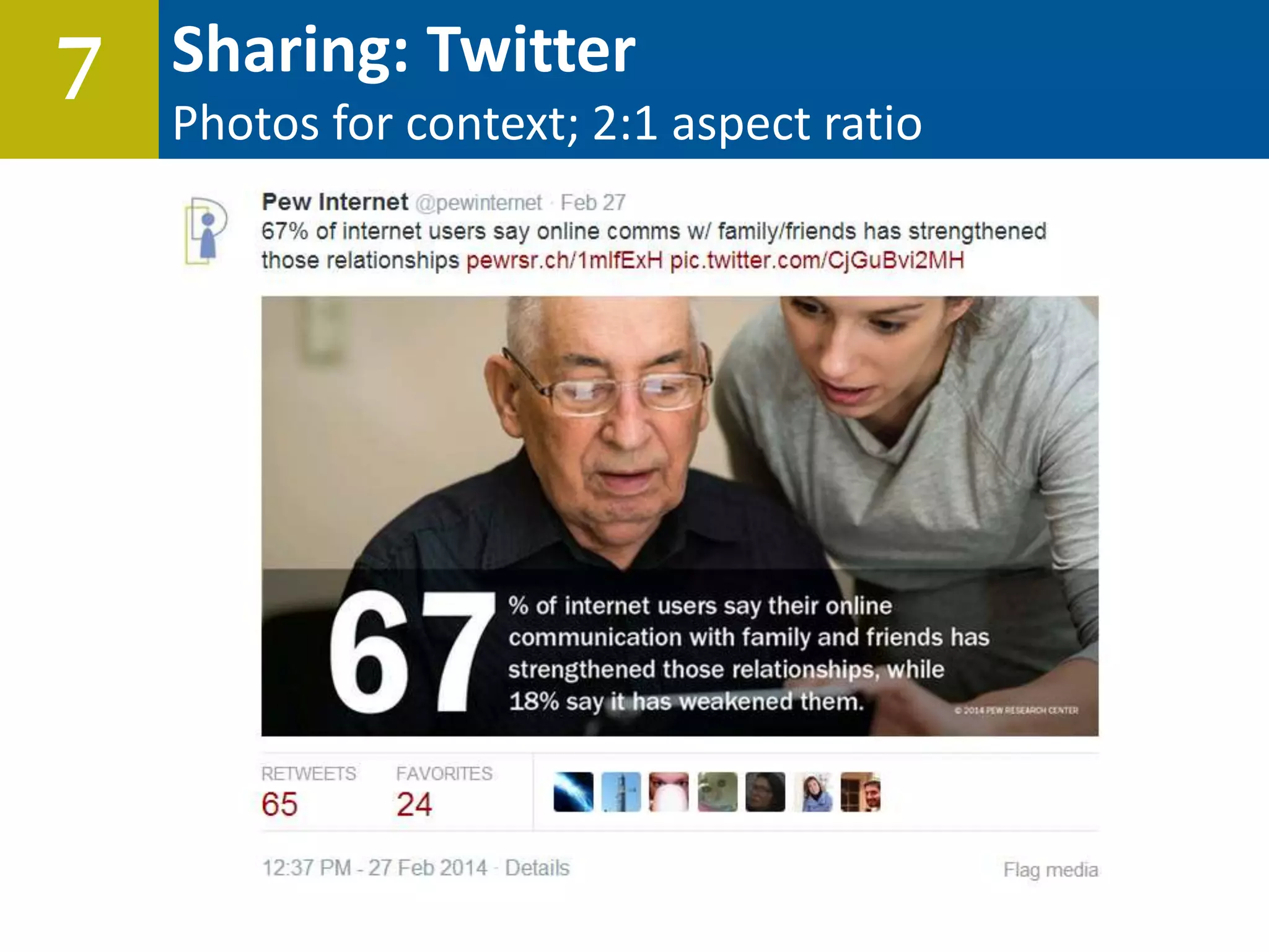
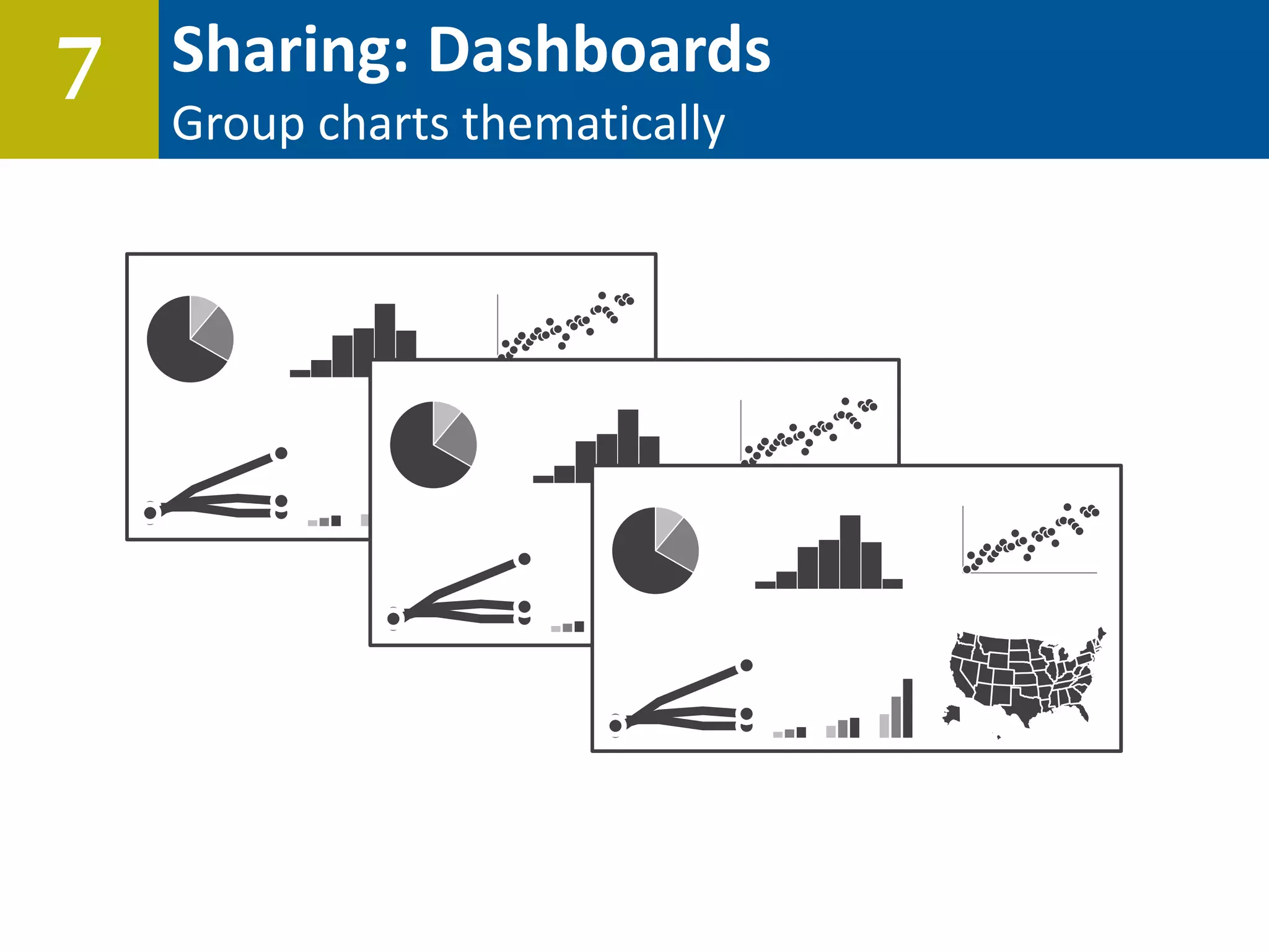
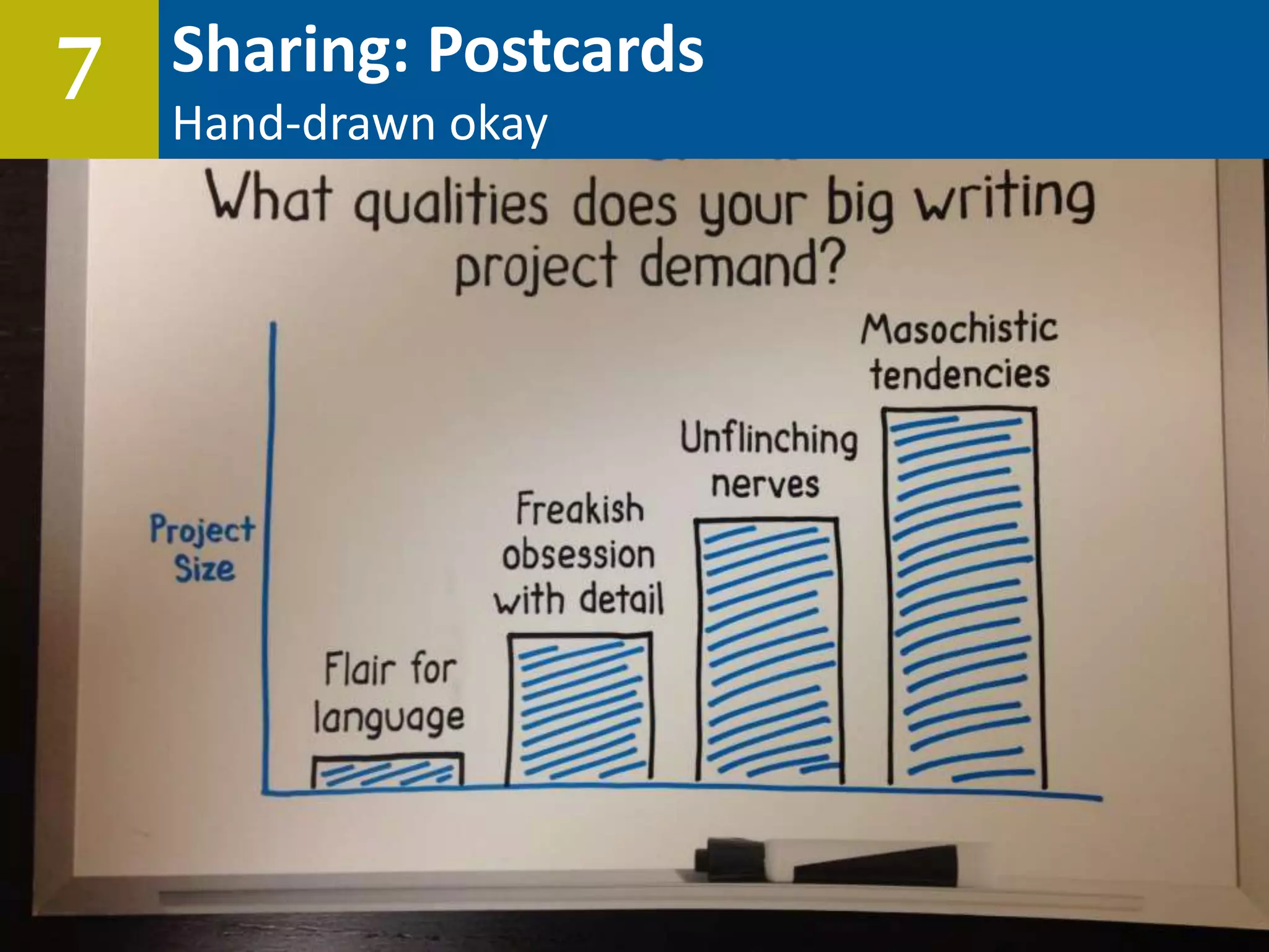

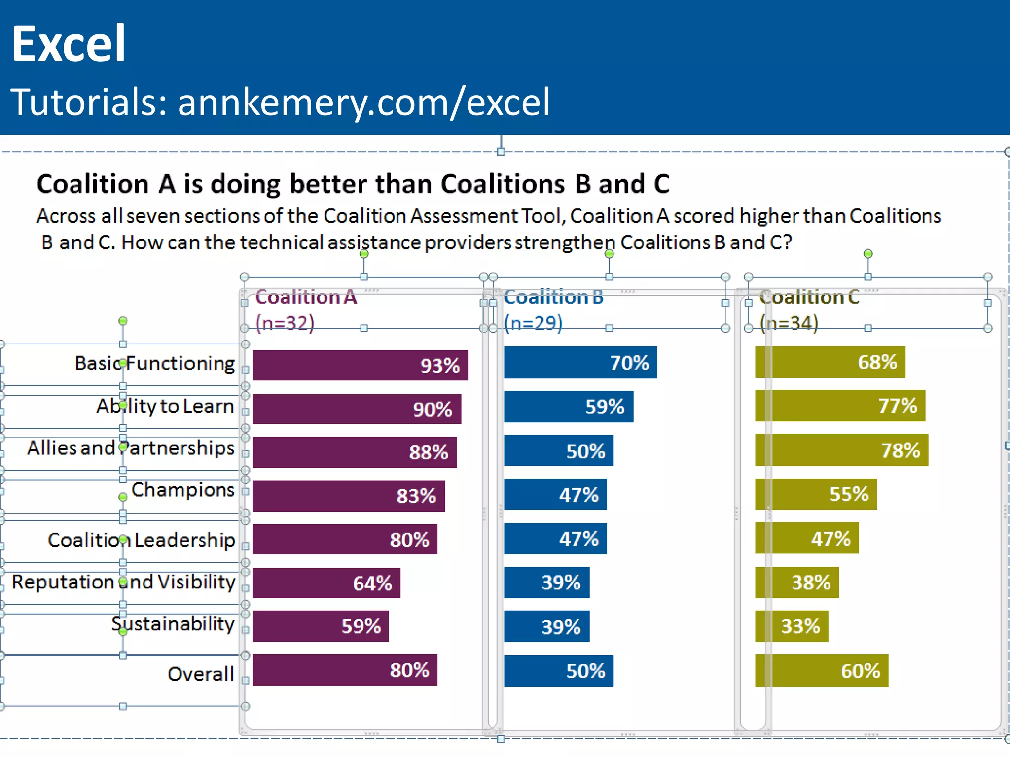
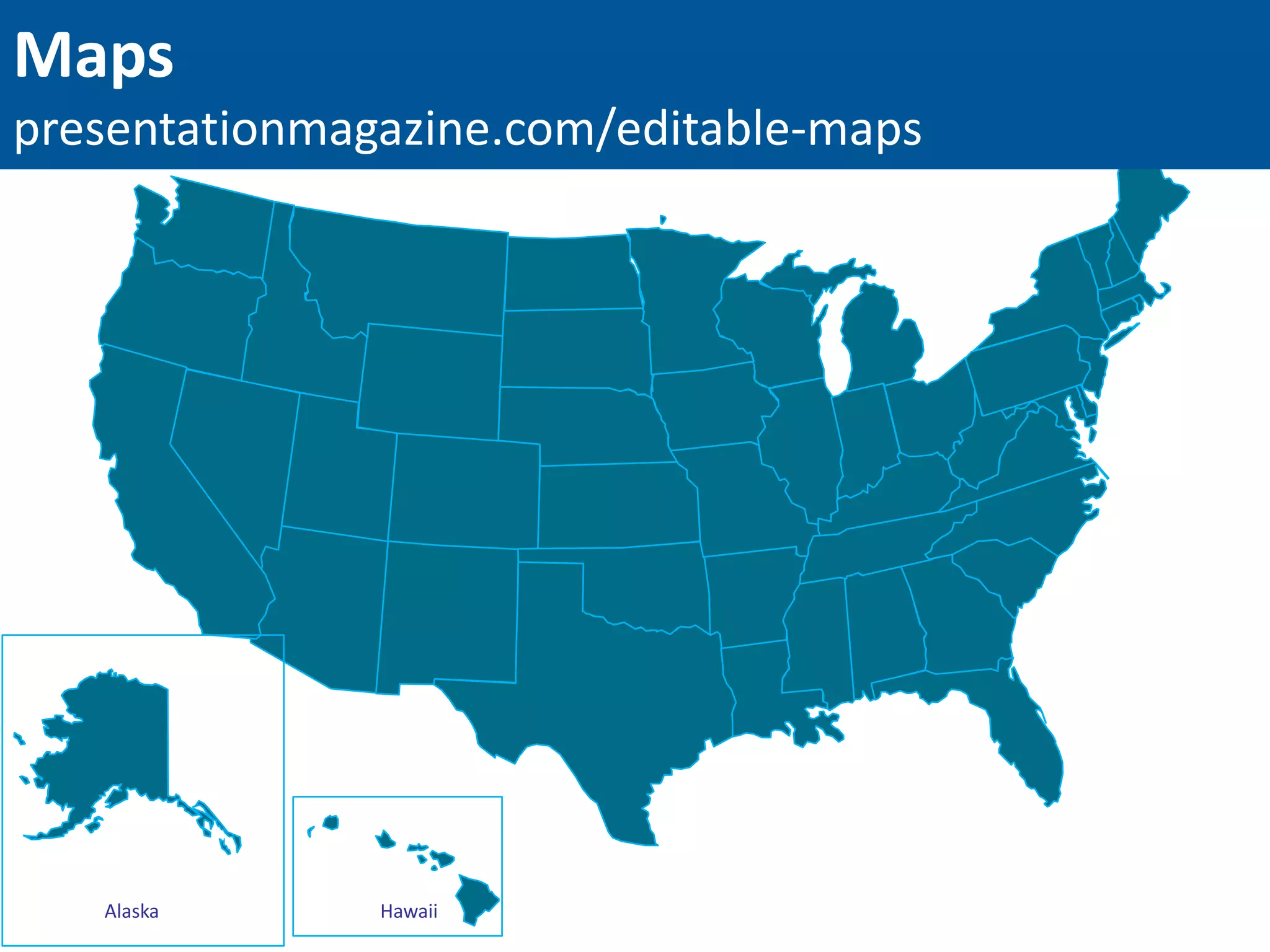
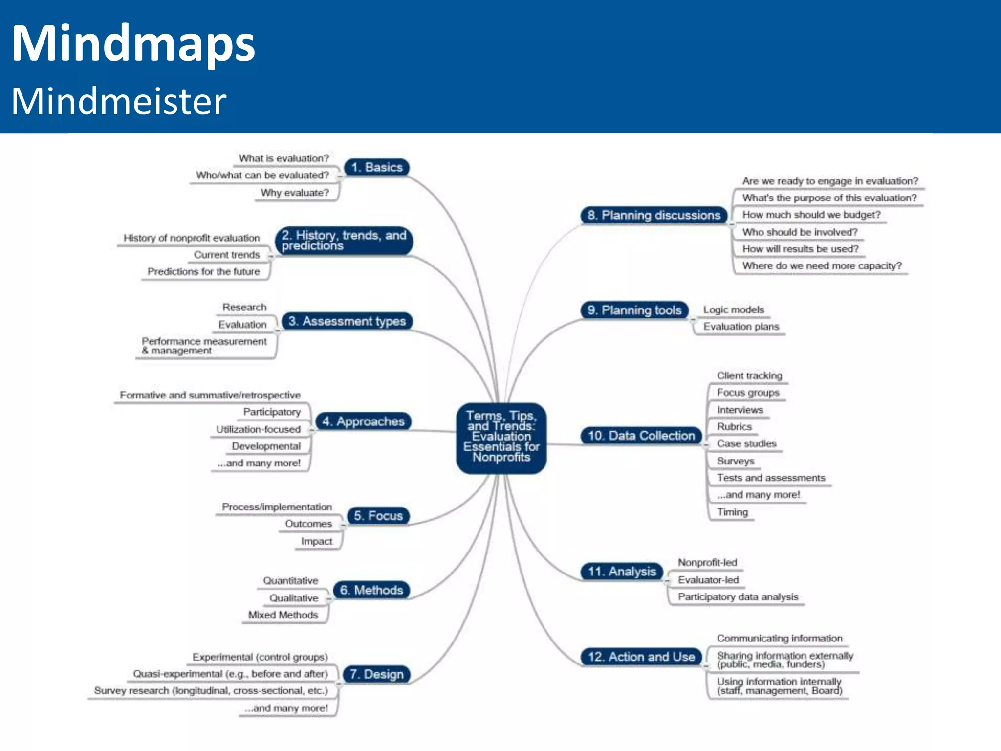
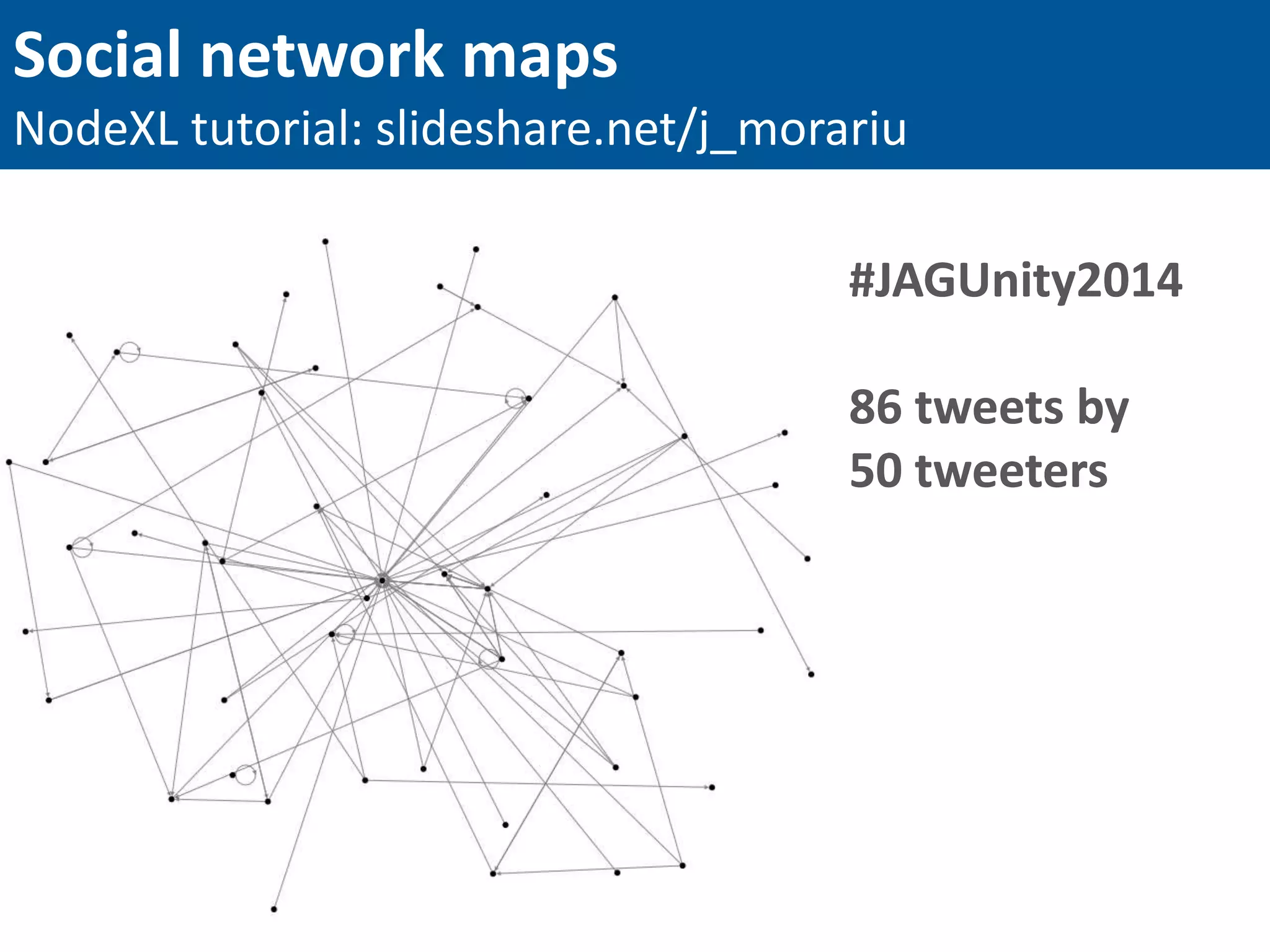
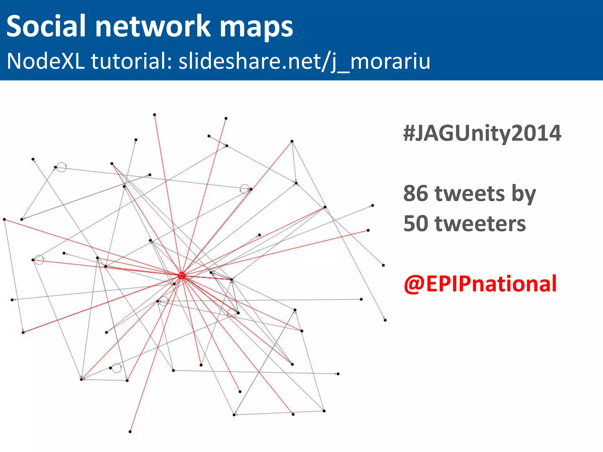

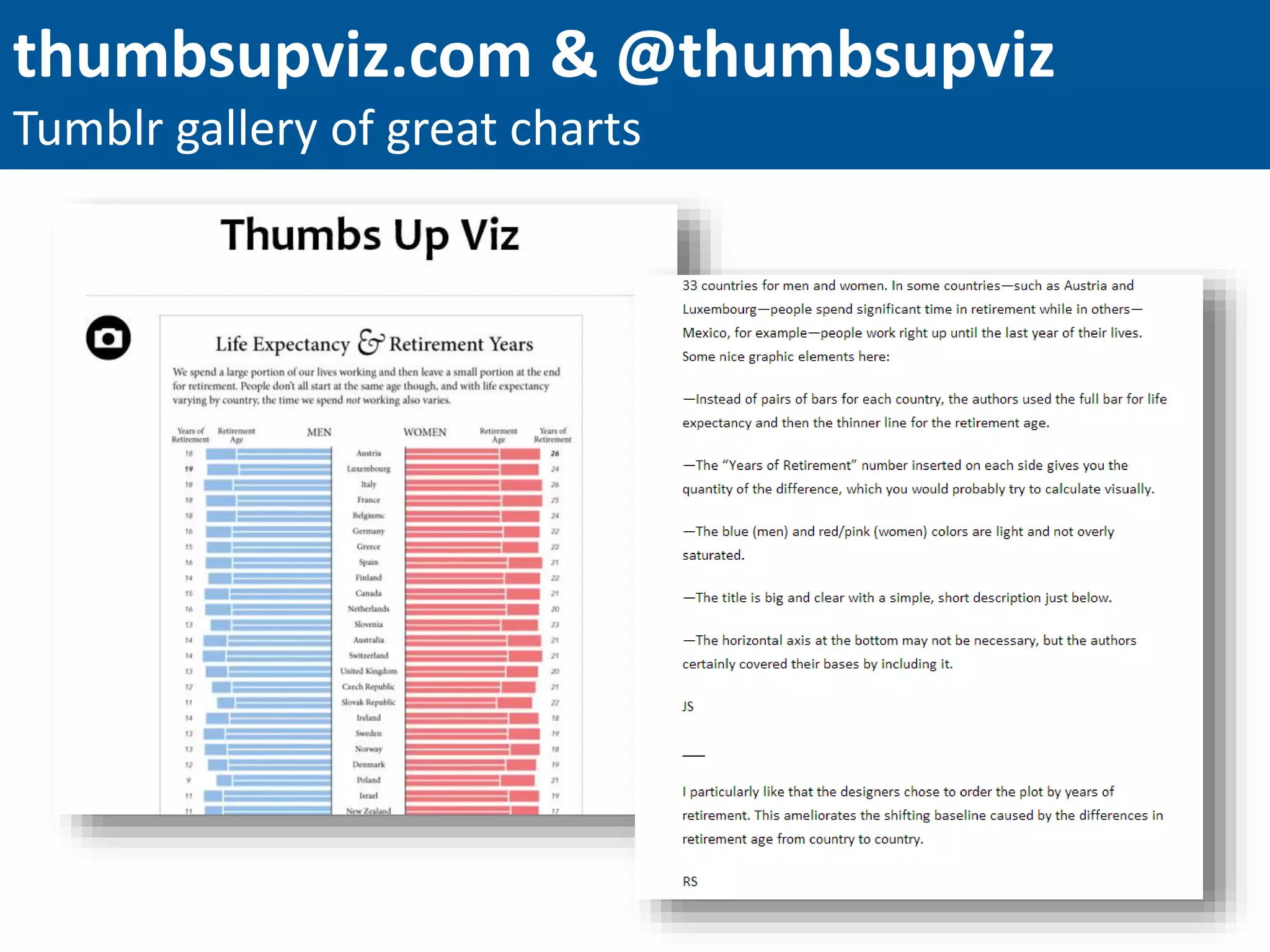


This document provides an overview of best practices in data visualization for philanthropists, including tips for effective chart design and the importance of clarity. Key steps in the design process emphasize reducing clutter, directly labeling data, and utilizing color effectively to highlight findings. It also suggests various sharing methods, tools, and resources for improving data visualization skills.