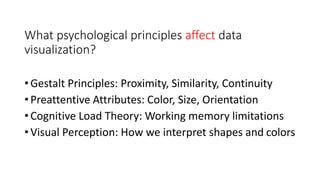
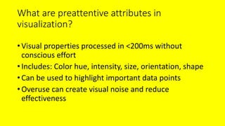
Data visualization isn't just about making graphs look pretty—it’s about telling a compelling story with data, using psychological and analytical techniques to engage an audience. A great presentation on this topic would explore how human perception influences the way we interpret visual data, revealing cognitive biases, color psychology, and the impact of effective chart design. It would highlight tricks like preattentive processing—our brain’s ability to notice certain visual elements almost instantly—and the way subtle design choices, such as contrast and layout, guide attention and understanding. By weaving in examples of misleading graphs and showing how simple tweaks can transform comprehension, the presenter can make data visualization feel less like a technical skill and more like an essential tool for communication.
The second part of the presentation could delve into the analytics side—how to optimize visualizations for deeper insights and decision-making. This section might cover advanced techniques like interactive dashboards, storytelling with data, and predictive visualizations that anticipate trends. A skilled presenter would demonstrate how the placement of information on a chart can subtly influence interpretation, as well as how simplifying complex data can make key insights stand out. By incorporating real-world case studies—perhaps showing how companies have used smart visualization techniques to drive successful strategies—the audience would leave inspired, equipped with practical techniques to craft visuals that don’t just present data, but persuade, inform, and engage on a psychological level.