FMP Evaluation
Your name
Production Process Evaluation
Research
• The strengths of my research were that it helped me come up with the
layout of my magazine and different way text was formatted. It helped me
design the general layout and helped with imaging. Weakness were I could
have focused on different aspects of the magazine instead of certain ones
Planning
• The strengths of my planning were that I was able to understand what
design would be better for my type of magazine. It helped me decide what
format would be best to attract the readers eye and keep it following the
page.
Time Management
• for the time I knew I had yes. My project was completed on time but
wasn’t handed in due to me being ill. If I was at 100% I would be able to of
done extra work on it and improve it massively.
Aesthetic Qualities
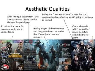
A custom title made for
my magazine to add a
unique touch
After finding a custom font I was
able to create a theme title for
the double spread page
Adding the “next month issue” shows that the
magazine is allows checking what’s going on so it can
be trusted
Having images of the developer
and the game shows the reader
that it’s not just a bunch of
rummers
Custom barcode
which shows the
magazine is fully
committed to its
genre.
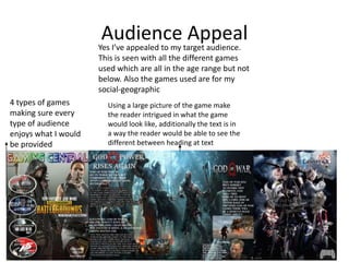
Audience AppealYes I’ve appealed to my target audience.
This is seen with all the different games
used which are all in the age range but not
below. Also the games used are for my
social-geographic
4 types of games
making sure every
type of audience
enjoys what I would
be provided
Using a large picture of the game make
the reader intrigued in what the game
would look like, additionally the text is in
a way the reader would be able to see the
different between heading at text
Peer
Feedback
Feedback 1
• What did you like about the product?
– Aesthetically pleasing
• What improvements could have been made to
the product?
– The way the text is laid out should be in
transparent boxes
Feedback 2
• What did you like about the product?
– No blur anywhere on the magazine
– Good use of text drawing the eye of the reader
• What improvements could have been made to
the product?
– Better looking text in general
– Don’t mess up circles
Feedback 3
• What did you like about the product?
– Back spread of 2nd page and words easy to read
– Front page good side stories
– Easy to differentiate
• What improvements could have been made to the
product?
– Have a theme for the magazine like colour palate or
shapes.
– Need a better logo
– Need better colours for the text
– Makes sure the images aren’t touching the text
– Back page is dead, add a blurb
– Have a logo (image for the type of magazine)
Peer Feedback Summary
• What do you agree with from your peer
feedback?
– I agree about having a theme for my magazine and
also fixing the text in general
• What do you disagree with from your peer
feedback?
– Disagree with the circle comment
Peer Feedback Summary
– I would start with fixing some boxes around the
text since it would improve the visibility of the
text.
– I would also make the pictures not touch, whilst
also making sure every picture makes sense where
it has been placed
– Finally I would have a logo for my magazine to an
some unique effects

7. evaluation visual

  • 1.
  • 2.
  • 3.
    Research • The strengthsof my research were that it helped me come up with the layout of my magazine and different way text was formatted. It helped me design the general layout and helped with imaging. Weakness were I could have focused on different aspects of the magazine instead of certain ones
  • 4.
    Planning • The strengthsof my planning were that I was able to understand what design would be better for my type of magazine. It helped me decide what format would be best to attract the readers eye and keep it following the page.
  • 5.
    Time Management • forthe time I knew I had yes. My project was completed on time but wasn’t handed in due to me being ill. If I was at 100% I would be able to of done extra work on it and improve it massively.
  • 6.
    Aesthetic Qualities A customtitle made for my magazine to add a unique touch After finding a custom font I was able to create a theme title for the double spread page Adding the “next month issue” shows that the magazine is allows checking what’s going on so it can be trusted Having images of the developer and the game shows the reader that it’s not just a bunch of rummers Custom barcode which shows the magazine is fully committed to its genre.
  • 7.
    Audience AppealYes I’veappealed to my target audience. This is seen with all the different games used which are all in the age range but not below. Also the games used are for my social-geographic 4 types of games making sure every type of audience enjoys what I would be provided Using a large picture of the game make the reader intrigued in what the game would look like, additionally the text is in a way the reader would be able to see the different between heading at text
  • 8.
  • 9.
    Feedback 1 • Whatdid you like about the product? – Aesthetically pleasing • What improvements could have been made to the product? – The way the text is laid out should be in transparent boxes
  • 10.
    Feedback 2 • Whatdid you like about the product? – No blur anywhere on the magazine – Good use of text drawing the eye of the reader • What improvements could have been made to the product? – Better looking text in general – Don’t mess up circles
  • 11.
    Feedback 3 • Whatdid you like about the product? – Back spread of 2nd page and words easy to read – Front page good side stories – Easy to differentiate • What improvements could have been made to the product? – Have a theme for the magazine like colour palate or shapes. – Need a better logo – Need better colours for the text – Makes sure the images aren’t touching the text – Back page is dead, add a blurb – Have a logo (image for the type of magazine)
  • 12.
    Peer Feedback Summary •What do you agree with from your peer feedback? – I agree about having a theme for my magazine and also fixing the text in general • What do you disagree with from your peer feedback? – Disagree with the circle comment
  • 13.
    Peer Feedback Summary –I would start with fixing some boxes around the text since it would improve the visibility of the text. – I would also make the pictures not touch, whilst also making sure every picture makes sense where it has been placed – Finally I would have a logo for my magazine to an some unique effects

Editor's Notes

  • #4 What were the strengths of your research? How did your research help your product? What were the weaknesses of your research? What could you have done better/improve? What effect would this have had on your product?
  • #5 What were the strengths of your planning? How did your planning help your product? What were the weaknesses of your planning? What could you have done better/improve? What effect would this have had on your product?
  • #6 Did you manage your time well? Did you complete your project on time or would your products have improved with additional time? What would you have done if you had more time to produce your work?
  • #7 Does your work look good? Was it creative? What aspects of your game’s visuals do you like? What would you improve? How would you improve it? Discuss the strengths and weaknesses Put your final piece(s) in the centre of a page and analyse them Use text boxes and arrows
  • #8 How have you appealed to your target audience? What specific bits of content would appeal to your target audience. Refer to your findings from your questionnaire. Put your final piece(s) in the centre of a page and analyse them Use text boxes and arrows
  • #14 What changes would you make to your product based upon your peer feedback and why?